


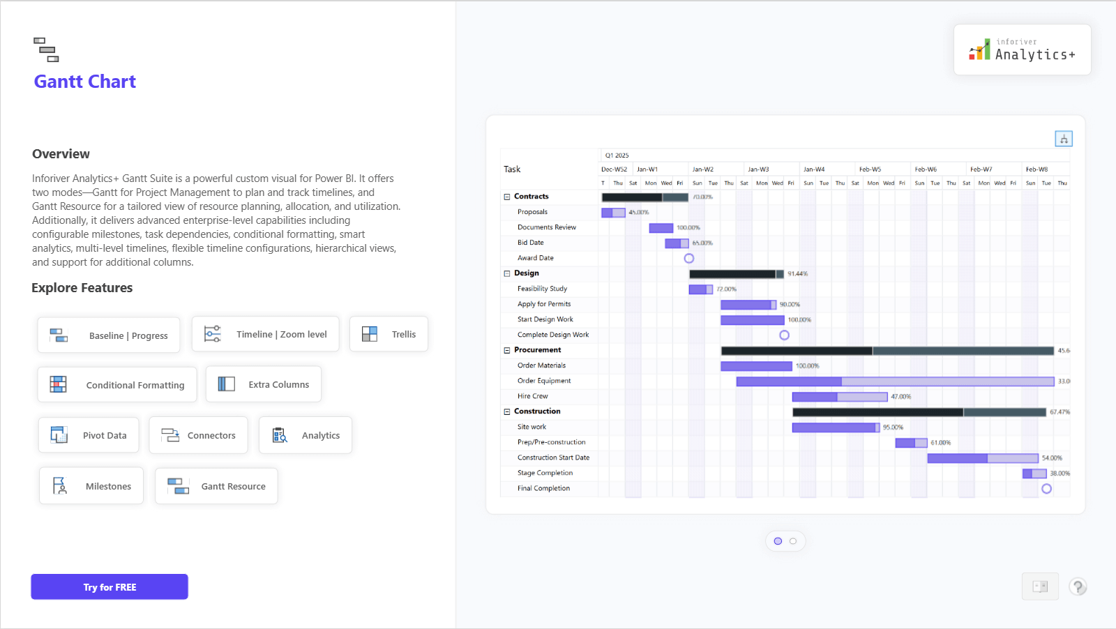


Gantt Chart for New Product Launch Timeline and Milestone Tracking
Plan and track complex product launches in Power BI using an interactive Gantt Chart with milestone visibility, budget monitoring, and progress insights.
Upcoming webinar on 'Inforiver Charts : The fastest way to deliver stories in Power BI', Aug 29th , Monday, 10.30 AM CST. Register Now
Plan and track complex product launches in Power BI using an interactive Gantt Chart with milestone visibility, budget monitoring, and progress insights.
Explore how a Tableau KPI report can be transformed into an interactive Power BI dashboard using Inforiver Analytics+, combining visual storytelling, year-over-year insights, and scalable KPI analytics.
Interactive P&L dashboard in Power BI for SaaS financial reporting. Analyze revenue, costs, margins, and profitability with variance vs prior year, plan, and forecast using Inforiver Analytics+.
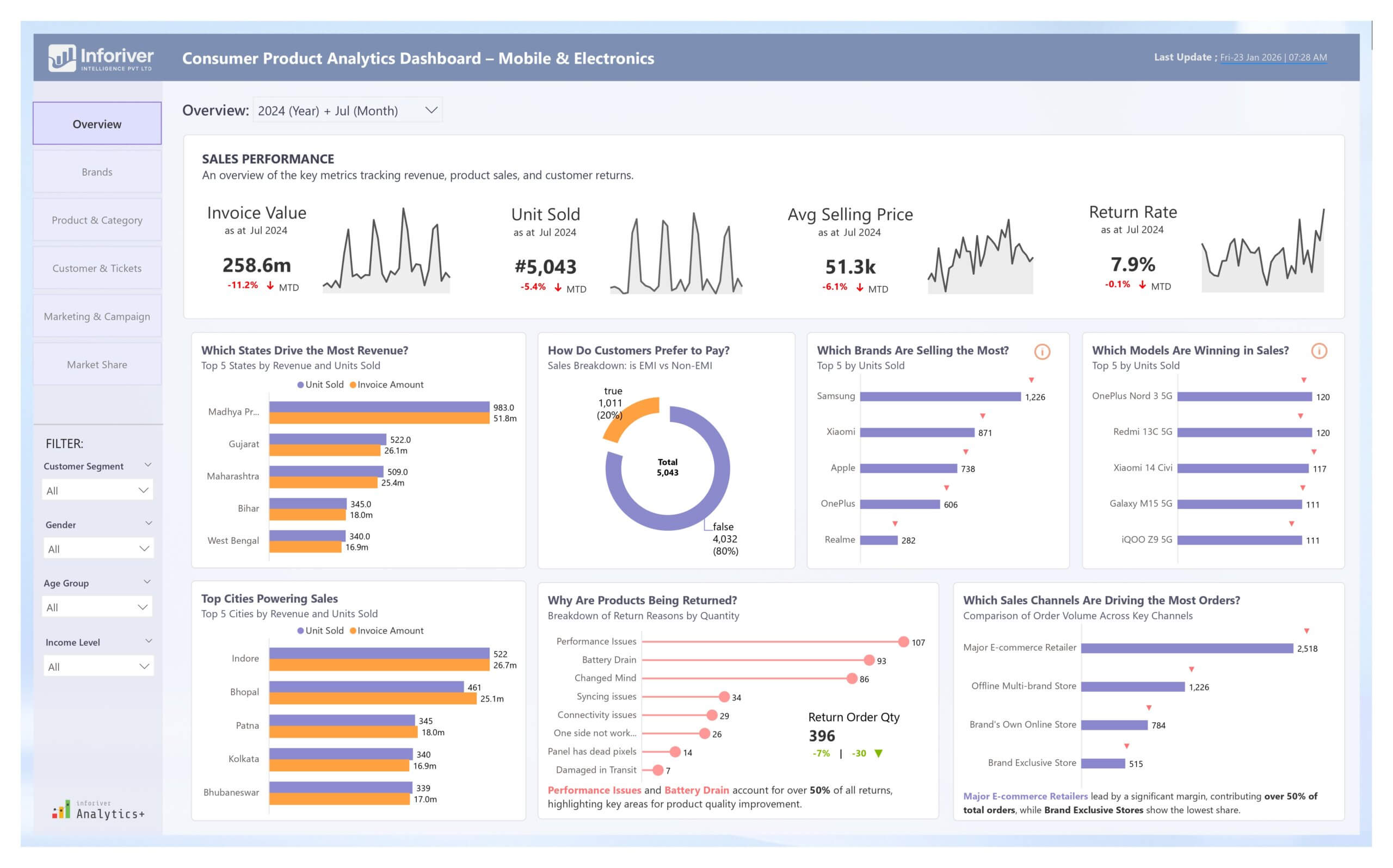
Drive growth in mobile & electronics with our Power BI Consumer Product Analytics Dashboard. Experience advanced data storytelling with Inforiver.
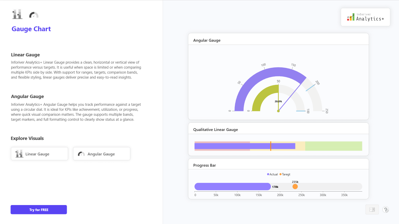
Track KPI progress against targets using Linear and Angular Gauge Charts in Power BI. Get instant visibility into performance status for executive dashboards
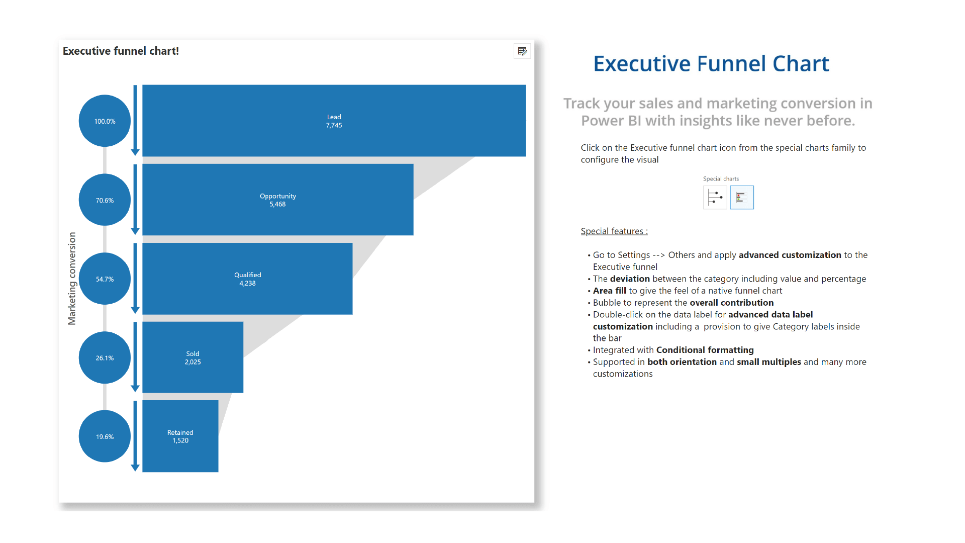
Analyze conversions across stages with Funnel, Pyramid, and Executive Funnel Charts in Power BI. See progression and drop-offs clearly for pipeline and journey analysis.
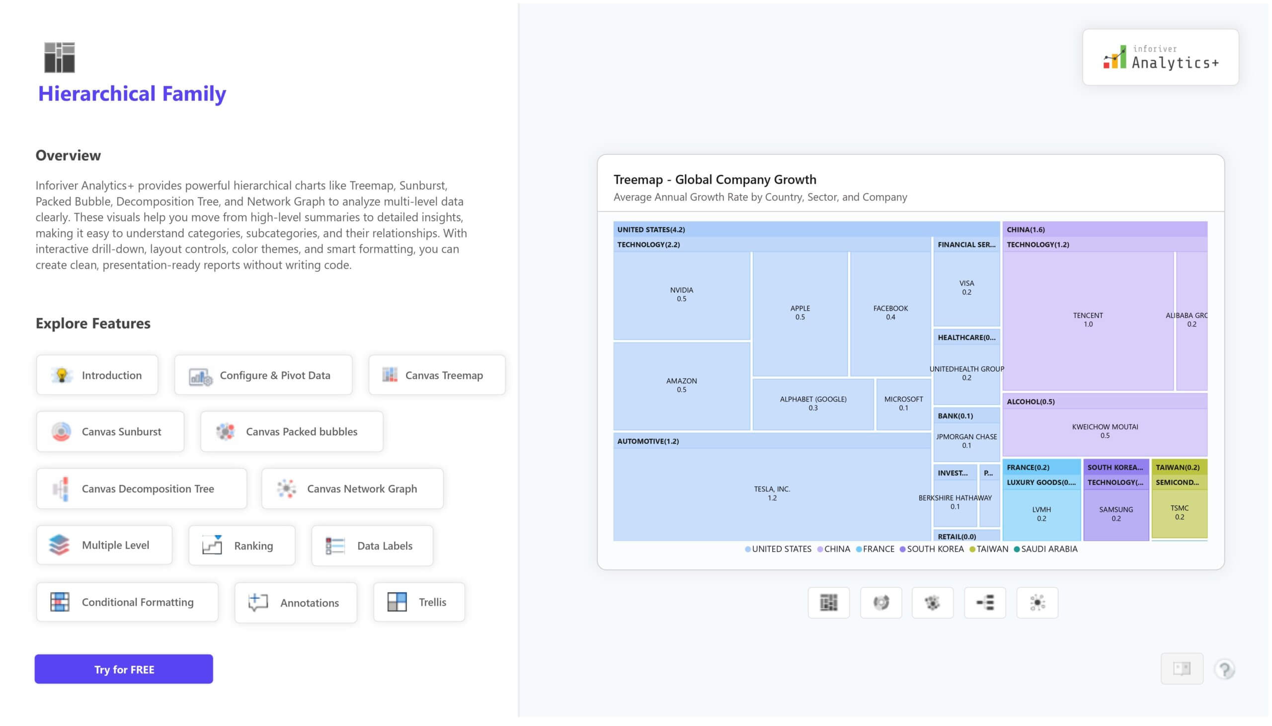
Visualize categories, subcategories, and relationships in Power BI with the Inforiver Hierarchy Chart Family. Get Treemap, Sunburst, Packed Bubble, Decomposition Tree, and Network Graph to support deep drill down and insight rich reporting.
View how metrics relate, how big their impact is, and where they stand using Scatter, Bubble, and Quadrant charts in Power BI.
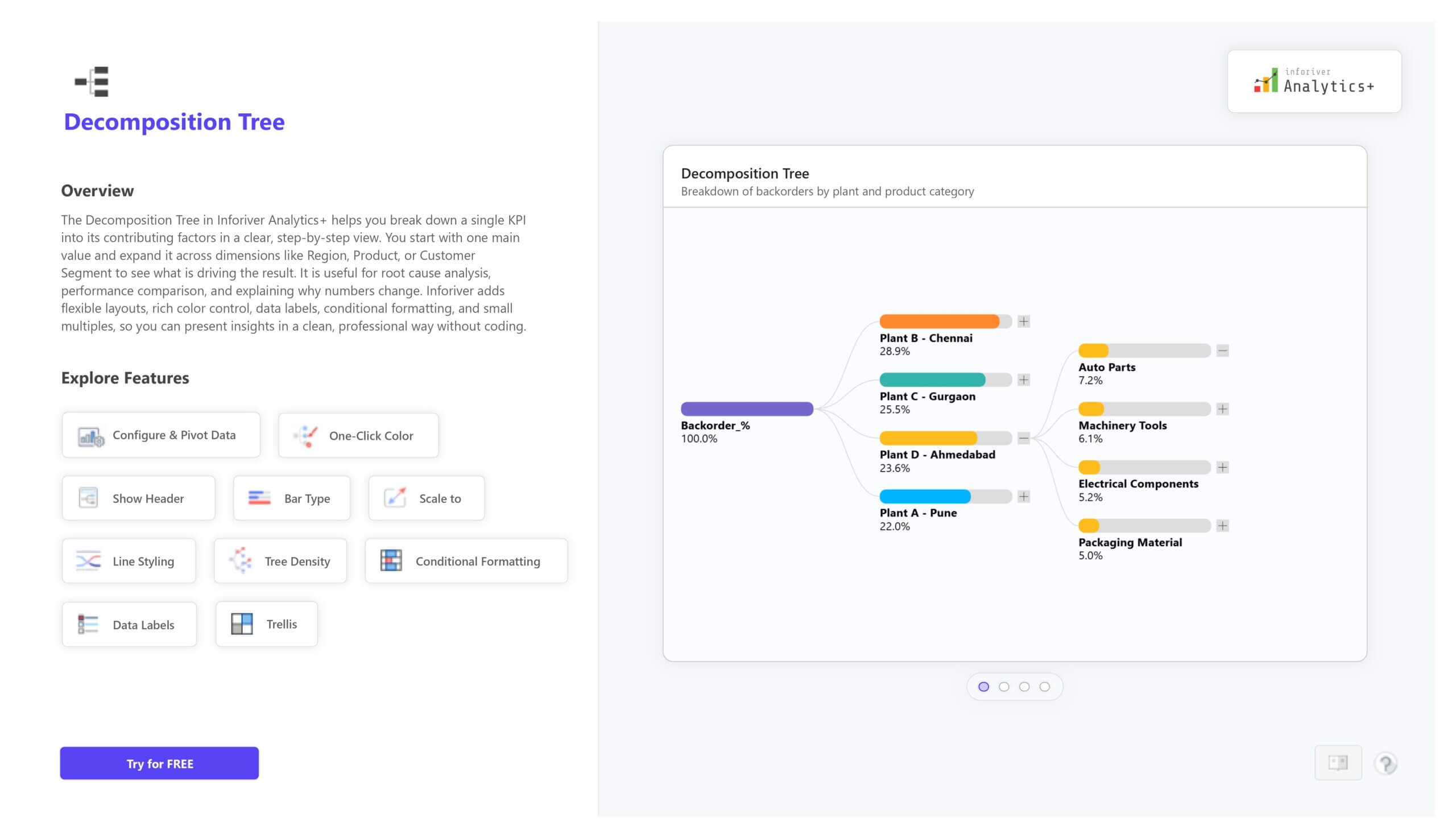
Break KPIs into root causes with the Decomposition Tree in Power BI. Easily explore contributors, compare branches, and format the view for clear insight.
Visualize and explore relationships with the Network Graph in Power BI using Inforiver Analytics+. See how nodes connect, compare links, and analyze complex networks with clear, customizable layouts.
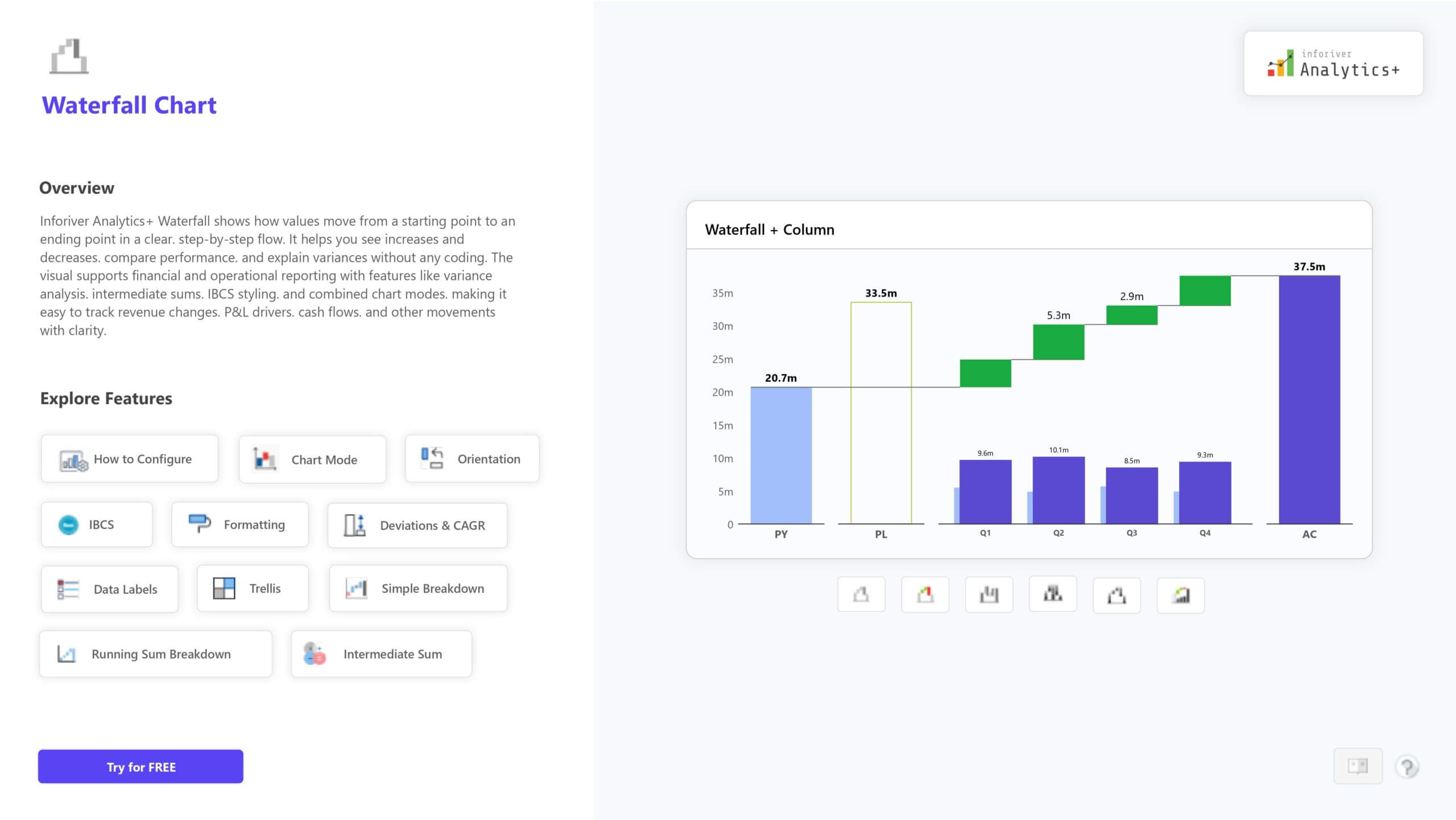
Visualize how values move between stages. Flow widths show volume, helping you track changes and understand relationships.
Track step-by-step value changes for clear profit, revenue, or cost analysis. Supports totals, breakdowns, and flexible formatting.
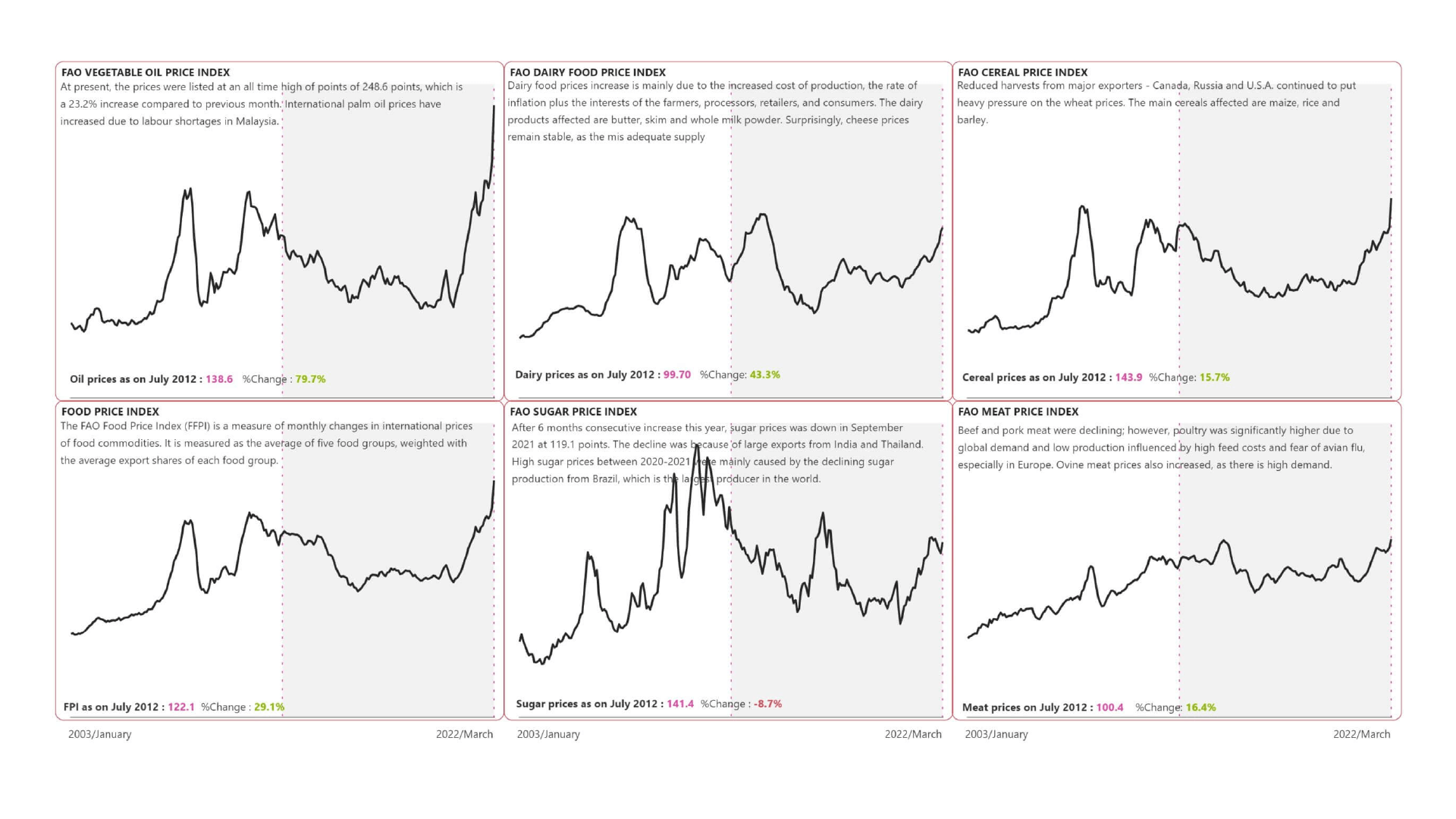
Show how numerical values are distributed by grouping them into bins. Useful for spotting patterns, trends, and frequency shifts.
Visualize multi-dimensional data in a circular view to compare categories and reveal clear performance patterns.
Compare proportions and totals across two dimensions with variable column widths for clear market and category insights.
Plan and track projects with clear timelines, milestones, and dependencies. Includes resource views and flexible formatting options.
Compare multiple measures on separate axes for clear insight. Supports up to five Y-axes with flexible layout and formatting.
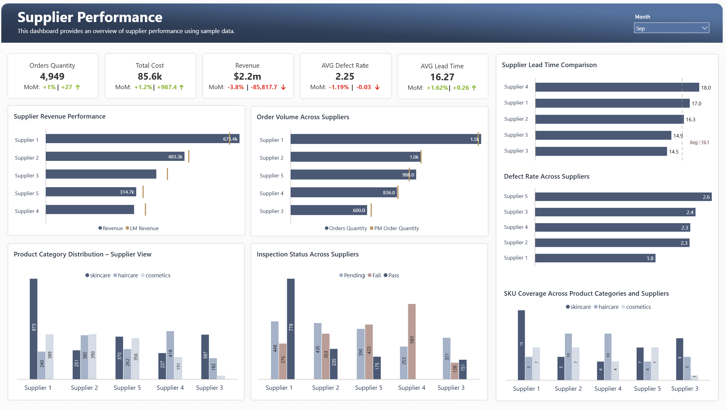
Track supplier performance with a Power BI dashboard. Get real-time insights on cost, quality, and delivery to strengthen your supply chain.
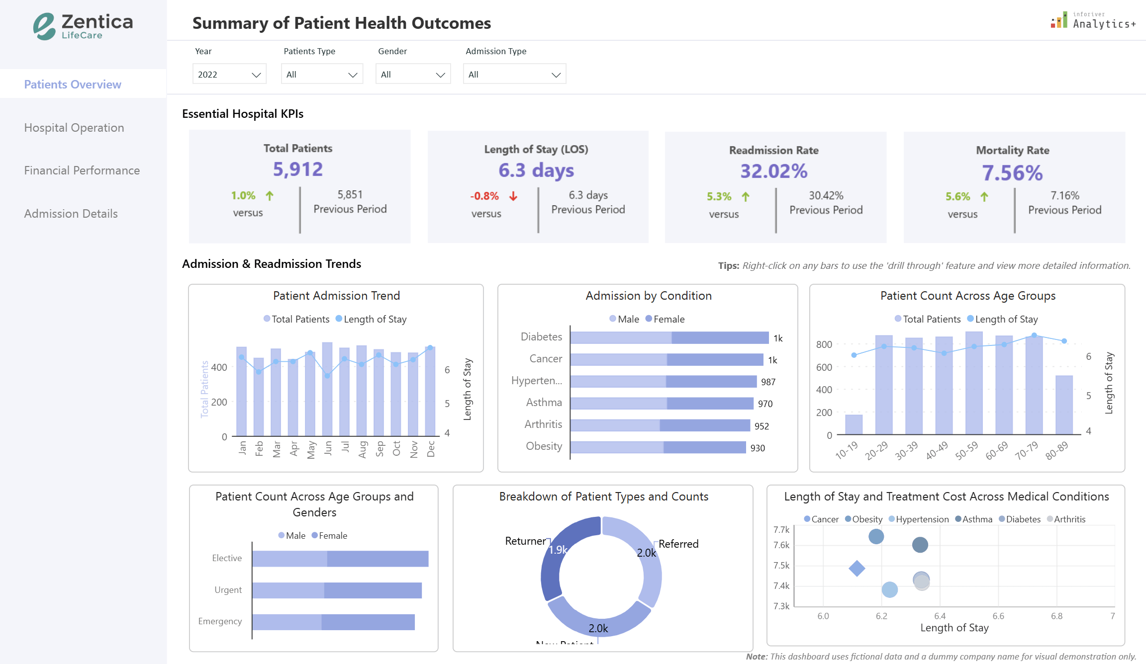
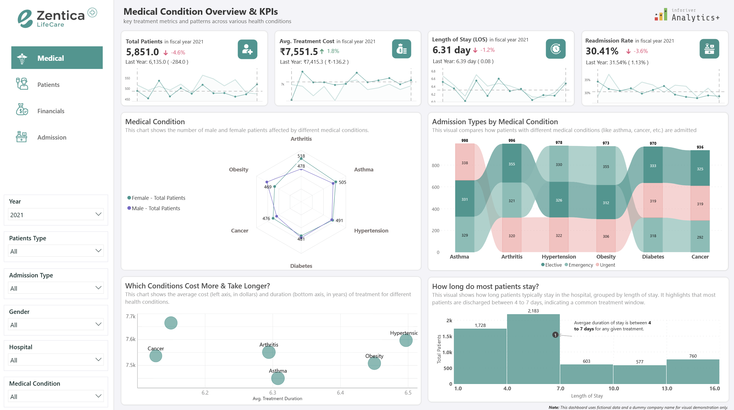
A Power BI and IBCS-compliant dashboard to analyze patient data, clinical outcomes, and revenue. Get instant, actionable insights for leaders.
Transform healthcare analytics with Power BI and Inforiver. Get fast insights on patient care, hospital operations, and financial performance for smarter decisions.
An all-in-one healthcare analytics dashboard with Power BI and Inforiver to gain critical insights into patient care, history, and financials.
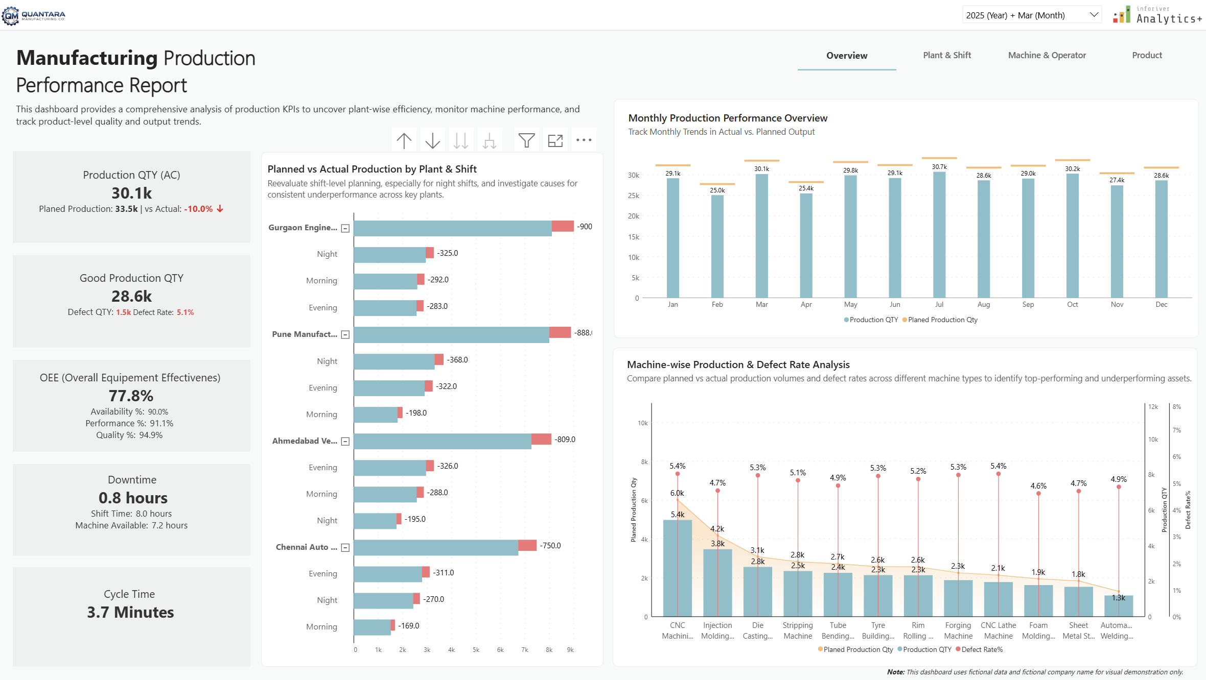
A Power BI dashboard for automotive manufacturing to optimize multi-plant operations. Track OEE, cycle time, and downtime with IBCS standards.
Boost manufacturing performance with this Power BI dashboard. Get real-time insights into OEE, cycle time, and operator performance to cut costs.
Unlock end-to-end FMCG supply chain intelligence with our Power BI report, powered by Inforiver Analytics+. Track KPIs, fulfillment & optimize logistics.
Transform financial strategy & unlock insights with Inforiver's Power BI dashboard. Analyze P&L, trends, risks, gain end-to-end visibility & IBCS compliance.
Download our HR Analytics Dashboard for Power BI, powered by Inforiver. Track hiring, satisfaction, and compensation for smarter talent strategies.
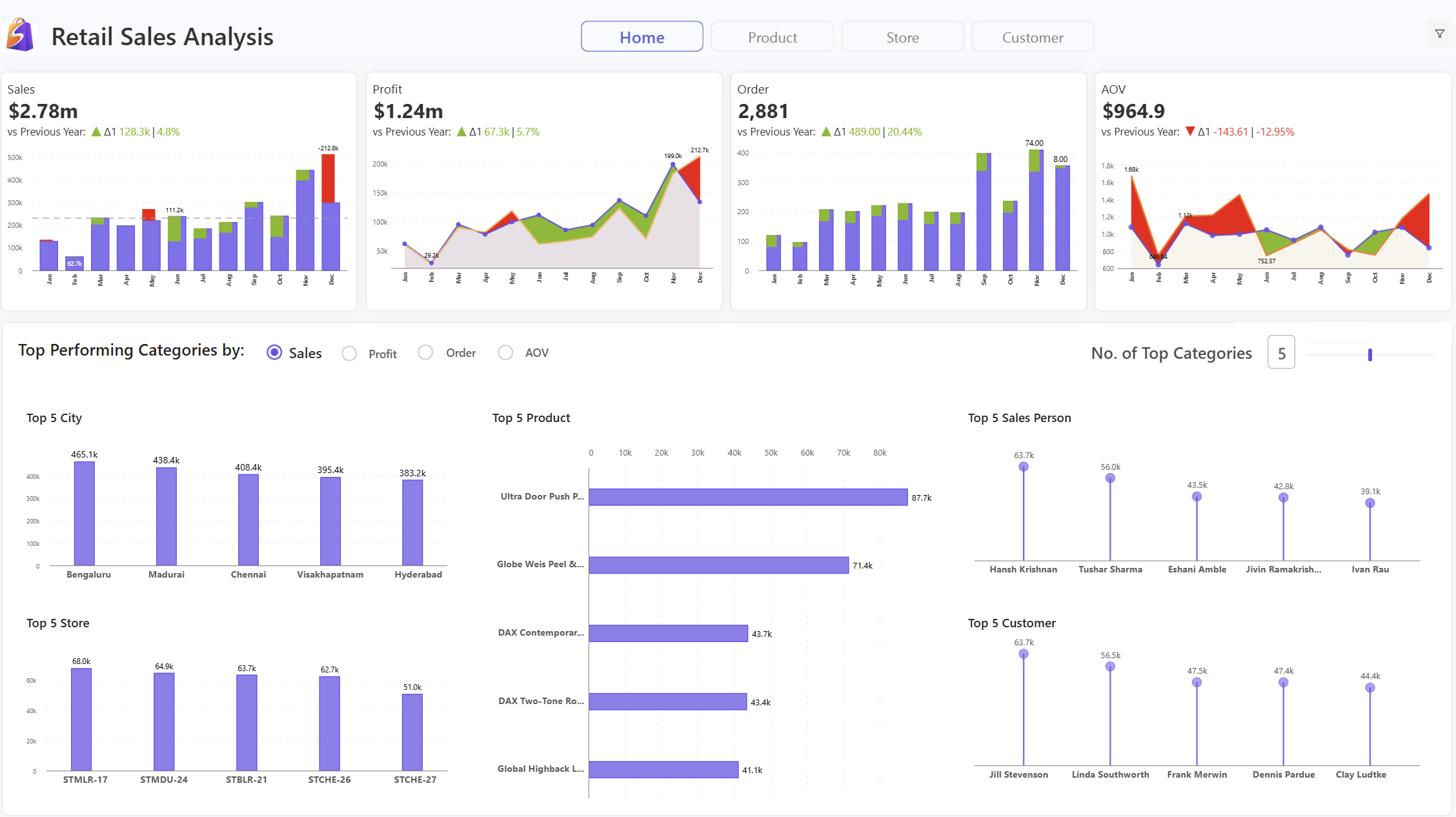
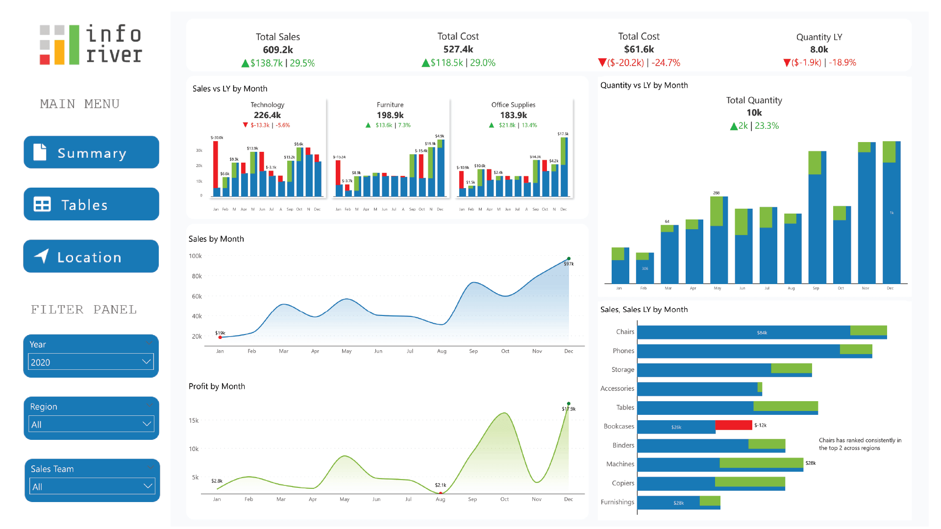
Explore your retail sales performance with an interactive Power BI dashboard built using Inforiver Analytics+
Visualize sales, profit, and YoY trends in one Power BI dashboard using Inforiver Analytics+ with sparklines, variance, and in-cell metrics.
Recreate and enhance Looker dashboards in Power BI using Inforiver Analytics+ with KPI cards, sparklines, and advanced interactivity.
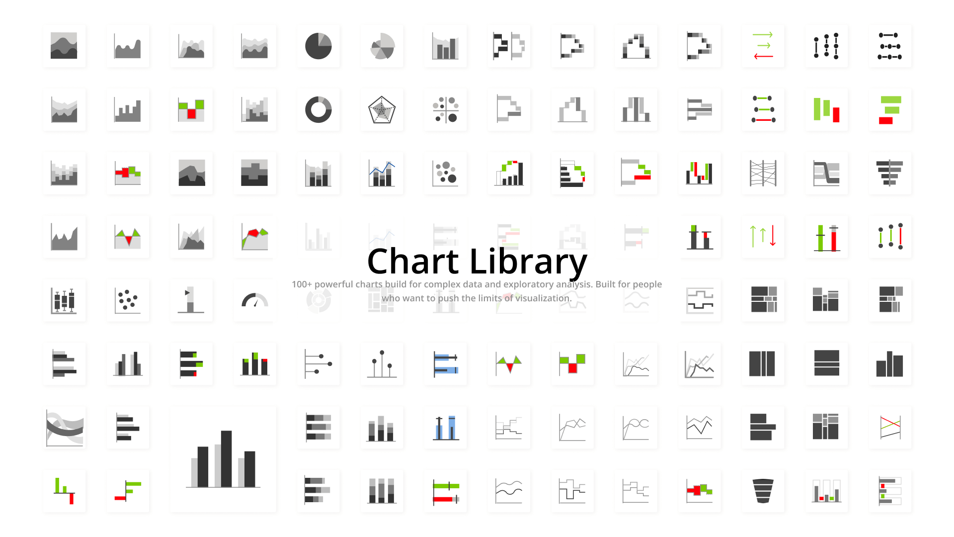
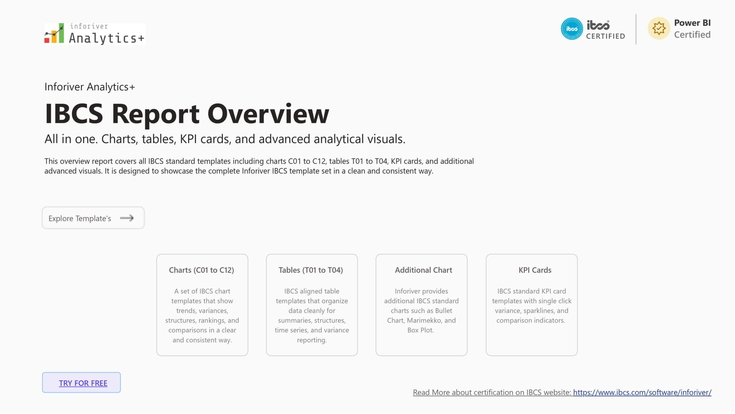
Inforiver Analytics+ transforms the way you visualize data in Power BI by offering dynamic suite of over 100 advanced chart types.
Inforiver Analytics+ is proudly certified by the IBCS and stands out as the leading solution in its category.
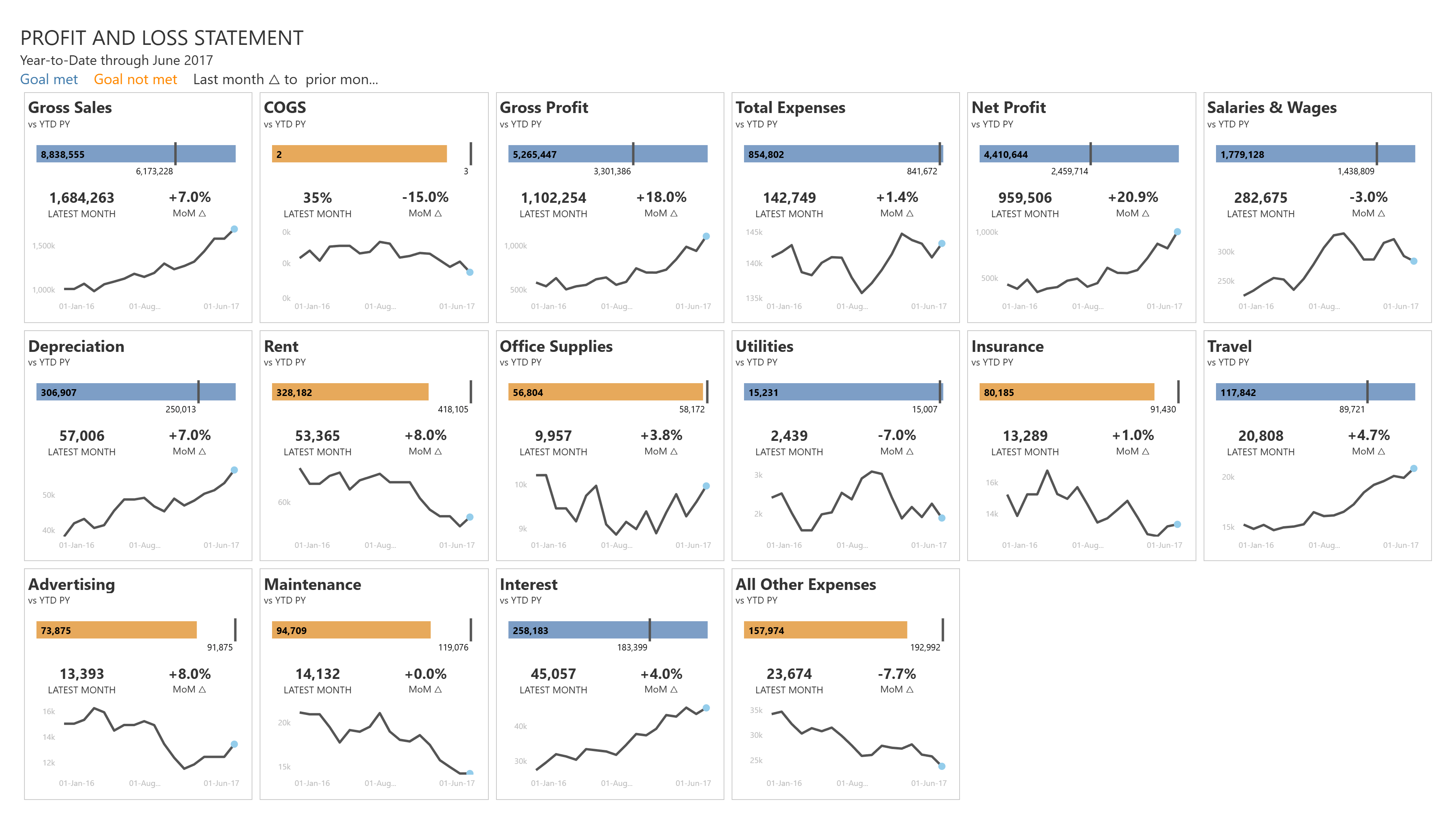
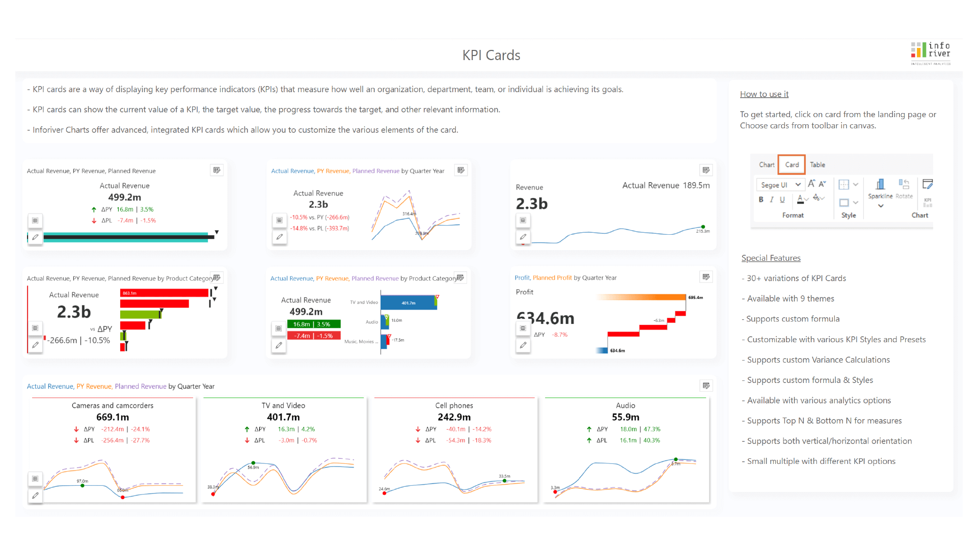
Inforiver Analytics+ KPI cards offer a dynamic way to visualize and track key performance indicators (KPIs) for Profit and Loss (P&L) statements and more.
Build detailed Sales dashboards with variance charts, comparing regions, products, and revenue targets effortlessly.
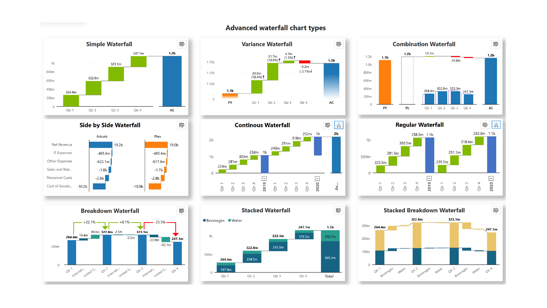
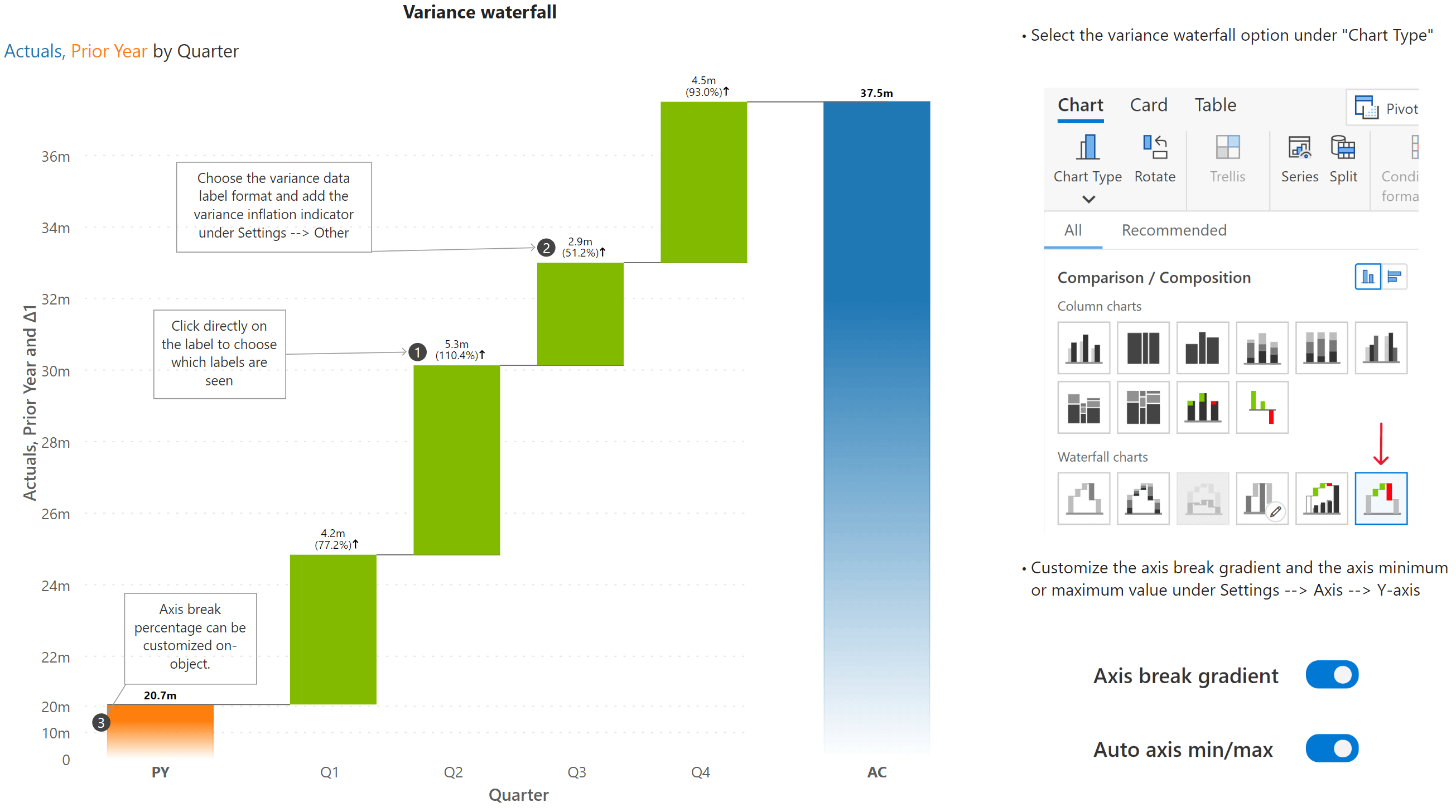
Explore 20+ Inforiver waterfall charts for powerful sales and financial analysis.
Explore 20+ waterfall chart variations along with advanced features and customization options.
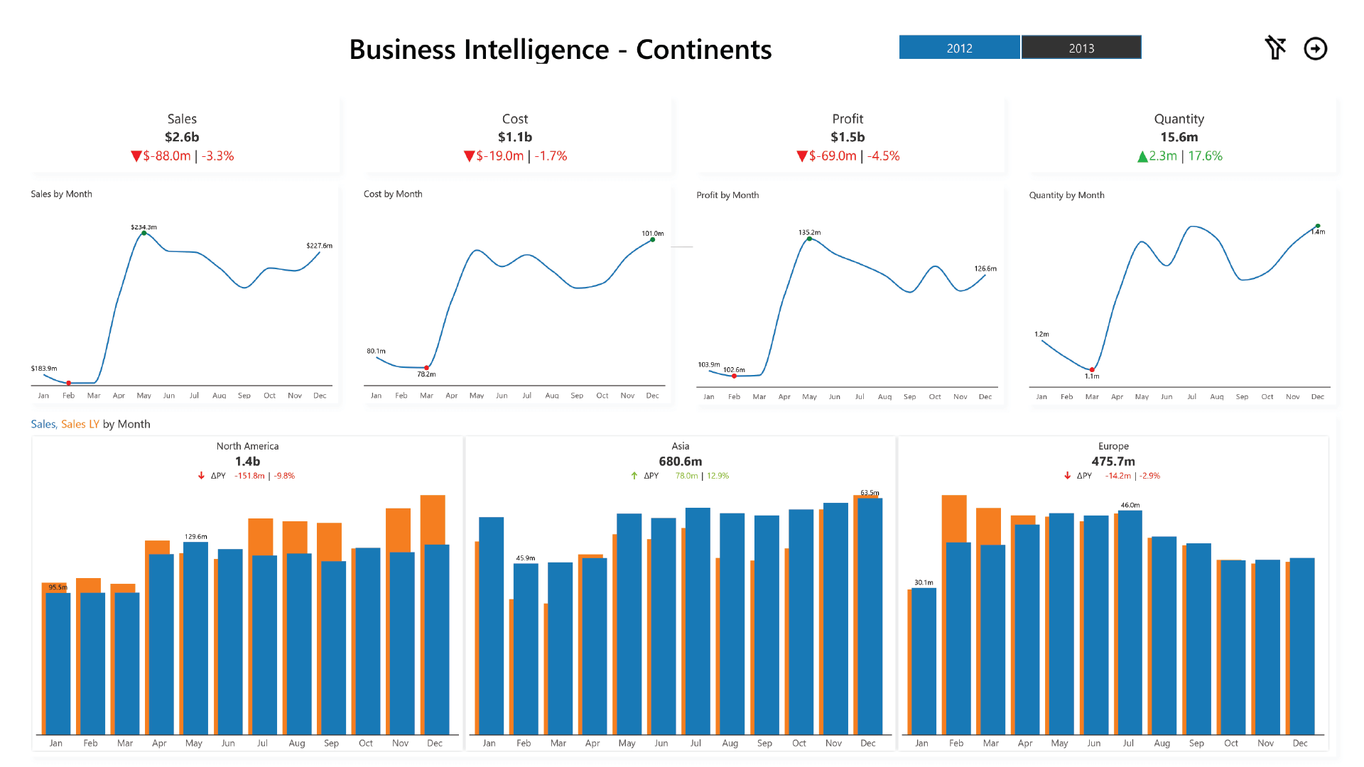
The Contoso Data Dashboard, built with Inforiver Analytics+, delivers interactive insights on cost, sales, and performance for smarter decision-making.
Inforiver’s executive funnel chart can be used to track the cumulative conversion and drop-off ratios for each stage.
Discover Box & Whisker plots for outlier identification and distribution comparison between data groups.
Discover advanced KPI cards for swift & insightful performance monitoring.
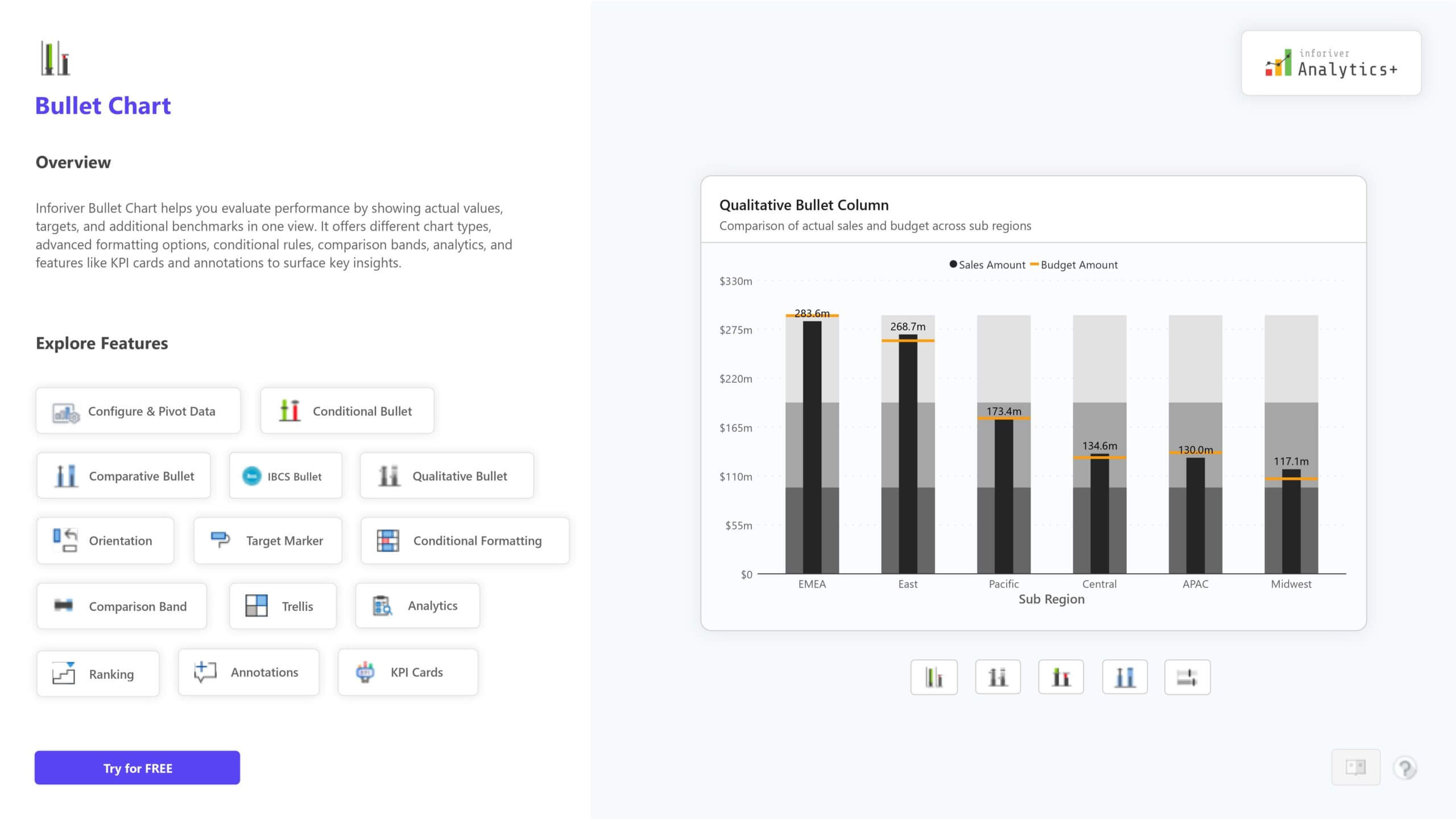
Create clear and compact bullet charts for KPI tracking, goal setting, and business analysis.
Tell compelling stories in Power BI using features such as dynamic data-level comments.
Visualize and analyze sales performance with detailed sales metrics using Inforiver Charts and Matrix.
An executive summary using Inforiver Charts, KPI cards and Matrix
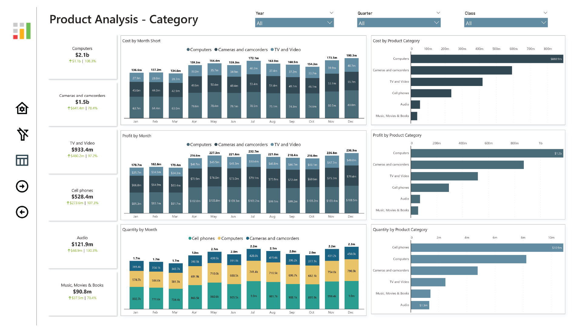
Use a combination of bar charts and KPI cards to visualize and evaluate the performance of brands and product categories.
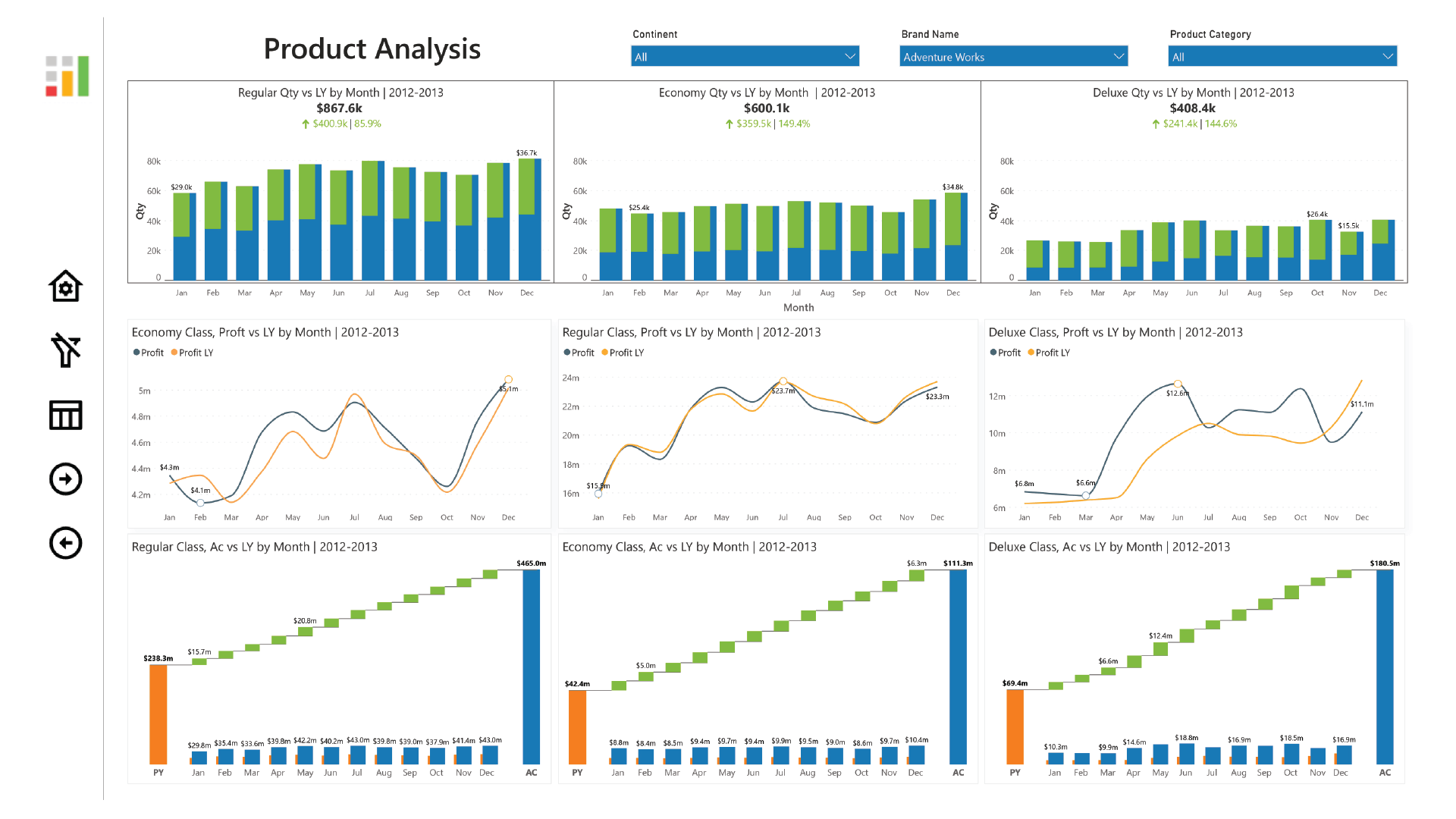
Visualize performance analysis with time intelligence, conditionally formatted matrix and KPI's
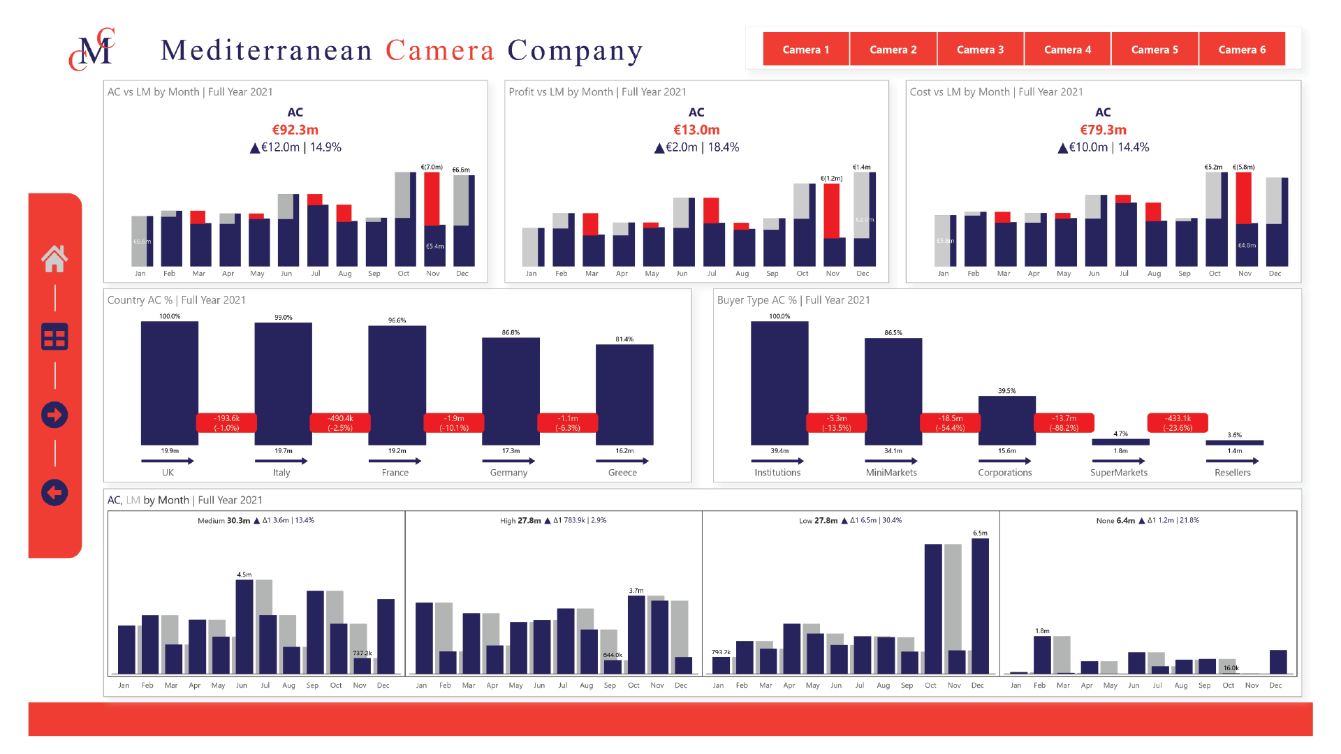
Provides quick insights on sales, discounts and quarterly trends
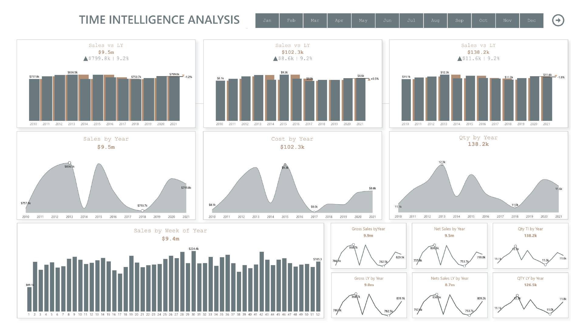
Visualize performance of sales, cost, and quantity over time
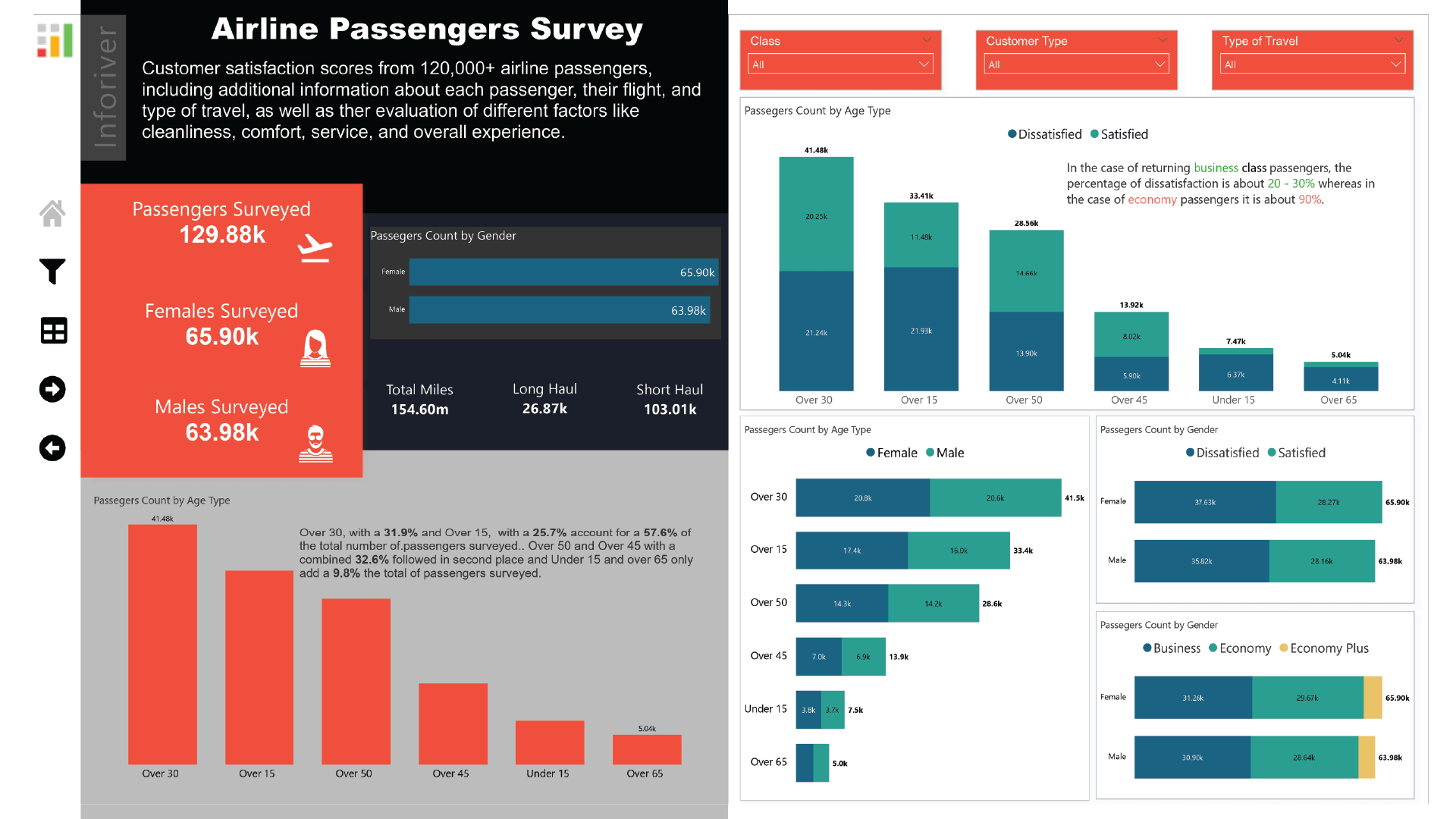
A detailed summary of a passenger survey on the basis of gender, flight type and flight hours.
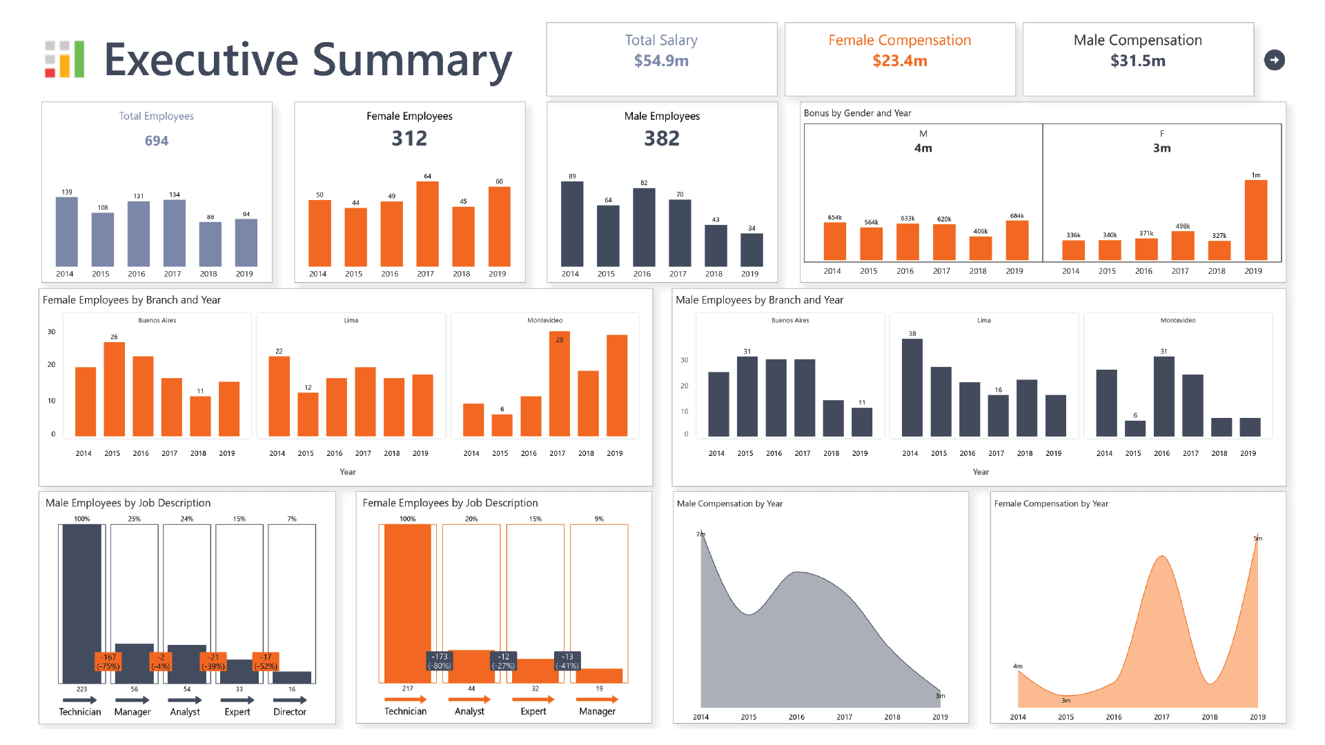
Provides detailed insights on employee equality practices based on gender, Job type and employment region.

Inforiver helps enterprises consolidate planning, reporting & analytics on a single platform (Power BI). The no-code, self-service award-winning platform has been recognized as the industry’s best and is adopted by many Fortune 100 firms.
Inforiver is a product of Lumel, the #1 Power BI AppSource Partner. The firm serves over 3,000 customers worldwide through its portfolio of products offered under the brands Inforiver, EDITable, ValQ, and xViz.