Upcoming webinar on 'Inforiver Charts : The fastest way to deliver stories in Power BI', Aug 29th , Monday, 10.30 AM CST. Register Now
Upcoming webinar on 'Inforiver Charts : The fastest way to deliver stories in Power BI', Aug 29th , Monday, 10.30 AM CST. Register Now
Tell compelling stories using 40+ charts, rich customizable themes, small multiples, data-level comments and more

Enrich your narratives using dynamic titles, data tags, measure-driven data labels and more

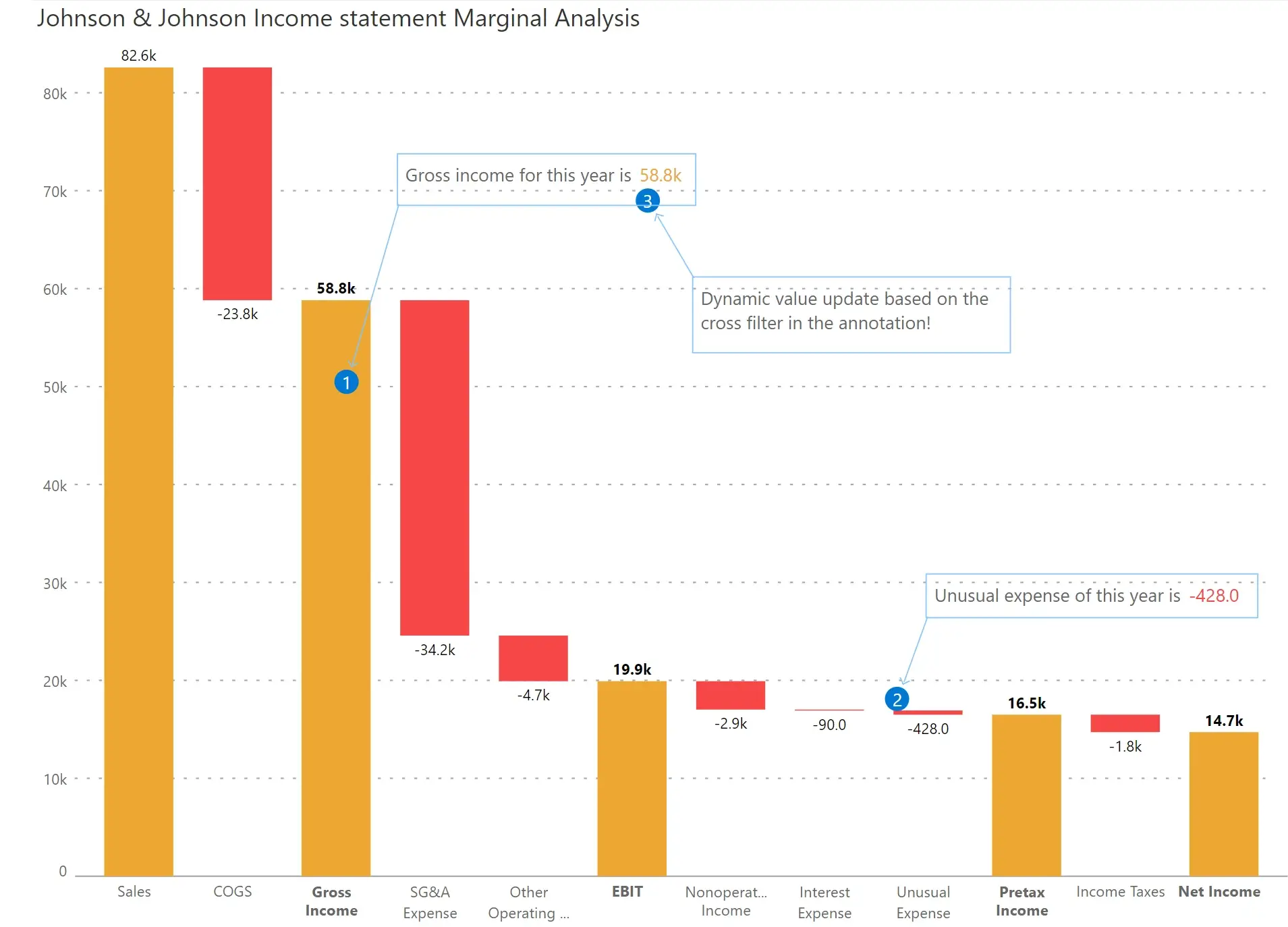
Explain the context and provide insights using dynamic data-level comments and annotations
Utilize presets and several customization options to insert KPI cards in a couple of clicks. You can also create custom calculations in KPI cards using an excel-like formula editor

Apply pre-set (e.g., win-loss, color scale, comparison band, line gradient) or custom conditional formatting based on rules

This one-of-a-kind charting capability is only available in Inforiver for Power BI
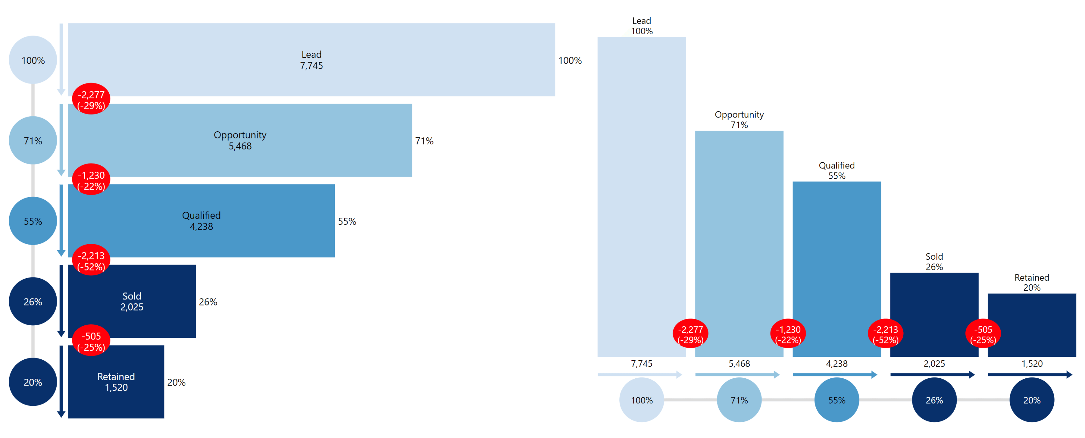
Leverage exclusive visualizations such as advanced funnel to track your pipeline; Displays overall %, numeric values and conversion % by stage
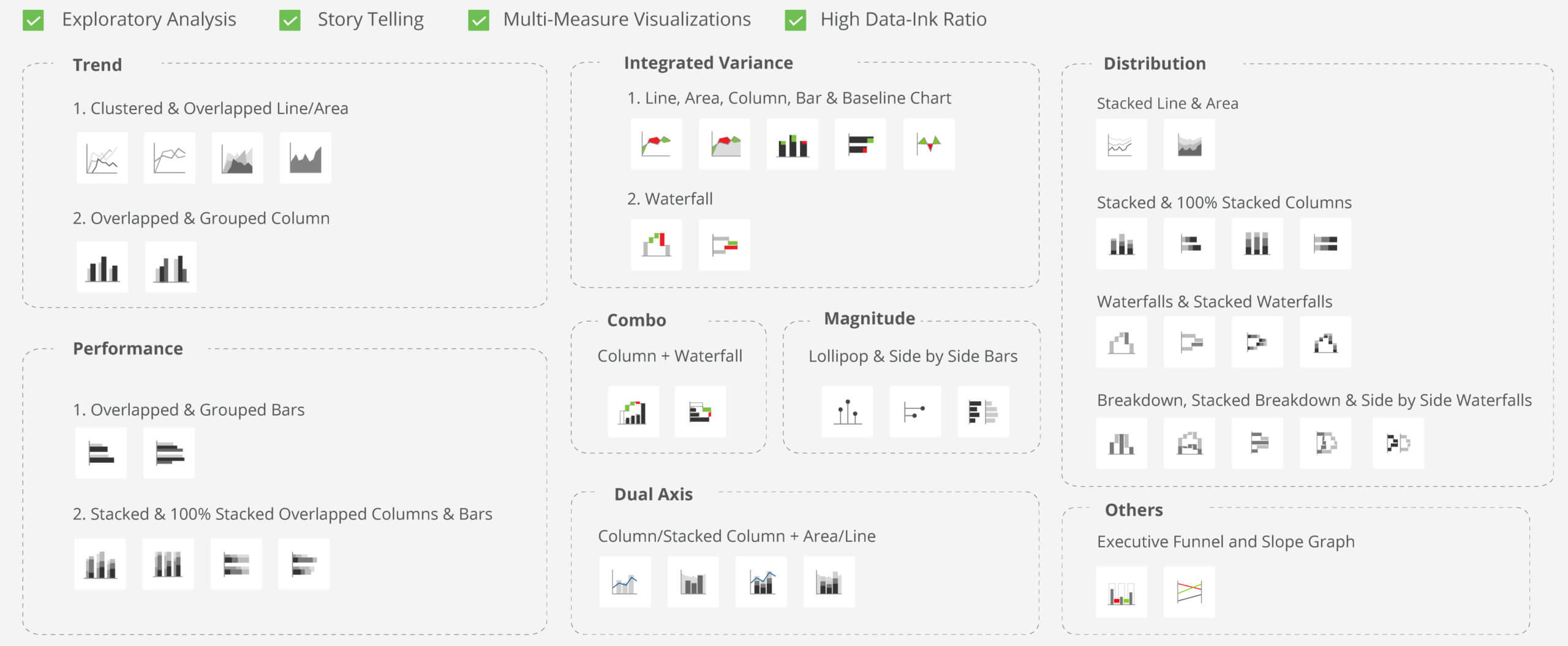
Serve up to 40+ visualizations, including charts that can handle multiple non-comparative measures (e.g., revenue & margin %)
Deliver a range of charts and visualizations in your matrix reports in a single click using Inforiver Matrix

Incorporate spark lines, spark columns and its variants such as win-loss trend to capture performance over time


Utilize bullet charts, clustered bars, overlapped, grouped, stacked & 100% stacked bars and columns

Deliver bar, lollipop/pin charts and data bars for highlighting magnitude and significance

Highlight distribution across categories using stacked chart and waterfall visualizations and progress bars
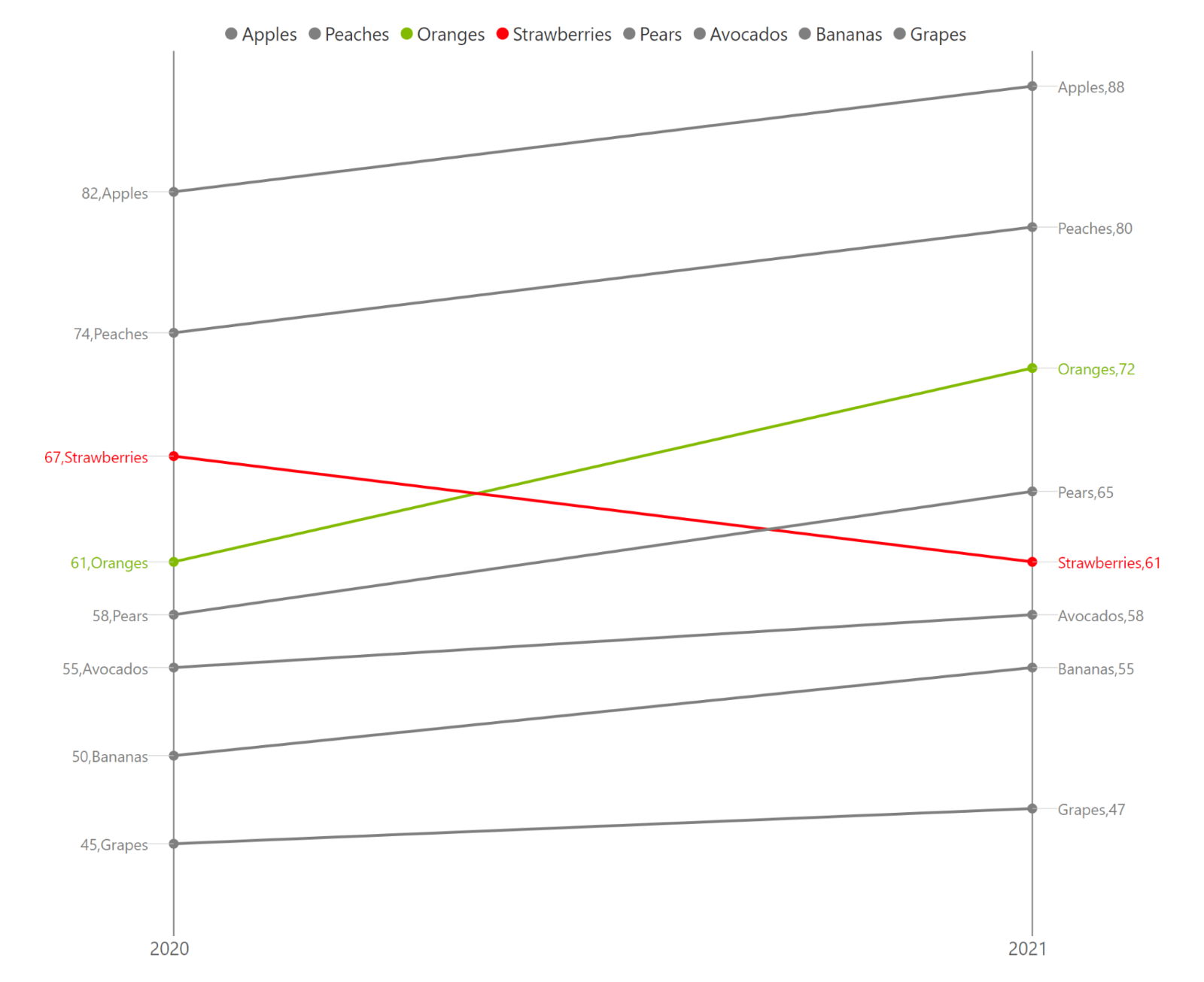
Track changes over time or with respect to benchmark by using dot plot, arrow plot, dumbbell plot & range plots
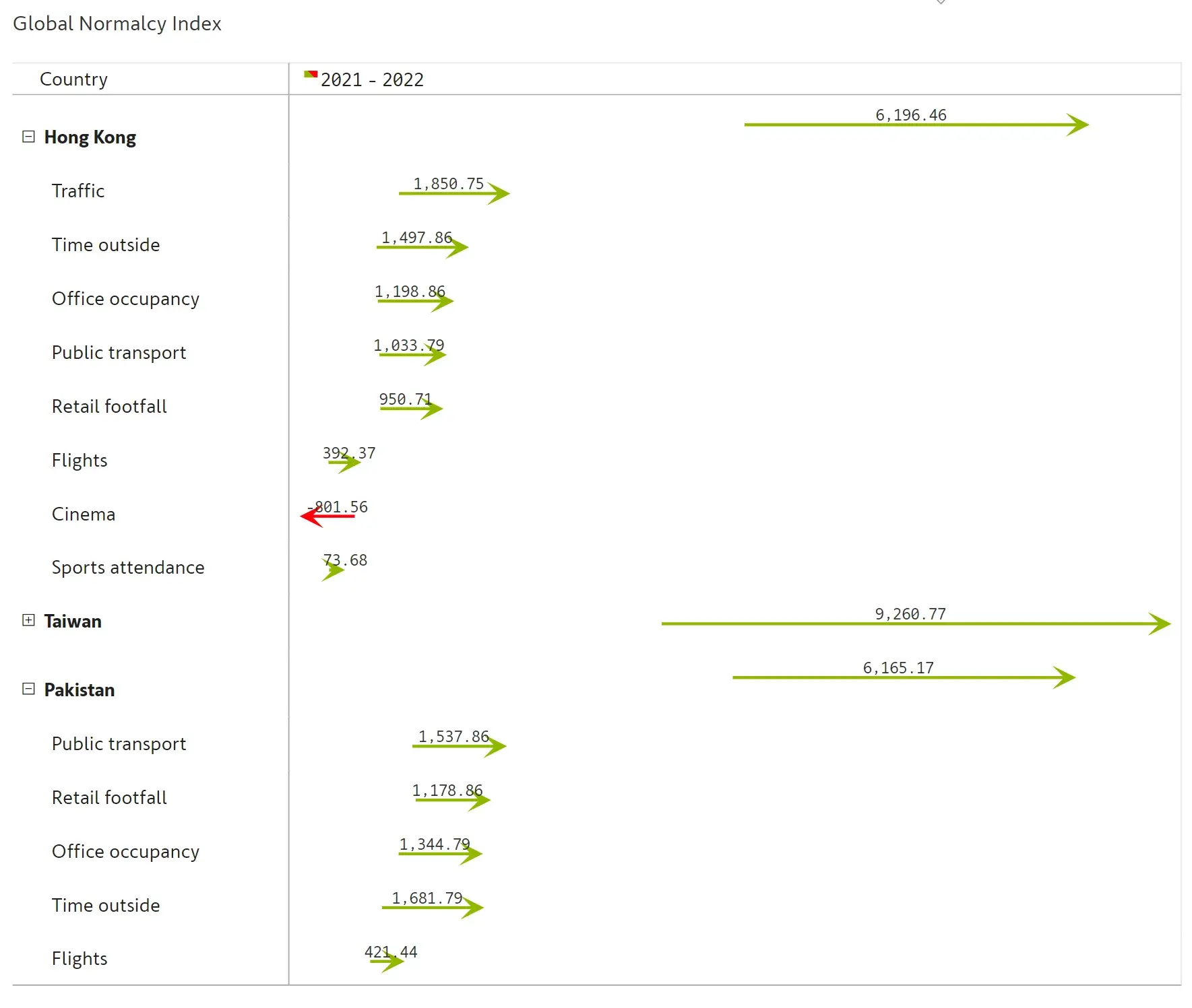
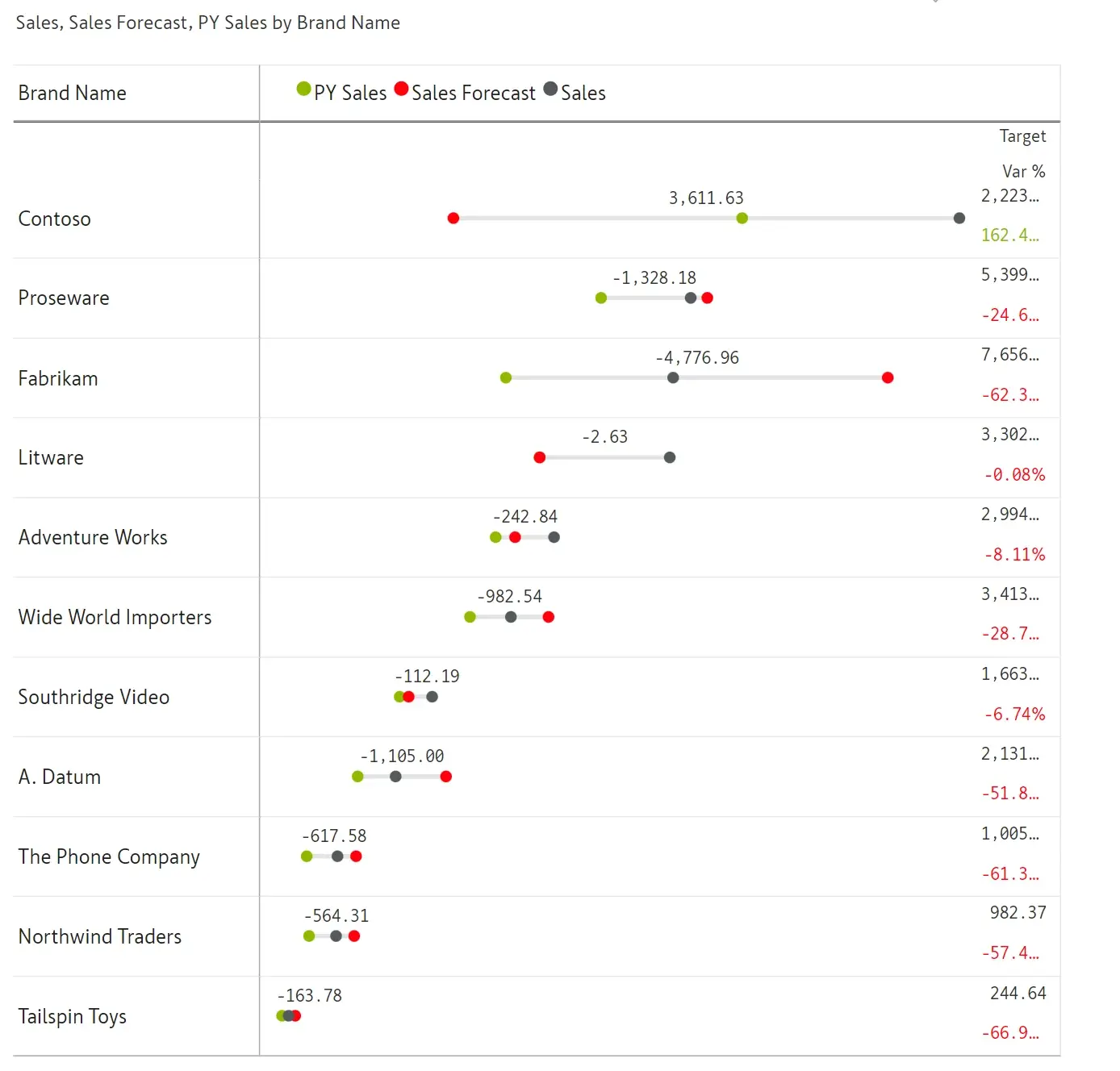
Leverage variance charts such as bars and pins/lollipops that highlight both absolute and percentage variances with alerts

Compare two measures and visualize integrated variances using line, area, column, bar and waterfall charts


Visualize relationships between measures with different scaling

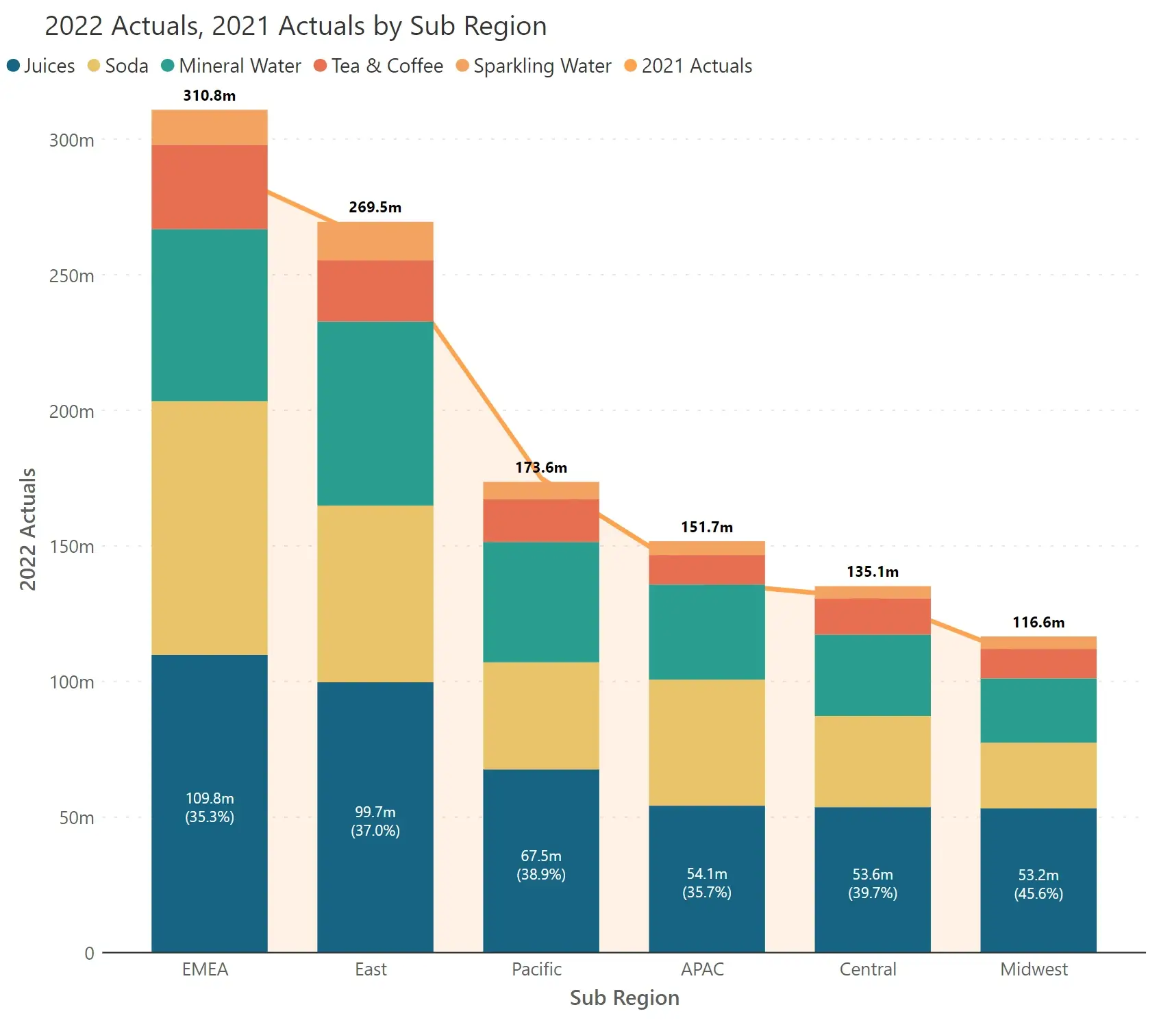
Compare and analyze how your business metrics have performed at two points in time (e.g., before & after Black Friday Sale)
Utilize combo charts such as bar/column with waterfall

Blend two measures in a single column along with formatting, including conditional formatting


Export to PDF with the exact formatting as seen in your reports

Inforiver helps enterprises consolidate planning, reporting & analytics on a single platform (Power BI). The no-code, self-service award-winning platform has been recognized as the industry’s best and is adopted by many Fortune 100 firms.
Inforiver is a product of Lumel, the #1 Power BI AppSource Partner. The firm serves over 3,000 customers worldwide through its portfolio of products offered under the brands Inforiver, EDITable, ValQ, and xViz.