Upcoming webinar on 'Inforiver Charts : The fastest way to deliver stories in Power BI', Aug 29th , Monday, 10.30 AM CST. Register Now
Upcoming webinar on 'Inforiver Charts : The fastest way to deliver stories in Power BI', Aug 29th , Monday, 10.30 AM CST. Register Now
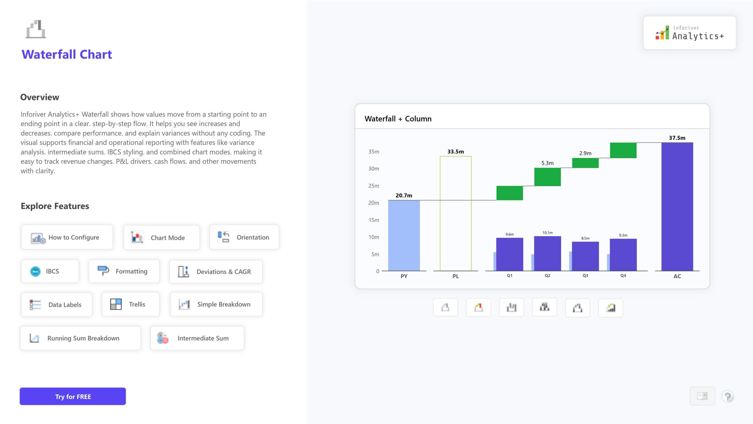
The Waterfall Chart in Inforiver Analytics+ helps you track how values change step by step, making it perfect for showing profit, revenue, or cost movement. It supports multiple variations, including stacked, breakdown, variance, and IBCS-compliant charts.
You can add intermediate totals, customize colors, apply conditional formatting, and use small multiples for detailed analysis. It’s a simple yet powerful way to visualize cumulative changes and insights.
For more details, demos, and pricing, visit: Explore the Waterfall Chart on Inforiver Analytics+
to try advance features
[demo_download_modal title="Waterfall Chart in Power BI" link="https://inforiver.com/wp-content/uploads/waterfall-chart-in-analytics-plus-update.zip"]
Inforiver helps enterprises consolidate planning, reporting & analytics on a single platform (Power BI). The no-code, self-service award-winning platform has been recognized as the industry’s best and is adopted by many Fortune 100 firms.
Inforiver is a product of Lumel, the #1 Power BI AppSource Partner. The firm serves over 3,000 customers worldwide through its portfolio of products offered under the brands Inforiver, EDITable, ValQ, and xViz.