Upcoming webinar on 'Inforiver Charts : The fastest way to deliver stories in Power BI', Aug 29th , Monday, 10.30 AM CST. Register Now
Upcoming webinar on 'Inforiver Charts : The fastest way to deliver stories in Power BI', Aug 29th , Monday, 10.30 AM CST. Register Now
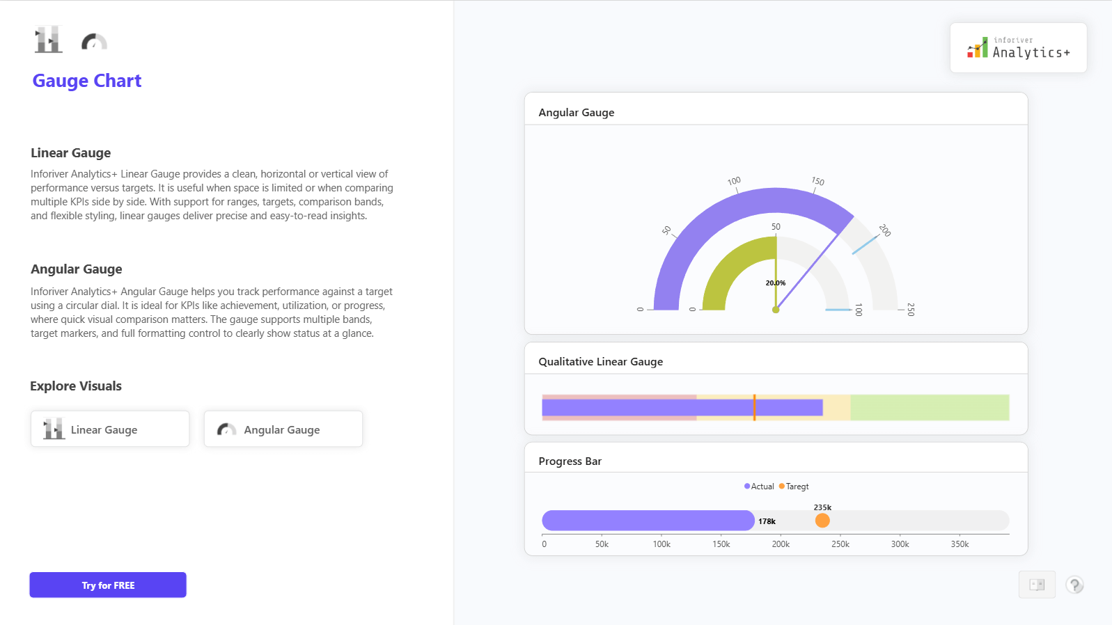
The Gauge Charts in Inforiver Analytics+ for Power BI help you track KPI performance against targets in a clear and compact visual format. You can use Linear Gauge, Angular Gauge, Qualitative Gauge, and Progress Bar to monitor achievement, utilization, and goal progress at a glance. These charts are ideal for management dashboards where quick status review is important and space is limited.
Gauge Charts let you compare actual values against target, minimum, and maximum limits, so performance status becomes immediately visible. You can use circular dials or horizontal and vertical gauges depending on your layout needs. Comparison bands make it easy to show good, average, and poor performance ranges. The Gauge visual fits perfectly for sales targets, revenue achievement, budget vs actuals, production progress, service SLAs, and utilization KPIs.
Inforiver Analytics+ adds flexibility with small multiples, target markers, qualitative bands, rich data labels, and formatting control, so you can present KPIs cleanly across categories or business units in Power BI without writing any code.
For complete feature details, demo visuals, and pricing information, visit: https://inforiver.com/analytics-plus/gauge-chart/
to try advance features
[demo_download_modal title="Gauge Chart in Power BI" link="https://inforiver.com/wp-content/uploads/gauge-charts-in-analytics-plus-demo.zip"]
Inforiver helps enterprises consolidate planning, reporting & analytics on a single platform (Power BI). The no-code, self-service award-winning platform has been recognized as the industry’s best and is adopted by many Fortune 100 firms.
Inforiver is a product of Lumel, the #1 Power BI AppSource Partner. The firm serves over 3,000 customers worldwide through its portfolio of products offered under the brands Inforiver, EDITable, ValQ, and xViz.