Upcoming webinar on 'Inforiver Charts : The fastest way to deliver stories in Power BI', Aug 29th , Monday, 10.30 AM CST. Register Now
Upcoming webinar on 'Inforiver Charts : The fastest way to deliver stories in Power BI', Aug 29th , Monday, 10.30 AM CST. Register Now
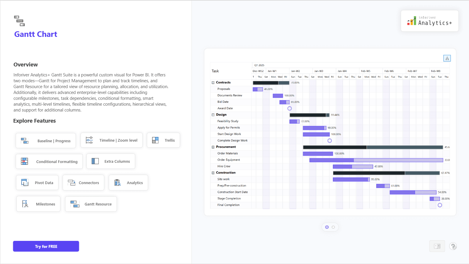
The Gantt Chart in Inforiver Analytics+ is a powerful tool for project and resource management. It lets you plan, track, and visualize timelines, milestones, and dependencies with clarity and precision. You can easily manage multiple projects using advanced features like configurable timelines, zoom levels, connectors, conditional formatting, and analytics-based insights.
The chart also includes a Gantt Resource mode, which helps you visualize resource allocation and utilization across different tasks and phases. With Trellis (small multiples), you can view multiple projects or teams side by side for better comparison and coordination.
Inforiver’s Gantt Chart brings flexibility, detail, and simplicity together to help you manage projects efficiently and make informed decisions.
For complete feature details, demo visuals, and pricing information, visit: https://inforiver.com/analytics-plus/gantt-chart/
to try advance features
[demo_download_modal title="Gantt Chart in Power BI" link="https://inforiver.com/wp-content/uploads/gantt-chart-in-analytics-plus-demo.zip"]
Inforiver helps enterprises consolidate planning, reporting & analytics on a single platform (Power BI). The no-code, self-service award-winning platform has been recognized as the industry’s best and is adopted by many Fortune 100 firms.
Inforiver is a product of Lumel, the #1 Power BI AppSource Partner. The firm serves over 3,000 customers worldwide through its portfolio of products offered under the brands Inforiver, EDITable, ValQ, and xViz.