Upcoming webinar on 'Inforiver Charts : The fastest way to deliver stories in Power BI', Aug 29th , Monday, 10.30 AM CST. Register Now
Upcoming webinar on 'Inforiver Charts : The fastest way to deliver stories in Power BI', Aug 29th , Monday, 10.30 AM CST. Register Now
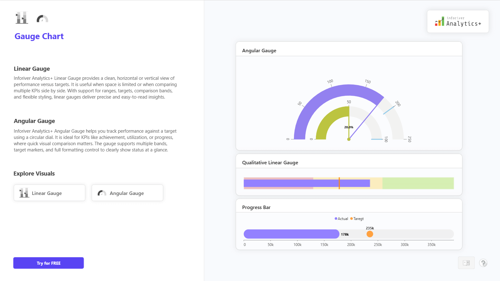
The Histogram Chart in Inforiver Analytics+ helps visualize the distribution of numerical data by grouping values into bins. It’s perfect for identifying patterns, trends, and frequency distributions in datasets.
You can create cumulative or stacked histograms, manage overflow and underflow bins, and apply analytics like reference lines, Pareto, or trend analysis. With small multiples, annotations, and conditional formatting, you can explore data deeply and present insights clearly.
For full details, demos, and pricing, visit: Explore the Histogram Chart on Inforiver Analytics+

to try advance features
[demo_download_modal title="Histogram Chart in Power BI" link="https://inforiver.com/wp-content/uploads/histogram-chart-in-analytics-plus-demos.zip"]
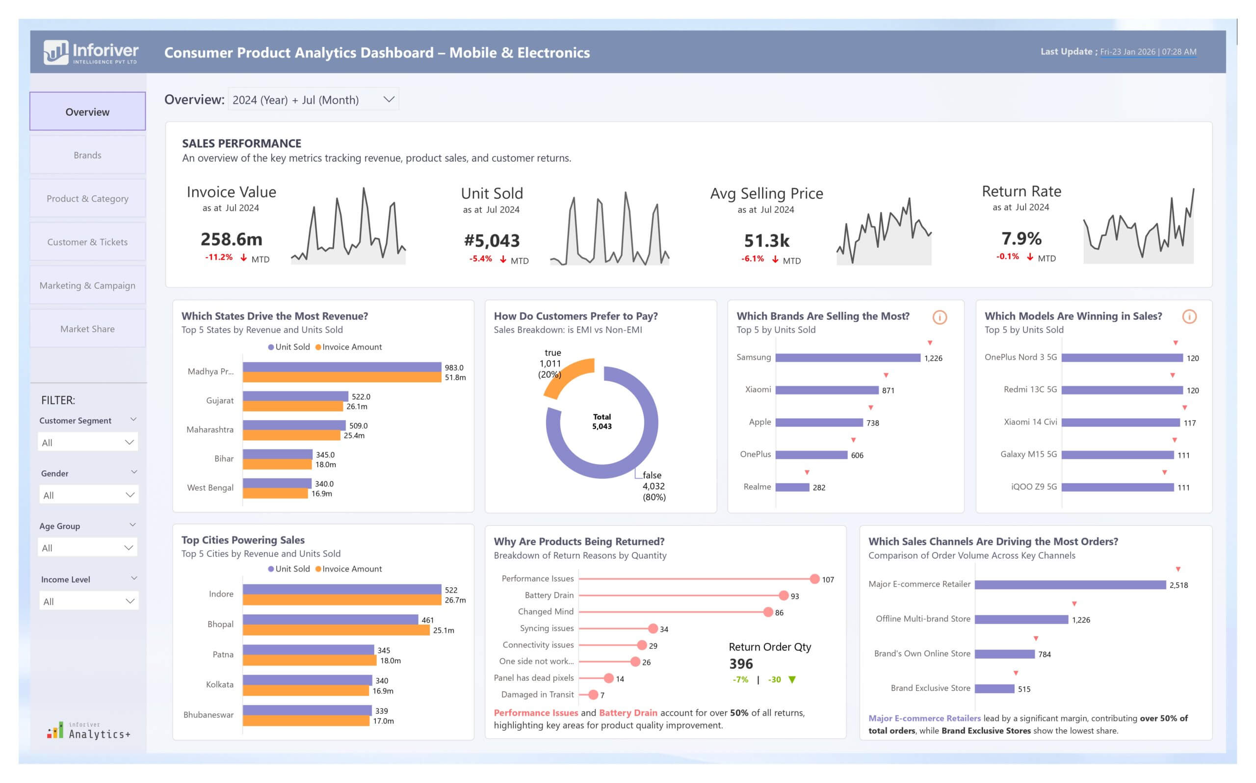
Inforiver helps enterprises consolidate planning, reporting & analytics on a single platform (Power BI). The no-code, self-service award-winning platform has been recognized as the industry’s best and is adopted by many Fortune 100 firms.
Inforiver is a product of Lumel, the #1 Power BI AppSource Partner. The firm serves over 3,000 customers worldwide through its portfolio of products offered under the brands Inforiver, EDITable, ValQ, and xViz.