Inforiver

Upcoming webinar on 'Inforiver Charts : The fastest way to deliver stories in Power BI', Aug 29th , Monday, 10.30 AM CST.    Register Now

Upcoming webinar on 'Inforiver Charts : The fastest way to deliver stories in Power BI', Aug 29th , Monday, 10.30 AM CST.    Register Now

Statistical Charts

Inforiver Analytics+ Statistical family includes Box Plot and Histogram. All Analytics+ charts offers small multiples support, ranking, annotation and more without any additional code.
Explore 100+ charts in Inforiver Analytics+ suite
Download PBIX
Box plot
Histogram chart
Download PBIX
iframe preview
View interactive content
Box Plot
Histogram
Box Plot chart is a statistical visualization that displays the distribution of numerical data points by highlighting the median, quartiles, minimum, and maximum values. This visual helps in identifying outliers, spread, and skewness of numerical data.
Inforiver Analytics+ Box Plot offers multiple varieties including overlapped box plots, forecast box plots, and combination charts showing variance bars. It includes IBCS theme support for charts as well.
Try for FREE

Key features

Multiple chart types

Multiple Chart Types

Boxplot supports overlapped, forecast and combo charts with variance bars.
IBCS compliant charts

IBCS-Compliant Charts

Includes all IBCS-compliant templates with features like forecast and planned bars.
Auto sorting

Auto Sorting

Automatically calculate the median, quartile 1 and quartile 3 in the box plot.
Upto 50 measures

Up to 50 Measures

Box plot can be created with up to 50 measures with dynamic and pre-calculated values.
Referernce line and band

Reference Line and Band

Highlight and plot lines based on custom and calculated values.
Deviation line

Whisker’s Deviation line

Draw deviation lines between whiskers and quartile min/max values.
Pivot mode

Pivot Mode

Easily manage your pre-calculated measures as actual, planned and forecasted bars. It also offers combo charts such as line and variance bar.
Small multiples

Small Multiples

Unlock features like multi-level row and column hierarchy, split measure into categories, merge rows & column into matrix view and more

Resources

Documentations
Comprehensive guides and techinical specifications
Blogs
Latest inisights, product updates, and industry trends
Videos
Tutorials, features, highlights, and live product demo
Histogram: A Histogram helps showcase the frequency of data for a continuous axis.
Inforiver Analytics+ Histograms offer three types: simple, cumulative, and stacked. Advanced features include axes binning & grouping, Pareto line, and normal distribution curve.
Try for FREE

Key features

Dynamic Bin Sizing:

Automatically adjusts bin width based on data range or custom user input for more accurate data grouping.

Cumulative Bar

Displays the running total of data points as bars accumulate.

Stacked Histogram

Show the distribution of multiple stacked groups together. Use legend to display different values.
Upto 50 measures

Overflow and Underflow

Group end and start point of axis values with a defined custom value.

Normal Distribution Curve

Analytics series support normal distribution curve to read the symmetry of data.
Deviation line

Bin by size and value

Groups x-axis with number of bins or by value ranges.

Mean and Mode Support

Plot and highlight vertical reference for Mean as average and Mode and maximum point within data.

Resources

Documentations
Comprehensive guides and techinical specifications
Blogs
Latest inisights, product updates, and industry trends
Videos
Tutorials, features, highlights, and live product demo

Gallery

Show More
Show Less

Pricing

Get  Statistical Family

Billed at
$9,995 Unlimited users
Buy Statistical chart family for your entire organization;
Buy now

Get the entire Analytics+ suite

Starts at
$3  /user/month (2 - 999 users)
$2.40  /user/month (1000+ users)
Buy all the 100+ Charts, KPI cards and Tables;
Buy now

Get Waterfall chart Family

Billed at

$9,995

/year
Buy waterfall chart family for your entire organization;
Buy now

Featured webinar

boxplots-in-powerbi-register-now

Boxplots in Power BI – A deep dive

Watch LIVE demo to learn the features, capabilities and limitation of box plot with Inforiver Analytics+
Watch now

Get your FREE eBook

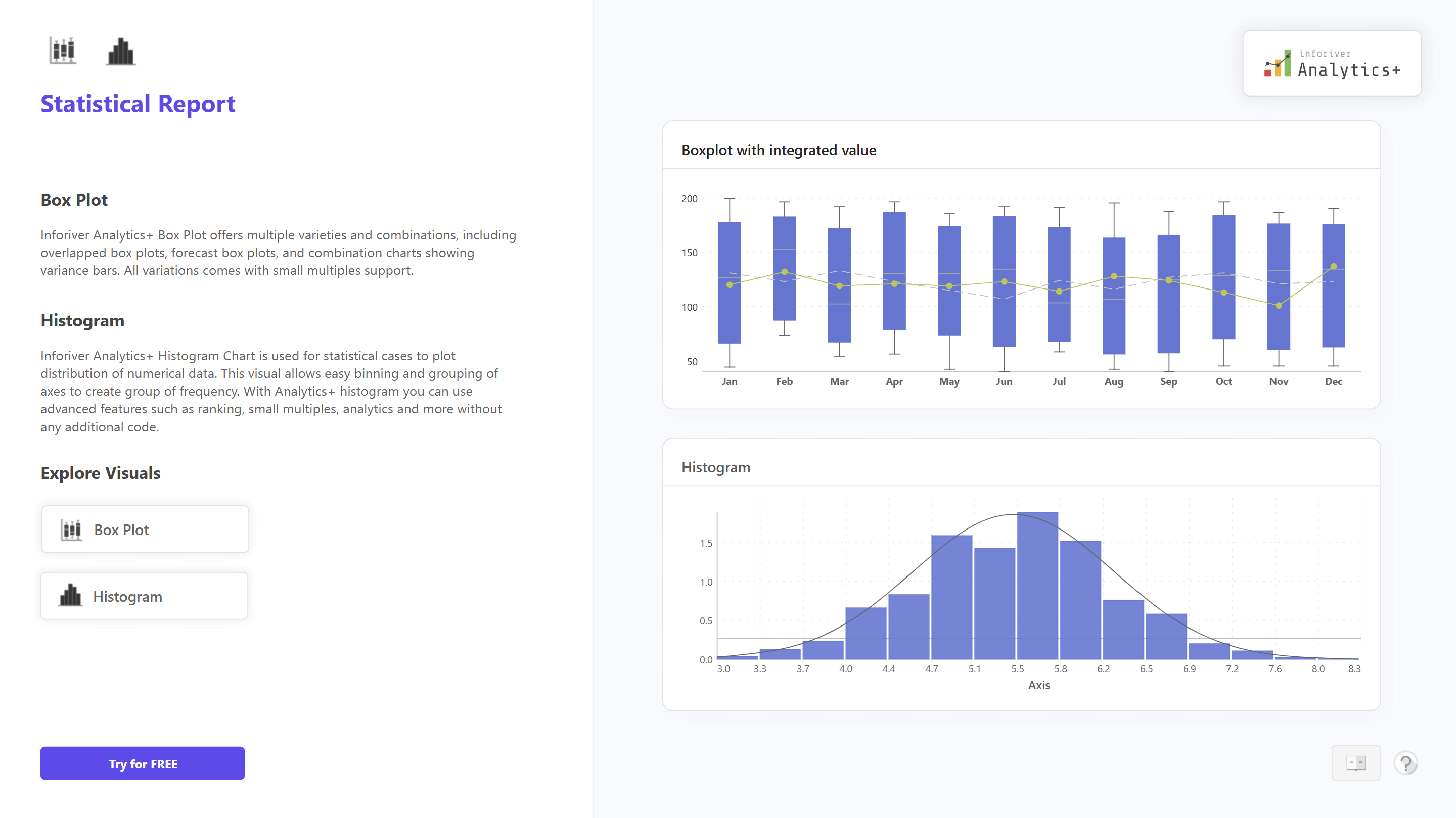
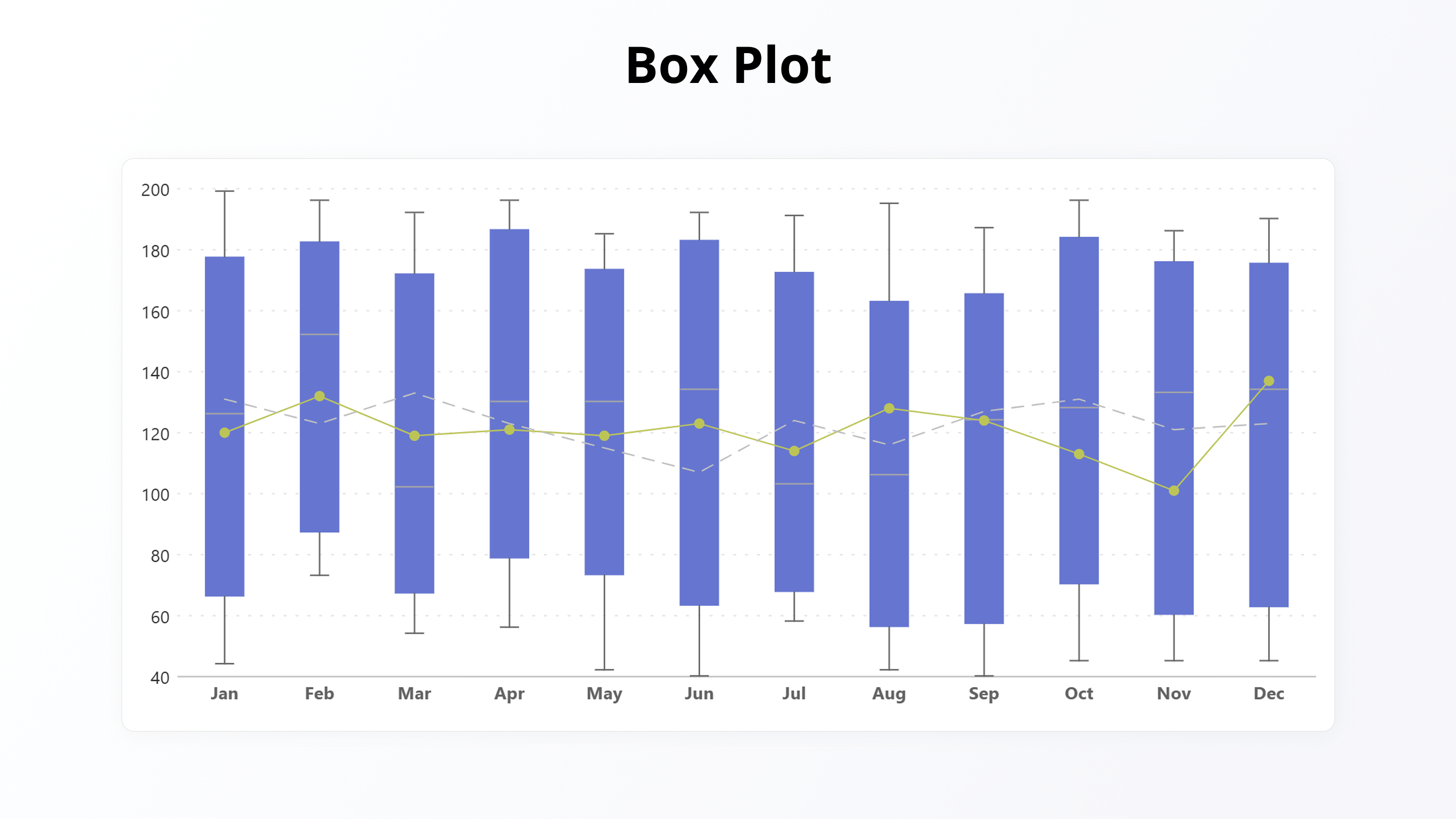
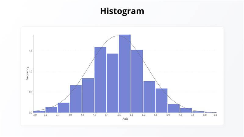
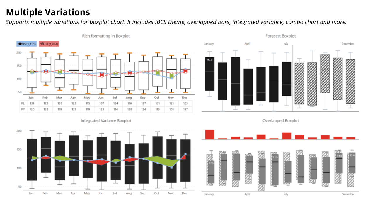
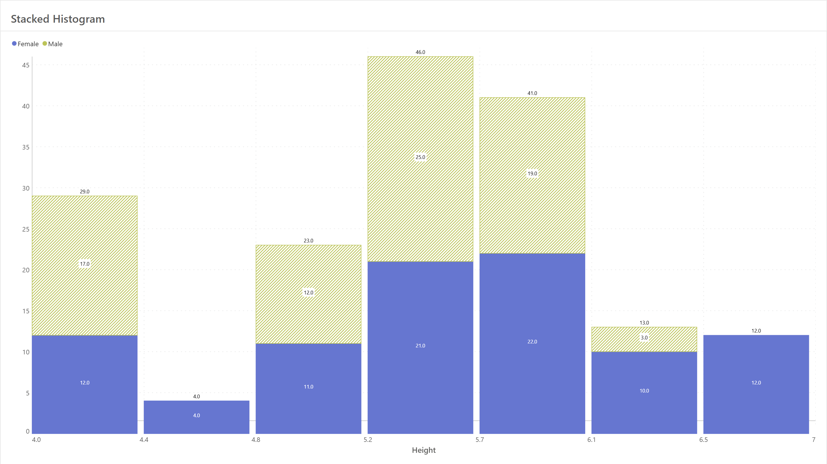
The Ultimate Guide to Box Plots in Power BI

Explore ultimate guide to box plot that you can create in Power BI without using scripting or DAX.​

boxplot-ebook

Get Inforiver brochure

Maximize your business potential with Inforiver's paginated reporting, data entry, planning & budgeting capabilities
Download now
Inforiver

Inforiver helps enterprises consolidate planning, reporting & analytics on a single platform (Power BI). The no-code, self-service award-winning platform has been recognized as the industry’s best and is adopted by many Fortune 100 firms.

Inforiver is a product of Lumel, the #1 Power BI AppSource Partner. The firm serves over 3,000 customers worldwide through its portfolio of products offered under the brands Inforiver, EDITable, ValQ, and xViz.

linkedin facebook pinterest youtube rss twitter instagram facebook-blank rss-blank linkedin-blank pinterest youtube twitter instagram