Upcoming webinar on 'Inforiver Charts : The fastest way to deliver stories in Power BI', Aug 29th , Monday, 10.30 AM CST. Register Now
Upcoming webinar on 'Inforiver Charts : The fastest way to deliver stories in Power BI', Aug 29th , Monday, 10.30 AM CST. Register Now
It’s not an exaggeration to state that organizations have hierarchies all around. Consider the following:
When a business wants to assess performance for a particular region, product or department against a benchmark, it is often helpful to analyse variances while traversing through a hierarchy. More often, analysis hierarchies can also include a combination of entities: e.g., Region --> Product -->Sales Associate.
This is where hierarchical variance analysis capabilities can come to help.
***
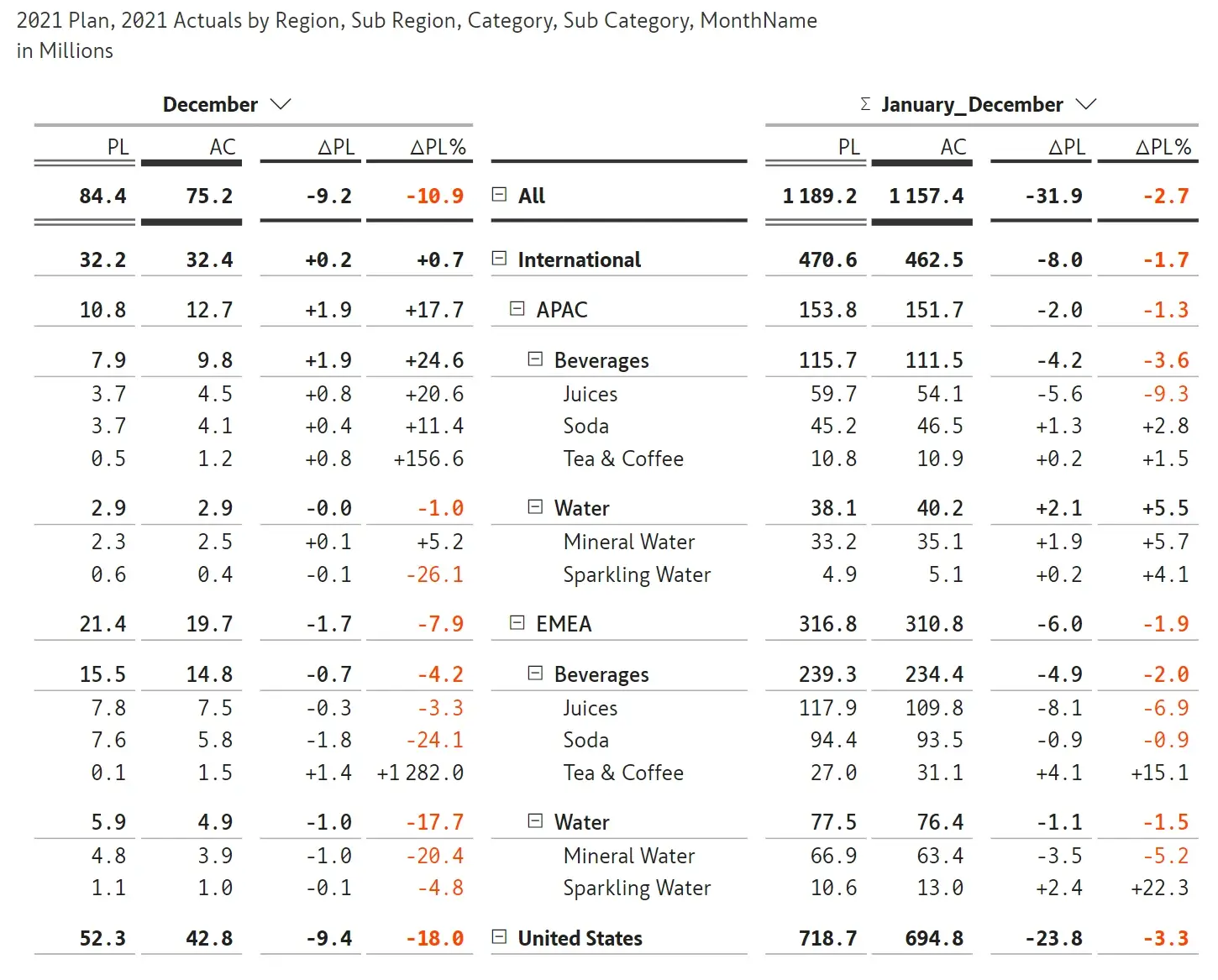
To demonstrate this further, we’ll be using a sales performance dataset with 3 measures - 2021 actuals, 2021 plan and 2020 actuals and 4 categories – region, sub region, product category and subcategory.
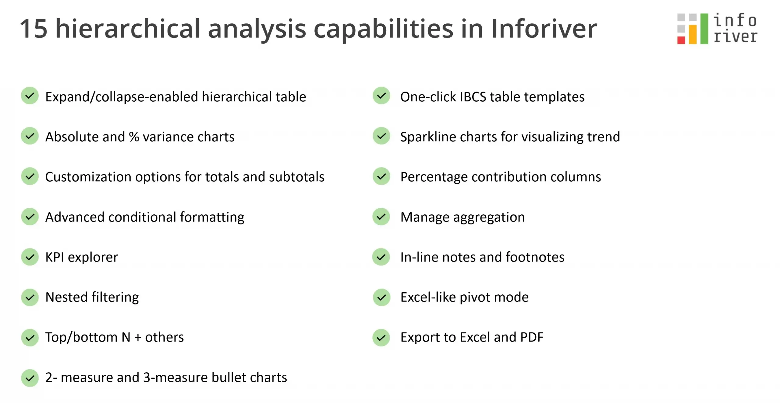
These are some of the hierarchical variance analysis capabilities delivered by Inforiver.
You can view all the levels of data at once without the need to drilldown and expand or collapse to a particular level. Child count can be displayed next to the hierarchies. In addition, several settings are available for customizing the hierarchies.
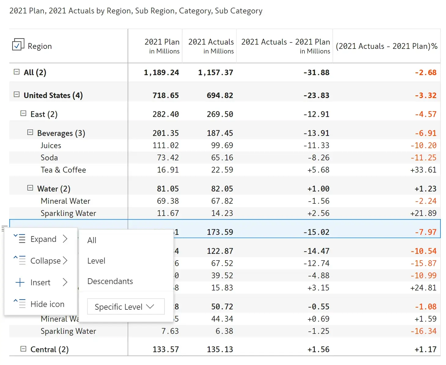
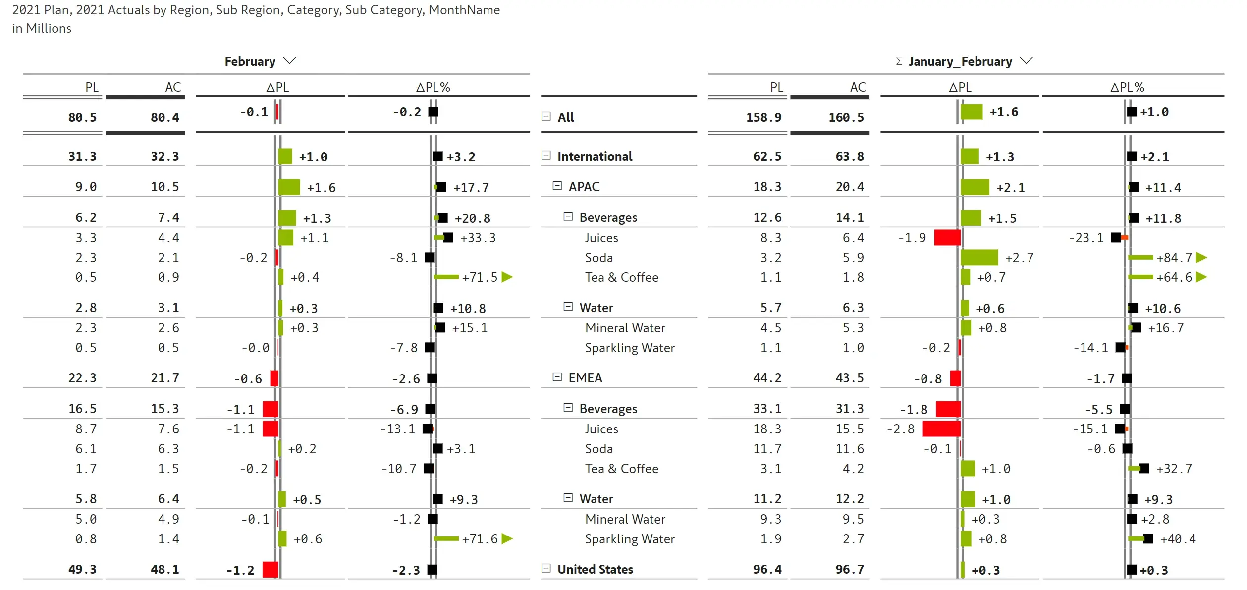
Absolute and relative variance are calculated automatically at every level of the hierarchy and can be visualized as bar and pin/lollipop charts.

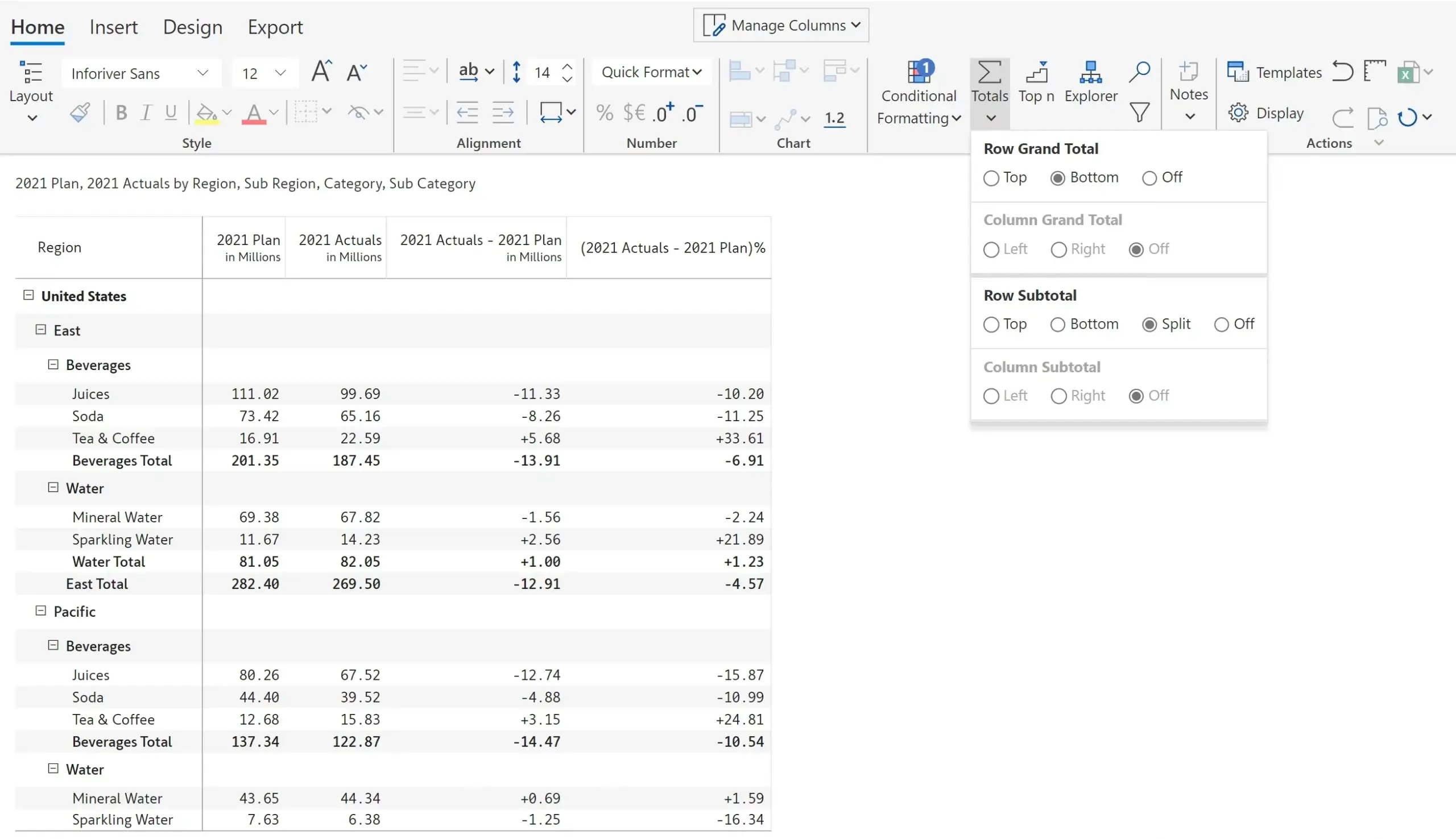
You can turn on/off or change the positions of the totals and subtotals using a no-code interface. Inforiver also provides a split subtotals option.
Conditional formatting can be applied to rows, row headers, or columns based on the measures or variances. Formatting can be based on color scale, classification, rules (if conditions) or ranking.

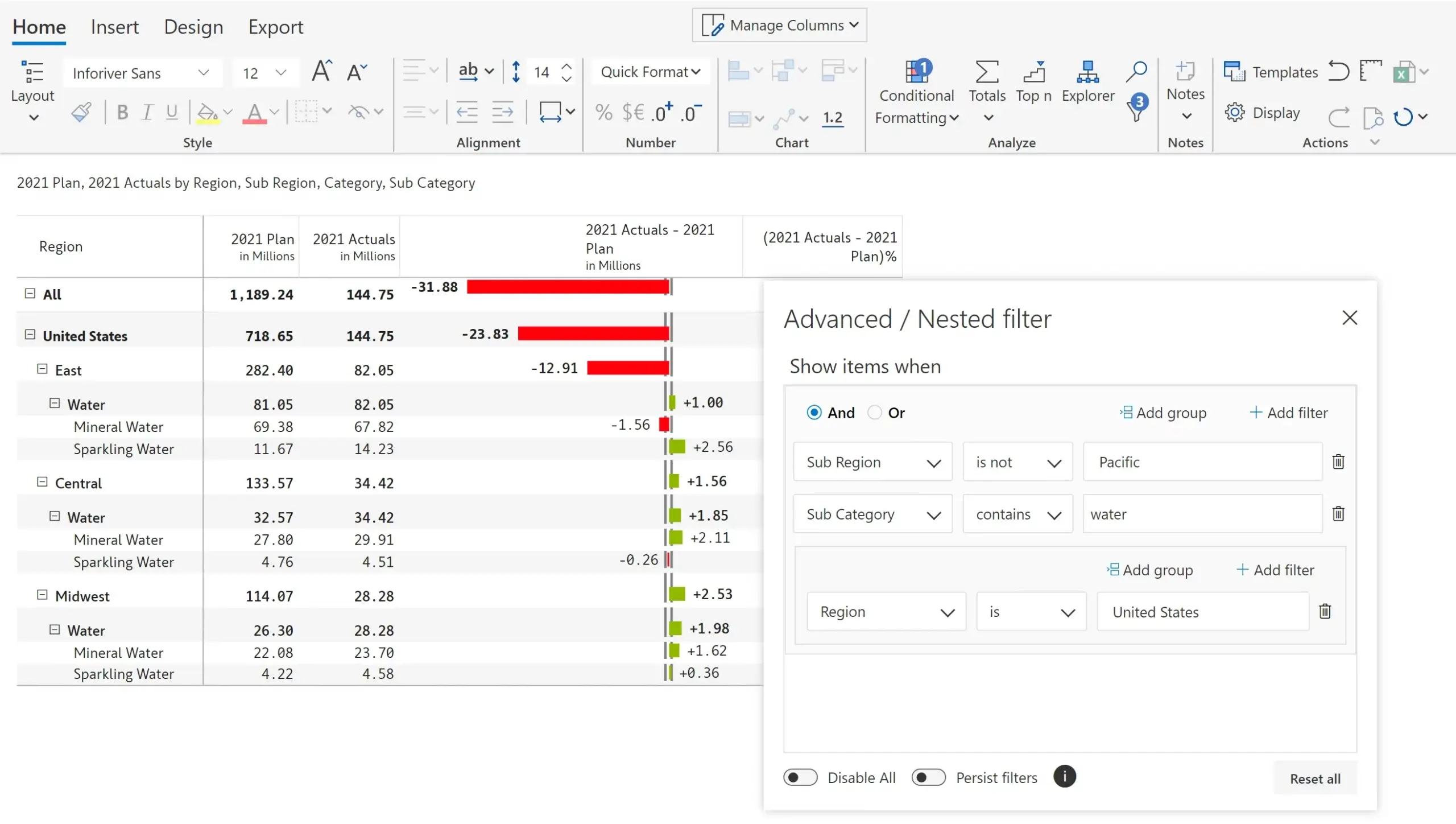
Inforiver’s KPI explorer can be used for filtering of rows, columns and measures.
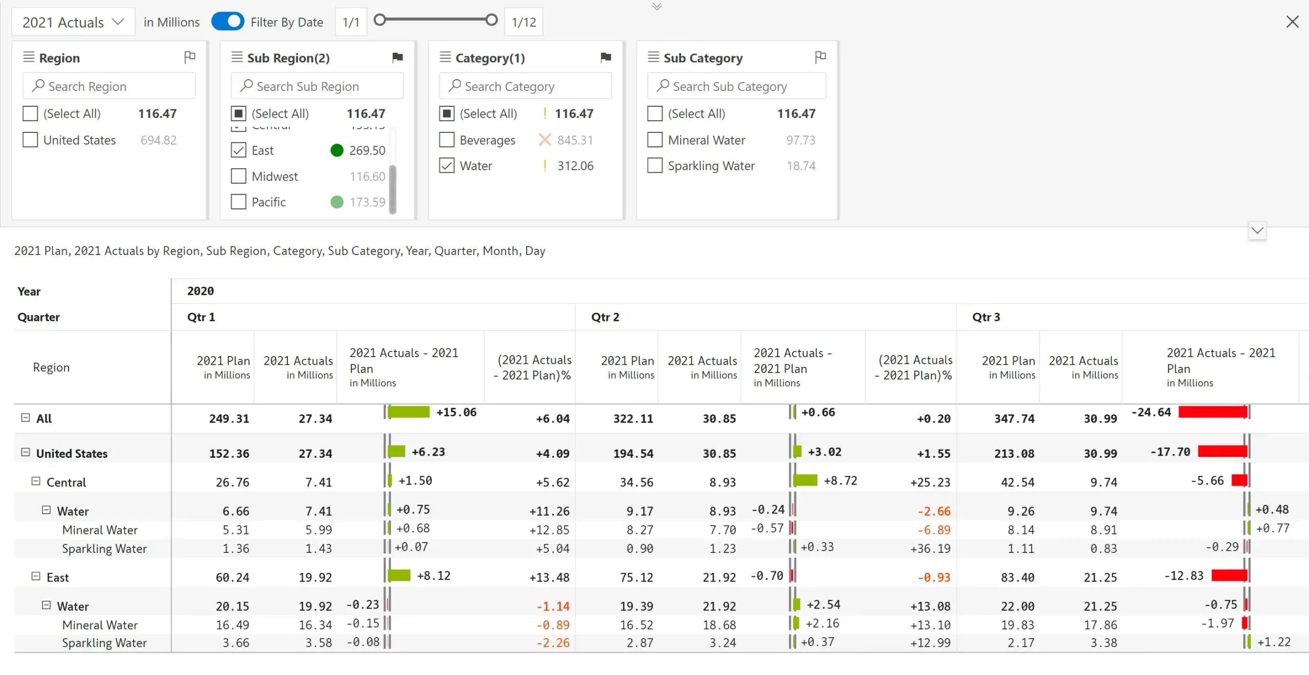
Filter rows using nested and/or conditions including filter groups.
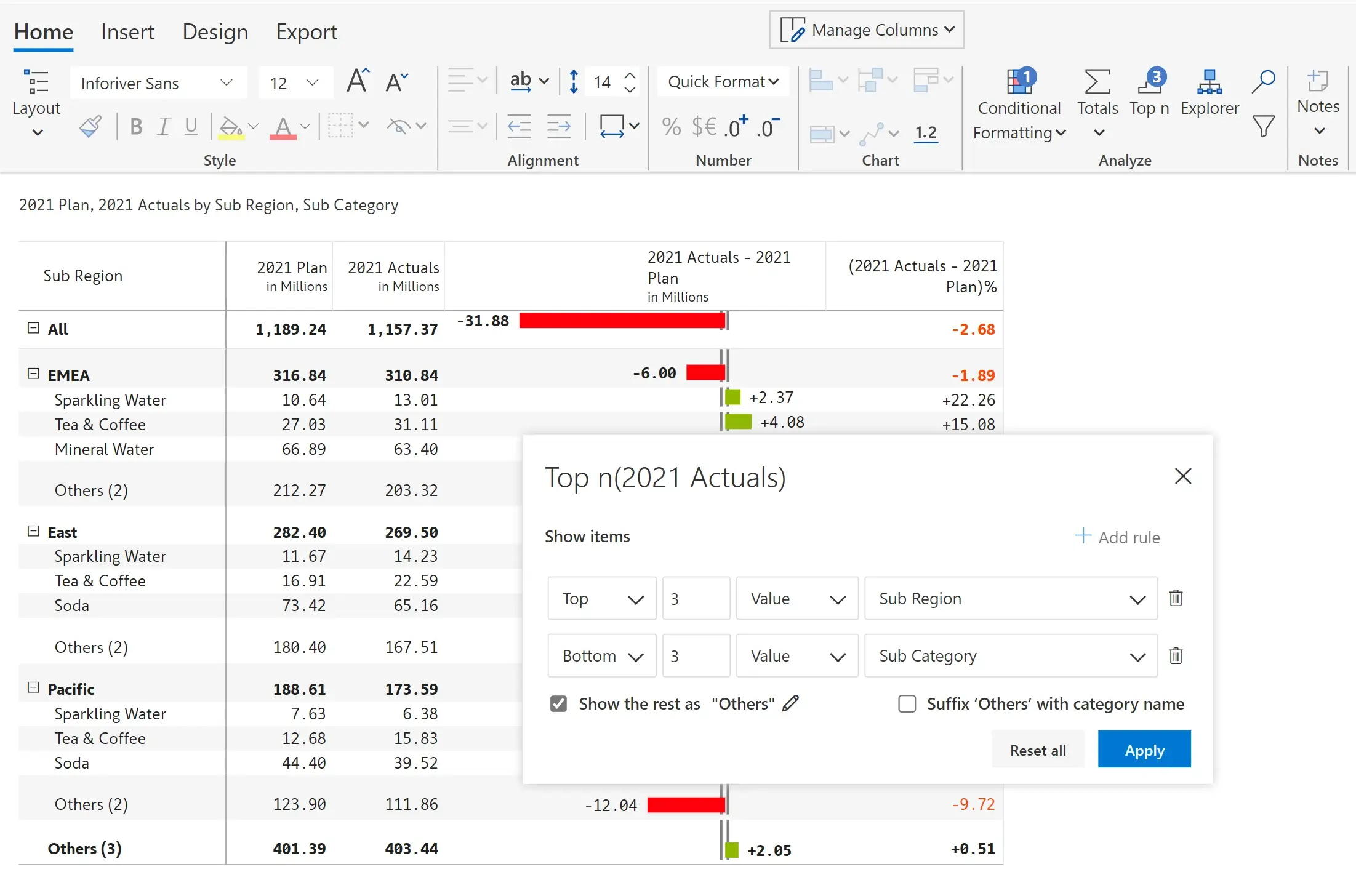
Inforiver supports multi-level and nested top N configurations (e.g., Top 5 subcategories from Top 2 regions); also supports a combination of Top and Bottom N (e.g., Top 3 subregions for the Bottom 3 subcategories).
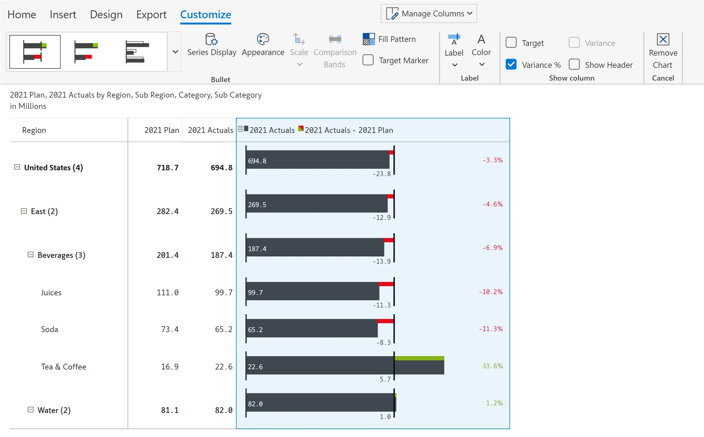
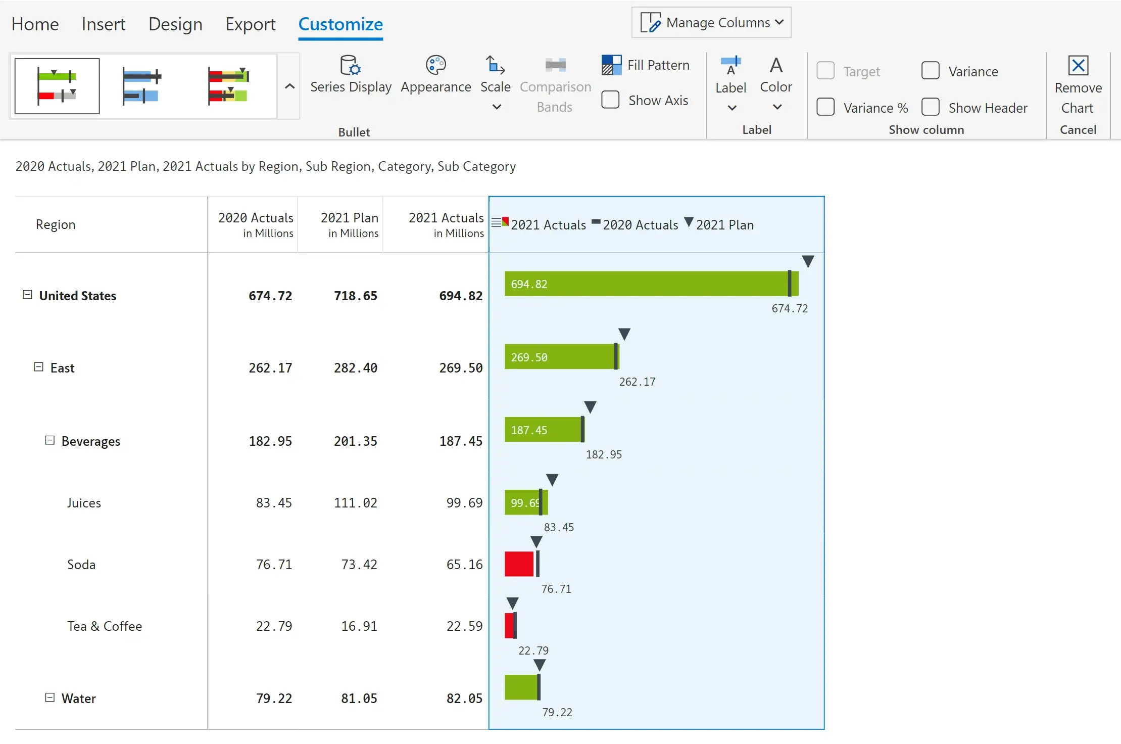
Compare 2 or 3 measures using 12 different bullet chart types. These charts can be inserted in a single-click and are highly customizable. Shown below are examples for the 2 and 3 measure bullet charts.
International Business Communication Standards provides standard table templates for analyzing hierarchical data. With Inforiver, you can apply these templates in a single-click. Note that you only need to bring your data; the layout and formatting are automatically handled by Inforiver.
The T01 template visualizes a measure (AC) with rows showing structural data and columns showing absolute and relative variances to previous year (PY) or plan (PL).
The T02 template visualizes a measure (AC) with rows showing structural data and columns showing absolute and relative variances to previous year (PY) or plan (PL) as bars and pins.
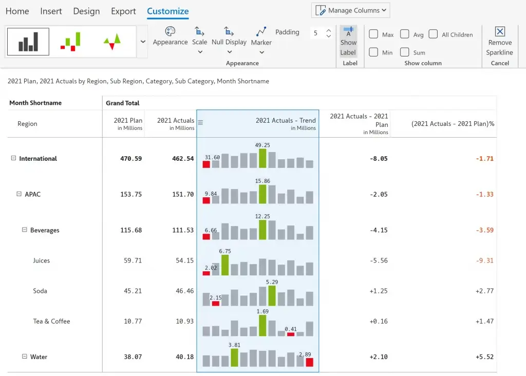
Sparklines can be added to the table by adding a time period in the column field and selecting a sparkline. The 9 available options include – line, area, win/loss, baseline and more.
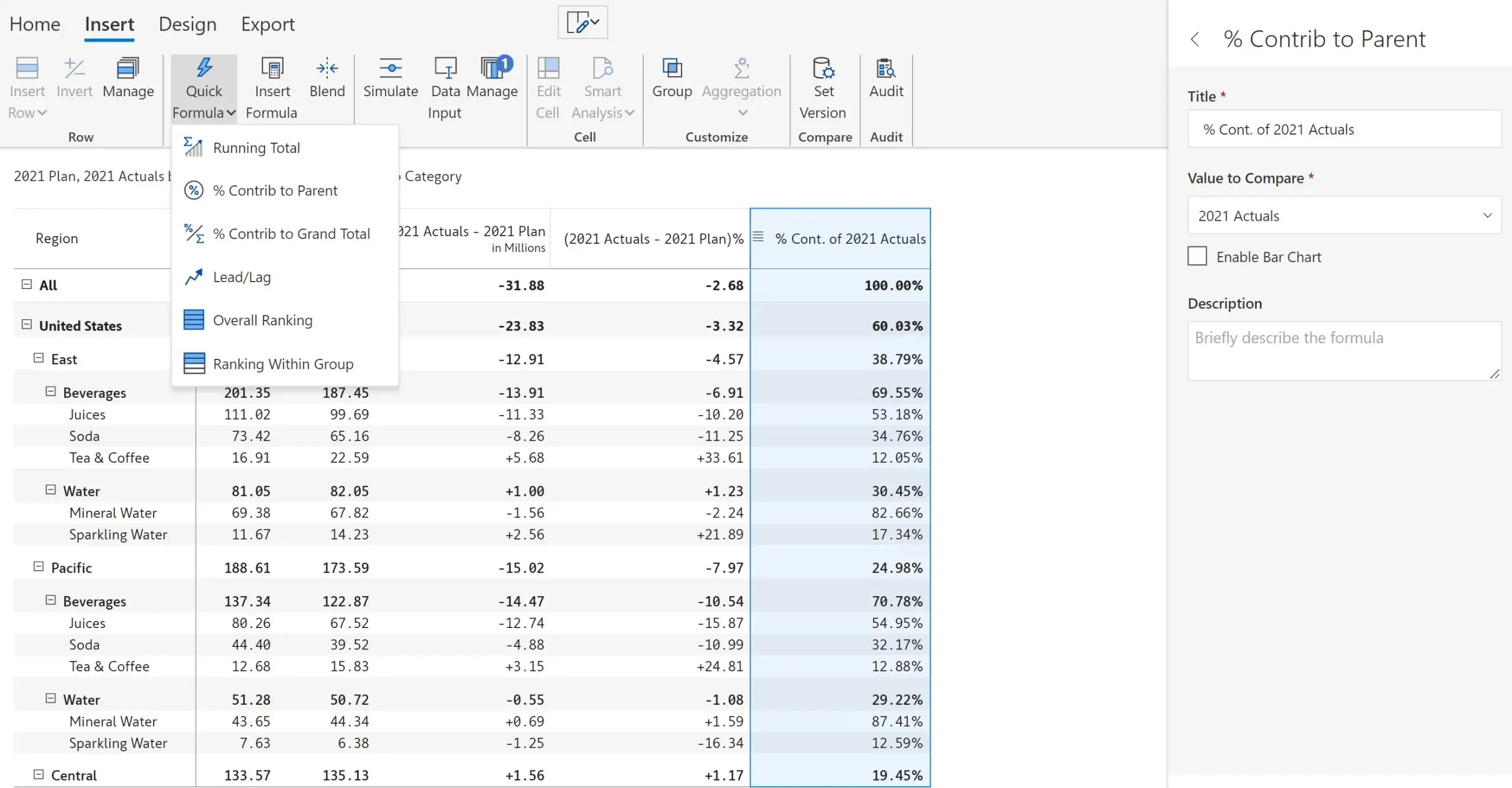
Percentage contribution to parent/grand total can be inserted on-the-fly. Contribution or variance column can also be inserted with respect to a data point as shown in the 2nd image.
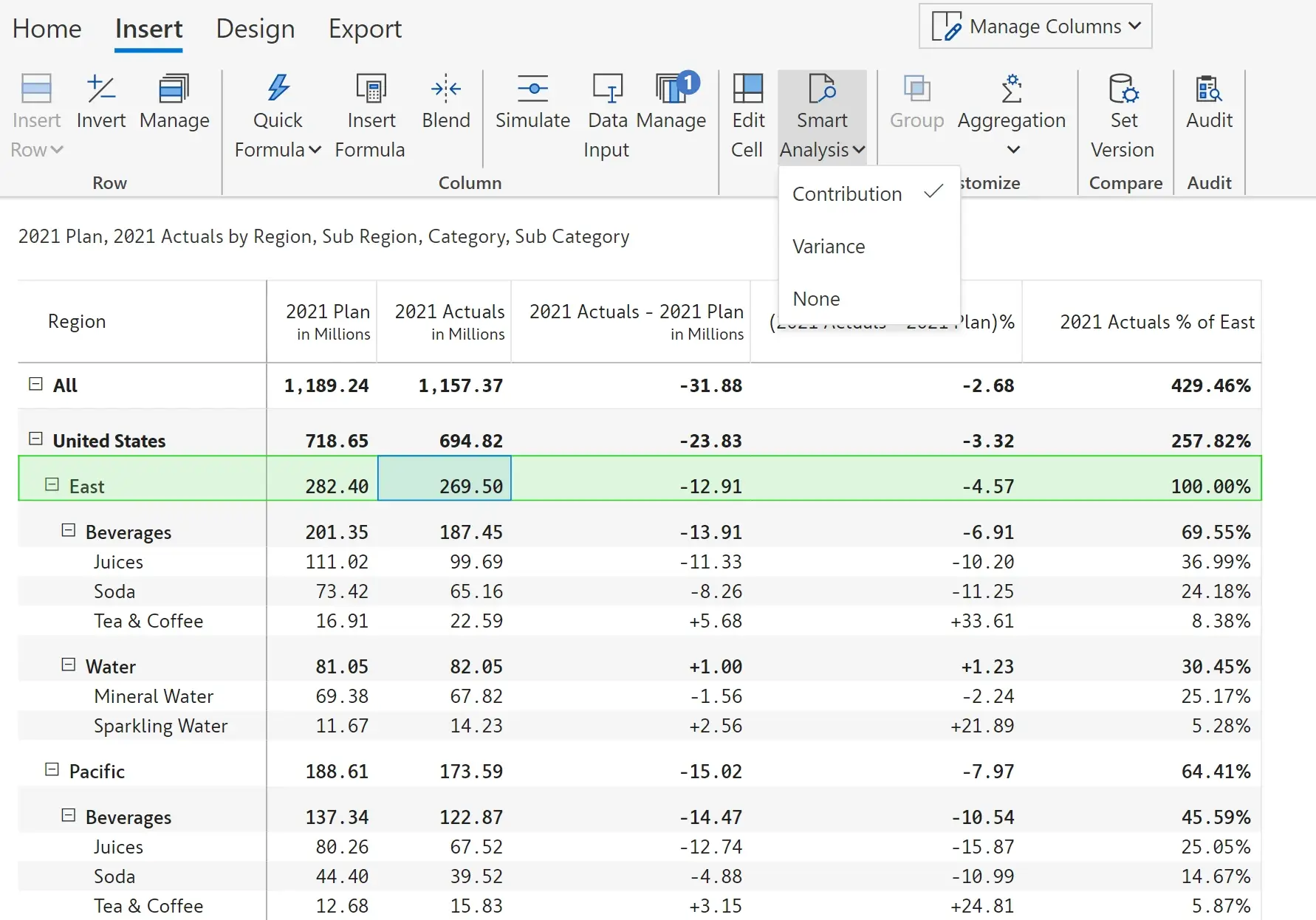
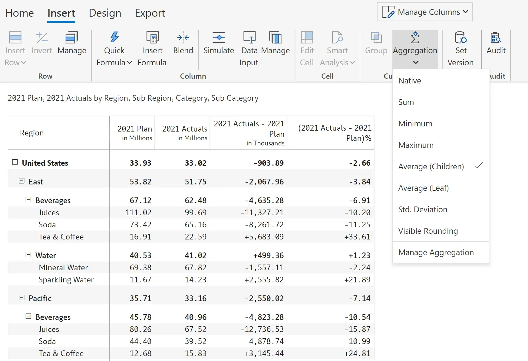
You can override the standard measure aggregation for measures and apply custom aggregations such as average, standard deviation, minimum, maximum, and more in a single click.
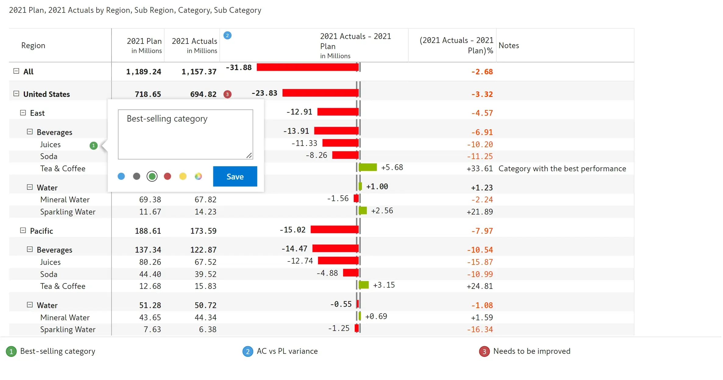
Notes can be added at a cell, row, column or row header level to provide descriptive details. These notes can be configured to display on hover or as footnotes.
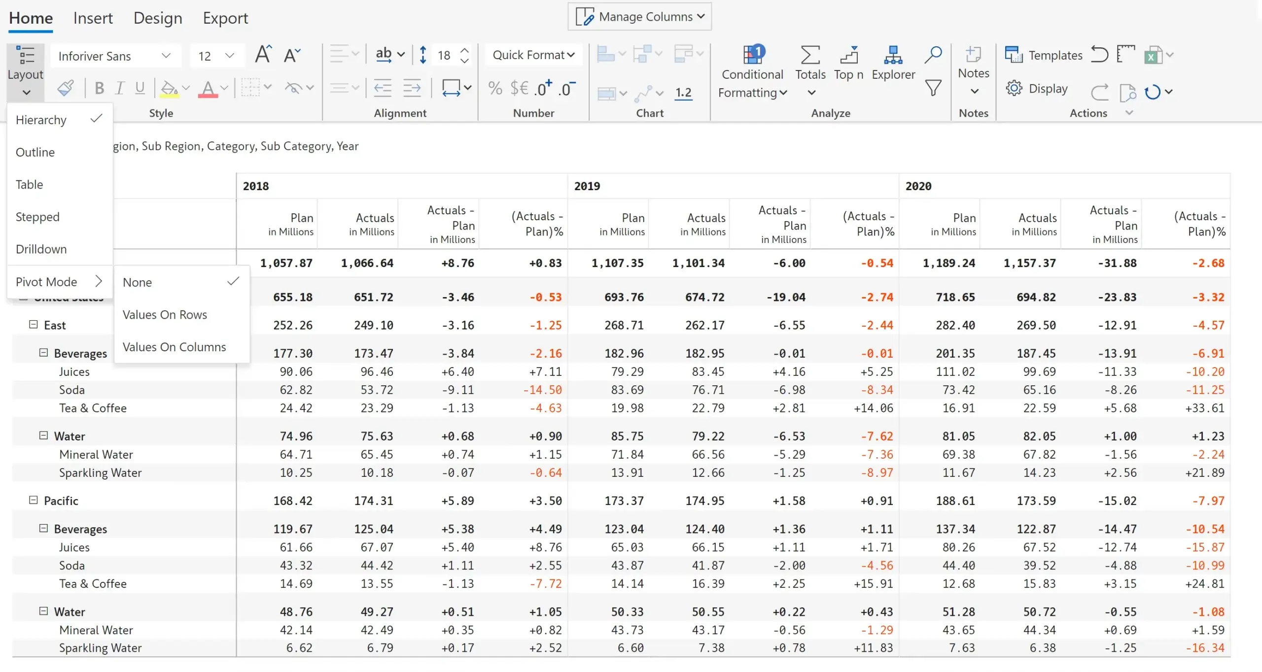
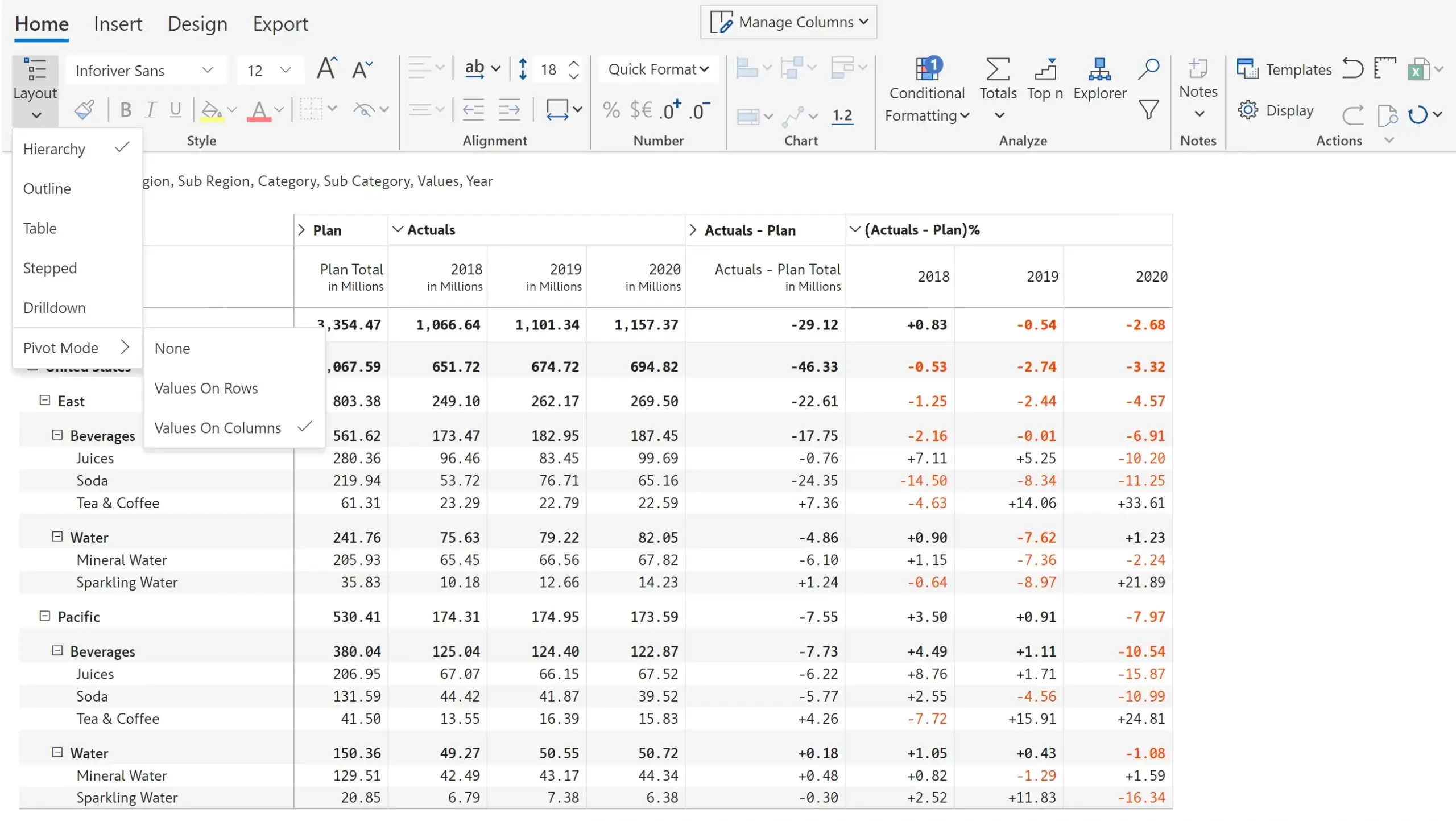
Inforiver supports expand/collapse hierarchies along both rows and columns like traditional pivot tables along with Stepped, Outline and classic pivot table layouts inside Power BI.
In the below image, pivot mode is off, and this is the default view. Notice that the actuals, plan, and variances are grouped by year.
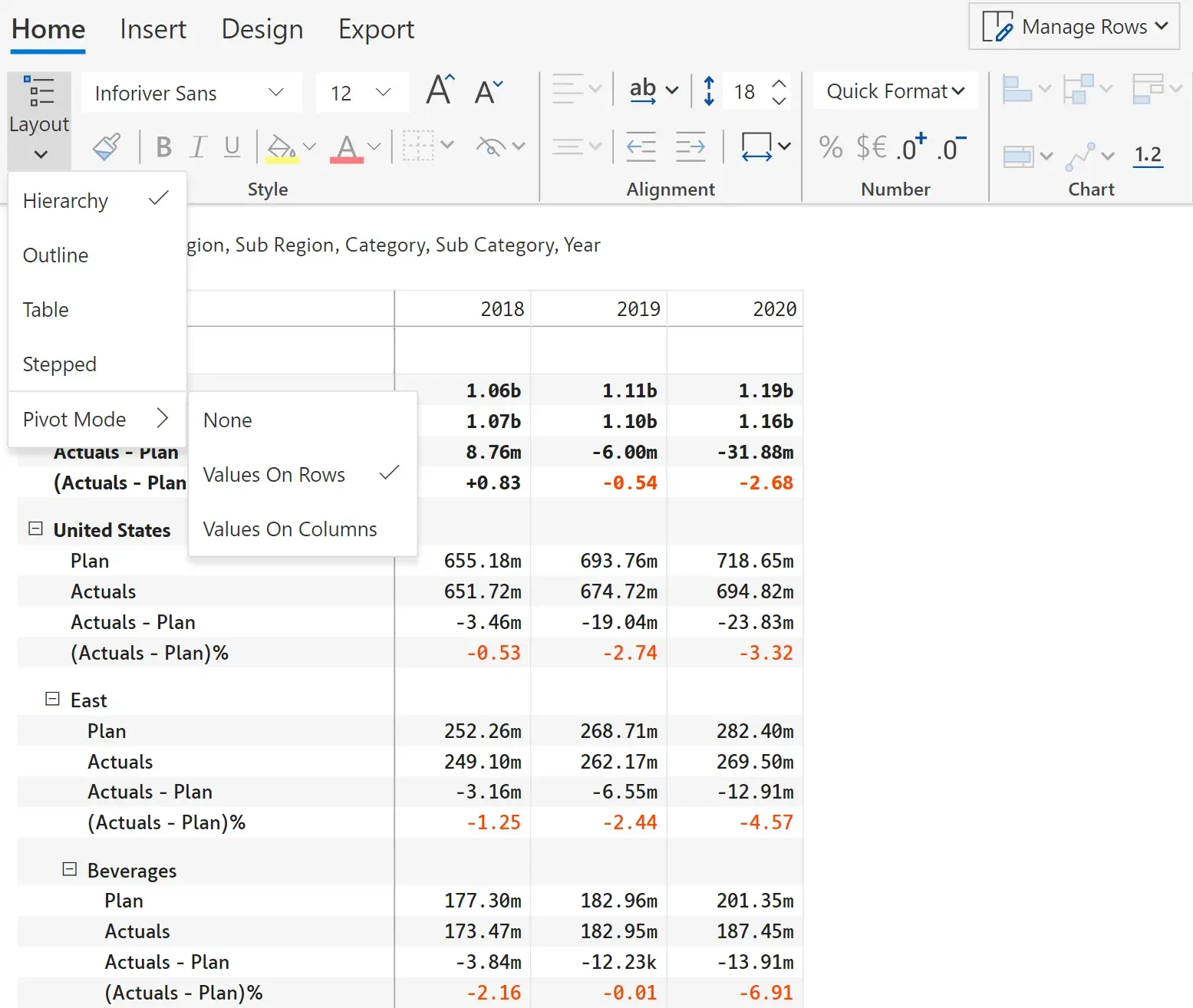
On choosing the ‘Values on Columns’ option, the columns are grouped by the measures – actuals, plan and the variances for the 3 years.
On selecting ‘Values on Rows’, the matrix gets transformed as shown below with the measures on the rows and the years in the columns.
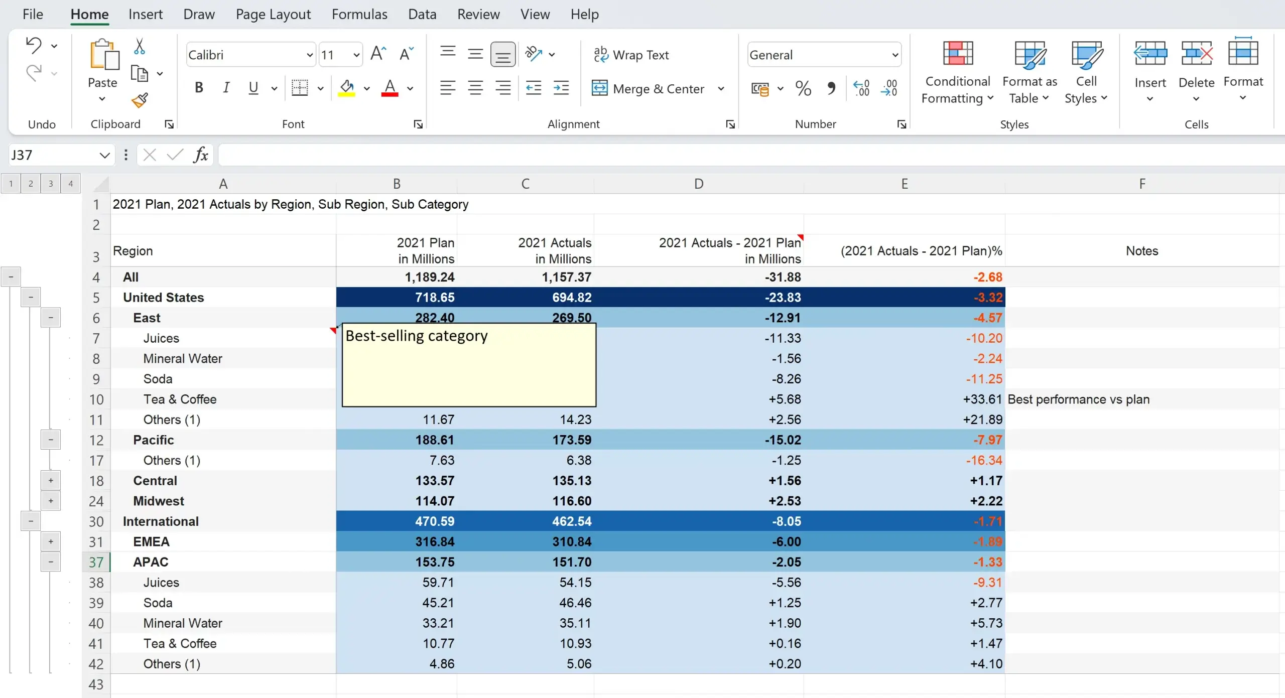
Inforiver reports can be exported to Excel with expand/collapse capability, along with conditional formatting, scaled number formatting, Top N, filters, notes etc. Here is a sample export.
Inforiver also supports formatted and paginated export to PDF including the in-line charts.

***
These are the 15 hierarchical analysis capabilities that we reviewed so far.
Inforiver offers a lot more that what is listed above. You can try for yourself by installing the free trial version of Inforiver Matrix from Appsource.
Inforiver Enterprise provides everything offered by Inforiver Matrix, along with several additional features such as manual data input, writeback, collaborative comments and report scheduler. Here is the Appsource listing for Inforiver Enterprise.

Inforiver helps enterprises consolidate planning, reporting & analytics on a single platform (Power BI). The no-code, self-service award-winning platform has been recognized as the industry’s best and is adopted by many Fortune 100 firms.
Inforiver is a product of Lumel, the #1 Power BI AppSource Partner. The firm serves over 3,000 customers worldwide through its portfolio of products offered under the brands Inforiver, EDITable, ValQ, and xViz.