Inforiver

Upcoming webinar on 'Inforiver Charts : The fastest way to deliver stories in Power BI', Aug 29th , Monday, 10.30 AM CST.    Register Now

Upcoming webinar on 'Inforiver Charts : The fastest way to deliver stories in Power BI', Aug 29th , Monday, 10.30 AM CST.    Register Now

All-in-One visualization suite for Power BI

100+ Charts, Gantt, Cards and Tables
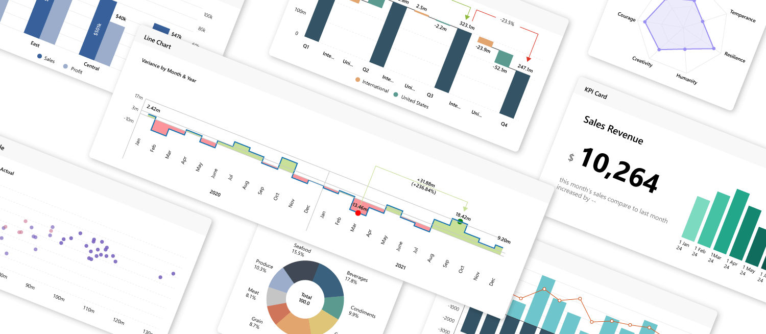
Discover best visualization practices and use cases here ➞

Get Best-in-Class Viz Engine for Power BI so you can retire legacy BI tools

Access advanced charts, high performance, seamless governance, and IBCS-certified storytelling—all with a modern, no-code UI.
iframe preview
View interactive content
More visualizations coming! see our roadmap here ➞

100+

Chart types

30K+

Data points

20+

Analytical Features
Migration Tableau Spotfire

Migrate from Tableau/Qlik/Spotfire to Power BI

Address key gaps in visuals, features and capabilities while migrating to Power BI
Watch Webinar
Additional Visualization
Bridging Functional Gaps
Power BI Improvements

1. Distribution

  • Box-and-Whisker plot
  • Histogram
  • Swarm plot
  • Dot plot

2. Comparison

  • Funnel/Pyramid
  • Bullet
  • Arrow plot
  • Slope graph
  • Dumbbell plot

3. Hierarchical/Relationship

  • Hierarchical treemap
  • Nested bar/column
  • Packed bubble
  • Marimekko
  • Sankey

4. Sparklines

  • Sparkline support for all chart types

5. Multi-dimensional analysis

  • Parallel coordinates (Bump)
  • Radar/Polar

6. Measure-based

  • Measure breakdown waterfall chart
  • Measure-only support

7. Small multiples/Trellis

  • Trellis support for all chart types
  • Multi-dimensional (x,y,z axes) trellis/small multiples with hierarchy support

8. Table

  • Conditional formatting
  • Row sparklines
  • Customization

1. Chart customization

  • Synchronized axis for multi axis charts
  • Adding grand total
  • Highly customizable charts
  • Error bars and analytics support
  • Conditional formatting icon support for tables
  • Rich themes and formatting

2. Interaction & filtering

  • Customize charts with on-object interaction
  • Lasso selection and zoom to focus on high-volume data
  • Include/Exclude values through Legends

3. Reading view UX

  • Visual data exploration by switching chart types
  • Toggle visibility of visual elements like labels, axis, etc
  • Ad-hoc analysis by mapping data into different buckets

4. Storyboarding

  • Rapidly build dashboards using templates and accelerators
  • Advanced layering and arrangements of visual elements
  • Bundling various charts and elements as component groups

1. Visualize more than 30K data points

  • Power BI visualizations cannot visualize more than 3.5k datapoints

2. In-visual calculations

  • Perform calculations directly within the visual with
  • NO DAX Inbuilt variance calculations

3. Data preparation & transformation

  • Pivot data - data catalog like Tableau
  • Make easy edits to category labels with summary table
  • Split measures into Trellis
  • Split categories into measures
  • Measure grouping capabilities

4. Story telling and annotations

  • Contextual annotations tied to the data point
  • Deviation and CAGR support
  • Visual storytelling with reference lines/bands
  • Dynamic analytics support (pareto, trendlines, error bar, etc.,) 

Key Features

One Stop Solution for all your custom visuals

Unify executive, self-service, and client reporting in one visual
  • Better BI adoption leading to best insights

  • Replace multiple 3rd-party visuals with a single enterprise-ready solution.

  • Ensure security and best standards across every dashboard.
One stop solution

Extend your ROI on Power BI investments

Unlock 100+ advanced visuals, end-user control and more interactivity—without code.
Extend your ROI
  • Add purpose-built visuals such as bullet charts, box plot and Marimekko.

  • Support 10X data points. Say goodbye to 3.5K data point limits—render 30K+ effortlessly.

  • Deliver best-in-class design and user experiences.

Developers Burn Hours on Workarounds?

Free your team from complex visual coding and rigid templates.
  • Use responsive visuals for all devices and Export presentation-ready PDFs with rich formatting.

  • Maintain consistent brand styling across every dashboard—colors, typography, layout—automatically.

  • Plot 4D hierarchical data in all axis, small multiples, automatic variance and in-visual calculations.
Developers burn hours

IBCS Compliant Reporting

Deliver standardized insights to unify business communication
  • IBCS compliant reporting
  • IBCS compliant reporting
  • IBCS compliant reporting
  • IBCS compliant reporting
  • One-click and interchangeable IBCS templates and themes for chart, card and table.

  • Automatic variance calculation and visualization of absolute and relative variances.

  • Offer core charts plus additional charts (Bullet, Bubble, Scattergram, Box Plot)
Turn Dashboards into Decision.

Turn Dashboards into Decisions

Convert charts into conversations through data storytelling
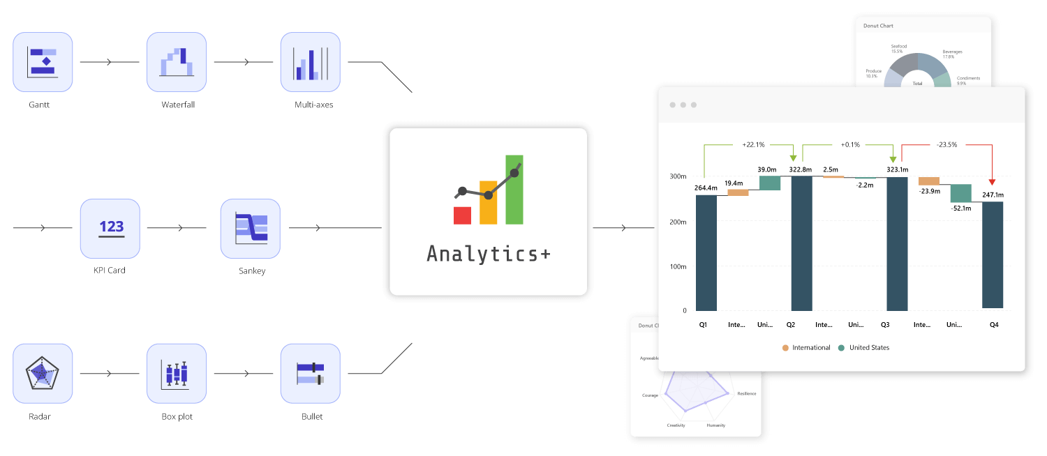
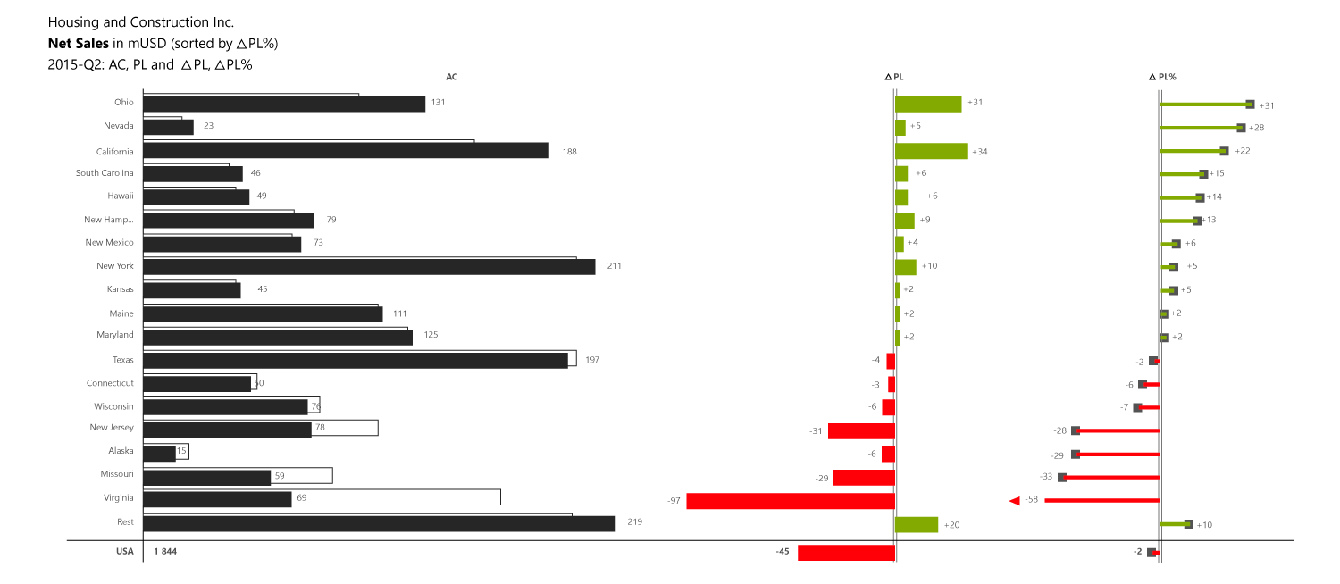
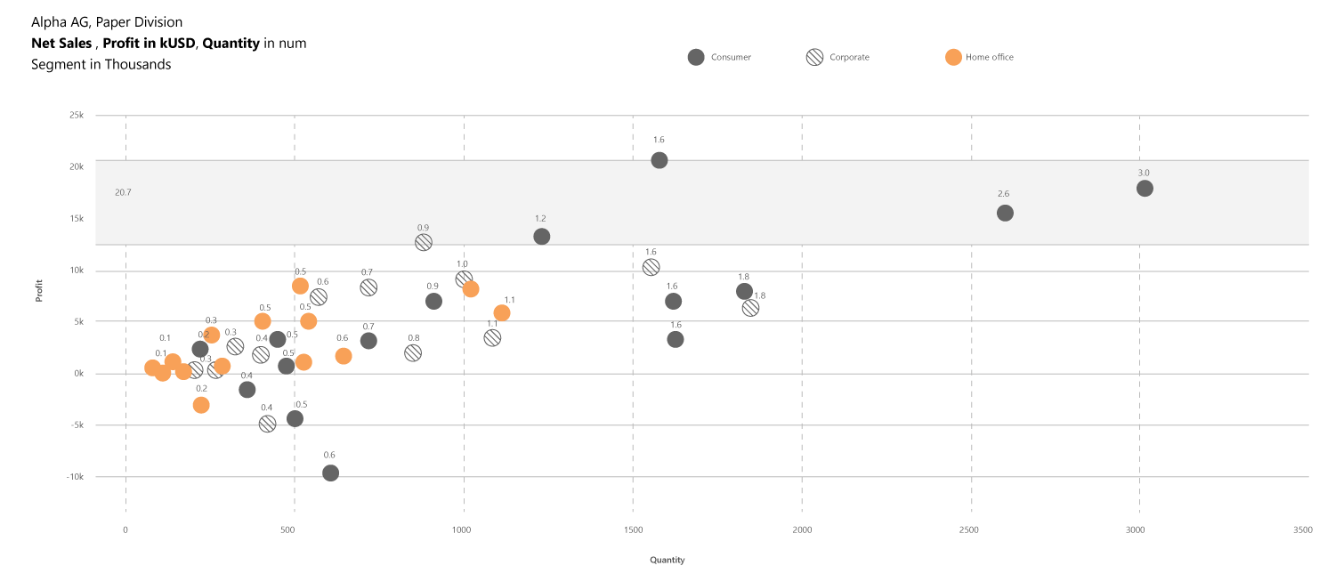
  • Draw attention to where it matters. Highlight trend and outliers dynamically.

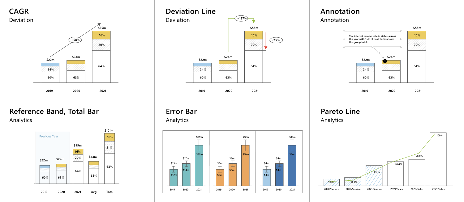
  • Show deviation, CAGR, and reference band.

  • Add contextual annotation, title and footnotes.

Turn dashboards into decisions

Get Inforiver brochure

Maximize your business potential with Inforiver's paginated reporting, data entry, planning & budgeting capabilities
Download now
Inforiver

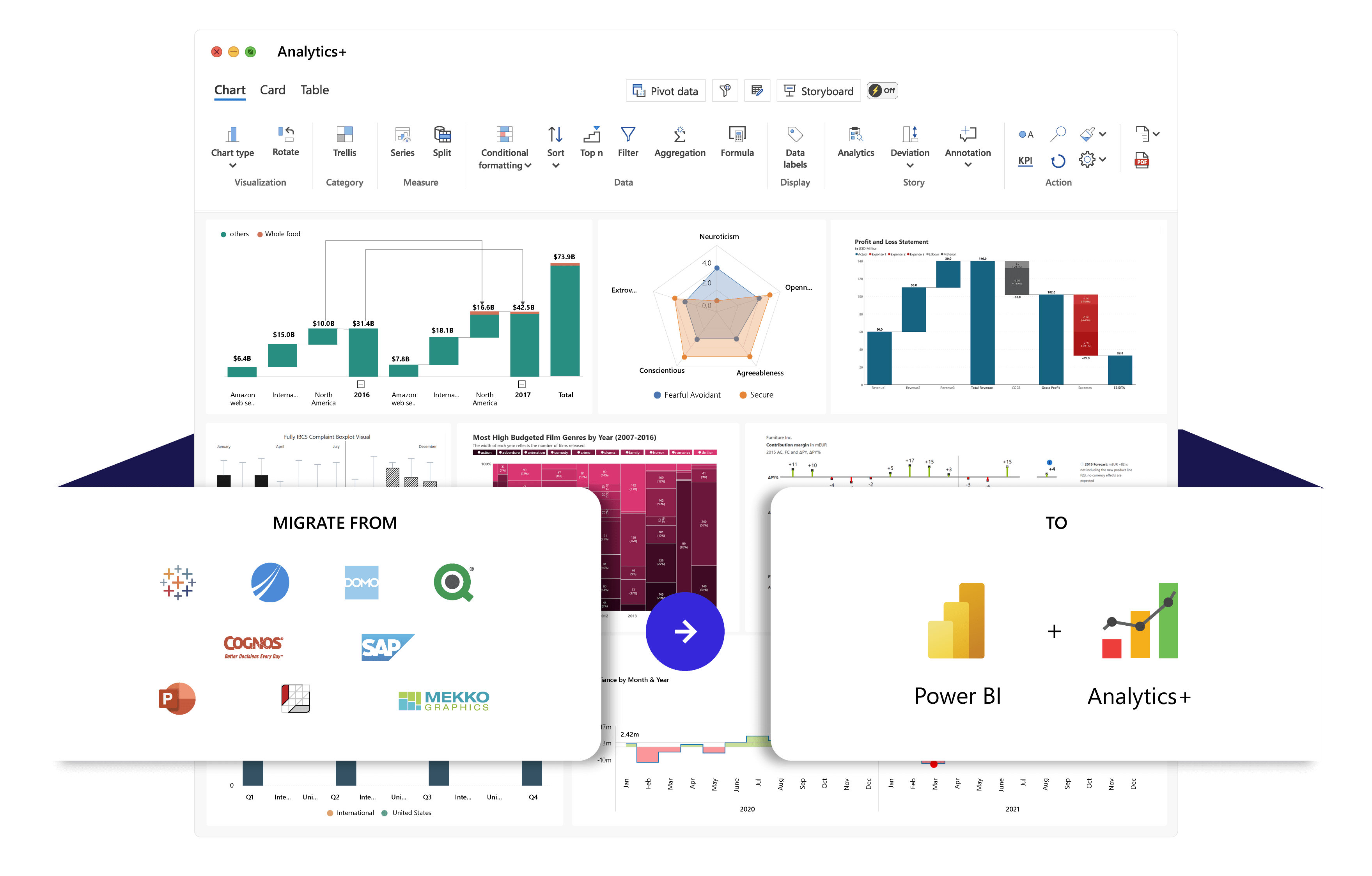
Inforiver helps enterprises consolidate planning, reporting & analytics on a single platform (Power BI). The no-code, self-service award-winning platform has been recognized as the industry’s best and is adopted by many Fortune 100 firms.

Inforiver is a product of Lumel, the #1 Power BI AppSource Partner. The firm serves over 3,000 customers worldwide through its portfolio of products offered under the brands Inforiver, EDITable, ValQ, and xViz.

arrow-right-circle linkedin facebook pinterest youtube rss twitter instagram facebook-blank rss-blank linkedin-blank pinterest youtube twitter instagram