Upcoming webinar on 'Inforiver Charts : The fastest way to deliver stories in Power BI', Aug 29th , Monday, 10.30 AM CST. Register Now
Upcoming webinar on 'Inforiver Charts : The fastest way to deliver stories in Power BI', Aug 29th , Monday, 10.30 AM CST. Register Now
Power BI provides a good foundation for data visualization and reporting. However, when organizations aim to deliver reports that align with International Business Communication Standards (IBCS), native capabilities often fall short. Even when developers resort to workarounds and hacks such as custom SVG measures, it falls short in terms of clarity, structure, and consistency. To bridge this gap, enterprises resort to Microsoft-certified commercial visuals like Inforiver or Zebra BI or Graphomate. Only these 3 software vendors are the IBCS Certified Solution Providers for Power BI.
This document presents a detailed, criteria-based comparison of:
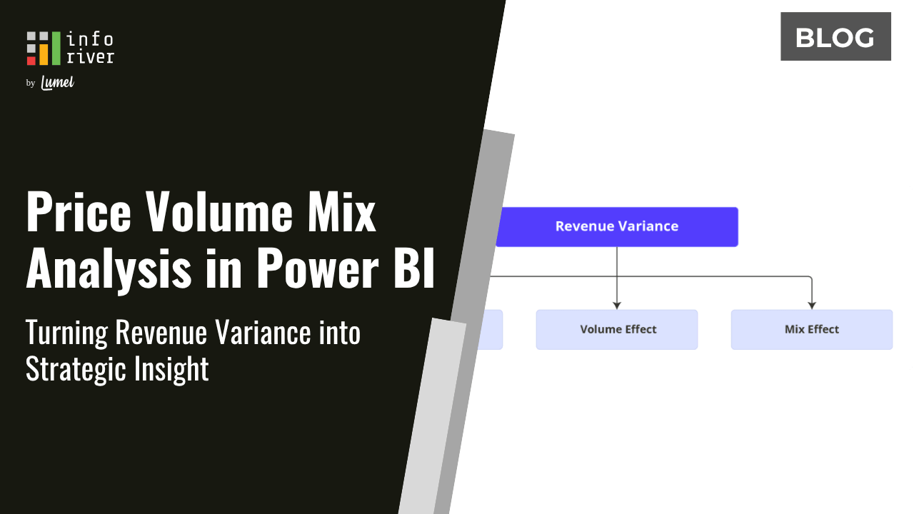
Inforiver Analytics +, A Single visual consisting of 100+ Charts + Cards + Table + Gantt all 4- in-1.
Vs
Zebra BI Tables + Zebra BI Charts + Zebra BI Cards. (3 different Visuals)
Both third-party visuals are designed to enhance Power BI's reporting capabilities with a focus on IBCS compliance and enterprise-grade features. Both tools are officially certified by IBCS that support structured, data-driven communication.
Note:
The comparison between Zebra BI and Inforiver Analytics+ for Power BI is summarized below.
Zebra BI
Standardize business communication with a vision to drive clarity and actionability. Actionable reporting through compliance with IBCS- International Business Communication Standards is their only USP.
Inforiver
Empowering global business users with extensive visualization capabilities, adhering to both IBCS and other visualizations standards and best Practices. IBCS standards are very popular in the DACH Region (Germany, Austria, and Switzerland) and Global Customers prefer generic visualization best practices. So, Inforiver offers to caters to both IBCS and generic visualization best practices by offering comprehensive no-code reporting & analytics suite, focusing on ease of use and overall value.
When it comes to adhering to IBCS (International Business Communication Standards) for creating clear and impactful business reports, Zebra BI offers a solid foundation. It fully supports a range of IBCS table templates, including those with hierarchical rows, variance columns, and integrated bar charts, as well as P&L structures. Zebra BI also provides full support for multi-tier column and bar charts, and area charts, demonstrating its commitment to standardized visualization.
Inforiver Analytics+, while also providing support for IBCS tables and charts, notably distinguishes itself with more comprehensive IBCS compliance across various chart types. It offers fully compliant stacked column and bar charts, including features like 100% stacked options and integrated legends, which are partially lacking in Zebra BI. Inforiver Analytics+ also extends its lead by fully supporting scattergrams, bubble charts, and Marimekko charts, which are not available in Zebra BI. While practitioners often struggle with the rigorous concept of 'No-Axis' in IBCS visualizations, Inforiver Analytics+ offers the Flexible IBCS approach which introduces a degree of leniency by allowing alignment with conventional visualization elements such as axes, reference lines, and number scaling.
There are a few things common to both Zebra BI and Inforiver Analytics+:
However, there are a lot of nuanced differences between the two. Below is detailed comparison of the capabilities across Zebra BI and Inforiver Analytics+ when it comes to delivering the IBCS Templates (4 table templates T01 to T04 and 13 chart templates C01 to C13).
# | Feature/Criteria (IBCS Template) | Zebra BI | Inforiver Analytics + | |||
|---|---|---|---|---|---|---|
| 1. Table Templates | ||||||
| 1.1 | Hierarchical rows and variance columns | Fully supported | Fully supported | |||
| 1.2 | Hierarchical rows and integrated bar charts | Fully supported | Fully supported | |||
| 1.3 | Table with measures rows (P&L structure) | Fully supported | Fully supported | |||
| 1.4 | Table with measure rows and integrated waterfalls | Fully supported | Fully supported | |||
2. Chart Templates | ||||||
| 2.1 | Stacked Column Chart | Partially Supported ➖ Lacks 100% stacked variant, integrated legends position control, and footnotes. | Fully IBCS-compliant ➕ Supports left/right legends, 100% stacked option, titles/footnotes. | |||
| 2.2 | Stacked Bar Chart | Partially Supported ➖ Lacks 100% stacked and total bar, limited legends position control | Fully IBCS-compliant ➕ Supports Integrated legends (left/right), 100% stacked option, titles/footnotes | |||
| 2.3 | Multi-tier Column Charts | Fully supported With automatic variance based on field | Fully supported With automatic variance, outliers, and uniform formatting. | |||
| 2.4 | Multi-tier Bar Charts | Fully supported | Fully supported | |||
| 2.5 | Column with Waterfall Charts | Supports IBCS compliance with automatic variance ➖ Lacks grouped columns in lower tier, do not offer an additional column (=PY) | Fully supports IBCS compliance with 2 scenario waterfalls chart ➕ Support for PL and PY columns, multiple deviation lines. | |||
| 2.6 | Bars with waterfall charts | Supports IBCS compliance with automatic variance ➖ Lacks additional bar (=PY) and grouped bar in lower tier, only one relative variance is available | Fully supports IBCS compliance with two (2) scenario waterfalls and grouped bar chart ➕ Extend additional bar, grouped bars, relative variance by PL & PY and multiple deviation lines | |||
| 2.7 | Line Chart | Partially supported ➖ Grouped line chart is not supported. | Fully supports IBCS compliance ➕ Grouped line chart available with series label. | |||
| 2.8 | Area Chart | Fully supported | Fully supports IBCS compliance | |||
| 2.9 | Scattergrams | Not supported | Fully supported | |||
| 2.10 | Bubble charts | Not supported | Fully supported | |||
| 2.11 | Tree charts | Partially supported Tree layout needs to be built manually. | Partially supported Tree layout needs to be built manually. | |||
| 2.12 | Vertical Waterfall | Fully Supported | Fully Supported ➕Offers 20+ types of waterfall charts with IBCS theme. | |||
| 2.13 | Small Multiples | Fully Supported | Fully Supported ➕ Extensive support for all chart types and KPI cards. Offers measure splitting, grouping and multi-dimensional layouts. | |||
| 3. Other Advanced Charts | ||||||
| 3.1 | Bullet Chart | Partially supported with cards | Fully supported ➕ Including normalizes target values, highlight variances, individual y-axis scaling. | |||
| 3.2 | Box Plot | Not supported | Fully supported ➕ Offers Box Plots, explicitly IBCS compliance, this caters to statistical distribution analysis needs. | |||
| 3.3 | Marimekko Chart | Not supported | Fully supported ➕ Supports 100% stacked Marimekko as per the example published by Tomasz M. Zieliński on IBCS. | |||
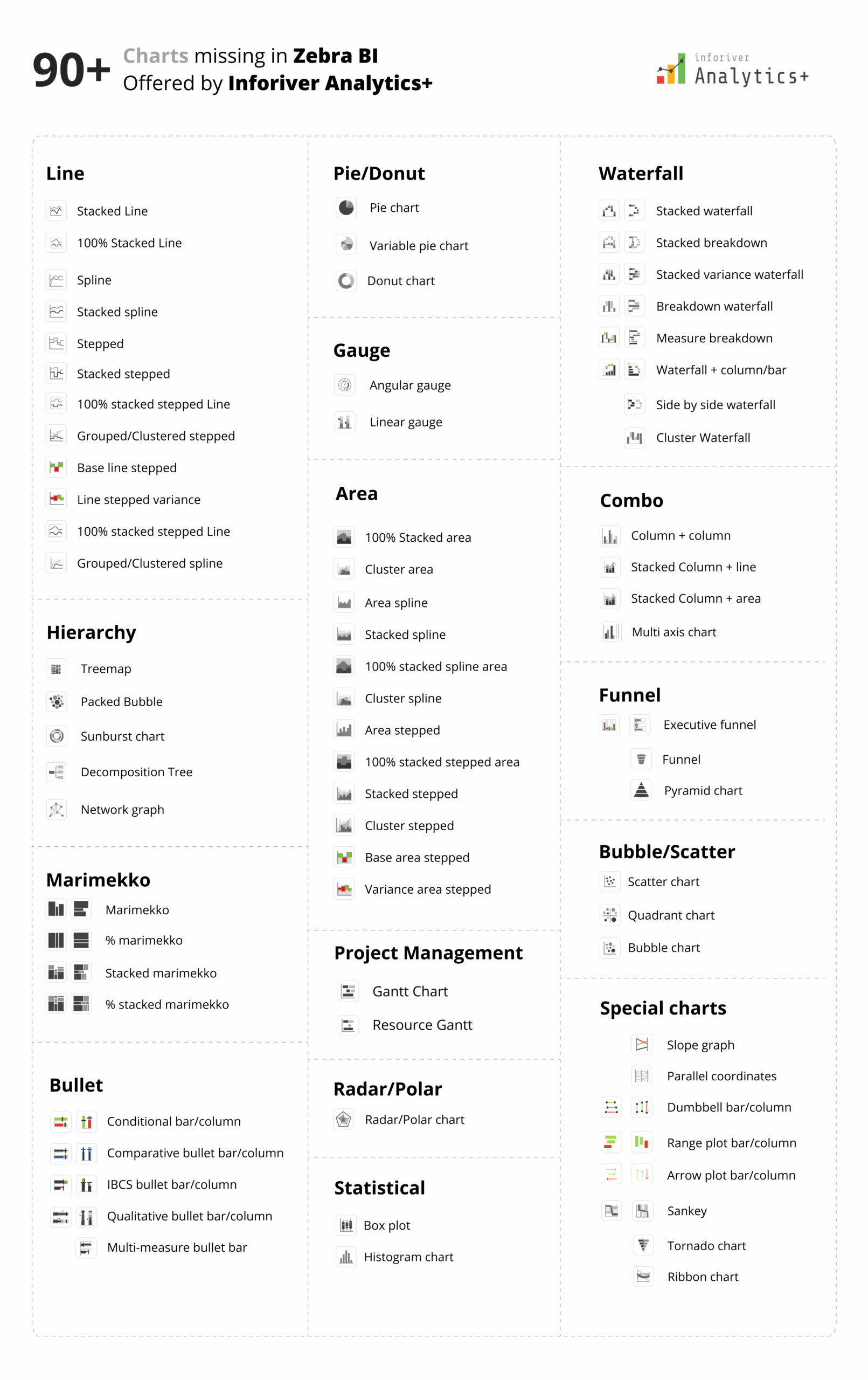
Zebra BI Charts provide approximately 36 chart variations, primarily column, bar, line, area, dot, waterfall, and combo chart families. Out of those 36-chart variations, 5 variations include small multiples of various column and waterfall charts.
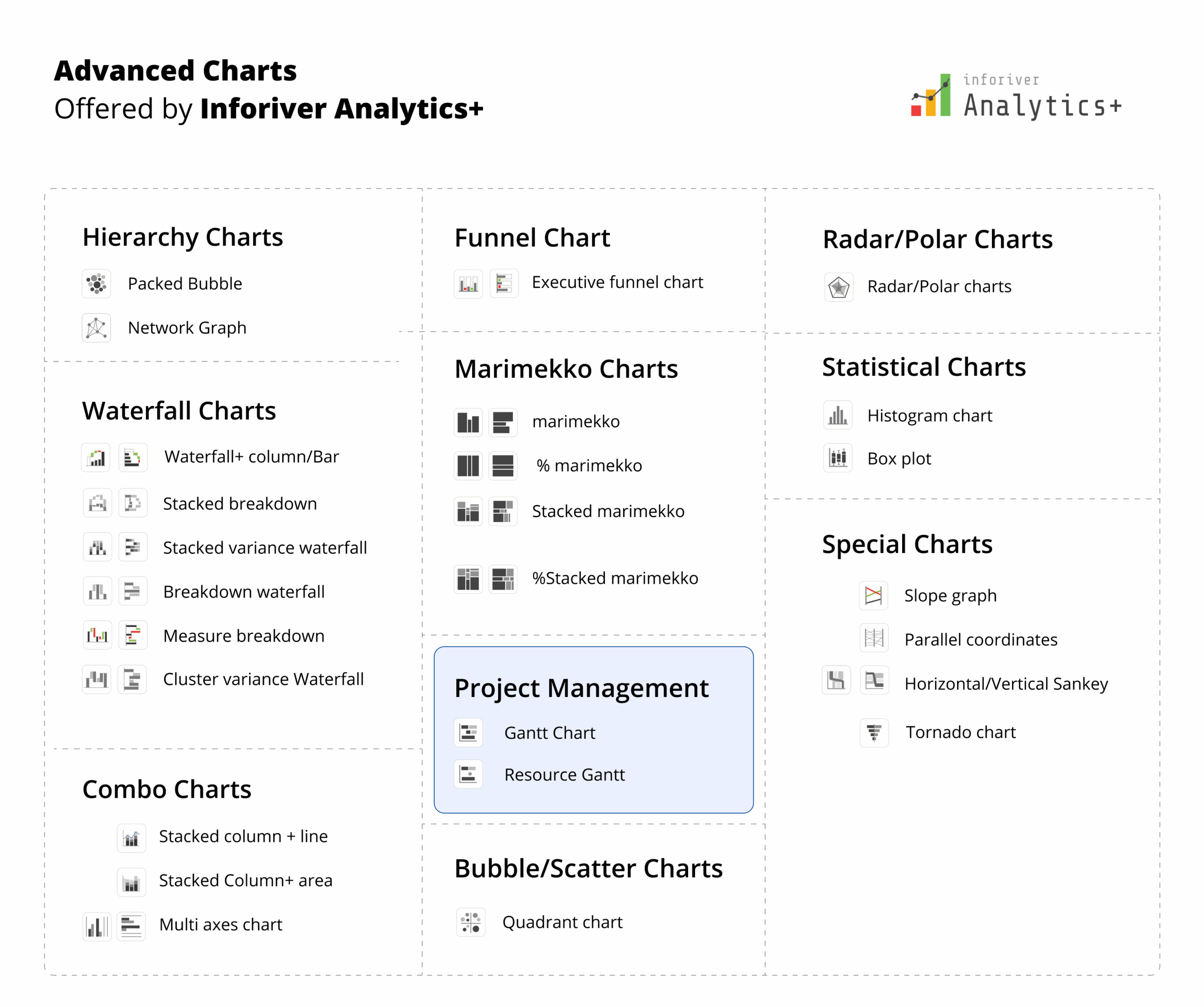
While, Inforiver Analytics+ offers over 100 visual types, encompassing a far richer and more diverse charting layer, including:

Inforiver Analytics+ also includes robust Table capabilities, offering an experience that goes far beyond basic data grids. It provides Excel-like cell, row, and column formatting, along with basic and advanced number formatting and scaling. It includes comprehensive conditional formatting options such as color scales, data bars, and action analysis. Key capabilities encompass automatic variance calculations, support for DAX measures, and built-in themes. The platform enables dynamic chart titles and column headers, allows for hiding empty/blank rows, and offers a context menu for extensive interactions. It also facilitates high Power BI integration, supporting bookmarks, calculation groups, and cross-filtering.
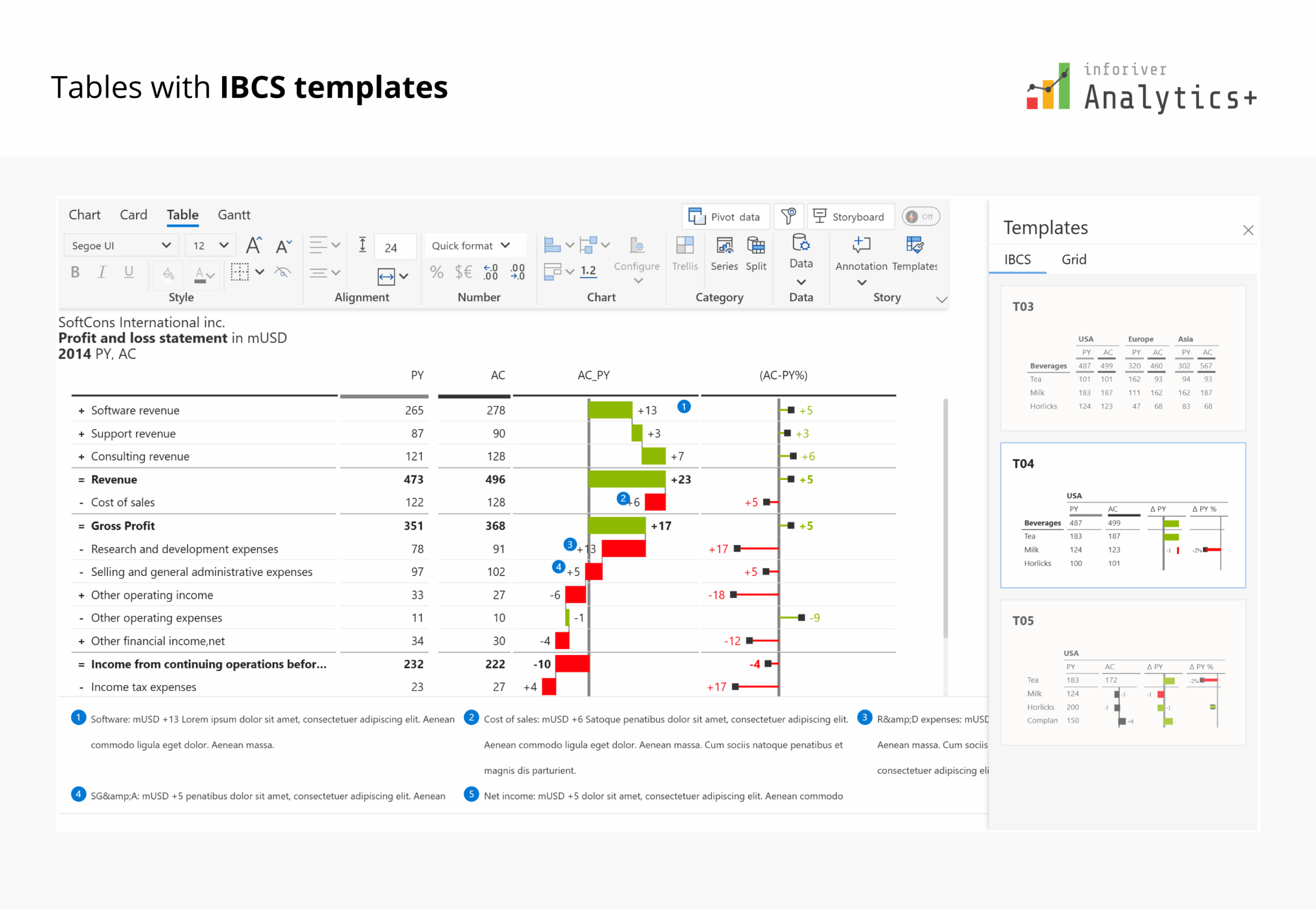
IBCS Support for Tables
Inforiver Analytics+ offers comprehensive out-of-the-box support for International Business Communication Standards (IBCS) within its tables. This includes dedicated built-in theme support for all standard IBCS templates:
This ensures that users can quickly and consistently create IBCS-compliant financial and management reports with minimal effort.
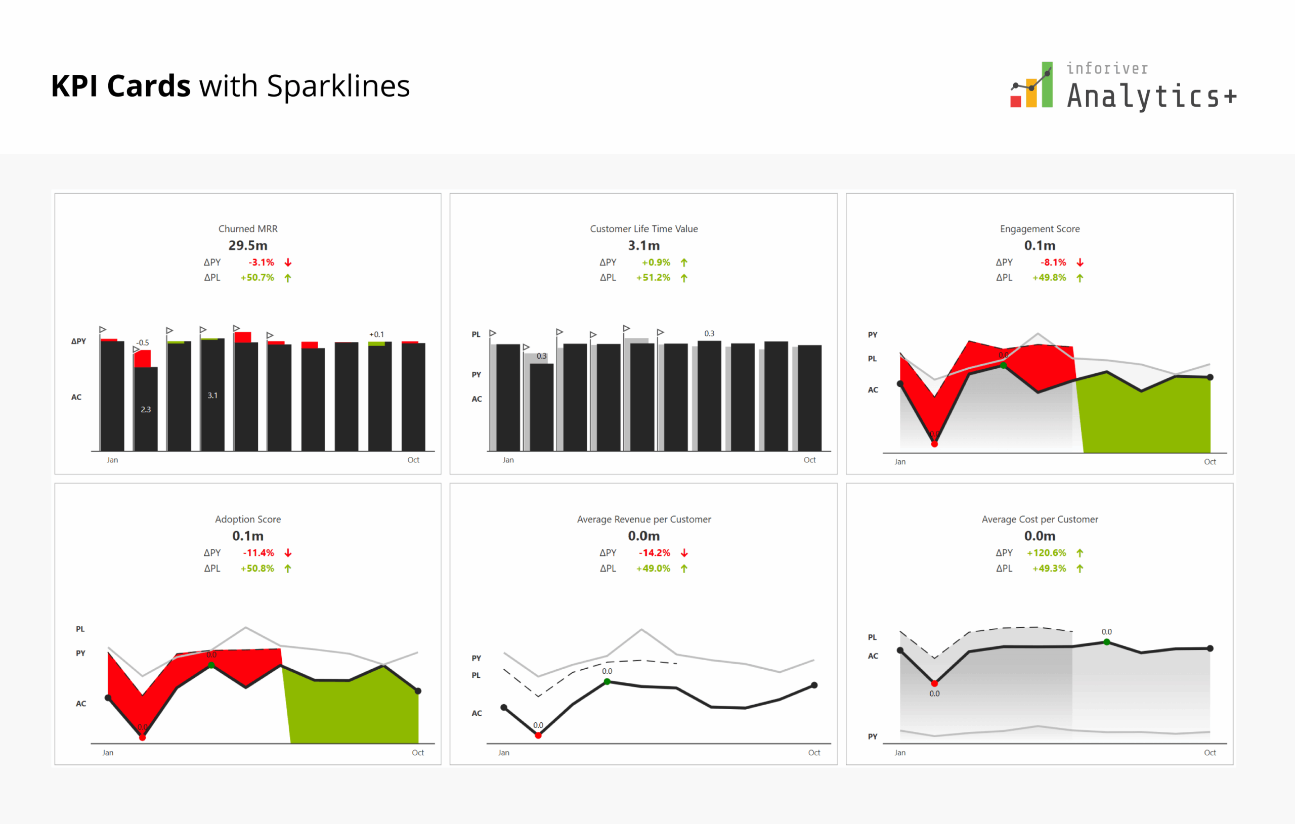
Inforiver's Analytics+ visual offers sophisticated KPI Cards specifically designed to highlight crucial organizational or financial metrics through highly informative and customizable visual elements. These cards provide a concise, dynamic representation of key performance indicators, enabling users to quickly grasp and monitor performance without needing extensive, detailed reports. Analytics+ facilitates the creation of insightful KPI dashboards, supporting features like multi-row cards that can integrate detailed insight charts.
The KPI card functionality in Analytics+ goes beyond basic displays, offering a rich set of features for dynamic and impactful data storytelling:
In essence, Inforiver Analytics+ transforms basic KPI reporting into an advanced, interactive experience, providing a truly all-in-one solution for powerful data storytelling through its versatile KPI Cards.
Inforiver Analytics+ offers sophisticated built-in themes designed for rapid formatting and establishing consistent corporate branding across all visualizations. The platform notably extends its theme capabilities with a dedicated IBCS theme option, ensuring swift and precise adherence to International Business Communication Standards (IBCS) for both charts and tables. This compliance encompasses specific series formatting conventions: Actuals (AC) are rendered in black, Previous Year (PY) in light grey, planned (PL) measures are outlined, and Forecast (FC) measures feature grey hatched lines. Alongside these visual standards, the IBCS theme applies uniform number scaling and standard chart headers.
Building upon this foundation, Inforiver Analytics+ brings in its own proprietary theme format, known as the Inforiver Theme or Flexible theme. Visualization experts often find the no-axis approach, as followed in the IBCS framework, a bit tricky. So, we give them some leeway by letting them use familiar visualization elements like axes, reference lines, custom number formatting and skip the average bar if they want. This way, the core IBCS principles stay intact, but users have the flexibility they need.

Inforiver Analytics+ offers a superior Export to PDF capability, ensuring that your meticulously crafted Power BI reports are perfectly preserved for print or formal distribution. Unlike basic exports, Inforiver's PDF output delivers high-fidelity reproduction, capturing every detail, formatting, and layout precisely as it appears in Power BI. This feature supports paginated reports, allowing complex multi-page tables and charts to be exported into a single, print-ready document, complete with consistent styling and clear pagination. This guarantees that stakeholders receive professional, pixel-perfect reports without any loss of visual integrity or crucial information.
Inforiver Analytics+ delivers exceptional performance, notably its ability to visualize up to 30K data points within a single visual, significantly surpassing the typical capacity 3.5K of many native Power BI visuals. This enhanced capability allows for highly granular data analysis, preventing the loss of crucial details that often occurs with data aggregation.
While comparing Inforiver performance with Zebra BI – Inforiver performance is significantly better as the number of data points go beyond 1K data points and we found it to be faster as the number of data points needed to visualize were higher than what is a typical limitation with Power BI. That's why customers looking to retire Tableau, Qliksense, Spotfire prefer Inforiver for their migration use cases to Power BI.
For particularly high data volumes, Inforiver Analytics+ offers a Performance Mode, which significantly accelerates the plotting of line and area charts. This mode optimizes rendering for speed, ensuring a smooth experience even with large datasets. It empowers users to visualize extensive datasets, such as

Inforiver Analytics+ is IBCS® certified and has been renewed recently. You can view the official Audit report for IBCS certification written by Jürgen Faisst.
→ Click to read the audit report

For teams evaluating cost-to-capability ratio, Inforiver delivers a significantly stronger value proposition. With lower per-user pricing and a broader feature set consolidated into a single visual, organizations often achieve more functionality at a lower total cost compared to Zebra BI.
Analytics+ is available on AppSource and our official website, with per-user pricing:
| User Range | Price (per user/month) |
|---|---|
| 2–999 users | $3.00 |
| 1,000–4,999 users | $2.40 |
| Enterprise / Domain-wide | Custom Quote |
The Inforiver BI bundle is a 4-in-1 plan that includes Analytics+, Reporting Matrix, Premium Table, and Super Filter, along with enterprise-grade support.
| User Range | Price (per user/month) |
|---|---|
| 100–999 users | $5.00 |
| 1,000–4,999 users | $4.00 |
| Enterprise / Domain-wide | Custom Quote |
Prices are subject to change. Please visit the pricing page for the most up-to-date information.
Buy Directly From Microsoft
Inforiver Analytics+ can be purchased directly from Microsoft, and Inforiver follows a transparent, public pricing model.
Zebra BI keeps its pricing and offers private, which results in surprise increases at renewal time. You can learn more about this here: https://www.reddit.com/r/PowerBI/comments/1p2w668/zebra_bi_is_the_perfect_example_why_you_should/
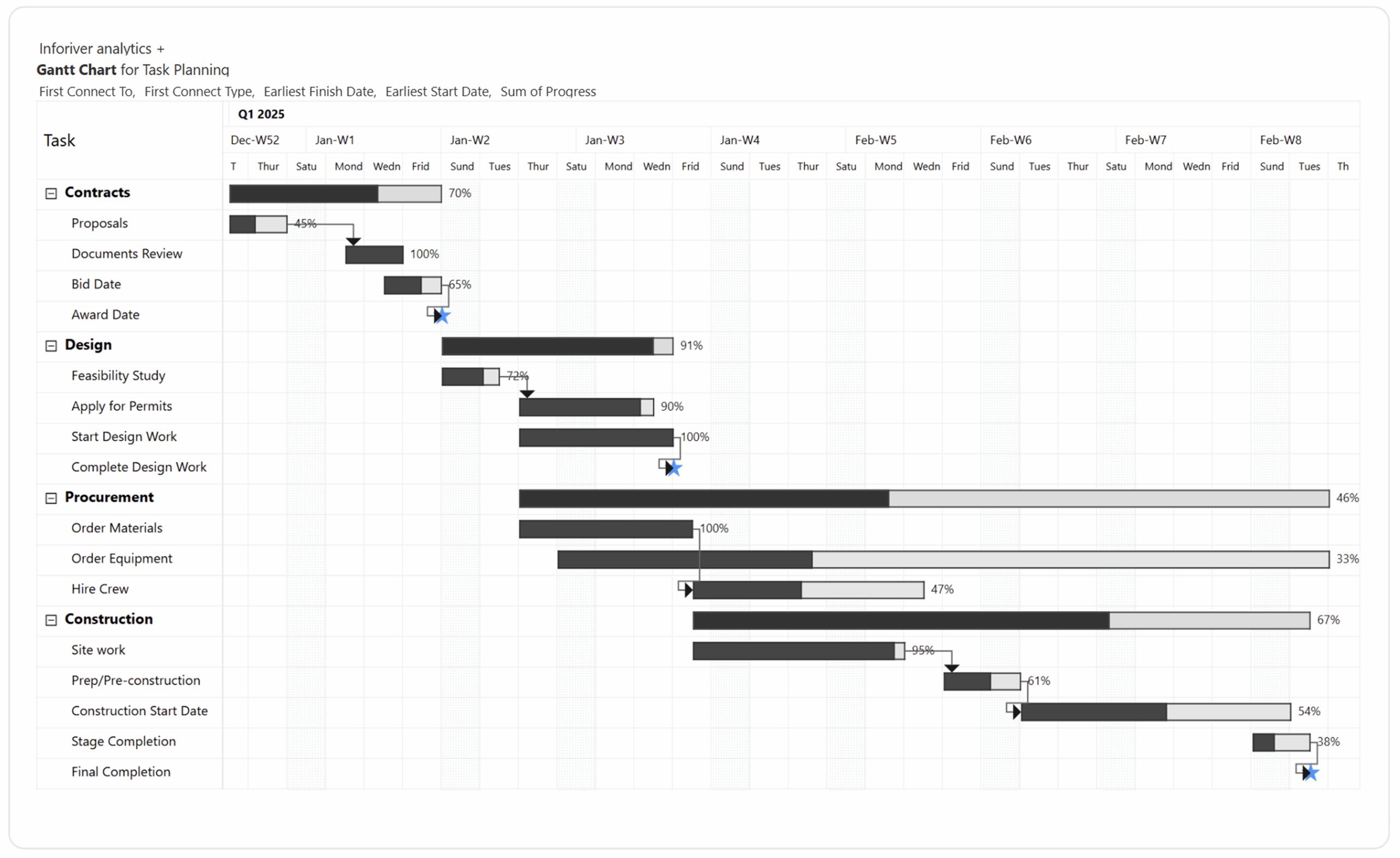
Inforiver Analytics+ stands out as a modern, enterprise-ready Power BI solution, uniquely integrating over 100+ Charts, KPI Cards, Tables, and Gantt functionalities into a single visual. This offers a distinct advantage over competitors like Zebra BI, which typically require three separate visuals for similar capabilities and notably do not include a Gantt chart in their offering.
Inforiver Analytics+ provides more comprehensive IBCS compliance with advanced chart types. Coupled with its no-code simplicity, advanced analytical features, support for 30,000+ data points, and a dedicated Performance Mode for high-volume data, Inforiver Analytics+ significantly elevates data storytelling and operational efficiency for Power BI users.
Building on these strengths, Inforiver Analytics+ introduces its flexible IBCS Theme standard, designed to make the IBCS framework more accessible to global users. With this combination of features and performance, Inforiver Analytics+ stands out as the ideal choice for users migrating from legacy tools to Power BI.
For teams seeking an even broader analytics and reporting experience, the Inforiver BI bundle extends these capabilities further by combining Analytics+ with Reporting Matrix, Premium Table, and Super Filter, delivering a complete, enterprise-ready solution for Power BI.

Inforiver helps enterprises consolidate planning, reporting & analytics on a single platform (Power BI). The no-code, self-service award-winning platform has been recognized as the industry’s best and is adopted by many Fortune 100 firms.
Inforiver is a product of Lumel, the #1 Power BI AppSource Partner. The firm serves over 3,000 customers worldwide through its portfolio of products offered under the brands Inforiver, EDITable, ValQ, and xViz.