Upcoming webinar on 'Inforiver Charts : The fastest way to deliver stories in Power BI', Aug 29th , Monday, 10.30 AM CST. Register Now
Upcoming webinar on 'Inforiver Charts : The fastest way to deliver stories in Power BI', Aug 29th , Monday, 10.30 AM CST. Register Now
Power BI for project management is rapidly reshaping how enterprise Project Management offices (PMO) operate. Traditional tools such as spreadsheets, manually updated trackers, and static slide decks were built for a slower era of delivery. They captured information but could not keep up with the speed of today’s distributed programs, Agile release trains, and continuous delivery cycles.
As organizations scale, leaders need reporting that is automated, real-time, and aligned across every team. This is where Power BI for Project Management becomes the governance backbone: a platform that standardizes data, surfaces risks early, and gives executives a single source of truth for decision making.
As projects scale and teams become more distributed, legacy tools start breaking down. Spreadsheets create versioning chaos. Slide decks lose context. Email updates get lost. Each team speaks a different status language, and visibility fades.
Power BI bridges these gaps. With automated refreshes, centralized models, and role-based access, it brings the entire program into a shared rhythm. Executives, program managers, and delivery teams finally view the same information with complete consistency.
Power BI does more than visualize data; it builds governance discipline. Once reporting is standardized, teams can focus on higher value conversations such as dependencies, risks, delivery readiness, and long-range planning.
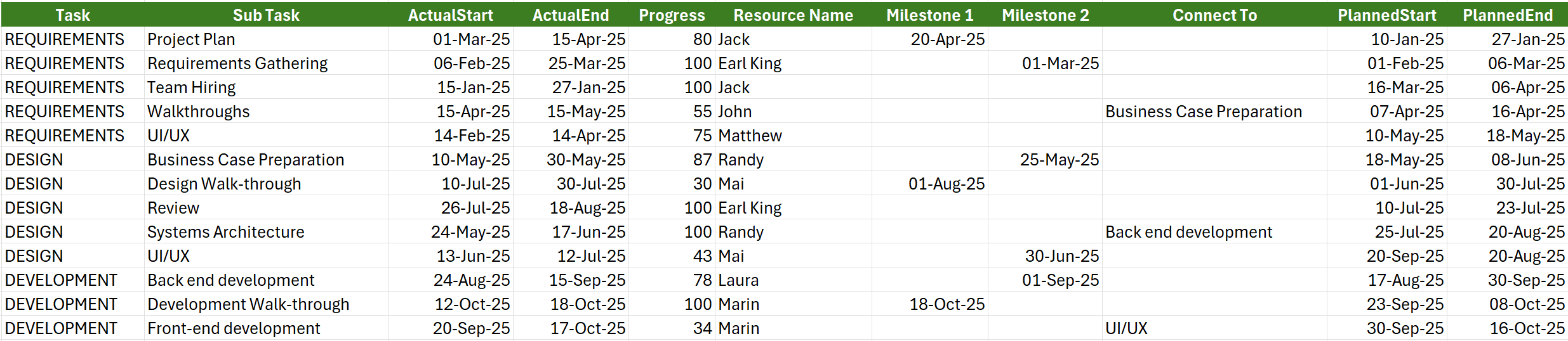
Figure 1:Project Management data shown in a spreadsheet

Figure 2: Project Management data visualized using Gantt Chart in Power BI
Every effective project report begins with a strong data model. Without it, dashboards look impressive but fail to answer critical questions. A well-designed project dataset includes:
Once these components are in place, teams reduce manual efforts, eliminate conflicting reports, and support richer stakeholder conversations. This naturally evolves into milestone driven reporting; a format executives rely on for clarity and decision making.
Executives do not manage tasks. They manage outcomes. Milestones provide a concise and meaningful summary of delivery commitments and highlight where support is needed.
Milestones help executives understand:
Power BI milestone visuals simplify communication by providing:
With clear milestone reporting, leadership discussions shift from granular task updates to strategic interventions that improve delivery outcomes.
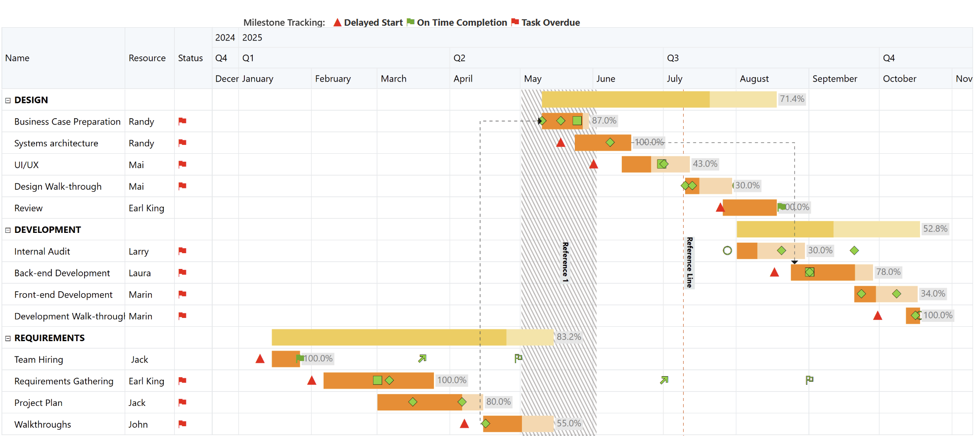
Figure 3: Milestone Tracking Dashboard built using Inforiver Analytics+ showcasing phase-wise progress, dependencies, and schedule status across the project timeline.
From here, the narrative naturally shifts from daily execution to broader planning through strategic roadmaps.
While task lists focus on execution, roadmaps focus on alignment. They help leaders see how initiatives line up across quarters and functions, giving them a panoramic view of the organization’s delivery trajectory.
Executives use roadmaps to answer:
Inforiver Analytics+ enhances roadmap creation by offering clean initiative bars, progress indicators, and dependency visualization that help PMOs communicate strategic intent with clarity.
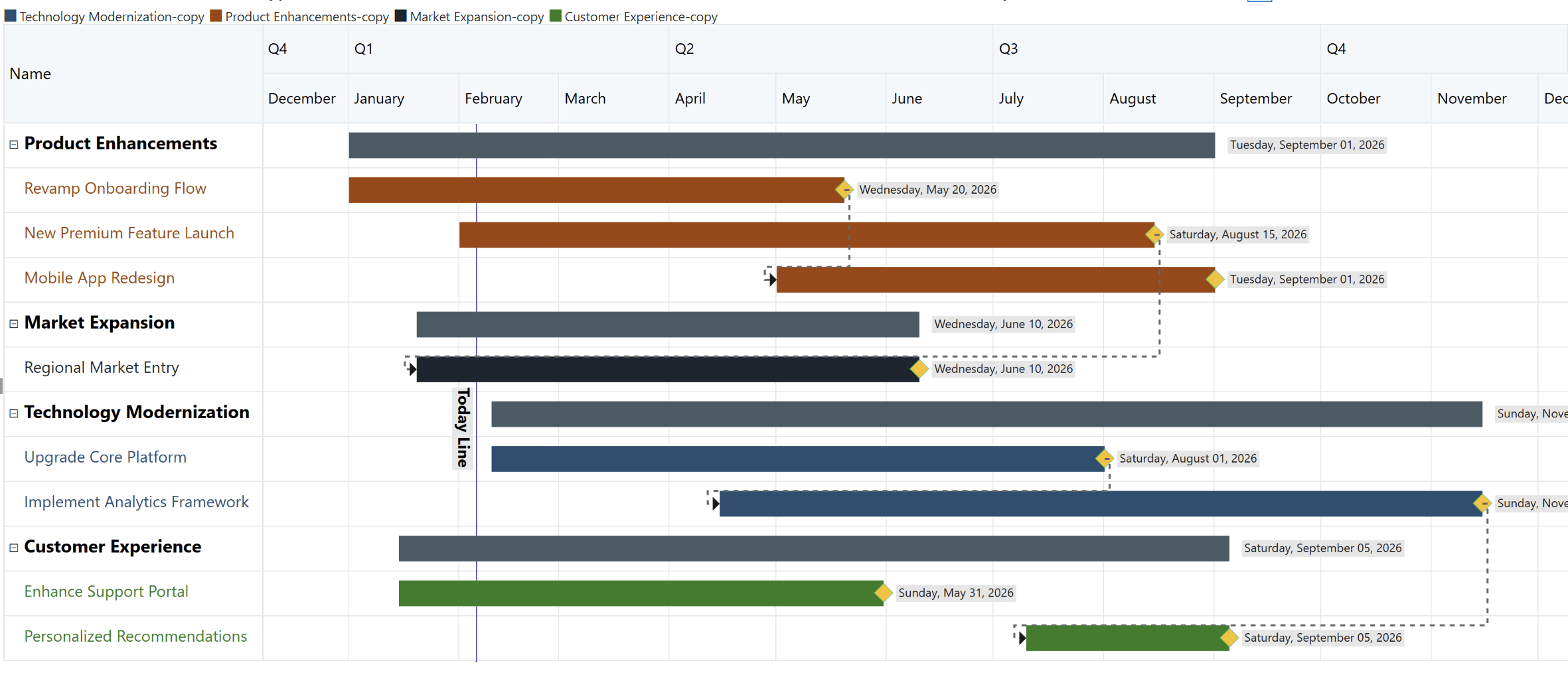
Figure 4: Strategic Roadmap Overview illustrating major initiatives, timelines, and cross-functional priorities driving business growth.
Power BI transforms day to day updates into meaningful insights through:
RAG Indicators
Instant visibility into project health using Red, Amber and Green indicators.
KPI Cards
Overdue milestones, schedule variance, blockers, and risks.
Progress Summaries
Heatmaps, Gantt variance views, and slippage analytics reveal bottlenecks and patterns.
These signals help executives make faster, more informed decisions without diving into granular task data.
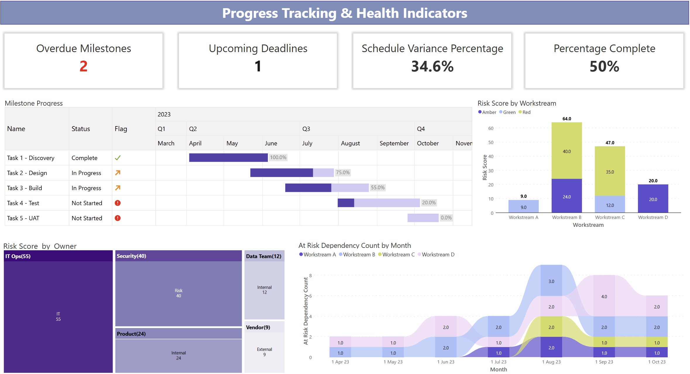
Figure 5: Project Health Snapshot highlighting milestone progress, schedule variance, completion status, and risk hotspots.
This becomes especially powerful when used across multiple functions.
Large programs often involve multiple functions with different working styles. Power BI standardizes governance across these teams by aligning:
This creates a single governance backbone that scales across the organization and supports alignment in IT, Operations, Marketing, Compliance, Product, and more.

Figure 6: Unified Cross‑Department Delivery View providing end‑to‑end visibility into status, ownership, and execution health.
To make this reporting efficient and polished, PMOs often adopt Enterprise solutions like Inforiver Analytics+ to meet complex and advanced reporting needs.
Choosing the right Gantt chart determines how effectively your organization communicates project progress and risks. While Power BI includes a native Gantt visual, it is not designed for enterprise-grade program management.
Below is a clear, side-by-side comparison:
| Capability Area | Native Power BI Gantt | Enterprise Gantt (Inforiver Analytics+) |
| Purpose & Complexity | Designed for simple project timelines | Built for enterprise programs and multiteam delivery |
| Dependencies | ❌ Not supported | ✅ Full dependency connectors (FS, SS, FF, SF) |
| Milestone Support | Basic milestone markers | Advanced milestones with icons, shapes, colours & status |
| Conditional Formatting | Very limited | Robust RAG rules, milestone slippage highlighting, icon sets & alerts |
| Customization | Minimal options | Extensive styling options with colours, sizing, font styles & more |
| Export Quality | Standard Power BI export only | Presentation ready exports (PPT, PDF), pixel perfect |
| Ideal Use Case | Small teams or basic projects | Enterprise PMOs, regulatory programs, multiteam initiatives |
This gap between native and enterprise Gantt capabilities is exactly where Inforiver Analytics+ steps in, giving PMOs a purpose-built visual storytelling layer on top of Power BI.
Inforiver Analytics+ Gantt eliminates the friction of building executive ready reports in Power BI. Instead of spending hours formatting visuals and exporting decks, PMOs get ready to use tools designed for clarity and structure.
This ensures PMOs spend more time improving delivery and less time maintaining reports.
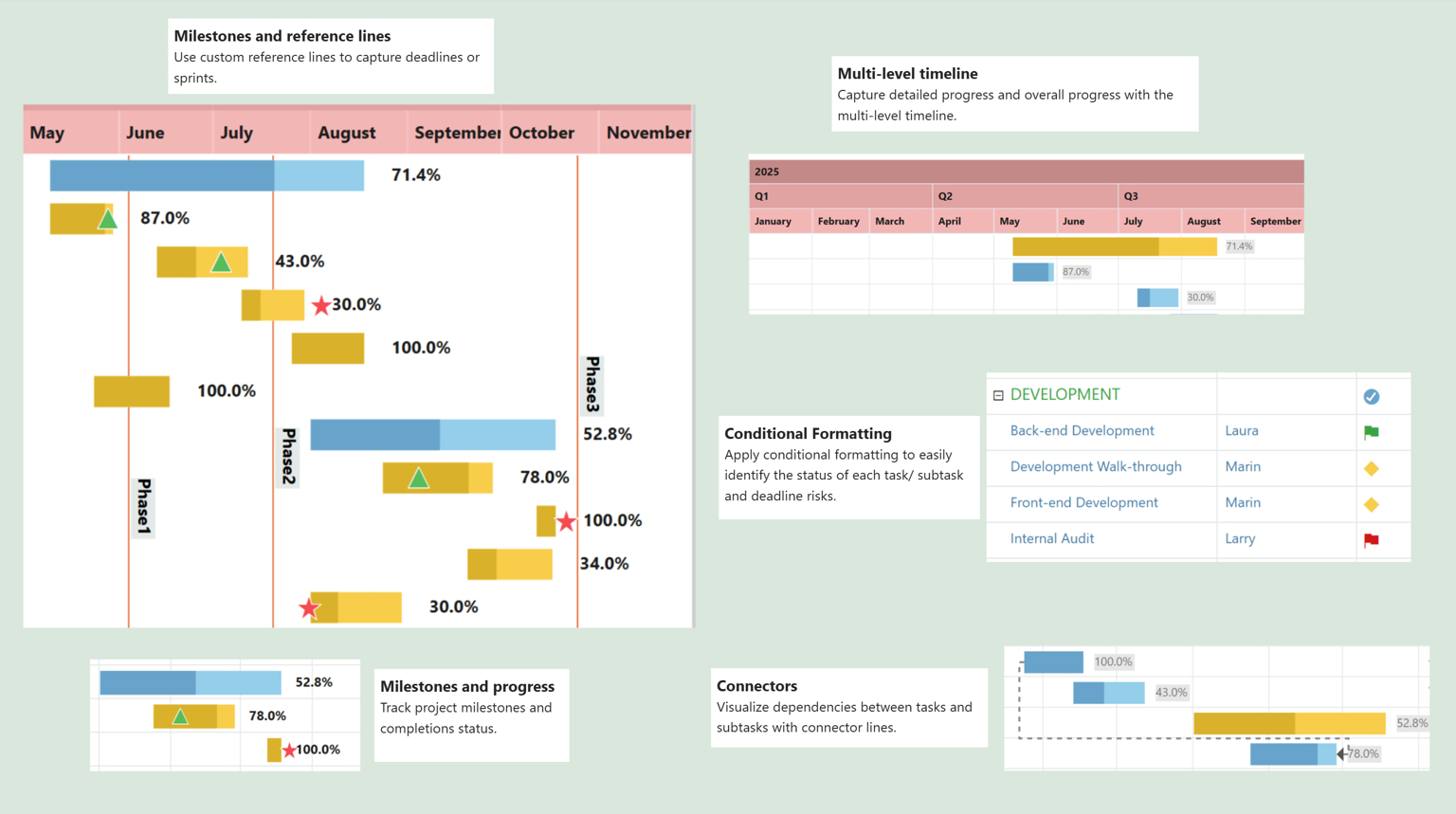
Figure 7: Inforiver Analytics+ Gantt: Executive‑ready project reporting in Power BI with automated timelines, milestone tracking, dependency visibility, and built‑in governance without manual formatting.
Now let us look at how real organizations use this setup to drive predictability.
A SaaS company managing a major product release consolidates Engineering, QA, Security, and Marketing timelines into one roadmap. Leadership quickly identifies sequencing conflicts, slippage against baseline, and readiness for launch milestones.
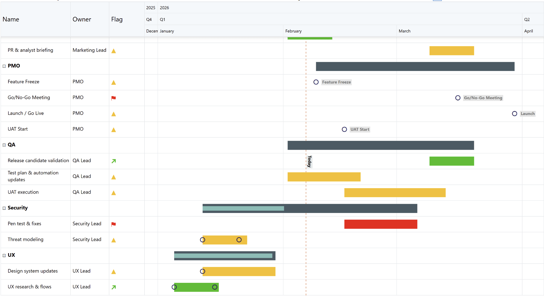
Figure 8: SaaS Product Release Roadmap: A unified view of Engineering, QA, Security, UX, and Marketing timelines, highlighting dependencies, launch readiness milestones, and risks to delivery.
A pharmaceutical PMO uses Power BI with Inforiver to track documentation, validation steps, and compliance milestones. High risk items automatically shift to Red or Amber based on slippage, giving executives a clear signal of submission readiness.
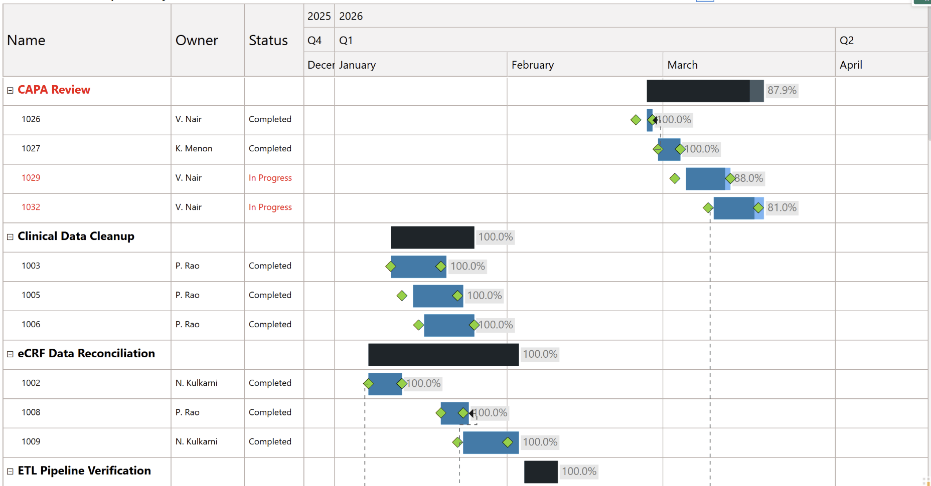
Figure 9: Regulatory Submission Tracking: End‑to‑end visibility into documentation, validation, and compliance milestones with automated risk signals for executive oversight.
These examples show how structured reporting helps organizations manage complex initiatives with confidence.
Project management is no longer only about tracking tasks. It is about creating predictable delivery. Power BI allows PMOs to move from manual reporting to automated, interactive governance that supports real time visibility.
When combined with Inforiver Analytics+ Gantt Chart, teams gain a powerful visual storytelling layer that simplifies dependencies, milestones, progress tracking, and leadership communication. The result is better alignment, earlier risk identification, and stronger delivery outcomes across the organization.
Download or try it out here: Start your free trial of Inforiver Analytics+ for Power BI
Related Reading: Gantt Chart for Power BI: Timelines & Project Tracking

Inforiver helps enterprises consolidate planning, reporting & analytics on a single platform (Power BI). The no-code, self-service award-winning platform has been recognized as the industry’s best and is adopted by many Fortune 100 firms.
Inforiver is a product of Lumel, the #1 Power BI AppSource Partner. The firm serves over 3,000 customers worldwide through its portfolio of products offered under the brands Inforiver, EDITable, ValQ, and xViz.