Upcoming webinar on 'Inforiver Charts : The fastest way to deliver stories in Power BI', Aug 29th , Monday, 10.30 AM CST. Register Now
Upcoming webinar on 'Inforiver Charts : The fastest way to deliver stories in Power BI', Aug 29th , Monday, 10.30 AM CST. Register Now
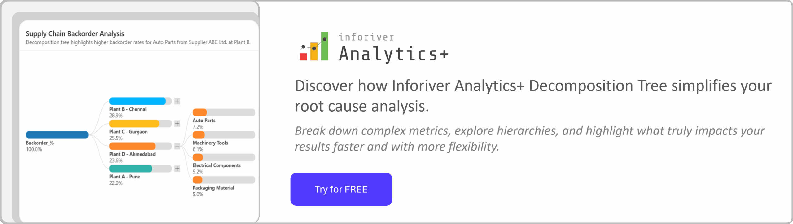
A Decomposition Tree is a powerful visualization for root cause analysis and drill-down exploration in Power BI. It helps you understand how different factors contribute to a single result, whether that’s total revenue, expenses, or any other business metric.
By starting with one key value, users can interactively break it down across multiple dimensions such as Region, Product, or Customer Segment, gaining instant clarity into what drives performance. This makes the decomposition tree ideal for uncovering trends, pinpointing issues, and explaining business outcomes with confidence.
In this post, we’ll explain how to interpret and apply decomposition trees in Power BI, explore their use for root cause analysis, and show how Inforiver Analytics+ enhances them with richer layouts, formatting flexibility, and advanced customization for professional reporting.
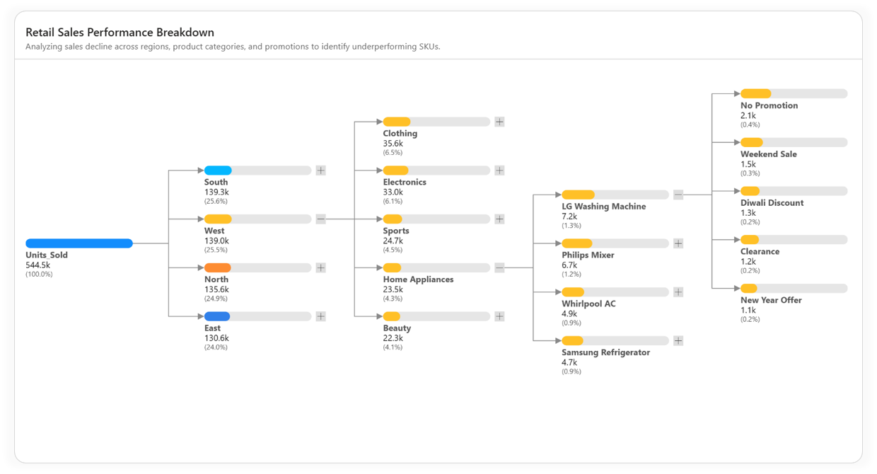
A Decomposition Tree visual in Power BI allows you to analyze one measure through multiple categorical dimensions, one level at a time. It provides an interactive, hierarchical view where each branch represents a breakdown of the total value, letting users explore “what contributes to what” in a clean, structured way.
For example, you can start with Total Sales and then drill down by Region → Product Category → Channel to quickly identify which combination contributes most to the overall figure. It’s a visual approach that replaces manual filters and static tables with intuitive, on-demand insights.
This makes the Decomposition Tree especially useful for scenarios such as:
While Power BI’s built-in decomposition tree offers a foundation for exploratory analysis, Inforiver Analytics+ takes it a step further transforming it into a presentation-ready, professional visual built for real business reporting.
As a Microsoft Power BI Certified Visual, the Inforiver Analytics+ decomposition tree provides advanced customization, rich formatting controls, and flexible layout options that help you create clean, insightful, and polished visuals. It’s designed for analysts and business professionals who need both analytical depth and executive-level presentation quality without writing a single line of code.
Now that we’ve covered the basics, let’s explore the core features that make this visual a powerful addition to your Power BI advanced analytics toolkit, including layout flexibility, formatting, labeling, and customization options.
Here are the key features available in the Inforiver Analytics+ Decomposition Tree:
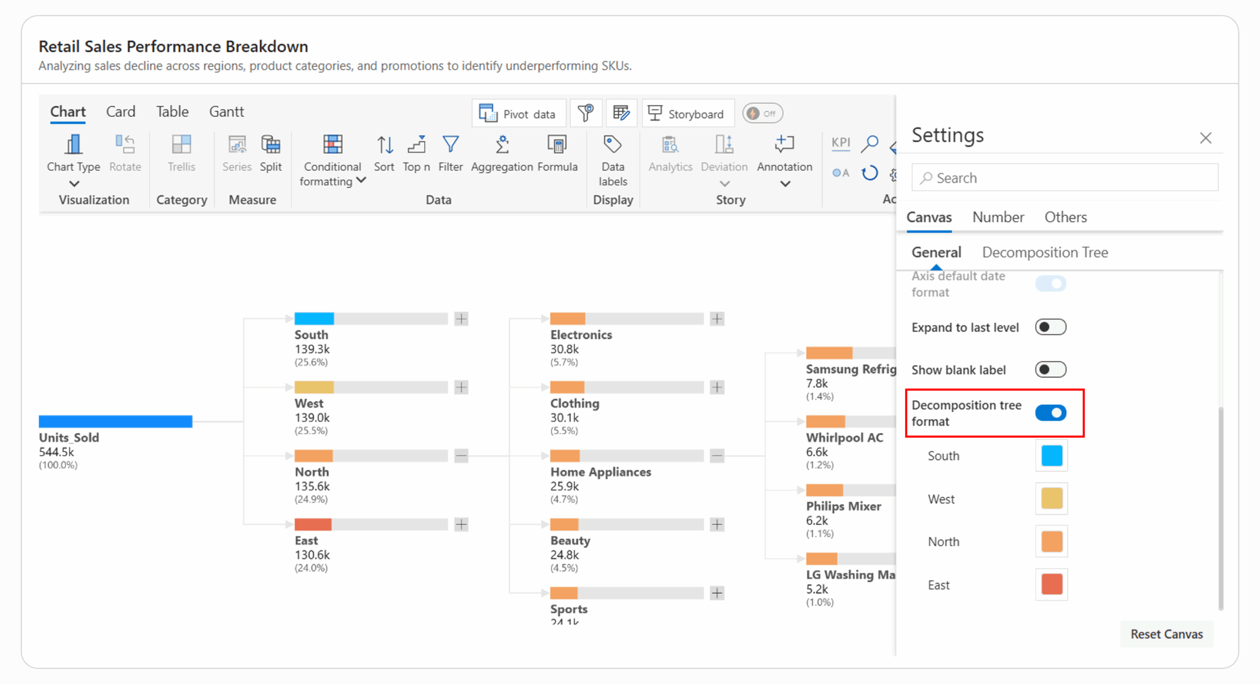
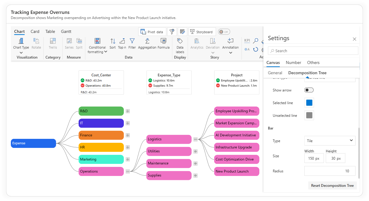
The Inforiver Analytics+ Decomposition Tree lets you apply different colors to each parent category with a single click. This helps you visually separate branches like North, South, East, and West in the example below for quick comparison and better readability.
Unlike the native Power BI decomposition tree, which uses the same color for all nodes, Inforiver allows complete control over colors to match your data story or brand theme.
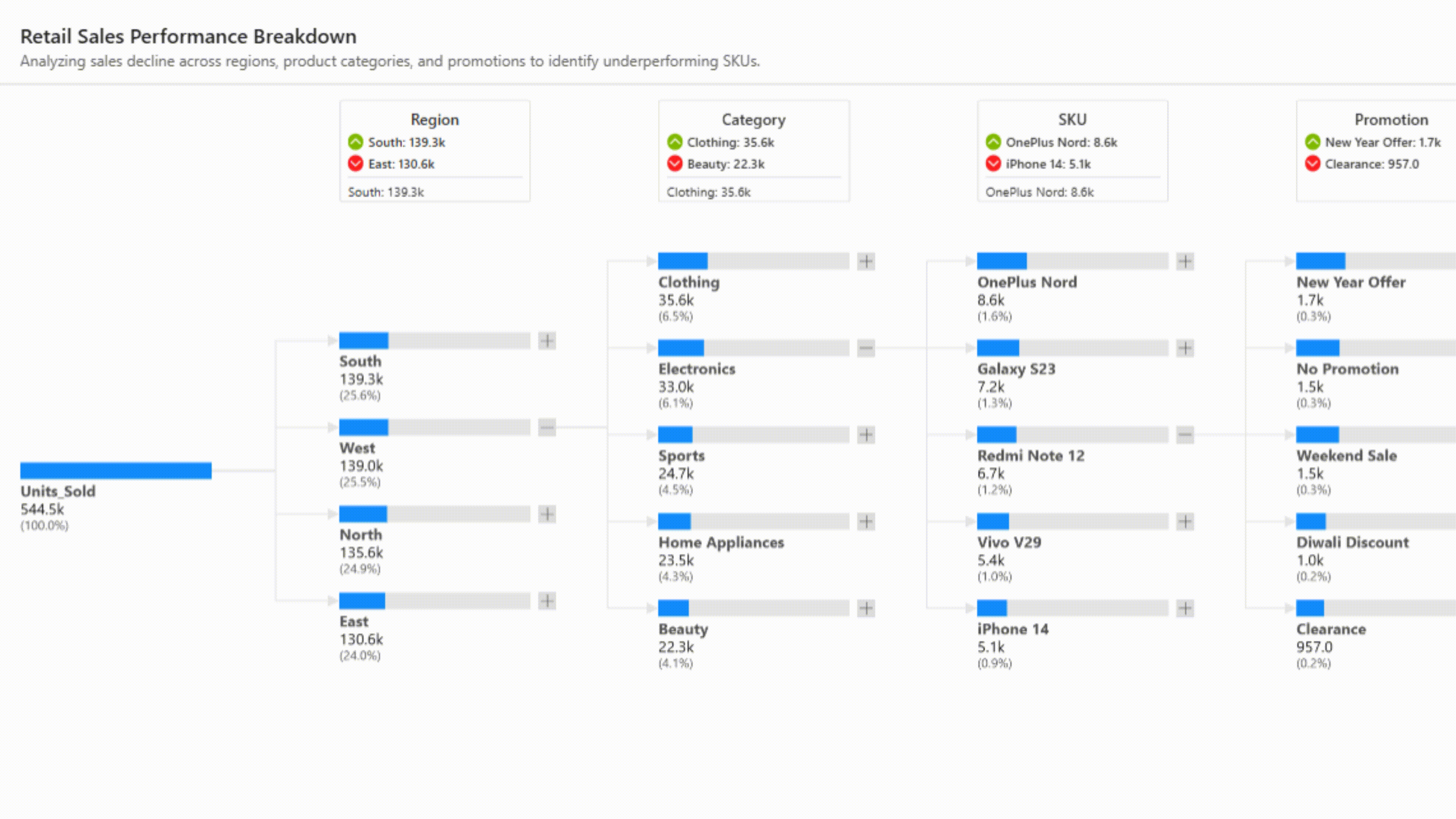
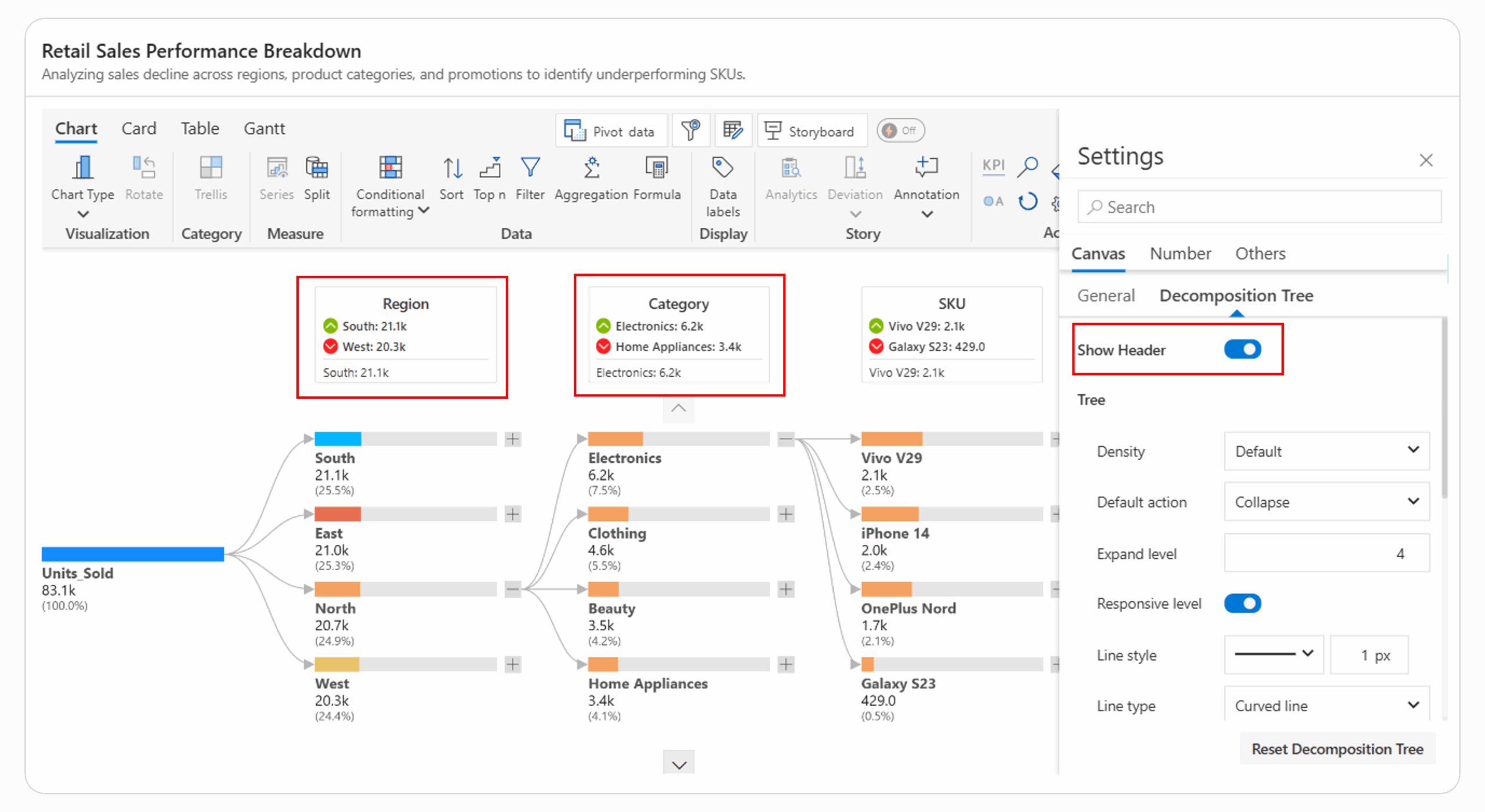
The Inforiver Analytics+ Decomposition Tree offers a Show Header option that displays each hierarchy name along with its highest and lowest values with formatted icons to visually highlight the top and bottom contributors, making it easy to identify best and least-performing categories.
The Inforiver Analytics+ Decomposition Tree provides three bar display types - Card, Progress Bar, and Tile, allowing users to visualize metrics in the most effective and visually appealing way for their reports.
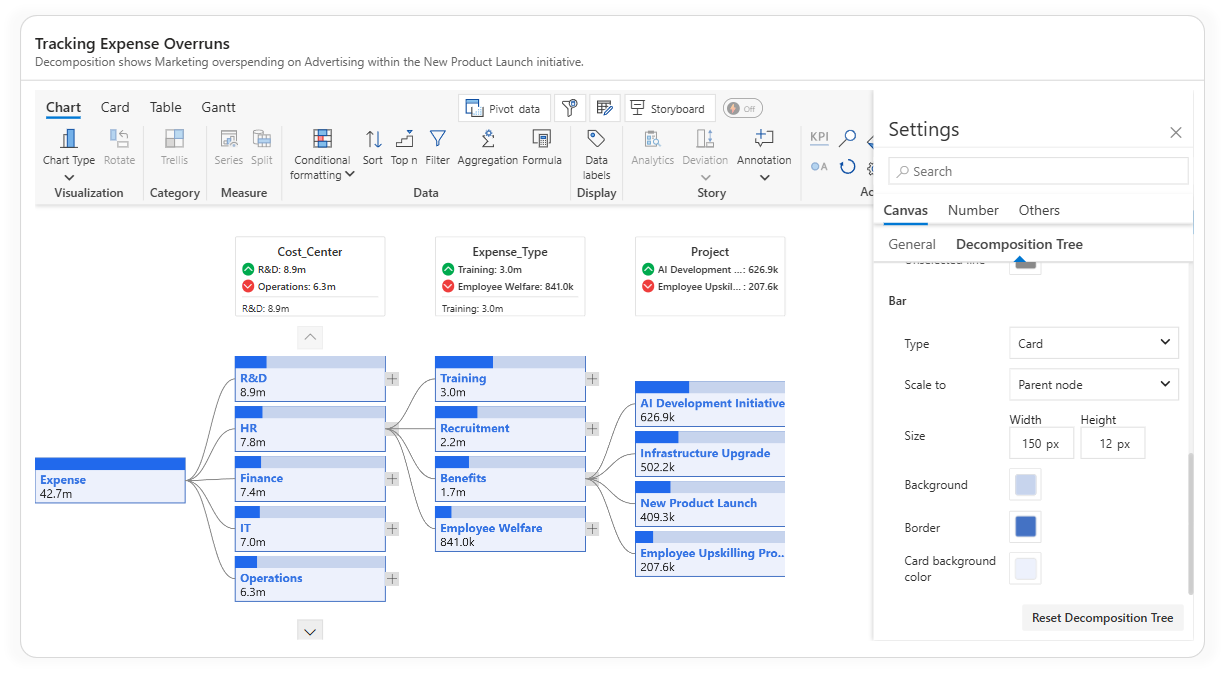
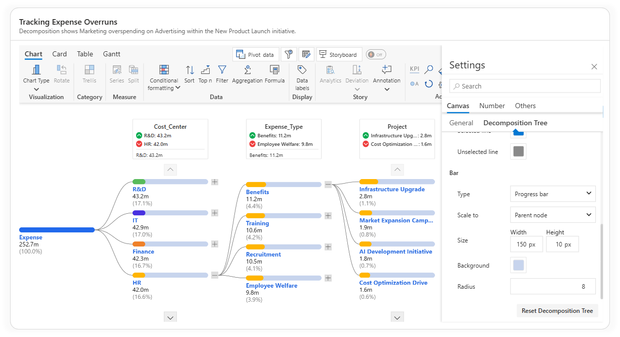
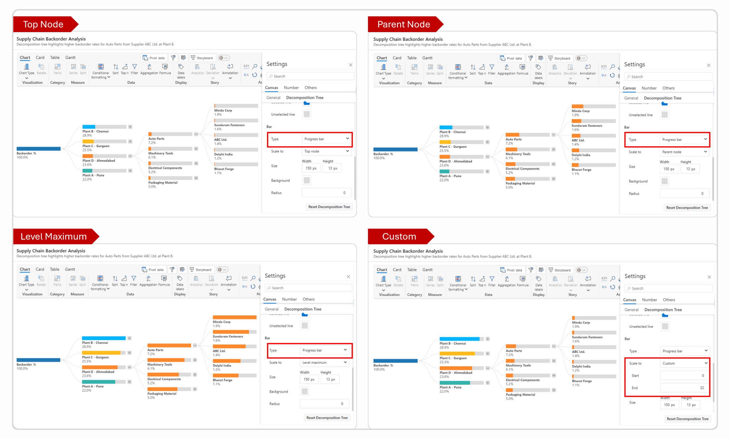
Inforiver Analytics+ Decomposition Tree offers flexible Scale To options, allowing users to control how values are scaled and compared across different hierarchy levels. This ensures accurate representation and easy interpretation of data, regardless of default size.
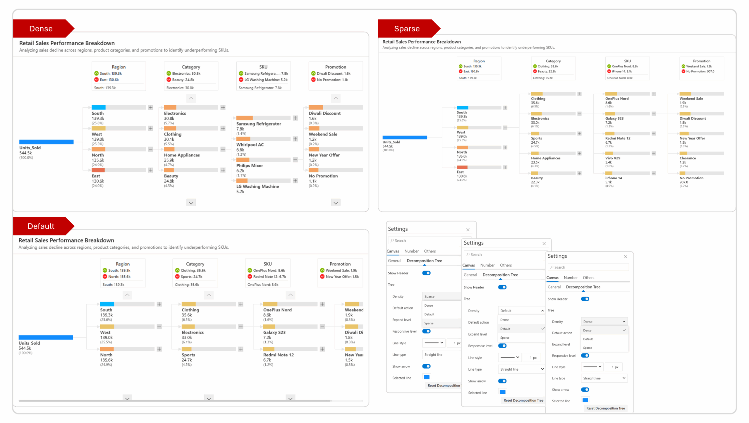
The Inforiver Analytics+ Decomposition Tree provides three density settings - Dense, Default, and Sparse, allowing you to control how compact or spaced-out the tree layout appears.
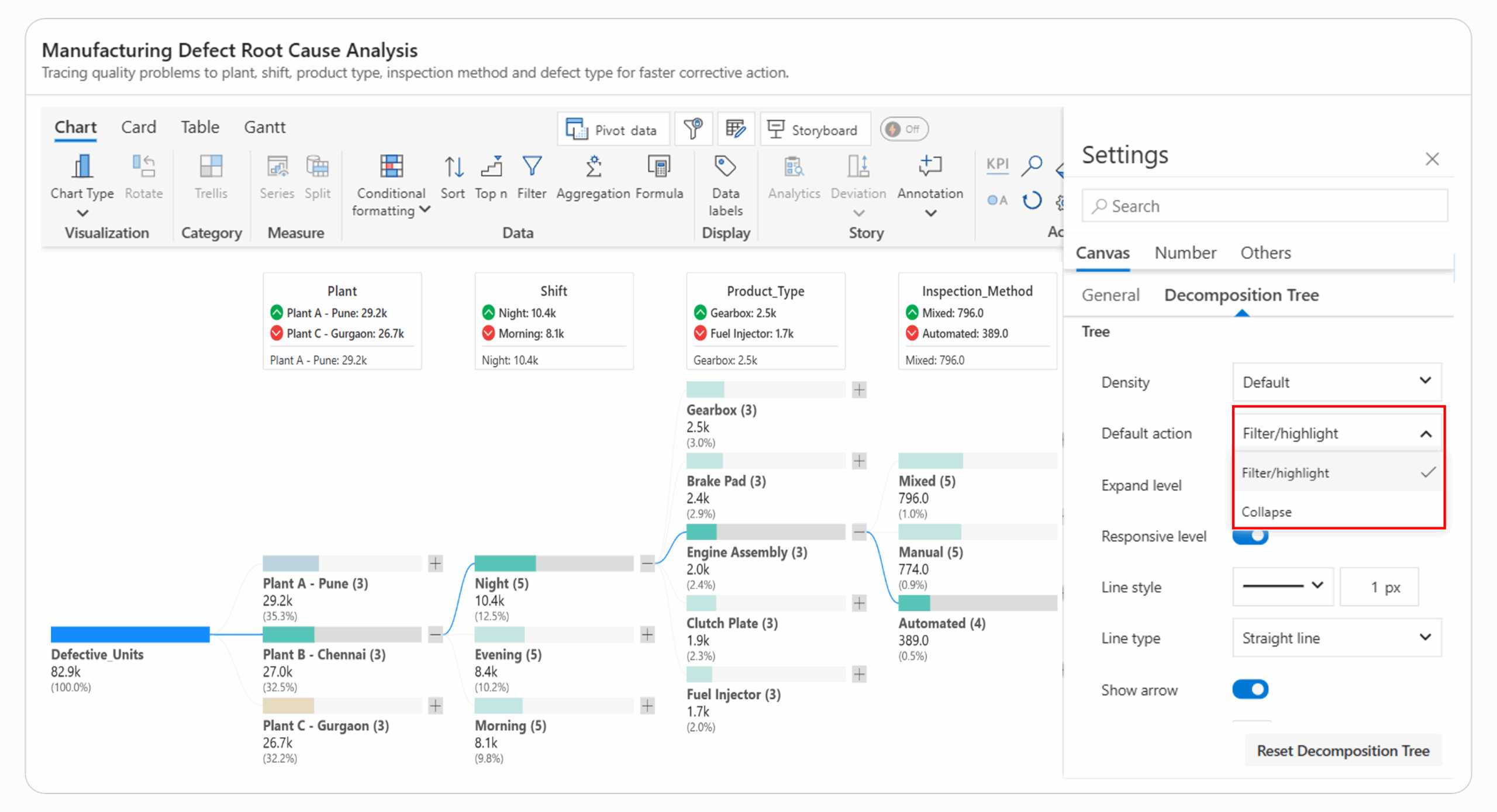
In the Inforiver Analytics+ Decomposition Tree, the Default Action setting controls how the visual responds when you click on a node. You can choose between two modes - Filter/Highlight and Collapse based on how you want to explore the hierarchy.
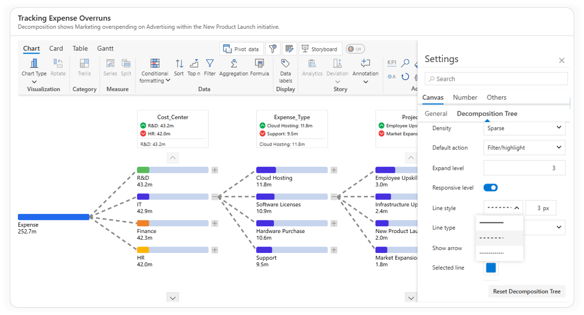
The Inforiver Analytics+ Decomposition Tree provides fully customizable line styling options, allowing users to design clear and visually consistent connections between nodes.
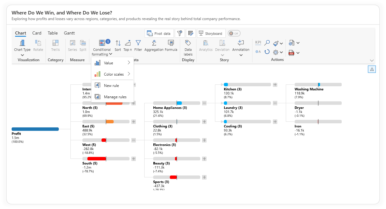
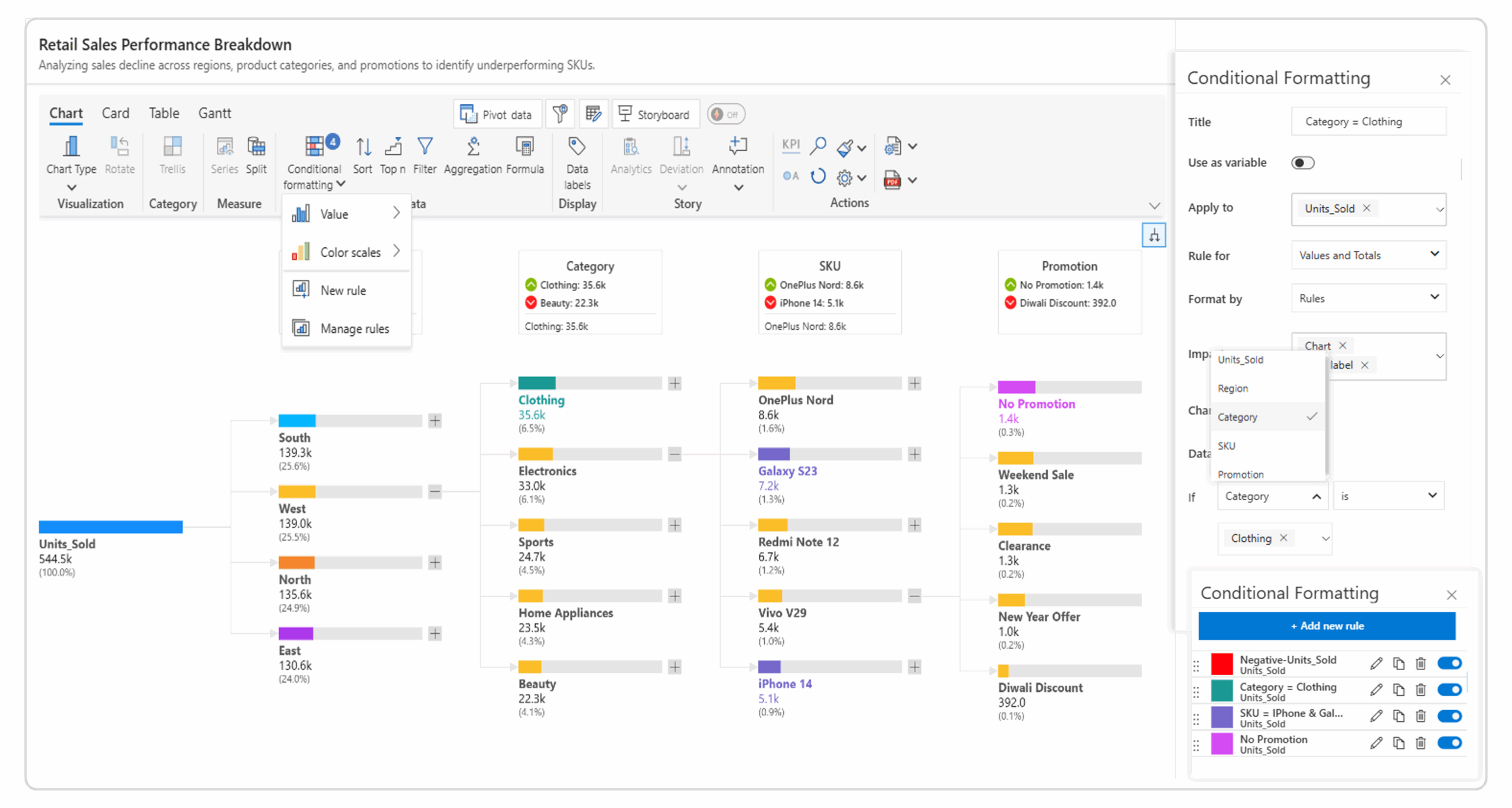
The Inforiver Analytics+ Decomposition Tree offers fully customizable conditional formatting to highlight patterns, performance gaps, and key contributors with clear visual cues.
You can set measure based rules such as values above or below a target, or define level specific rules for different parts of the hierarchy. For more advanced needs, you can combine conditions with AND or OR logic and choose whether the formatting appears on bars, data labels, or percentages.
These options make your decomposition tree more intuitive and help important insights stand out immediately.
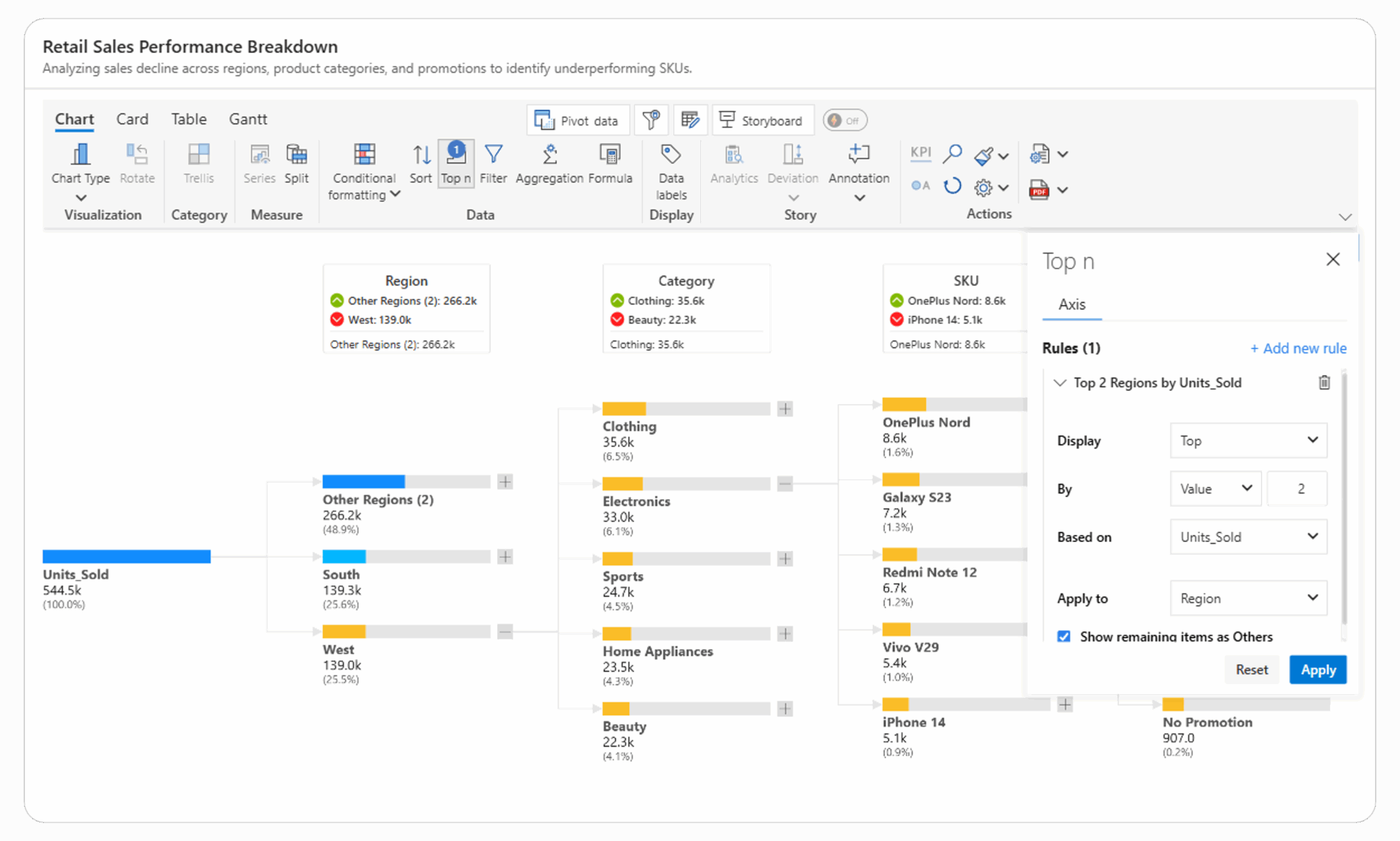
The Inforiver Analytics+ Decomposition Tree includes a Top N / Bottom N filtering feature that helps you focus on the most important contributors within your hierarchy. You can apply these filters at any hierarchy level to display only the top or bottom performers based on your selected measure such as Units Sold or Revenue.
It also provides the option to show remaining items as “Others”, keeping your view clean while still preserving total context. This makes it easy to highlight key categories, compare top drivers, and simplify complex hierarchies for faster, more focused analysis.
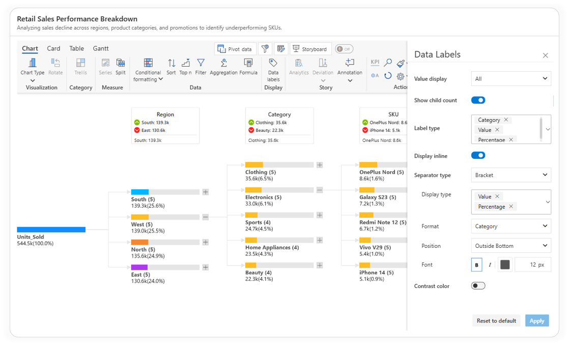
The Inforiver Analytics+ Decomposition Tree provides comprehensive customization for data labels, helping you control exactly what details appear within each node and how they’re displayed.
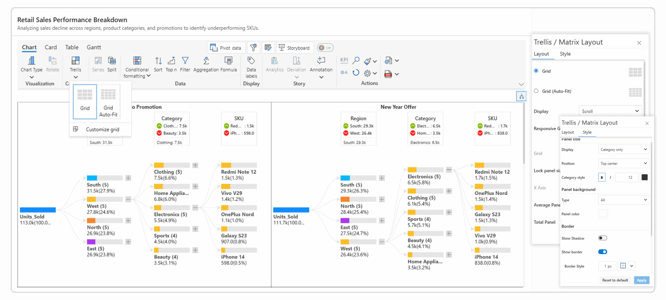
The Inforiver Analytics+ Decomposition Tree offers a Trellis/ small multiples layout that lets you display multiple decomposition trees side by side for easy comparison. You can choose between Grid and Grid Auto-Fit layouts, define rows and columns, and use scroll or pagination when panels exceed the canvas space.
Each panel can be customized with titles, background colors, borders, and shadows, allowing you to create clean, organized visuals. This layout helps analyze data across categories or scenarios simultaneously, making comparisons clearer and reports more interactive.
The Inforiver Analytics+ Decomposition Tree transforms traditional root cause analysis into an interactive, presentation-ready experience inside Power BI. With advanced formatting options, customizable layouts, conditional logic, and smart display controls, it allows you to explore complex hierarchies and explain insights clearly without writing a single line of code.
Whether you’re analyzing performance drivers, identifying key contributors, or presenting executive summaries, Inforiver Analytics+ gives you the flexibility to build visuals that are both analytically rich and visually polished.
Take your Power BI decomposition tree to the next level with Inforiver Analytics+.
Start your free trial and discover smarter, more intuitive ways to explain your data.

Inforiver helps enterprises consolidate planning, reporting & analytics on a single platform (Power BI). The no-code, self-service award-winning platform has been recognized as the industry’s best and is adopted by many Fortune 100 firms.
Inforiver is a product of Lumel, the #1 Power BI AppSource Partner. The firm serves over 3,000 customers worldwide through its portfolio of products offered under the brands Inforiver, EDITable, ValQ, and xViz.