Inforiver

Upcoming webinar on 'Inforiver Charts : The fastest way to deliver stories in Power BI', Aug 29th , Monday, 10.30 AM CST.    Register Now

Upcoming webinar on 'Inforiver Charts : The fastest way to deliver stories in Power BI', Aug 29th , Monday, 10.30 AM CST.    Register Now

Combo Chart

Inforiver Analytics+ Combo Chart brings you a powerful suite of horizontal and vertical combo charts, multi-axis charts, and stacked combo charts to enhance your Power BI dashboards. Designed for enterprise-level visualization, this custom visual supports up to 5 Y-axis, making it ideal for complex data analysis.

Explore 100+ charts in Inforiver Analytics+ suite
Download PBIX
Column + Line
Multi Axis Chart
Column + Area
Column + Column
Stacked Column + Line
Stacked Column + Area
iframe preview
View interactive content
Combo Chart
Multi-Axis Chart
A combo chart (short for combination chart) is a type of data visualization that combines two or more chart types—typically a column chart and a line chart—into a single graph. It plot values on a dual axis representing different scale of data. This is ideal for comparison and trends.
Inforiver Combo chart supports line, area and column series types along with stacked combinations. Additionally, customizable reference lines, error bars, and conditional formatting enable you to track performance and discover hidden insights
Try for FREE

Key features

Various chart types

Chart Types

Offers combination between line, area, column and stacked column charts
IBCS compliant charts

Legend Formatting

Show legend with proper marker styling to make visual more clear
Trellis support

Trellis Support

Experience advanced trellis charts with 3 axes and multi-level small multiples.
Conditional formatting

Conditional Formatting

Apply different colors to highlight data based on business rules.
Advanced analytics and statistic

Advanced Analytics and Statistics

Provide insights with error bars, reference lines and bands.
Rich formatting

Rich Formatting

Features include ranking, sorting, legends, number formatting, aggregation, conditional formatting, and pixel-perfect export to PDF.
Pivot mode

Annotation

Enhance your storytelling options by adding comments/annotations inside the visual. Includes filter context awareness

Resources

A multi-axis chart is a type of data visualization that uses two or more axes to display different data sets on the same chart. This allows you to compare variables with different units or scales in a single view, making complex data relationships easier to understand.
This visual supports up to 5 Y-axes, with 20+ chart types and 10+ data series options, horizontal & vertical orientation, color coded axis and many more customizations.
Try for FREE

Key features

Multi Axes support

Multi Axes Support

Use up to 5 Y-axes to visualize complex datasets.

Various Chart Types

Displays the running total of data points as bars accumulate.

Data series customization

Customize from 10+ data series options to fit the available real estate
Upto 50 measures

Auto Series Order

Automatically adjust the display order of chart series based on their visibility.
Conditional formatting

Color Coded Axis

Apply the corresponding series color to the axis line and title.
Conditional formatting

Conditional Formatting

Apply different colors to highlight data based on business rules.
Advanced analytics and statistic

Advanced Analytics and Statistics

Provide insights with deviation bars, error bars, reference lines and bands
Rich formatting

Rich Formatting

Features include ranking, sorting, legends, number formatting, aggregation, conditional formatting, and pixel-perfect export to PDF

Resources

Gallery

Show More
Show Less

Featured webinar

dual-multiple-axis-charts-powerbi

Dual & multi axis charts in Power BI

Dual and multiple axis charts enable visualization of many measures in a single compact chart. Learn how to supercharge your visuals using dual and multiple axis charts in Power BI.
Watch now

Pricing

Get Combo chart family

Billed at
$9,995 Unlimited users
Buy combo chart family for your entire organization;
Buy now

Get the entire Analytics+ suite

Starts at
$3  /user/month (2 - 999 users)
$2.40  /user/month (1000+ users)
Buy all the 100+ Charts, KPI cards and Tables;
Buy now

Get Waterfall chart Family

Billed at

$9,995

/year
Buy waterfall chart family for your entire organization;
Buy now

Get Combo chart family

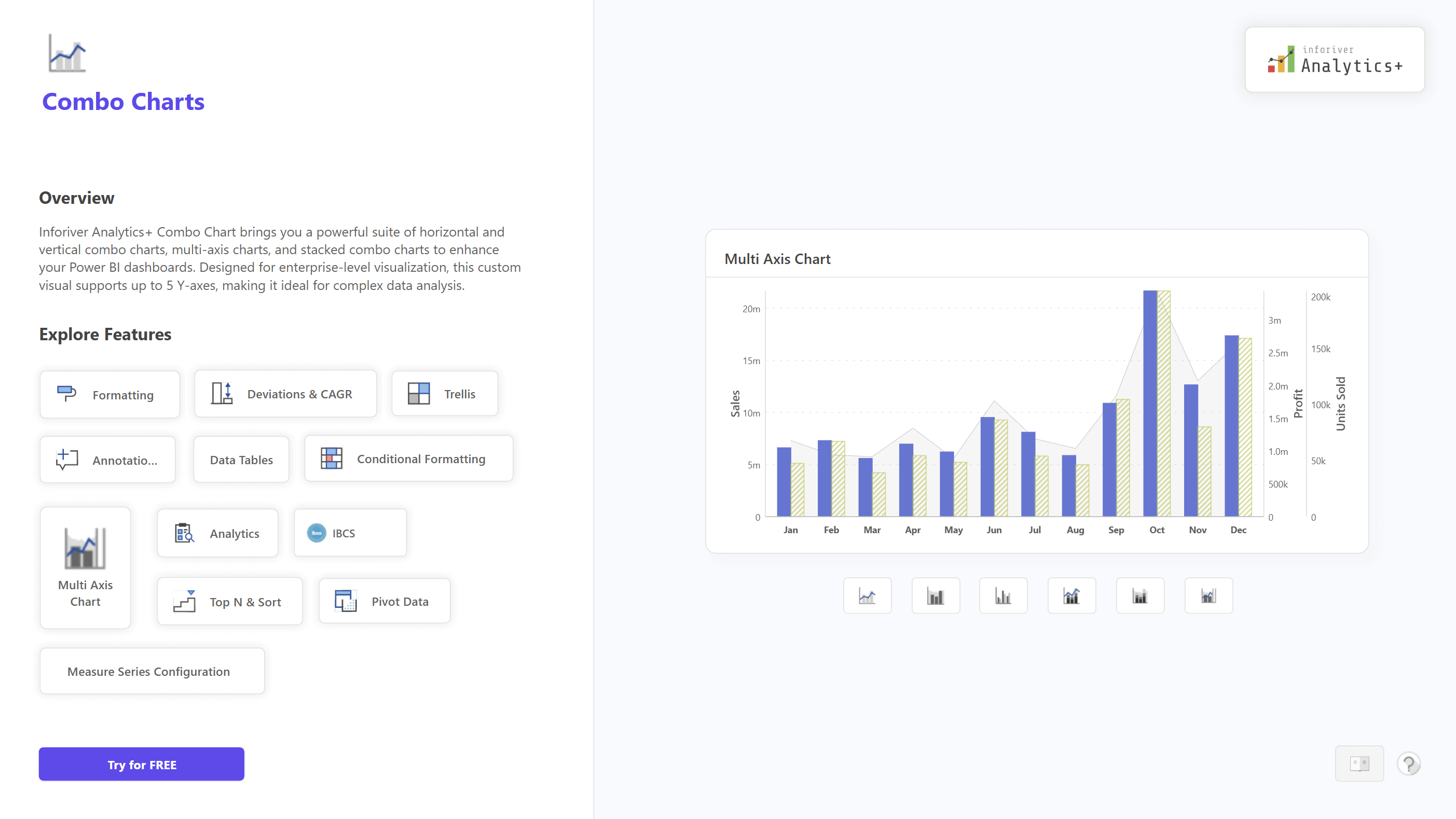
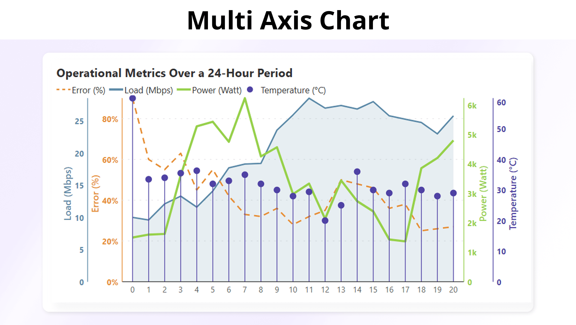
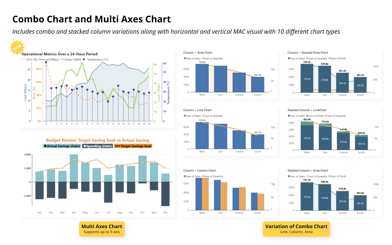
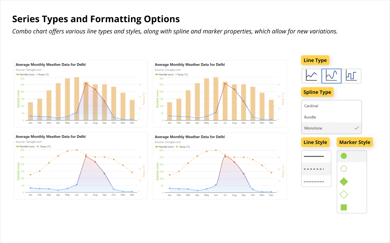
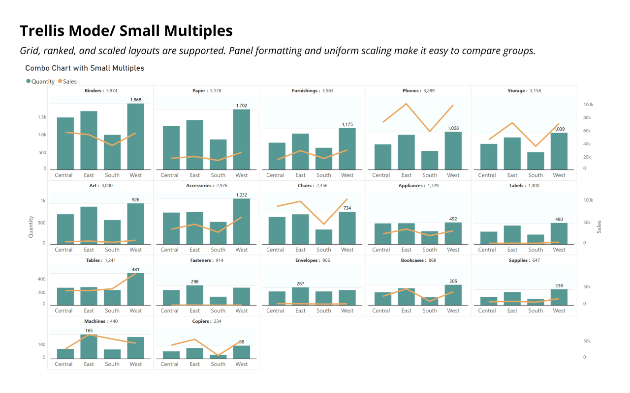
The Ultimate Guide to Dual & Multi Axis in Power BI

Explore all types of combo chart that you can create in Power BI without using scripting or DAX.​

dual-multi-axis-ebook

Get Inforiver brochure

Maximize your business potential with Inforiver's paginated reporting, data entry, planning & budgeting capabilities
Download now
Inforiver

Inforiver helps enterprises consolidate planning, reporting & analytics on a single platform (Power BI). The no-code, self-service award-winning platform has been recognized as the industry’s best and is adopted by many Fortune 100 firms.

Inforiver is a product of Lumel, the #1 Power BI AppSource Partner. The firm serves over 3,000 customers worldwide through its portfolio of products offered under the brands Inforiver, EDITable, ValQ, and xViz.

linkedin facebook pinterest youtube rss twitter instagram facebook-blank rss-blank linkedin-blank pinterest youtube twitter instagram