Upcoming webinar on 'Inforiver Charts : The fastest way to deliver stories in Power BI', Aug 29th , Monday, 10.30 AM CST. Register Now
Upcoming webinar on 'Inforiver Charts : The fastest way to deliver stories in Power BI', Aug 29th , Monday, 10.30 AM CST. Register Now
I’m proud to share the progress our organization has made so far in 2024—and into 2025—in delivering on our original vision and roadmap.


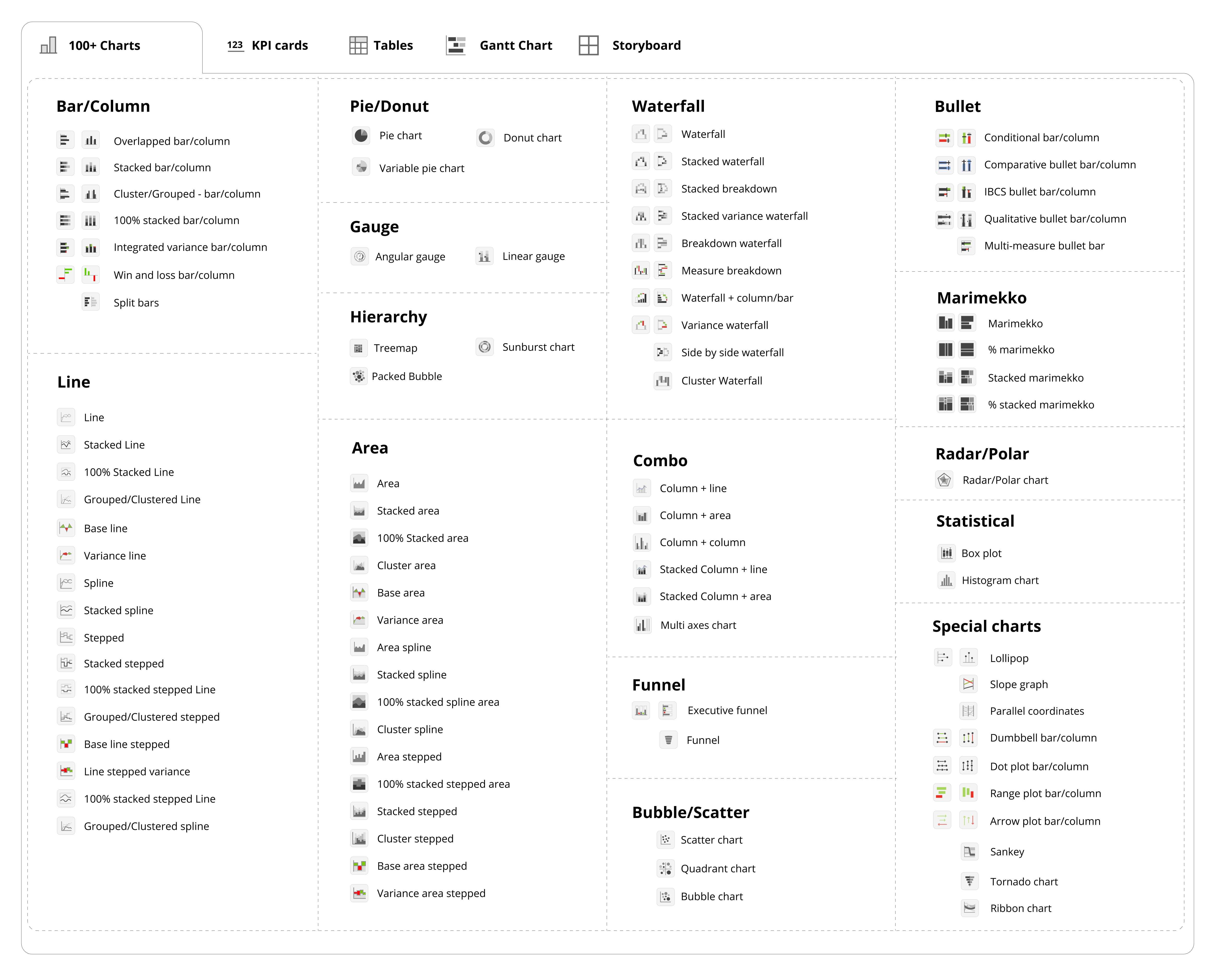
Our team has been hard at work expanding our chart library from 50+ to over 100 chart types. We did this because our customers made it clear: they wanted a unified, consistent visual experience without needing to rely on multiple custom visuals on their canvas.
So, we delivered.
By enabling a single, no-code interface with support for small multiples and trellis layouts across all chart types, we’ve empowered teams to standardize their reporting and eliminate the complexity of juggling visuals from different vendors.
We also responded directly to your most requested features.
A standout example is the Multi Axis chart—one of the top-voted requests from the Power BI community with over 2,000 votes. We didn’t just deliver it—we expanded it to support over 10 series types, including line, area, lollipop, cluster, and stacked bars.
To make Analytics+ a comprehensive solution for project management, we introduced a robust Gantt chart, offering end-to-end visibility into timelines and task progress.
And we didn’t stop there. We added advanced chart types to help visualize complex relationships—Sankey diagrams, parallel coordinates, cluster waterfall charts, and vertical line visuals are now all part of the solution. Each of these additions reflects our commitment to listening closely to customer feedback and delivering precisely what you need to succeed.

As we moved forward, it became increasingly clear that customers preferred not to mix their dashboards with native core visuals. They recognized that our visual capabilities and overall user experience were significantly more powerful and intuitive.
This preference played a key role in easing the transition from legacy BI tools like Tableau, Qlik, and Spotfire. Customers no longer had to compromise or struggle with Power BI’s native visualization limitations or rely on additional DAX measures to unlock advanced features.
Our core audience is made up of organizations that are relatively new to Power BI and want to consolidate their BI and visualization efforts within a single platform. These customers are retiring legacy BI tools and replacing them with a streamlined Power BI experience—powered by our solution. As a result, they’re saving considerable time and reducing costs across their BI transformation initiatives.
One of the significant architectural investments we made was bringing more than 30K data points into the visual.
Power BI renders up to 3.5K data points for most chart types before applying high-density sampling. We switched rendering techniques from SVG to Canvas Rendering to render more than 3.5K data points for high performance.
This breakthrough empowers our customers to confidently use Power BI for large-volume time series, scatter plots, spaghetti charts, and distribution analyses—with the same level of performance and flexibility they previously relied on in Qlik, Tableau, or Spotfire.
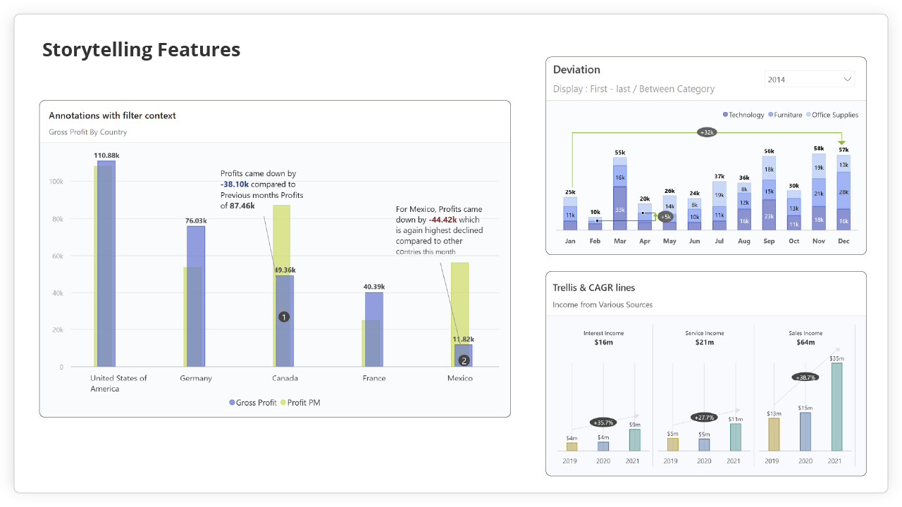
We know the power of data storytelling. That's why we've heavily invested in Inforiver’ s storytelling capabilities, like Deviations, In-depth Analytics, Data Labels, Legends, and Annotations.
With Power BI’s native integration inside PowerPoint, it becomes a much better architecture to support interactive visualizations with annotations for business presentations right inside Power BI. We introduced this enhancement to support customers looking to move their PowerPoint dashboards out of Think Cell and Mekko Graphics—and fully transition to native Power BI for their presentation needs.
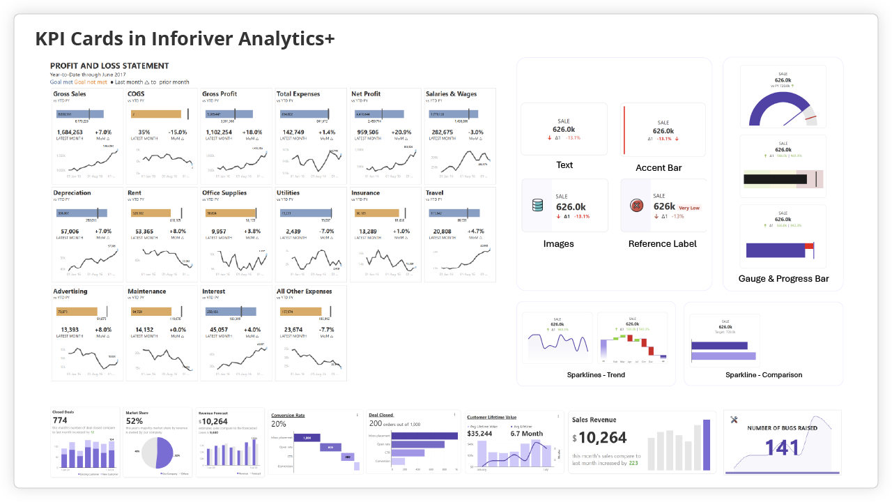
KPI cards received a complete overhaul to make them more intuitive and easier to use. With Inforiver KPI cards, you can add multiple elements, apply dynamic text, images, color and choose from over 40+ sparkline options. A standout feature of the Analytics+ KPI card is its support for trellis layouts with customizable panels.
You can learn more by watching this webinar.
We also started incorporating expert recommendations from industry-leading authors like Brent Dykes, Nick Desbarats, Cole Nussbaumer Knaflic.
This ensures that our platform not only meets IBCS certification standards but is also aligned with the best practices championed by top data visualization experts—giving users the flexibility to implement the very techniques these thought leaders advocate.
By 2024, a clear trend had emerged:
Most enterprise customers had already made significant investments in building semantic models within Power BI—regardless of whether their data platform was Snowflake, Databricks, BigQuery, SAP, Oracle, or Redshift.
We also had the privilege of welcoming some of the largest customers migrating from Tableau, Qlik, Spotfire, SAP BusinessObjects, and Cognos. Their adoption of our solution reinforced the strength of our strategy and played a direct role in shaping the vision and roadmap for Inforiver Analytics+.

As we move into 2025, our focus remains on customer enablement and helping customers accelerate their efforts to consolidate into a unified data and BI platform strategy in Microsoft Power BI and Fabric.
Our product has reached its maturity, and we will continue to invest in customer-driven enhancements, address user-reported bugs, and improve overall experience. Feel free to join our community and share your feedback to help us make the product even better.
Inforiver Analytics+ drives superior productivity for business power users and all Power BI developers. We noticed that developers spend hours on workarounds or hacks to build Power BI reports and dashboards. That's why we've built no-coding solutions that offer an advanced range of visuals supporting complex data structures, 4D hierarchies, and single-click templates.
All of this means one thing:
You and your team can now focus on what matters most — delivering strategic decisions and driving insights. We made our first step towards unifying your Power BI experience. We introduced
SuperFilter, free-for-all visual that introduces filter context awareness across the Inforiver suite.
We are on a mission to completely take over your Power BI canvas, and let’s see who gets there first: Lumel or Core Visuals. But please remember that we both want to drive Microsoft Fabric adoption! It does help win with our bigger vision to bring Planning to Power BI and Fabric. We may achieve this with our native Apps strategy as Fabric Workloads.
We’re building toward a future where Planning, BI, and Data Apps are integrated together seamlessly on top of Microsoft Fabric.

As AI and Co-Pilot Insights continue to grow in importance,
Inforiver Analytics+ — the industry’s only multidimensional, multi-measure visualization library — will soon offer native support for paragraph and nested prompts.
Imagine if users wanted no clicks and just a single prompt? We do believe that people will get tired of iterative prompting and will expect to get the full insight with a single, nested prompted question as AI and CoPilot gets mainstream. That's why we’re investing in making our visualization engine API-driven and embeddable, ensuring that any LLM or Co-Pilot can easily leverage it by rendering insights with nested prompts.
Join us on this exciting journey.
Try Inforiver Analytics+ for free today and transform how you tell stories with your data.
What enhancements would you like to see next in Inforiver Analytics+?

Inforiver helps enterprises consolidate planning, reporting & analytics on a single platform (Power BI). The no-code, self-service award-winning platform has been recognized as the industry’s best and is adopted by many Fortune 100 firms.
Inforiver is a product of Lumel, the #1 Power BI AppSource Partner. The firm serves over 3,000 customers worldwide through its portfolio of products offered under the brands Inforiver, EDITable, ValQ, and xViz.