
Upcoming webinar on 'Inforiver Charts : The fastest way to deliver stories in Power BI', Aug 29th , Monday, 10.30 AM CST. Register Now
Upcoming webinar on 'Inforiver Charts : The fastest way to deliver stories in Power BI', Aug 29th , Monday, 10.30 AM CST. Register Now
Pie charts remain beloved in the real world while simultaneously being widely criticized by data visualization experts, so much so that their use is sometimes even parodied.
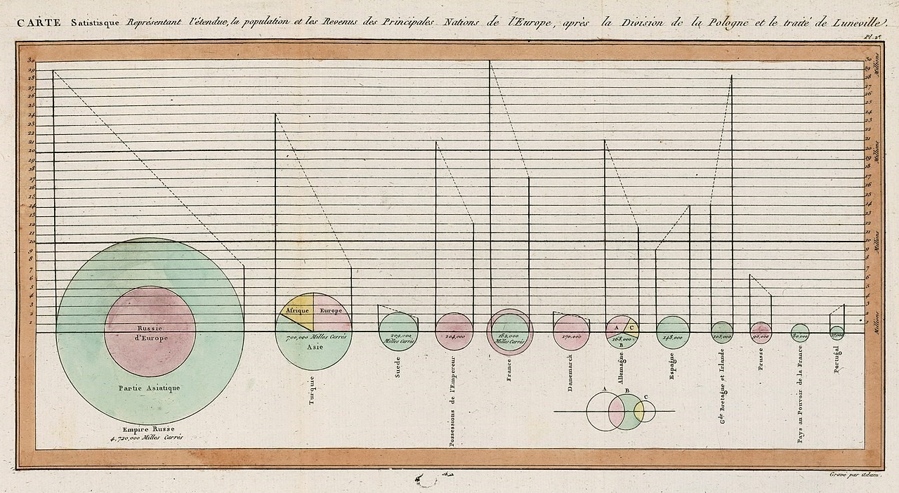
Despite the controversy about their utility, pie charts have been commonly used across fields since their inception in 1801 in William Playfair’s “The Statistical Breviary”.
The popularity of the pie chart has been attributed to various factors – including historical and evolutionary! It is possible to effectively use a pie chart to visualize fractional relationships in specialized contexts. For a guide on how to use pie charts and when to avoid them, click here.
In this article, we will briefly examine some of the reasons why pie charts are criticized, and then discuss some alternatives to pie charts and how to use them.
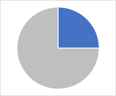
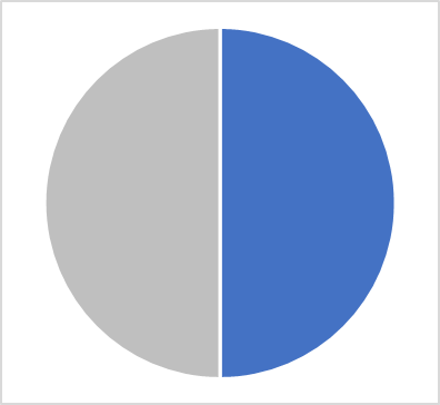
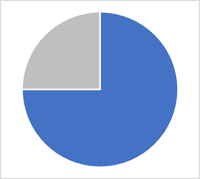
It is not clear if our brains read the values of the slices using the area of the segments, the arc length, or the angle of the segment. Nevertheless, pie charts rank poorly in our visual perception. We cannot accurately estimate most values, with the exception of those that make 90° angles or multiples thereof. Notice how it is easy to estimate that the proportions represented are 25%, 50% and 75% in the following charts.
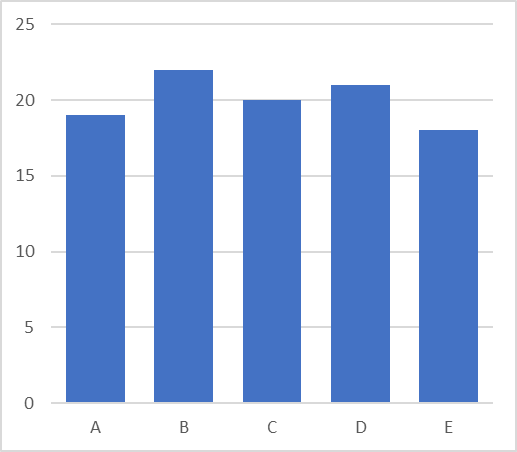
By contrast, it is much more difficult to estimate the size of the segments in the following pie chart. The bar chart on the right, however, allows for much more accurate reading of the same percentage values.
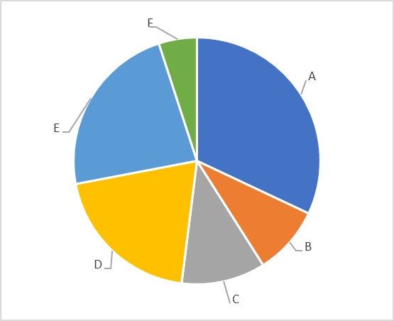
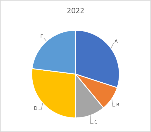
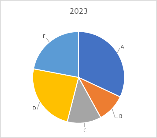
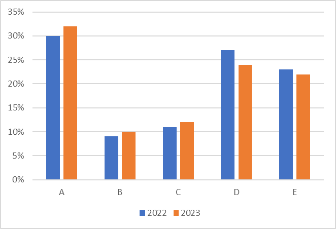
Pie charts do not facilitate side-by-side comparisons. Consider the year-to-year comparison made using the two pie charts below. The differences between the categories appear very minor and it difficult to say whether there has been a change, and if yes, in which direction the change has occurred.
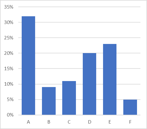
By contrast, consider how easy it is to compare the two years in this clustered bar chart – we see the magnitude as well as the direction of change clearly. As Stephen Few points out, for a pie chart to be effective, we need to reproduce all the information from the data table in the form of labels. This defeats the purpose of visualizing the data!
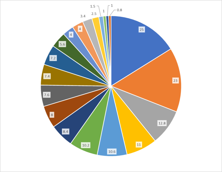
Pie charts can only handle a limited number of values at a time. In the following chart, notice how the visualization itself tells us next to nothing about the values of the segments and how we rely on the labels instead to glean information.
Pie charts also require values that show obvious variations to be effective. Both the pie chart and the column chart below visualize the same data. The values appear extremely close in the pie chart, and we are barely able to detect differences. However, the differences are not as small as they seem, as seen in the column chart below.
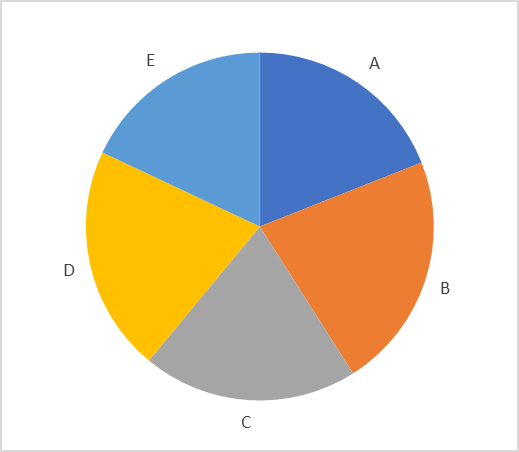
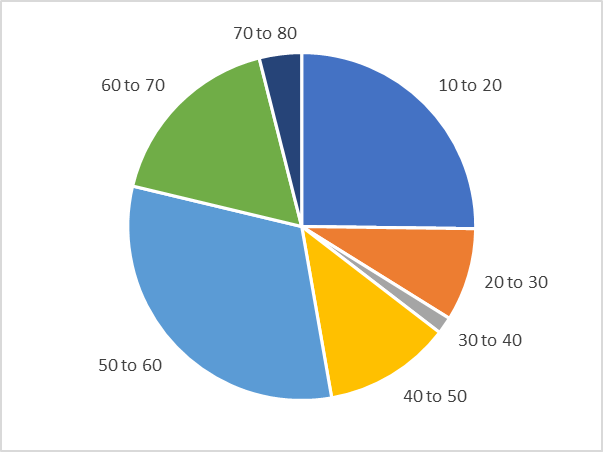
It is easier to read data on a pie chart when the categories are sorted by size, starting from the largest at the 12 o’clock position, and progressively decreasing in the clockwise direction. This type of sorting may not work for sequential categories, like age classes, where the most logical way to sort may be according to the order of the categories. This is shown in the image below.
One of the best alternatives suggested to pie charts is the humble column chart. The popularity of this chart is well earned – bars on a common baseline lie at the top of our visual perception scale. This means that we can make very accurate estimates based on the height of the bars.
Column charts are especially useful when the segments are similar in value, and when making side by side comparisons between categories. One disadvantage of replacing a pie chart with a column chart, however, is that the pie chart provides an obvious visual cue on the part-to-whole relationship between the categories, while this is not apparent from the column chart.
A partial solution is to indicate percentages on the y-axis scale, allowing us to read the columns as percentage contributions to a whole. Despite this drawback, the accuracy of the bar chart may still make it an attractive option.
A relatively novel variation of the pie chart is the treemap. The treemap is a “squarified” version of the pie chart, using a rectangular area divided into sections to represent values. The area of these sections is in proportion to the corresponding value.
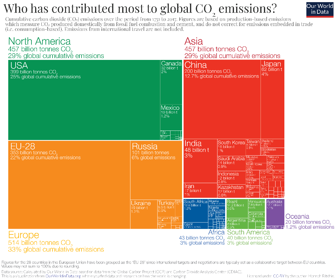
Treemaps have the advantage of visually indicating a part-to-whole relationship. While our brains still do not process area calculations accurately, studies suggest that rectangular areas can be processed better than pies. Note that treemaps can handle hierarchies, while a typical pie chart cannot. Treemaps are also effective in visualizing many more categories than a traditional pie chart. For example, the following treemap breaks down cumulative global CO2 emissions by country. The areas are in proportion to each country, and the countries are grouped into continents using color. Treemaps also provide an engaging representation that invites your reader to investigate further.
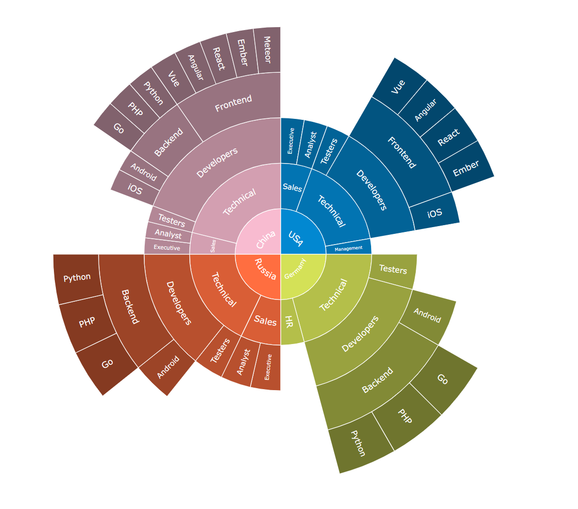
The Sunburst diagram can be described as a hierarchical pie chart. As with a pie chart, the sunburst divides a circle into segments to show different categories, but each hierarchy is shown using concentric rings. The area of the segments is proportional to the value of the category, and the hierarchies expand outwards from the center.
A sunburst diagram thus shows part-to-whole data that is also hierarchical. The following diagram, for example, shows us the employee directory of a company, divided by country and department. Several levels of hierarchy are shown, with the size of the segments representing the number of employees in the respective department.
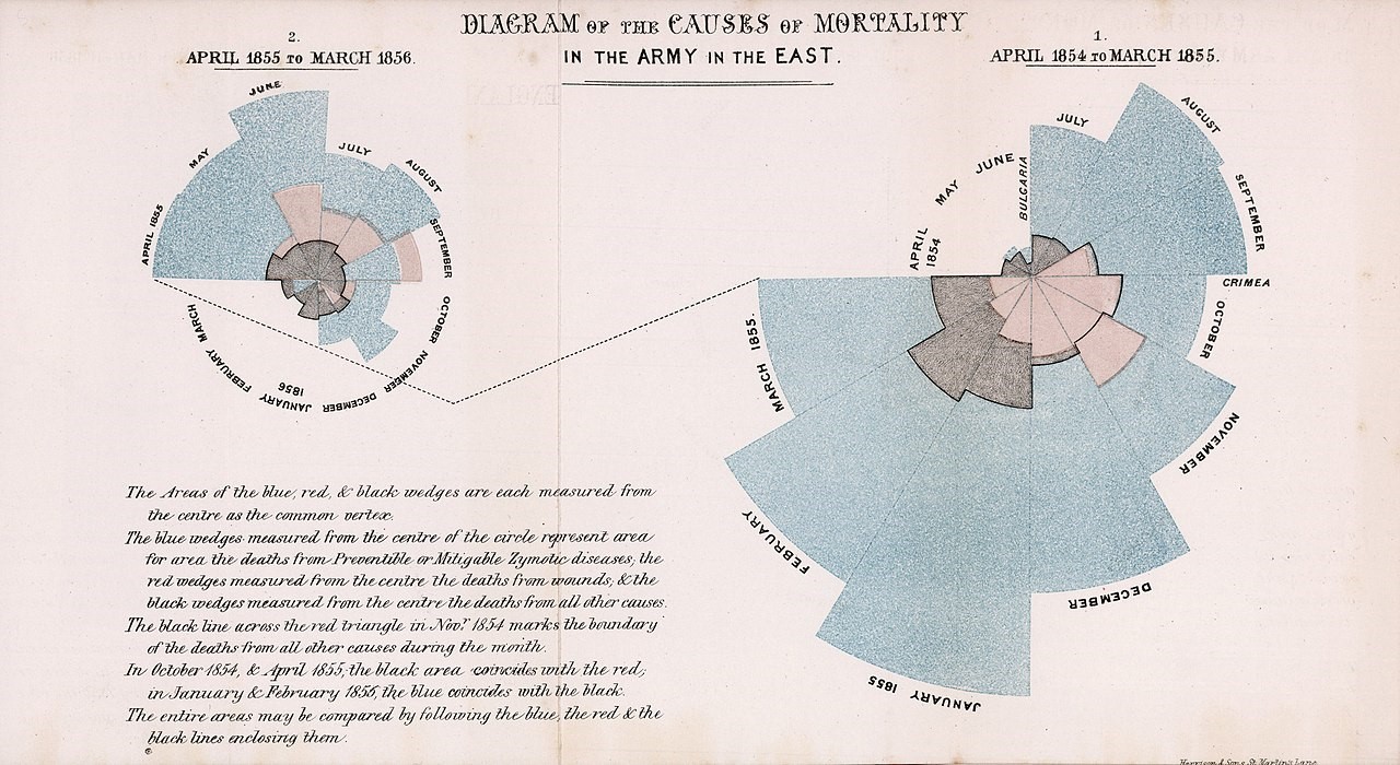
The Nightingale diagram is named after its famous inventor, Florence Nightingale, who used the power of data visualization to bring major changes to the standards of hygiene in hospital conditions. A Nightingale diagram can be thought of as a pie chart where the slices have been expanded in proportion to their value. The angle of each slice remains constant, but the area of each slice varies by value. They can be used to show part-to-whole as well as hierarchical data. These charts are sometimes called coxcombs or rose diagrams.
Florence Nightingale demonstrated using her “roses” (pictured below) that deaths due to disease (blue) far outweighed deaths caused by wounds in battle (pink) or deaths from other causes (black) during the Crimean War. The two charts below show the change in numbers before and after the work of the Sanitary Commission. This led to a revolution in sanitation and hygiene that paved the way for today’s modern standards.
The Voronoi diagram is yet another way to show how a whole is divided into parts. Though these charts are commonly used to represent geospatial data, they can also be used for part-to-whole data. A Voronoi diagram divides the chart area into irregularly shaped segments that represent the categories that add up the whole. The area of the segments is in proportion to the values of the categories. In practice, Voronoi diagrams are usually generated by algorithms that are beyond the scope of discussion here, but the shape of each segment is determined as follows.
The segments are generated according to the position of points (called sites) scattered around the chart area. Each segment is bound by straight lines and forms a polygonal shape around the sites. The polygons don’t overlap, and the borders of the polygon are equidistant from the generating sites. The following Voronoi diagram shows the populations of the top 100 countries in the world.
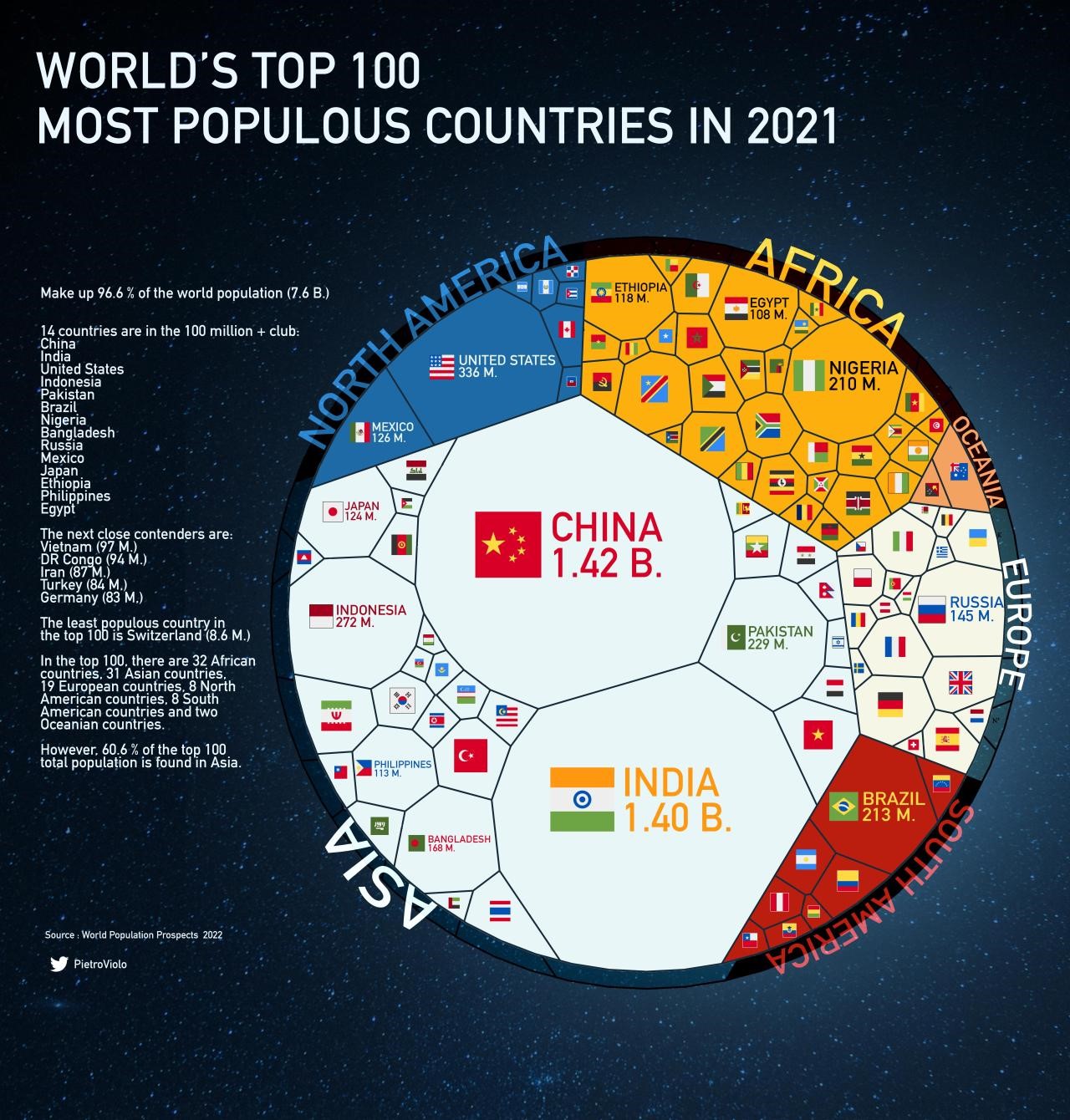
Voronoi patterns appear everywhere in nature – from the markings on giraffes to the pattern of cracks in dry land. These charts are used in chemistry, ecology and in biology literature.
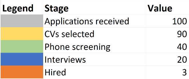
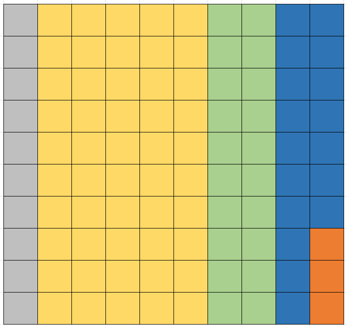
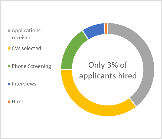
Waffle diagrams use color-coded squares to represent segmented and discrete data. The following chart, for example, shows 100 applicants passing through a hiring process. We see the proportion of applicants that made it through each stage of the selection process. At the end of this process, only 3 out of the 100 that applied were hired. This provides a novel and thus visually engaging alternative to the pie chart.
Donut charts can be thought of as pie charts with a hole punched into the center. This means that instead of a circle, the donut chart divides an annulus into segments, with the area of the segments in proportion to their value. In effect, we are removing the information on the angle made by the segments, making the reader rely on area or arc length estimates to determine the value.
Donut charts face many of the same problems as pie charts, but have the advantage of providing a space at the center of the chart to add extra information in the form of text. They are used for the same primary purpose as a pie chart, which is to visualize data as a percentage of the whole.
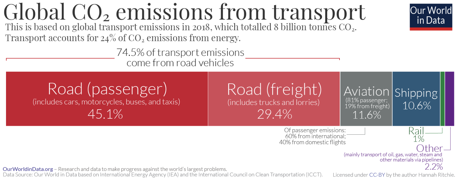
Stacked bar charts can also be used to show categories that add up to a total. A stacked bar chart subdivides a bar into segments that represent each category, with their length in proportion to the value plotted. Our visual perception is more adept at accurately estimating lengths when compared to areas, making stacked bar charts a better choice. The chart below shows global carbon emissions from transportation, subdivided by mode of transport.
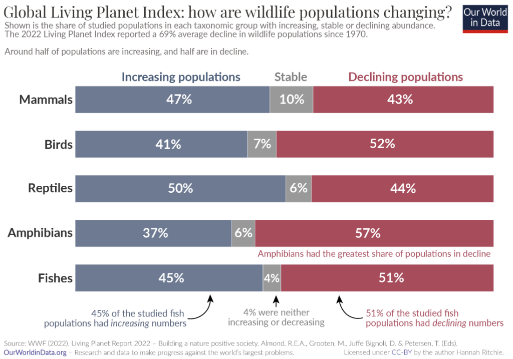
Stacked bar charts are much more effective when used to make side-by-side comparisons like below, instead of being used as a single bar as in the chart above. The following 100% stacked bar chart, for example, compares the changes in population for various taxa.
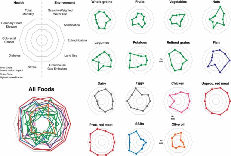
Radar charts plot multiple variables on axes that radiate out from a central point. A radar chart must always have at least 3 axes. Values are plotted as points on each of these, and the points are connected by straight lines to form a “spiderweb” shape. These charts are therefore sometimes called spider charts. Radar charts can be used for data with multiple variables, and more than one radar chart can be overlayed to make comparisons or show correlations.
The charts below show the rank-ordered health and environmental impacts per serving of food consumed per day, with all of the charts overlayed in the chart on the bottom left. We see how different food types score on different scales, and the combined chart reveals that overall, plant sources tend to have a lower negative environmental and health impact.
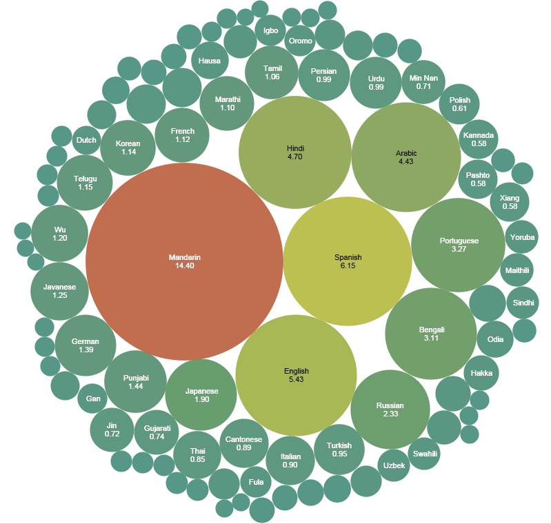
Packed bubble charts provide an eye-catching alternative to pie charts. These charts use circles to represent each category, with the area of each circle in proportion to the corresponding category. The bubbles are then packed around each other, with the largest circles usually towards the center. This chart can be used to show part-to-whole relationships and relative proportions. For example, the following chart shows languages sized by the number of native speakers. Packed bubble charts suffer from the same drawback as pie charts – our visual perception fails at estimating areas accurately. Nevertheless, packed bubbles can be used to present the overall picture and are a visually engaging chart that can boost engagement.
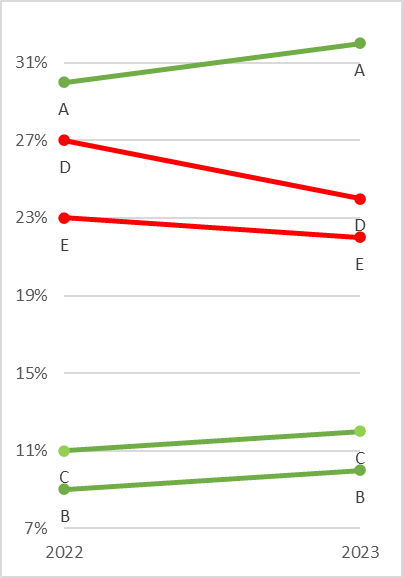
Slopegraphs can replace pie charts that make side-by-side comparisons. Pie charts do not facilitate these types of comparisons as it is difficult to correctly estimate the value of a slice, remember its size and compare it to the equivalent category in the next pie chart. Try this for yourself using the two pie charts below.
Instead of this, slopegraphs directly present comparisons by plotting the values of different categories across two time periods using points and connecting each category with a line. Slopegraphs can be thought of as line charts with only 2 points plotted for each series.
The position of the points tells us the value at each point in time, while the slope of the line between the two points tells us the magnitude and the direction of change. Slopegraphs can be used to tell before and after stories, even in the case of part-to-whole data. The same data from the pie charts above has been shown here in a slopegraph. Notice how easy it is to see the changes between the years.
In conclusion, though we may want to sometimes use a pie chart for quick comparisons of familiar proportions, there are plenty of alternatives which we may use to show the same relationships. Each of these alternatives presents its own advantages and challenges, and we may choose the right chart based on our goal, and the structure of the data.
Learn About Inforiver’s Visualization Options
- By Hamsini Sukumar
Stacked column charts: When to use them and when to avoid them

Inforiver helps enterprises consolidate planning, reporting & analytics on a single platform (Power BI). The no-code, self-service award-winning platform has been recognized as the industry’s best and is adopted by many Fortune 100 firms.
Inforiver is a product of Lumel, the #1 Power BI AppSource Partner. The firm serves over 3,000 customers worldwide through its portfolio of products offered under the brands Inforiver, EDITable, ValQ, and xViz.