
Upcoming webinar on 'Inforiver Charts : The fastest way to deliver stories in Power BI', Aug 29th , Monday, 10.30 AM CST. Register Now
Upcoming webinar on 'Inforiver Charts : The fastest way to deliver stories in Power BI', Aug 29th , Monday, 10.30 AM CST. Register Now
A stacked column chart uses columns divided into stacked subsegments to showcase totals that can be divided into contributing categories. These charts can be powerful data visualization tools when used in the right context, but may also lead to misrepresentation of data when used incorrectly. In this article, we explore the common uses as well as the pitfalls of stacked column charts.
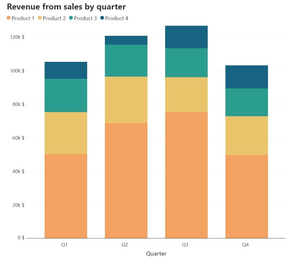
The primary use for stacked column charts is in representing data where values are divided into contributing categories that sum to the total. This means that the data naturally has two categorical variables, one of which we designate as the primary variable to plot as columns, and the second which we use to divide the columns into segments. An example would be sales data for four products, tracked over each quarter as shown below:
| Quarter | Product 1 ($) | Product 2 ($) | Product 3 ($) | Product 4 ($) |
| Q1 | 50000 | 25000 | 20000 | 10000 |
| Q2 | 68500 | 27750 | 19000 | 5300 |
| Q3 | 75000 | 20750 | 17290 | 13500 |
| Q4 | 49500 | 23000 | 16600 | 13800 |
In this dataset, we see that there are two categorical variables – Quarter, and Product. We may designate the Quarter as the primary variable and the Product as the secondary variable to obtain the following chart where we track total sales revenue in a quarter using the height of the columns, and the revenue from individual products using the height of the segments.
In datasets where there is a sharp change in the total, we may want to see which category accounts for the majority of the change. This is an ideal situation to use stacked column charts because the columns allow us to compare totals, while sharp changes in contribution are also made visible. Consider the two charts below, for example.
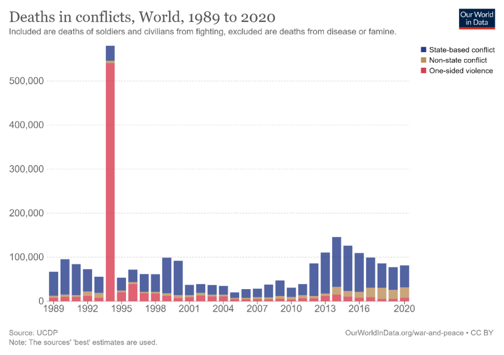
The first shows the global number of deaths due to conflict from 1989 to 2020, while the second is similar to the above sales revenue data by quarter, divided into revenue from different products. In the first chart, the year 1994 jumps out as being one with a disproportionately high number of deaths, and it is apparent that the escalation in one-sided violence is the main cause for this tremendous increase. In the second chart, there is comparatively little variation in the totals and the contributing categories. This makes it difficult to see the trends in the series. For example, the sales revenue from Product 3 decreases slightly across quarters, but this is difficult to see because of the lack of significant variation over the quarters. Stacked column charts are thus highly effective when contributing categories and consequently totals undergo large fluctuations.
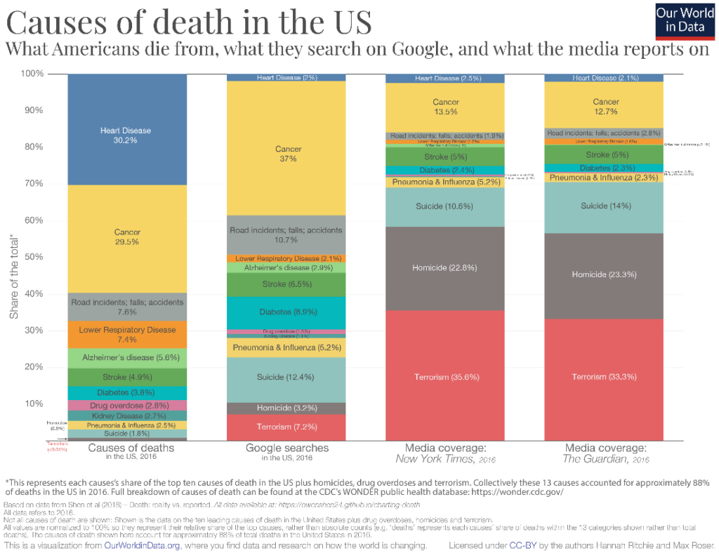
The x-axis in a stacked column chart can represent a categorical variable that is time or a nominal category. For time series data, we may use this type of chart to emphasize individual values and to facilitate comparisons. We have already seen a time series example above, so we may examine one with a nominal category on the x-axis. In the chart below, we see a comparison between the proportions of various causes of death in the US and their representation in Google searches and the media. We notice, for example, that heart disease receives little attention in the media and searches on Google despite accounting for more than 30% of all deaths in the US, while terrorism takes up more than 30% of the reportage in the media while accounting for less than 0.01% of deaths in the country.
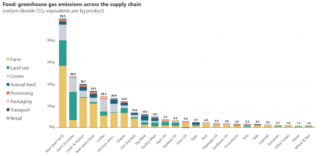
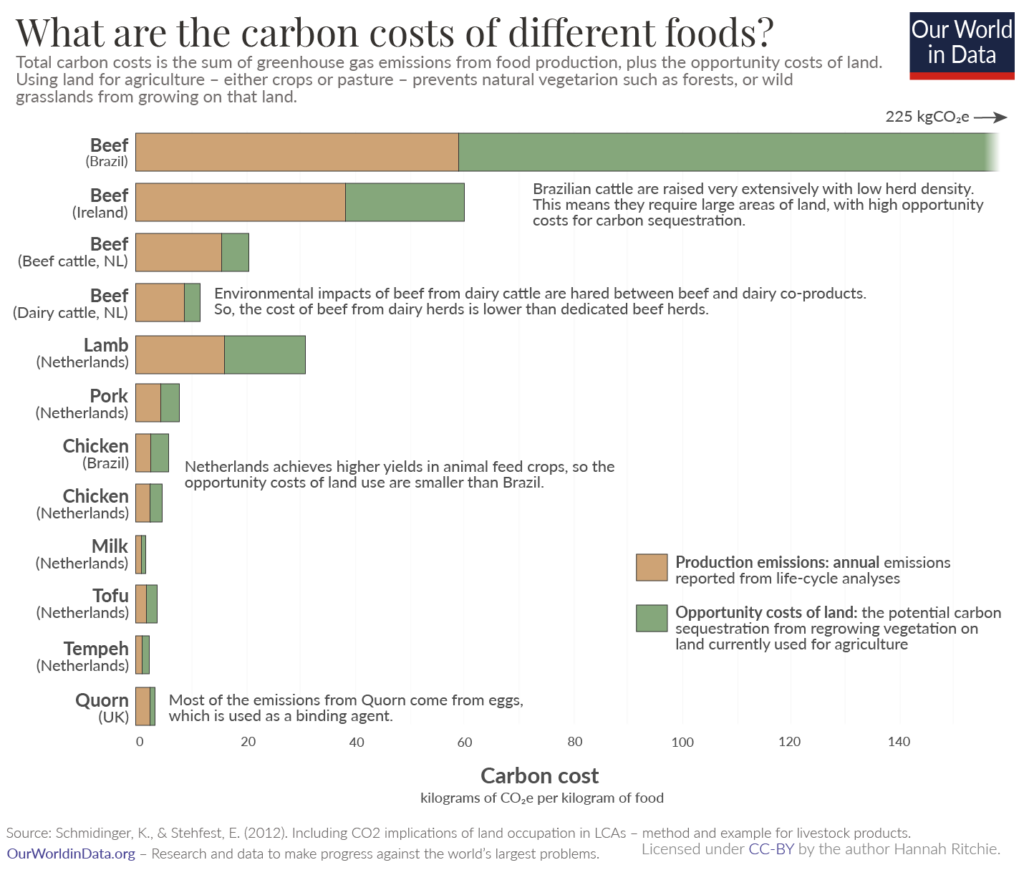
Column charts are ideal to show rankings since our visual perception allows us to accurately compare heights. A stacked column chart can convey additional information about how various categories contributed to the totals in order to influence the rankings. In the chart below, for example, we look at greenhouse gas emissions per kilogram of product for different foods, divided into emissions from the different parts of the supply chain. The different types of food are sorted by their total emissions in descending order, and we can see the parts that sum to each of the totals. For instance, we see that beef from beef herd produces the highest total emissions per kilogram of product with almost 60 kg of emissions from the farm to blame for more than half of the total. While the farm category contributes significantly across food sources, the highest quantity is contributed to beef from beef herd.
As noted before, column charts allow us to accurately compare totals. This is because all of the columns are positioned on the same horizontal baseline. Stacked column charts extend this advantage to the contributing data series that is positioned directly on the horizontal axis. This positioning can be used strategically to leverage important series. Conversely, the changing baseline provided by the series below makes it difficult to assess the height of a stacked series, and the order of categories can be chosen keeping this fact in mind.
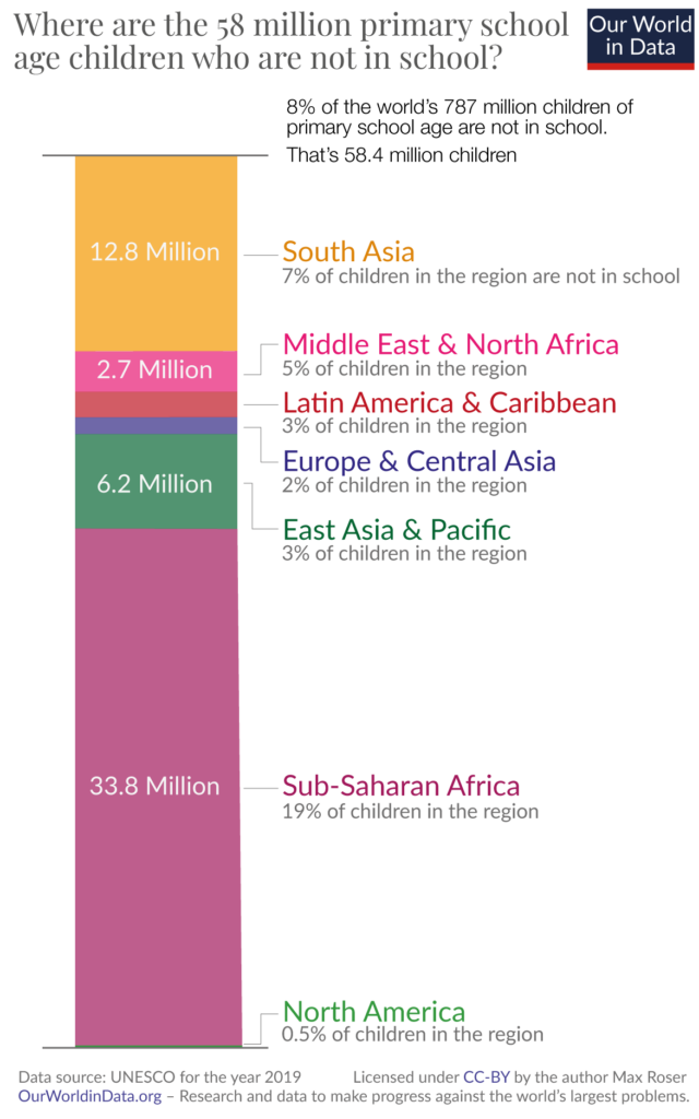
Stacked column charts are best avoided when you have a single series of part-to-whole data. A study by Cleveland and McGill showed that error margins in estimation are greatest when comparing segments within the same bar and are in fact even greater than error margins for estimation in pie charts! In the chart below, for example, we know from the title that the total length of the bar corresponds to 58 million children, but it is very difficult to estimate the size of any region without the legend. Consider other alternatives to stacked column charts in this scenario, such as a standard column chart with unstacked bars or pie charts.
Avoid using stacked column charts when the highlight is one component series overtaking another. These charts work well for comparing totals and for a quick picture of their composition, but the changing baseline for stacked series and the format of a stacked column do not allow the reader to easily assess and compare the height of different segments to determine whether one series overtakes another. For these purposes, consider using a line chart with a focus on the specific series that you want to showcase.
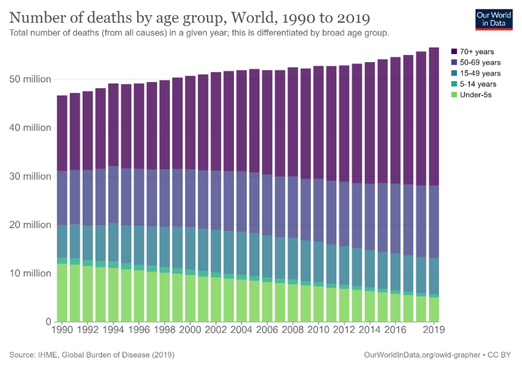
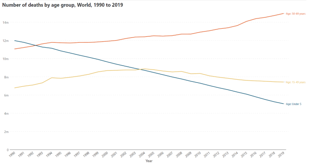
The stacked column chart below shows the global number of deaths by year, divided into age cohorts. We have an overall picture of the behavior of the data, but what if we want to show how the number of deaths in the under-5s category has fallen below that of the 15-49 years category as well as the 50-69 years category? A line chart like the one below can show this information much more accurately than a stacked column chart.
Certain types of data require long labels to be conveyed accurately and completely. This becomes difficult in a stacked column chart because the labels would need to be truncated or rotated to accommodate their length. In such cases, use a horizontal stacked bar chart, as shown below.
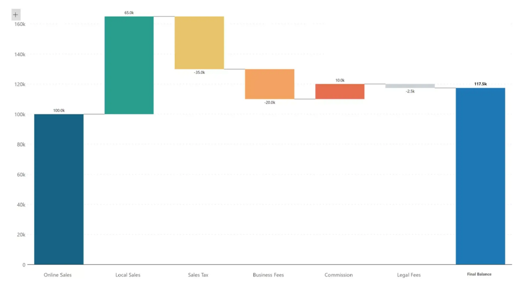
Avoid stacked column charts when you have both positive and negative values in the same data set. Since the columns are unidirectional, these charts are best used when all values are positive or negative. If you have a mix of positive and negative values, consider a diverging column chart or a waterfall chart like the one below. Note that in a diverging column chart, the total length of the bar no longer corresponds to the value of our measure.
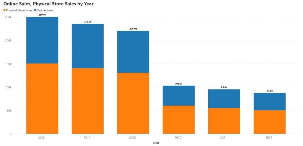
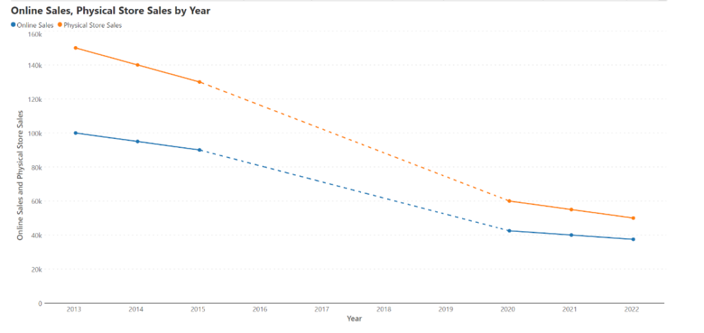
Stacked column charts may cause misrepresentations when the x-axis is not a continuous time series. Consider the stacked column chart below, showing sales by year as a sum of sales from physical stores and online sales. There appears to be a steep decline in the total after 2015, but this is because there is data missing between 2016-2019. For a more accurate representation, we may plot the same data on a line chart as below, using dots to show data points and dotted lines to show missing data. Here, we see that sales declined much more gradually from 2015 to 2020, and this is a more accurate picture of the data.
-By Hamsini Sukumar

Inforiver helps enterprises consolidate planning, reporting & analytics on a single platform (Power BI). The no-code, self-service award-winning platform has been recognized as the industry’s best and is adopted by many Fortune 100 firms.
Inforiver is a product of Lumel, the #1 Power BI AppSource Partner. The firm serves over 3,000 customers worldwide through its portfolio of products offered under the brands Inforiver, EDITable, ValQ, and xViz.