
Upcoming webinar on 'Inforiver Charts : The fastest way to deliver stories in Power BI', Aug 29th , Monday, 10.30 AM CST. Register Now
Upcoming webinar on 'Inforiver Charts : The fastest way to deliver stories in Power BI', Aug 29th , Monday, 10.30 AM CST. Register Now
A stacked area chart is a variation of the standard area chart where we showcase how a measure, broken down into categories, trends over time. While a stacked column chart uses vertical bars stacked on top of each other, a stacked area chart stacks multiple area series on top of each other. In this article, we will examine the differences between stacked area and stacked column charts:
Stacked area charts are primarily used to show how a total evolves in time along with its contributing components. This provides a parts-to-whole picture of the overall trends present in the data.
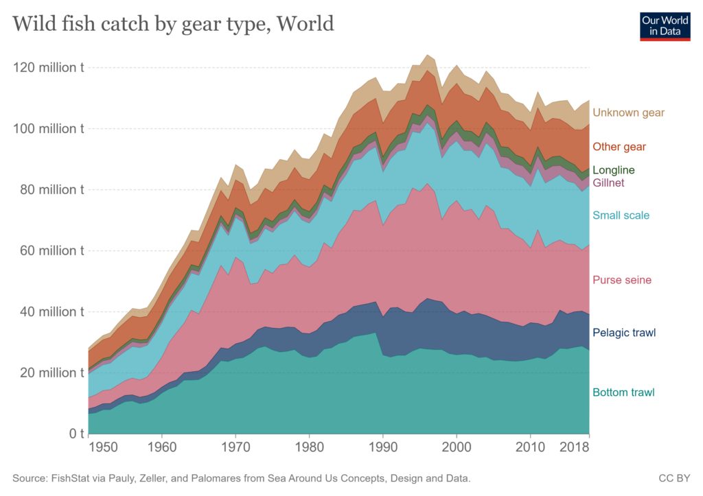
In the stacked area chart above, for example, we see how the total catch of wild fish increased from the 1950s and subsequently experienced a slow decline from the 1990s. We also see the breakdown of total wild fish catch by the type of gear used, and how their trend and composition have changed over time.
In cases where the data is broken into categories that sum to a whole, stacked area charts can give us a picture of how the contributions of each category change over time, giving us an insight into their relative proportion. This is especially important when our totals undergo sharp changes and we want to know which category majorly contributed to this change.
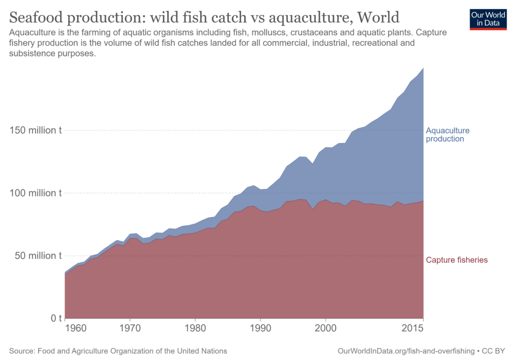
In the above chart, we see an increase in total seafood production in the world. What contributed to this increase? The stacked area also shows us the rise in the relative contribution of Aquaculture production. While in the 1960s, Aquaculture only contributed to a small proportion of total seafood production, we see that it has risen in prominence and in fact contributed to about half of all seafood produced in 2015. While seafood production from Capture fisheries has remained relatively constant since around 1990, we see that the increase in Aquaculture production largely contributed to the increase in total seafood production.
Stacked area charts are best used when we are tracking trends over a long period of time. This is because they allow us to track trends in the total and its contributors as they evolve over time. In general, it is advisable to use them when you have at least ten points in time to track. If you have fewer than ten points, consider using a stacked column chart instead, where the focus is on comparing the totals with each other.
One of the main advantages of stacked area charts is that they provide a quick and broad overview of our data. They are not suited to exact estimates of the numbers but instead provide a rough idea of the trends in the total and its categories. This is because of two reasons – each data series is on a moving baseline instead of a common horizontal baseline and furthermore, we have a limitation to our visual perception where our brains don’t process area calculations well. For precise comparison of the totals, consider using a stacked column chart instead. If your goal is to accurately track the trend in the total as it evolves over time, use a line chart.
Unlike stacked area charts, stacked column charts are not necessarily used to track trends over time. They are usually used to compare totals (indicated by the height of the bar) and simultaneously detect sharp differences in the categories contributing to the totals. Relatively minor changes are harder to detect in a stacked column chart.
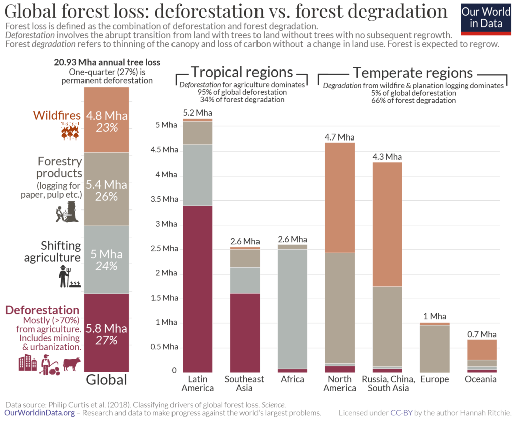
In the above stacked column chart, we track the drivers of global forest loss across regions. The bars allow us to accurately compare totals to see, for instance, that total forest loss is higher in Latin America than in North America. We also see how deforestation results in the majority of forest loss in Latin America and Southeast Asia, but is a relatively minor contributor in other regions of the world. If, however, we want to see if forest loss by deforestation is higher in Africa or in Russia, China and South Asia, it is difficult to compare these because of the minor changes in magnitude. Stacked column charts are best used for visualizing sharp changes in the contributing categories and comparing totals.
Column charts in general are best suited to comparisons with emphasis on the individual values rather than to show trends. Stacked column charts allow us to compare totals using the height of the column, but also to compare the category that is positioned directly on the horizontal axis. The horizontal axis provides a constant baseline for this category, giving us an accurate reading of its value as indicated by its height. This allows us to consistently compare this category.
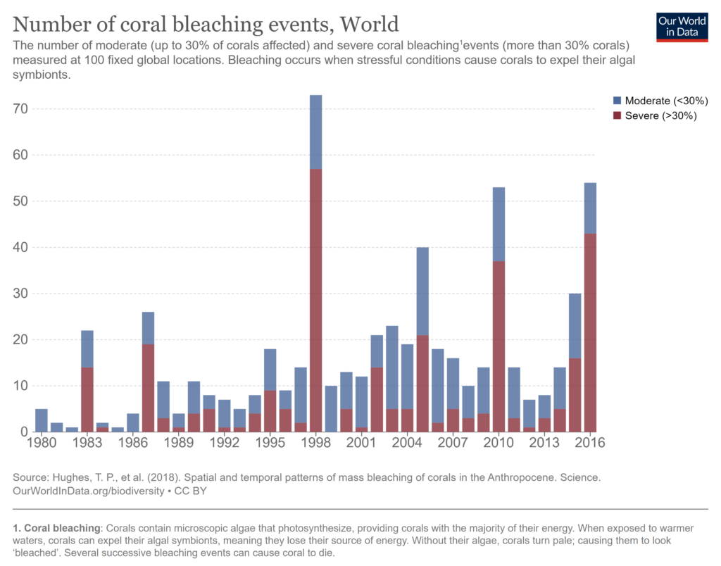
Consider the chart above where we look at the total number of coral bleaching events in the world, divided into moderate and severe events. This chart gives us an accurate picture of the totals and we are able to compare them to identify years with an abnormally high or an extremely low number of events. We can also make similar inferences about the number of severe bleaching events as this category is on a common horizontal baseline which allows us to compare the height of its columns. This type of comparison becomes very difficult when it comes to judging the number of moderate bleaching events using the height of the blue columns as each of them has a different starting point provided by the brown column below. For example, we can clearly see that the number of severe events in 2010 far exceeded that of 2006, but it is much more difficult to make an estimate about the number of moderate bleaching events in the same years in order to compare them.
Stacked column charts are ideal when your x-axis is a non-time dimension. However, you may also use a stacked column over a stacked area chart when you have very limited time dimension values, for example, four quarters.
Here is an example of a 100% stacked column chart that shows the reported frequency of loneliness by age in England in 2017.
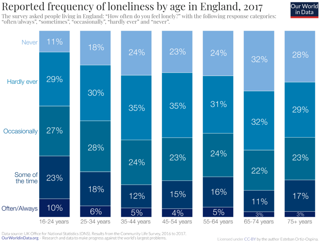
In this chart, each column represents all the responses of a single age cohort divided into categories according to the response. The information has been collected at a single point of time (2017) and this chart thus gives us a snapshot of the different responses given by each age group at this point in time.
As discussed above, stacked area charts give us a rough idea of the overall trends. On the other hand, stacked column charts allow for an accurate comparison of the total values which is indicated by the height of the bars. We can also accurately compare the category that is set directly on the x-axis as this provides the columns with a constant baseline.
Choose a stacked area chart when:
Choose a stacked column chart when:
When all other things are equal, note that lengths rank higher in our visual perception than areas. This means that our brains are more accurately able to estimate lengths rather than areas, making a stacked column chart the better choice for accurate comparisons.
- By Hamsini Sukumar
Stacked Area Charts - An Overview
Stacked Area Charts: When to Use Them and When to Avoid Them?

Inforiver helps enterprises consolidate planning, reporting & analytics on a single platform (Power BI). The no-code, self-service award-winning platform has been recognized as the industry’s best and is adopted by many Fortune 100 firms.
Inforiver is a product of Lumel, the #1 Power BI AppSource Partner. The firm serves over 3,000 customers worldwide through its portfolio of products offered under the brands Inforiver, EDITable, ValQ, and xViz.