
Upcoming webinar on 'Inforiver Charts : The fastest way to deliver stories in Power BI', Aug 29th , Monday, 10.30 AM CST. Register Now
Upcoming webinar on 'Inforiver Charts : The fastest way to deliver stories in Power BI', Aug 29th , Monday, 10.30 AM CST. Register Now
A stacked area chart is a variant of a regular area chart with several data series stacked on top of each other. The first series on the bottom uses the x-axis as its baseline, but every subsequent series uses the value of the series immediately below it as its baseline. As with a regular area chart, stacked area charts plot quantitative values on the y-axis tracked against the progression of another variable that is usually time, plotted on the x-axis.
Unlike a regular area chart, stacked area charts track how a set of observations perform individually and together as a group. While the topmost line corresponds to the total which is the sum of all categories, each line below it shows the cumulative contribution of all the categories underneath it.
There are two variants of stacked area charts – the standard stacked area chart as described above and the 100% stacked area chart, where each series is plotted based on its percentage contribution to the entire set of observations, with all contributing values at any x-axis value adding up to 100%. This is explored further below.
Another type of stacked chart is the stacked column chart which is used to compare the absolute totals and absolute contribution of segments at specific point(s) in time. We use a stacked area chart to instead track how the contribution changes over time.
In the following example, we can observe cumulative CO2 emissions from 1750 to 2021, broken down by countries & world regions.
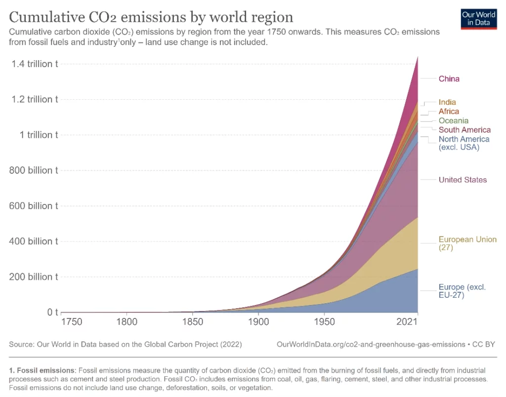
It is evident from the chart that the total carbon emissions of the world have increased sharply over the last 150 years or so and have, in fact, been accelerating. At the same time, we are also able to track the contributions of the different regions over the same period. Even today, Europe and the United States contribute to majority of world’s emissions as they did historically. In recent years, we also notice how the proportion of emissions by China has increased, though is still far smaller than emissions from Europe and the United States.
As seen above, stacked area charts encode the contribution of each data series using the shaded area that it occupies. They can thus be used effectively to show how a total evolves over time while also allowing us to simultaneously track how the different components change relative to each other.
Let us visualize the same data using a 100% stacked area chart.
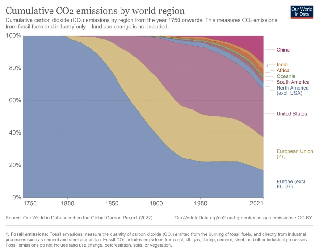
In this chart, the same data on cumulative carbon emissions has been used to plot a 100% stacked area chart. The contributions of each region of the world are shown as percentages that add up to 100%, which represents total global emissions. The percentage contribution of each region is encoded as the area that it occupies, and this area changes as the proportion changes over time. This completely changes the focus of the chart – it becomes evident at a glance that Europe dominates in terms of the proportion of historical carbon emissions from 1750 to 2021. This type of chart also allows us a glimpse into the early years of our data where the regular stacked area chart could not provide much detail due to the scaling needed to accommodate the exponential rise in emissions in recent decades.
A 100% stacked area chart uses the whole space available between the axes to plot percentage contribution over time for each contributing component. This allows us to focus on changes in the distribution of the different components instead of the total.
One of the limitations of human visual perception is that we are able to compare areas only as rough estimates. The contribution of each series in a stacked area chart is encoded by its area and while the area thus remains in proportion to the value of our measure, the line created by the graph varies according to the baseline provided by the plot below it. This means that we tend to erroneously view stacked area graphs like line graphs. The order in which data is stacked thus influences how the reader interprets this data.
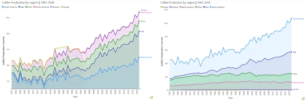
Consider the two charts above. In the first chart, the reader may think that there has been a lot of volatility in coffee production in Africa between 1961 and 1989. This conclusion stems from wrongly interpreting the stacked area chart like a line chart. If we plot the same data with stacking in the opposite order, as in the second chart above, we see that the curve traced by coffee production in Africa is actually fairly smooth in this time period.
In general, it is advisable to be careful of how data is stacked in order to avoid highlighting patterns of change for individual categories and to use this type of chart to instead give a rough idea of the contribution of different components while also tracking the total.
Another common error in perception is the line width illusion, where humans tend to evaluate the distance between two curves at the closest point between them instead of using the vertical distance. This also applies to stacked area charts.
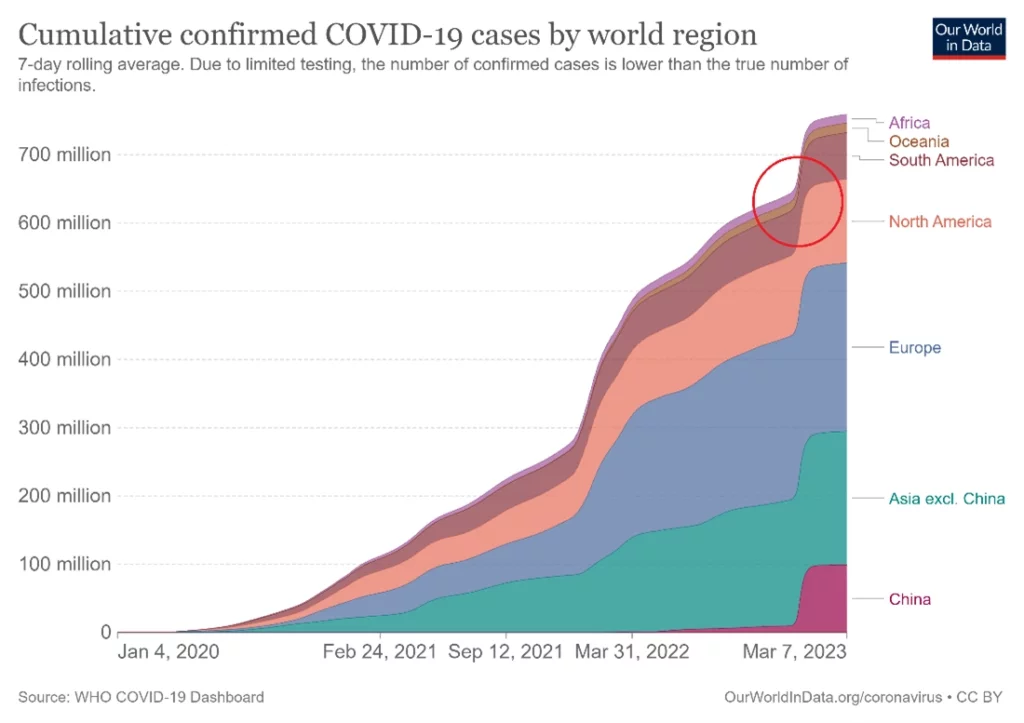
Consider the example above where COVID-19 cases are broken down by world region. With the sharp increase in cases in China around December 2022, we see a “bump” in our stacked area chart across regions because the cases in China at the bottom act as a moving baseline for the rest of our cases. In such cases, our brains tend to estimate the distance between the curves at the closest point between them (indicated by the red circle) instead of reading the vertical distance between the curves – this means that the curves appear closer to each other than they actually are even though in reality, the vertical distance does not change very much.
In our example, our brains interpret the area of South America in the red circle as a dip in cases since there appears to be a narrowing of the brown area, when in fact cases were increasing at this time. This is called the line-width illusion or the sine illusion. It is important to be mindful of this illusion when designing stacked area charts. One solution to this problem is to plot the difference between the curves when it is of interest.
Dive deeper on when to use and avoid stacked charts in this article and discover even more insights!
- By Hamsini Sukumar

Inforiver helps enterprises consolidate planning, reporting & analytics on a single platform (Power BI). The no-code, self-service award-winning platform has been recognized as the industry’s best and is adopted by many Fortune 100 firms.
Inforiver is a product of Lumel, the #1 Power BI AppSource Partner. The firm serves over 3,000 customers worldwide through its portfolio of products offered under the brands Inforiver, EDITable, ValQ, and xViz.