
Upcoming webinar on 'Inforiver Charts : The fastest way to deliver stories in Power BI', Aug 29th , Monday, 10.30 AM CST. Register Now
Upcoming webinar on 'Inforiver Charts : The fastest way to deliver stories in Power BI', Aug 29th , Monday, 10.30 AM CST. Register Now
Stacked area charts typically allow us to visualize how a measure, observed through multiple category values, changes over time. The category series are each plotted as an area and stacked on top of each other. This chart therefore visualizes contributions from different category values along with their total.
Note that the curve traced by each series becomes the baseline for the series stacked on top of it. This means that the stacked area chart allows us to track cumulative totals slightly better than the absolute value of each series.
In this article, we explore when to use stacked area charts and when to avoid them.
Stacked area charts are useful when you want to do one or more of the following.
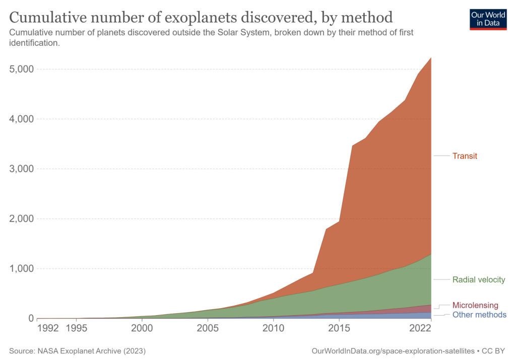
Stacked area charts allow the reader to easily understand the change over time in the total value of a quantity, along with the change in the parts that contribute to this total. The example above tracks the cumulative number of exoplanets discovered, broken up by the method of discovery over a period spanning the last thirty years. You can notice the steep increase in the total number of exoplanets discovered over the last decade. At the same time, the pattern that is conspicuous is the huge increase in the number discovered through the transit method. We also notice an increase in the number of exoplanets discovered using all the other methods. This stacked graph thus offers us a view of the part-to-whole relationship, with transit contributing to the most, followed by radial velocity.
In cases where our totals are composed of a group of categories, we may use stacked graphs to highlight the change in contribution over time.
Taking the same example above, notice that prior to 2006, barely any exoplanets were discovered using the transit method and that most discoveries during this time were made using radial velocity method. We then see a gradual increase in the number of discoveries by transit including a spike sometime between 2013 and 2014, when this method overtakes the number discovered using radial velocity. After this, the transit method becomes the primary method for discovering exoplanets. The stacked chart thus allows us to observe how the relative contribution of transit & radial velocity methods change over time.
Stacked area graphs are best used to give a rough idea of the numbers involved in your analysis, as opposed to depicting exact values. This is because the human brain does not process area calculations well while stacked area graphs encode the magnitude of a category using its area on the chart. The different categories are also not on the same horizontal baseline (or x-axis) to facilitate comparison but are instead stacked on top of each other, which makes it doubly hard for our brains to process. This limitation in our visual perception means that it is advisable to use these graphs to show your audience a quick glance of the totals and contributions rather than the exact value of a specific category. This type of graph is ideal to showcase the overall pattern in contribution without too much of a focus on precise numbers.
While stacked area charts can give a quick idea about totals and composition, there are cases where they are best avoided. Some of these situations are listed below.
Stacked area charts can give the reader a rough estimate of the total and its parts, but if you are interested in a more accurate depiction of the changes within each category contributing to the total, try a small multiple area chart instead. This places all our categories on a horizontal baseline, and allows us to clearly see patterns over time within the category.
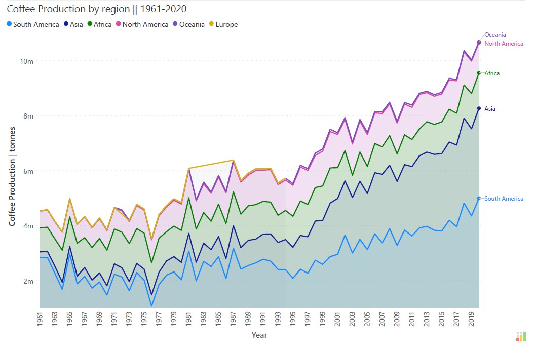
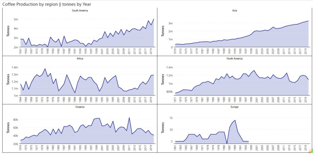
The two charts above both visualize coffee production from 1961-2020, broken down by region – with the first chart being a stacked area chart and the second one using small multiple to show each region. The stacked area chart gives the reader a good idea of the cumulative global coffee production, but it is very difficult to see the individual patterns of each category. The small multiples chart (below) however allows the reader to track the changes in coffee production over the years within each region.
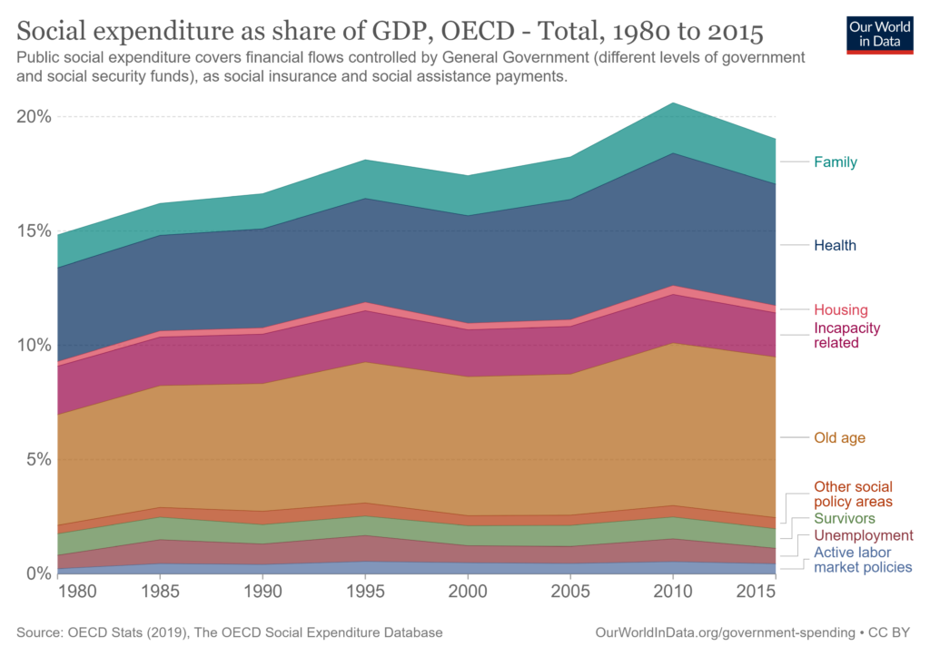
Consider the stacked chart above which depicts social expenditure as a percentage of the GDP in OECD countries. It gives us a good idea about how government spending on social schemes has changed over the years along with an approximate idea of the different sectors into which money is funneled. However, if we are interested in comparing how government spending on unemployment compares to government spending on survivors, this stacked area chart does not allow such comparisons.
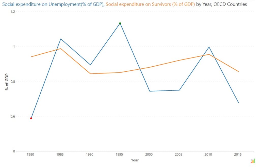
Consider instead the line chart depicted above, where we only plot these two values. We are able to clearly see the percentage of GDP spent on each of these areas as well as the exact point when expenditure on unemployment overtakes expenditure on survivors and vice versa throughout our time period. If your focus is on showing how one category overtakes another, consider using a line chart.
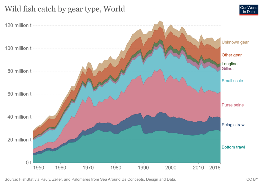
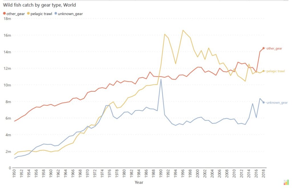
In the above example, the chart on the top shows a stacked chart with wild fish catch classified by type. This gives us an overall idea of the totals and a quick idea about the categories involved, but we cannot use it to compare specific categories with each other. Let us assume that we are interested in understanding how catch using other gear, pelagic trawl and unknown gear compare to each other. The line chart below specifically plots catch using these three categories from the same data. In this chart, we can accurately evaluate the magnitude of each of these and clearly show when one overtakes another, or falls behind.
In case where your data is not captured over a continuous time series, consider using a stacked bar chart or a stacked column chart to represent your data.
On the other hand, if you are more interested in the total itself rather than the sum-of-parts representation, consider using a simple line chart with time plotted on the x-axis.
When your main focus is to show accurate readings of each category in your total, consider plotting these values as a line chart instead. Stacked area charts work well in giving a rough and quick idea of how the parts contribute to the whole, but are not ideal to understand the exact value of each category. This is because each category has a moving baseline and its magnitude is indicated by the area it occupies.
One variant of the stacked area chart is the 100% stacked area chart.
100% stacked area charts plot percentage contribution instead of absolute numbers on the y-axis, against time on the x-axis. The focus in this case is the proportion of contribution made by each category rather than absolute numbers and we in fact lose the information on the absolute values of the total and its parts. Standard stacked area charts are best used when the absolute values of the totals and categories are important, while 100% stacked charts are used when the percentage contribution assumes higher relevance.
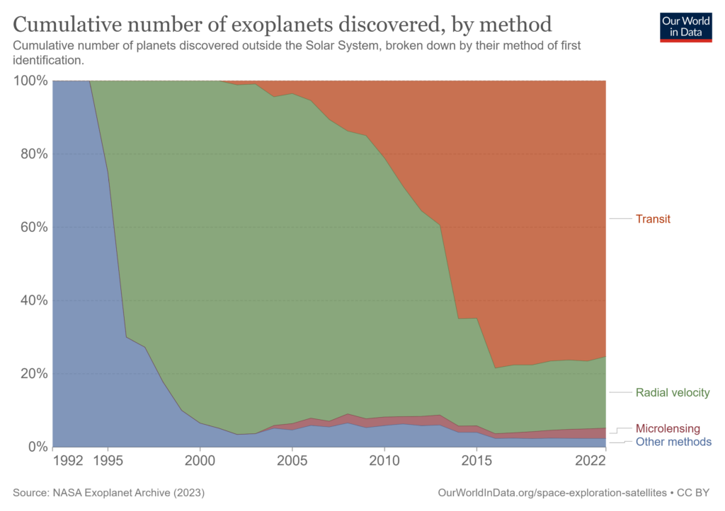
In the chart above, the same data on the cumulative number of exoplanets discovered has been plotted as a 100% stacked area chart. This gives us a fascinating insight into how drastically the major method of finding exoplanets has changed. While in recent years, we see the dominance of the transit method, we see that using radial velocity contributed to the majority of exoplanets found before this, and in the early years, we see the dominance of other methods of discovery.
For an overview of this topic, check out our related article linked here!
- By Hamsini Sukumar

Inforiver helps enterprises consolidate planning, reporting & analytics on a single platform (Power BI). The no-code, self-service award-winning platform has been recognized as the industry’s best and is adopted by many Fortune 100 firms.
Inforiver is a product of Lumel, the #1 Power BI AppSource Partner. The firm serves over 3,000 customers worldwide through its portfolio of products offered under the brands Inforiver, EDITable, ValQ, and xViz.