
Upcoming webinar on 'Inforiver Charts : The fastest way to deliver stories in Power BI', Aug 29th , Monday, 10.30 AM CST. Register Now
Upcoming webinar on 'Inforiver Charts : The fastest way to deliver stories in Power BI', Aug 29th , Monday, 10.30 AM CST. Register Now
Stacked area charts plot a measure on the y-axis whose total value is contributed by several categories, usually against the progression of time on the x-axis. These types of charts have several area charts stacked on top of each other to show the cumulative as well as the final totals.
A 100% stacked area chart works on the same principle, but each category is plotted as a percentage value of an absolute number, with the total adding up to 100%. The y-axis therefore plots percentages instead of numbers. You can quickly identify a 100% stacked chart by its rectangular shape.
100% stacked area charts are used in situations where the percentage contributions from each category are more important than the absolute values of the total or the individual contributions themselves.
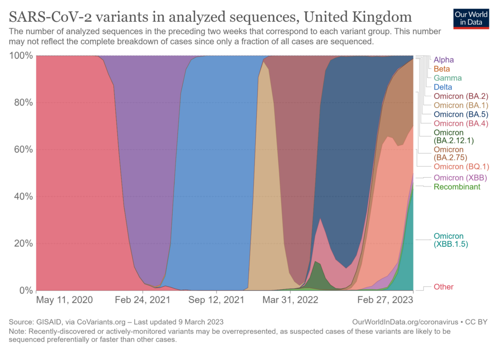
In the chart above, the relative proportions of different Covid variants in analyzed sequences in the UK are shown in percentage terms. We do not know the exact number of analyzed sequences, but we have a good overall picture of how different variants contributed to the total (in percentage terms) and how these contributions changed over time.
There are several advantages of using 100% stacked area charts.
In cases where we have large variations in the total, 100% stacked area charts help us with insights into time periods when our totals are too low to allow the reader to see details related to the contributing categories. This usually happens because of the scaling of the y-axis necessary to accommodate the periods when totals are high. However, we do not have this problem with 100% stacked charts. In the following graph, for example, we see the same data plotted in a 100% stacked area graph and a regular stacked area chart.
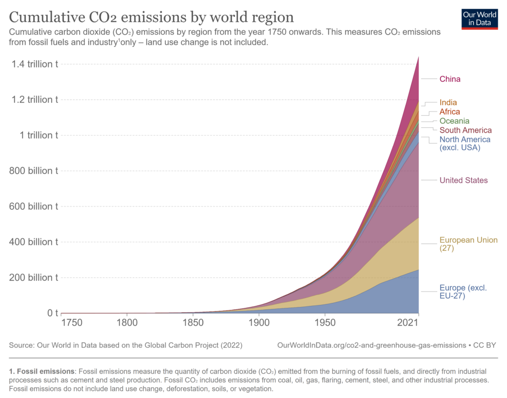
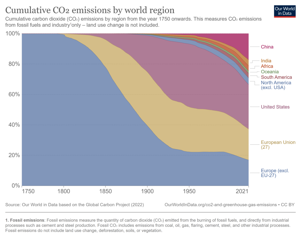
These charts depict the cumulative carbon emissions of the world from 1750-2021, broken down by region. In the standard stacked area chart, it is difficult for the reader to understand any details about the carbon emissions in the early years of this period (say, till 1900) because of the steep acceleration shown by the total in recent decades. The 100% stacked area graph however plots the cumulative emissions of each region as percentages of the total, and it is easy to see the pattern in contributions than has dominated historically.
Another advantage of 100% stacked area charts is that they provide a second baseline along the top of the chart, parallel to the x-axis. In a standard stacked area chart, we only have one baseline provided by the x-axis along the bottom of the chart. This horizontal baseline allows us to track the changes in the series at the bottom much more accurately than we can track the series above it, since each of the other series has a moving baseline given by the cumulative total of the series below it. The 100% stacked area chart provides an additional baseline at the top which allows us to track the percentage contribution of the series placed at the top as well as the bottom more accurately than the series between them.
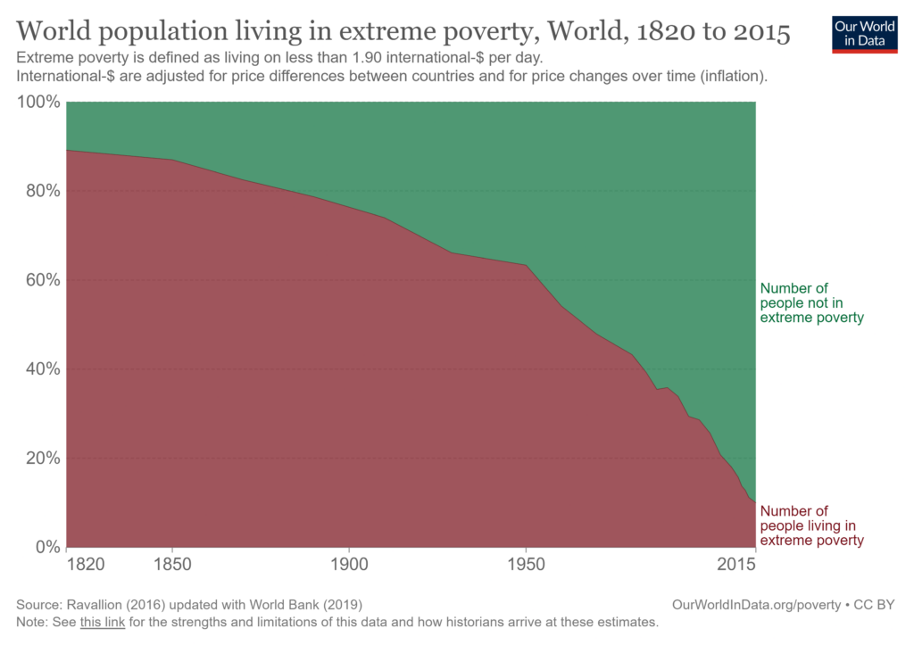
In the above chart, we can use the baseline at the top to estimate that the proportion of the world population that was not in extreme poverty in 1820 was only about 10%, and that this proportion has increased to about 90% in 2015.
With a 100% stacked area chart, we also have the power to dictate the order in which categories get stacked. This means that we can choose to place categories in a meaningful order in terms of importance or classification, or in a visually pleasing order (for example, by size). It is also important that we have the option to choose which categories we want to place at the top and the bottom of the chart – these two categories have constant baselines as discussed above, and this allows readers to follow changes within each category.
There are also disadvantages when it comes to using 100% stacked area charts. Some of these are listed below.
One disadvantage of this type of chart is that there is a loss of information as we can no longer follow the actual magnitude of the total or the categories. If the totals themselves are important, we may resort to a standard stacked area chart, but the focus of the 100% stacked area is on the relative contributions and not the totals themselves.
We may consider the same example from above of the cumulative carbon emissions split up by world region.
In the standard stacked area chart on the top, we can see a sharp increase in the total emissions, but this information is lost in the 100% stacked area chart on the right-hand side. There are other details that we can read from the standard chart – such as the total emissions from Europe excluding the EU-27 being above 200 billion tons in 2021 – which are also lost in the 100% stacked area chart.
Another disadvantage of 100% stacked area charts is that they do not allow us to add too many data series. This means that it is difficult to plot complex data sets with many contributing categories and we must restrict our attention to data sets with a relatively simple internal structure. In general, having too many series in one chart can make the chart crowded and hard to read and may cause confusion. It is best to limit the series to a number that keeps the chart clear.
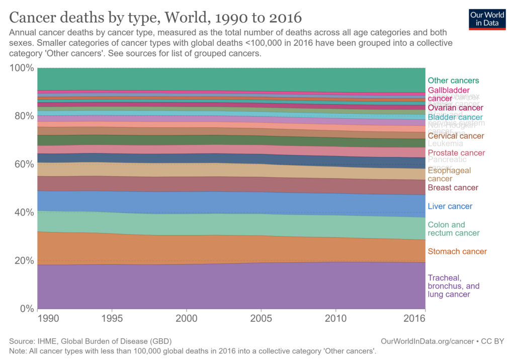
Consider the chart above showing cancer deaths by type between 1990 and 2016. Notice how the large number of series plotted makes the labels overlap on the right and renders some of the series nearly impossible to understand. Avoid plotting too many series to improve the readability and clarity of your chart.
The line width effect is a limitation of our visual perception where we tend to estimate the distance between curves as the shortest distance between them instead of as the vertical difference. This shows up in many forms, and one example of this is illustrated below where we plot the percentage contribution of sales revenue by product category. It is apparent that the percentage contribution of Category 1 (blue) increases over our time period, but what happens to Category 2 (yellow) in this period? The percentage contribution of Category 2 also increases from about 5% to about 13%, but this is not very visible because we tend to estimate its width at the shortest section instead of using the vertical distance. This effect is especially strong during time periods where Category 1 shows a steep increase, such as between June and August 2023. We tend to underestimate the increase in the contribution of Category 2 at this time because the width of the curve appears smaller than the vertical distance which is the value that we actually plot.
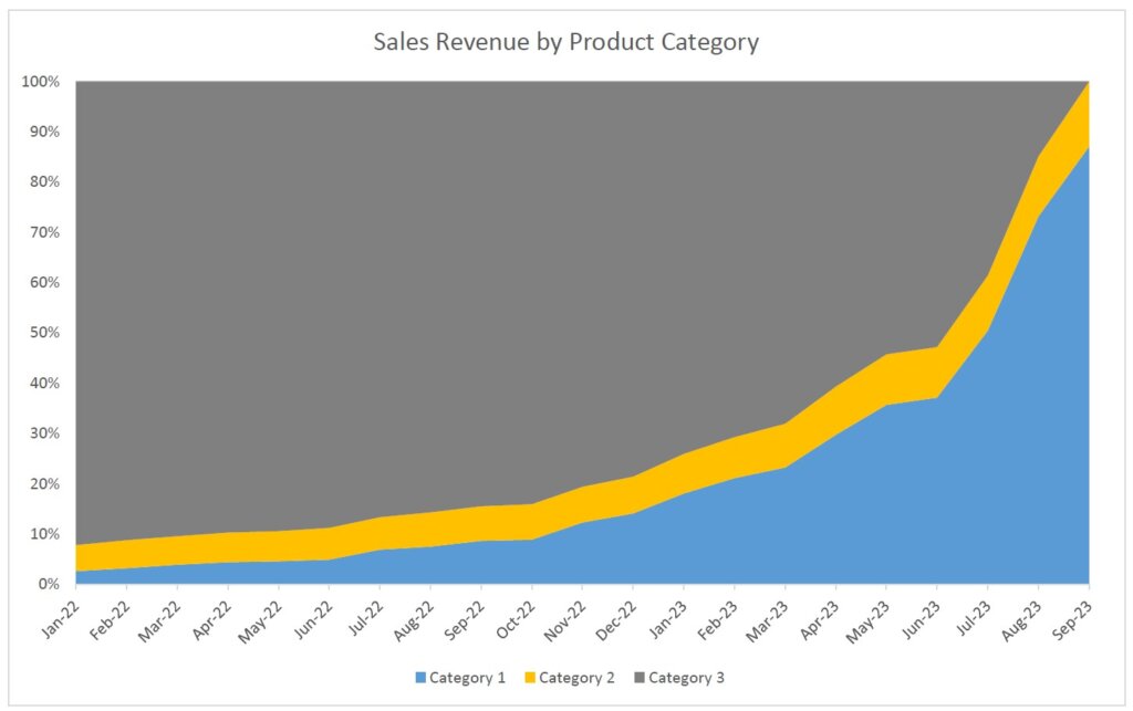
One form in which the line width effect comes into play in a 100% stacked area chart is thus when we have two categories, both of whose proportion of contribution is increasing, but with one rising more sharply than the other. If we put this steeper curve at the bottom and stack the other curve on top of it, we will likely not even be able to see that the contribution of the second curve is increasing.
- By Hamsini Sukumar
Stacked Area Charts - An Overview
Stacked Area Charts: When to Use Them and When to Avoid Them?

Inforiver helps enterprises consolidate planning, reporting & analytics on a single platform (Power BI). The no-code, self-service award-winning platform has been recognized as the industry’s best and is adopted by many Fortune 100 firms.
Inforiver is a product of Lumel, the #1 Power BI AppSource Partner. The firm serves over 3,000 customers worldwide through its portfolio of products offered under the brands Inforiver, EDITable, ValQ, and xViz.