
Upcoming webinar on 'Inforiver Charts : The fastest way to deliver stories in Power BI', Aug 29th , Monday, 10.30 AM CST. Register Now
Upcoming webinar on 'Inforiver Charts : The fastest way to deliver stories in Power BI', Aug 29th , Monday, 10.30 AM CST. Register Now
Stacked area charts can be used to visualize changes to contributions and totals simultaneously over time. While they are simple to create, it is important to keep a few points in mind as you consider them for your data visualization needs.
Area charts use the area under the curve to show the magnitude of the measure that is plotted, and the same principle applies to stacked area charts as well. The area under the curve depends on the distance between the curve and the x-axis, and this distance would change depending on whether the y-axis begins at zero or not. In order to accurately represent data and avoid misinterpretations, it is imperative to begin the y-axis at zero.
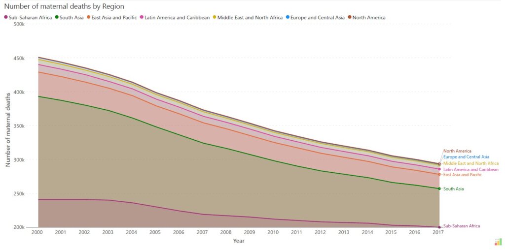

If we look at the chart above, we may interpret it to mean that the maternal deaths in South Asia far exceed the number in Sub-Saharan Africa, but this is a false impression created by the y-axis starting at 200,000. The correct representation is the chart below, where the y-axis begins at zero. In this chart, we can clearly see that the number of maternal deaths in Sub-Saharan Africa exceeds that of South Asia during the entire time period visualized.
Stacked area charts are ideal for parts-to-whole representations of how a total transforms over time. In doing this analysis, we may wish to emphasize the change in the absolute numbers or contribution of one particular category value (e.g., Region = East). It is best to place this important category first on the horizontal axis as this allows the reader to track both the absolute performance of this category and its contribution to the total. If we place this category instead on top of some another (e.g., Region = Southwest), you would no more be able to keep an eye on the absolute performance of the most important category (East) – as its baseline is now the curve below and not the x-axis anymore.
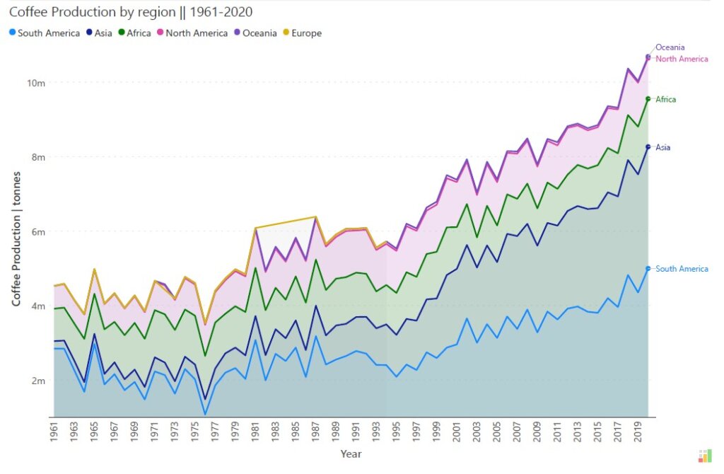
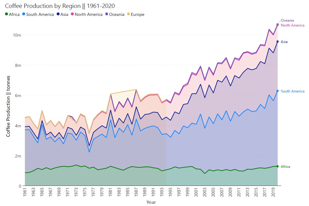
Both of the charts above plot coffee production by region from 1961-2020. If we wish to track the coffee production in Africa over this period, the chart above obscures the absolute values by placing the area chart Africa on top of those of South America and Asia. However, we may remedy this by placing the values for Africa on the horizontal baseline as in the chart below to clearly see the changes that take place over this period.
Use a meaningful ordering when stacking multiple data series. Consider if your categories have a natural order in terms of size, importance, or classification, and use this order to stack different series. This will make data interpretation intuitive and logical for your audience.
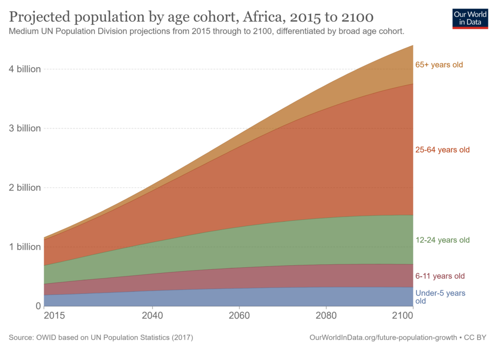
For example, in the above chart showing the projected population in Africa broken down by age group, the age cohorts have been stacked on top of each other in ascending order which makes interpretation of the chart natural and easy.
If you have several small categories that contribute only a small percentage of the total, consider grouping all of these into a “Miscellaneous” or “Other” category. This reduces clutter and distractions and focuses your reader’s attention on the big picture. Stacked area charts are great at providing quick ideas about the overall trends without a focus on exact numbers, and adding too many small values can detract from these insights.
Since stacked area charts show several series of data simultaneously, it is important to provide context using appropriate labels and subtitles to pre-empt confusion. Make sure to label the axes, provide a legend, and label the categories to enable your readers to draw the right conclusions. Consider placing the category labels on the right-hand side of the chart to avoid clutter and make for easy reading.
Limit the number of series you plot on a stacked area chart to aid ease of interpretation. Having too many series provides too many pieces of information for the reader to process and can distract from the overall trends in totals and composition that you want to showcase. Make your chart clear and concise by limiting the number of series that you plot.

In the above chart, notice how the data labels for each series on the right overlap because of the huge number of series plotted. It is nearly impossible to understand which series is being plotted in some instances, and this takes away from insights on trends and composition that the reader may have discerned.
Stacked area charts are used to show the evolution of a total over time while giving an idea of how the different categories that contribute to this total also change. These charts are thus designed to be used with categorical data, where these categories sum to a whole. If your data is not broken up by categories, or if your categories do not logically sum to a whole, a stacked area chart is not suitable for your needs. Consider if a bar chart or a line chart may instead be useful.
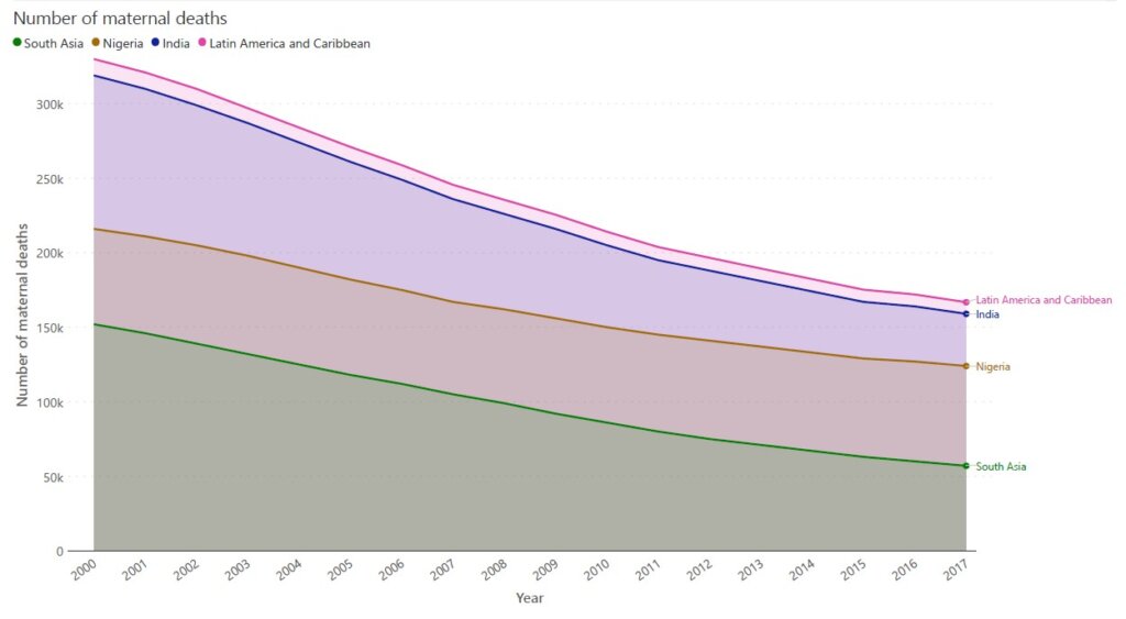
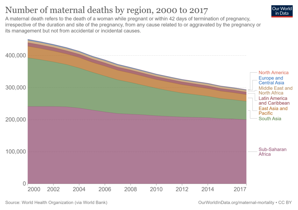
In the first chart above, for example, the regions and countries shown include South Asia, India, Nigeria, and Latin America, which don’t sum up in any meaningful way to a whole. The chart below instead uses a logical breakdown of world regions to visualize cumulative data.
While presenting different categories on a stacked area chart, avoid using too many similar colors for different categories. This stops readers from easily distinguishing between categories and can lead to confusion. Instead, use easily distinguishable colors and consider using color strategically to group similar categories or to highlight an important contributor.
Stacked area charts are prone to the line width effect or the sine effect, where our brains tend to read the distance between curves at the closest point between them instead of the vertical distance between them. In cases with sudden changes in the values, the line width effect can make steep changes seem larger than they are or can obscure the reader’s evaluation of how two categories perform relative to each other. Be aware of the line width effect while designing your chart, and use a separate line chart to plot the differences between categories where it is important to highlight this aspect.
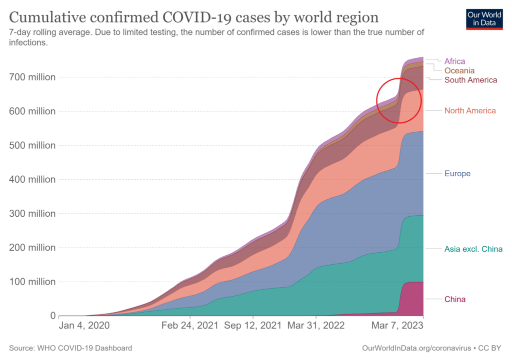
In this chart visualizing Covid-19 cases broken down by world region, we see an apparent narrowing of the area occupied by South America in the region indicated by the red circle and our brains interpret this to mean a drop in the number of cases in South America. This is the line width illusion in play – the number of cases in South America actually increased during this period and this would be apparent if we measured the vertical distance instead.
- By Hamsini Sukumar
Stacked Area Charts - An Overview
Stacked Area Charts: When to Use Them and When to Avoid Them?

Inforiver helps enterprises consolidate planning, reporting & analytics on a single platform (Power BI). The no-code, self-service award-winning platform has been recognized as the industry’s best and is adopted by many Fortune 100 firms.
Inforiver is a product of Lumel, the #1 Power BI AppSource Partner. The firm serves over 3,000 customers worldwide through its portfolio of products offered under the brands Inforiver, EDITable, ValQ, and xViz.