
Upcoming webinar on 'Inforiver Charts : The fastest way to deliver stories in Power BI', Aug 29th , Monday, 10.30 AM CST. Register Now
Upcoming webinar on 'Inforiver Charts : The fastest way to deliver stories in Power BI', Aug 29th , Monday, 10.30 AM CST. Register Now
A slopegraph is a simplified line chart where multiple entities are tracked between two categories. These categories can be points in time or two different quantitative values. We may think of a slopegraph as a line chart with only two points plotted for each entity. Slopegraphs were invented by Edward Tufte and provide a clean yet information-rich display. We will examine the use cases for these charts, scenarios when they should be avoided, some advantages and best practices.
Slopegraphs tell compelling “before” and “after” stories, showing values at the beginning and the end of a time period. This allows the reader to focus on how different entities have fared overall, without being distracted by the intermediate pattern of troughs and peaks. These charts are therefore best used when it is not important to show data for the entire period. Slopegraphs show the absolute values of different entities and allow us to make comparisons between different points in time using the slopes shown.
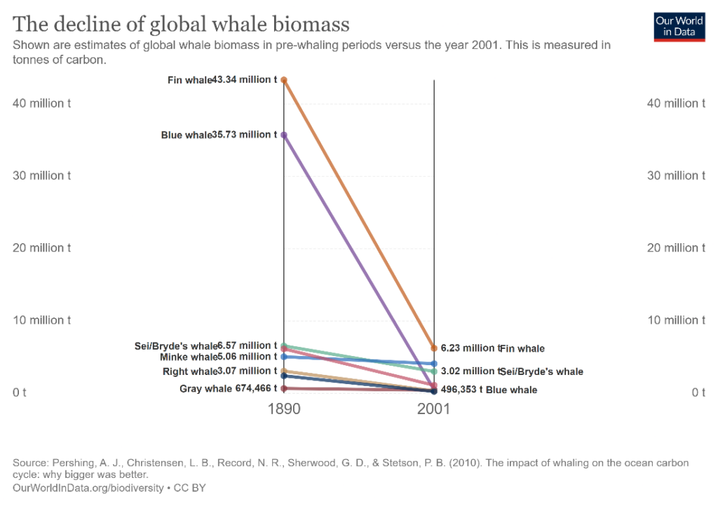
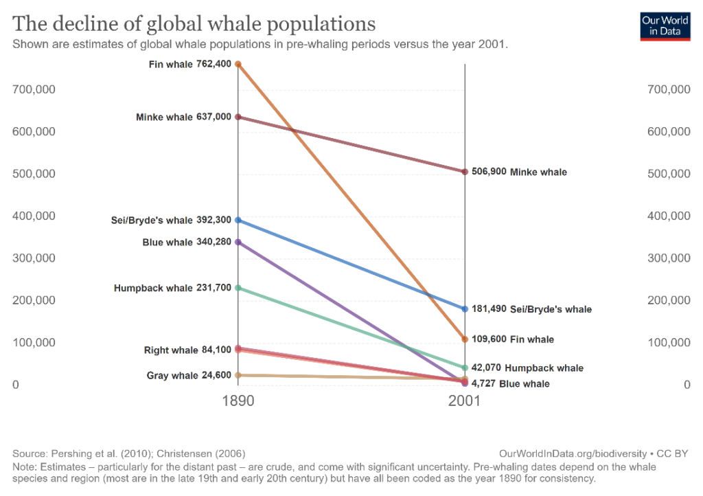
The following chart, for example, shows the difference in whale populations of different species between 1890 which predates whaling (i.e., whale hunting), and 2001. We see that there has been a substantial decline in numbers across species since pre-whaling times, which suggests that whaling may have contributed to this decline.

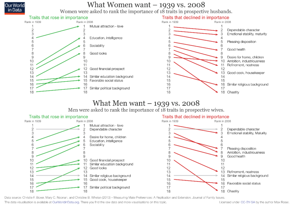
The simple vertical layout of a slopegraph allows easy representation of hierarchy and enables us to show changes in rankings between time periods. The fascinating chart below shows the changes between 1939 and 2008 in the traits that women and men valued in prospective spouses. The 18 traits are shown as rankings, and we see how priorities for both sexes have changed over the decades.

Slopegraphs provide insights into the relative increases or decreases between various categories. For example, we may have two categories that have shown declines. But one category declines faster than the other. This information is revealed by the slope of each category.
We may illustrate this with the same chart on whale populations from above. The slope of the line for each species gives us a measure of how steeply its population has declined – for instance, the Fin whale had the largest population among all the whales shown in 1890, but its population dropped very steeply to about a seventh of its previous strength, while the Minke whale, which also saw a decrease in numbers, showed a much more gradual decline.
We may also use a slopegraph to show relative positioning across two different quantitative observations. This can highlight correlations, or deviations from the expected positioning. For example, we may expect the number of Nobel prizes won to be in proportion to the population of a country, but a slopegraph may show the huge disparities caused by global inequalities in income and education. Countries with smaller populations but higher incomes may bag more medals simply because a larger proportion of their population can spend time and resources on research instead of daily subsistence.
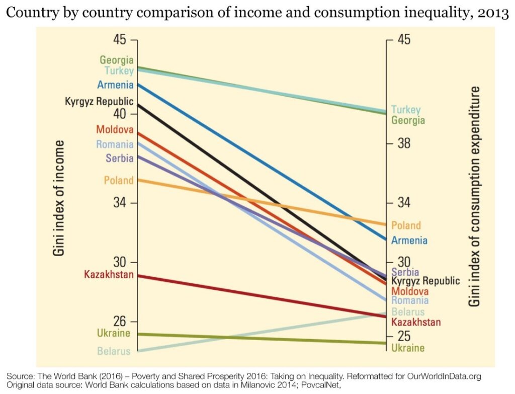
The following chart shows a comparison between income and consumption inequality in middle income countries. We see that consumption inequality is lower than income inequality in most countries, which makes sense as consumption can be tided over by savings and loans.
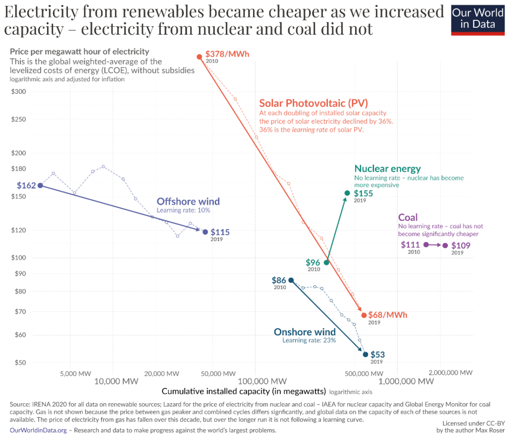
Consider using innovative variations on the slopegraph to show multiple categorical variables. The following chart, for example, shows how the price and the capacity of electricity produced by different sources has changed between 2010 and 2019. It illustrates how the price of renewable energy has declined with an increase in capacity. This makes for an information rich graph with several variables – electricity source, price, capacity, and time – while staying clean, legible and on target with its message.
Slopegraphs work well to show entities that deviate from the general trend shown in the data. This is the type of information that could be obscured by the use of a line graph – a chart showing the peaks and valleys of the entire period does not allow for easy comparison of the starting and end points. These comparisons are especially important when all but one of the entities show a particular trend. Slopegraphs make these distinctions visible by showing the one slope that goes against the grain.
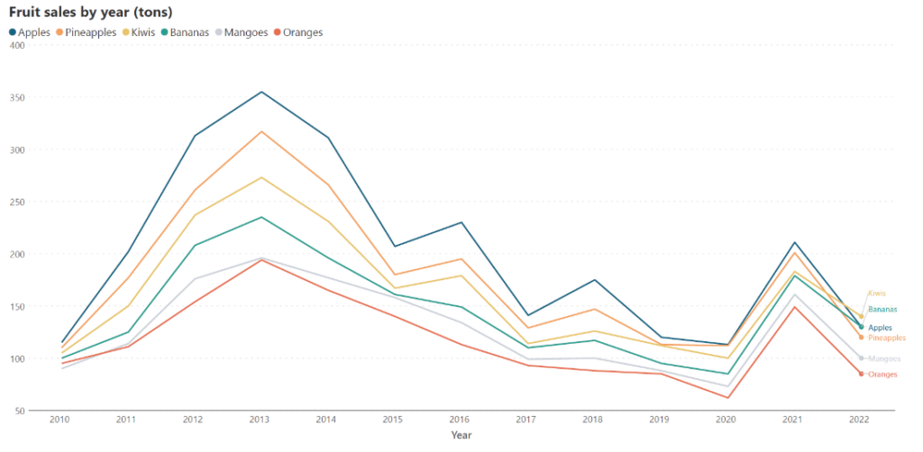
Consider the line chart below. Here, a fictional fruit vendor tracks the yearly sales of different fruits from 2010 to 2022. We see the pattern change from year to year, but how do sales in 2010 compare to sales in 2022? This is difficult to immediately see because of the pattern of sales in the intervening years.
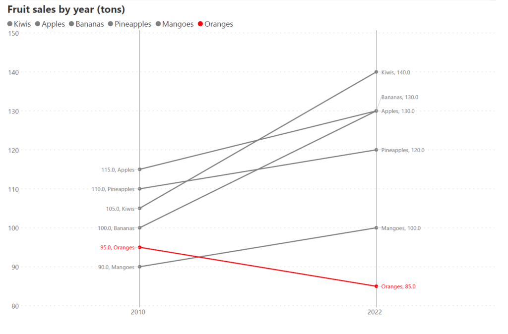
If instead, we were to plot a slopegraph comparing 2010 and 2022, we immediately see that the sales of all fruits increased, except for Oranges, which in the chart below has the only downward slope. This deviation from the trend becomes immediately apparent.
Avoid using slopegraphs when there is no relationship between the quantitative values compared. These types of comparisons may show correlations in the data, but the relationships themselves are logically meaningless. Keep in mind that correlation does not imply causation - your categories need not be causally related, but must at least have a meaningful connection. Check out this website for amusing examples of excellent but meaningless correlations. For example, it has a chart showing a 96% correlation between the consumption of mozzarella cheese and the number of Civil Engineering doctorates awarded!
The message of a slopegraph can also be confusing in cases where data does not show any specific trends over time or across categories. This can result in a chart with crisscrossing lines with no real story. Choose wisely between charts in this scenario.
There are scenarios where the intermediate stages of evolution are as important as the beginning or the end. These are scenarios where slopegraphs can be avoided in favor of line or area charts to preserve detail in the information on trends.
Slopegraphs provide the following advantages:
The usage of too many slopes can make the chart crowded, illegible, and hard to label. Limit the number of slopes to keep your chart engaging and clean.
Color can be effectively used to elucidate information on a slopegraph:
Include the names as well as the values in the label for each entity. Expand your vertical axis to accommodate all labels. Use clear labels on the left-hand side and the right-hand side axis.
Get your free copy of Inforiver Analytics+ today and try out slopegraphs in Power BI.
-By Hamsini Sukumar
*Inforiver Charts has been renamed to Inforiver Analytics+, a 3-in-1 visual for dashboards and storyboards. It offers 50+ charts, cards, and tables.

Inforiver helps enterprises consolidate planning, reporting & analytics on a single platform (Power BI). The no-code, self-service award-winning platform has been recognized as the industry’s best and is adopted by many Fortune 100 firms.
Inforiver is a product of Lumel, the #1 Power BI AppSource Partner. The firm serves over 3,000 customers worldwide through its portfolio of products offered under the brands Inforiver, EDITable, ValQ, and xViz.