
Upcoming webinar on 'Inforiver Charts : The fastest way to deliver stories in Power BI', Aug 29th , Monday, 10.30 AM CST. Register Now
Upcoming webinar on 'Inforiver Charts : The fastest way to deliver stories in Power BI', Aug 29th , Monday, 10.30 AM CST. Register Now
Column charts use vertical bars to encode the value of a measure. Stacked column charts are a variation on the standard column chart where we divide each of the columns into segments, representing the different data series that sum to the total. While the x-axis encodes a single categorical variable in a standard column chart, a stacked column chart encodes a second categorical variable in addition, by dividing the columns into segments. These columns can encode absolute numbers as in the case of the standard stacked column chart or percentage contribution as in the case of the 100% stacked column chart. The former has columns of different heights in proportion to the total, while the latter has columns of the same height, each divided into segments in proportion to its percentage contribution.
The primary use for stacked column charts is to showcase totals that are the sum of two or more categories. This allows us to compare totals and highlight differences in their contributing components. Consider the chart below, for example.
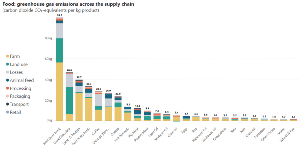
Here, we plot the kilograms of carbon dioxide emitted per kilogram of food produced for different food types, broken down by the emissions from each stage of the supply chain. We can compare total emissions to see where the highest emissions come from, and simultaneously understand how the different parts of the supply chain contribute to the emissions. We notice, for example, that emissions from the farm (yellow) contribute significantly across food types, while emissions from land use and losses also contribute a relatively high proportion to the totals.
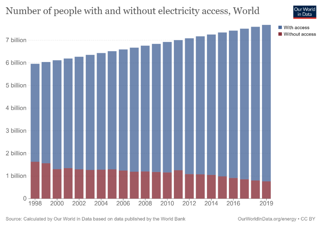
Stacked column charts are versatile in use and can depict both time series and non-time series data. Consider the two examples below. The first chart is a time series that shows the number of people in the world with and without electricity access from 1998 to 2019. We can see how the number of people in the world has grown during this time and how the number of people without access to electricity has declined.
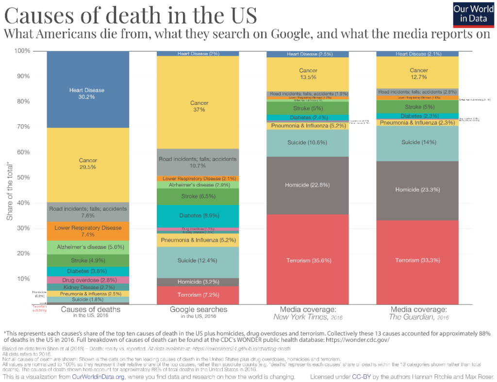
In the second example below, the category for the x-axis is not a time series at all! It allows us to compare the relative proportions of the causes of death in the US with the proportion in which Americans search for these causes on Google and the proportion of media attention that is devoted to these causes. It is interesting to see, for example, that heart disease is such a major cause of death among Americans but receives an almost negligible quantity of attention on Google searches as well as in the media. On the other hand, terrorism, which contributes to less than 0.01% of deaths in the US receives hugely disproportionate attention in the media as well as in searches on Google. Stacked column charts can therefore be used to compare categorical data that is divided by subcategory, rather than just time series data.
You may face scenarios when the patterns in the relative proportion of the categories contributing to the total are as important as the trend in the total. Stacked column charts are excellent for these purposes. For example, we may look at the chart below showing the total number of child deaths per year, broken up by cause of death. The causes are divided into those that are vaccine-preventable and those that are not vaccine-preventable, with the former shown in detailed categories. This may be a scenario where it is important to note that the total number of deaths shows a decline from 1990 to 2017, but also that the absolute number as well as the relative proportion of vaccine-preventable deaths have declined during this period.

One of the useful variations of the stacked column chart is the 100% stacked column chart. In this type of chart, the y-axis plots percentage contribution instead of absolute numbers. This means that all of the columns are of the same length, representing the total of 100%, and the focus is on the proportion of contribution made by the segments rather than the exact values of the totals.
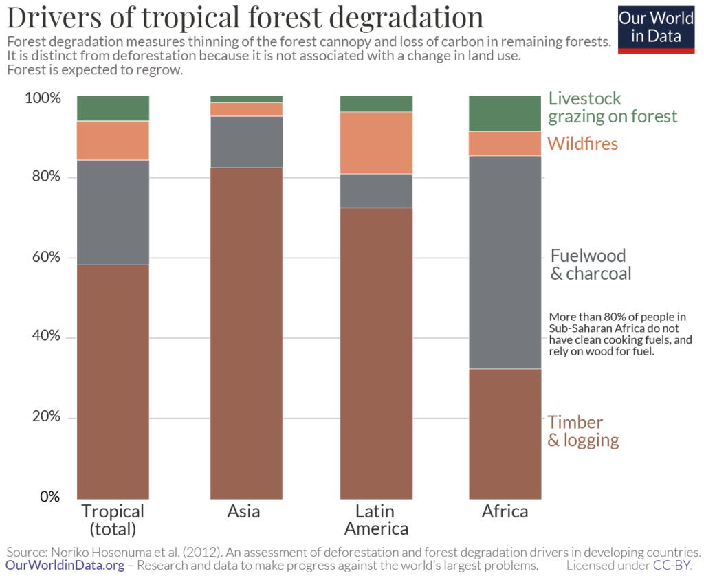
The example above examines the driving factors of tropical forest degradation by percentage contribution to the total in a 100% stacked column chart. The chart shows us, for instance, that timber and logging account for the highest proportion of forest loss in Asia and tropical forests at large, but the percentage contribution of this category to global tropical forests is smaller than its percentage contribution in Asia. This is a good illustration of a situation where it does not make sense to compare absolute totals, making a 100% stacked chart a good choice – tropical forests in Asia, Latin America, and Africa would be included in the total tropical category, and it would not make sense to compare the totals for the individual regions with this total for all tropical forests. We can instead compare the relative contributions to derive insights.
It is important to keep in mind that stacked column charts can only be used when all elements are positive or negative. This is because they work unidirectionally. If you have data with both positive and negative elements, consider using a diverging column or Marimekko chart instead, like the one below.
Stacked column charts give us a precise idea of only the total and the category that rests on the horizontal axis. This is because the axis acts as a constant baseline to allow us to judge the heights of the columns. The categories resting on top of each other cannot be judged with the same accuracy.
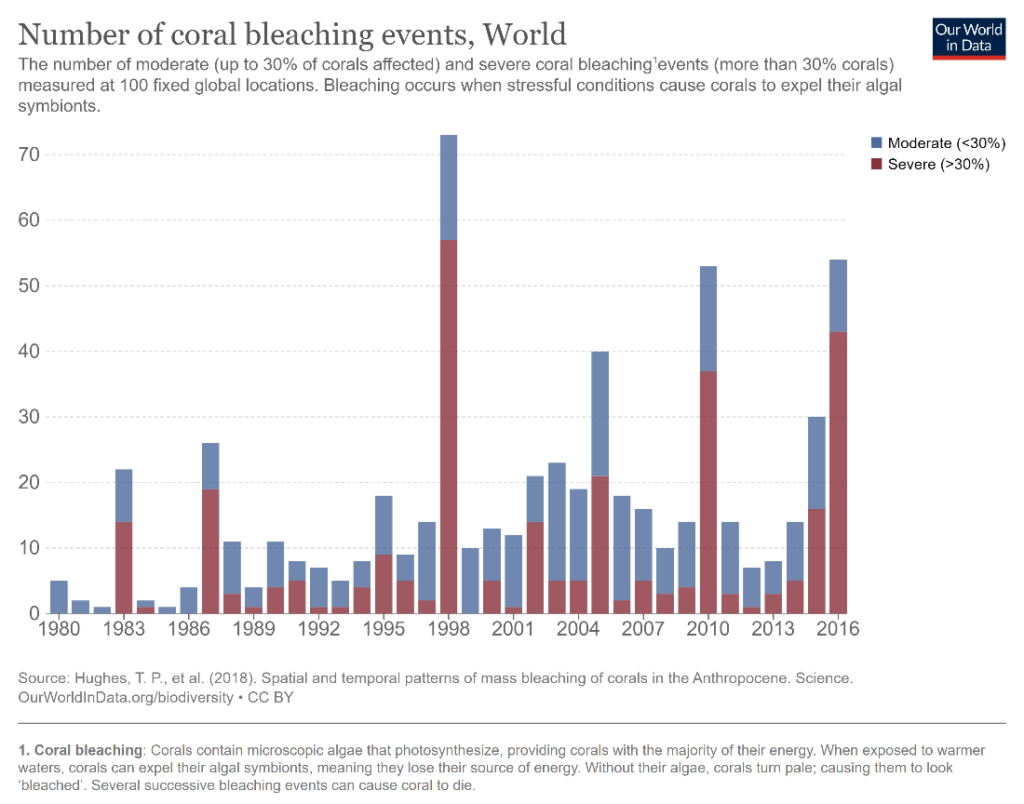
In the example below, a stacked column chart is used to visualize the number of coral bleaching events in the World, divided by severity. We can accurately compare the column heights for the total number of events as well as for severe events (brown columns) in different years, what about comparisons between moderate events (blue columns)? This is difficult to do because the baseline provided by the brown bars below keeps changing. Compare the number of moderate events that took place in 2006 and 2010 – are you able to tell which one is greater? What about the number of severe events in the same years? We find that the latter question is much easier to answer than the former because of the constant baseline.
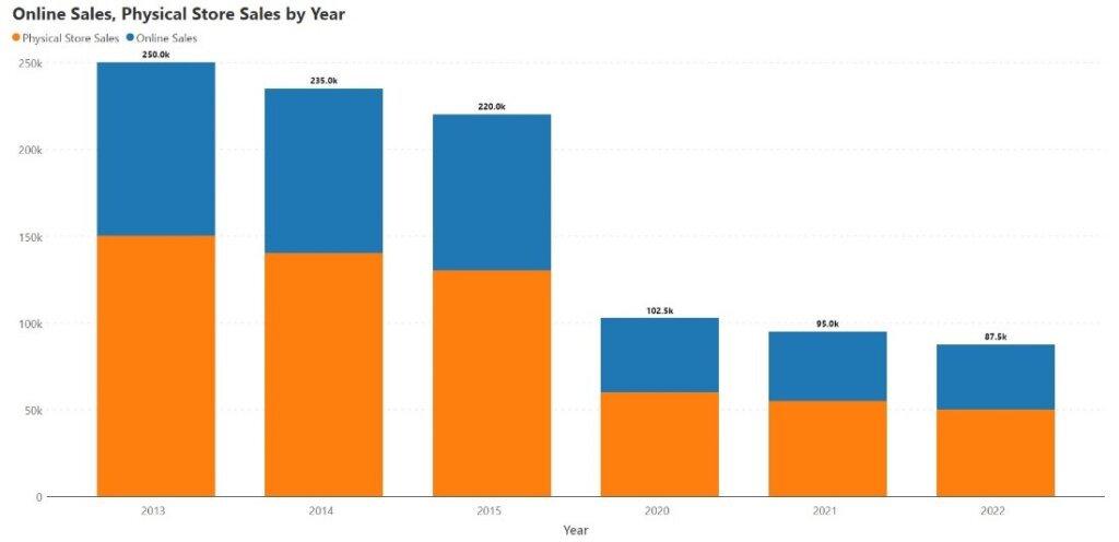
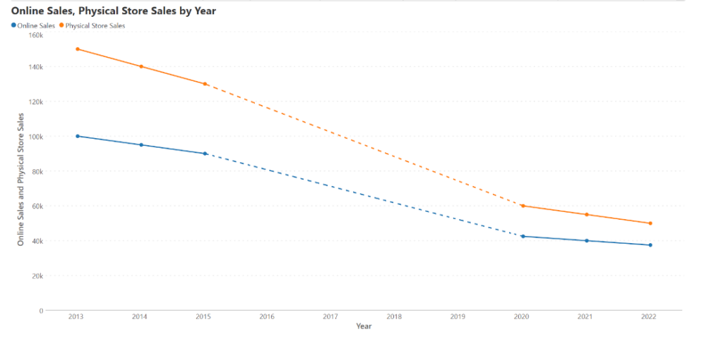
The format of a stacked column chart can make missing data points difficult to indicate and can make their interpretation difficult. Consider the following example where we plot sales data by year, divided into online sales and sales from physical stores. We notice that there is a decline in sales, and at first glance, we may assume that there is a steep dip in sales after 2015. This is a misrepresentation because the data between 2015 and 2020 is missing. If we plot the same data on a line chart (shown below), we see that the rate of decline has been much more gradual, and this gives us a better appreciation of the overall trend.
As observed above, accurate comparisons can be made for the totals and for the series that is positioned on the horizontal axis because of the constant baseline. Consequently, it is advisable to position the contributing series whose changes you want to follow directly on the x-axis.
Column charts use the height of the column to encode the value of a measure. This height is measured from the horizontal axis, which should thus always intersect the vertical axis at zero. The visual weight of the column also lends to the reader’s perception of its height, and it is therefore advisable to begin the y-axis at zero.
Column charts have heavy visual weight because of the density of the columns in the chart space. This means that an excessive number of tick marks and gridlines can make the chart very crowded and hard to read. Use these features strategically with stacked column charts.
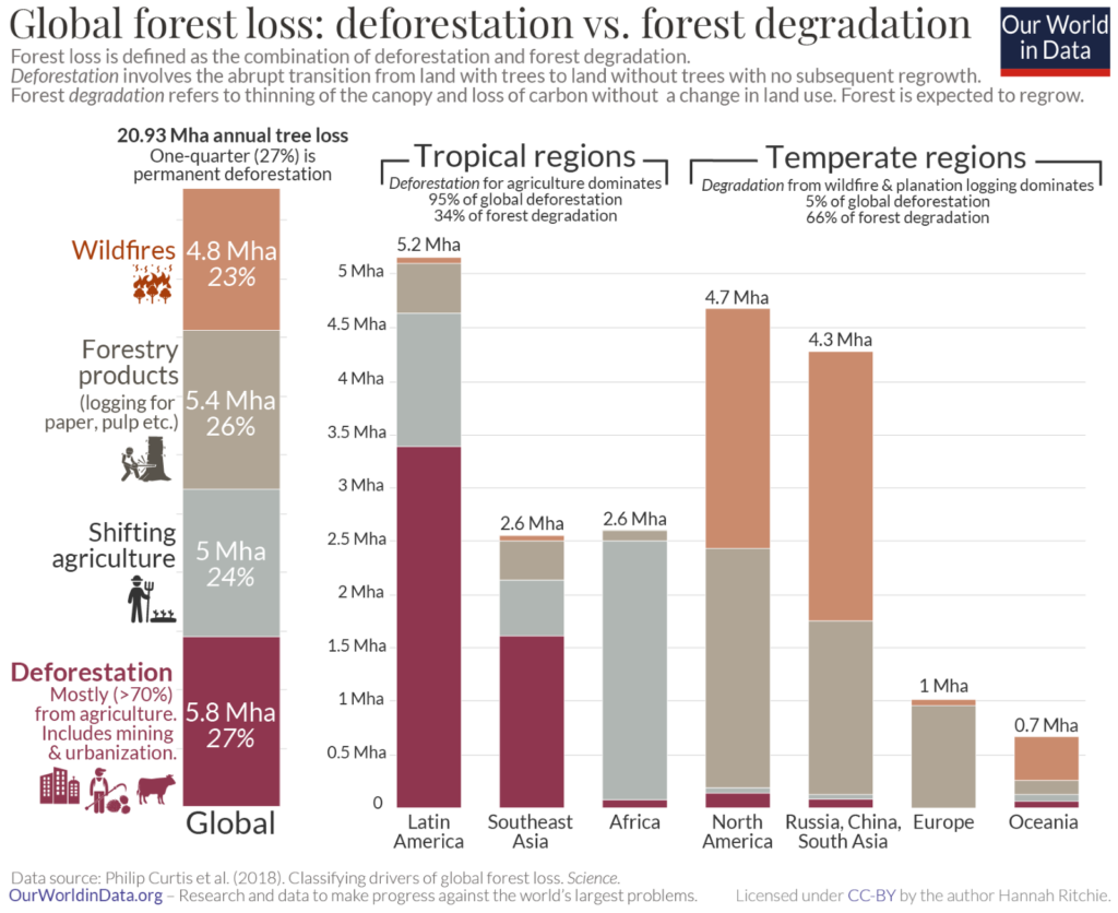
Legends for the different categories must be positioned to the left of the leftmost column or to the right of the rightmost column. This improves legibility and allows the reader to focus on the information represented in the chart itself. In the following chart, we can see how keeping the legend to the left of the leftmost column keeps a chart with a lot of information clean and legible. (Interestingly, the legend in this example acts as a 100% stacked column itself, showing us the global proportions of the different drivers of forest loss!)
- By Hamsini Sukumar

Inforiver helps enterprises consolidate planning, reporting & analytics on a single platform (Power BI). The no-code, self-service award-winning platform has been recognized as the industry’s best and is adopted by many Fortune 100 firms.
Inforiver is a product of Lumel, the #1 Power BI AppSource Partner. The firm serves over 3,000 customers worldwide through its portfolio of products offered under the brands Inforiver, EDITable, ValQ, and xViz.