
Upcoming webinar on 'Inforiver Charts : The fastest way to deliver stories in Power BI', Aug 29th , Monday, 10.30 AM CST. Register Now
Upcoming webinar on 'Inforiver Charts : The fastest way to deliver stories in Power BI', Aug 29th , Monday, 10.30 AM CST. Register Now
Pie charts are a common type of data visualisation that are used to show performance or contribution by multiple categories.
In this blog, we'll look at how to use the pie chart appropriately, explore a few presentation ideas, and understand where they must be avoided.
Let us take this sample dataset where we have revenue from three cities.
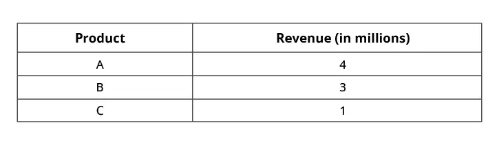
You can visualize this using a column chart or a pie chart as shown below.
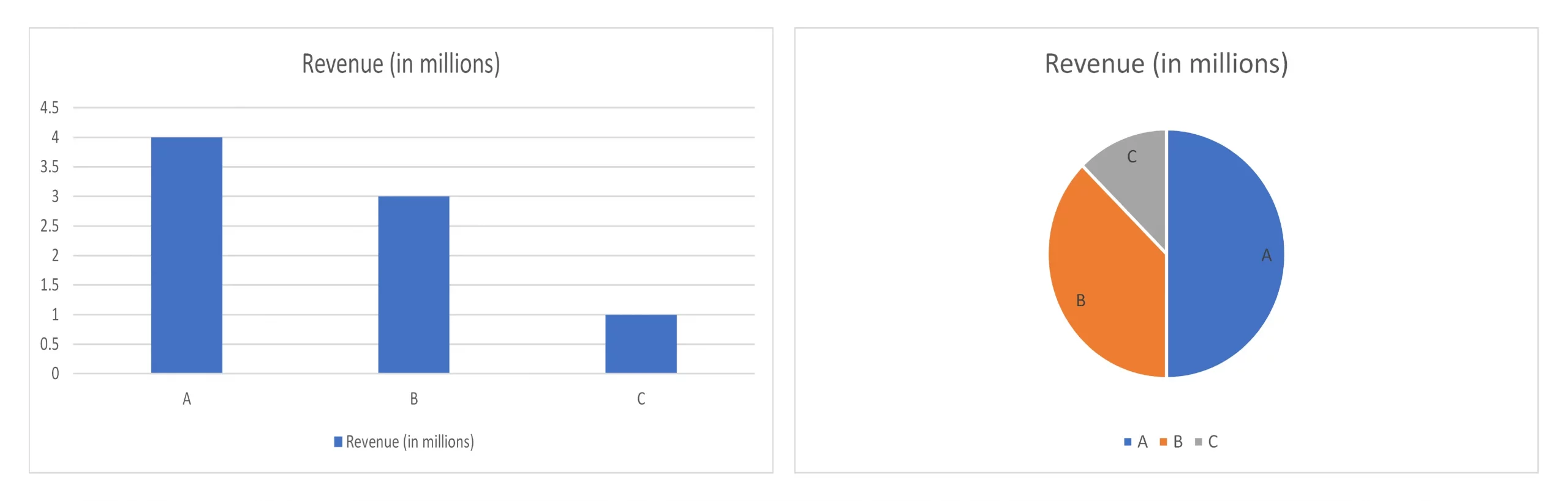
Notice that the column chart tends to communicate absolute revenue with clarity (e.g., City A is 4 million). On the other hand, the pie chart tends to communicate % share with clarity (e.g., City A contributes 50% of revenue, City B more than one-third of revenue, and so forth).
Interestingly, it is harder to make out from the column chart that City A contributes 50% of total revenue.
Pie charts, therefore, are very good in communicating % contribution than bar or column charts. Depending on what you are looking to highlight or communicate in your report, you must choose between a pie and a bar/column chart.
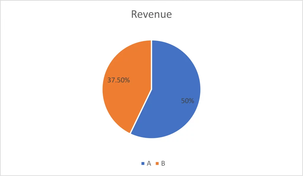
2. Pie chart observations should always add up to 100%
While building pie charts, ensure that you consider all categories and observations that add up to 100%. For example, if you have five regions, you need to display all regions in the pie. Excluding a region and rendering a pie chart with the remaining four will skew the % contribution from each of the remaining regions.
In this example below, we are showcasing only cities A and B (from the same dataset as above). It paints an incorrect representation of % contribution of revenue from these cities.
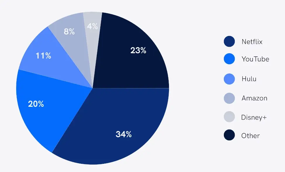
3. Consider pie charts when your data is in percentages
Consider the case of market share data of several streaming services. Assuming your raw data is in percentages, it makes more sense to render it using a pie chart (unless you have too many observations making the pie crowded – in which case you will revert to a bar or column chart).
Similarly, infographics showing gender participation in the workforce is often shown in a pie chart.
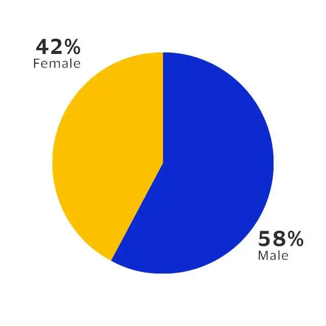
In these cases, a pie chart may provide a better representation than a bar or column chart.
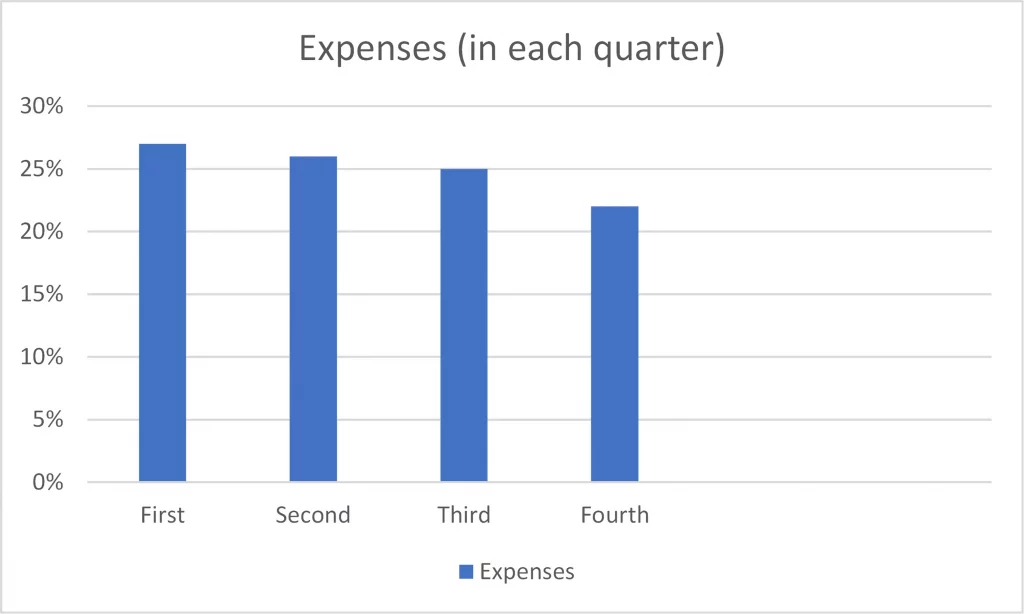
4. Pie charts are more effective when distribution is slightly skewed
Pie charts are more suited for data that is slightly skewed (than when data is evenly distributed).
Take the example below tracking expenses by quarter. Since each quarter contributes to almost a similar amount, the chart is not much of value.
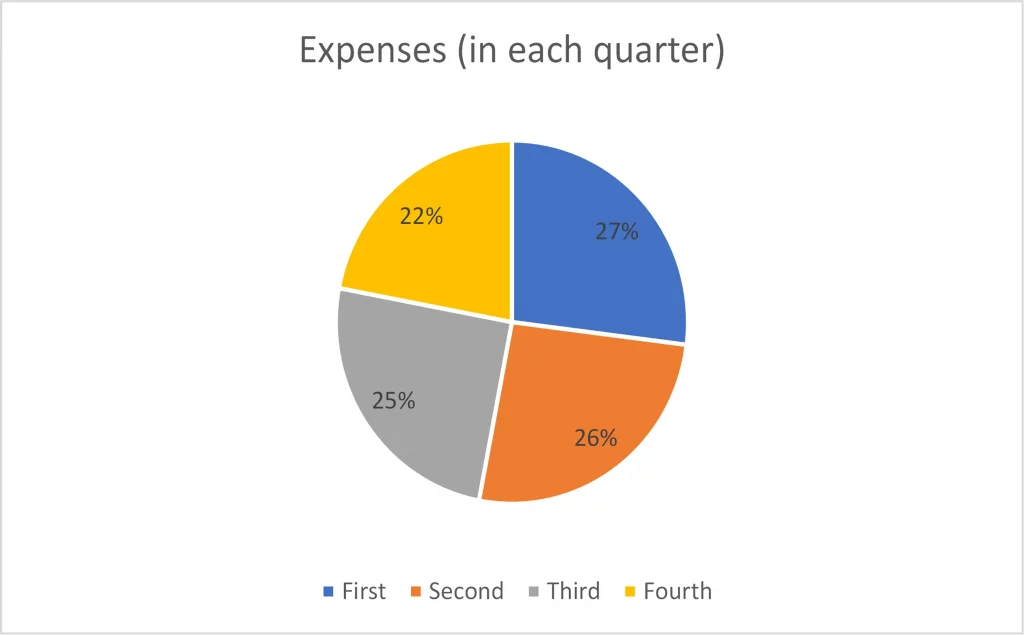
A bar chart may be a better option for plotting such data, as you will be easily able to compare two quarters easily.
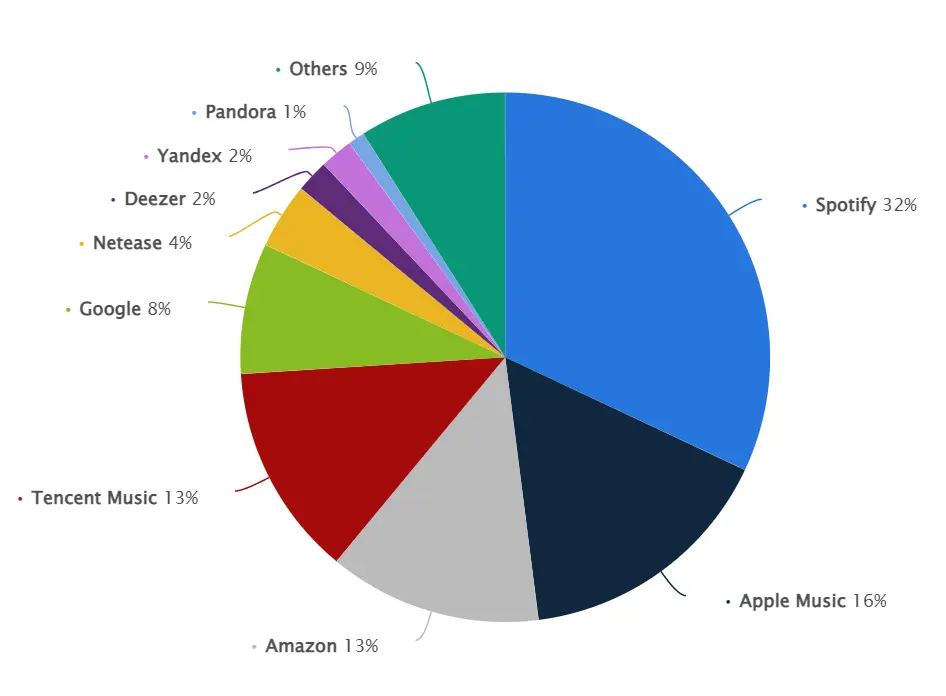
5. Pie charts are ideal when you have at the most five (5) category values
Pie charts are most effective when there are fewer categories, ideally less than or equal to 5. As the number of observations increase, readability becomes difficult. It also becomes challenging to distinguish colors of similar tones or contrast. The slices/pies also get smaller and crowded.
Take the example below highlighting music streaming subscriber share in 2021. The larger of these services are easier to spot, but smaller ones lose out. In addition, there are at least two shades of both blue and green, impacting user experience.
6. Pie chart values must be sorted
When creating a pie chart, sort the values in descending order of size. Sorting makes it easier for viewers to quickly identify the top contributors, and also compare the relative proportions of each category.
For example, the image on the right below is easy to consume, while the one at the bottom which is unsorted appears cluttered and a bit disorienting.
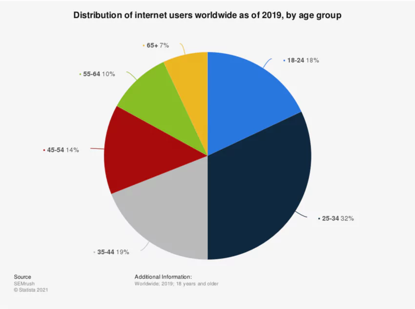
7. Avoid pie charts for sequential categories
When your categories are sequential (e.g., quarters), it is better to avoid a pie chart and go for a column chart.
For example, the illustration below shows age distribution of internet users worldwide in 2021. If they are sorted in order of category (e.g., those aged 18 to 24 followed by those in age group 35 to 44), it may be easier to misinterpret that age group 18-24 is the largest group. Sorting the data will throw the categories out of order. It is better to avoid pie charts to showcase such data.
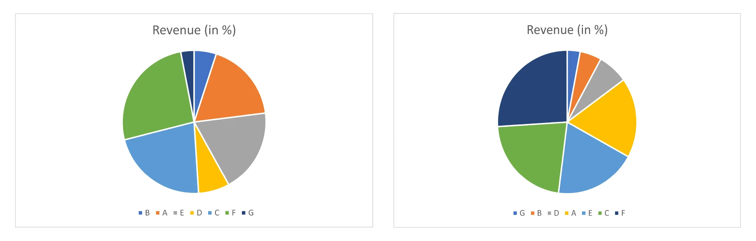
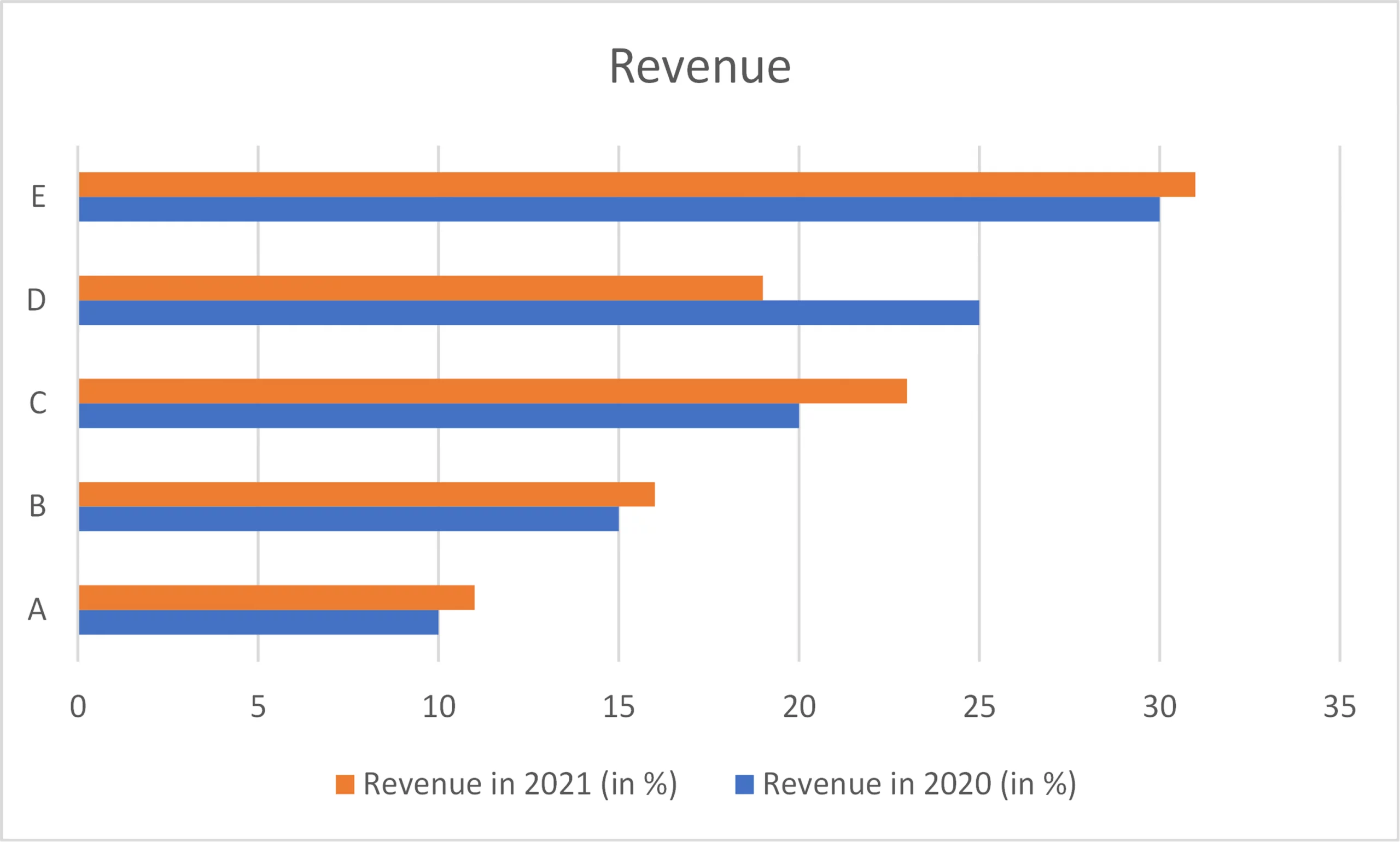
8. Do not use pie charts side by side to facilitate comparison
Comparing categories in two pie charts will often not yield desired results. One reason is that the relative positioning of categories within a pie chart may change due to sorting. Even if they remain the same (as shown below), it is difficult to compare pies across two charts.
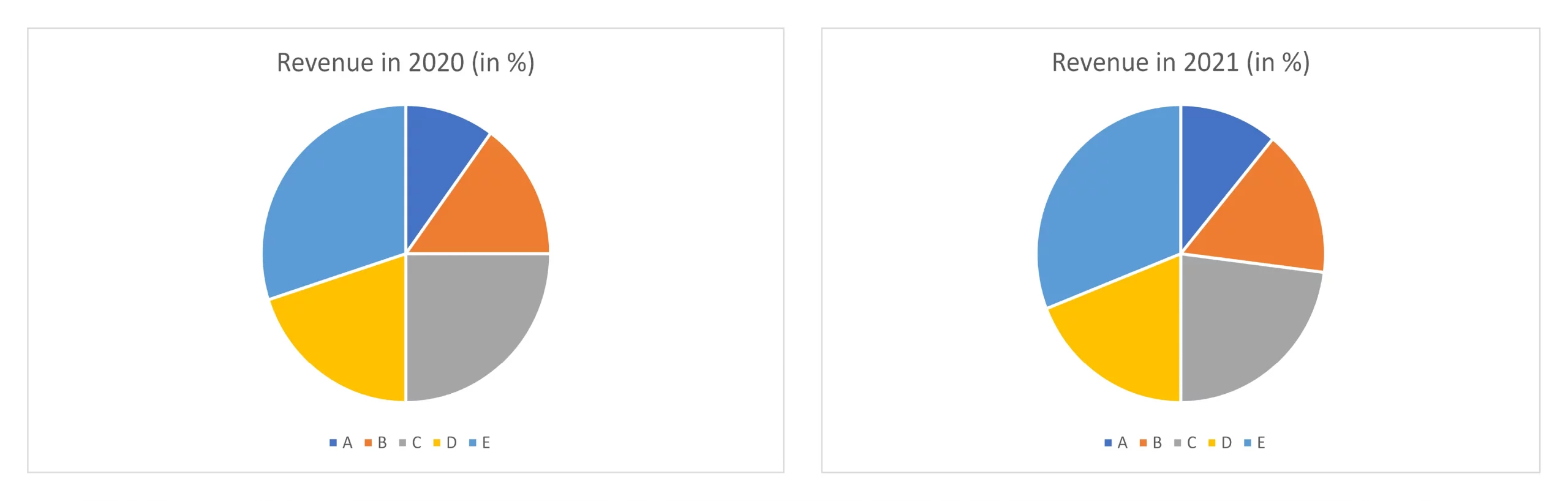
When you plot the same data in a bar chart, you will notice the YoY changes with much clarity.
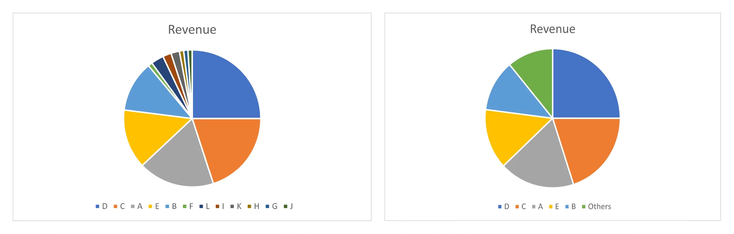
9. Club minor items under ‘Others’
In a pie chart, it is a good practice to combine minor items and represent them as a single data point labelled "Others" or "Miscellaneous." This is a common technique used when the pie chart has many items and the minor items, taken together, make up a relatively small portion of the total. Representing the minor items under "Others" helps to simplify the chart and make it easier to read.
In conclusion, pie charts are a valuable tool for illustrating the relationships between parts of a whole, provided they are used with caution and proper understanding. By correctly selecting data and presenting it in an appropriate manner, pie charts can be used to effectively communicate insights in a simple manner.

Inforiver helps enterprises consolidate planning, reporting & analytics on a single platform (Power BI). The no-code, self-service award-winning platform has been recognized as the industry’s best and is adopted by many Fortune 100 firms.
Inforiver is a product of Lumel, the #1 Power BI AppSource Partner. The firm serves over 3,000 customers worldwide through its portfolio of products offered under the brands Inforiver, EDITable, ValQ, and xViz.