
Upcoming webinar on 'Inforiver Charts : The fastest way to deliver stories in Power BI', Aug 29th , Monday, 10.30 AM CST. Register Now
Upcoming webinar on 'Inforiver Charts : The fastest way to deliver stories in Power BI', Aug 29th , Monday, 10.30 AM CST. Register Now
Bar charts are some of the most widely used and recognizable charts. They plot one categorical variable (e.g., quarter) and one numerical variable (e.g., revenue), and use the length of horizontal or vertical bars to represent values. They are easily understood thanks to their familiarity and are versatile in use. In this article, we examine some scenarios to which bar charts are ideally suited and some situations in which they are best avoided.
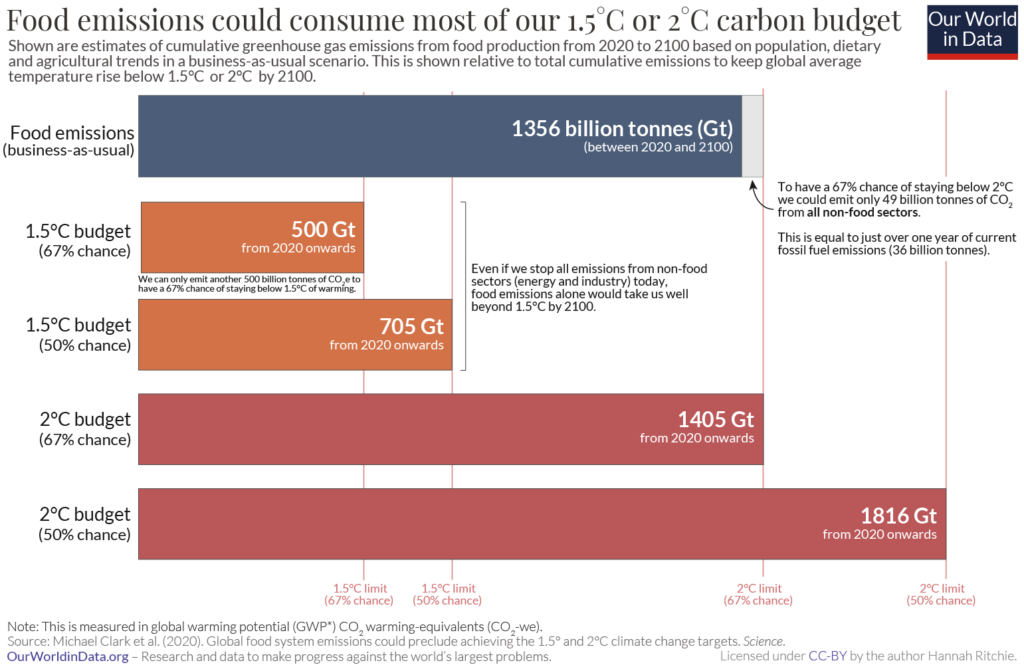
Bar charts are ideally suited to making comparisons between categories because our visual perception is excellent at interpreting the lengths of bars that have a common baseline. The following chart, for example, compares the emissions limit (carbon budget) for different temperatures of global warming with the emissions from food to show that just food emissions exceed the budget for 1.5 °C of warming and could take up most of our carbon budget for 2 °C of global warming.
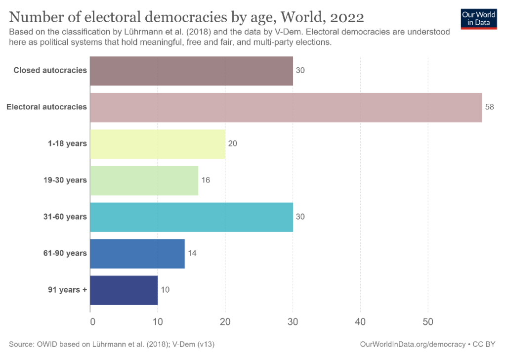
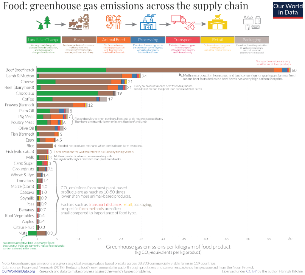
Bar charts are well suited to show rankings where the categories can be sorted from highest to lowest to emphasise the largest value, and from lowest to highest to emphasise the smallest value. The following chart sorts greenhouse gas emissions from food sources from highest to lowest and particularly draws attention to how beef contributes the highest emissions across the various sources.
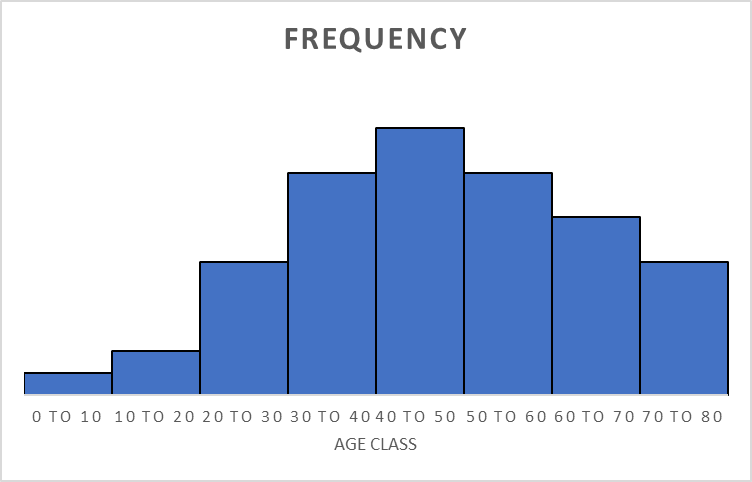
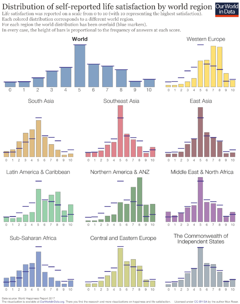
A close relative of the bar chart is the histogram, which is used to visualize frequency distributions. The histogram emphasises the continuous nature of a distribution by omitting the space between bars.
The following chart uses bars (in their vertical orientation, also commonly referred to as column chart) to show the distribution of life satisfaction in various regions of the world, and compares these regions to the global distribution using markers. We see how most people in the world report a mid-level satisfaction score of 5, while individual regions show variation in the overall shape with peaks at different levels. Sub-Saharan Africa and South Asia, for example, report lower levels of satisfaction overall than Latin America and Western Europe.
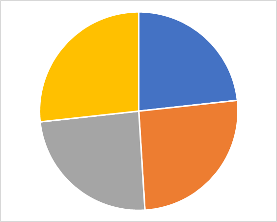
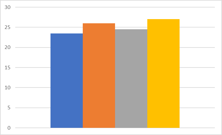
Standard column charts can be an alternative to traditional part-to-whole representations like the pie chart. The contributing categories in a pie chart can be separated into different columns for a clearer representation of their relative proportion. Consider the pie chart and the column chart below showing the same data. The pie chart has roughly equal areas and it is difficult to determine which part is larger. The bar chart on the other hand makes the size order evident at a glance – even though the differences are slight, we can still clearly see that the blue bar is the smallest, followed by grey, orange and finally yellow.
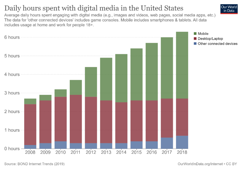
You may use also use a segmented bar or column chart to show parts that add up to the total. The chart used below is a stacked column chart which divides the total hours spent on digital media from 2008 to 2018 by the type of device used. We see the increasing trend overall, as well as how the increase in mobile usage for these purposes has contributed to much of the upward trend.
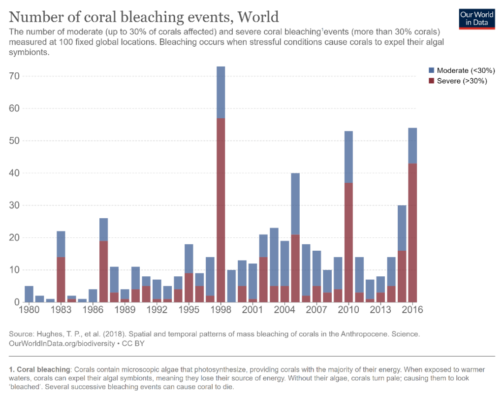
Using bar charts to represent time series can be a controversial subject, and there is one school of thought that believes that only line charts should be used. However, the column chart can be useful to visualize time series data because the primary category is plotted on the horizontal axis. It can be employed specifically to make comparisons of individual values, which is difficult to accomplish with a line chart where the focus is on the shape of the trend. Line charts can be a messy choice in cases where values vary wildly and bar charts may be a better choice for this type of data. For example, the following chart shows the number of coral bleaching events by year, where totals show high stochasticity. The bars provide a clean representation and the years with unusually high events compared to the general trend especially stand out.
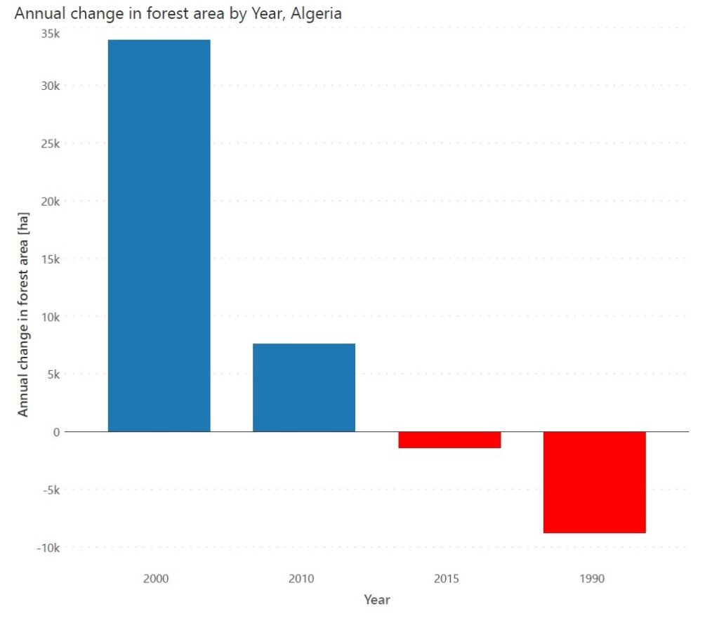
Use diverging bar charts to show deviations from a fixed baseline – with positive values on one side and negative values on the other side of a central axis. For this chart, it is useful to employ a diverging colour scheme like in this chart showing the annual change in forest area by year in Algeria.
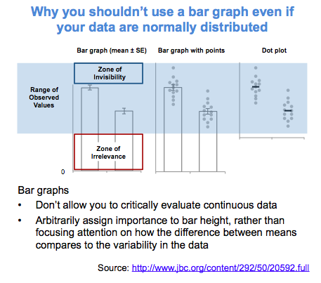
Bar charts can obscure the nature of the underlying data when it comes to summarizing continuous distributions. Distributions with different shapes can result in the same summary bar chart, as seen in this chart below from a journal article quoted on twitter.
For extremely long time series where showing the overall trend is important, consider using a line or an area chart instead. The continuous nature of these charts draws the eye to the overall shape of the trend, while the bars in a column chart instead lend themselves to comparisons between individual values.
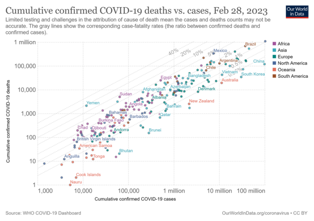
Bar charts are not ideal to show correlations between two series. Use a scatterplot where the overall form of the underlying data is visible, like in the chart below showing the correlation between the number of COVID-19 cases and the number of deaths. You may add a regression line to show how the variables are related.
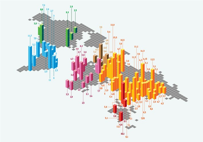
Avoid using bar graphs overlayed on a map to show geospatial information, unless the chart has enough space to show the entire bar for all bars. Otherwise, this can lead to occlusion, where some bars hide shorter bars behind them, like in this chart showing the populations of the 100 biggest cities in the world. Even in cases where the entire bar is seen, it can be difficult to compare the lengths of the bars because the positions of their baselines vary in two dimensions. Many representations of this kind also use boxes instead of rectangular bars, which creates further ambiguity.
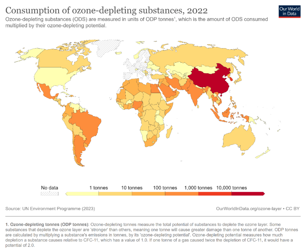
Instead, consider using a choropleth map like the one below to represent numerical values on a map. This chart uses a gradient color scale to represent increasing values. The one below used a gradient from yellow to red to show the consumption of ozone-depleting substances in different countries.
- By Hamsini Sukumar