
Upcoming webinar on 'Inforiver Charts : The fastest way to deliver stories in Power BI', Aug 29th , Monday, 10.30 AM CST. Register Now
Upcoming webinar on 'Inforiver Charts : The fastest way to deliver stories in Power BI', Aug 29th , Monday, 10.30 AM CST. Register Now
Bar charts use vertical or horizontal bars to describe a quantitative variable. The value of the variable is encoded by the length of the bar. These are some of the most common and recognizable charts in use today because of their ease of interpretation and many applications. In this article, we seek to examine the different variations of bar charts and their uses, and some advantages and shortcomings of these charts. We will also briefly look at some best practices.
Bar charts are used to make comparisons, show rankings, frequency distributions, and deviations, and to emphasize individual values. There are different variations of the bar chart that are suitable for each of these purposes. We will examine some of them below.
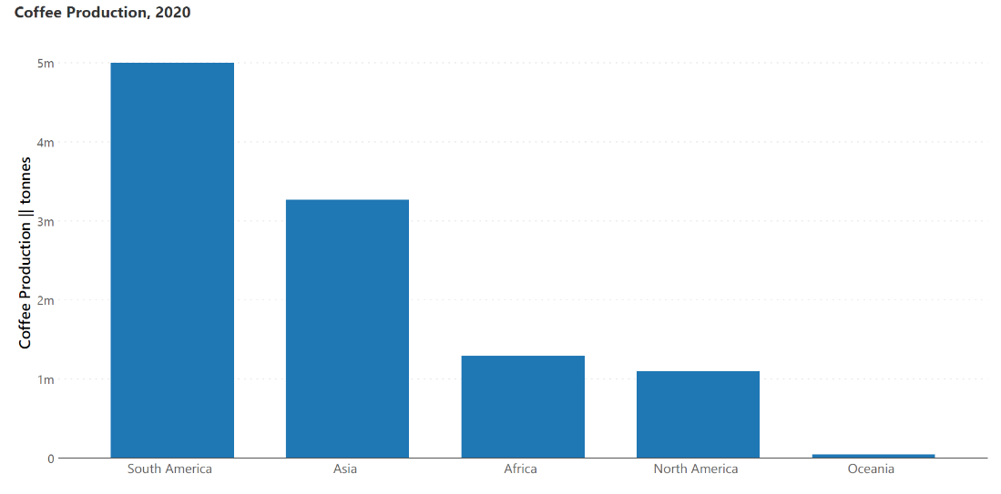
Column charts use the height of vertical bars to represent the value of a quantity. The primary categorical variable is on the horizontal baseline, which means that these charts can be used to show time series data, as well as make nominal comparisons at a single point in time. An example of the latter is illustrated in the chart below showing coffee production in various regions in the year 2020.
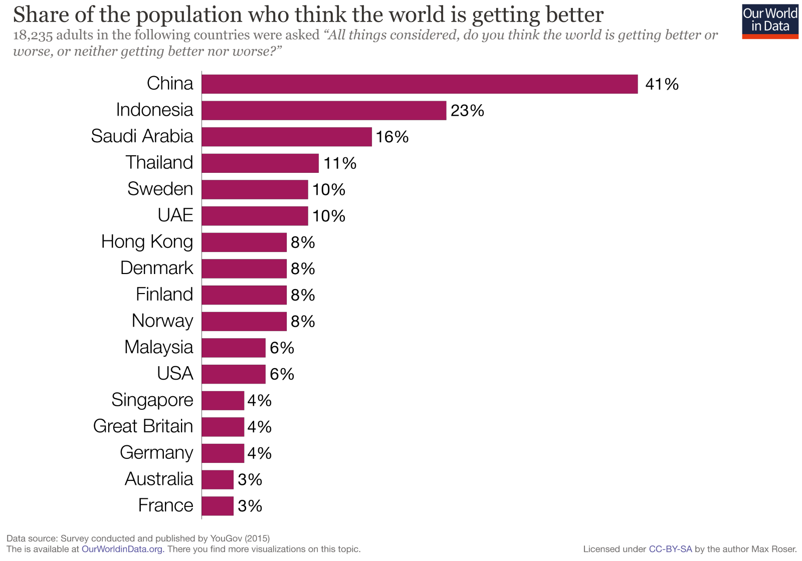
The horizontal bar chart (sometimes just called the bar chart) uses horizontal bars to describe quantitative variables. The length of the bar is linearly proportional to the value of the measure. This chart plots one categorical variable, which is designated as the primary variable and set on the vertical axis (country in the chart below), and one numerical variable which is designated as the secondary variable and plotted on the horizontal axis (percentage of the population in the chart below). This chart is best used when column labels are long and to show ranking, like in the chart below.
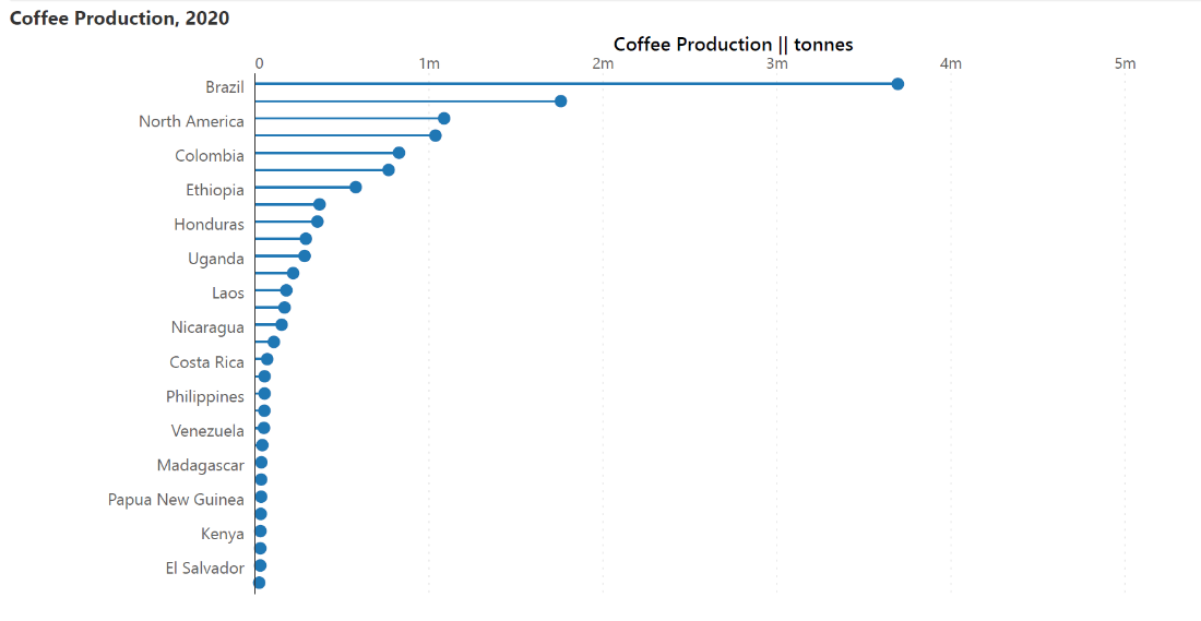
Lollipop charts are similar to the bar charts described above but use a line with a dot at the end to indicate values. They are used for the same purposes as the charts above but provide a better data-ink ratio to make the chart less cluttered and more visually appealing. This is ideal for bar charts with values that are close to each other.
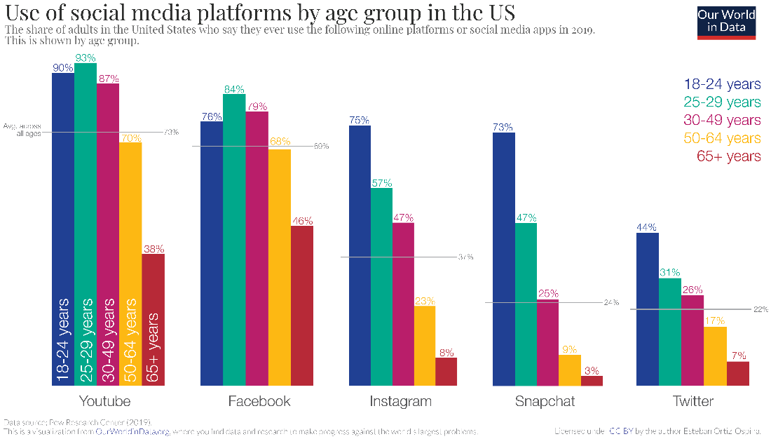
Clustered bar charts are a type of bar chart that groups bars together to plot two categorical variables and one numerical variable. In the chart below, the two categorical variables are the social media platform and the age classes, while the quantitative measure is the percentage of users. These charts are thus used to compare subcategories and show an extra categorical variable.
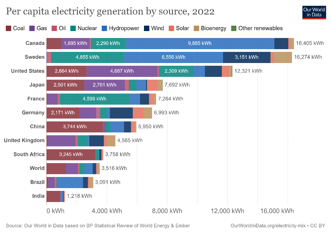
Stacked bar charts are a variation where the bars in a standard chart are divided into segments denoting contributing categories that sum up to the whole. These charts are used to compare totals and simultaneously understand the values of contributing categories. This presents a parts-to-whole view where the length of each segment is proportional to its contribution.
A stacked column chart is a vertical variation of the stacked bar. Learn more about the application of stacked column/bar charts here.
This type of bar chart chart employs bars that diverge from a central axis to show positive and negative values on either side. While standard bar charts can only handle values that are all positive or all negative, diverging bar charts can handle a mix of both types of values. The chart below, for example, shows revenue as positive, and costs as negative, allowing us to compare these values by month.

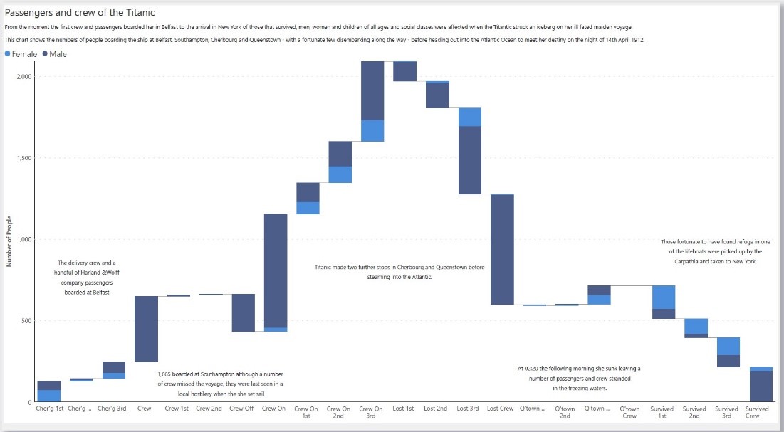
Waterfall charts also use bars to denote the values of contributing categories like in a stacked bar chart, but the contributions can be negative or positive. To accommodate this and to show a parts-to-whole view, this chart unstacks the segments and allows the eye to move across the contributions to arrive at the total.
The response of the brain to visual stimuli has been studied in detail to form a perceptual ranking list, which ranks different types of charts according to how accurately our visual perception allows us to interpret them. The standard bar chart is at the top of this list, meaning that it allows for very accurate interpretation of values. This is because of two factors – all of the bars on a bar chart are positioned on the same baseline, and the chart uses the lengths of the bars to encode value, which is a representation that our brains can estimate very well. This leaves little room for ambiguity.
Bar charts are also incredibly easy to make – so much so that even pen and paper suffice! This means that they are widely accessible even without specialized software, making them usable across contexts ranging from business to science and education.
As noted above, bar charts are some of the most commonly used charts. This can act as a significant advantage when it comes to ease of interpretation. Unlike more specialized charts, their familiarity means that their message is immediately understood by a wide audience without further annotations or explanations.
Data-ink is the set of all elements on a chart that are directly relevant to the data represented. While non-data ink can be erased without removing any information on the chart, data-ink is essential to the completeness of the information. The data-ink ratio, which is the ratio of data-ink to total ink, should always be maximized. In other words, all irrelevant elements of the graph should be minimized. This concept was introduced by Edward Tufte and he points out that bar charts have several redundant elements – each bar typically indicates the value of the measure shown in several ways including the height of the left line, the height of the right line, the height of the shading, the position of the top line, and sometimes also with the number on top of each bar. This means there are many extraneous elements that can be removed without losing information.
The ubiquitousness of the bar chart can also act as a disadvantage – it may not pique the curiosity of your audience like a flashier chart. Other graphs like streamgraphs or waffle charts may sacrifice accuracy to some extent, but invite viewers to investigate further thanks to their novelty and eye-catching form. A bar chart may not generate the same engagement because of its perception as being technical and common.
We will briefly examine some best practices below. For a longer discussion, take a look at our dos and don’ts article here.
Bar charts indicate values using the height of the bar as measured from the horizontal axis. This means that beginning the y-axis at any point other than zero would truncate (or elongate) the bars, resulting in misrepresentation of data. Always begin the y-axis at zero to ensure accuracy.
Bar charts already have a lot of ink contributing to their visual weight. They can quickly look overcrowded with tick marks, gridlines, outline boxes, and individual labels. Use these elements strategically to add value to your graph, but avoid unnecessary clutter to keep your chart clean and legible.
Set the spacing between the bars to 50% of the width of the bars. This ensures a legible and clean chart, with adequate spacing to allow users to see the separate values and compare them.
Different bar charts are used for different purposes:
- By Hamsini Sukumar
Stacked column charts : The essential guide
A comprehensive guide to bar charts: when to use them and how to design them

Inforiver helps enterprises consolidate planning, reporting & analytics on a single platform (Power BI). The no-code, self-service award-winning platform has been recognized as the industry’s best and is adopted by many Fortune 100 firms.
Inforiver is a product of Lumel, the #1 Power BI AppSource Partner. The firm serves over 3,000 customers worldwide through its portfolio of products offered under the brands Inforiver, EDITable, ValQ, and xViz.