
Upcoming webinar on 'Inforiver Charts : The fastest way to deliver stories in Power BI', Aug 29th , Monday, 10.30 AM CST. Register Now
Upcoming webinar on 'Inforiver Charts : The fastest way to deliver stories in Power BI', Aug 29th , Monday, 10.30 AM CST. Register Now
Bar charts may be some of the most ubiquitous charts seen, used in contexts ranging across business, media, science and education, but misrepresentations and errors are almost as common as the charts themselves! This article explores best practices to keep in mind, and common mistakes to avoid when designing bar charts to make for faithful representations of data. Use this guide to level up your data literacy and representation skills.
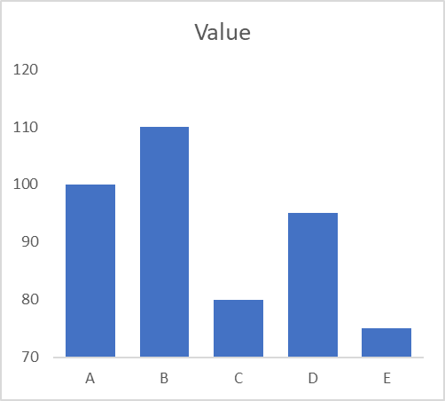
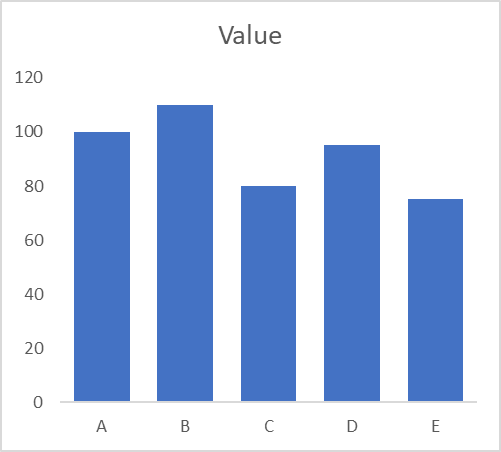
One of the most common manipulations of data using bar charts is to begin the vertical axis at a point different from zero. Take a look at the chart below on the left – the discrepancies between the categories appear significant. This is however a result of the y-axis starting at 70. The chart on the right is the correct representation with the y-axis beginning at zero and we understand that the differences in value are not as large as they appeared before. Bar charts use the height of the bar to assign value, and beginning the y-axis at a different point truncates the bars. We also tend to assign more value to areas that appear larger, ignoring the readings themselves in favor of the areas of the bars. The two graphs below thus appear very different from each other, even though they visualize the same data.
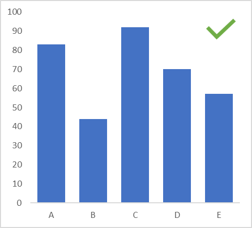
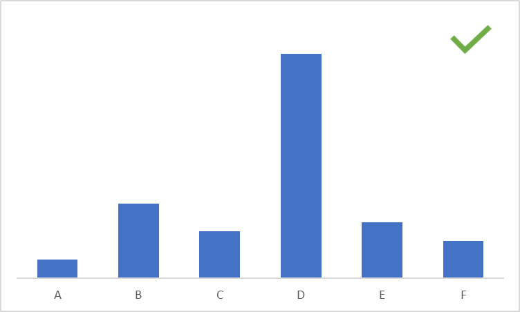
Keep the spacing between bars to 50% of the width of the bars themselves. This allows for a well-balanced and aesthetically pleasing graph, where the chart area is neither too crowded nor too sparsely populated. Notice how the chart with the tick mark below makes good use of the chart area, while keeping the chart clean.
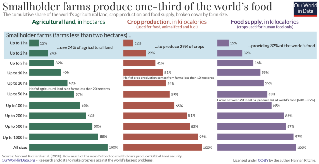
Include context in the form of a chart title, labels, annotations and comments to improve understanding of your chart and provide further information. The chart below uses data level annotations to illustrate that smallholder farms produce almost a third of the world’s food. The annotations provide a spotlight on the message and contribute to its clarity. While these elements may be useful, use them strategically to avoid overcrowding your chart area.
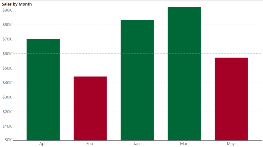
Use color in your bar chart to draw attention to your message and enhance insights. The following chart, for example, shows sales by month along with a target line. Months that fall short of the target are shaded red, while those that meet or exceed the target are shaded green. This allows the reader to immediately draw the correct inference about the trends over various months.
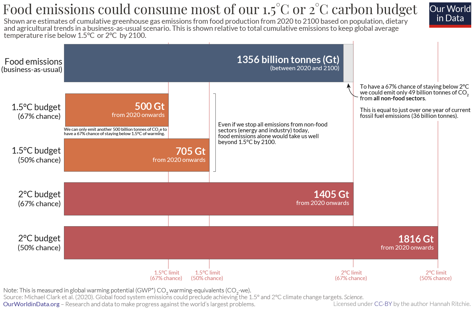
You could also color bars within the same group or category with the same shade. The chart below illustrates this by using a single color for bars related to the same threshold of global warming. This allows us to quickly see the categorization of the data and how it relates to the comparison being made.
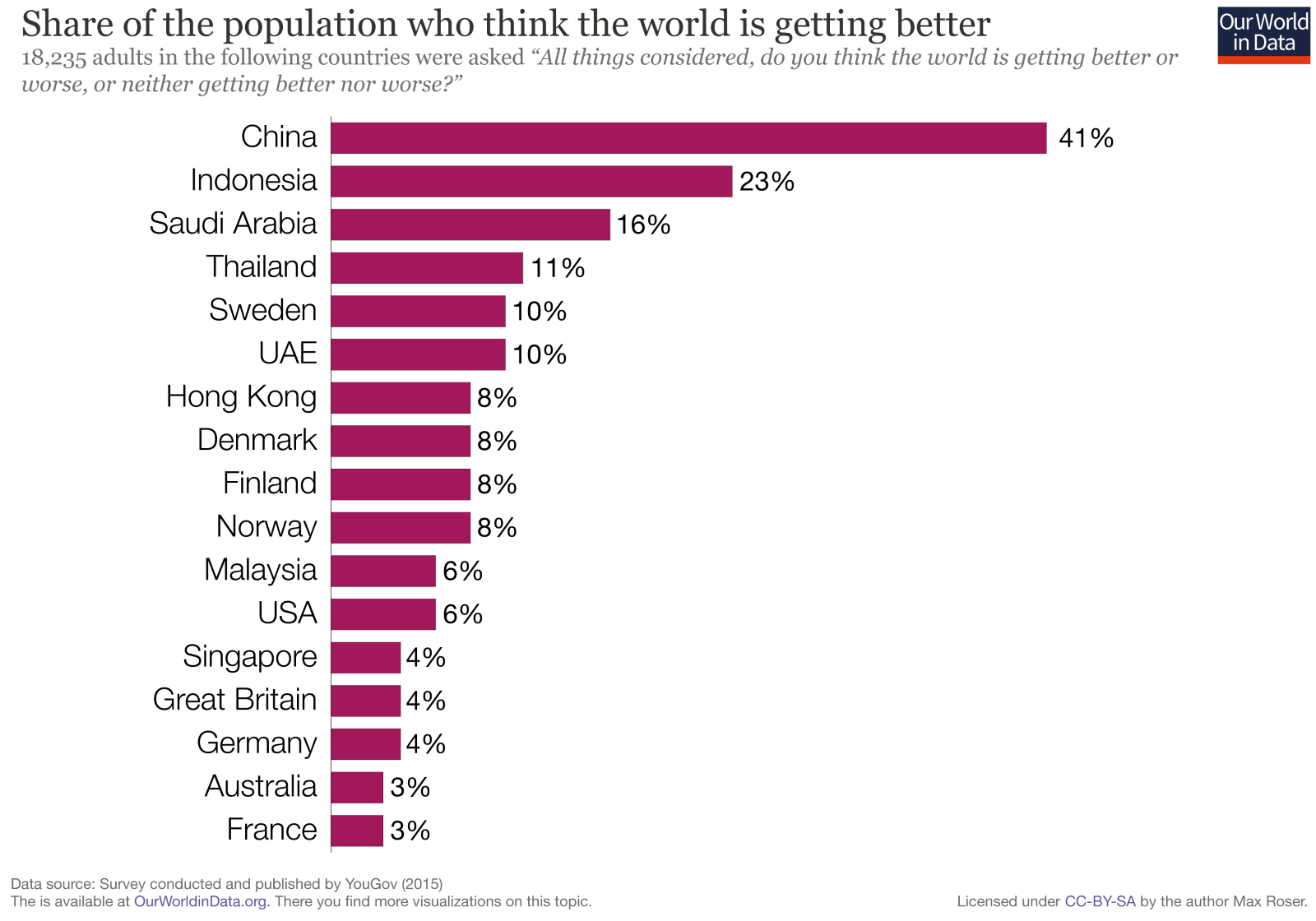
Consider the order in which you want to sort your bars. There may be a natural or logical order to your categories which you want to highlight, or you may want to sort by size to emphasize the largest or smallest values (sort from largest to smallest to emphasize the largest value and vice-versa for the opposite effect). This allows your readers to quickly parse through information to gain insights. The following chart, for example, sorts from largest to smallest, allowing the reader to immediately pick out the most optimistic countries.
A common mistake in cases where data shows high variation in values is to break longer bars to show the differences between the bars with smaller values. This can lead to confusion as the values may appear to be much closer together than in reality. This is illustrated in the charts below, with an axis break in the chart on the left, and the true representation on the right. Notice how the values are far more separated in the chart without the break.

Bar charts use a lot of ink and can quickly become overcrowded. This removes the spotlight from the information, like in the chart below. Limit the usage of gridlines, outline boxes, and tick marks while avoiding pattern fills on your bars altogether. If it is necessary to use some of these elements to add context, be mindful of the line thickness and color used (for example, try using grey instead of black and thinner lines) to keep your chart clean and legible. A general rule of data visualization is to limit non-data ink as much as possible.
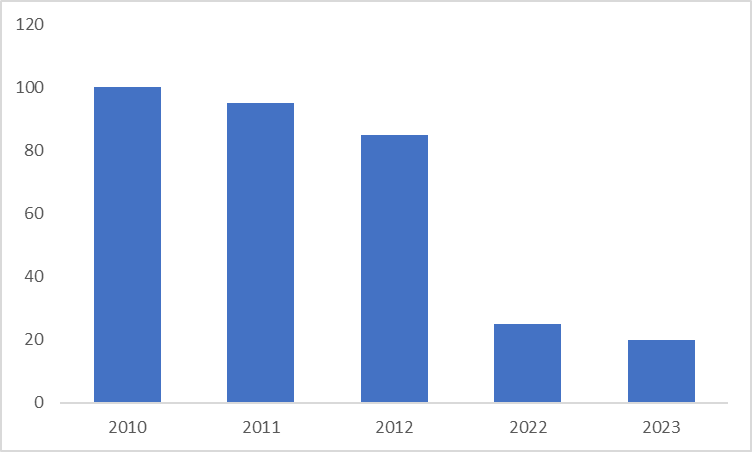
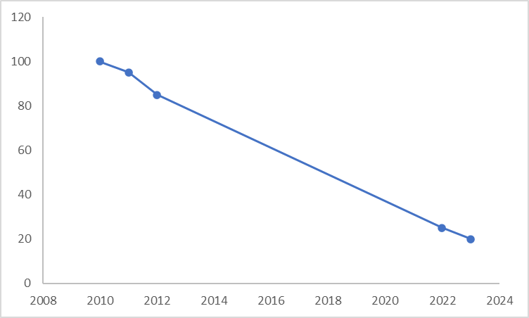
For time series representations, make sure that the interval between bars is consistent, and do not skip values to avoid distortion of the trend. Consider the bar chart on the left. There appears to be a steep dip in values after the third value, but the correct representation is given by the line chart below on the right. We see from this chart that the decline is actually gradual, with a slope that is fairly consistent indicating that the rate of decline is consistent throughout.
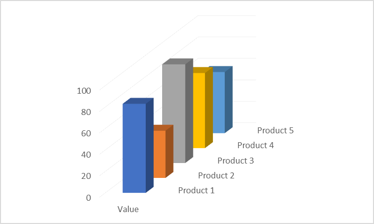
Avoid flashy representations like 3-dimensional effects for bar charts. The effectiveness of the bar chart lies in its simplicity – it is in fact at the very top of our perceptual ranking list! This means that the standard bar chart is the most accurate representation with bars that begin on a common baseline. 3D effects like in the chart below put the bars on different baselines, introduce ambiguity in the heights themselves, and lead to occlusion.
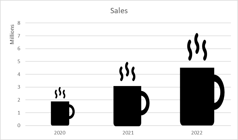
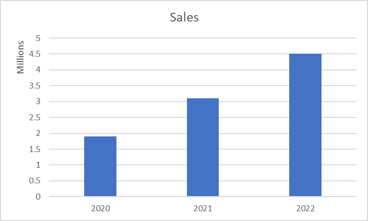
Icons sometimes provide an engaging way of presenting data in a bar chart, but more often become a source of confusion when it comes to accuracy. A coffee company, for example, may choose to use a coffee mug to show its sales data as on the left below. However, remember that the area of an icon changes along with its height as we need to change its breadth in proportion to its height. This means that we perceive a disproportionate increase in value as we use larger and larger icons for increasing values. The bar chart on the right gives the true representation, allowing us to understand the correct proportions.
- By Hamsini Sukumar