Visualizing multiple metrics such as revenue, profit margin, and customer acquisition cost within a single chart can be challenging when those values exist on different scales. Using only one y-axis in Power BI often results in distorted visuals or misinterpretation, especially when comparing percentages against absolute values.
This is where creating a multi-axis chart in Power BI becomes essential. By using multiple y-axes, Power BI developers and data visualization professionals can ensure each metric is accurately represented, preserving the integrity of the data and improving readability for business stakeholders.
Tools like a Power BI combo chart or dual axis chart in Power BI provide a foundational solution, allowing you to plot different data series with their own axes in a single visual. To take this further, the Inforiver Analytics+ Combo / Multi Axis Chart for Power BI enables even more advanced configurations—making it easier to build scalable, insightful, and easy-to-interpret visualizations for enterprise reporting and decision-making.
The Core Advantage of Multi-Axis Visualization
Standard single-axis charts often struggle when you try to show metrics that have very different magnitudes. For example, if you try to plot sales in millions of dollars and profit margin as a percentage on the same chart, the profit margin line can end up being almost invisible. Multi-axis charts fix this problem by giving each relevant measure or group of similar measures its own y-axis. This makes sure that all the data series are clearly visible and interpretable, no matter how big or small the numbers are. And this is important for presenting multiple key performance indicators (KPIs) in a single, efficient visual.
Key Features to Look for in a Multi-Axis Chart Tool:
So, when you're choosing a tool to create multi-axis charts, here are some key features to look for:
Scalability of Axes: You really need the ability to support more than two independent y-axes if you're going to visualize complex datasets that have multiple, very different metrics.
Chart Type Flexibility per Axis: It's important to have the option to assign different chart types, like lines or columns, to each measure plotted on its own axis. This makes the chart clearer and lets you represent different characteristics of the data in the most effective way.
Granular Axis Control: You'll want precise control over things like axis scaling, labelling, formatting, and positioning. This helps ensure that your chart is easy to read and doesn't look cluttered.
Synchronization Options: In some cases, it can be valuable to be able to synchronize axes, even if they have different scales. This can help you highlight specific relationships or time-based correlations within your data.
Clear Labelling and Tooltips: Effective labelling of the axes and data points is essential, and informative tooltips are also crucial for making sure your audience can easily understand the information in the chart.
Ease of Use: Finally, you'll want an intuitive interface that makes the whole process of adding and configuring multiple axes and assigning measures as simple as possible. This is vital for efficient development.
Inforiver Analytics+ Combo / Multi Axis Chart: Enhanced Multi-Axis Functionality
The Inforiver Analytics+ Combo Chart / Multi Axis Chart takes Power BI's built-in capabilities and expands them with a full suite of horizontal, vertical, and stacked combo chart options, along with advanced multi-axis support. This really empowers data visualization experts to build more effective and compelling data narratives.
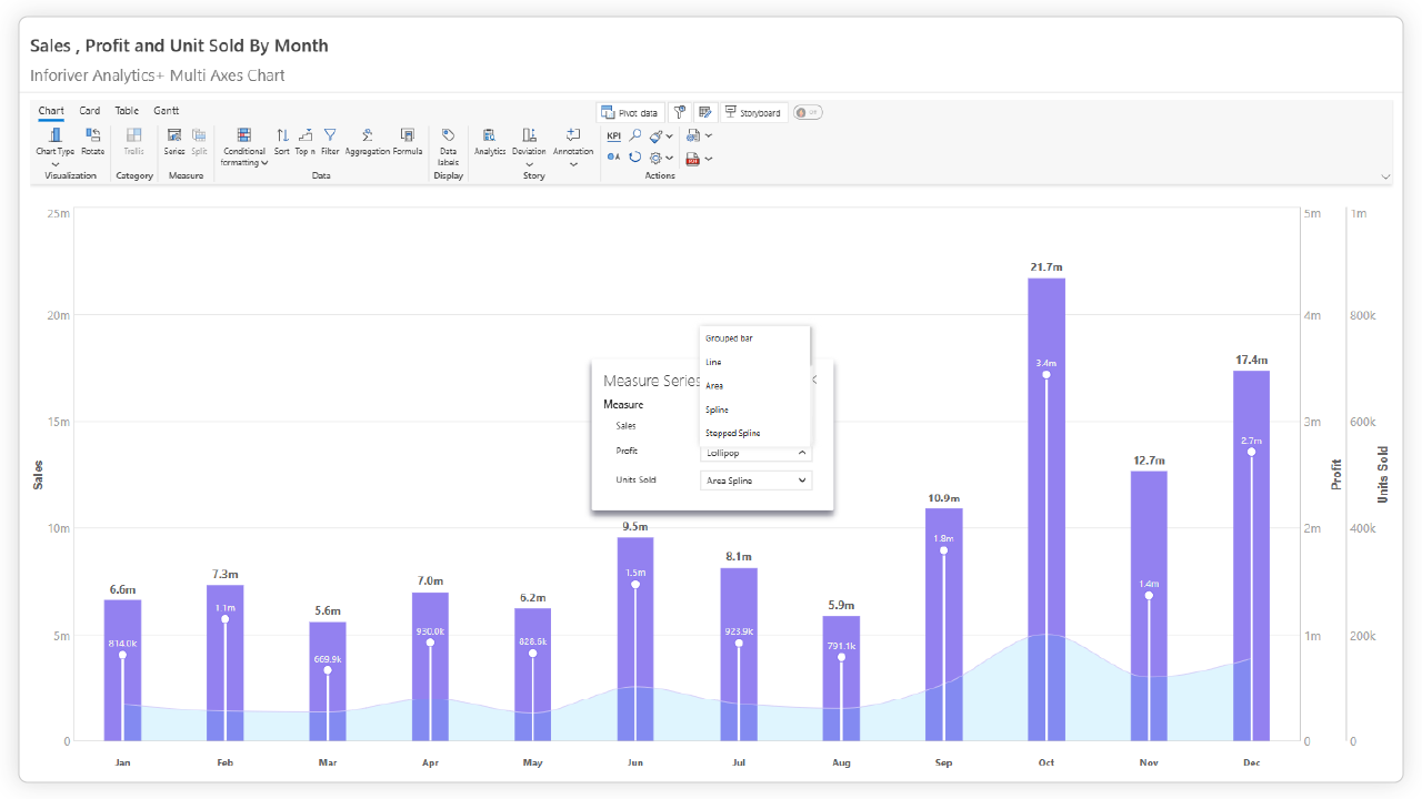
Scalable Multi-Axis Support: The Inforiver Analytics+ Multi Axis chart is designed to handle complex situations where you need to display numerous metrics with diverse scales at the same time. It offers up to five independent y-axes, and developers can assign a specific y-axis to each measure, ensuring optimal visual representation of the data.
Flexible Chart Type Integration:Inforiver Analytics+ Multi Axis chart lets you choose different chart types, including lines, columns, areas, splines, and stacked variations. You can then assign a specific chart type to each measure within the series menu. This flexibility allows for nuanced representation of different data characteristics within a single visual, such as using columns for actual values and lines for target values.
Line Charts: These are ideal for visualizing trends and changes over time. You'll typically see continuous lines connecting data points, effectively showing the progression of a particular metric. Variations include:
Basic Line Chart: This is simply a line connecting the data points.
Spline Chart: Instead of a straight line, this uses a smooth curve to connect the points, often used for a softer visualization of trends.
Stepped Line Chart: This type of chart uses horizontal and vertical lines to connect data points, which is useful for showing values that remain constant for certain periods.
Column Charts: These allow you to combine different chart types within a single visual to highlight various aspects of your data simultaneously. For example, you might see a mix of bars and lines, plotted against either shared or separate axes.
Lollipop Chart: These charts display a quantitative value using a line and a circle at the end, providing a clear visual separation of each data point.
Area Charts: Similar to line charts, these charts fill the area below the line with color, which emphasizes the magnitude of the values. Variations include:
Basic Area Chart: In this chart, the area below a single line is filled.
Stacked Area Chart: This type of chart features multiple area charts stacked on top of each other, showing how each part contributes to the overall total.
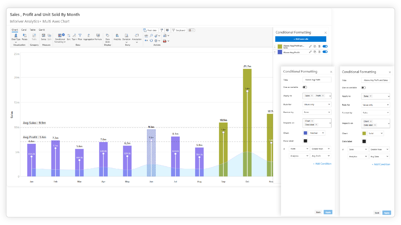
Precise Axis Control: Inforiver Analytics+ Multi AxisChart gives you very granular control over each measure's y-axis and the various chart elements. This includes things like customizing the axis scale, setting minimum and maximum values, controlling the display units and decimal places, and configuring the axis titles. Furthermore, Inforiver Analytics+ offers the option to "Sync Axes." When enabled, this feature ensures all measures share the same minimum and maximum points, essentially applying a uniform scale across different y-axes. Another valuable control is the ability to "Align Axes Baseline." Activating this setting forces all axes to start from zero, while their end points can still adjust based on their individual maximum values. You also get independent formatting options for each y-axis, such as font styles, colors, and display options for axis lines and tick marks. All of this helps enhance readability and prevents any single axis from dominating the visual or obscuring the trends of other metrics.
Integrated Storytelling Features: In addition to its multi-axis functionality, Inforiver Analytics + includes a range of features that are essential for effective business analysis:
Advanced Analytical Elements: Inforiver Analytics+ empowers users to enrich multi-axis charts with sophisticated analytical elements. The incorporation of a reference line allows for the direct overlay of crucial context like averages, targets, or benchmarks. Furthermore, the inclusion of deviation analysis provides a clear visual representation of variances from these reference points, highlighting areas of over or underperformance. Beyond these, Inforiver Analytics+ also supports the integration of reference bands to visualize acceptable ranges, error bars to indicate data variability, and trend lines to reveal underlying patterns. By layering these advanced analytical elements onto multi-axis charts, experts can gain a more nuanced understanding of performance against key metrics, facilitating more informed analysis and decision-making.
Conditional Formatting: Conditional formatting is another powerful tool that enhances data visualization by allowing you to apply formatting rules based on data values. In Inforiver Analytics+, you can set up rules to dynamically change the color of data points, bars, or other chart elements based on predefined criteria. This can help to immediately draw attention to critical insights, such as highlighting areas where performance is below target or identifying potential risks.
Annotations: Direct annotation of data points within Inforiver Analytics+ further enriches the narrative by enabling users to add context and commentary directly to the chart. You can attach notes to specific data points to explain anomalies, highlight key events, or provide additional information, making your insights more accessible and actionable.
Comprehensive Formatting Options: Inforiver Analytics+ provides a wide array of formatting features, as visually demonstrated, to ensure your multi-axis charts are both insightful and easily digestible. This includes generating clear legends that distinctly identify each data series. You have precise control over number formatting and scaling, allowing you to display values in the most appropriate unit, precision, and scale (e.g., thousands, millions). The customization extends to axis labels and values, grid lines, series patterns, and even data table presentation, ensuring every element enhances understanding
Illustrative Applications for Enterprise Insights
Inforiver Analytics+ 's multi-axis capabilities make it easier to visualize complex relationships within business data, providing valuable insights for enterprises:
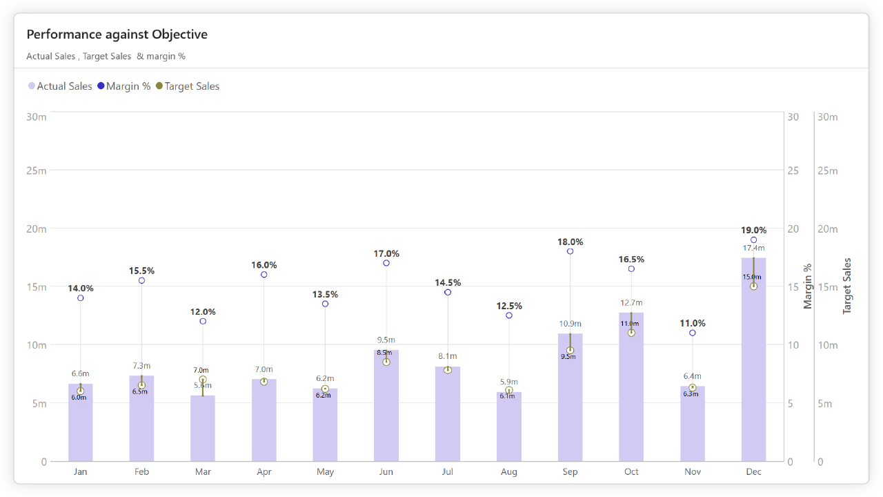
Performance Against Objectives: You can visualize actual sales (using columns on a primary axis) alongside target sales (using either columns or a line on the same primary axis) and profit margin percentage (using a line on a secondary axis). You can even add an optional reference line for the overall profit margin target. This gives you a clear view of how you're performing across key metrics relative to your targets.
Correlating Business Drivers: You can plot website traffic (using an area or line on one axis), conversion rate (using a line on a secondary axis), and average order value (using columns on a third axis) to identify potential correlations and what's driving your business outcomes.
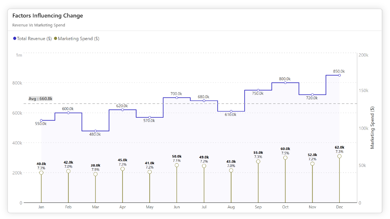
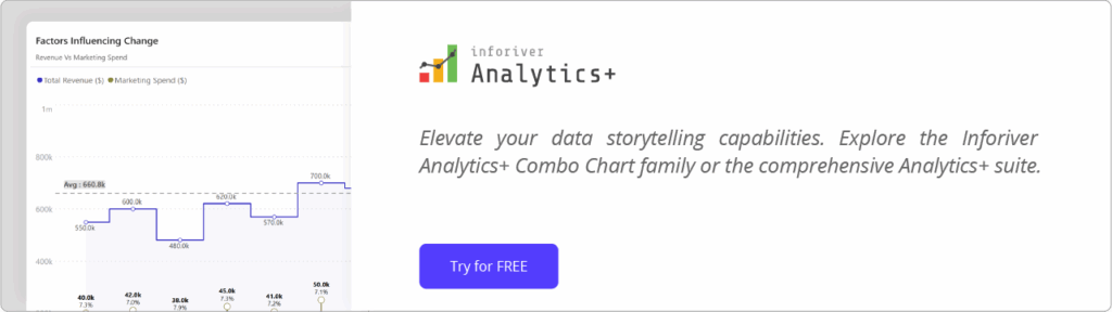
Highlighting Factors Influencing Change: You can display total revenue (using columns on the primary axis) along with metrics like marketing spend or customer satisfaction score (using lines on secondary axes) to visually explore potential causal relationships.
By integrating these varied metrics into a single, well-structured visual, Inforiver Analytics+ reduces the amount of cognitive load on decision-makers, enabling them to understand complex dynamics more quickly and effectively compared to analyzing multiple individual charts.
Beyond Axes: Leveraging Trellis/ Small Multiples: To facilitate detailed comparative analysis, Inforiver Analytics+ provides Trellis support, which allows for the disaggregation of multi-metric visuals across categories. This means that you can break down a complex multi-axis chart into a grid or series of smaller charts, each representing a different category or dimension within your data. For example, if you're analyzing sales, profit, and customer satisfaction across different regions, Trellis can display a separate multi-axis chart for each region, making it easier to spot trends and outliers.
These features, in conjunction with the robust multi-axis capabilities of Inforiver Analytics+, empower users to create more insightful and impactful visualizations.
Empowering Data-Driven Decisions Today
Utilized by numerous leading enterprises, the Inforiver Analytics+ Combo Chart / Multi Axis Chart is a powerful asset for Power BI developers and data visualization experts seeking to create impactful, clear visualizations of complex data for enterprise decision-makers. Explore the diverse combo chart options and customization features available.
Begin leveraging the power of multi-axis charts with Inforiver Analytics+ to bring enhanced clarity and impact to your Power BI dashboards, facilitating more informed decisions across your organization.
Inforiver helps enterprises consolidate planning, reporting & analytics on a single platform (Power BI). The no-code, self-service award-winning platform has been recognized as the industry’s best and is adopted by many Fortune 100 firms.
Inforiver is a product of Lumel, the #1 Power BI AppSource Partner. The firm serves over 3,000 customers worldwide through its portfolio of products offered under the brands Inforiver, EDITable, ValQ, and xViz.