
Upcoming webinar on 'Inforiver Charts : The fastest way to deliver stories in Power BI', Aug 29th , Monday, 10.30 AM CST. Register Now
Upcoming webinar on 'Inforiver Charts : The fastest way to deliver stories in Power BI', Aug 29th , Monday, 10.30 AM CST. Register Now
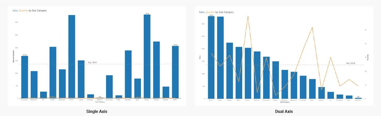
Dual axis charts, also known as multiple axis chart, allows us to plot KPIs of different scales or units of measures (UoM) on a single chart. The dual axis chart allows us to visualize relative trends that might not be immediately obvious when looking at the data separately. For example, a line chart representing quantity sold and a column chart representing revenue can be trended over time in a single chart with multiple axes.
In the example below, notice how the single axis chart on the left struggles to plot quantity sold due to the shared axis. The dual axis chart on the right fares much better.
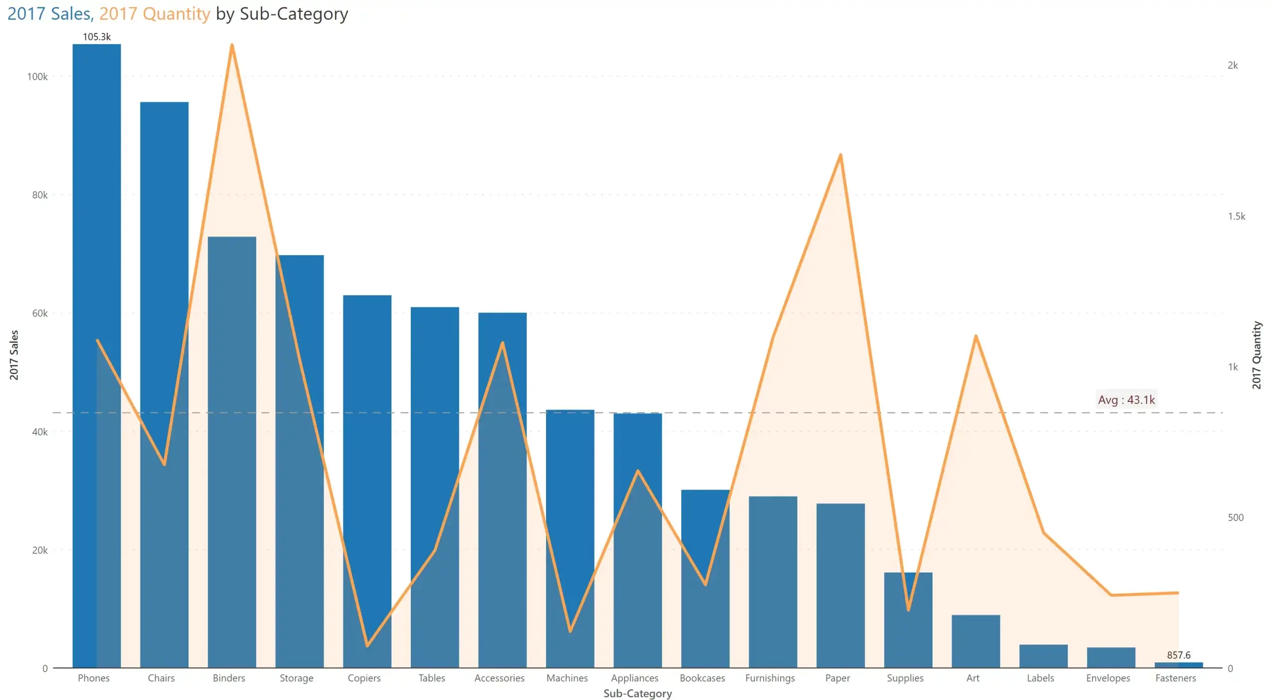
While the dual axis chart can have any series type (e.g., column, line, area) for either of its axes, the most common and recommended one is to have column series for one axis and a line for the other as shown above.
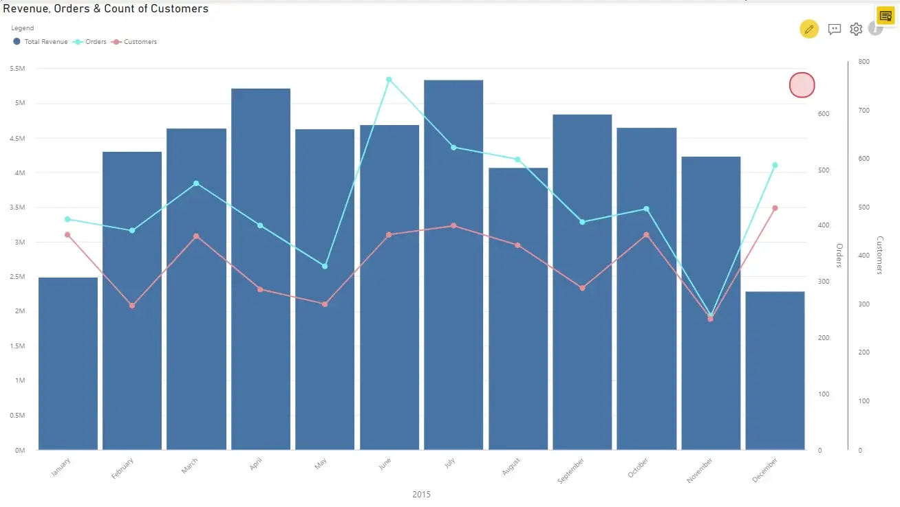
You may also mix up other series types based on the data and aesthetics. For example, we have used an area chart for the secondary axis below.
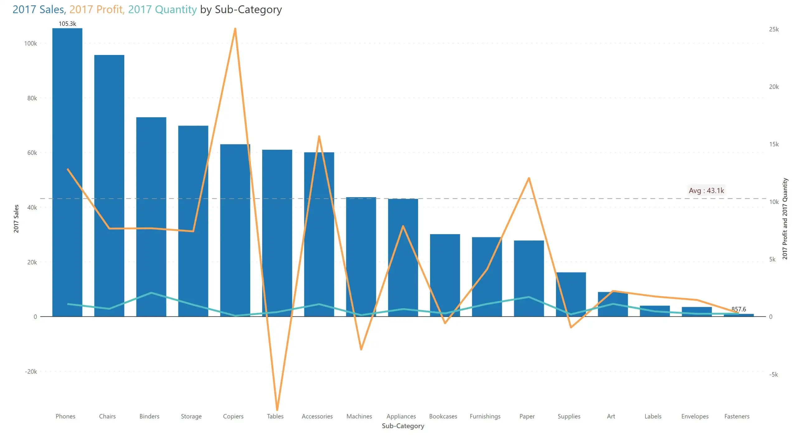
An extension of dual axis chart is the true multiple axis chart, which can have 3 or more axes.
Example:
Here are 5 best practices that will help you to create clear and insightful dual axis charts that effectively communicate key insights from your data:
1. Use dual-axis chart selectively
A dual-axis chart is useful when comparing data that has different units or ranges. However, when the values are in a similar or an overlapping range, a dual-axis chart can only cause confusion. Stick to a single-axis chart in these cases for clarity and simplicity.
2. Choose proper colors
Ensure you use distinct colors to differentiate and distinguish measures, making it easier for the user to understand crucial data points or trends.
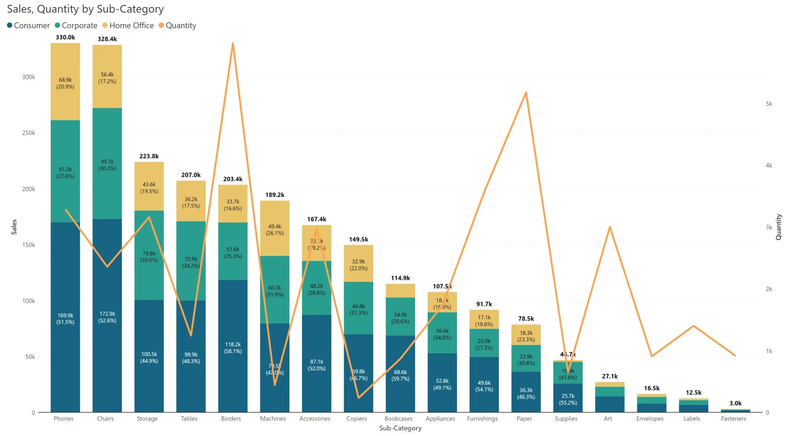
3. Customize Data labels
Customize data labels to deliver better clarity when you are working with multiple series and axes. When you work with dual axis charts, ensure that the data labels do not overlap. In this example below, we are showing both the individual values and the total for the stacked columns, while we have foregone the labels for Quantity.
4. Use Annotations
Make your visualization stand out by using written callouts and bring attention to key areas using annotations. They help to guide the users to critical data points, such as what caused a dip or spike.

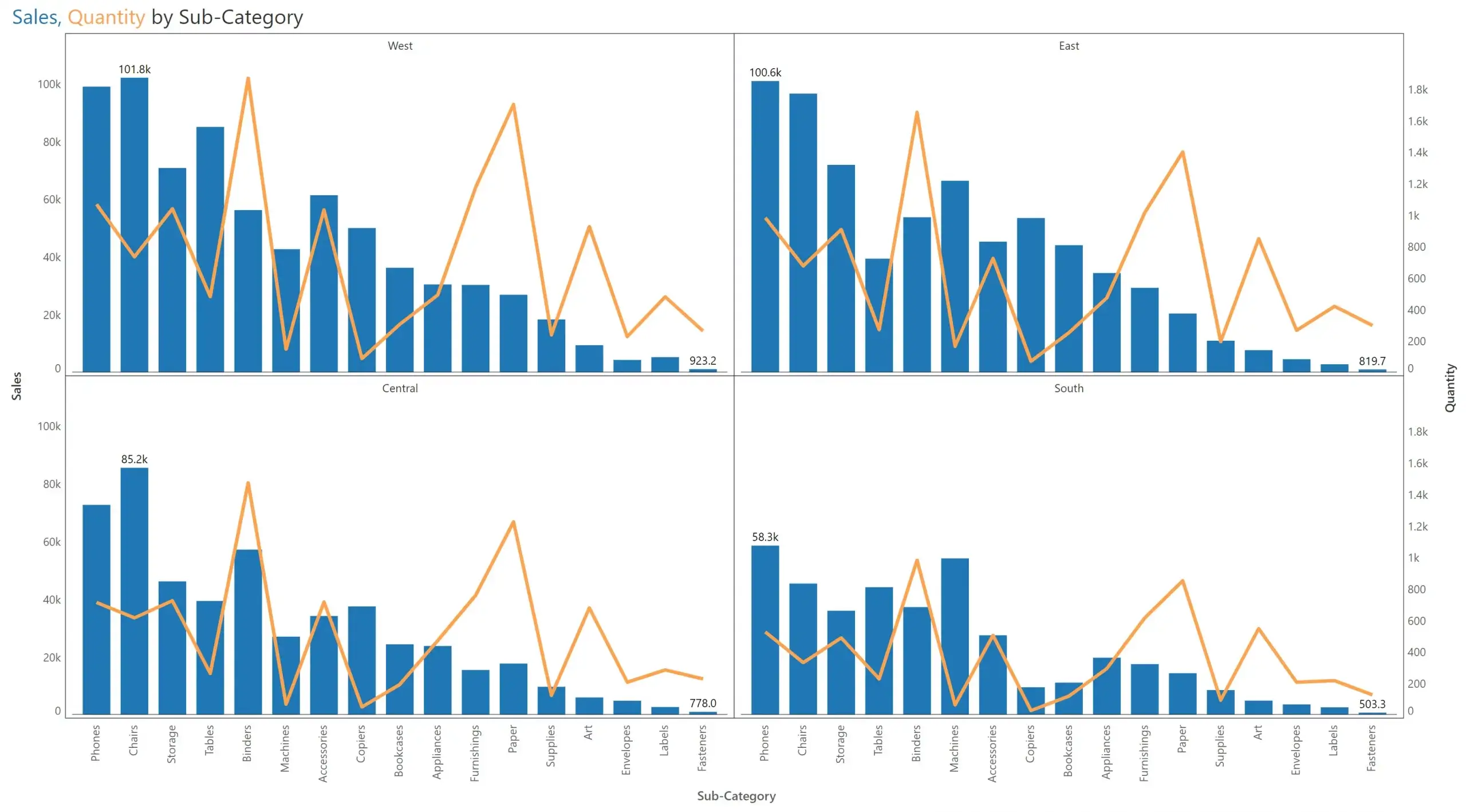
5. Use Trellis to plot multiple charts together
It is highly recommended to use trellis to plot multiple dual-axis charts together in order to easily identify and compare trends across various categories, regions, months, and years. Trellis is an ideal option to plot multiple charts without having to overload the dashboard with multiple instances of the same visual. In the example below, we have used shared axes for the dual axes charts. You have one set of x-axis labels at the bottom, and then both axes plotted on the extreme left & extreme right.
In conclusion, dual-axis chart is a powerful option for datasets with measures of varying ranges. It helps you uncover unique insights that would otherwise be missed while using a normal combination (line + column) chart plotting values on a single axis. Try out dual axis charting capabilities in Inforiver today.
Learn everything you need to know about dual & multi-axis charts and how to create them right inside Power BI in our free ebook "The ultimate guide to dual & multi-axis charts in Power BI."

Inforiver helps enterprises consolidate planning, reporting & analytics on a single platform (Power BI). The no-code, self-service award-winning platform has been recognized as the industry’s best and is adopted by many Fortune 100 firms.
Inforiver is a product of Lumel, the #1 Power BI AppSource Partner. The firm serves over 3,000 customers worldwide through its portfolio of products offered under the brands Inforiver, EDITable, ValQ, and xViz.