
Upcoming webinar on 'Inforiver Charts : The fastest way to deliver stories in Power BI', Aug 29th , Monday, 10.30 AM CST. Register Now
Upcoming webinar on 'Inforiver Charts : The fastest way to deliver stories in Power BI', Aug 29th , Monday, 10.30 AM CST. Register Now
When we think of data visualizations, we often recollect imagery of colorful and engaging charts and graphs. However, there are several situations where displaying data in a tabular format is better. Here are some 7 scenarios where table, matrix or scorecard visuals fare better than charts.
1. Displaying large amounts of data: Table/matrix visuals are better for displaying large quantity of data as they support higher data-density than charts. If you have 200 records that need to be displayed, it may be better to fall back on to tables.
2. Displaying multiple dimensions or measures: When your data has multiple dimensions & measures that need to be displayed together, a table or matrix visual may be your best choice. Most charts do well with one measure and dimensions with smaller labels/text. Some can handle two to three measures. But for additional measures or measures with different granularity (e.g., Population & GDP), it is better to go with a tabular output.
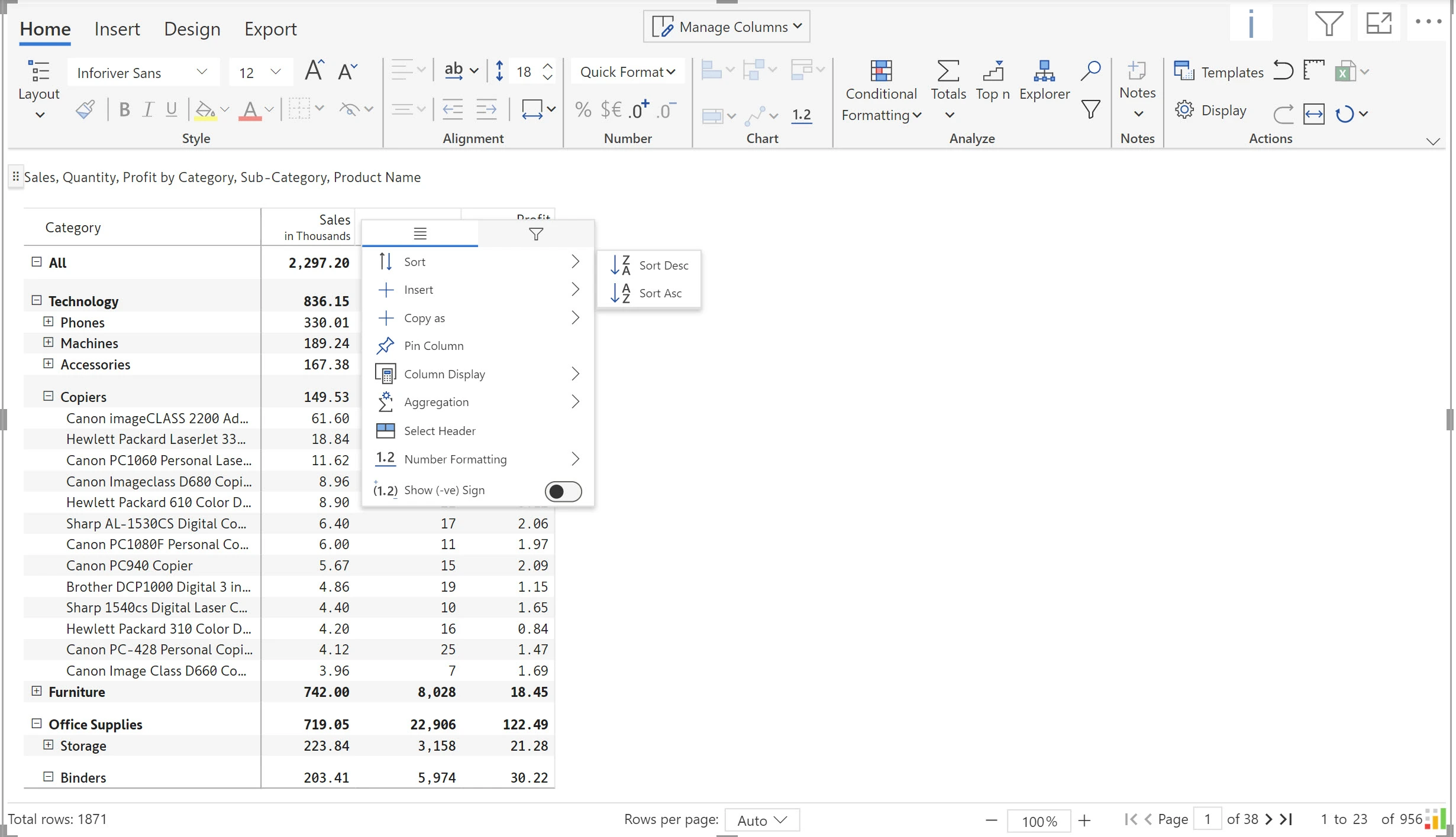
3. Showcasing hierarchical data: Table and matrix visuals are better for displaying data hierarchically, such as a breakdown of a category into subcategories, as they can display multiple levels of data in a single view.

4. Publishing raw data: Table/matrix visuals are better for displaying raw data where one needs to observe actual data points rather than a representation of the data.
5. Displaying data that requires a lot of sorting, filtering or grouping: Table/matrix visuals are best suited where the user expects flexible interaction capabilities – such as sorting, filtering and grouping.
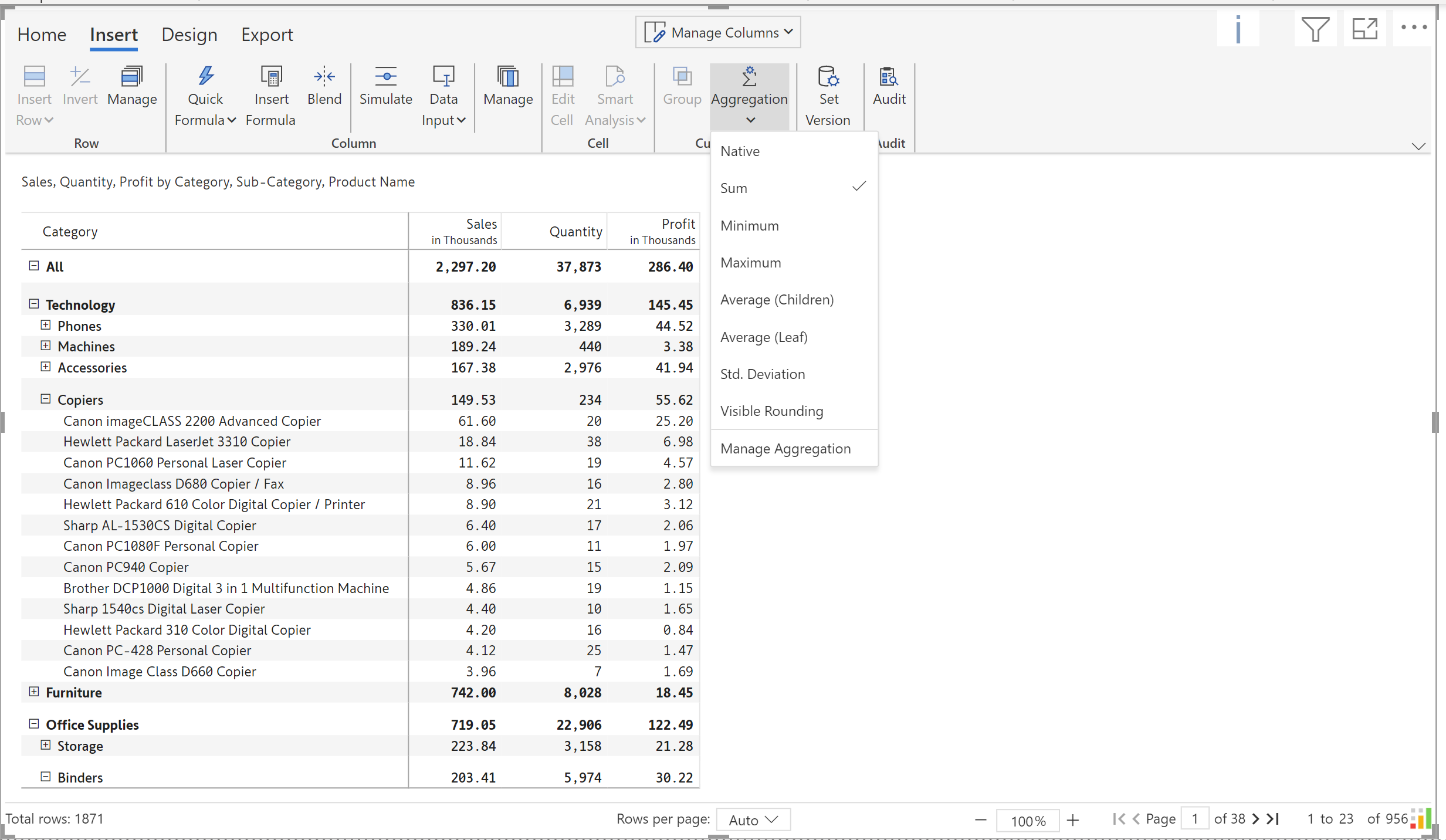
6. Displaying individual & aggregated observations: When you need to display individual as well as aggregated observations in a dataset, table/matrix visuals can be the best choice. Visuals like Inforiver matrix go further and allow to customize aggregations for each measure.
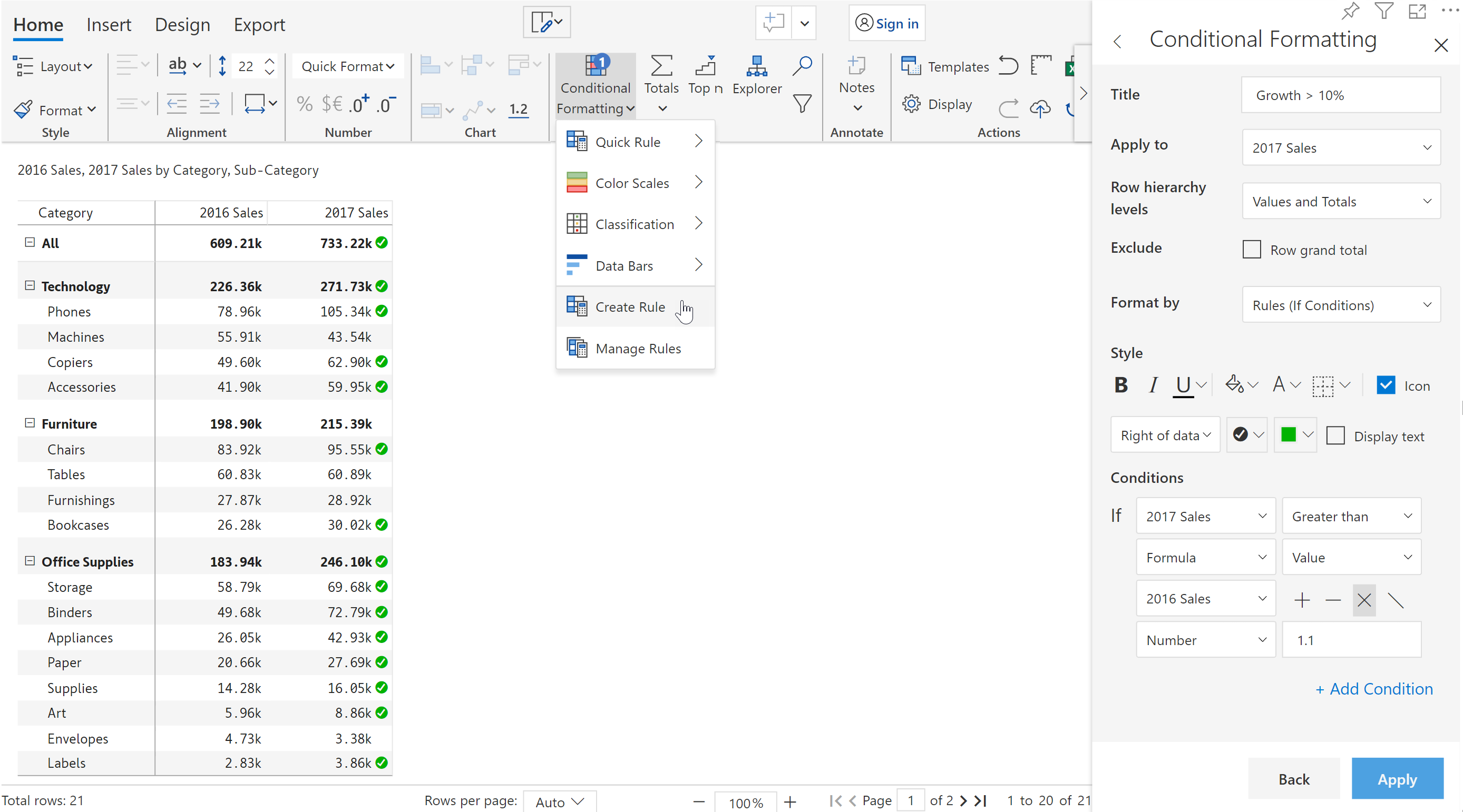
7. Visualizing data with advanced conditional formatting: As we know, the conditional formatting capabilities of charts are quite limited. If your data requires advanced alerting capabilities, table/matrix visuals may be your best bet.
In conclusion, it's important to note that tables and charts are not mutually exclusive, and one can be used to complement the other. While charts are often better for quickly and easily conveying high-level trends and patterns in data, tables are better suited for displaying large sets of detailed data, making comparisons, and allowing for easy manipulation of data. When choosing between a table and a chart, it's necessary to consider the purpose of the visualization, the type of data being displayed, and the audience for the visualization to ensure that it is effective.

Inforiver helps enterprises consolidate planning, reporting & analytics on a single platform (Power BI). The no-code, self-service award-winning platform has been recognized as the industry’s best and is adopted by many Fortune 100 firms.
Inforiver is a product of Lumel, the #1 Power BI AppSource Partner. The firm serves over 3,000 customers worldwide through its portfolio of products offered under the brands Inforiver, EDITable, ValQ, and xViz.