Upcoming webinar on 'Inforiver Charts : The fastest way to deliver stories in Power BI', Aug 29th , Monday, 10.30 AM CST. Register Now
Upcoming webinar on 'Inforiver Charts : The fastest way to deliver stories in Power BI', Aug 29th , Monday, 10.30 AM CST. Register Now
When dealing with Power BI table/matrix reports, there might be occasions where we prefer to apply customized measure aggregations in a particular report—such as calculating the average quantity sold at the company level —rather than relying on the default aggregation specified in the data model, like the sum of quantity sold.
Often, altering the aggregation in the data model may not be possible for several reasons, such as the following:
Inforiver’s aggregation feature allows you to override the standard measure aggregation for specific measures or categories in Power BI table/matrix reports. It supports aggregations such as sum, average, standard deviation, minimum, maximum, and more. This allows you to build reports rapidly without making extensive model-level changes.
With Inforiver, you can define aggregation at three different levels:
Let us explore this further.
Click on the Insert --> Aggregation and select “ALL” to set the report level aggregation.
This option sets the aggregation type for all measures in the report. Note that this functionality is accessible only when there are three or more measures present in the report.
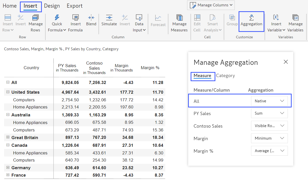
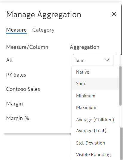
Clicking on the dropdown will reveal the following aggregation options:
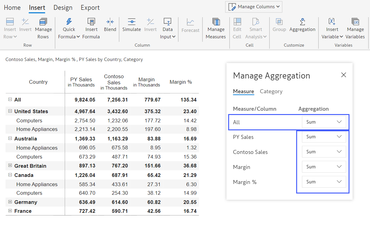
As demonstrated below, after setting the aggregation for "All" to "Sum," all the measures automatically adopt the "Sum" aggregation.
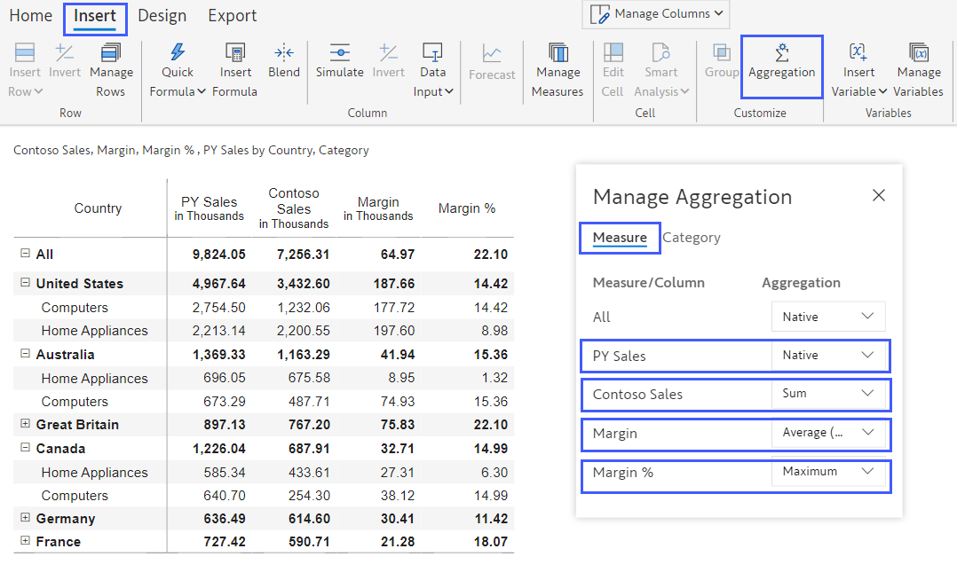
As shown below, we also have the option to choose specific measures and define the aggregation for each. For instance, we can set PY Sales as Native (as defined in the Power BI data model), Sales to be aggregated as a Sum, Margin as an Average, and Margin% as a Maximum.
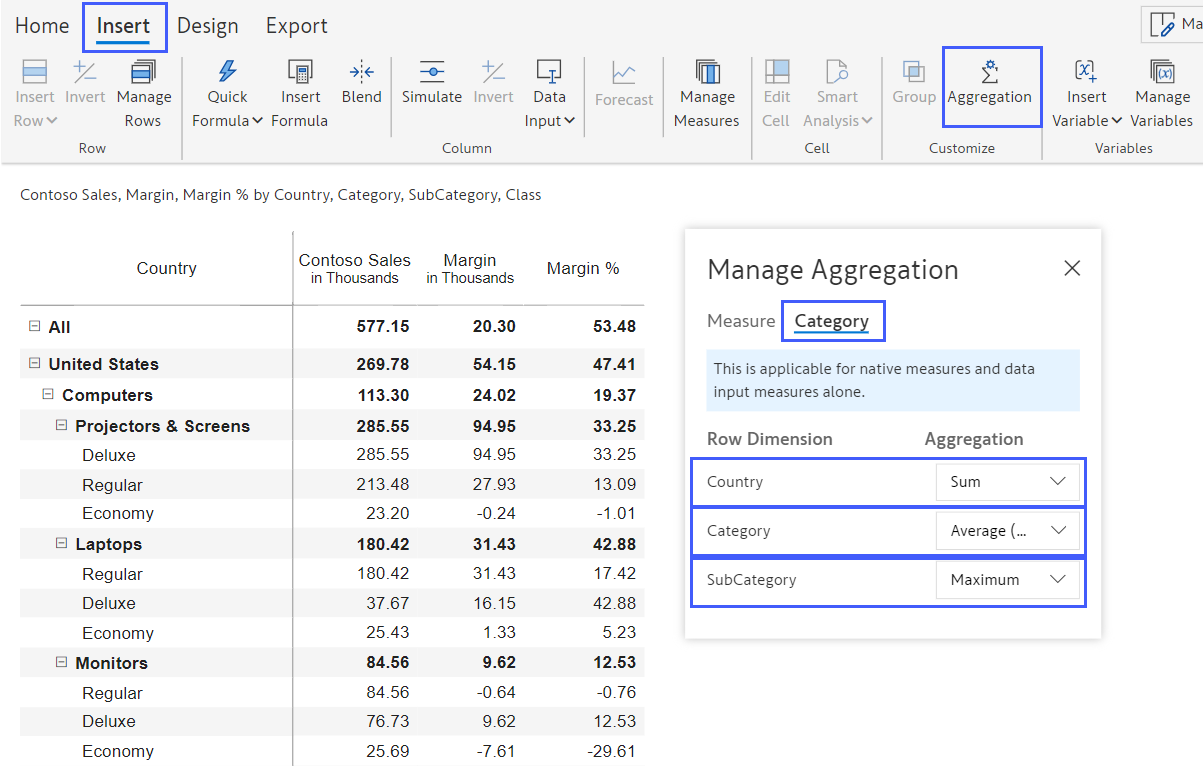
When we use hierarchies, we may want to aggregate the same measure differently at different levels. To apply an aggregation method to a specific level in the hierarchy, go to the Aggregation popup and switch the view from Measure to Category. In this example, the Country records will use Sum aggregation, the Category will use Average, and the Subcategory will use Max.
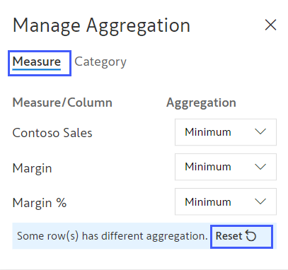
When you configure both types of aggregation, the hierarchy-level aggregations override measure-level aggregations. If you wish to cancel the hierarchy-level aggregation, click on the "Reset" option in the popup window as shown below.
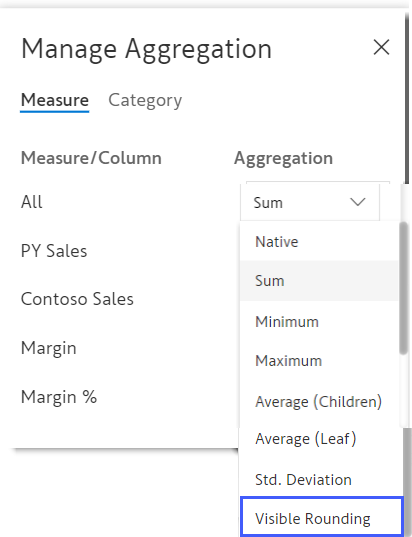
You will see an item called ' Visible Rounding ' in the list of aggregation options shown earlier (and reproduced below). This is mainly used in financial statements. Click here to learn more about why financial statements need a different type of aggregation.
Check out our latest video tutorial: Implement Advanced Aggregations in Power BI
Visit our product documentation page to learn how to manage aggregations.

Inforiver helps enterprises consolidate planning, reporting & analytics on a single platform (Power BI). The no-code, self-service award-winning platform has been recognized as the industry’s best and is adopted by many Fortune 100 firms.
Inforiver is a product of Lumel, the #1 Power BI AppSource Partner. The firm serves over 3,000 customers worldwide through its portfolio of products offered under the brands Inforiver, EDITable, ValQ, and xViz.