
Upcoming webinar on 'Inforiver Charts : The fastest way to deliver stories in Power BI', Aug 29th , Monday, 10.30 AM CST. Register Now
Upcoming webinar on 'Inforiver Charts : The fastest way to deliver stories in Power BI', Aug 29th , Monday, 10.30 AM CST. Register Now
A line chart plots points connected by straight lines to visualize continuous data. The values are encoded by the position of the data points, and the lines connecting these points form a continuous curve that reveals the overall shape of the series. Line charts are some of the most widely used and recognizable charts, making their interpretation intuitive and easy. In this article, we explore some of the most common uses for line charts and examine some cases where they are best avoided.
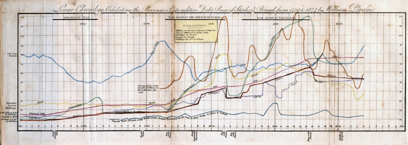
The most classic use case for a line chart is time series data, where the time variable is plotted on the horizontal axis. The line chart is ideal for this purpose because our eyes naturally tend to move across it from left to right, following the patterns in the troughs and peaks of the series. The continuous nature of the curve is also a visual cue mimicking the continuous nature of time. Some of the very first line charts created by William Playfair also depicted time series values, like the one below showing how bread and stock prices were affected over the years by war.
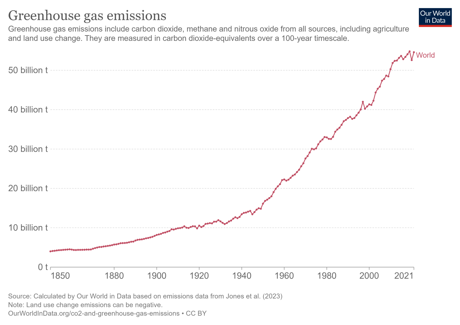
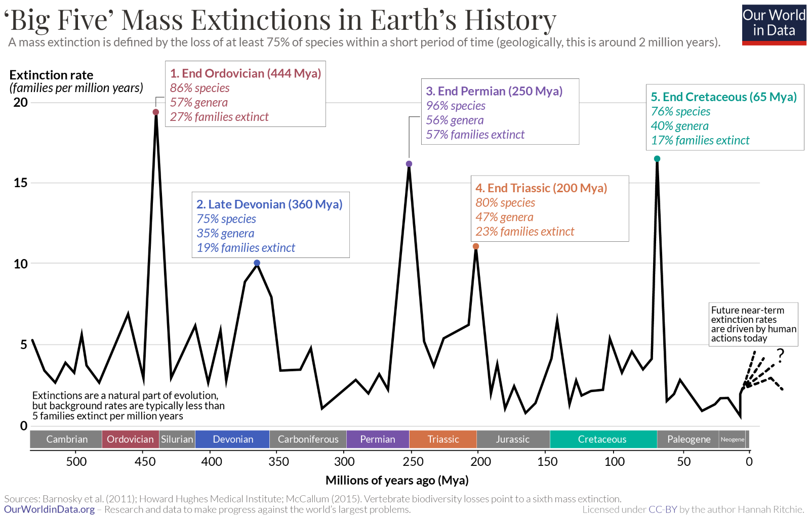
The continuous nature of the line chart puts the focus on the trend over time, drawing the eye to the overall shape of the curve, rather than to individual values (like in a bar chart). The chart below highlights the five big mass extinctions in Earth’s History by showing the change in the rate of extinction over time. We see that the general trend shows variation, but the five mass extinction events clearly stand out as peaks against the rate of background extinction.
Column charts are sometimes used to show time series data with relatively few values. However, line charts are a better choice than column charts when the time intervals involved are uneven. This is aided by the fact that we can use markers to clearly indicate where data points are positioned on the curve. Uneven intervals are much more difficult to see on a column chart, which may give the wrong impression about the rate of decline/increase by evenly spacing all bars. The markers in the chart below, for instance, make the uneven time intervals easy to see.
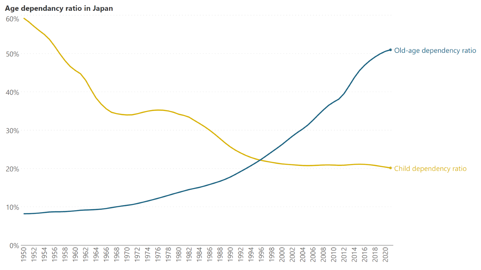
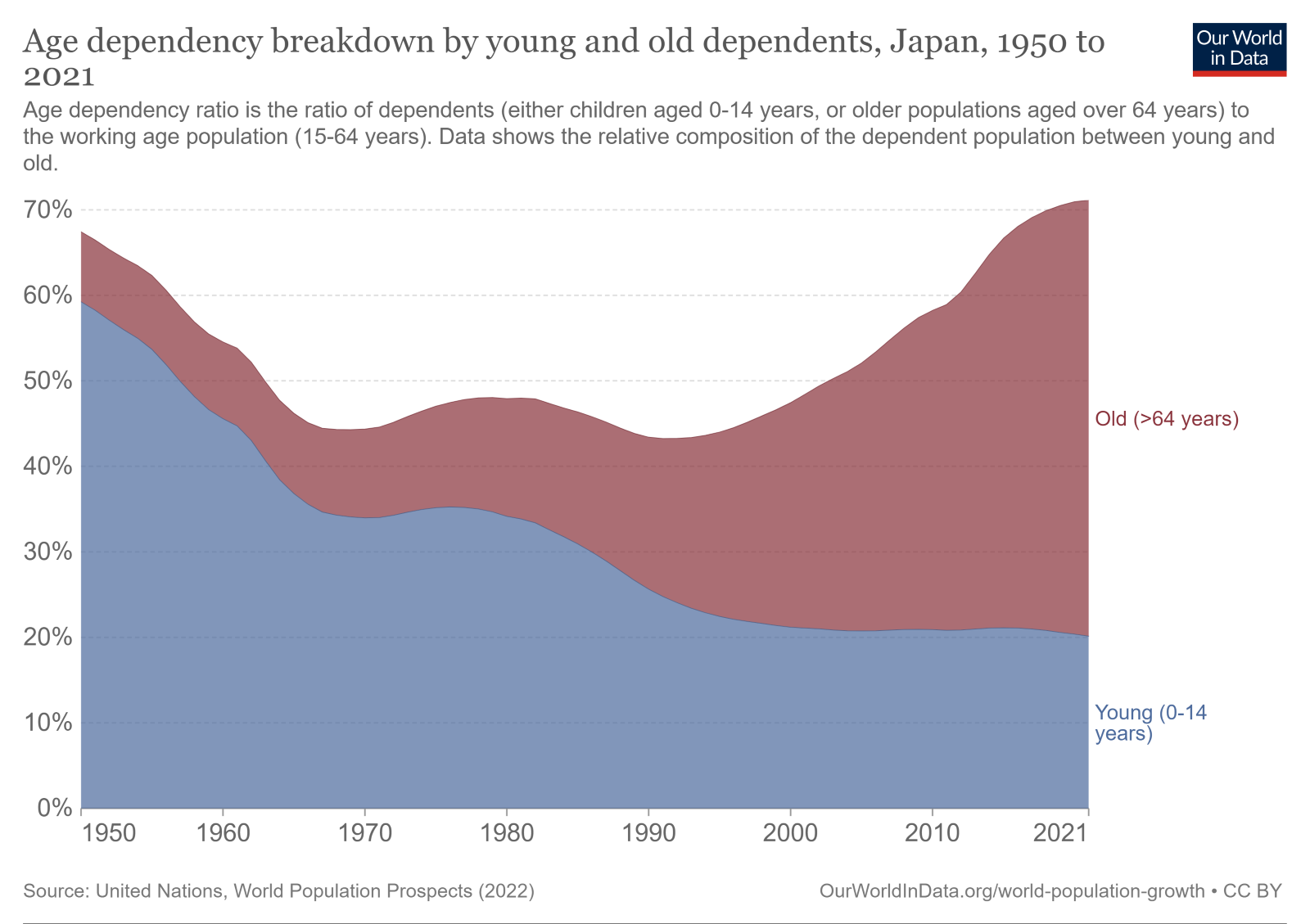
Line charts can be used to show more than one series at a time, allowing us to compare their values. In this case, the intersection points between the series provide additional information on overtaking values. The following chart shows the age dependency ratio in Japan broken down into two series showing young dependents and dependents in old age. We see that in the 1950s, the proportion of dependent children outweighed the proportion of elderly dependents, but this trend has now been reversed with the proportion of elderly dependents overtaking the proportion of young dependents in the mid 1990s, hinting at Japan’s ageing population. This type of information is much more difficult to see in a bar chart, or in a stacked area chart as in the second chart below that shows the same data.
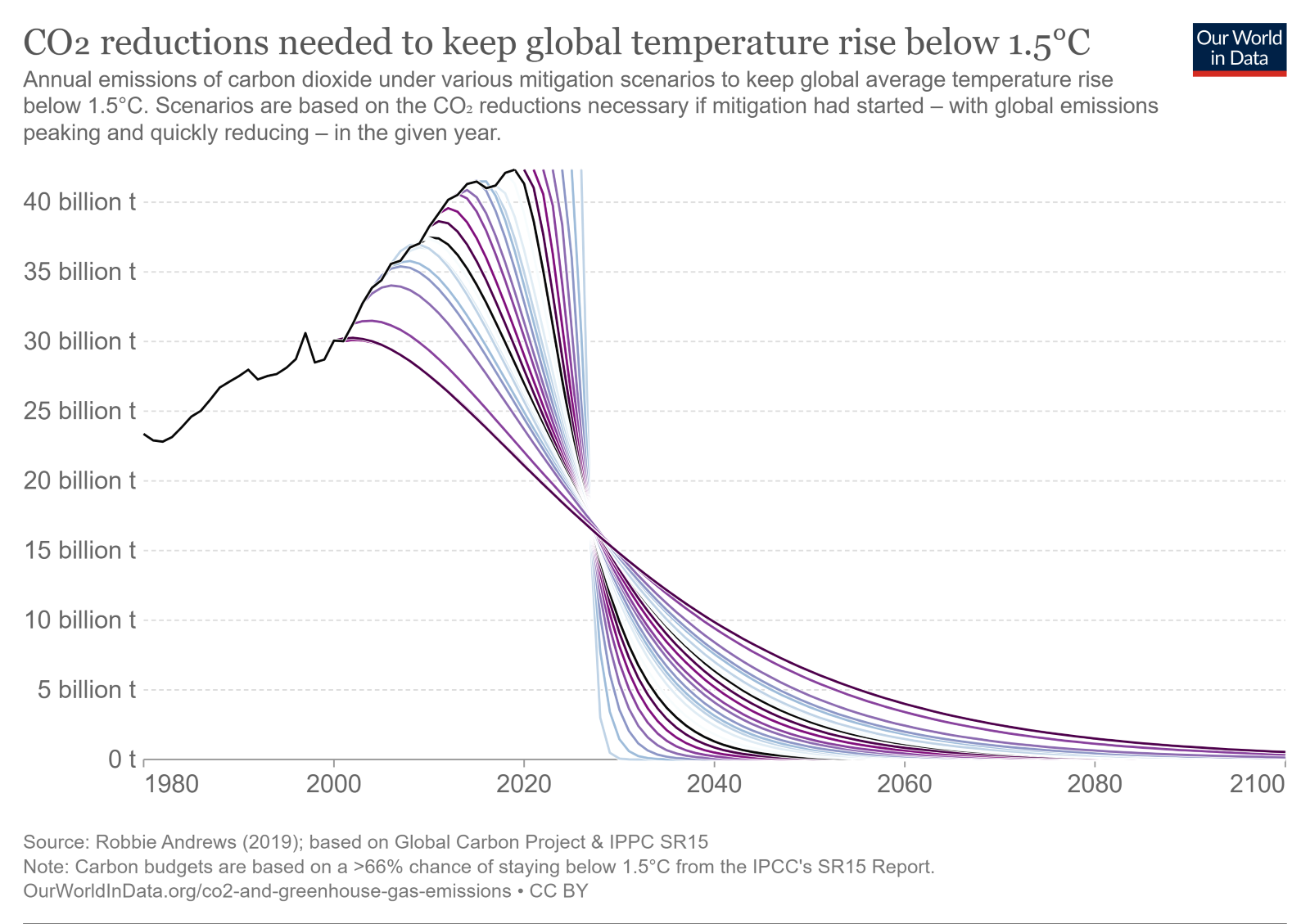
Another piece of valuable information is relayed by the slope of a line chart. For a chart with a single series, we see not only the absolute values of the points, but also the rate of increase or decrease, as conveyed by the slope. For a chart with more than one series, we can also compare the slopes of the different series to understand their relative rates of change. The following chart shows the reductions in the annual emissions of carbon dioxide necessary to keep global temperature rise to 1.5°C, with each line representing the emissions if mitigation started in a given year. The slopes of each of the projected scenarios tell us how quickly emissions must drop if the goal of 1.5°C is to be reached. The message of the chart is clear – the later we begin climate change mitigation, the steeper the price we must pay.
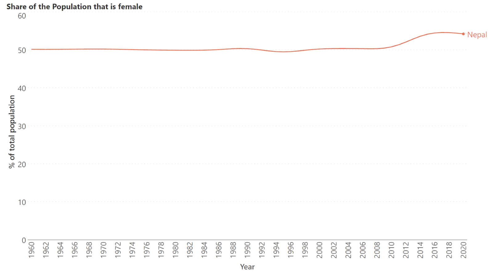
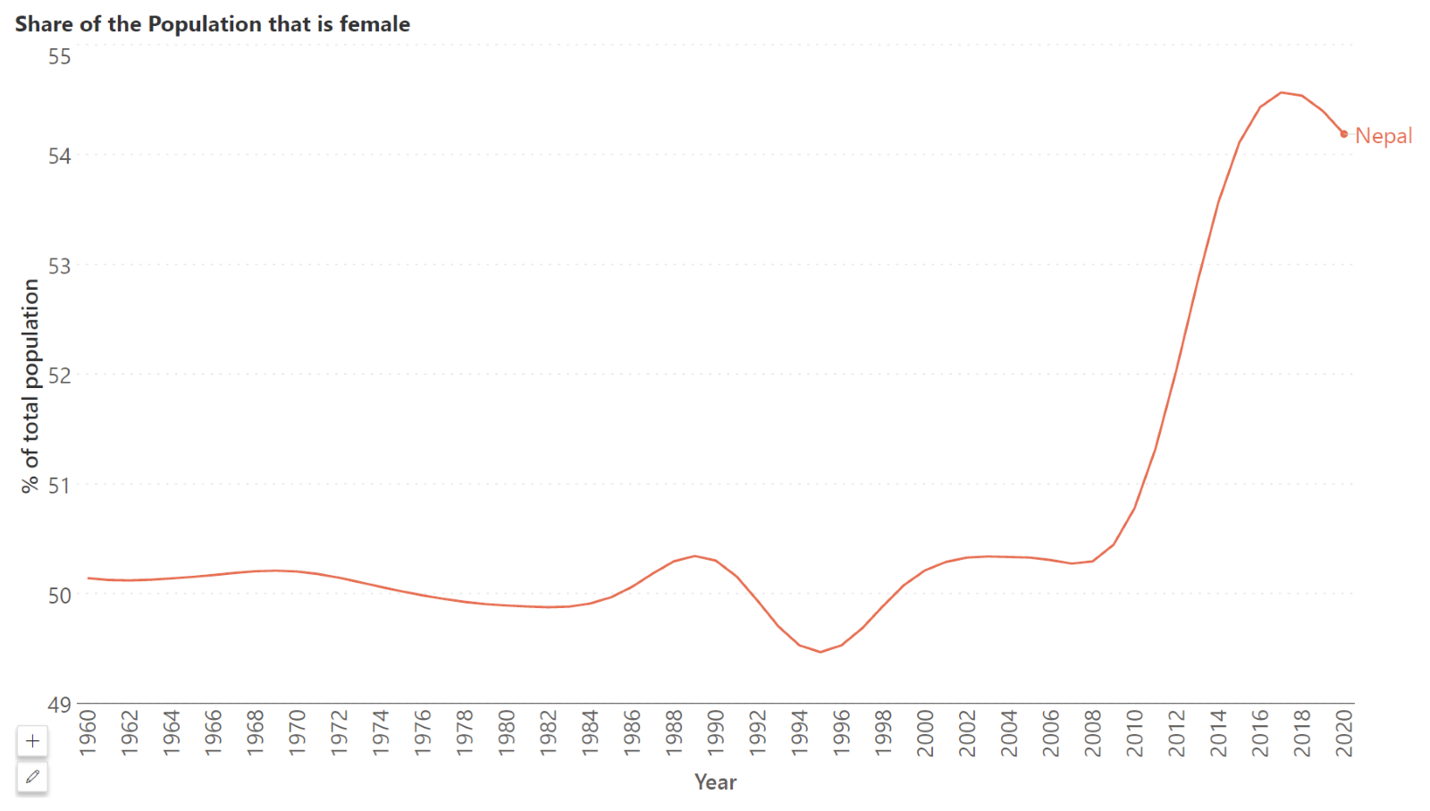
Line charts are also ideal for values that are relatively stable. In such cases, we may “zoom in” on the chart by starting the y-axis at an appropriate value. This allows us to make efficient use of the chart space by “expanding” the line chart to fit the chart area, giving us a detailed perspective on the changes in value. For example, the first chart below shows the trend in the percentage of the population in Nepal that is female. As we can see, this is a relatively stable value with minimal variation, but we may zoom in to see the patterns more clearly by beginning the y-axis at 49%, as in the second chart below. Notice how we clearly see the uptick in the curve over the last decade in this chart, while it is barely perceptible in the first one.
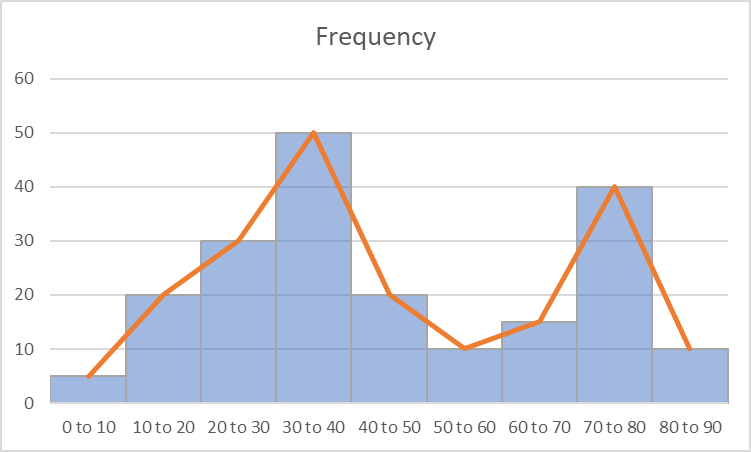
Line charts are sometimes also used to show frequency distributions. These types of charts are called frequency polygons. A frequency polygon can reveal the overall shape of a distribution by connecting the frequency values encoded by the height of the histogram bar, as shown in the image below. They are sometimes used to represent cumulative frequency instead, in which case the slope of the chart allows us to see which bins have large values (the steeper the slope, the larger the bin value). Frequency polygons are especially useful when we want to compare two different distributions on the same chart by overlaying the polygons, which is difficult to accomplish with a regular histogram. This chart also has a better data-ink ratio compared to the histogram.
Explore Line & Advanced Chart Capabilities in Inforiver Analytics+
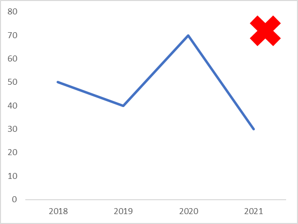
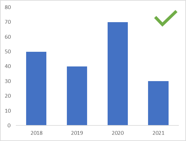
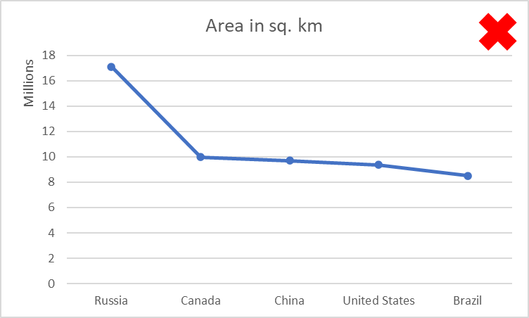
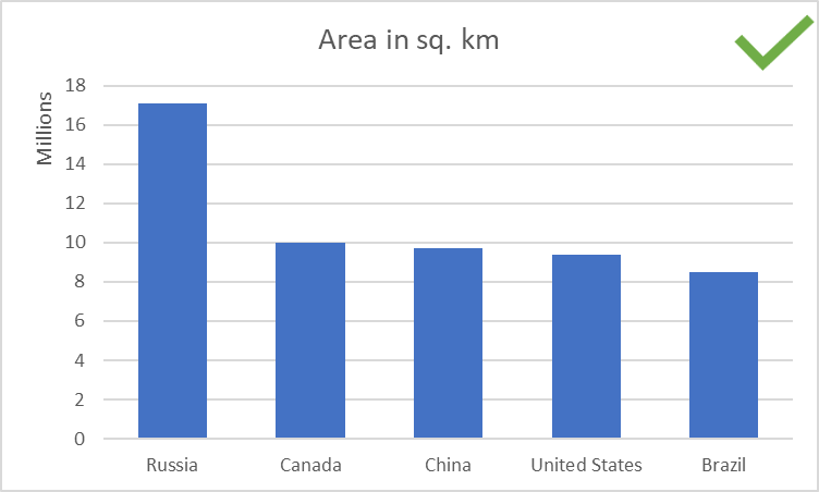
For short time series with only 4-5 values, use a column chart instead of a line chart. This is a case where the overall shape of the curve may not reveal any important information and it could be more useful to compare individual values instead. Line charts are best used for continuous data, while column charts emphasize individual values due to their discrete nature.
Line charts provide a prominent visual cue on the continuity of the underlying data set because of the continuity of the line connecting the points. It is therefore important not to imply a continuity that does not exist by using a line chart for discrete values. This can include time values that are discrete, as well as other types of categorical and nominal comparisons. For example, the line chart below shows the area of the top 5 largest countries in square kilometers. By using a line chart, we imply a relationship between the areas of these countries that does not exist! It is better to use a bar chart, as shown in the second image below.
- By Hamsini Sukumar
Line charts vs. Area charts: A comparison

Inforiver helps enterprises consolidate planning, reporting & analytics on a single platform (Power BI). The no-code, self-service award-winning platform has been recognized as the industry’s best and is adopted by many Fortune 100 firms.
Inforiver is a product of Lumel, the #1 Power BI AppSource Partner. The firm serves over 3,000 customers worldwide through its portfolio of products offered under the brands Inforiver, EDITable, ValQ, and xViz.