
Upcoming webinar on 'Inforiver Charts : The fastest way to deliver stories in Power BI', Aug 29th , Monday, 10.30 AM CST. Register Now
Upcoming webinar on 'Inforiver Charts : The fastest way to deliver stories in Power BI', Aug 29th , Monday, 10.30 AM CST. Register Now
Area charts and line charts have many similarities, but some key differences in use, properties, and advantages mean that they are not interchangeable. This article explores the differences between area charts and line charts, guiding you to make the right choice for your data visualization purposes.
Line charts plot a numerical variable on the vertical axis against a categorical variable on the horizontal axis. The categorical variable is often taken to be time, resulting in a chart showing the trend over time. This type of chart uses the position of a point to denote the numerical value of an entity, with lines connecting consecutive points to show the shape of the overall curve.
Area charts are similar to line charts, but shade-in the area below to curve to represent the value of the quantity plotted, as seen in the chart below. As we shall see, this becomes an important distinction between these commonly used charts.
Shading the area under the curve changes the entire focus of the chart. While the eye naturally moves from left to right on a line chart and tracks the trend over time, an area chart changes the focus to the total volume occupied by each series. This is because the shading puts the spotlight on the area taken up by the series, rather than just the top of the curve showing the changes over time.
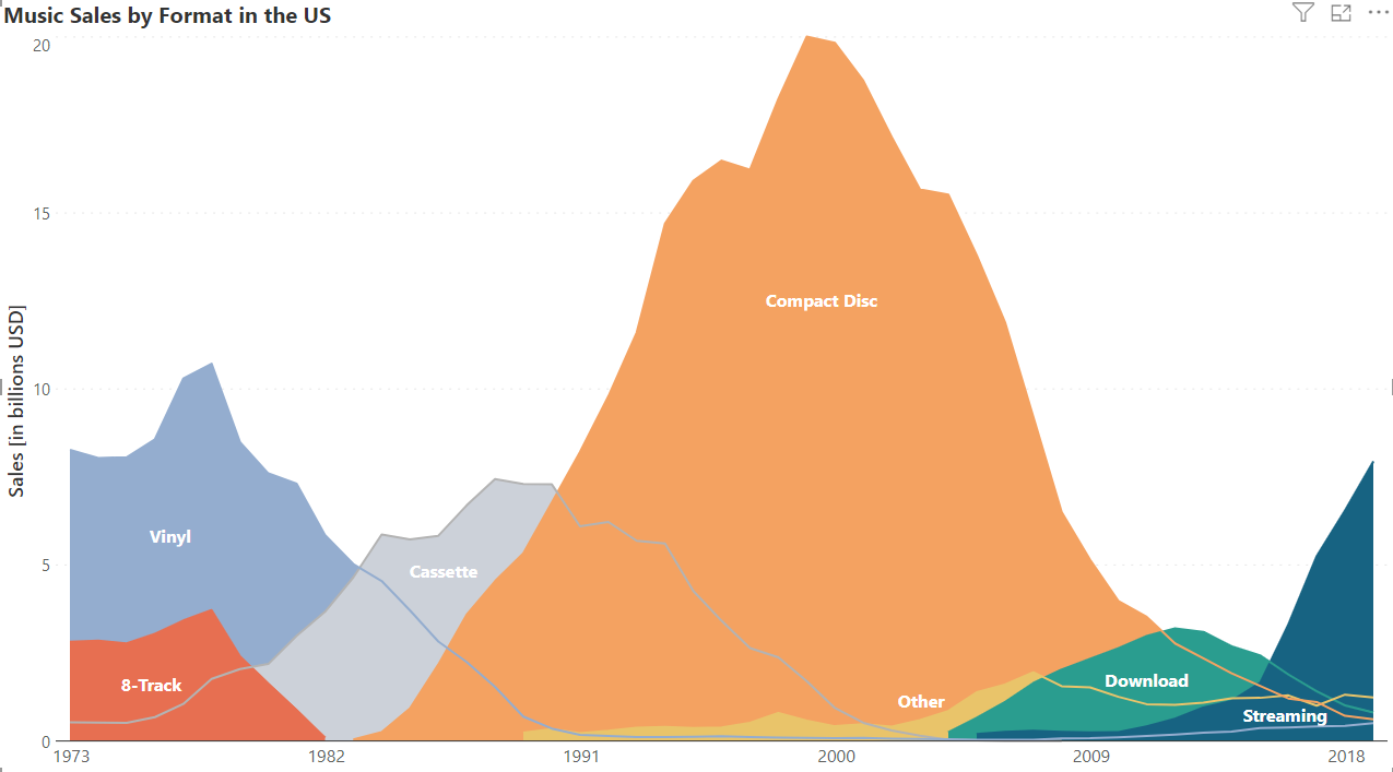
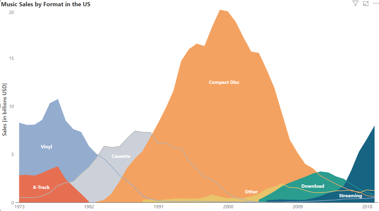
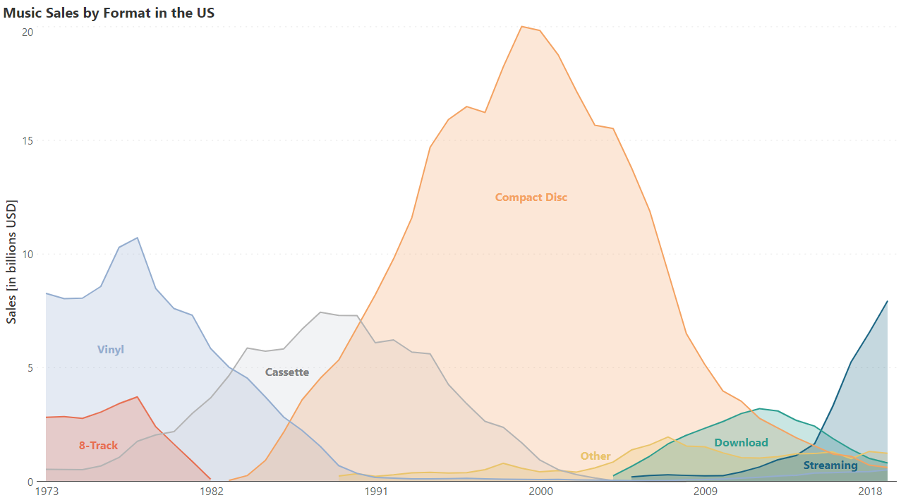
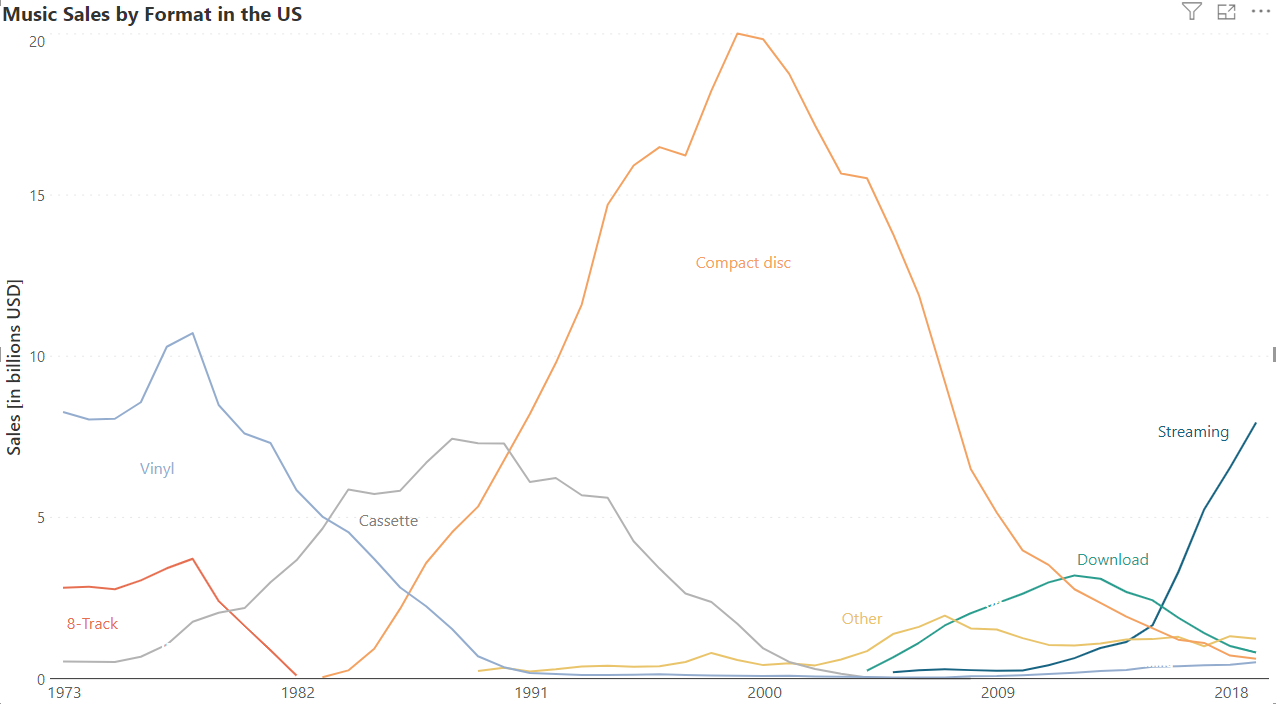
We see this in the line chart and the area chart below, both visualizing the same data on music sales in the US by format. In the first chart, we naturally compare the rise and fall of different formats and notice the points when one format overtakes another.

In the area chart however, the shading draws our attention to the total area taken up by each format on the chart, and we tend to compare the differences in the total volume of sales for each of the formats.
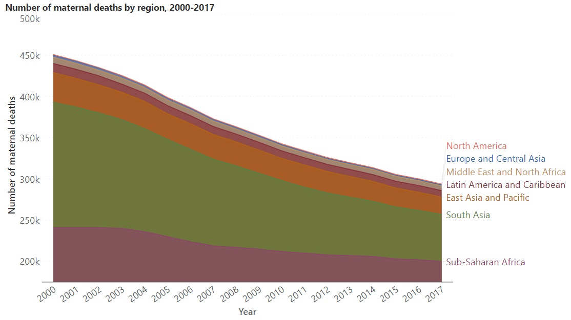
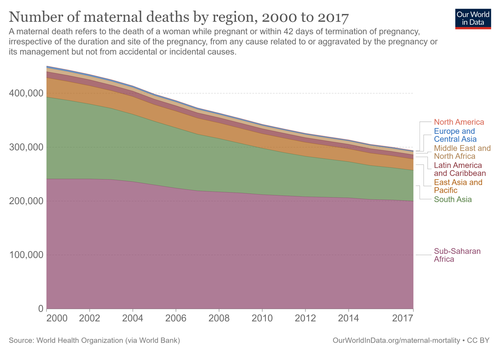
Another distinction to emphasize is that area charts use the total area to denote value, instead of the reading denoted by the position of the curve. We tend to assign more value to objects with larger areas which means that it is important to start the vertical axis at zero for an area chart. Starting the axis at any other point truncates the areas, giving a false impression about their relative magnitudes. Consider the two stacked area charts below (more on this type of chart to come), showing the number of maternal deaths by region. We may assume from the first chart that the volume of deaths in Sub-Saharan Africa is less than that in South Asia. A closer look, however, reveals that the axis here does not start at zero. The correct representation is given by the second chart, where we see that the number of deaths in Sub-Saharan Africa dominates all other regions.
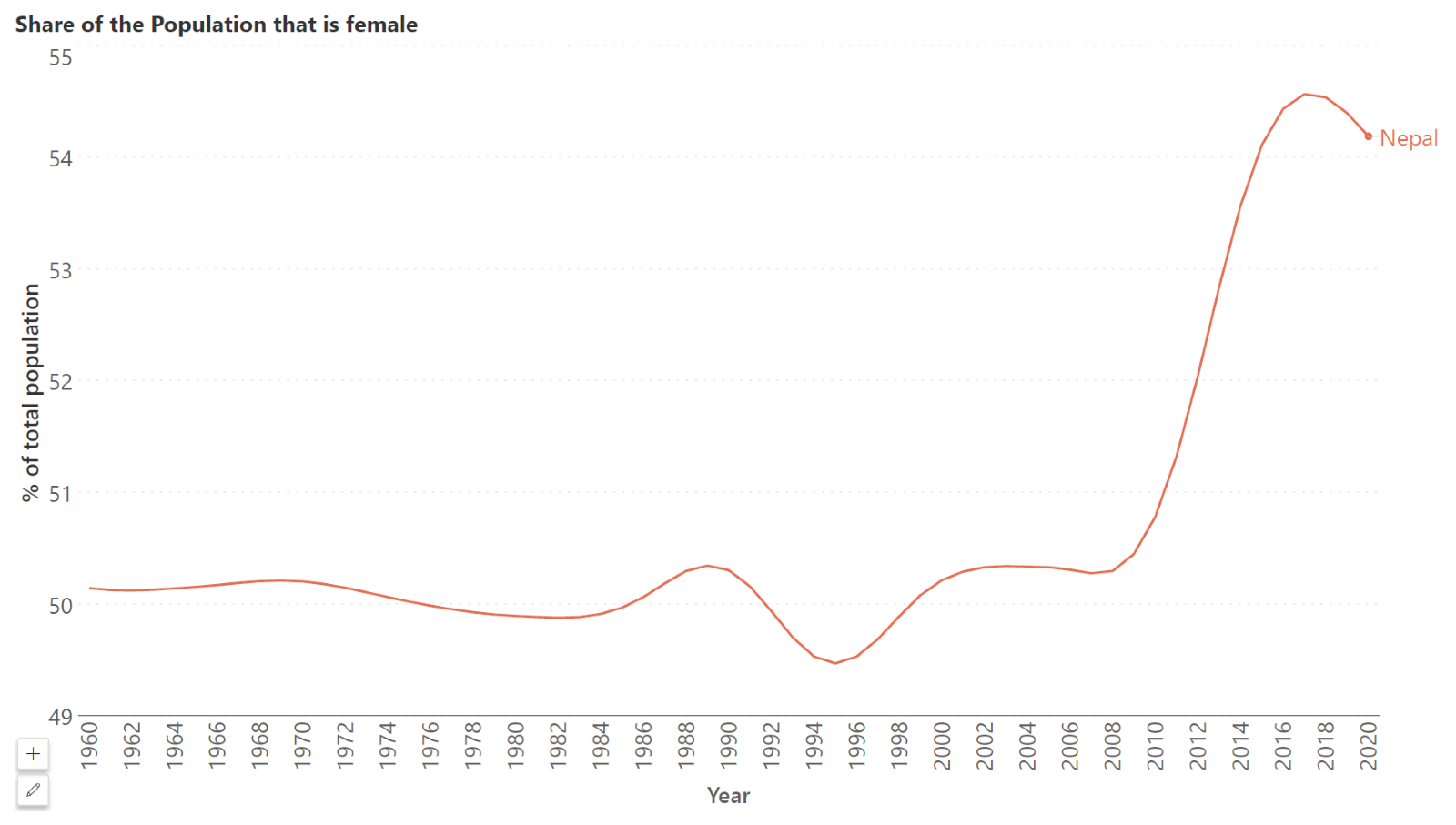
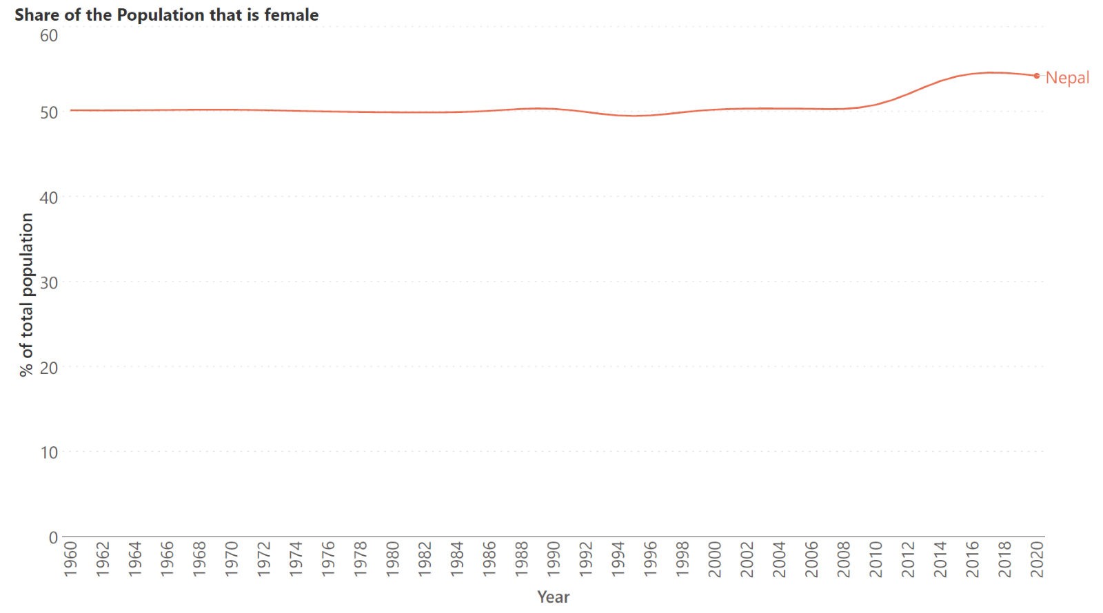
The y-axis need not start at zero for a line chart, by contrast. This means that we may “zoom in” on the curve to get a better understanding of the differences between the values. There is no single right answer and the important question to consider is whether your data has a meaningful relationship to zero. The following line chart shows the share of the population in Nepal that is female. This is an example where it is not necessary to include zero since values usually hover around 50% and even small changes in large populations (for example at the country level) can have significant consequences. Consider the second chart where we start the axis at zero – the line looks almost flat, and it is difficult to see that any change has occurred at all!
Being able to “zoom in” on values by choosing the starting point on the y-axis means that line charts are suited to values that are relatively stable.


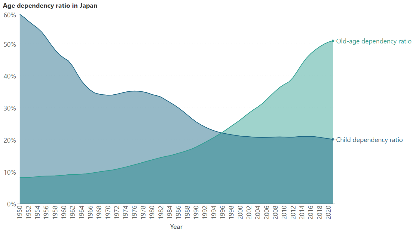
On the other hand, area charts are a better choice for values that show large variation. This variation can easily be seen even with the y-axis starting at zero, while the visual weight provided by the shaded areas further emphasizes the distinction. The following chart, for example, shows the ratio of dependents to the working population in Japan from 1950 to 2020, broken down by children and people in old age. It shows large variation in the values, with the child dependency ratio showing a sharp decline, while the old-age dependency ratio shows an increase. This type of variation is ideal for an area chart.
Area charts can often lead to occlusion, where one data series obscures another lower-valued series behind it. The solution to this is usually to add transparency to the areas, so that all series can be seen. This is illustrated by the two charts below, the first without and the second with transparency.
This is not a problem encountered with line charts as demonstrated below in this chart visualizing the same data. This leads us to the next two points of difference.
Another solution to the problem of occlusion in area charts is to use a variant called the stacked area chart. This chart stacks the series on top of each other instead of putting them on the same horizontal baseline, i.e., the baseline for each series is provided by the cumulative curve of all the series below it. This provides a parts-to-whole picture of the data, where we can see how different series sum up to the total. This is shown in the chart below. Another possibility is the 100% stacked area chart, which tracks percentage contribution over time instead of absolute numbers.
While stacked line charts do exist, they can be very difficult to read and are often best avoided. Line charts thus cannot generally be used to show part-to-whole relationships but are instead used to show one series overtaking another. Meanwhile, this is not a suitable purpose for a standard area chart due to occlusion, or for a stacked area chart as our visual perception is not adept at evaluating areas.
Area charts are also not equipped to handle more than a few series at a time, whether as a standard or as a stacked area chart. This increases their tendency to occlusion, as discussed above, and leads to overcrowding. Take a look at the stacked area chart below. The huge number of series plotted makes the chart busy, difficult to read, and even obscures some of the labels.

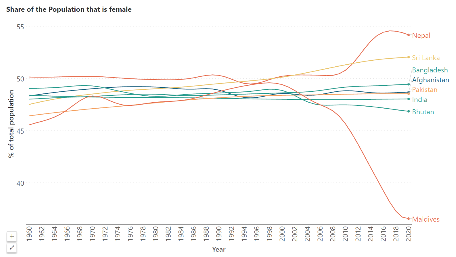
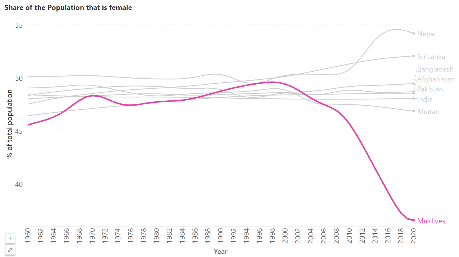
A line chart, however, can handle many more series. The strategy here is to avoid the “spaghetti” effect (where overcrowding results in a confusing line chart that has the appearance of spaghetti noodles thrown together) through clever use of color to focus attention on the message of the chart. Consider using a thicker line width combined with highlight colors against grey to draw the eye to specific series. For example, the charts below show the trend in the percentage of the population that is female for South Asian countries. Notice how in the first chart, it is difficult to follow the trend in any country thanks to the density of the lines that are crowded together. Let us assume that we wanted to focus on the Maldives, where the influx of primarily male immigrant workers has skewed the sex ratio substantially. Notice how the second chart shines a spotlight on this country using pink against grey, as well as a thicker line width, to clearly show how the proportion of females increased until about 1998, after which there was a decline.
Area charts also have more visual weight than a line chart. They use a lot of ink to relay the same message as the equivalent line chart and thus contain a lot of non-data ink. Line charts make more efficient use of ink on the other hand, but this does not necessarily mean that they are always the better choice, as we have seen. A general principle of data visualization as introduced by Edward Tufte is to limit the quantity of non-data ink on a chart. While this is generally true, the added visual weight of an area chart can also be leveraged to draw attention to the right message.
Explore Line & Area Chart Capabilities in Inforiver Analytics+
- By Hamsini Sukumar
Line charts: when to use them and when to avoid them
Line chart dos and don’ts: Creating an effective chart

Inforiver helps enterprises consolidate planning, reporting & analytics on a single platform (Power BI). The no-code, self-service award-winning platform has been recognized as the industry’s best and is adopted by many Fortune 100 firms.
Inforiver is a product of Lumel, the #1 Power BI AppSource Partner. The firm serves over 3,000 customers worldwide through its portfolio of products offered under the brands Inforiver, EDITable, ValQ, and xViz.