
Upcoming webinar on 'Inforiver Charts : The fastest way to deliver stories in Power BI', Aug 29th , Monday, 10.30 AM CST. Register Now
Upcoming webinar on 'Inforiver Charts : The fastest way to deliver stories in Power BI', Aug 29th , Monday, 10.30 AM CST. Register Now
Scatterplots plot the relationship between two numerical variables using points on the Cartesian plane. The position of each point is determined by its value in relation to the variables plotted on the horizontal and the vertical axes.

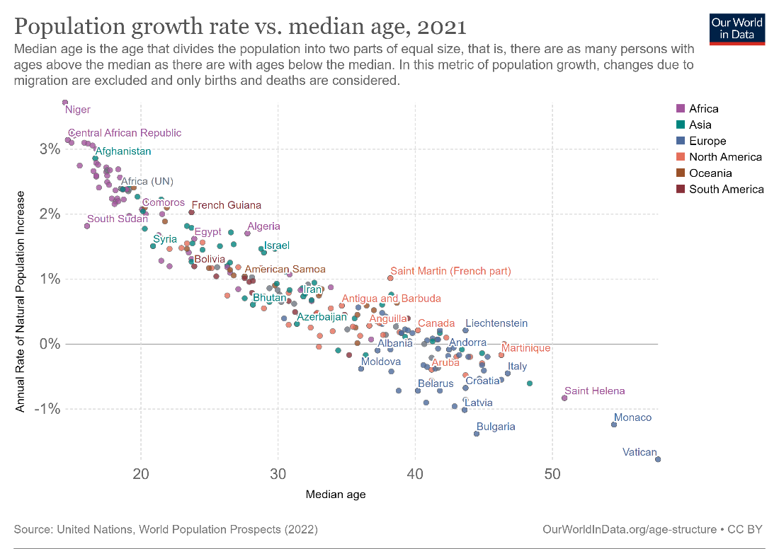
For example, the above scatterplot shows the relationship between population growth rate and median age for countries around the world. Each point represents a single country, with its horizontal position determined by its median age, and its vertical position determined by the annual rate of population growth. Let us understand this by picking a specific country – say, Saint Helena towards the bottom right of this chart. The median age can be read by drawing a vertical line through the point and reading its intercept on the x-axis – in this case around 51 – and the population growth rate can be read by drawing a horizontal line through the point and reading its intercept on the vertical axis – in this case, around –0.9%. This indicates that the population is in fact shrinking every year, while the median age in Saint Helena is very high.
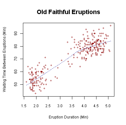
Scatterplots like this reveal the overall shape of the data, allowing us to see where data points are clustered. This allows us to see how the variables are correlated, how tightly clustered the points are, and what the form of the data distribution is. The following scatter shows the relationship between the duration of eruptions and the time between eruptions of the Old Faithful Geyser in Yellowstone National Park. We see that the longer the waiting time is between eruptions, the longer the duration of the eruption. In addition to this, we can also see that this forms a bimodal distribution which has two clusters of points - at the top right and the bottom left of the chart, with relatively few points in between them.
In this article, we examine what scatterplots are used for, some best practices, and some variations that can make them even more information rich. Use this guide to make better charts, and to understand how to interpret scatterplots.
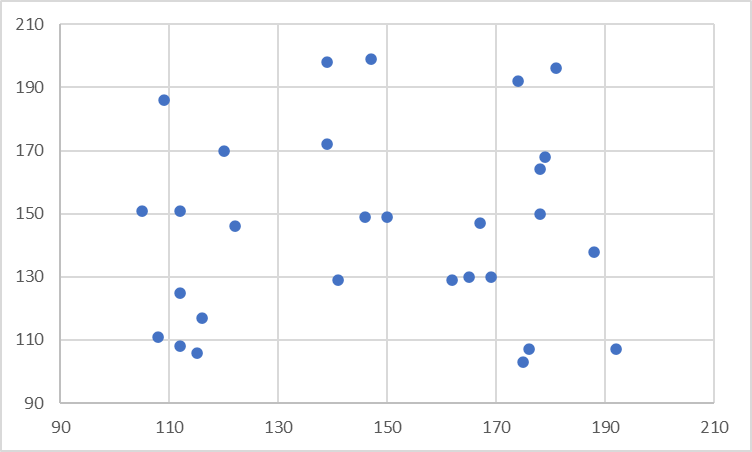
The primary use of scatterplots is to highlight a correlation (or lack thereof) between the two sets of quantitative values. Correlation is a statistical measure of how two numerical variables are related. Though a discussion of the exact formulae is beyond the scope of this article, we say that two variables are correlated if we can roughly estimate the value of one of the variables when the value of the other variable is known. The chart on the left here shows no correlation between the variables – the points are scattered randomly around the chart and do not show a relationship. The chart on the right, however, does show a correlation between the x and y variables – given the value of the x variable, we can roughly predict the value of the y variable.

The relationship between the two need not be causal, but this predictability can be a useful tool. A scatterplot can show whether two variables are correlated, how much they’re correlated and whether they’re correlated positively or negatively. Let us examine each of these in detail.
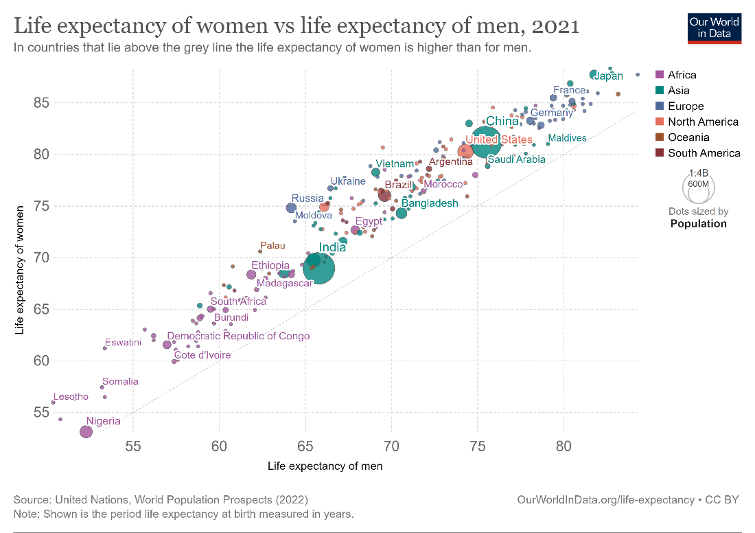
The correlation between two variables can be positive or negative. A positive correlation means that the second variable increases when the first variable increases, as seen in the image below. Here, we see that the life expectancies of women and men are positively correlated.

A negative correlation means that the second variable decreases while the first variable increases. This is seen in the scatterplot chart below showing the correlation between population growth rate and median age – as median age increases, population growth rate generally decreases. This also makes logical sense since an ageing population is less likely to reproduce.

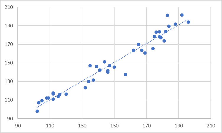
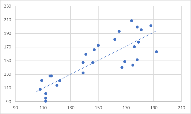
Correlations can also be strong or weak. There are exact statistical calculations that measure this, but roughly speaking, a correlation is said to be strong if the data is clustered together closely along a trendline, as in the image below. (We will examine trendlines in detail in the next section.) Here, we see a strong correlation between population growth and median age. This correlation is negative, as mentioned above.
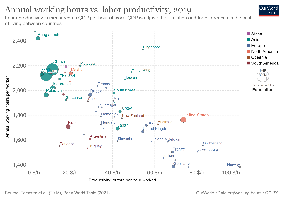
A correlation is said to be weak when the points are scattered loosely around the trendline. The following chart shows a negative correlation between annual working hours and labor productivity, but in this case, the correlation is relatively weak.
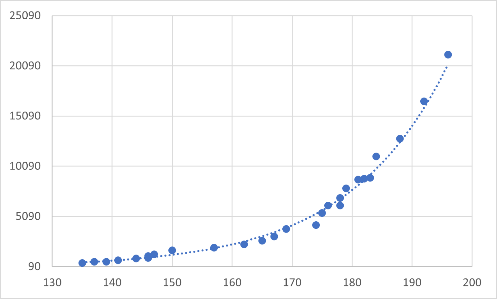
So far, the cases that we have examined have assumed that the correlation is linear. A correlation is called linear if our variables are directly proportional to each other. This means that an increase in one variable means a uniform increase or decrease in the second variable. For example, if 5 apples cost 2 dollars, then 10 apples cost 4 dollars, i.e., the cost of apples and the number of apples are directly proportional. The best approximation for a linear scatter is given by a straight trendline, as seen in the image below.
However, the relationship between the variables could be more complex. For example, the population of a species over time could depend on several factors such as the availability of nutrients and water, genetic factors, competition, and predation, among many other factors that also interact with each other. The chart below, for example, fits an exponential line to the data shown, which is an example of a non-linear correlation.
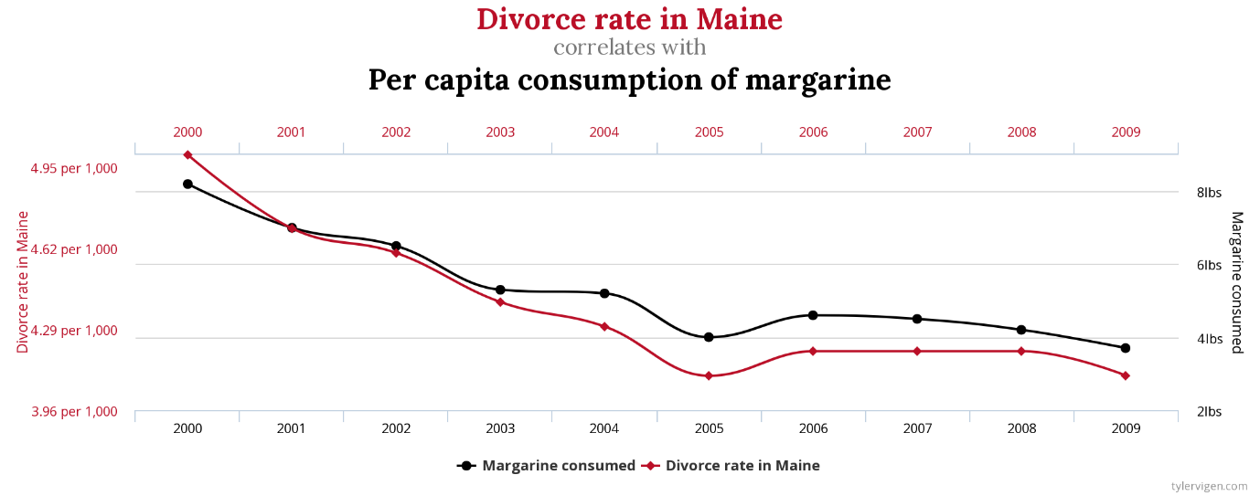
A note of caution while discussing correlations – we must always keep in mind that two variables may be correlated, but that does not necessarily imply a causal relationship between them. Correlation gives us a measure of predictability that we can use for estimates, but causality requires many more conditions. For instance, if event “x” causes event “y”, then in addition to the two showing a correlation, event “x” would needs to chronologically happen before “y”, and there should not be a third factor driving both “x” and “y”. Sometimes, we also find correlations between very strange variables, like the chart below showing a spurious correlation between the divorce rate in Maine and the per capita consumption of margarine! Always critically examine your hypothesis and your data – a correlation may exist, but it must make logical sense in the context of your model.
Scatterplots can also be used to show disproportionalities or deviations from the expected value for paired comparisons. This is usually done by comparing the same variable across two categories or time periods. For example, the chart below compares the life expectancy of men and women in various countries. If the two were equal, all points would lie on the diagonal line indicating parity. However, we see that the points lie above this line for all the countries plotted, which means that the life expectancy of women is higher than that of men in 2021.
A trendline, sometimes called a regression line or a line of best fit, is a line drawn on a scatterplot that estimates the relationship between the two variables as accurately as possible. Given the value of one variable, we can use the trendline to estimate the value of the second variable. Once again, the statistical theory behind trendlines is beyond the scope of this article, but most charting software will have built-in capabilities to plot one. Use a trendline to emphasize the correlation between the two variables. This gives readers a visual cue on the nature and strength of the correlation.
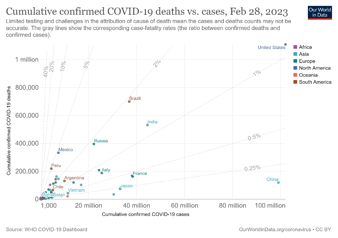
Using a logarithmic scale instead of a linear scale may sometimes be useful for one or more of your axes. A log scale can help separate points that are clustered too closely together to be seen. Consider the chart below comparing cumulative COVID-19 deaths with the number of cases in various countries. We see that most countries are clustered towards the bottom left of the chart, leading to overlapping of the points to such an extent that it is difficult to even see how many countries have been plotted.
In the chart below, however, we use a logarithmic scale on both the x and the y axes to plot the same data. Notice how separated the points are, and how this chart is easier to read than the previous one.
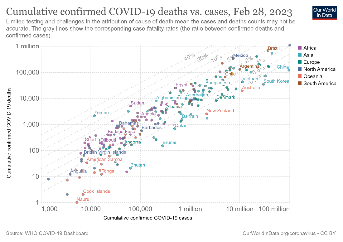
One disadvantage of using the logarithmic scale is that it is not intuitive to understand. While a linear scale plots additive increases, a logarithmic scale plots multiplicative increases. This means that in a linear scale, the difference between two gridlines remains constant, while in a log scale, their ratio remains constant. For example, in the first chart above with the linear scale, the difference between the x-axis gridlines is 20 million and the difference between the y-axis gridlines is 200,000. In the second chart with the log scale, the ratio between consecutive gridlines is 10. In interpretation, this means that China (top right of the chart), for example, has had 10 times as many cases as Argentina, but with roughly the same number of deaths. In other words, the death rate relative to the number of cases is 10 times higher in Argentina when compared to China.
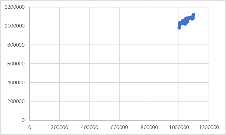
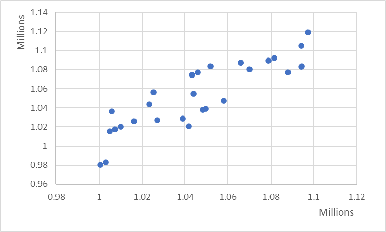
Take advantage of your entire chart area by beginning the y-axis at an appropriate value. The two charts below show the same data, with the first chart beginning the y-axis at zero, and the second chart at 0.98 million. Notice how closely clustered and occluded the points are in the first chart, and how the second chart rectifies this and clearly demonstrates the positive correlation.
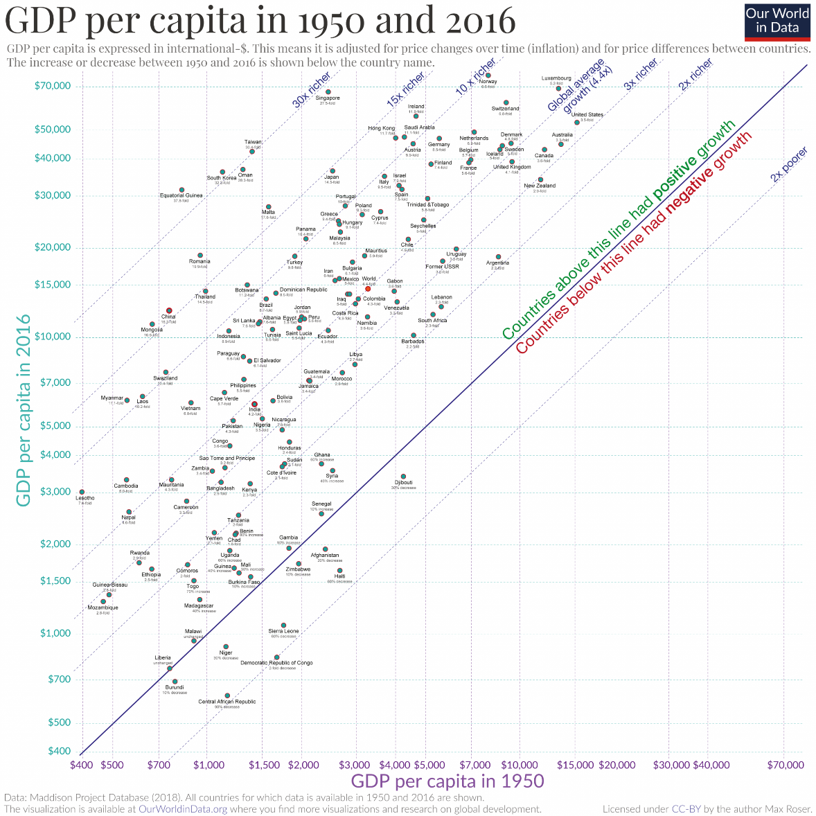
Scatterplots may be unfamiliar to many readers and even readers who are familiar with scatterplots may struggle to understand the message of your chart. Prepare the road for your reader by providing comments and annotations, along with a clear title and subtitle. The chart below compares the GDP per capita for various countries, between 1950 and 2016. Notice how the chart provides clear annotations on the main diagonal demarcating positive and negative growth (called an isocline), as well as additional lines marking each magnitude of growth. This paves the way for easy interpretation.
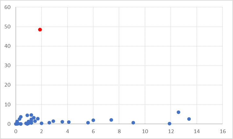
Use color and annotations to draw attention to a specific area of interest. For example, outliers can sometimes be an important part of a dataset, indicating an element that is out of the ordinary. You may highlight outliers using a bright color, as in the chart below. You may also highlight points that lie on different sides of a line (showing an average or parity) in different colors.
In general, it is advisable not to label every datapoint to avoid an overcrowded, illegible chart. You may label datapoints of special interest or use scroll-over labels in an interactive chart.
There are several variations that allow a third numerical or categorical dimension to be added to a scatterplot in addition to the two dimensions plotted on the axes. Using these variations can make for an information-rich chart, and in many cases, does not negatively affect the data-ink ratio. We will examine some of these below.
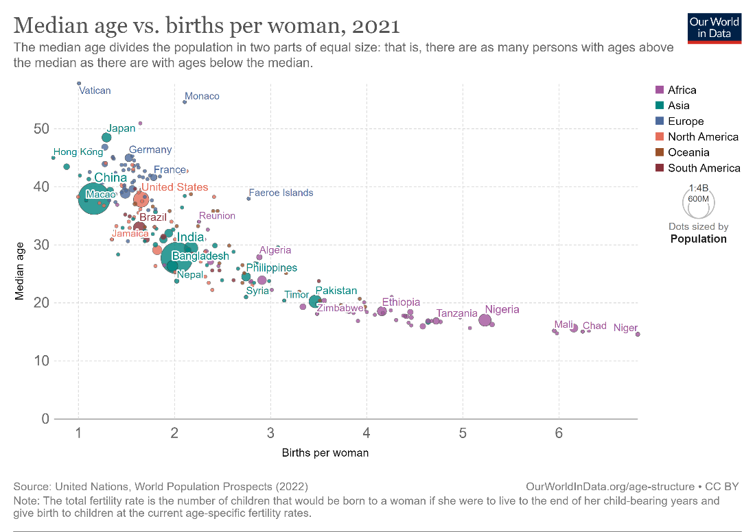
We may add a third numerical dimension by varying the size of the points. This type of chart is called a bubble plot. The bubble plot below compares the median age of the population with the number of births per woman, and sizes each of the points according to the population of the corresponding country. Remember that the points should be sized by area rather than radius.
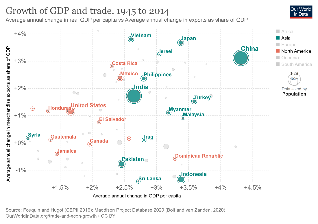
We may also visualize an extra categorical dimension using color. This can help us distinguish between two sets of plotted data. The following chart uses green and orange for countries in Asia and North America, indicating a possible regional pattern in the growth of GDP versus trade.
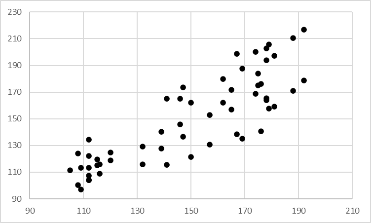
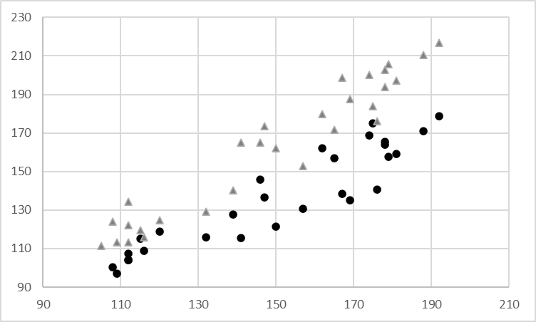
We may also vary the shape of the points plotted to differentiate between two sets of data. This adds a third categorical dimension and is especially useful when we can only use shades of grey, as in a journal article. We may use triangles, squares, circles and crosses to denote points from various sets. Compare the two scatter plots below, both plotting the same data. The standard plot allows us to see the relatively weak positive correlation between the two variables plotted. However, when we add an extra dimension using the shape of the points, we notice that the triangular points tend to have higher y-axis values than the circular points. Each category may also have a different regression line, perhaps showing a stronger correlation between the x and y variables than what could be gleaned from the standard scatterplot.
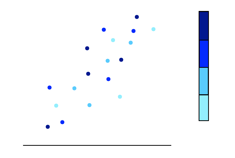
Another numerical dimension can also be added using a color gradient.
The extra numerical variable can be divided into bins, and we may use a color gradient going from light to dark for values going from smallest to largest, as represented in this image.
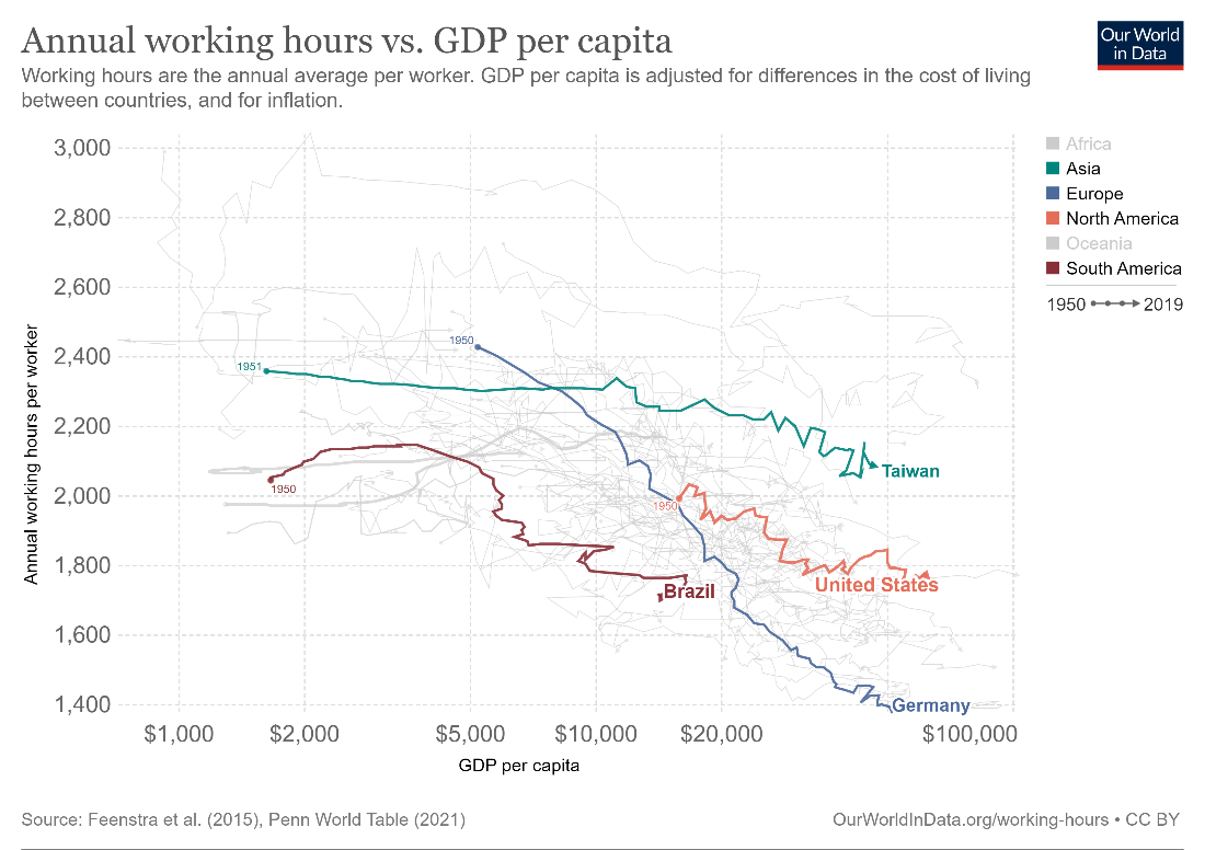
Connected scatterplots are a combination of a scatterplot and a line chart. They can be described as a scatterplot where the points are connected together in a logical order by straight lines. The following chart, for example, plots the annual working hours versus the GDP per capita for various countries. However, instead of only plotting these variables for a single point in time, the chart examines the years from 1950 through 2019. The scatters for each country are connected by lines in chronological order, allowing us to track how the relationship between these two variables changed over time for each country. In fact, we may also think of a connected scatterplot as a combination of two line charts – in this case, one chart plotting annual working hours vs. time, and the other plotting GDP per capita vs. time.
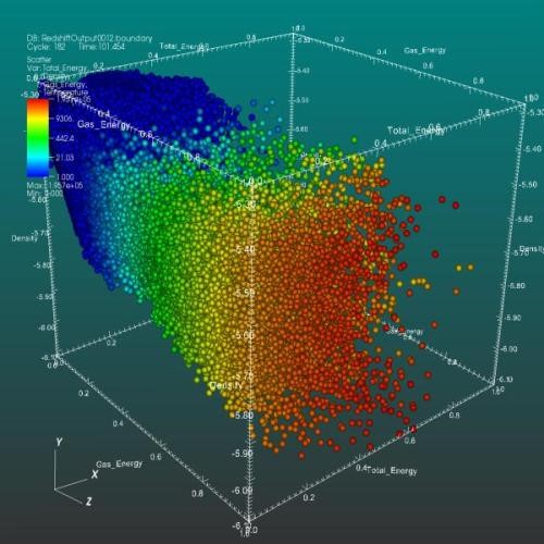
Scatter plots are also sometimes rendered in three dimensions to include a third numerical variable for the data points, as in the image below. As with other 3-dimensional charts, 3D scatterplots can give us a rough idea of the overall shape of the points, but are also prone to occlusion.
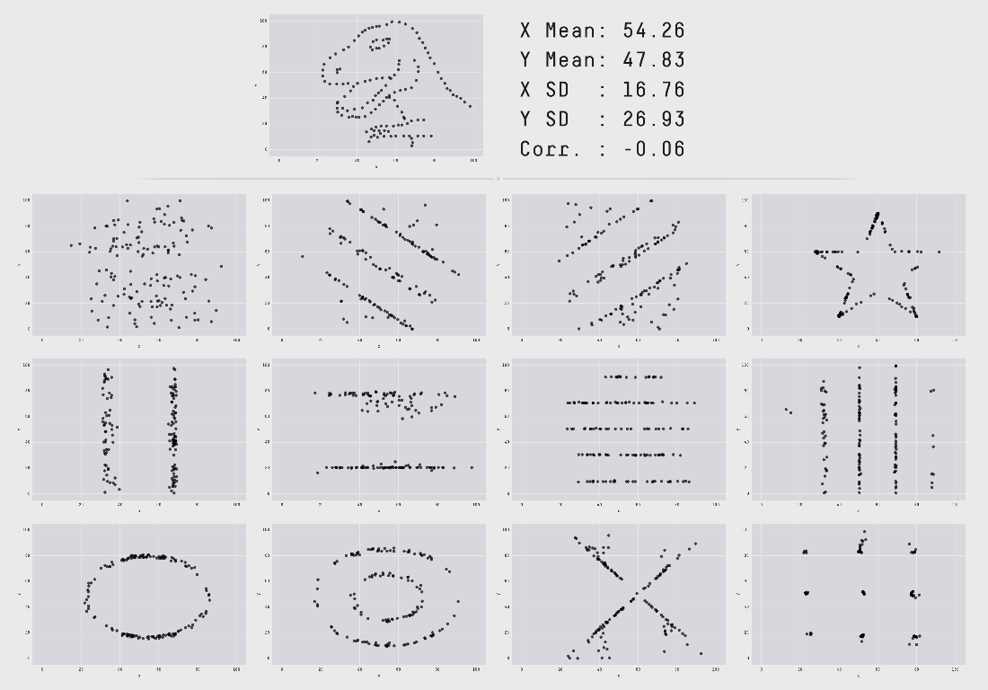
As noted above, scatterplots allow us to see the overall shape of the data. The following image, first introduced by Alberto Cairo, shows us why it is important to actually plot the data and not rely only on summary statistics. All of the following plots have the same mean, standard deviation and correlation coefficient. There is even a dinosaur figure - the Datasaurus - that has the same summary statistics! Visualizing the actual data can give us insights into the patterns that we cannot glean from just statistical analysis. In conclusion, plot your data!
Explore Scatterplot & Advanced Visuals in Inforiver Analytics+
- By Hamsini Sukumar

Inforiver helps enterprises consolidate planning, reporting & analytics on a single platform (Power BI). The no-code, self-service award-winning platform has been recognized as the industry’s best and is adopted by many Fortune 100 firms.
Inforiver is a product of Lumel, the #1 Power BI AppSource Partner. The firm serves over 3,000 customers worldwide through its portfolio of products offered under the brands Inforiver, EDITable, ValQ, and xViz.