
Upcoming webinar on 'Inforiver Charts : The fastest way to deliver stories in Power BI', Aug 29th , Monday, 10.30 AM CST. Register Now
Upcoming webinar on 'Inforiver Charts : The fastest way to deliver stories in Power BI', Aug 29th , Monday, 10.30 AM CST. Register Now
A variable is a characteristic or quantity that can assume different values. Weight, number of units produced, customer segment and age class are all examples of variables. Working with data involves handling variables of various kinds (typically called measures).
Visualizing measures requires a thorough understanding of their classification, which correlates closely to the type of axis – continuous, discrete, or categorical – that is compatible with each measure type.
To pick the right chart for our data, we must also be aware of how different charts support different axes. To understand numerical and categorical axes, let us first dive into the classification of variables/measures.
Variables can be classified into two primary types – numerical and categorical, as seen in the diagram below.
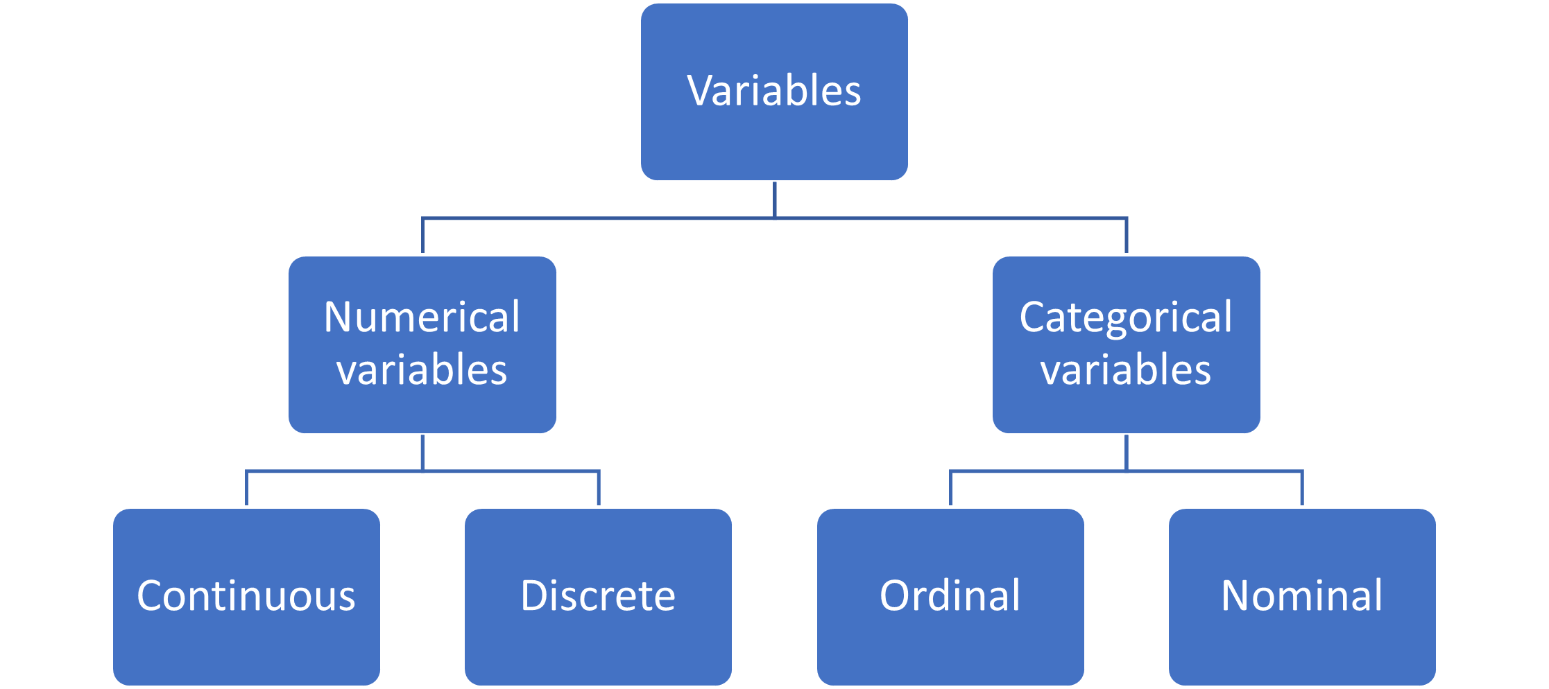
Numerical variables describe a quantitative value using numbers. Any value that can be measured or counted can be thought of as a numerical variable. For example, age, production capacity, volume of milk, population and the number of leaves on a tree are all quantitative variables. Each of these uses different units of measurement, but all of them come under the category of numerical variables. Numerical variables can further be divided into two branches – continuous variables and discrete variables.
Continuous variables can take any of the values within a given range, including decimal and fractional values. This range can even extend to infinity in both positive and negative directions. For example, distance, temperature, and weight are continuous numerical variables. Discrete numerical variables, on the other hand, can only take specific (spaced-out) values, usually whole numbers. Examples of discrete values include inventory count, population, or the number of product reviews on a website. Notice how none of these can be measured as decimals or fractions.
By contrast to the quantitative values described by numerical variables, categorical variables describe a qualitative characteristic of your data. These characteristics are descriptive, and do not involve measurements. Nationality, customer segment, month, and age class are all examples of categorical variables. Categorical variables can be further classified into two types – ordinal and nominal.
Ordinal variables are categorical variables that can be classified into a logical order or list. For example, the months of the year can be placed in a logical order, going from earliest to latest. Similarly, customer ratings can be ordered from least favorable to most favorable, and age classes can be classified from youngest to oldest. On the other hand, nominal variables cannot be placed in a meaningful order. Some examples of nominal variables are nationality, customer segment and viewing device.
As you may imagine, when visualizing these variables, each of the types needs to be treated differently. We have three different types of axes for this purpose – continuous, discrete and categorical. These types correspond to the variables discussed as shown in the diagram below:
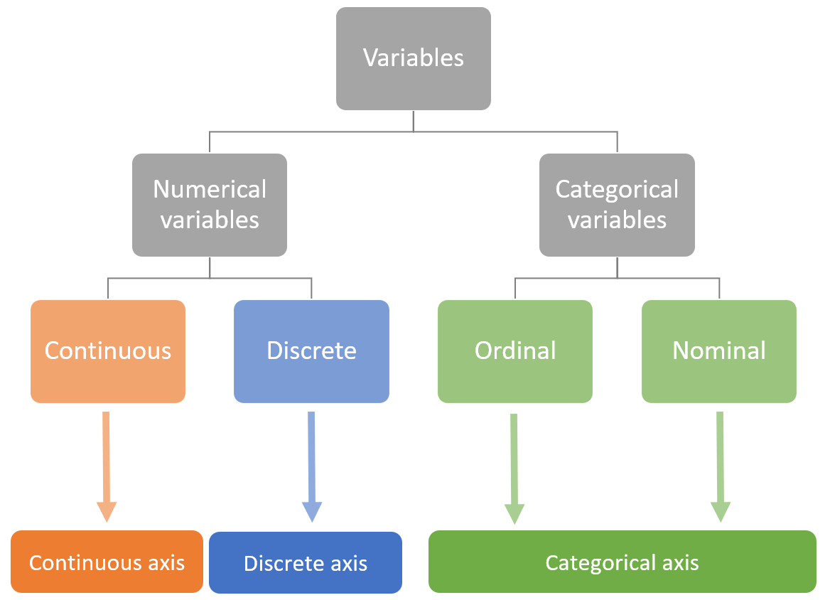
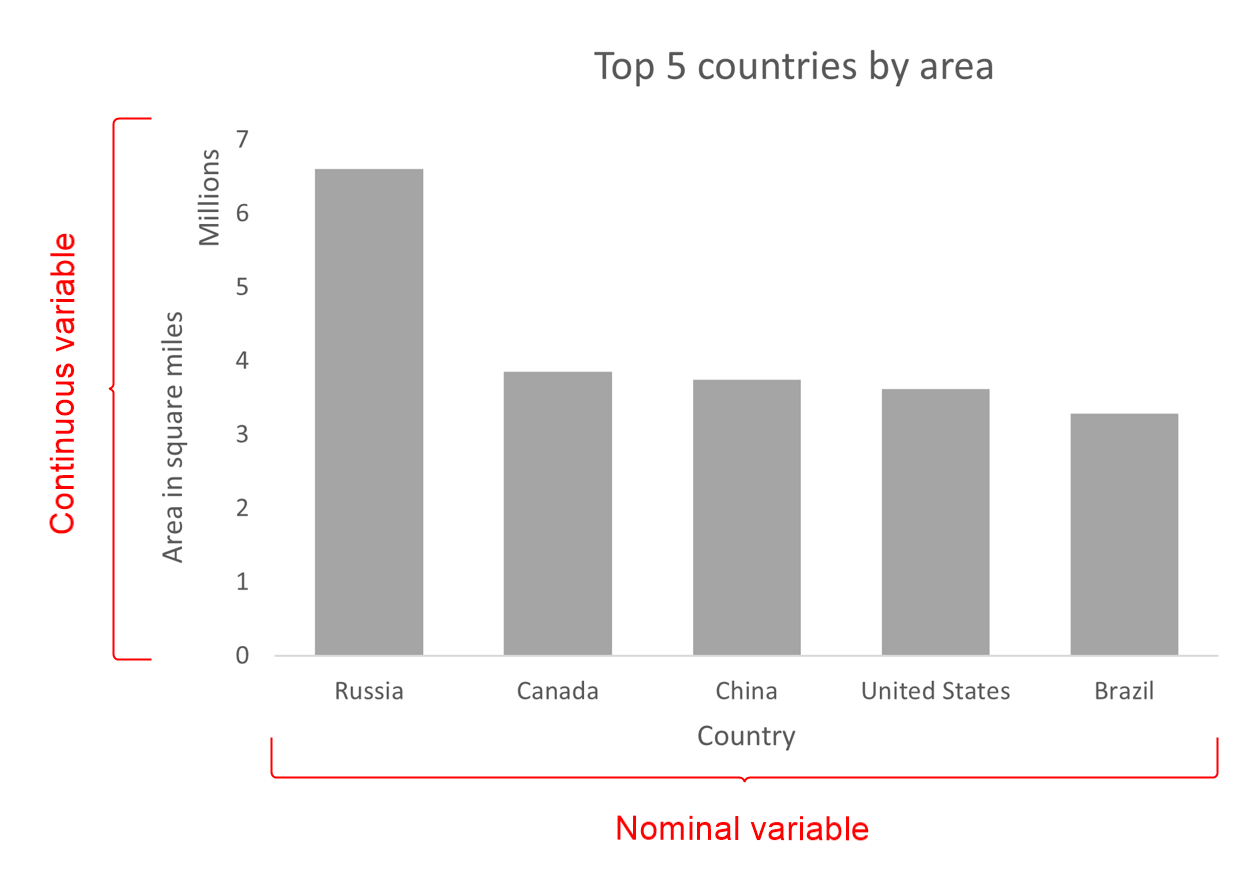
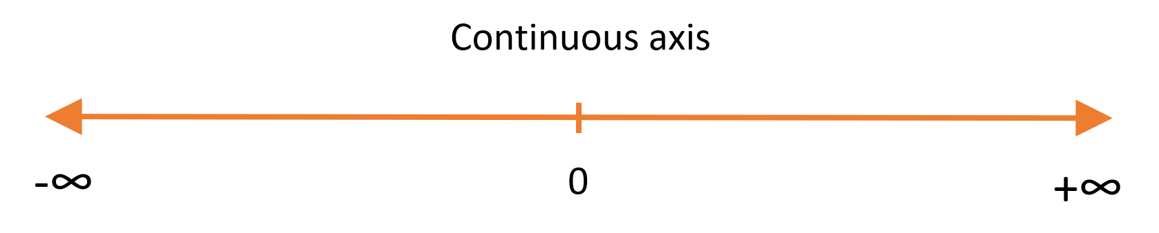
A continuous axis represents continuous values in a given range. It represents a continuous subset of the real numbers, i.e., including whole and decimal values. We may add tick marks to demarcate the values on a continuous axis, but the decimal values in between the tick marks are also included in the axis. This is therefore the axis that we use to visualize continuous numerical variables and is the most common type of numerical axis used.
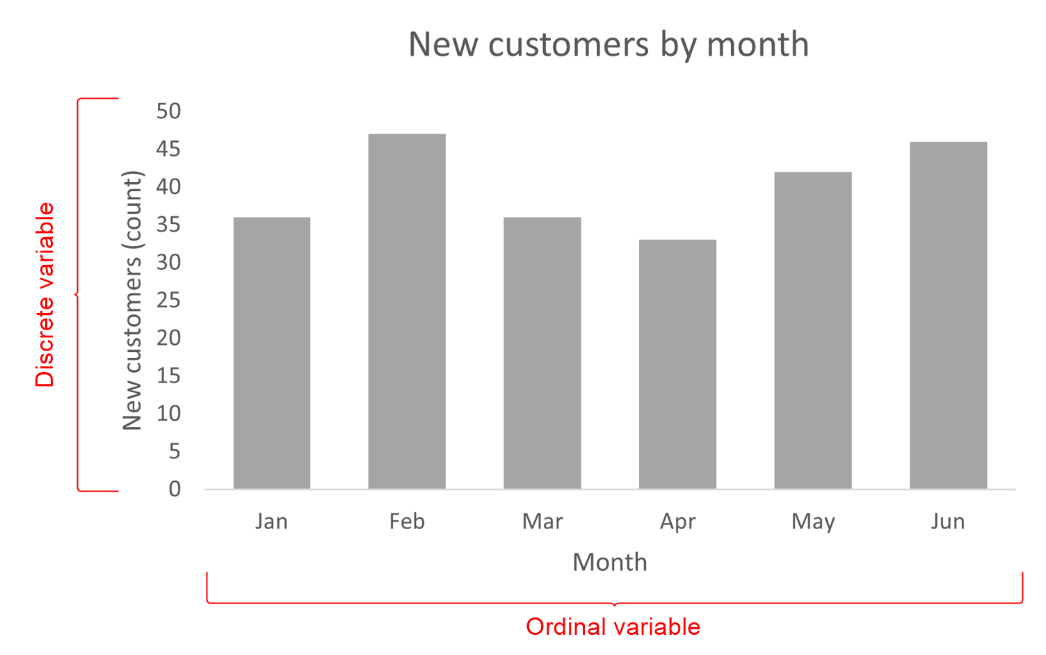
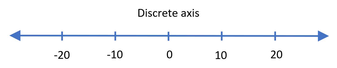
A discrete axis represents values that are spaced out, with the gaps between the values usually being equal. Tick marks are essential for this type of axis to accurately show the position of the values being represented on the line, especially in cases where our values are not evenly spaced. This type of axis is used to visualize discrete numerical variables.
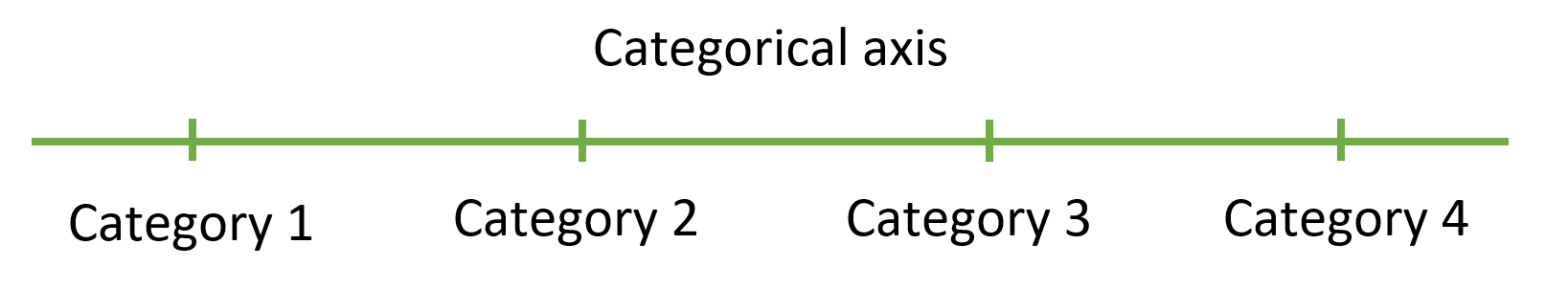
A categorical axis can also be seen as a type of discrete axis, but instead of numerical values, we use descriptive categories. This is the type of axis that we use for both types of categorical variables that we discussed earlier. In addition to this, numerical ranges are also visualized as categories. For example, age classes (0-10 years, 10-20 years, 20-30 years, 30+ years etc.) are treated as categorical variables.
To consolidate what we have discussed, let us now look at some examples of common chart types and the type of axes that they each use. We first note that charts usually visualize two or more variables simultaneously. The table below shows some common charts and the variables that are plotted on the different axes. The table is divided into two sections - one for each of the two variables shown. The first variable is taken to be the independent variable where possible – for example, in a line chart, the independent variable is plotted on the horizontal axis, and the dependent variable is on the y-axis, while in charts like the pie chart or the treemap, there is no real primary or secondary axis to speak of.
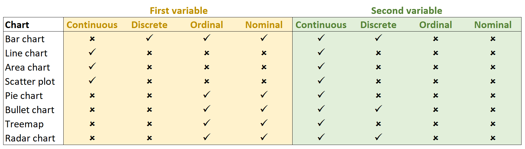
Let us examine a few of these charts in detail.
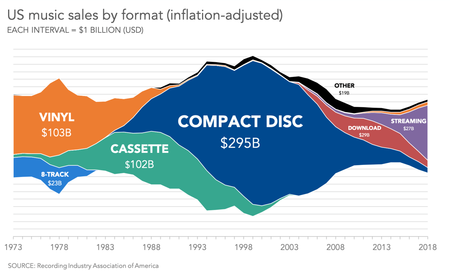
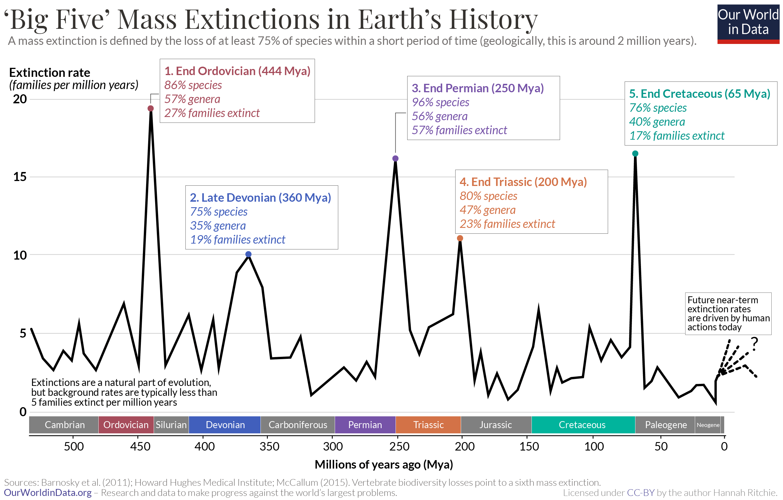
Typical examples of charts that use continuous axes are “area type” charts like the standard and stacked area charts, or the streamgraph as shown below, which represents continuous numerical values on both axes – in this case, time on the horizontal axis, and sales volume on the vertical axis.
Most line charts also use continuous axes. The continuity of the line representing the values of our series acts as a visual cue on the continuity of the underlying data for these types of charts. However, discrete series with a large number of values are also sometimes treated as continuous, as in the case of line charts showing a time series evolution over several years. The intuition behind this is that individual points seen from a distance appear to merge into a continuous curve.
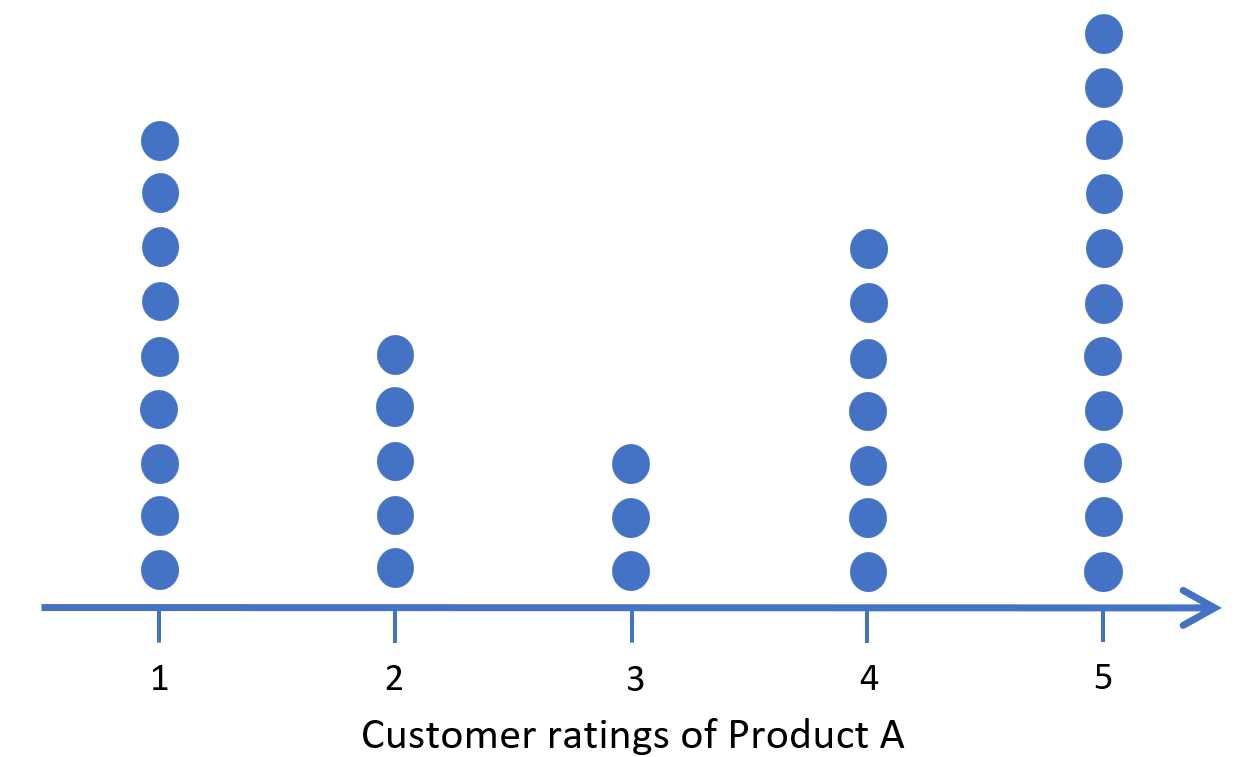
The dot plot (sometimes called a strip plot) below is an example of a discrete numerical axis in action. The chart below shows the distribution of the customer ratings of a specific product from a survey with ratings running from 1 to 5, where each dot represents a single vote. This is a discrete axis as all of the rating values are whole numbers. In this chart, we see that the opinions show a split – customers either love or hate the product, with few neutral opinions. Note that as in this example, discrete axes are used for individual counts as opposed to aggregated values which tend to require a continuous axis.
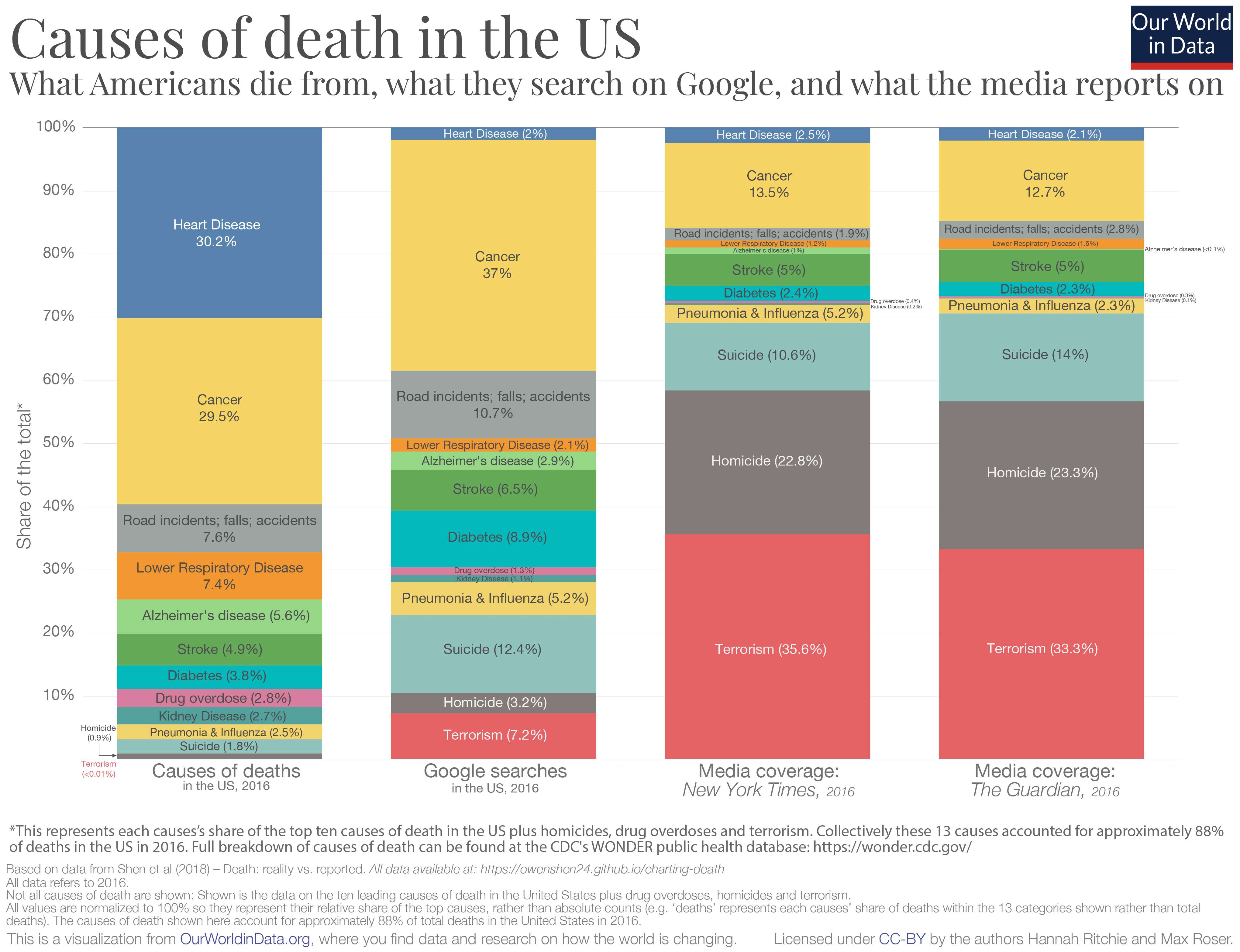
One of the most common examples of a categorical axis is the independent axis of a bar chart, as seen in the chart below. Here, the categories represented are the causes of death in the US compared to the representation in media and in google searches.
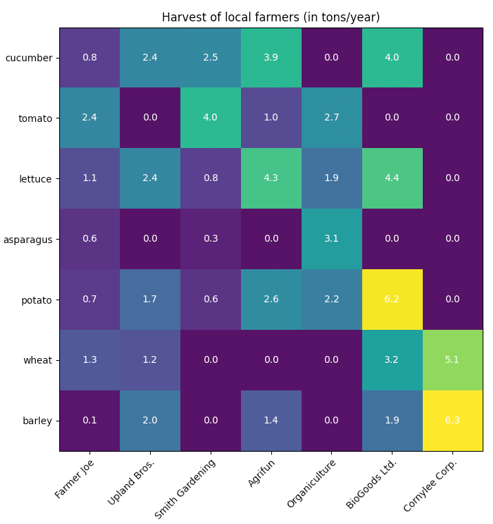
Another good example is the heatmap shown below, visualizing the quantity of harvest from different farmers, where both the axes are categorical axes. The horizontal axis shows the producer, while the vertical axis shows the type of produce.
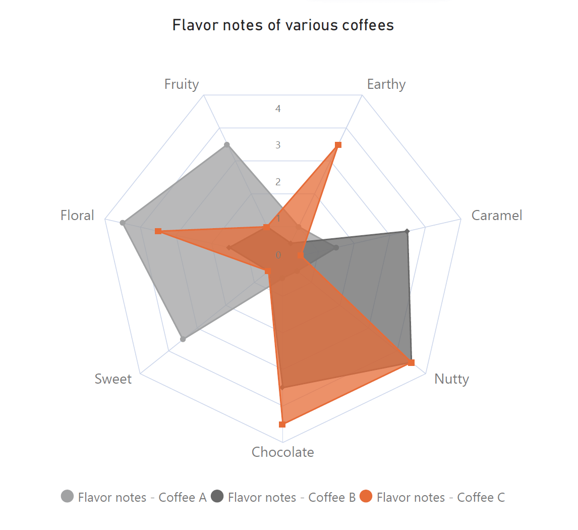
Radar charts are another example of the categorical axis. The chart shown below depicts the flavor profiles of three different coffees. The categories represented are the different flavors, and the categorical axis can be thought of as being “wrapped around” the chart. In fact, the radial axis on this chart is a numerical axis.
Effective data visualization thus begins with a firm understanding of our data, of which type of axis to use for each variable, and of which chart to use for the specific combination of variables that we wish to show. Keep this guide handy while examining your data to choose the correct visual.
Explore Inforiver Analytics+, Start your free trial now
By - Hamsini Sukumar
7 types of bar charts: ABCs and advantages
Funnel charts: How and when to use them

Inforiver helps enterprises consolidate planning, reporting & analytics on a single platform (Power BI). The no-code, self-service award-winning platform has been recognized as the industry’s best and is adopted by many Fortune 100 firms.
Inforiver is a product of Lumel, the #1 Power BI AppSource Partner. The firm serves over 3,000 customers worldwide through its portfolio of products offered under the brands Inforiver, EDITable, ValQ, and xViz.