
Upcoming webinar on 'Inforiver Charts : The fastest way to deliver stories in Power BI', Aug 29th , Monday, 10.30 AM CST. Register Now
Upcoming webinar on 'Inforiver Charts : The fastest way to deliver stories in Power BI', Aug 29th , Monday, 10.30 AM CST. Register Now
A radar chart, sometimes called a spider chart or a star chart, is a powerful tool to examine
multivariate data in a novel and engaging form. In this guide, we will first understand what
radar charts are, and then explore their many uses.
The easiest way to understand a radar chart may be through the parallel coordinates plot
pictured below.
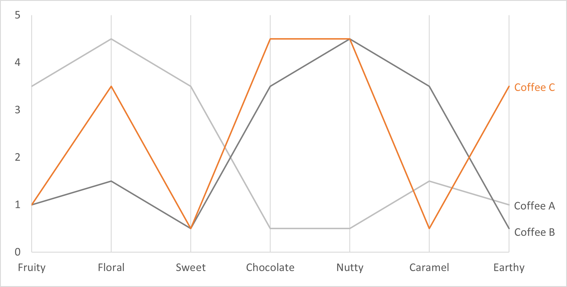
The parallel coordinates plot maps data along multiple vertical axes and connects the points
using lines. The chart above plots the flavor profile of three different coffees, with each flavor
plotted in a separate vertical axis. It looks very similar to a line chart, but has multiple vertical
axes, each representing a single dimension.
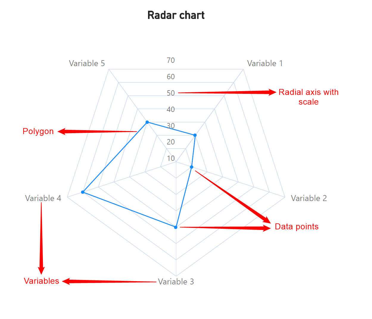
A radar chart can now easily be understood as a parallel coordinates plot where the
coordinates are rearranged to extend radially outwards from the zero point. The coordinates
are arranged equidistant from each other, with lines connecting the data points to form a
polygon as shown below. These charts require a minimum of 3 coordinates in order to join the
points plotted with straight lines. Gridlines can also aid in estimating radial distance.
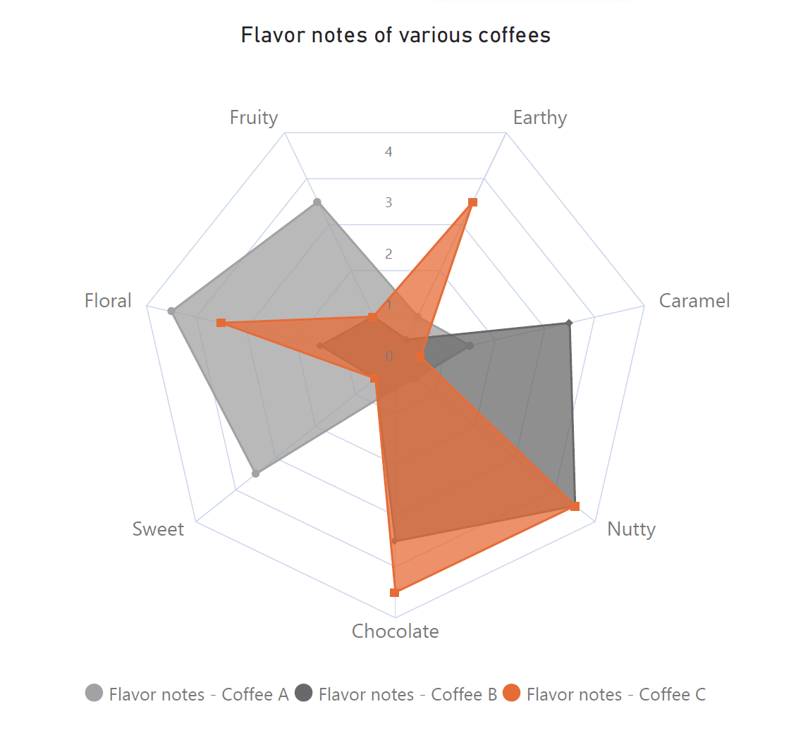
Sometimes, the area enclosed by the curve is also shaded in, as shown below. Radar charts are
also commonly called spider charts or star charts.
You may scroll up to the first image to see the various labeled parts of a radar chart.
Radar charts are seen across a variety of business and professional contexts where multivariate
data is compared. For example, in Food Science, foods can be compared across flavor, texture
and aroma profiles, while in the domain of sports, the performance of athletes can be tracked
and compared across different dimensions. The different uses of radar charts can be broadly
classified as follows:
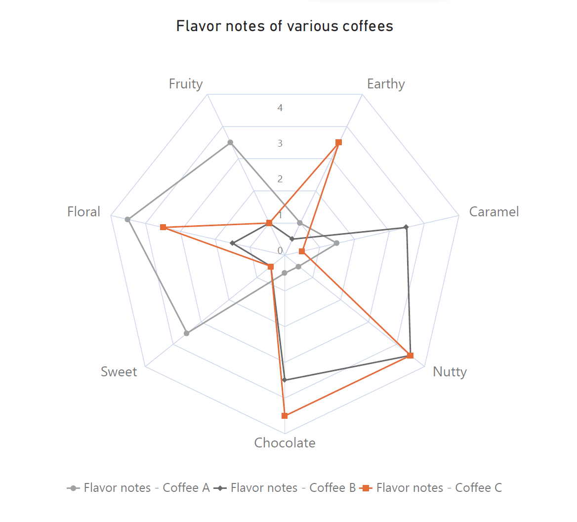
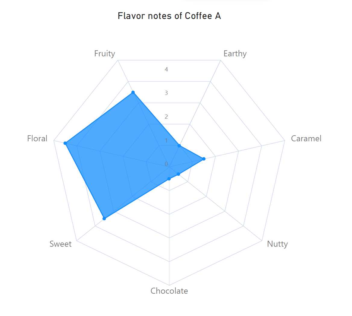
One of the primary uses of radar charts is to represent multivariate data. The following chart
shows how a specific variety of coffee scores on seven different flavors, similar to the chart we discussed earlier. Each of these flavors represents a separate variable, and this radar chart plots each of these dimensions in a compact area.
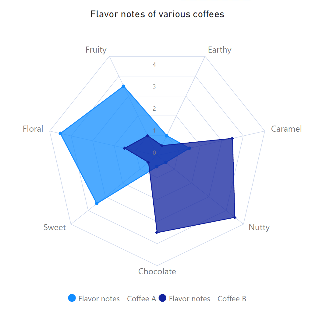
Another dimension can be added by comparing more than one series using a radar chart. For
example, the following chart adds another coffee, evaluated on the same criteria. We see that
while Coffee A has sweet, floral and fruity notes, Coffee B has almost no common
characteristics, predominantly exhibiting chocolate, nutty and caramel notes.
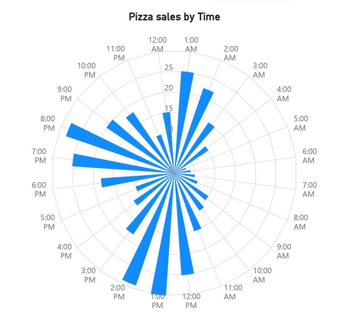
Due to their “circular” nature, radar charts are also well suited to show cyclical data, including
seasonal patterns. The following chart is a variation that uses radial columns to show the sales
that a 24-hour pizza parlor makes every hour. This is a seasonal pattern, repeating every day in
approximately the same manner. We see a spike in orders around lunchtime, dinner time, and
late at night. Tracking this type of cyclical data can help the pizza parlor plan budgets,
ingredients and staff shifts for the future.
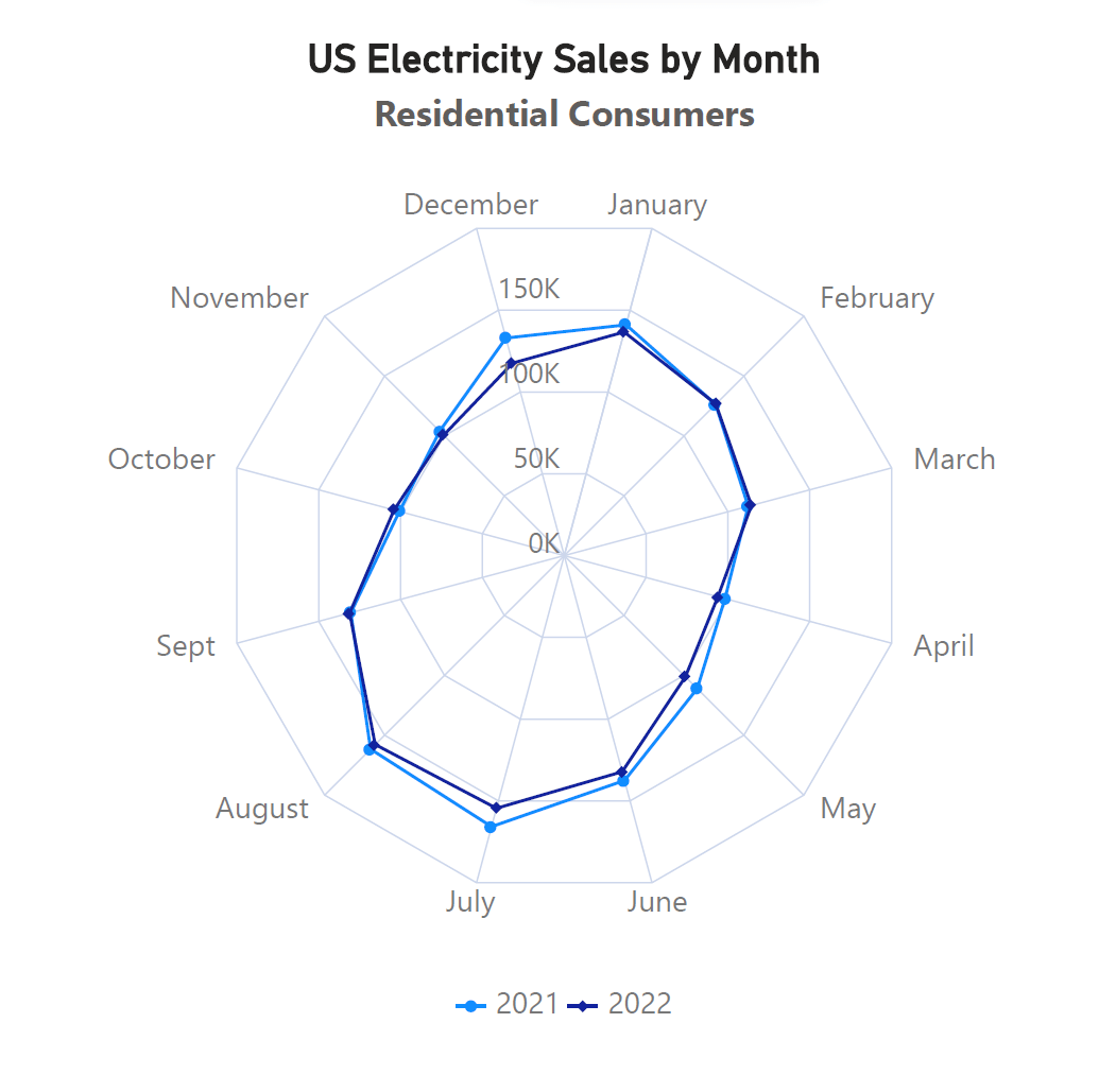
Radar charts can be used to examine clusters of observations, and observations that are similar to each other. The following chart shows how residential electricity consumption has followed a predictable pattern over the last two years, with consumption showing an increase in summer as well as winter months. In fact, this is also an example of a seasonal pattern, as discussed above.
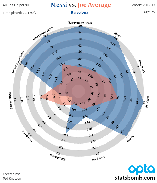
Along with examining similarities, radar charts are also an apt choice to showcase outliers. One example of an outlier is a series that lies well above or below average values, as in the chart below which compares Lionel Messi’s stellar performance with the average for players across five soccer leagues. As seen here, Messi is an exceptional player who outshines the average player with respect to most parameters.
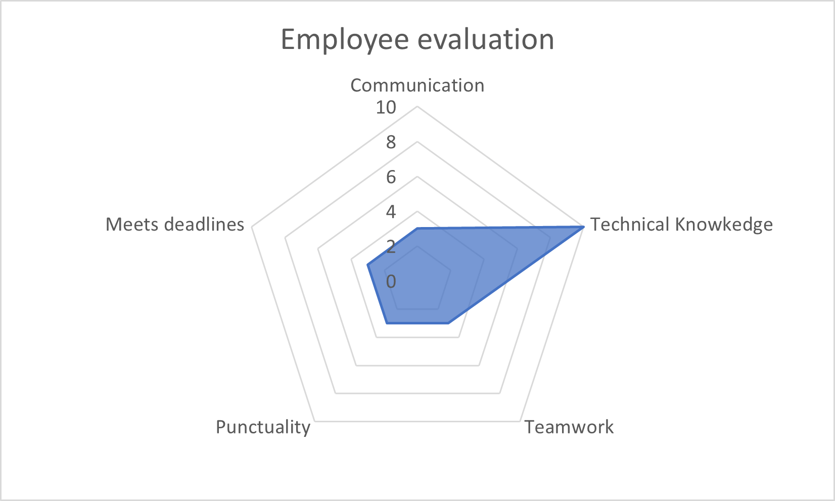
Another example of an outlier is a series with a “spike”, i.e., much higher or lower values in a certain metric when compared to others. This is seen in the chart below showing an employee who scores very low on most metrics, except for their technical knowledge.
Radar charts can thus be used in a variety of contexts, and having the right understanding of these charts can help you use them effectively. For a discussion on best practices, advantages, and disadvantages of these charts, click here.
Create compelling radar and polar charts effortlessly. See what's possible with Inforiver Analytics+ and visualize your data more effectively. Explore the Product
Radar vs. Polar charts – A comparison

Inforiver helps enterprises consolidate planning, reporting & analytics on a single platform (Power BI). The no-code, self-service award-winning platform has been recognized as the industry’s best and is adopted by many Fortune 100 firms.
Inforiver is a product of Lumel, the #1 Power BI AppSource Partner. The firm serves over 3,000 customers worldwide through its portfolio of products offered under the brands Inforiver, EDITable, ValQ, and xViz.