
Upcoming webinar on 'Inforiver Charts : The fastest way to deliver stories in Power BI', Aug 29th , Monday, 10.30 AM CST. Register Now
Upcoming webinar on 'Inforiver Charts : The fastest way to deliver stories in Power BI', Aug 29th , Monday, 10.30 AM CST. Register Now
Radar and polar charts are often grouped together thanks to their similar characteristics – so much so that the two terms are used interchangeably by some authors! However, these two charts have important differences. If you want to know what polar charts are, click here for a detailed introduction. If you would like to understand radar charts better, click here. In this article, we examine the similarities as well as the differences between radar and polar charts.
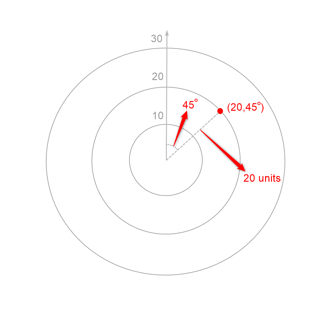
Both radar and polar charts use Polar coordinates to represent data. Polar coordinates use magnitude and angle, i.e., the distance from the zero point and the angle made by the line joining the point to the zero point, as shown below. While polar charts directly use polar coordinates, radar charts can be thought of as polar charts where the angles have been discretized.
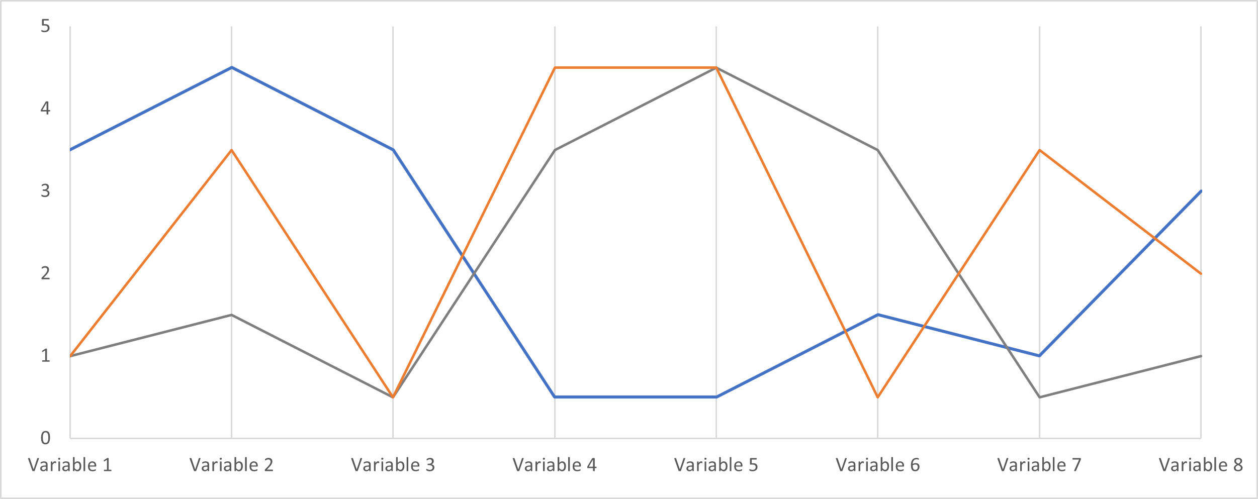
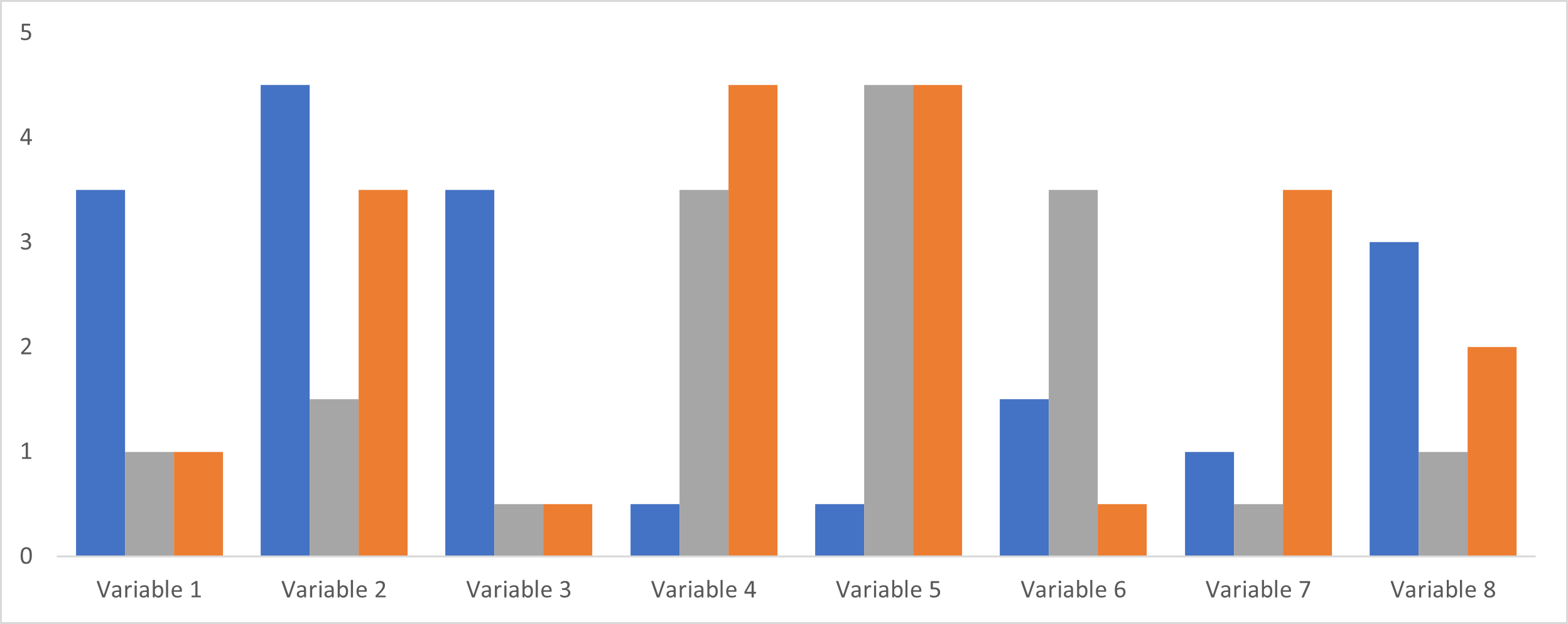
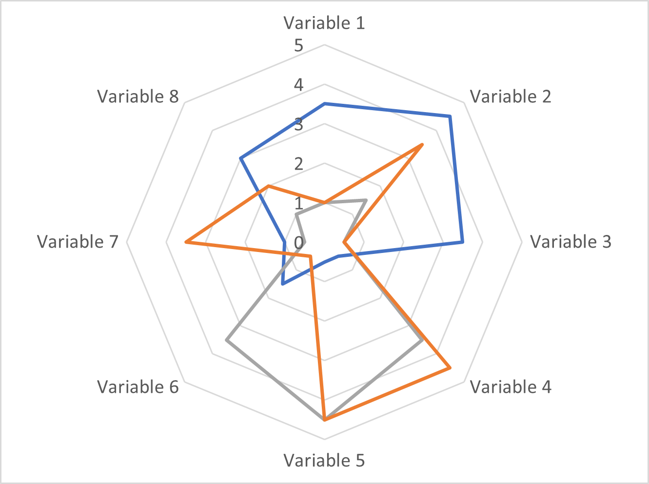
Radar and polar charts are highly compact charts that can represent several series in a relatively small area. With Cartesian (x,y) coordinates, our axes may extend to accommodate our values and labels. However, with polar coordinates, we only have 360° in angle which ensures that we must normalize our values to fit within this “circular” area. This can be seen clearly when we compare the same data plotted in a parallel coordinates plot or a clustered bar chart and a radar chart, as seen below.
Both chart types are also novel and eye-catching. Many readers are not familiar with polar coordinates and this sense of newness can invite the reader to examine the chart to investigate further. This is something that may be more difficult with a more common chart like a line or bar chart.
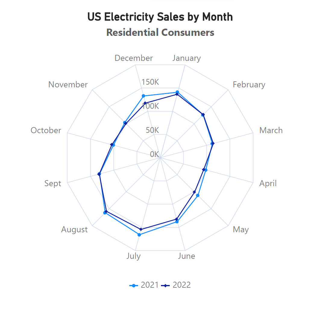
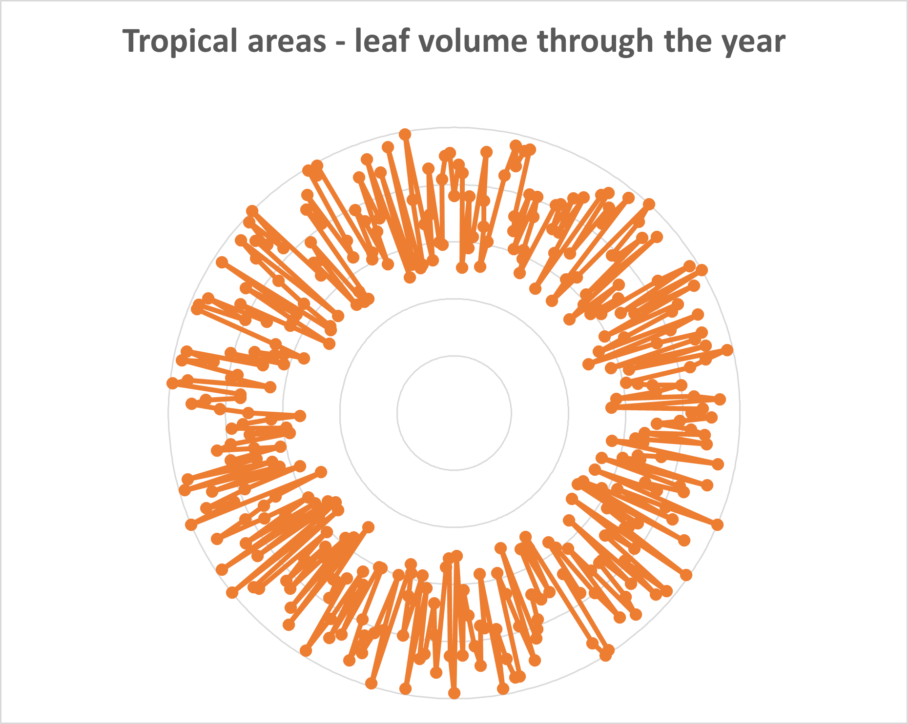
These charts are also well suited to cyclical data, as in the charts below, showing patterns that occur through the course of the year. The cyclical nature of the chart acts as a visual cue for cyclical data, allowing the reader to intuitively grasp this aspect.

Radar and polar charts may often be grouped together because of their similarities, but they also have important differences between them.
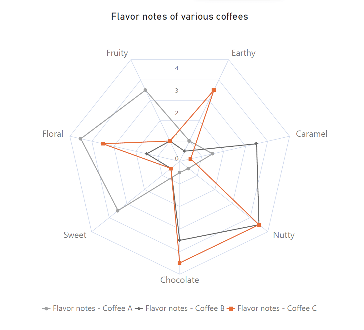
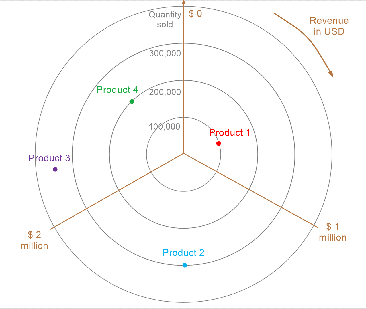
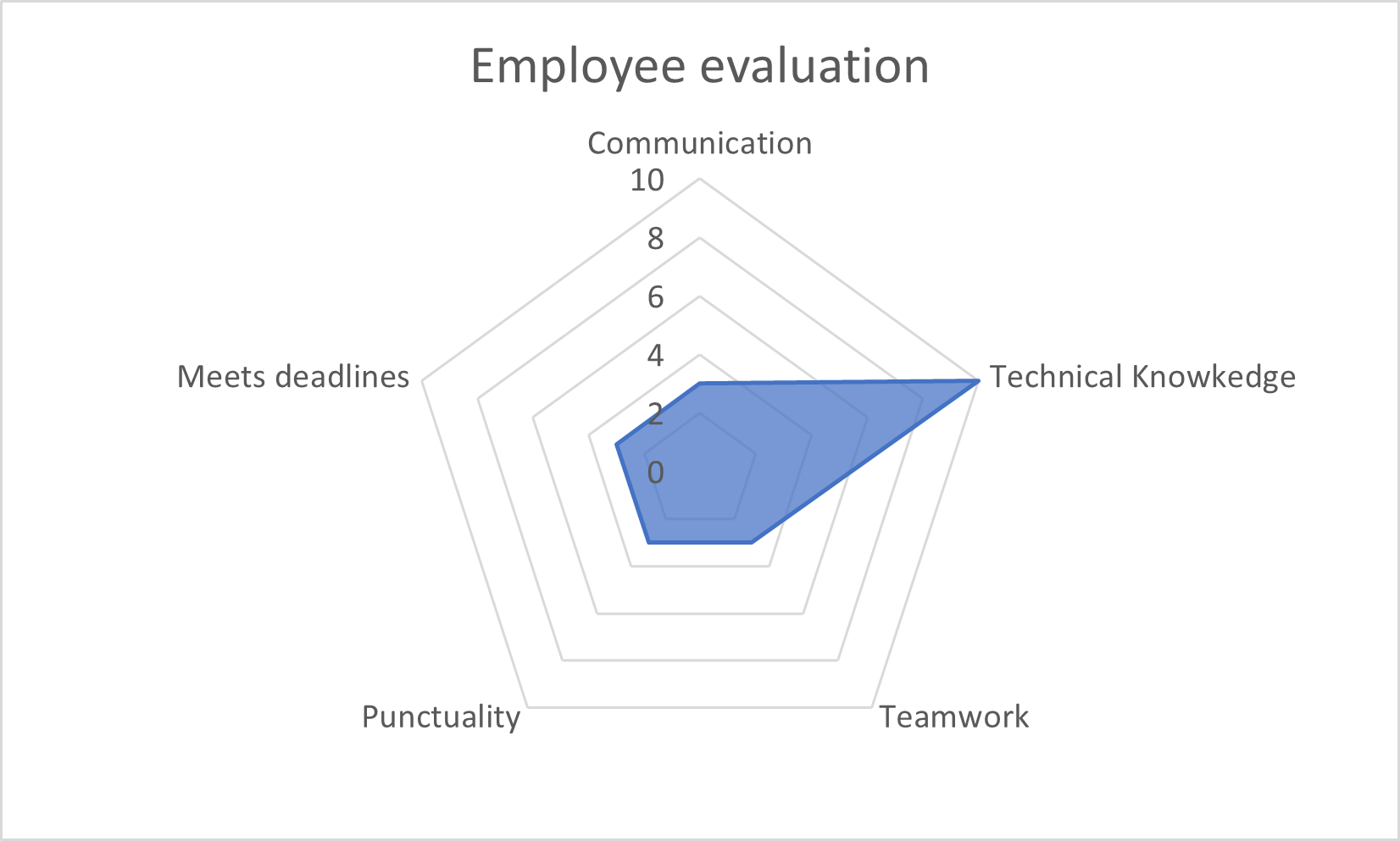
The most important difference between the two is that a polar chart uses continuous axes, while a radar chart uses one continuous axis and one categorical or discrete axis. A continuous axis is one that uses continuous numerical values such as time, or revenue. The polar chart on the left side below uses a continuous axis for revenue as well as quantity sold. On the other hand, a categorical axis discretizes the axis with separate categories. For example, most column charts have a discrete x-axis showing categories. In the case of radar charts, the values shown by the angles are discretized into categories, as seen in the chart on the right side below. The categories in this case are employee performance metrics and this chart shows how a specific employee has performed across these metrics. The radial axes of a radar chart are not, however, categorical axes.
This difference in continuous vs. discretized axes results in a difference in the number of dimensions that we can plot in polar and radar charts. A polar chart typically plots two dimensions – one using the radial distance and one using the angle. With a radar chart, however, each radial axis acts as a dimension, allowing us to plot multivariate data. In fact, it can be argued that the radar chart is a form of the parallel coordinates plot, where we rearrange the axes radially as seen below.
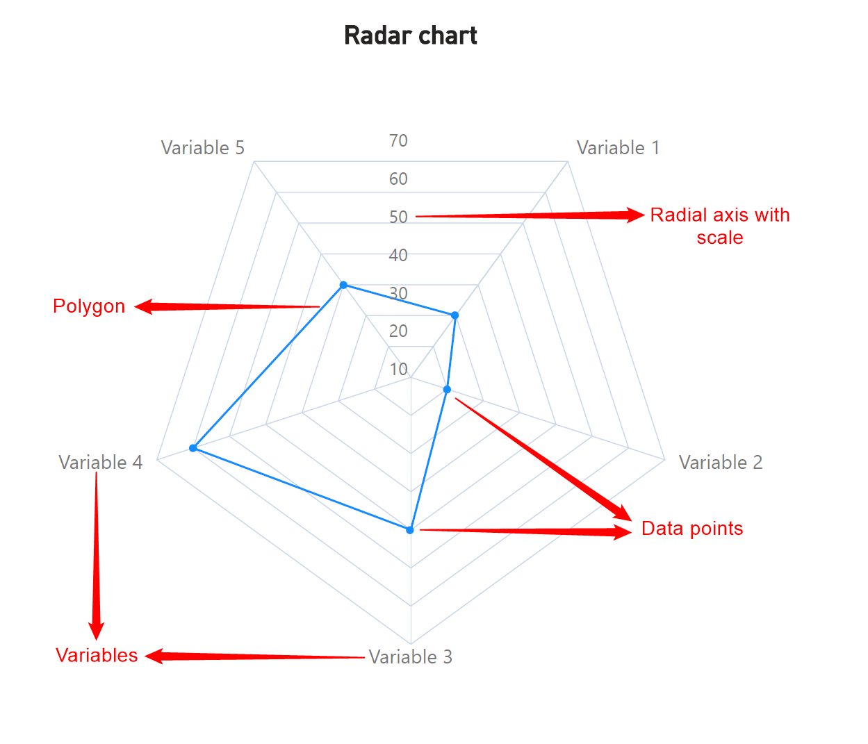
With radar charts, we connect the points plotted on each axis with lines to form a polygonal shape, as seen below. This is why they are also called spider charts or star plots. The polygon can show us how skewed our series is along the different axes, allowing us to make comparisons between multiple variables.
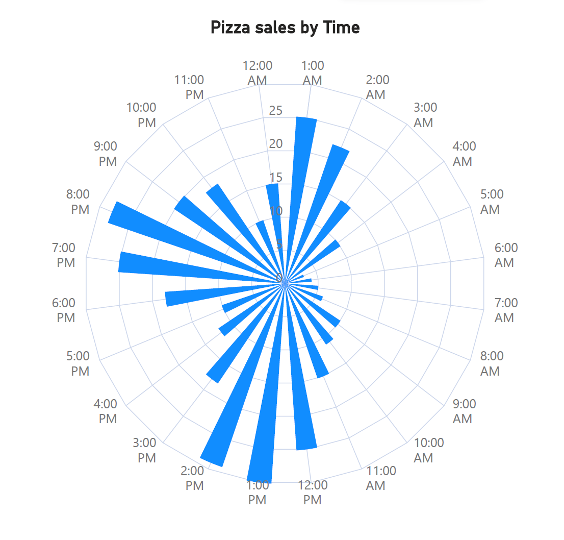
With polar charts, there is no single correct way to connect the points. We may connect the points using a logical order, as in the chart below on the left. This chart shows leaf volume through the year as studied by a fictional biologist, where the points are connected in order of date. Points may also be left unconnected when it does not make logical sense, as seen in the chart on the right below, where we plot revenue against quantity sold.
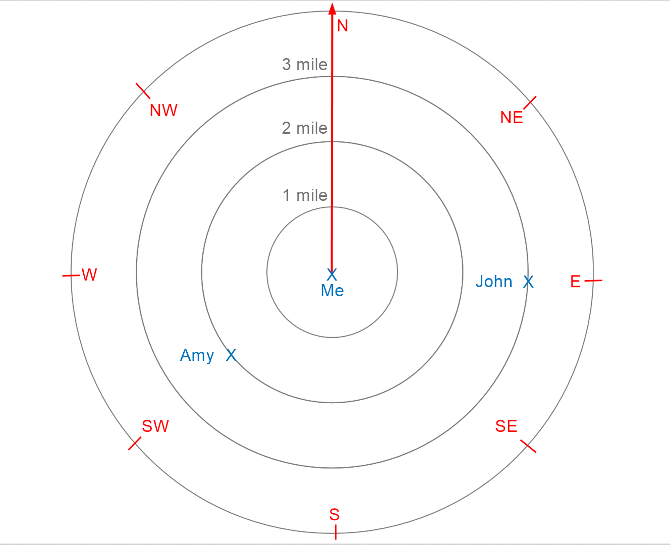
Thanks to these differences, radar and polar charts are also used in very different contexts. Polar charts are used in scientific and mathematical contexts, but we most often see them in navigational contexts. The latitude and longitude system that we use to pinpoint our position is in fact a polar coordinate system on the earth’s surface, and this system is used by aircraft and ships to navigate. We also use polar charts in everyday life when we use our location on a map to find directions. This is shown in the image below – when we say that John is 3 miles to the east, we are measuring a distance from the center (3 miles), and an angle (90° from the north), thus giving us the polar coordinates of John with respect to our position.
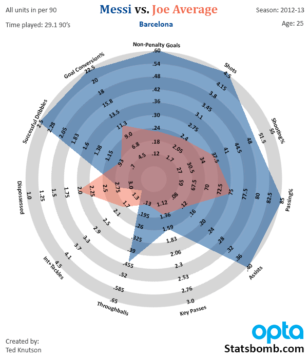
Radar charts, on the other hand, are widely seen across business contexts to make multivariate comparisons. This is especially true when we want to examine clusters of observations to identify patterns of similarity or outlying points. The chart below, for example, is typical of those used in sports, where athletes are compared across various performance metrics. This chart shows how Lionel Messi’s performance far outstrips the average player.
To understand the advantages and disadvantages that radar and polar charts offer, as well as a discussion on best practices to help you make your own charts, Create compelling radar and polar charts effortlessly. See what's possible with Inforiver Analytics+ and visualize your data more effectively. Explore the Product
-By Hamsini Sukumar
Radar charts 101: Overview and use cases
Demystifying radar and polar charts
Polar charts 101 – An in-depth guide

Inforiver helps enterprises consolidate planning, reporting & analytics on a single platform (Power BI). The no-code, self-service award-winning platform has been recognized as the industry’s best and is adopted by many Fortune 100 firms.
Inforiver is a product of Lumel, the #1 Power BI AppSource Partner. The firm serves over 3,000 customers worldwide through its portfolio of products offered under the brands Inforiver, EDITable, ValQ, and xViz.