
Upcoming webinar on 'Inforiver Charts : The fastest way to deliver stories in Power BI', Aug 29th , Monday, 10.30 AM CST. Register Now
Upcoming webinar on 'Inforiver Charts : The fastest way to deliver stories in Power BI', Aug 29th , Monday, 10.30 AM CST. Register Now
In order to understand what polar charts are, we must first understand the polar coordinate system and how it differs from our standard (x,y)-coordinate system. In this article, we will explore both polar coordinates and polar charts, and then conclude with a discussion on the uses of polar charts.
(x, y)-Coordinates
In general, we use coordinate systems (e.g., x and y coordinates) to plot a point in space, whose position we describe with respect to a zero point, called the origin. For example, your position on the globe is determined by your exact latitude and longitude because these two values form a coordinate system on the Earth.
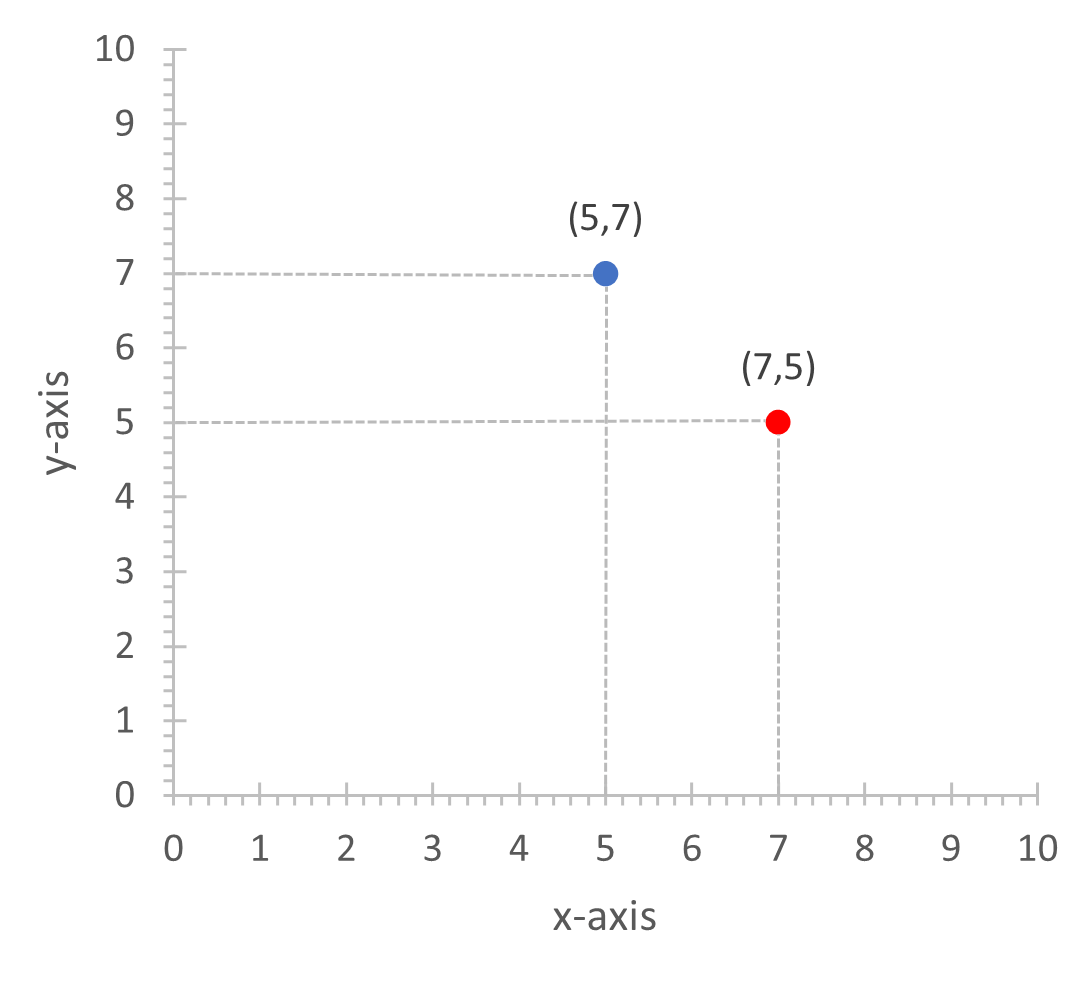
The system that we are familiar with, popularly known as Cartesian coordinates, uses two axes passing through the origin, that are at right angles to each other. This is the most common type of coordinate system that we see in a number of different charts, for example, in line and bar charts. How would we describe the position of the blue point in the diagram below? When measured perpendicularly, this point is 7 units from the horizontal axis and 5 units from the vertical axis, as indicated by the dashed lines. Thus, its position can be described by the pair (5,7). By the same process, the position of the red point is given by the tuple (7,5).
Polar Coordinates
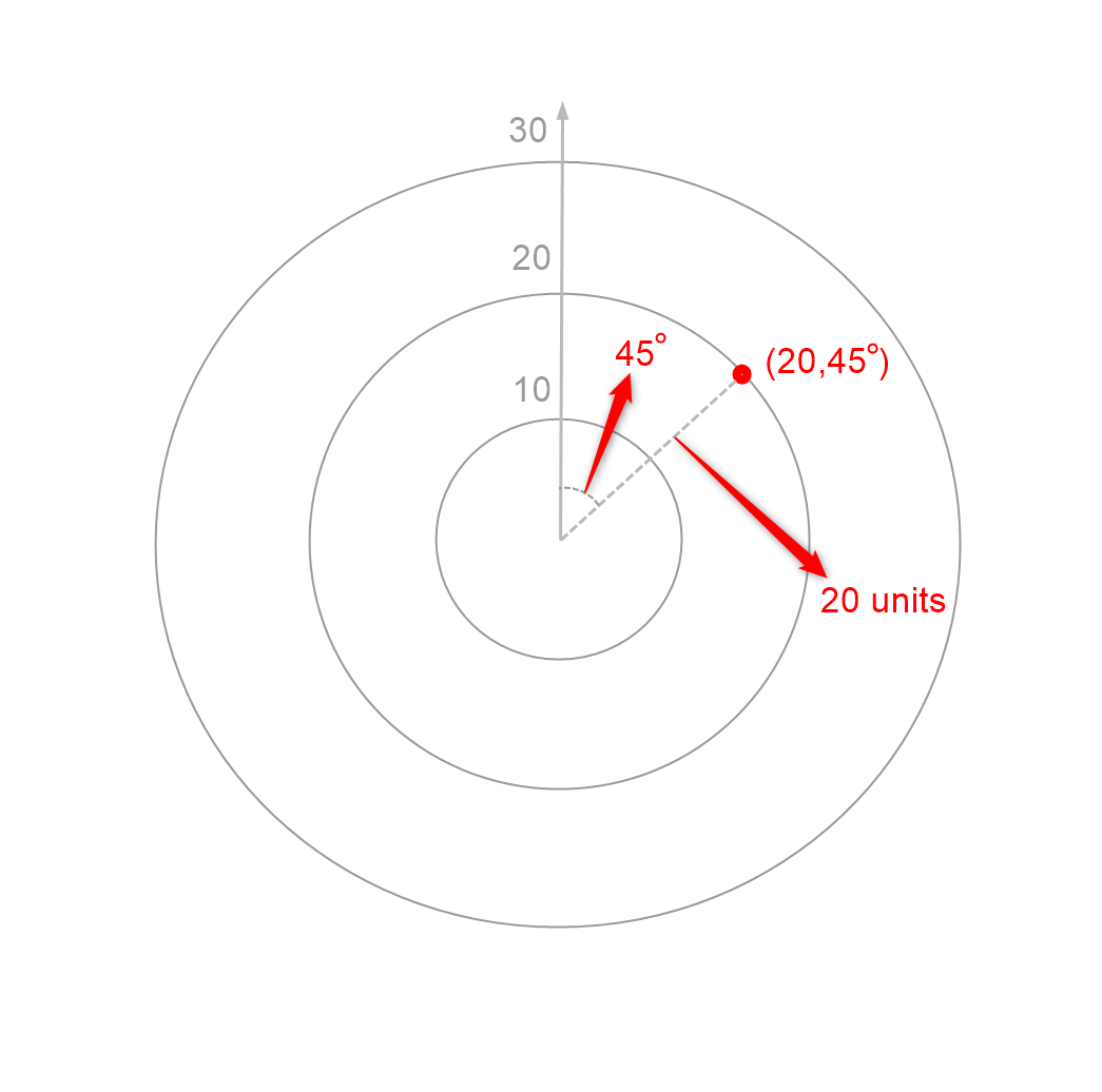
The polar coordinate system instead uses the distance from the origin and the angle made by the line joining the point to the origin to determine the position of a point on the plane. One direction is taken to be at angle zero by convention, and all angles are measured from this ray. In the image below, the ray pointing upwards is taken to be at angle zero. The concentric circles here can be thought of as gridlines showing all points at distance 10, 20 and 30 units respectively from the origin. The position of the red point can thus be read as follows – it is 20 units from the origin, and the line joining it to the origin is at an angle of 45° from the vertical line, thus giving us a position of (20, 45°).
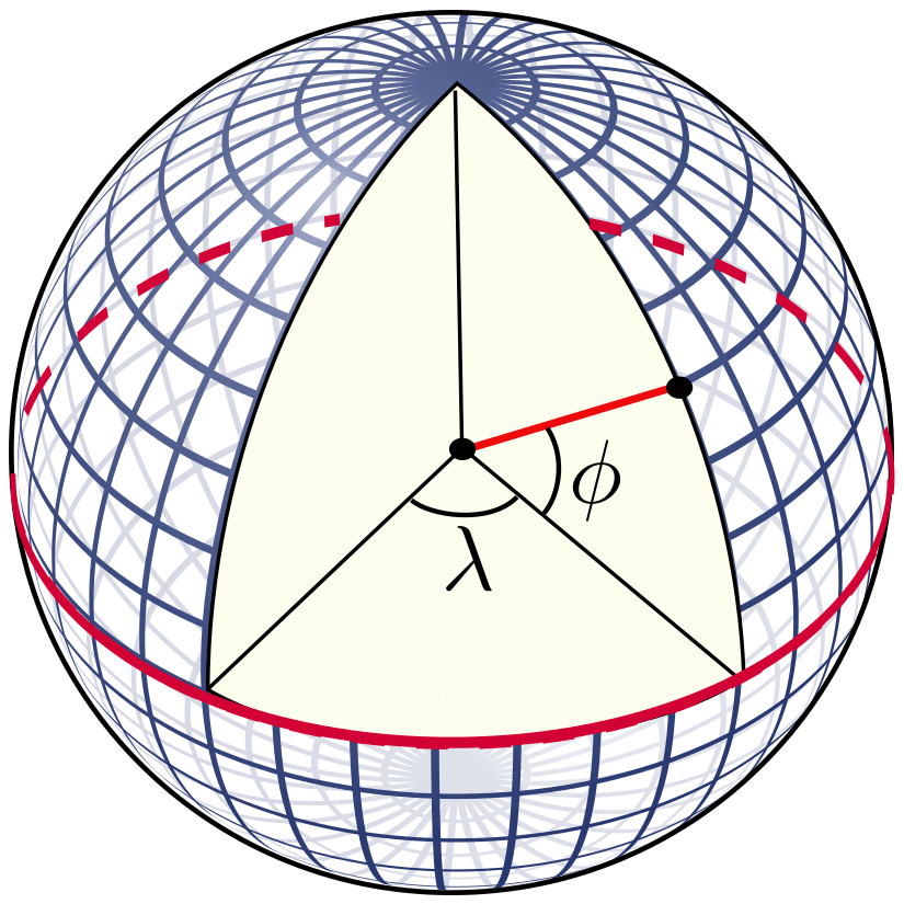
In fact, we have already seen a polar coordinate system before – the latitude and longitude system is a polar coordinate system in 3 dimensions, with the distance coordinate taken to be the radius of the earth on all points on the earth’s surface. The latitude and longitude values that we are familiar with are measured in degrees because they measure angles in the polar coordinate system as seen below.
What are polar charts?
Polar charts represent two numerical variables using the polar coordinate system, one using the radial distance from the center, with a bigger distance representing higher values, and one variable using the angle, going from 0° to 360°, with larger angles representing higher values. Since we have a maximum of 360° for the second axis, we usually need to perform some type of normalization or adjustment to the values to fit our minimum and maximum values correctly.
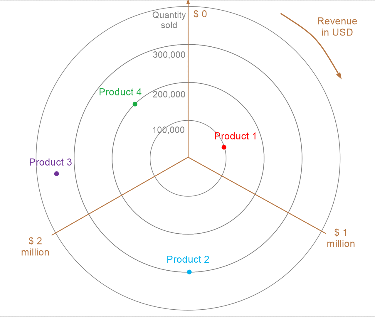
The chart below plots revenue against quantity sold for 4 products. Quantity sold is plotted on the axis extending radially outwards, and revenue is plotted using the angle. Here, the revenue values plotted go from $0 to $3 million, and thus 360° has been divided evenly, i.e., normalized, to reflect this range. How do we read this chart? Consider Product 1 – the point rests on the first gridline, denoting 100,000 units sold, and is a little more than halfway between $0 and $1 million in terms of angle, with the revenue thus reading more than half a million dollars. Thus, Product 1 sold 100,000 units and brought in a revenue of a little more than half a million dollars. Reading the other values in a similar manner, we see that Product 2 sold about 300,000 units with a revenue of about $1 million, Product 3 sold about 350,000 units with a revenue of more than $2 million, and Product 4 sold about 200,000 units with a revenue of more than $2.5 million, making it the best performer in terms of revenue.
In fact, several definitions of polar charts exist, with some authors taking them to be synonymous with radar charts, and some using the term to mean Nightingale charts. However, the basic concept of a polar chart is to use polar coordinates as shown above.
When are polar charts used?
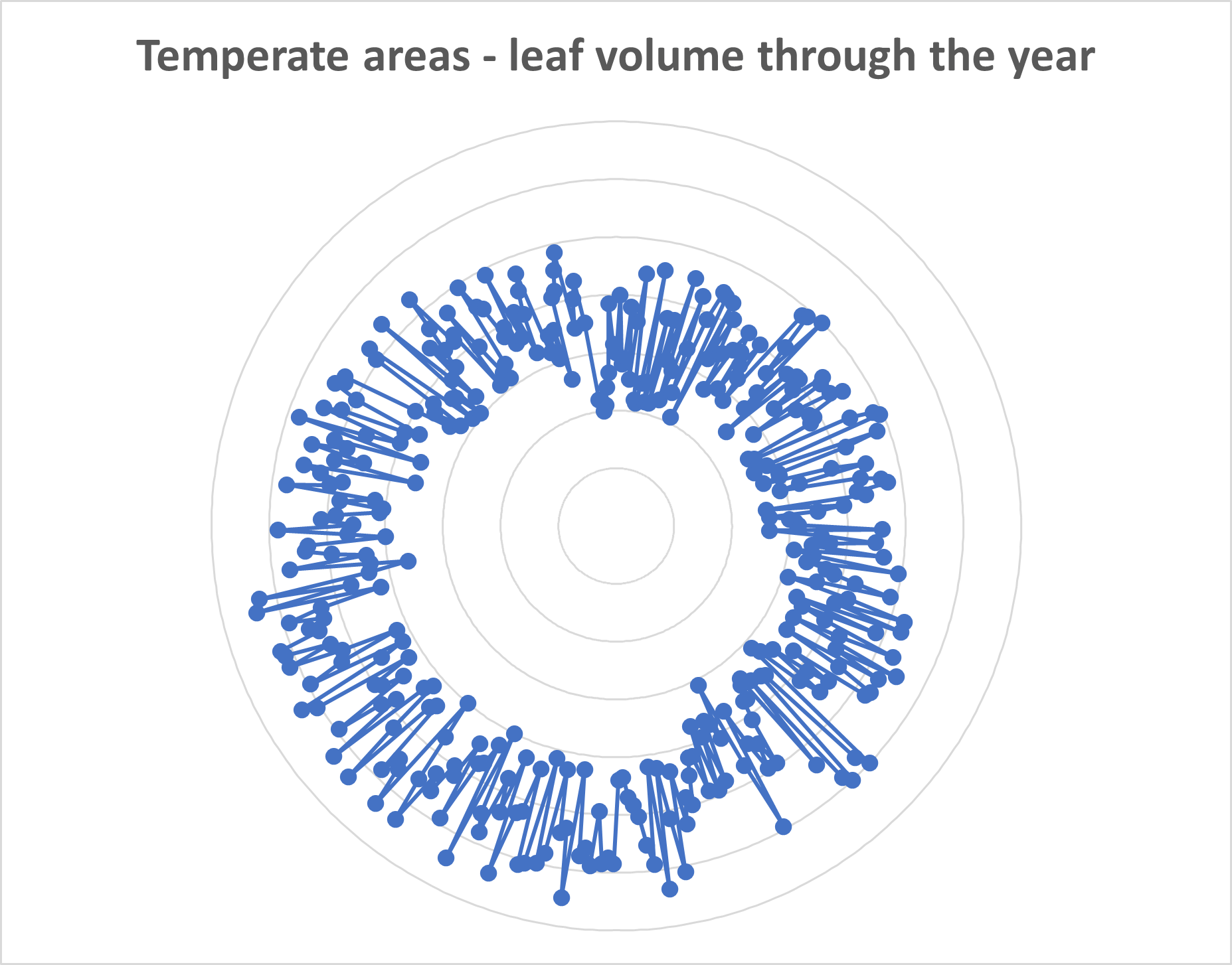
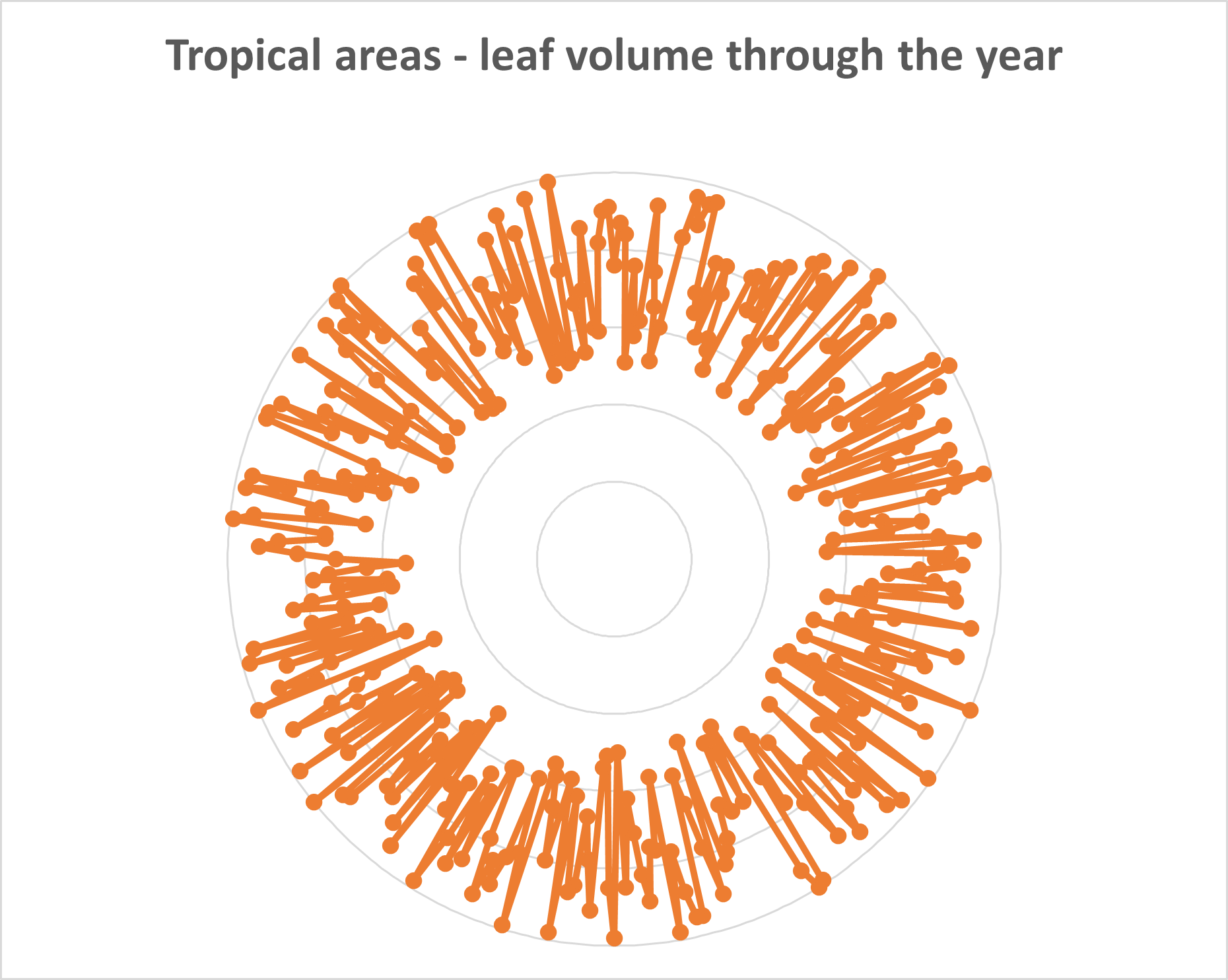
Polar charts are used in scientific and mathematical contexts to represent specialized datasets. Polar charts are especially suited to cyclical datasets, like in the chart below where a fictional biologist tracks tree leaf volume in tropical and temperate forests. Here, the radial distance represents the leaf volume, while the angle represents the day of the year, with one point plotted for each day of the year. The points have been connected with straight lines in order of the date. The biologist may find a sharp variation in the volume between summer and winter in temperate regions reflecting the changes in weather between these two seasons, leading to a skewed chart as seen on the left below. By contrast, tropical areas have a smaller degree of variation in temperature and rainfall through the year, leading to a more symmetric pattern in leaf volume throughout the year, as seen on the right below. Biological systems tend to inherently contain a lot of noise, leading to the “spiky” graphs seen below.
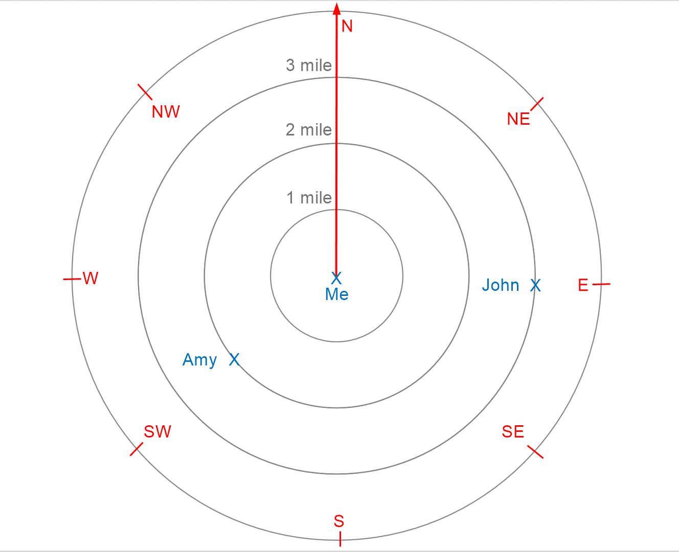
As mentioned before, the latitude and longitude system is one of the most commonly seen polar charts. In fact, most of us unknowingly use polar charts every day! When we navigate using our location on a map, we are actually placing ourselves at the origin of a polar coordinate system. Consider the “map” below, where John is 3 miles due east, and Amy is 2 miles south-west. This represents the distance coordinate. When we say that John is to the east, what we are actually measuring is a 90° angle from North, and when we say that Amy is to the South-West, we are measuring a 225° angle from due North. Polar charts are central to our everyday lives even if we don’t recognize them!
Create compelling radar and polar charts effortlessly. See what's possible with Inforiver Analytics+ and visualize your data more effectively. Explore the Product
-By Hamsini Sukumar
Other Resources:
Radar vs. Polar charts – A comparison

Inforiver helps enterprises consolidate planning, reporting & analytics on a single platform (Power BI). The no-code, self-service award-winning platform has been recognized as the industry’s best and is adopted by many Fortune 100 firms.
Inforiver is a product of Lumel, the #1 Power BI AppSource Partner. The firm serves over 3,000 customers worldwide through its portfolio of products offered under the brands Inforiver, EDITable, ValQ, and xViz.