
Upcoming webinar on 'Inforiver Charts : The fastest way to deliver stories in Power BI', Aug 29th , Monday, 10.30 AM CST. Register Now
Upcoming webinar on 'Inforiver Charts : The fastest way to deliver stories in Power BI', Aug 29th , Monday, 10.30 AM CST. Register Now
Radar and polar charts use polar coordinates instead of our usual (x,y)-system to create unusual and engaging charts that hold the reader’s attention. Click here for an introduction to radar charts and polar charts. In this article, we discuss the advantages that these charts offer, as well as some drawbacks. We conclude by exploring some best practices that you can adopt to help you make beautiful charts that faithfully represent your data.
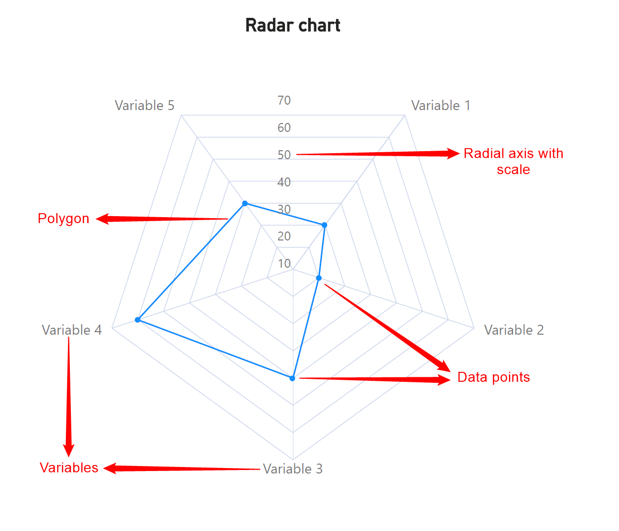
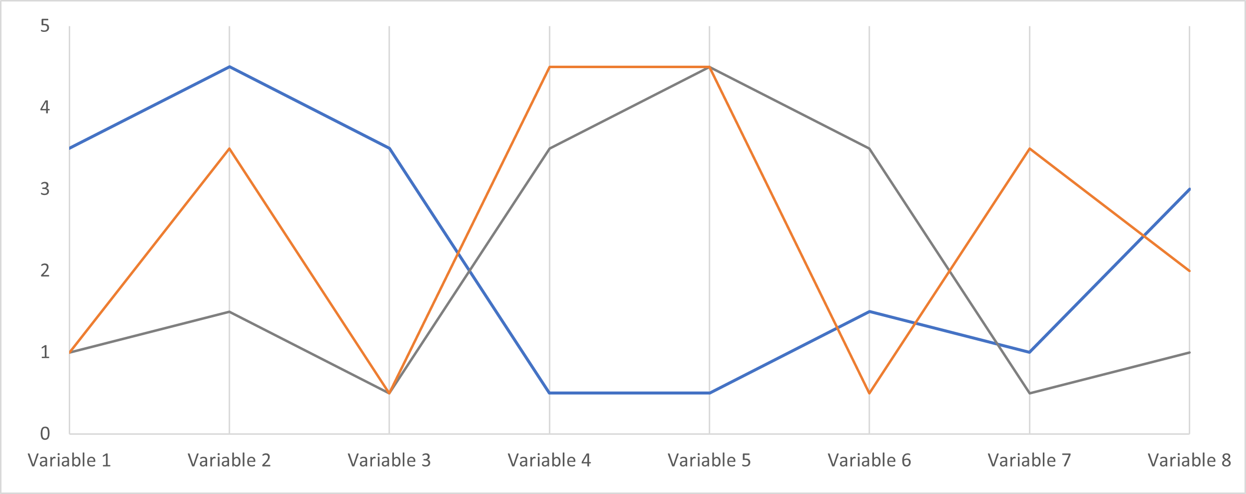
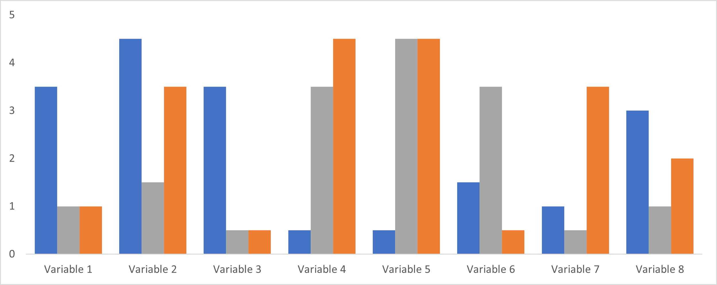
Radar charts are an excellent tool to pack a lot of information into a small area. Consider the parallel coordinates plot, the clustered bar chart, and the radar chart below, all three of which plot the same data. Notice how the radar chart occupies far less space than either of the other two charts. This is especially useful for multivariate data that is tracked over several series, as well as for dashboards with limited space, where the density of information on a radar chart can become a major advantage.
Both radar and polar charts are relatively unfamiliar representations to most readers, but this novelty can also draw attention to the chart, inviting the reader to investigate further. This increase in engagement can be vital in a crowded media environment.
Along with the advantages discussed above, radar and polar charts also present many difficulties.
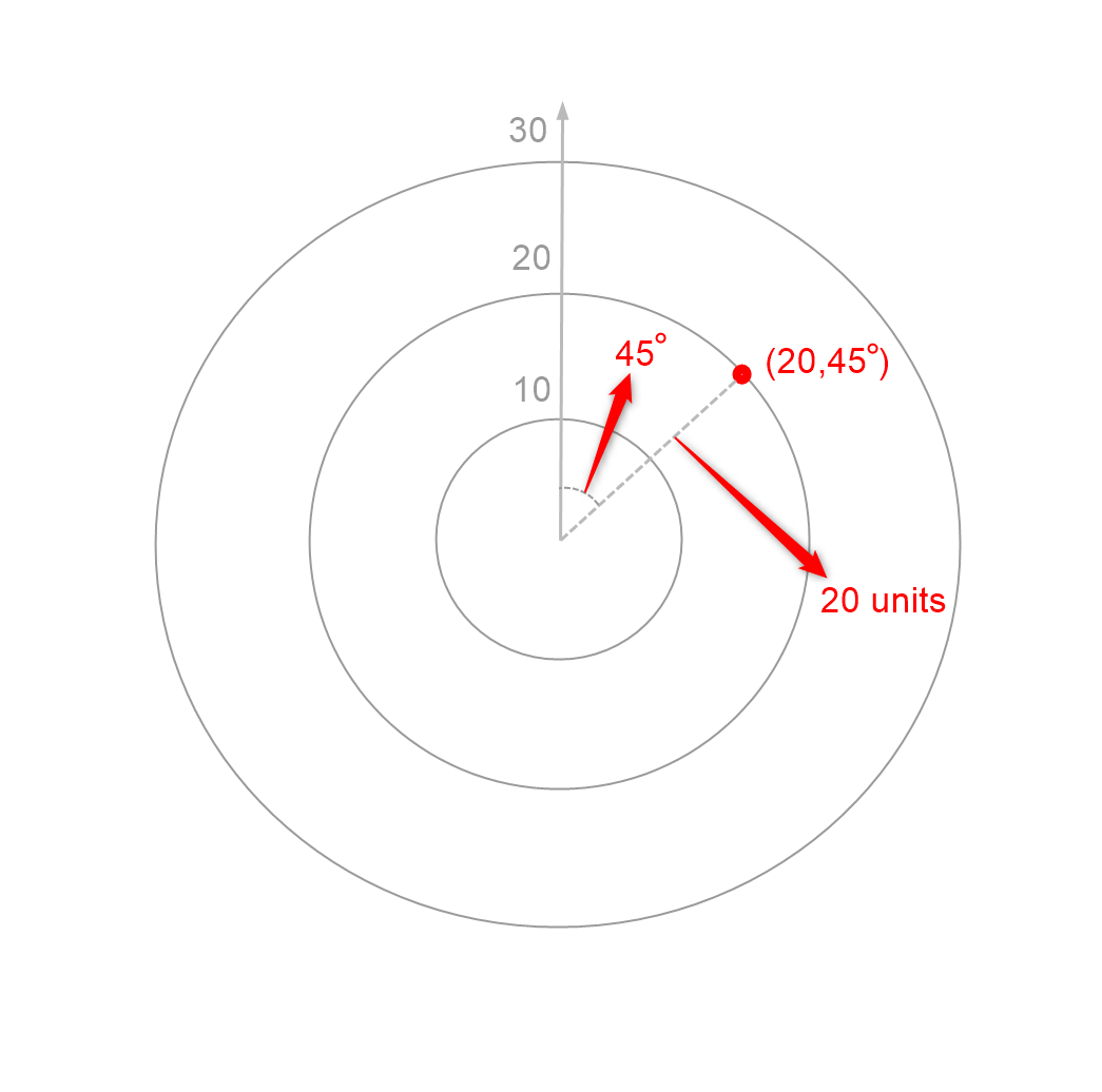
Our visual perception allows us to most accurately estimate distances measured from a common baseline, as in a line chart. In radar and polar charts, however, we need to estimate radial distances, which can be much more difficult to do. Even with gridlines added, it may be difficult to compare values across a single series. In addition to this, we also need to estimate angles for polar charts, which can make reading values doubly difficult.
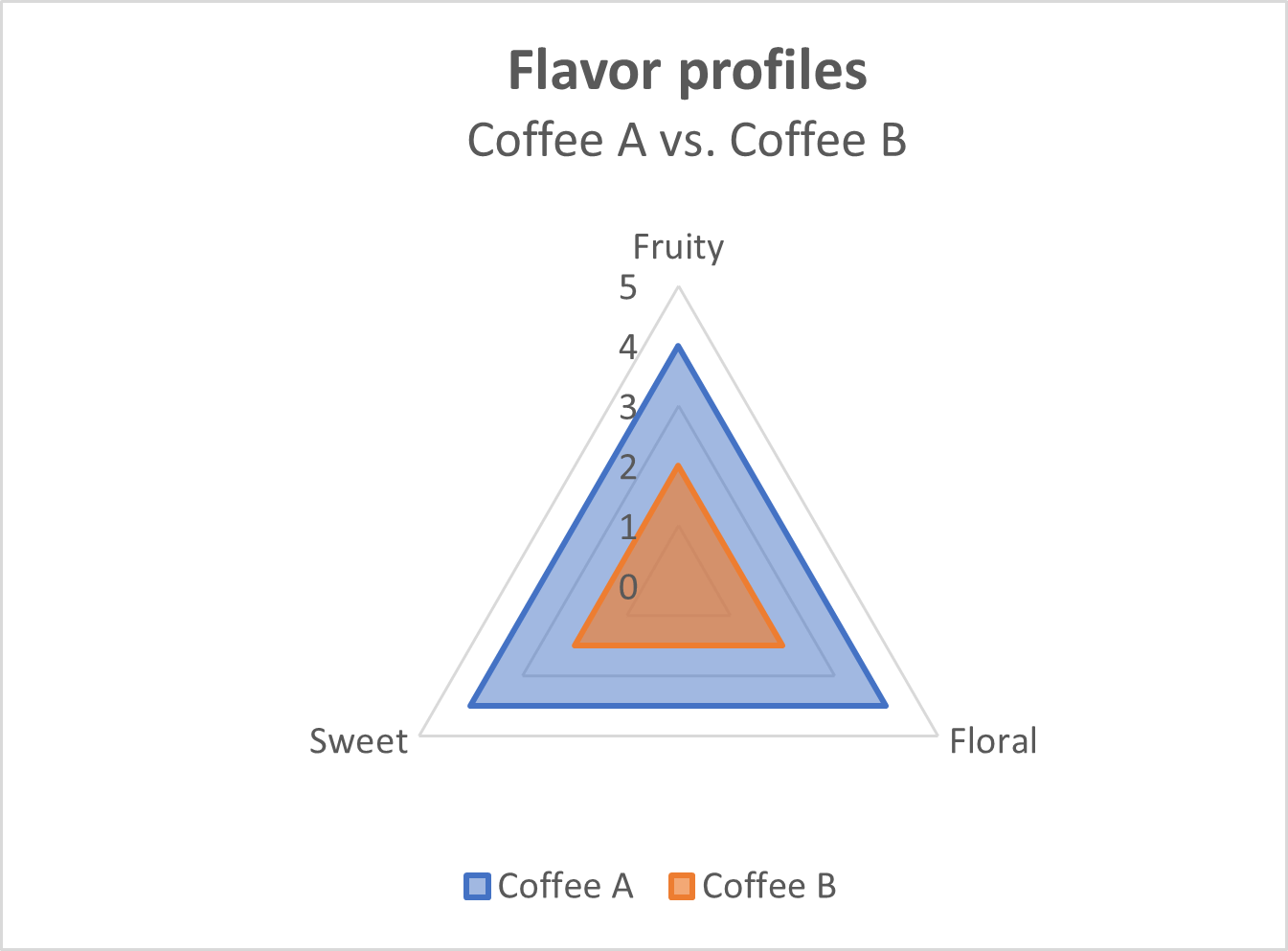
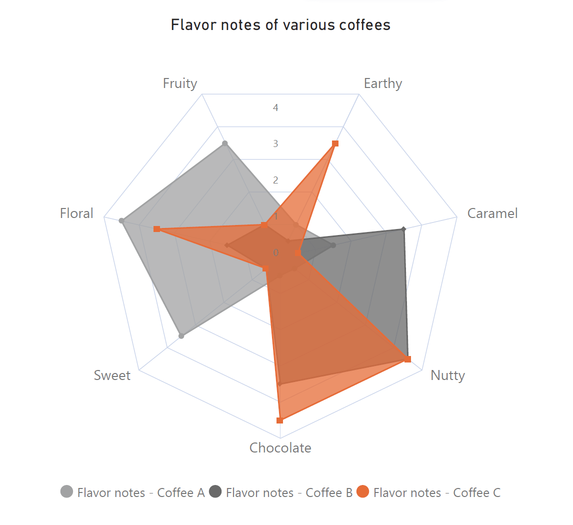
As discussed before, radar charts use polygons to represent multivariate series. However, this means that larger values tend to be overrepresented as the area of a polygon grows geometrically, while our axes typically have linear scales. For example, the following chart shows two coffees scored from 1 to 5 on three flavor metrics. Coffee A scores twice as much as Coffee B on all three metrics, but the blue triangle representing Coffee A is four times as large as the orange triangle representing Coffee B!
Polar coordinates can be unfamiliar and confusing to many readers, making the interpretation of charts that use these coordinates difficult. Radar charts may be easier to understand than polar charts in this respect because they can be interpreted as a radial form of the parallel coordinates plot as discussed, but even radar charts often require some introduction.
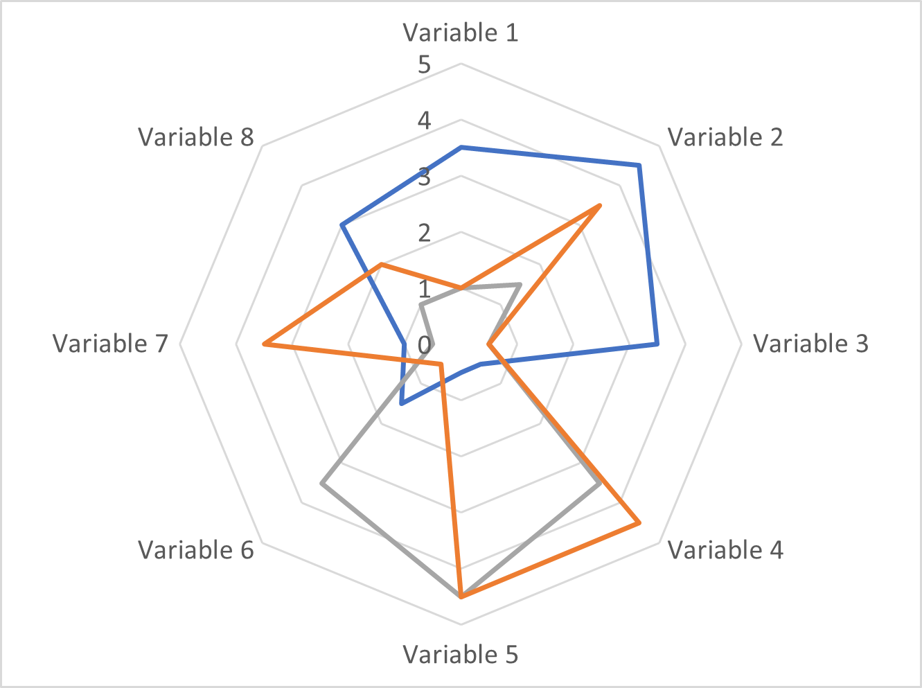
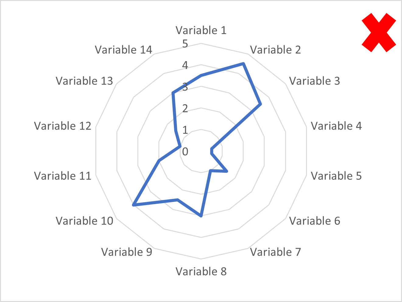
With multivariate observations, it is important to pay attention to how we group observations. When we connect the points on the axes in a radar chart, we may suggest relationships that don’t necessarily exist between neighboring variables. Changing the order of the variables may change which relationships are implied, along with the overall shape of the chart, making the relationships themselves arbitrary.
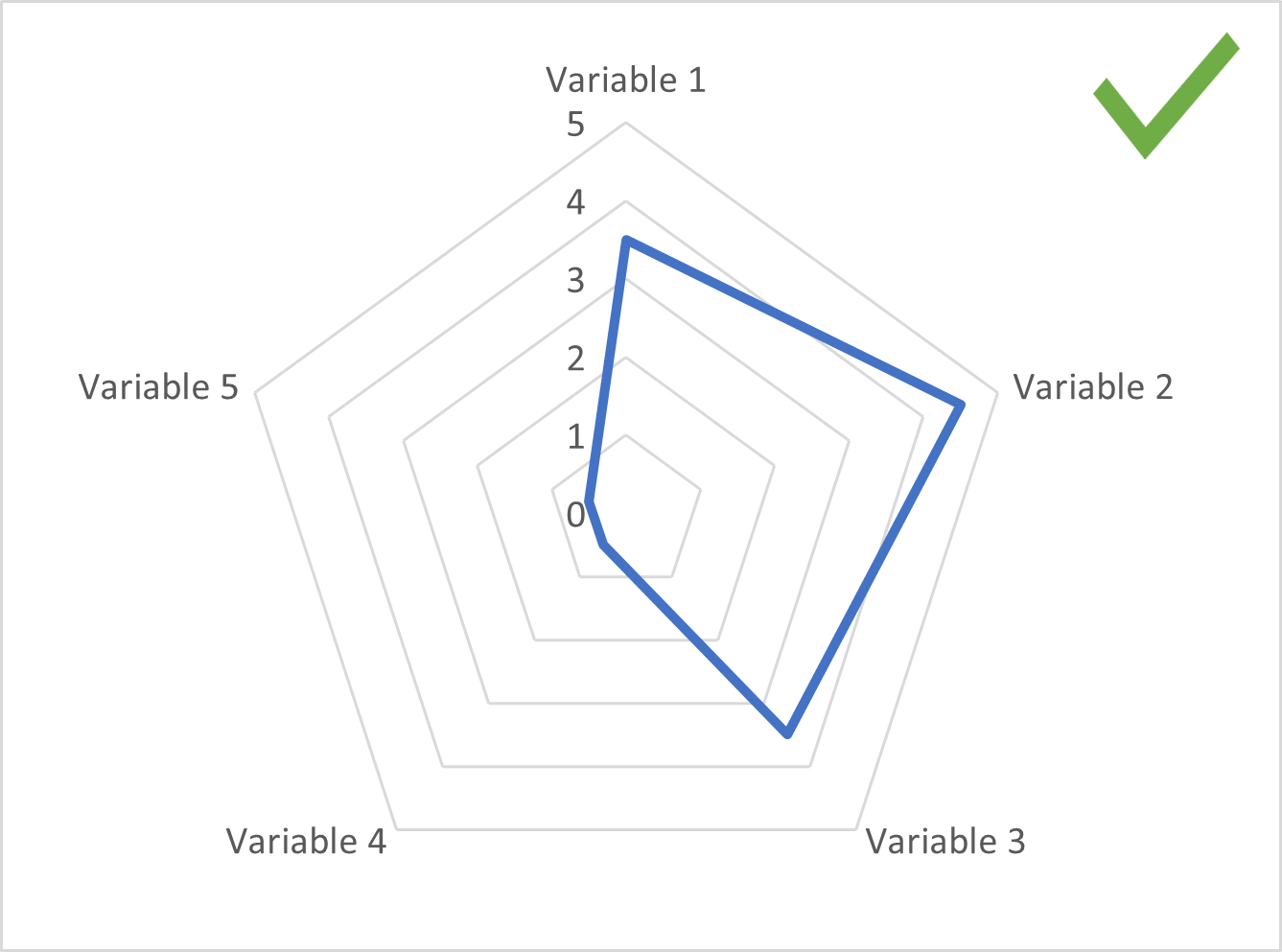
It is advisable to limit the number of series plotted to allow the reader to clearly see all the series and compare their values. Adding too many series can lead to an occluded or crowded chart.
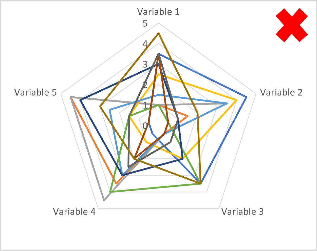
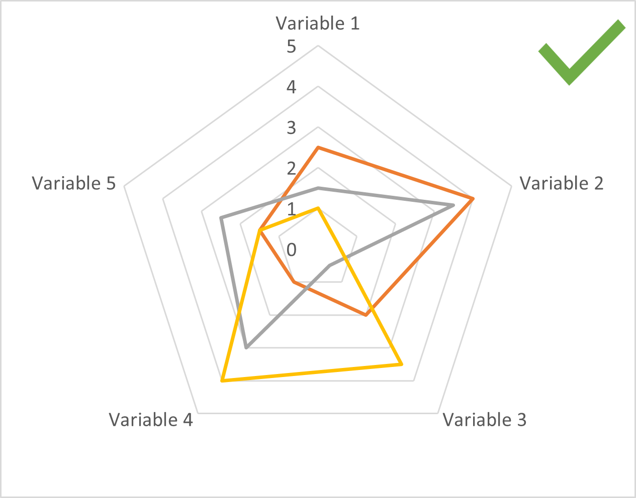
It is also best to limit the number of axes to avoid an overload of information, and to allow readers to accurately judge values.
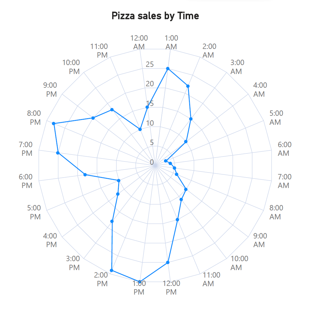
A potential exception to this rule is with sequential, rather than categorical variables. The chart below shows pizza sales for every hour that a 24-hour pizza parlor is open. This is an example of a sequential variable, where we have 24 radial axes plotted (one for every hour), but the main message of the chart remains clear: there are three spikes in pizza sales over the course of the day – during lunch, dinner, and late at night.
Radar and polar charts are unfamiliar to most audiences and benefit from an introduction on what they represent and how to read them.
As with all multivariate data, it is important to choose variables that have a logical connection to each other in order to make meaningful comparisons. In addition, choose a meaningful order for the variables and order the axes of your chart accordingly.
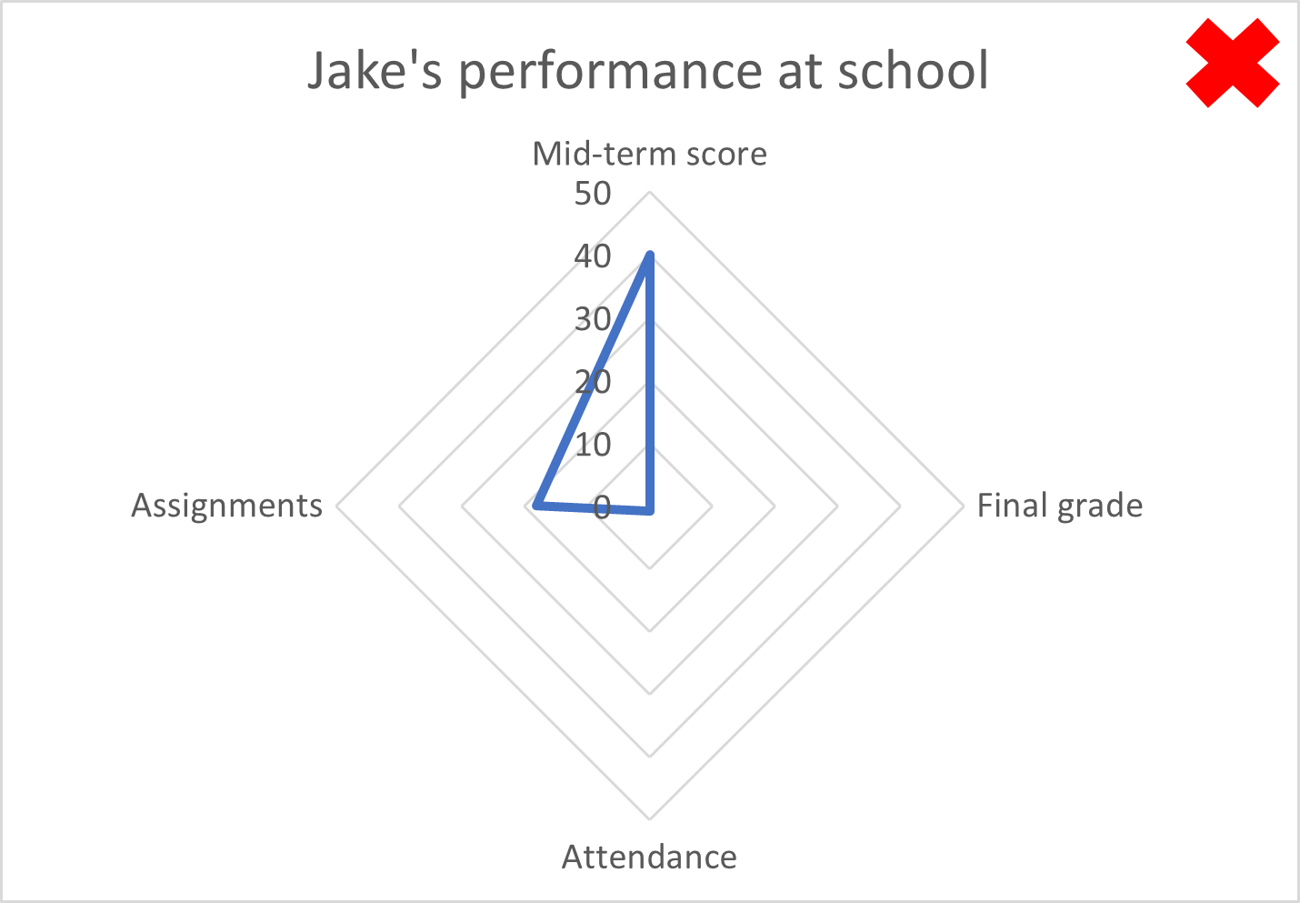
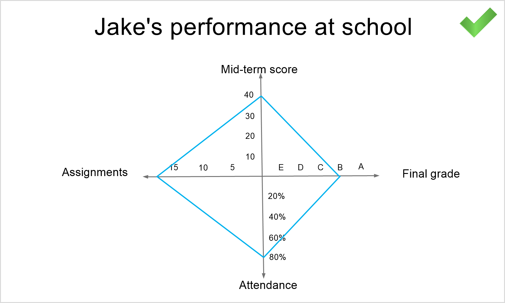
When comparing different variables, we often have different units of measurement and different scales used for each variable. This means that each axis needs to be normalized for radar charts to fit the correct range of values to each axis. To understand this, let us take the example of a student’s performance at school.
Jake’s performance at school is measured across four metrics – his mid-term test scores, his final grade, his attendance and the number of assignments he hands in. Now, his mid-term test is scored on a scale of 0 to 50, out of which he scored 40, his final grade is a letter grade, going from A+ to F-, with Jake scoring a B, his attendance is scored as a percentage and Jake attended 80% of his classes, and he had 20 assignments in total to hand in over the course of the year, out of which he handed in 18 successfully. Consider the radar chart below without normalized axes, where all axes range from 0 to 50. Of course, this is not possible for the final grade, which is a letter, but notice how skewed the values appear – Jake appears to have barely attended any classes and seems to have handed in less than half of his assignments.
However, when we normalize the axes, setting the ranges and scale individually for each axis, we see that he has performed reasonably well.
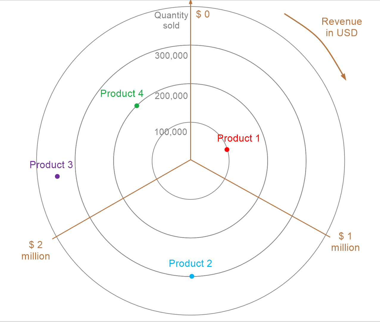
This principle extends to polar charts - we must also ensure that both the radial axis and the values represented by the angle also have the correct ranges that correspond to our variables, as in the chart below. Here, the radial axes range from 0 to 400,000 units, and the angle from 0 to $3 million.
Radar and polar charts are better suited to providing an overview of the broad patterns in the data rather than accurate evaluations of the values, given the challenges with estimating radial and angular distances that we discussed earlier.
When shading in the area enclosed by the polygons in a radar chart, use transparency to allow gridlines as well as other series to be seen easily.
Create compelling radar and polar charts effortlessly. See what's possible with Inforiver Analytics+ and visualize your data more effectively.
Explore Radar & Polar Chart Capabilities in Inforiver Analytics+
-By Hamsini Sukumar
Radar charts 101: Overview and use cases
Polar charts 101: An in-depth guide
Radar vs. Polar charts – A comparison

Inforiver helps enterprises consolidate planning, reporting & analytics on a single platform (Power BI). The no-code, self-service award-winning platform has been recognized as the industry’s best and is adopted by many Fortune 100 firms.
Inforiver is a product of Lumel, the #1 Power BI AppSource Partner. The firm serves over 3,000 customers worldwide through its portfolio of products offered under the brands Inforiver, EDITable, ValQ, and xViz.