
Upcoming webinar on 'Inforiver Charts : The fastest way to deliver stories in Power BI', Aug 29th , Monday, 10.30 AM CST. Register Now
Upcoming webinar on 'Inforiver Charts : The fastest way to deliver stories in Power BI', Aug 29th , Monday, 10.30 AM CST. Register Now
A funnel chart visualizes a linear process through several stages using the metaphor of a funnel. A classic application of this chart is a Sales Funnel where an organization tracks prospects until deal closure.
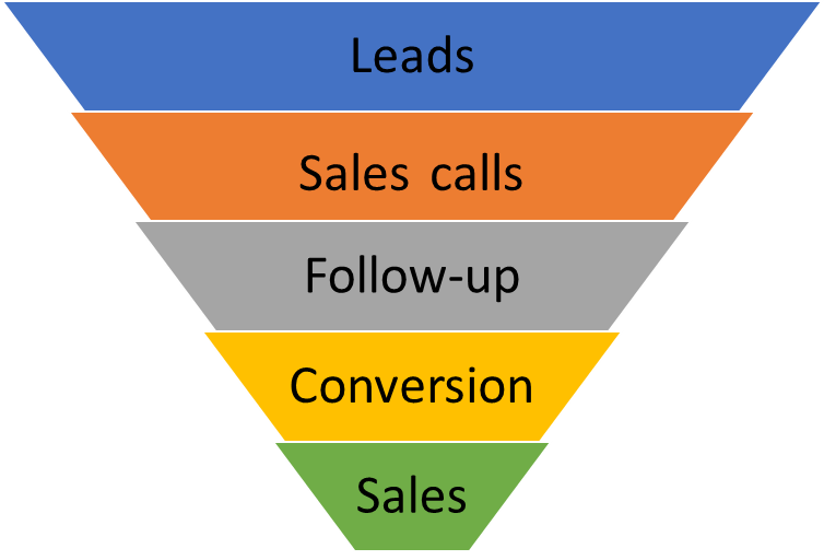
Funnel charts are used for data that goes through multiple connected stages. Each stage accepts data from the previous stage based on certain criteria. Typically, there is a reduction in width from one stage to the next, as not all items flow through to the next stage. This means that the chart has a broad section representing the beginning of the process, called the “head”, and a narrow section representing the end goal, called the “neck”. Data is often presented as a percentage of the first stage, starting at 100% for the first stage, and decreasing at each stage to the final goal.
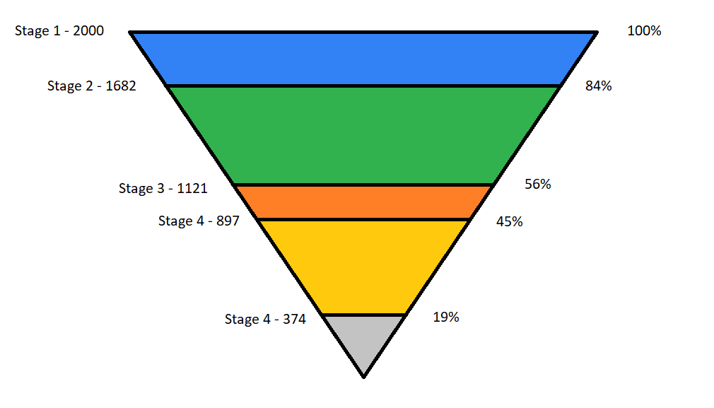
There are two common variations of the funnel chart – the inverted triangle and the diminishing bar. We will briefly examine each of these.
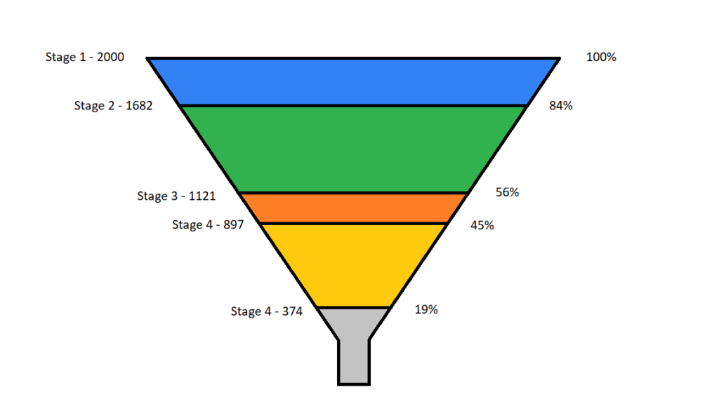
The classic way to interpret a funnel chart is as an inverted triangle. This is a literal interpretation of the funnel metaphor, and often has a rectangle attached to the apex of the triangle at the bottom to make it appear like a funnel. There are several issues with this representation.
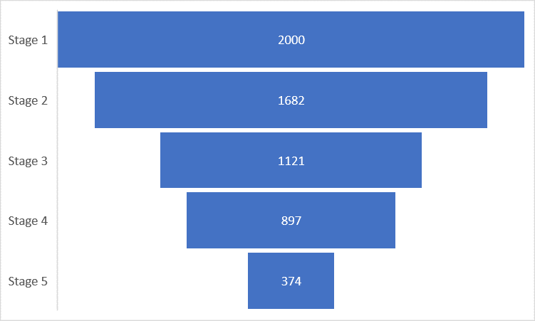
Both of the issues from above are solved by using diminishing bars instead. Below is the same data represented using bars. The width as well as the area are both proportional to the value of the stage, leaving no ambiguity in interpretation. This gives us a much more accurate representation of the data and solves the area-width ambiguity. The lengths of the bars can also be compared more accurately than a traditional funnel, making this variation the better choice.
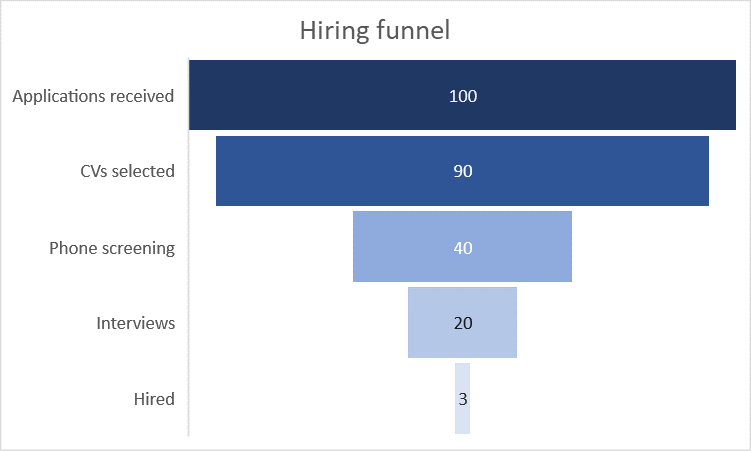
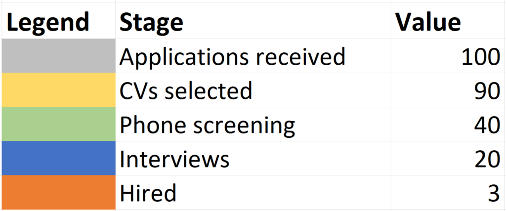
Funnel charts can help identify bottlenecks in processes by revealing sudden drops in numbers. We can understand this using the example of a hiring funnel, like the one below. This funnel visualizes the stages of the hiring process. Out of 100 applicants, 3 are finally hired at this company. In this chart, we see the largest drop off at the phone screening stage, indicating a bottleneck. The company may have an unmet hiring goal, and examining this chart for the bottleneck may indicate where changes need to be made.
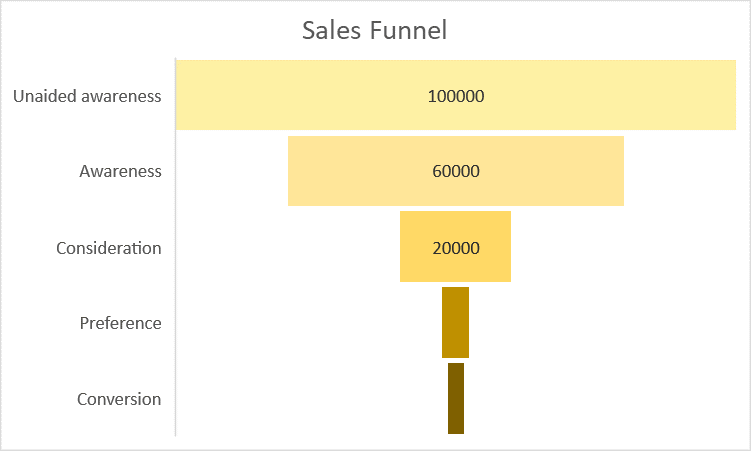
These charts can also help in understanding retention rates from one stage to the next. For example, the following chart is a sales funnel, showing the stages from unaided awareness to conversion. There is naturally a drop-off of customers at each stage, and we get an approximate idea about the rate of drop-off by looking at how quickly the funnel narrows. We can use the retention rate of customers at each stage to understand the most effective and the least effective stages. This is especially important to understand because this is a linear process and the retention numbers of a stage affect all subsequent stages. The rate of customer dropout may indicate the stages that need more attention.
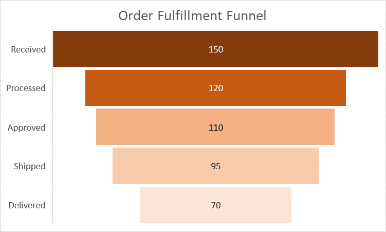
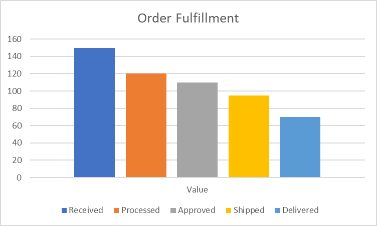
Funnel charts can also be used to track the processes in a workflow. The chart below visualizes the processes involved in order fulfillment from receiving orders to delivering them, showing the number of orders at each stage. This allows us to monitor the chain of processes involved and helps allocate resources and manpower accordingly.
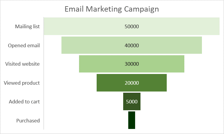
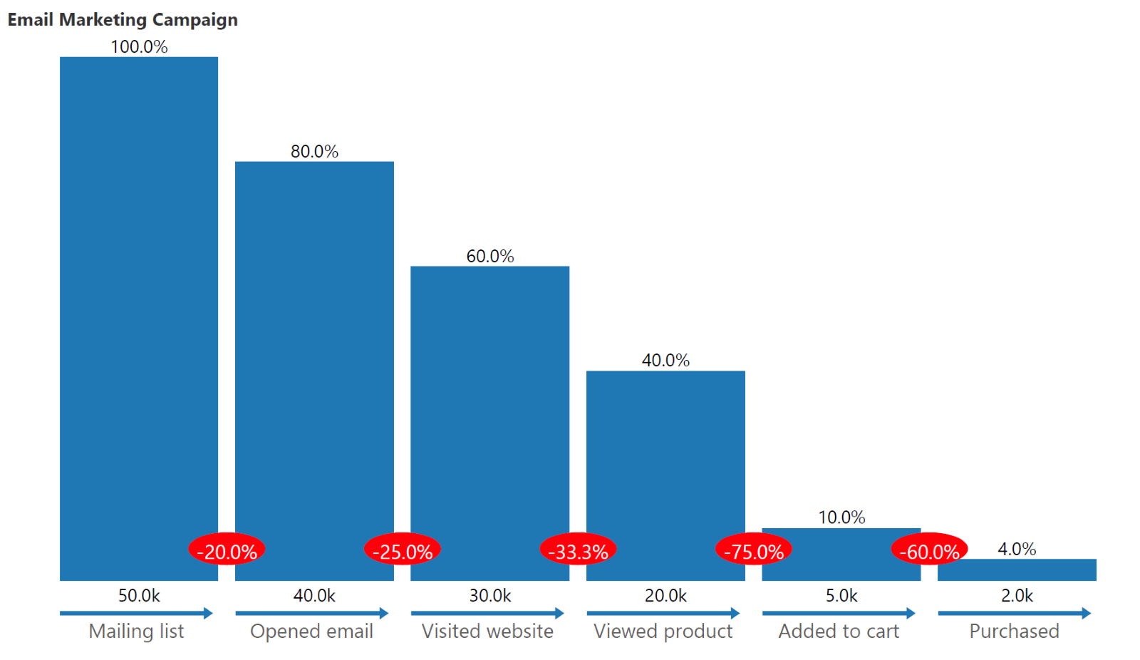
Funnel charts are meant to be used as high-level visualization tools. This means that they illuminate the overall picture, but do not help in understanding details. For example, if we wanted to understand why a certain pattern exists, we would need to carry out further analysis. In the funnel chart below, showing the stages of an email marketing campaign, we may notice that only a fourth of the people who viewed a certain product ended up adding it to their carts. This is information in the overall picture that can be relayed by the funnel chart. However, understanding the driving factors of this pattern would need further analysis beyond the scope of the chart.
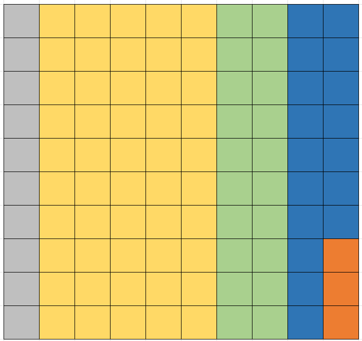
A waffle chart could also be an effective way to visualize the drop-off at every stage of a linear process. A waffle chart uses color-coded squares to present a parts-to-whole picture. In the chart below, the same data from the hiring funnel above is visualized in a waffle chart. Each applicant here is represented as a square – there are 100 squares in total in a 10x10 grid, and we clearly see that only 3 applicants were hired at the end. This gives us a visually engaging option to represent the continuously decreasing stages of a linear process.
Another alternative to a funnel chart is the column chart. This chart is excellent for accurate representation of the data and allows for easy comparisons between the stages. The chart below, for example, plots the same data on order fulfillment from above and allows us to compare the volumes of the various stages and track changes in the processes involved.
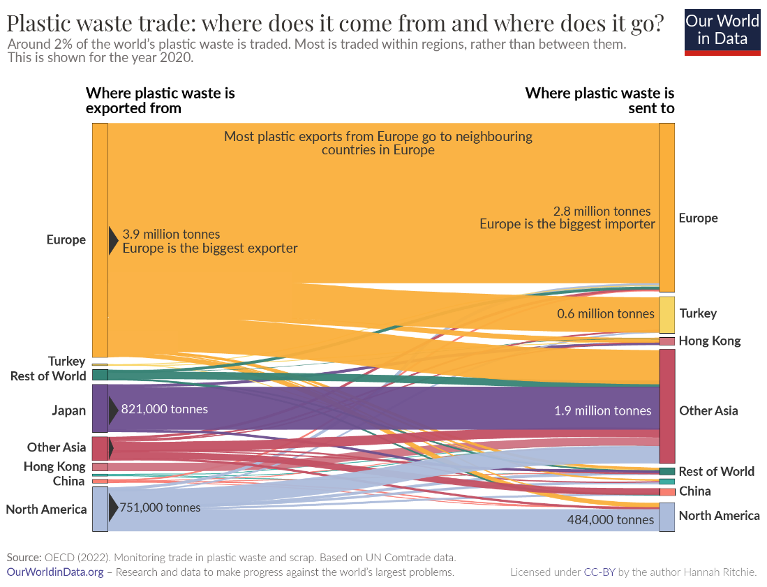
As we have seen, funnel charts are useful for visualizing linear processes. These are processes that flow directly from one stage to the next. Not all processes fit this description and sometimes, we may have more complicated relationships. For non-linear flows, consider using a Sankey diagram like the one below. This chart visualizes the plastic waste trade by showing the sources and destinations of plastic waste. This is not a linear process and has many interconnected locations as shown.
Build Funnel & Other Advanced Charts — Try Now
- By Hamsini Sukumar
Get your free edition of Inforiver Charts and try out the advanced funnel chart in Power BI.

Inforiver helps enterprises consolidate planning, reporting & analytics on a single platform (Power BI). The no-code, self-service award-winning platform has been recognized as the industry’s best and is adopted by many Fortune 100 firms.
Inforiver is a product of Lumel, the #1 Power BI AppSource Partner. The firm serves over 3,000 customers worldwide through its portfolio of products offered under the brands Inforiver, EDITable, ValQ, and xViz.