Upcoming webinar on 'Inforiver Charts : The fastest way to deliver stories in Power BI', Aug 29th , Monday, 10.30 AM CST. Register Now
Upcoming webinar on 'Inforiver Charts : The fastest way to deliver stories in Power BI', Aug 29th , Monday, 10.30 AM CST. Register Now
The Funnel and Pyramid Chart in Inforiver Analytics+ helps you analyze stage-wise movement and conversion across processes such as sales pipelines, marketing funnels, user journeys, recruitment stages, and onboarding flows. You can clearly see how values progress from one step to the next and where drop-offs or growth occur, which makes it easier to identify bottlenecks and improvement areas.
Along with standard Funnel and Pyramid layouts, Inforiver also provides an Executive Funnel Chart designed specially for leadership dashboards. It delivers a clean summary view of conversions with clear percentages and stage-wise contribution, so executives can review performance quickly without dense visuals.
You can switch between multiple display styles, control width and layout, and show values or percentages as needed. Trellis view allows comparison of multiple funnels or pyramids across regions or segments side by side, keeping analysis structured and simple inside Power BI.
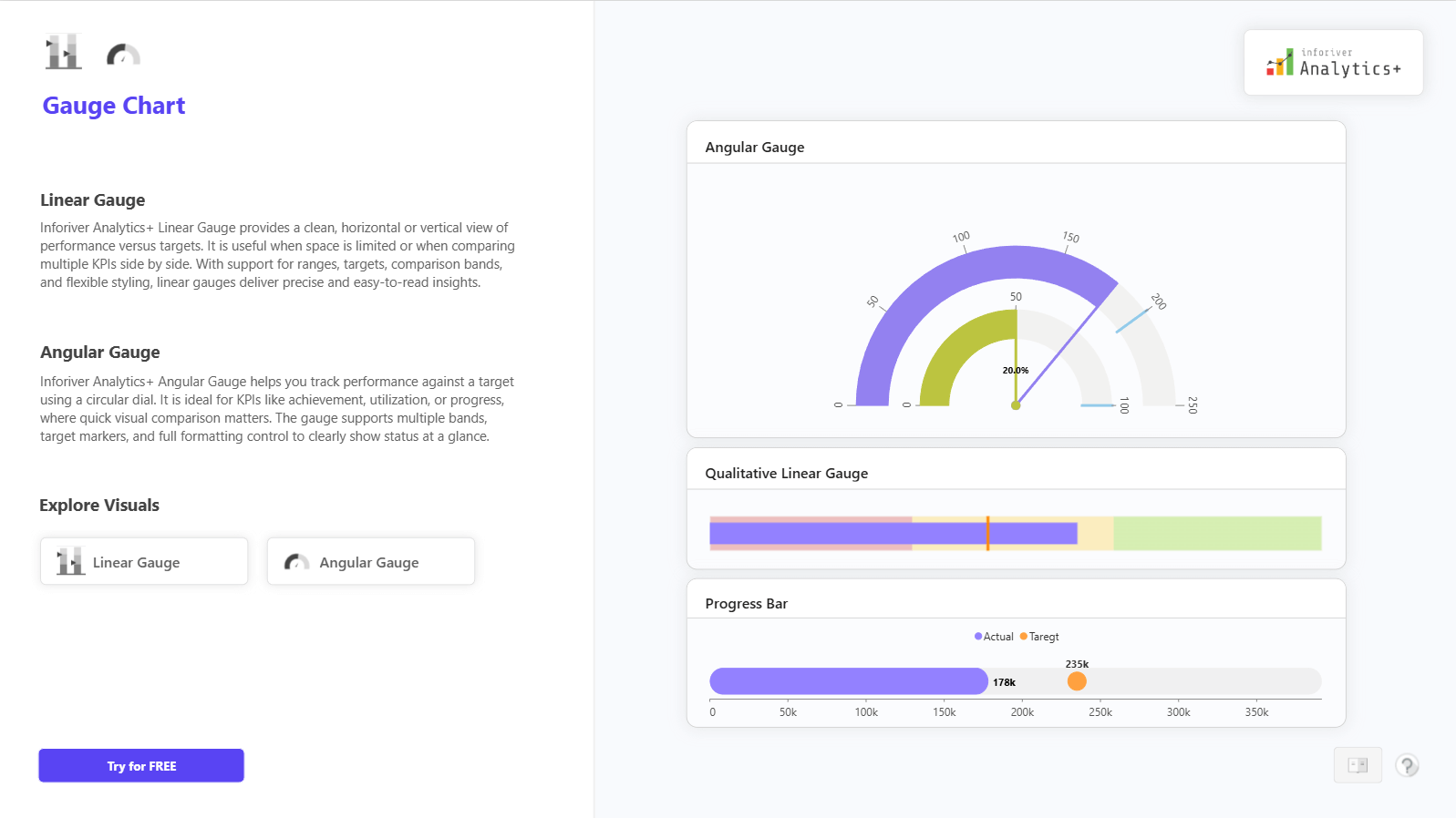
For complete feature details, demo visuals, and pricing information, visit: https://inforiver.com/analytics-plus/gauge-chart/

to try advance features
[demo_download_modal title="Funnel and Pyramid Chart in Power BI" link="https://inforiver.com/wp-content/uploads/funnel-and-pyramid-chart-in-analytics-plus-demo-update.zip"]
Inforiver helps enterprises consolidate planning, reporting & analytics on a single platform (Power BI). The no-code, self-service award-winning platform has been recognized as the industry’s best and is adopted by many Fortune 100 firms.
Inforiver is a product of Lumel, the #1 Power BI AppSource Partner. The firm serves over 3,000 customers worldwide through its portfolio of products offered under the brands Inforiver, EDITable, ValQ, and xViz.