Upcoming webinar on 'Inforiver Charts : The fastest way to deliver stories in Power BI', Aug 29th , Monday, 10.30 AM CST. Register Now
Upcoming webinar on 'Inforiver Charts : The fastest way to deliver stories in Power BI', Aug 29th , Monday, 10.30 AM CST. Register Now
Welcome to the Analytics+ 3.5 major release update!
The February 2024 – 3.5 release for Analytics+ is a major milestone release that delivers a range of high-value dashboards and visualization capabilities. We have exciting features like new IBCS table templates, better storytelling through annotations inside tables, variations for our waterfall chart, excel-like nested sorting, and many more. Just to name a few, we have enhancements across data management, hierarchy handling, and enhanced discoverability with our new user experience (UX) for chart selection.
In the upcoming release iterations starting from March 2024, we will be introducing a lot more new chart types, new functions and formulas to perform basic visual-level calculations and bring in a host of much-anticipated storyboarding and analytical capabilities.
The upcoming layout and storyboard feature will allow even casual users to build beautiful dashboards and storyboards in under 5 minutes with just a single query and single visual. We anticipate a substantial performance boost for most of your dashboards as the storyboard can significantly reduce the number of visual elements and components they might currently be using.
Let’s discover the innovations in this 3.5 release as we continue to deliver features that are most sought after and anticipated by the Power BI community. Thank you for choosing Analytics+!
Feel free to explore the sections that interest you.
1.1 Measure management for insight charts
2.3 Inline charts in data tables
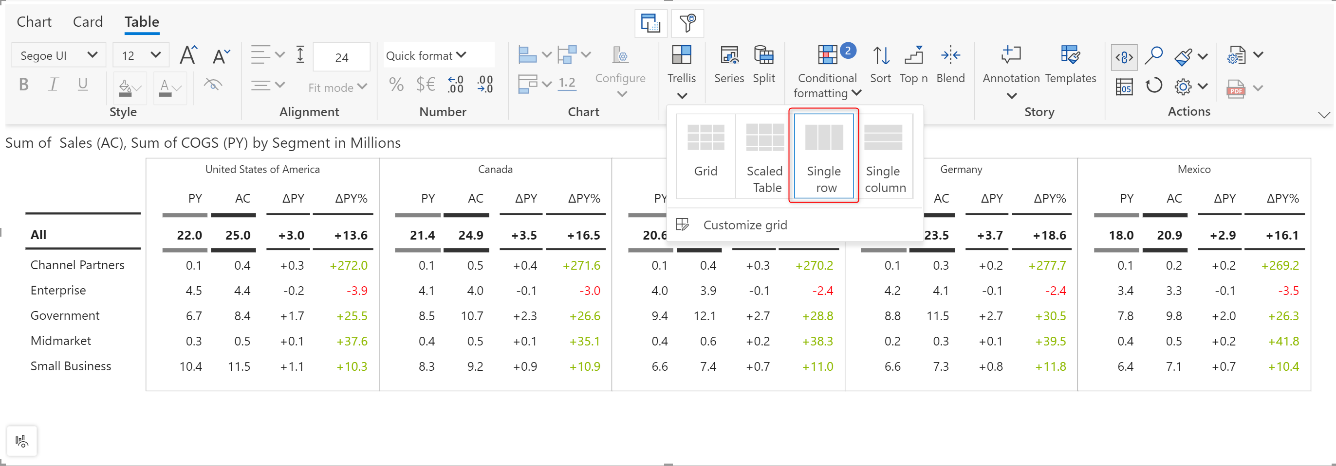
2.4 Trellis layout – single row and single column
2.5 Business responsiveness for tables
3.1 Measure-based interim waterfall
3.2 Enhanced discoverability for chart types
3.3 Scenario-based chart selection
3.4 Custom bar color on data selection
3.5 Enhancements to Marimekko – responsive data labels and axis breaks
3.6 Enhancements to bullet charts – pivot data
4.1 Template for single column cards
5.1. Unbalanced ragged hierarchy support
5.2. Display single child nodes in hierarchies
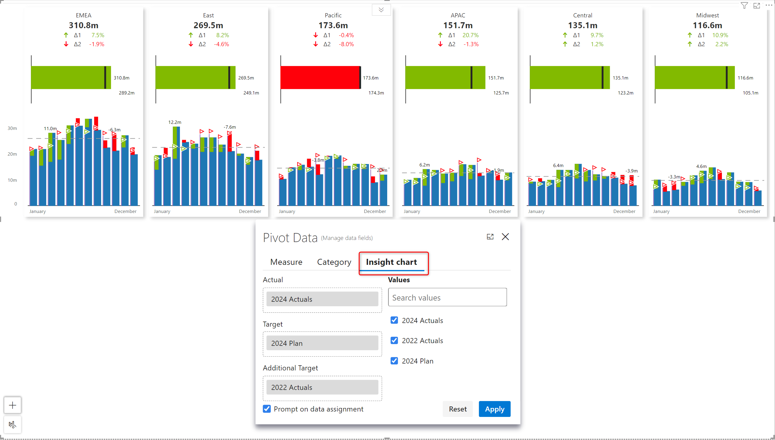
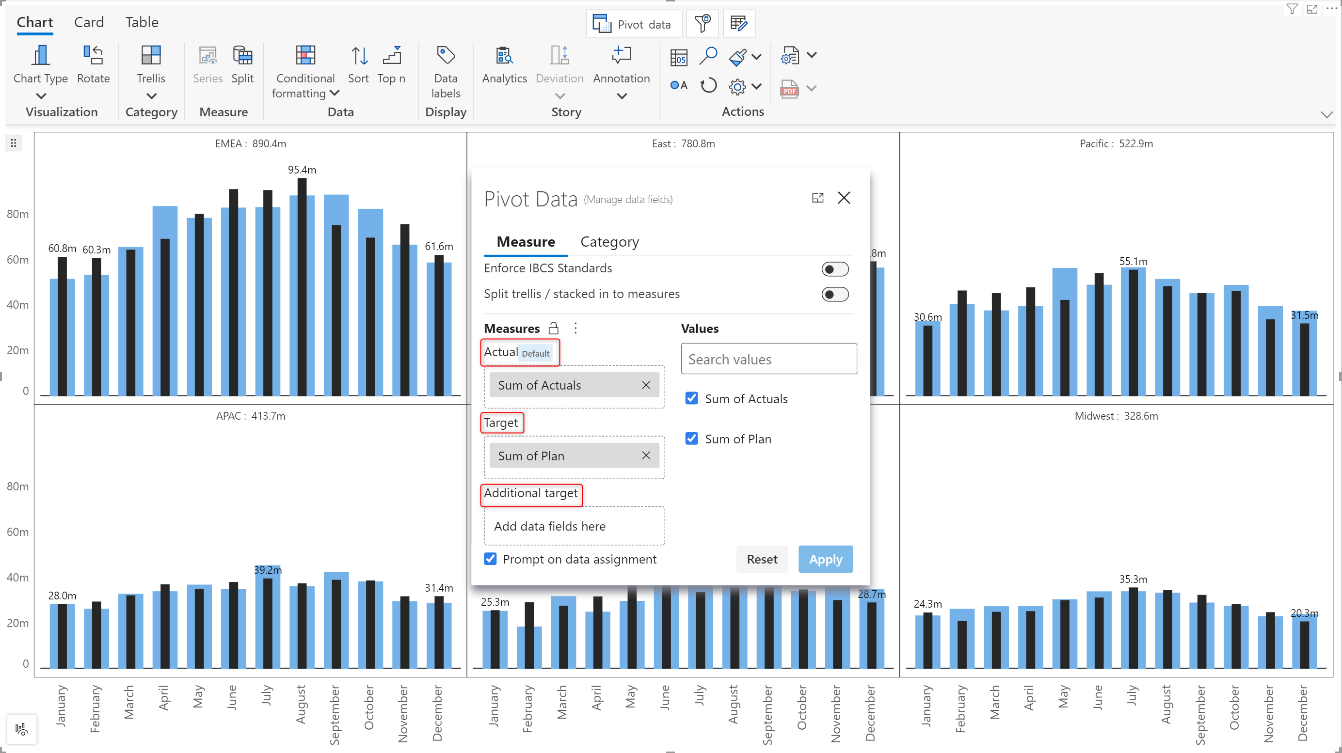
Analytics+ enables you to embed insight (bullet) charts that show a summarized perspective of the sparkline chart. For example, if the sparkline shows the quarter-wise sales and target, the insight chart will display the overall sales against the target. With the latest release, you can configure the target and additional target measures for insight charts. The pivot data window now has a dedicated configuration tab for insight charts.
Please note-this tab will be only enabled in card mode.
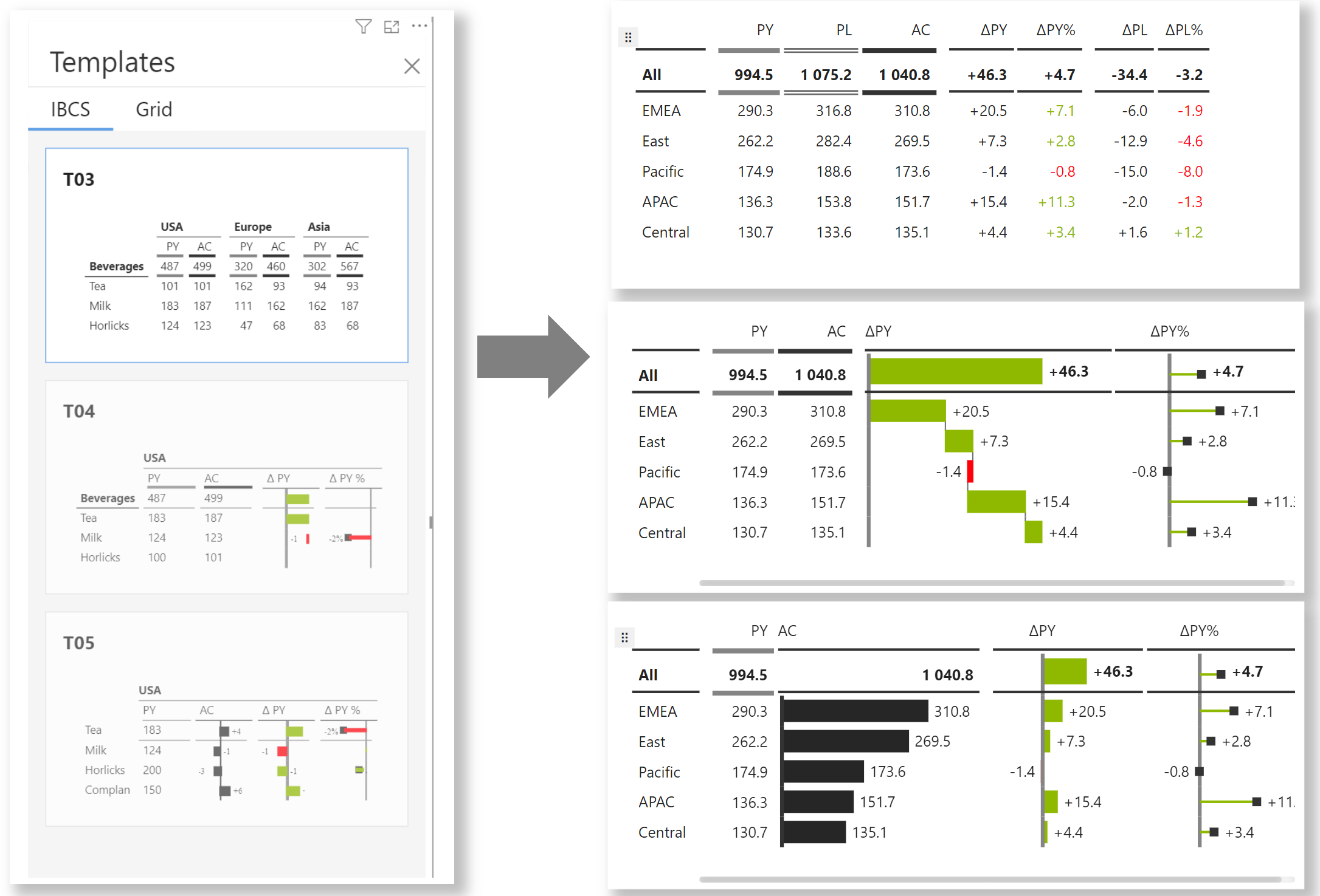
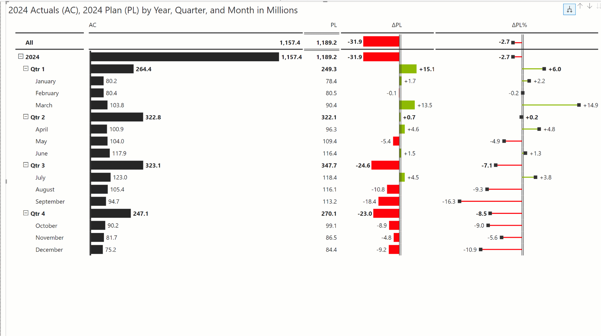
In our previous release, tables were included as part of Analytics+, making it an all-in-one dashboarding platform. As an enhancement to the existing tables, you will be able to create in-line charts within these tables, like the Reporting matrix. The Analytics+ visual is IBCS compliant, adhering to standardized IBCS design principles. You get the IBCS templates out of the box – you can instantly create an IBCS report with in-built variance calculations in a single click. Variances are also conditionally formatted by default.
We’ve introduced additional IBCS templates in the February release. You can now select from T03, T04, and T05 templates.
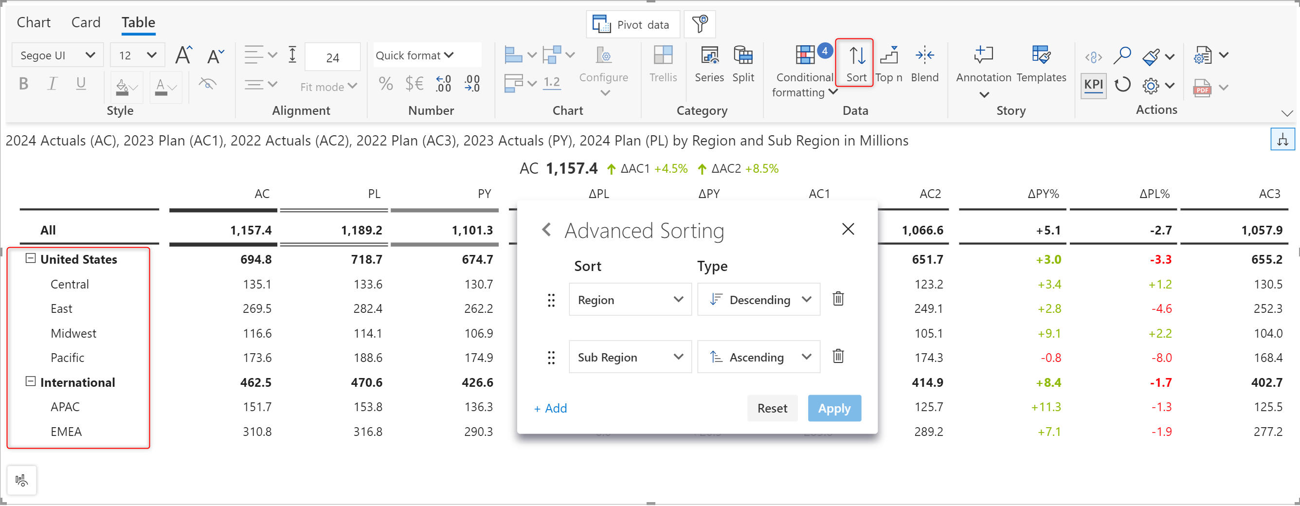
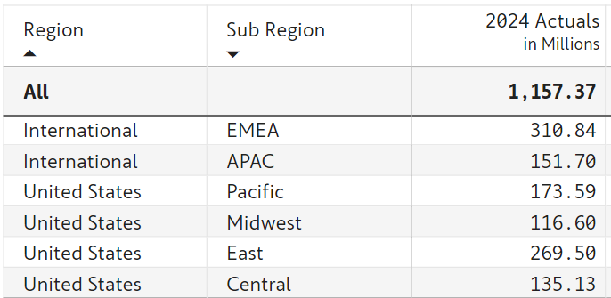
If you’re someone who loves looking at tabular data like in Excel, you’ll love this one. Excel-like custom sorting, where you can sort multiple columns in a nested manner. Although it is widely used in the BI space, nested sorting has been a long pending request in the Power BI idea portal.
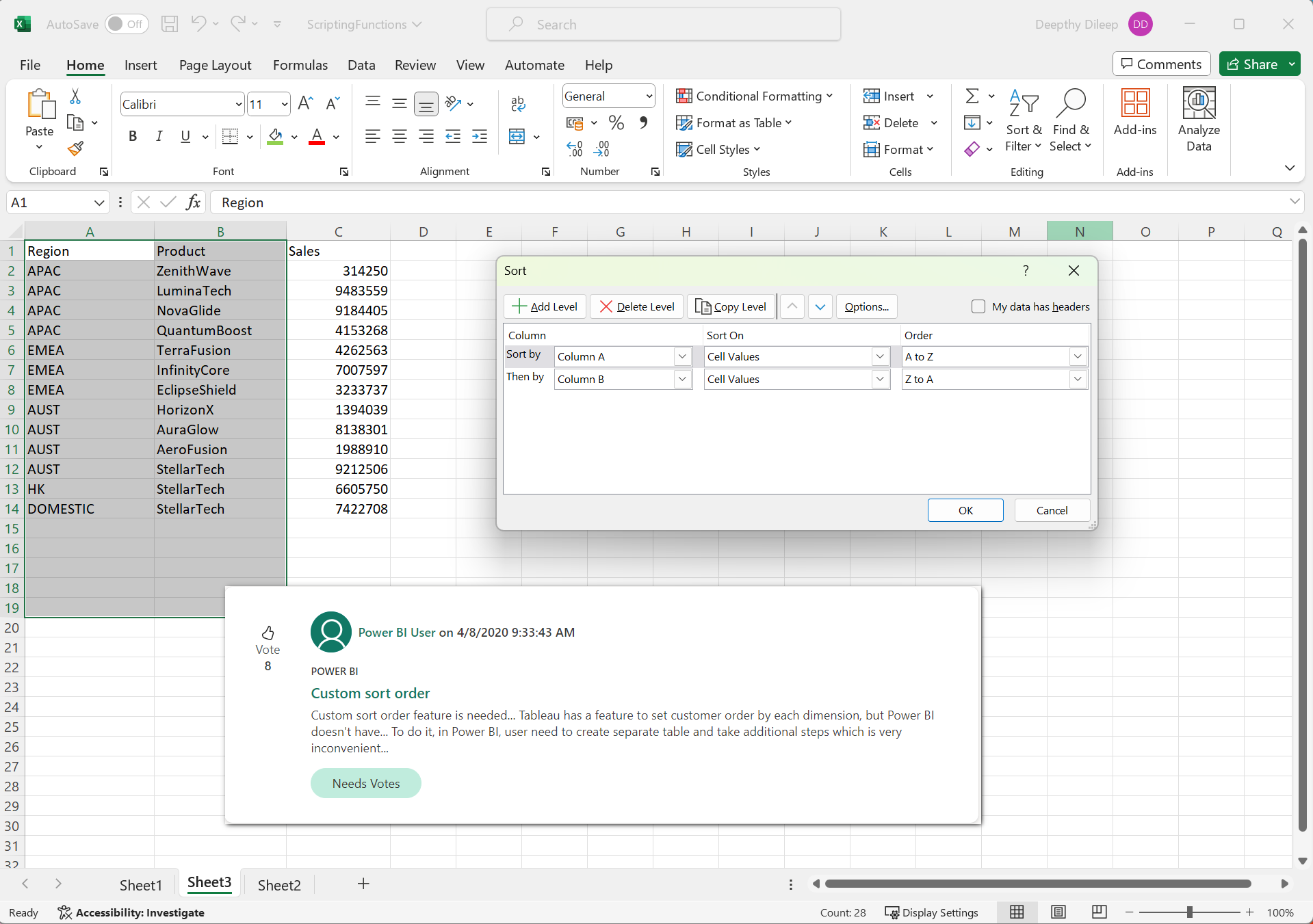
The Advanced Sorting option in the latest Analytics+ version delivers the ability to sort your data on different columns simultaneously through a familiar user experience.
In the upcoming versions, we will be including additional layout options in Analytics+ tables, including the tabular layout like in Excel, which would look similar to what is shown in the image below.
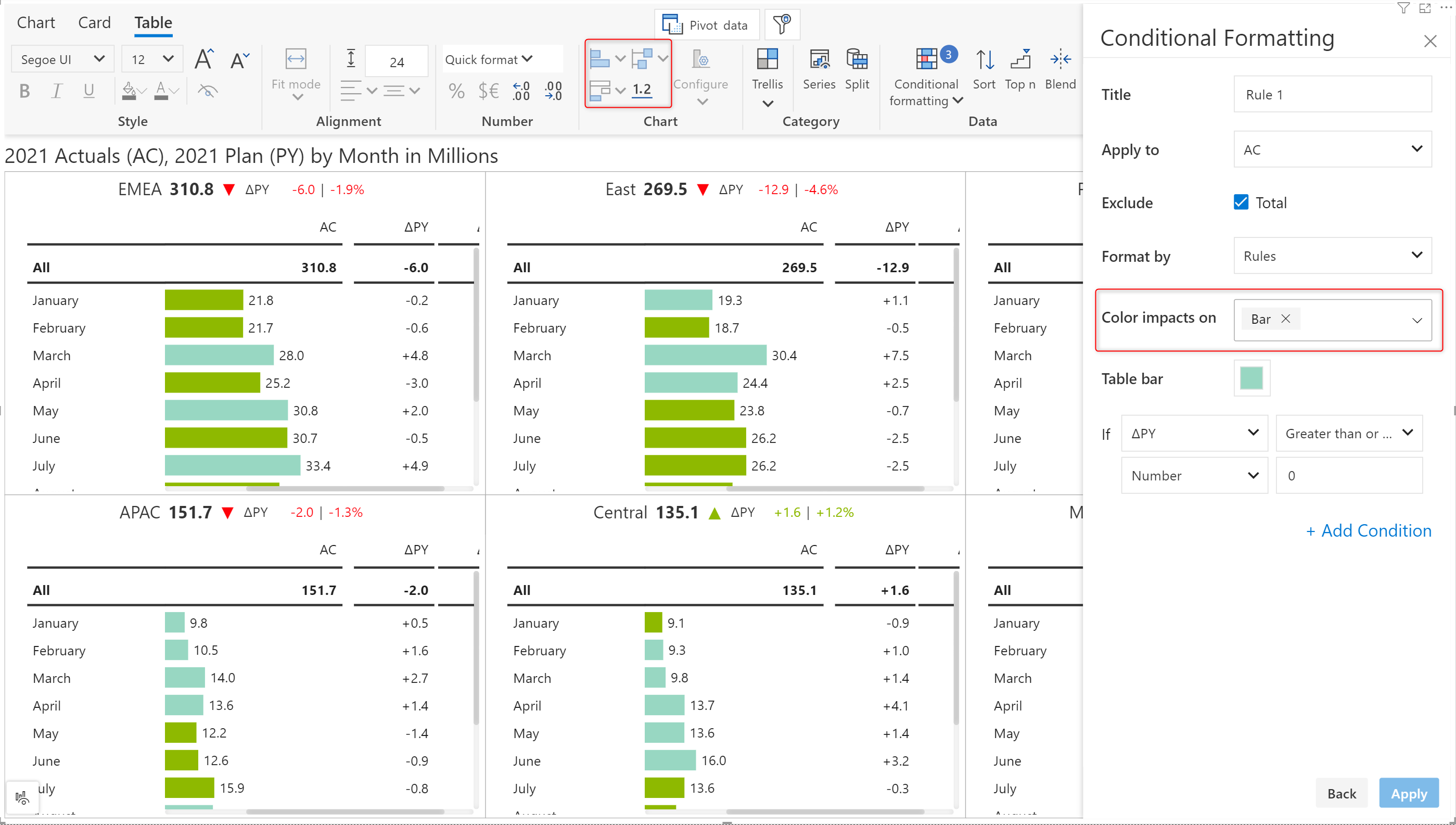
As mentioned in the previous section, you can visualize the measures in your data tables by embedding row-level in-line charts. Like the Reporting Matrix, you can insert charts for a particular measure with a single click. You can also customize the chart by clicking on the configure button, where you can change the marker styling, scaling, and colors for positive and negative values, etc. In addition to this, you also get all the conditional formatting options from the Reporting Matrix.
Inforiver’s signature small multiple variance tables enable the user to create management reports, giving a bird’s eye view of the data on a single PDF page as executive summaries. Analytics+ offers a hierarchical approach to the small multiple tables without any pagination.
If you’re looking to build wider or longer paginated reports, then you might have to go to our Reporting Matrix. Reporting Matrix is designed more for your reporting use case and used as a single visual on a page, whereas Analytics+ is for your responsive tables in small form factor and usually for your shorter and leaner summary tables without pagination or column hierarchies.
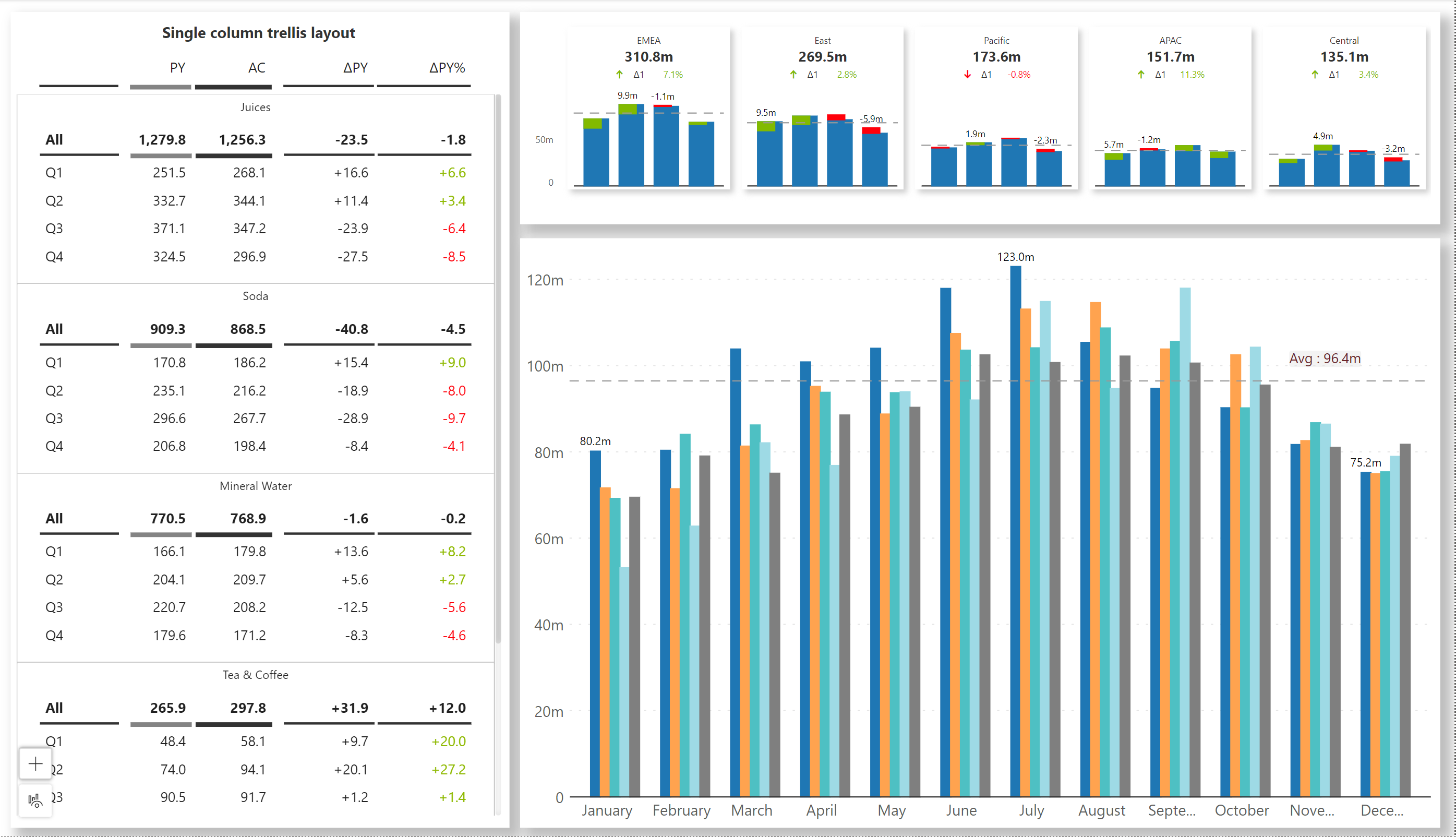
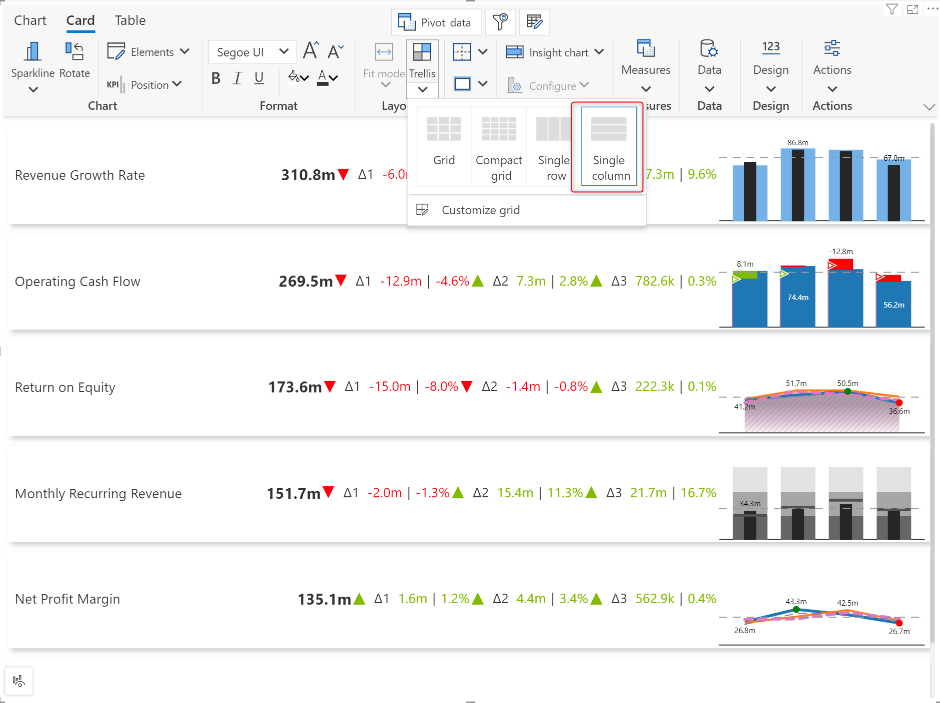
You have various trellis layout options, including a single row or a single column, which helps you view all the tables either in one row or column without having a matrix-like grid. This can be mainly used when you have a single group dimension. This feature facilitates the creation of compact trellis tables that can be used in dashboards and storyboards.
In the image below, we have created a sample dashboard using Analytics+ cards, charts, and table modes. Tables are arranged in a single-column trellis layout, while the KPI cards are arranged in a single row.
When you resize the table, Analytics+ dynamically adjusts the whitespace, resizes charts without affecting the scaling of the charts, or even converts charts to numbers to fit the given data in the available canvas space. Analytics+ also blends measures and variance columns by combining two relevant measures into a single column while resizing, to provide as much insight as possible, even in the minimal real estate available.
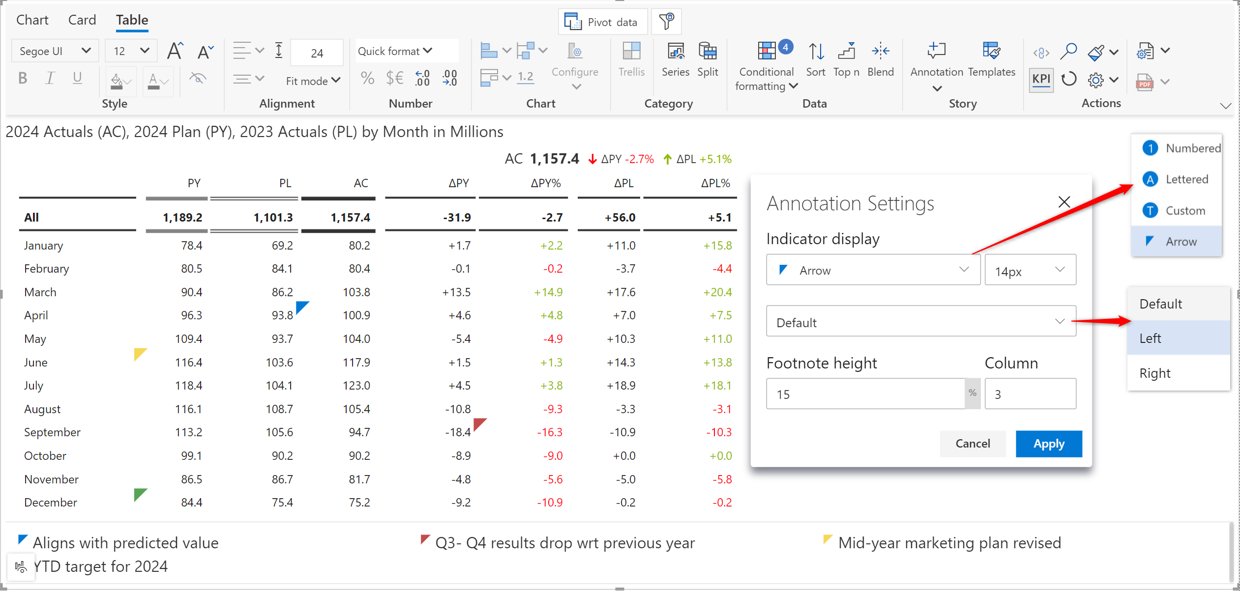
Inforiver Analytics+ helps you capture perspectives, descriptive stories, and priorities in your reports with the annotation feature. In this version, you will also have a notes feature for tables similar to Reporting Matrix -
The notes feature supports rich text formatting where you can make it bold, italicized, or underlined and apply a font color and background fill to specific notes.
You can hide all comments or use the reset all option to remove all annotations from the report at once.
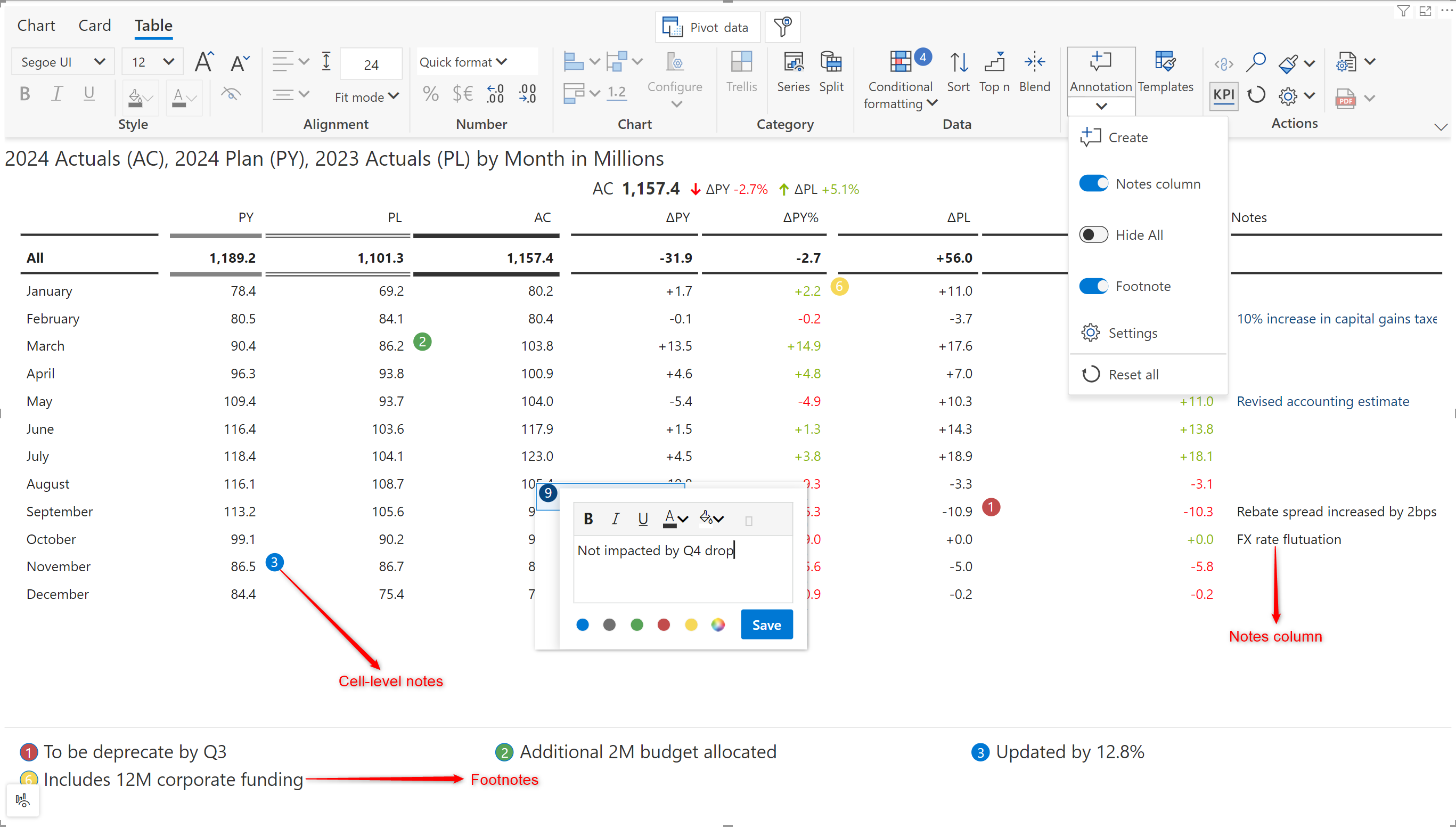
You can click on the settings icon to customize and format the notes indicators
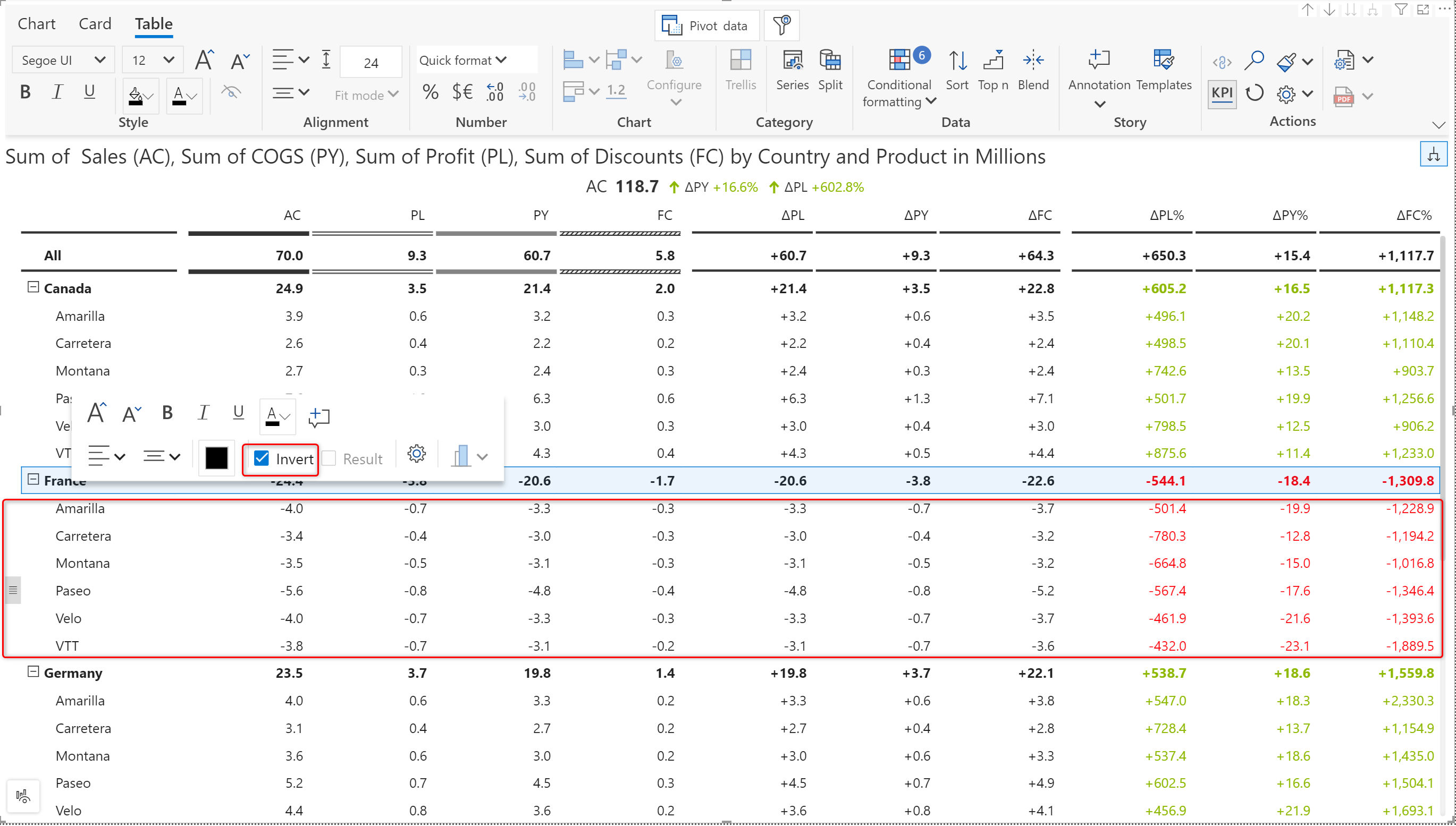
Financial reports can accurately reflect the financial position, performance, and cash flows of an organization by adjusting the sign of values appropriately. Most financial data is modeled and consumed in reports without proper signage. For example, both revenue and cost data are often treated as positive values. For such use cases, you can invert an entire row in a single click either by selecting the row and inverting it from the contextual floating toolbar or by clicking on the row gripper. When you invert a parent row, the invert operation will cascade to the child rows as well.
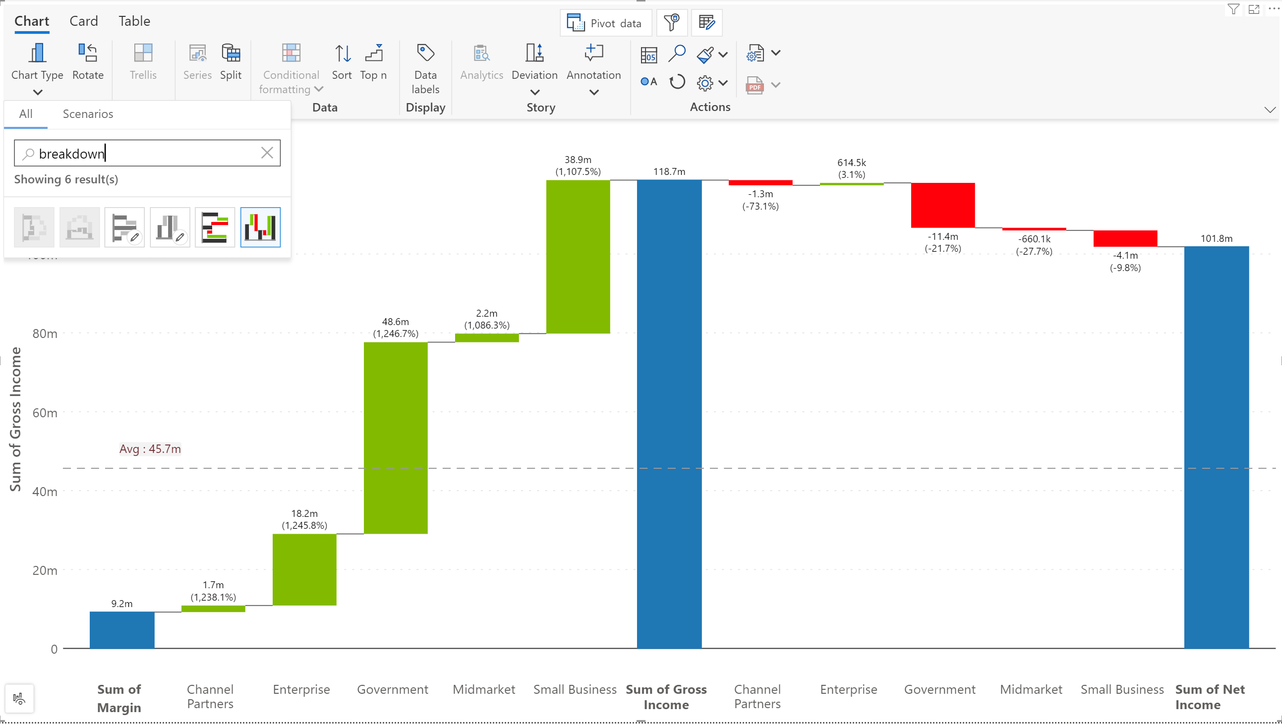
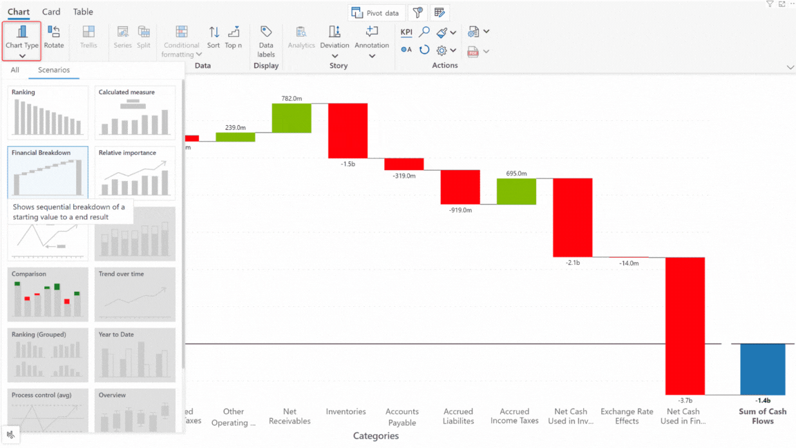
Analytics+ offers a whole bunch of waterfall charts for a variety of financial and business use cases. In the February release, we have added the measure-only breakdown waterfall – enabling you to analyze the change between measures breaking it down by each category.
We are constantly adding new charts to support diverse data visualization use cases for both advanced visualization types as well as storytelling. Many of the chart types are not typically available out of the box in other tools. Inforiver Analytics+ is a visualization platform by itself, and we are constantly trying to provide the best user experience for all kinds of users inside a single Power BI visual framework.
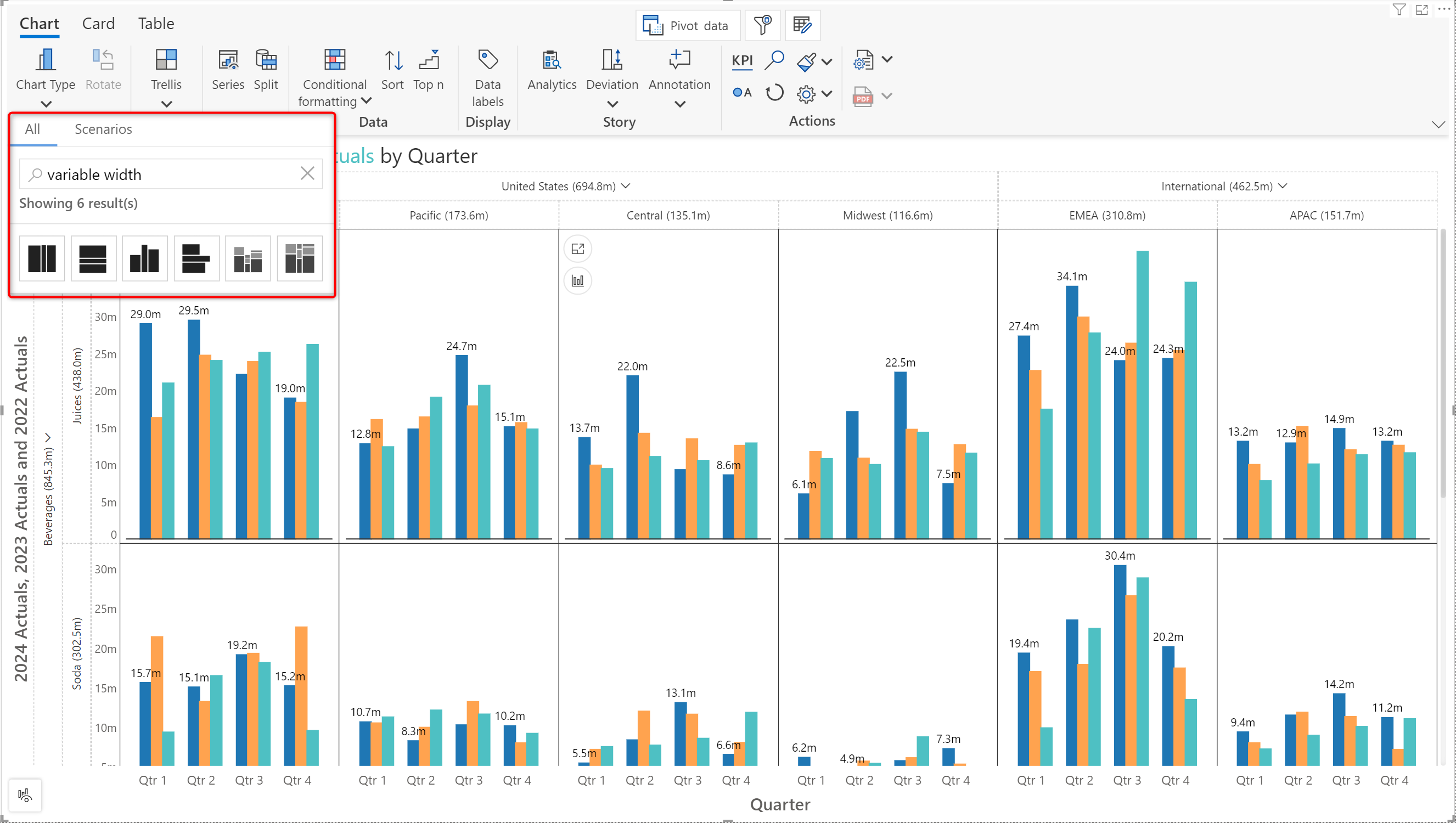
Some business users may find it difficult to find a specific type of chart from the large library of chart types. To make charts more discoverable, we’ve added a search capability. You can search for a chart based on the chart name or based on a tag.
When you already know what type of chart you are looking for, you can directly type in the name and search for that chart. For example, line, waterfall, boxplot, mekko, etc. and all the variations of that chart will be displayed. The naming conventions for chart types can vary across tools. For instance, the Marimekko chart may also be called a variable width in Tableau. Waterfall charts may also be called Cascade charts by Mekkographics or a few other BI tools. Analytics+ will still be able to locate the chart for you however you search it.
For those who do not know what type of chart to use, you can now perform a keyword or a tag-based search that will display the chart types that are best suited for your requirements. Searching for ‘finance’ will display charts related to financial use cases and entering ‘variance’ will display all charts that can illustrate variances. A few other examples of tag-based search are shown below.
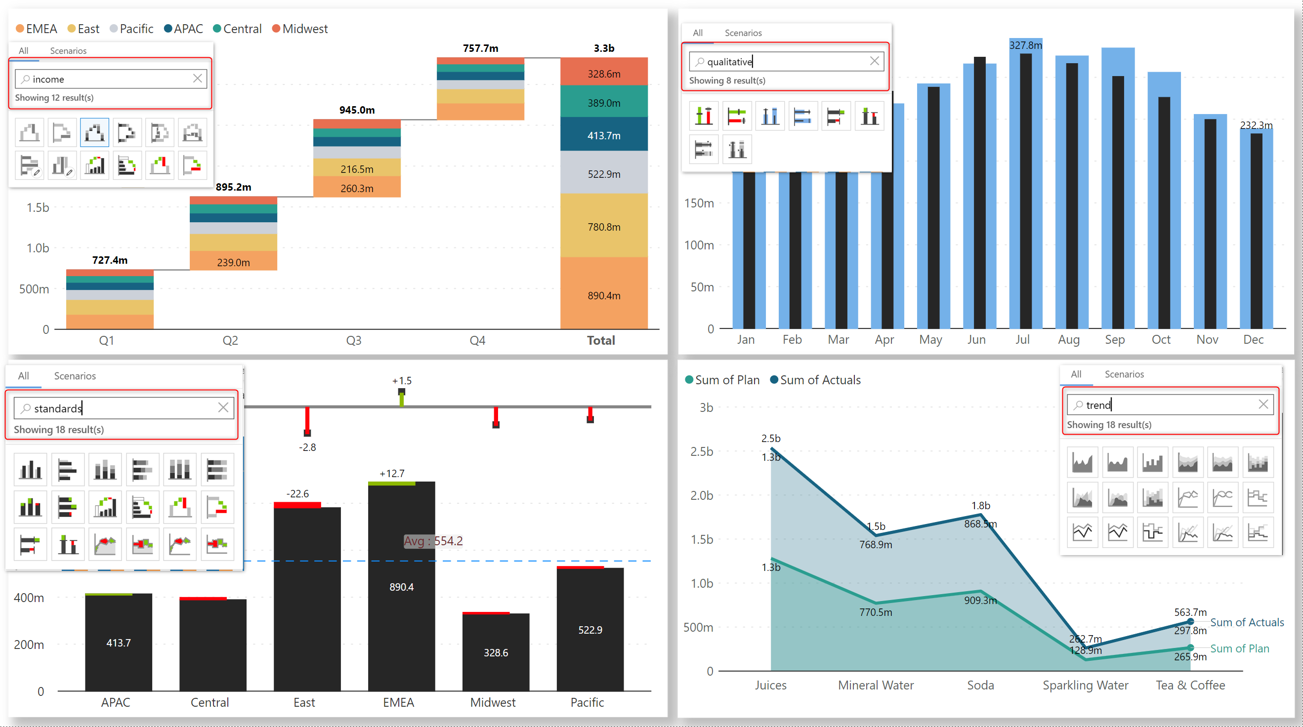
You can still use scenario-based chart selection from the Scenarios tab. Analytics+ can render the chart that is best suited to visualize your data based on your business use case – all you need to do is choose an option from the list of scenarios. For instance, if you need to analyze cash flows across different sectors, you can choose the ‘Financial Breakdown’ scenario, and it will assign your data to a relevant chart type.
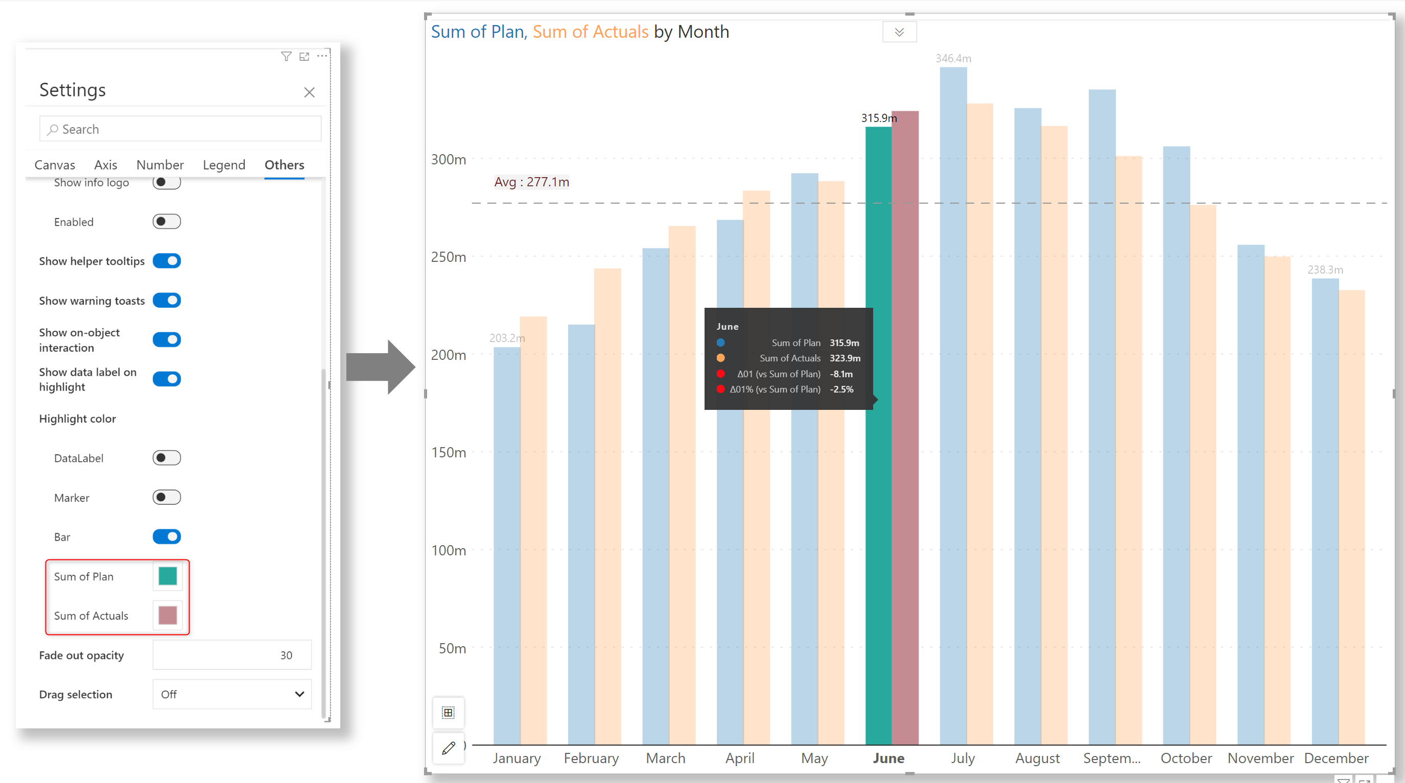
In the 3.1. release, we introduced data selection options like lasso, reverse lasso, and single-point selection. You can now set a custom color to highlight bars when a data point is selected.
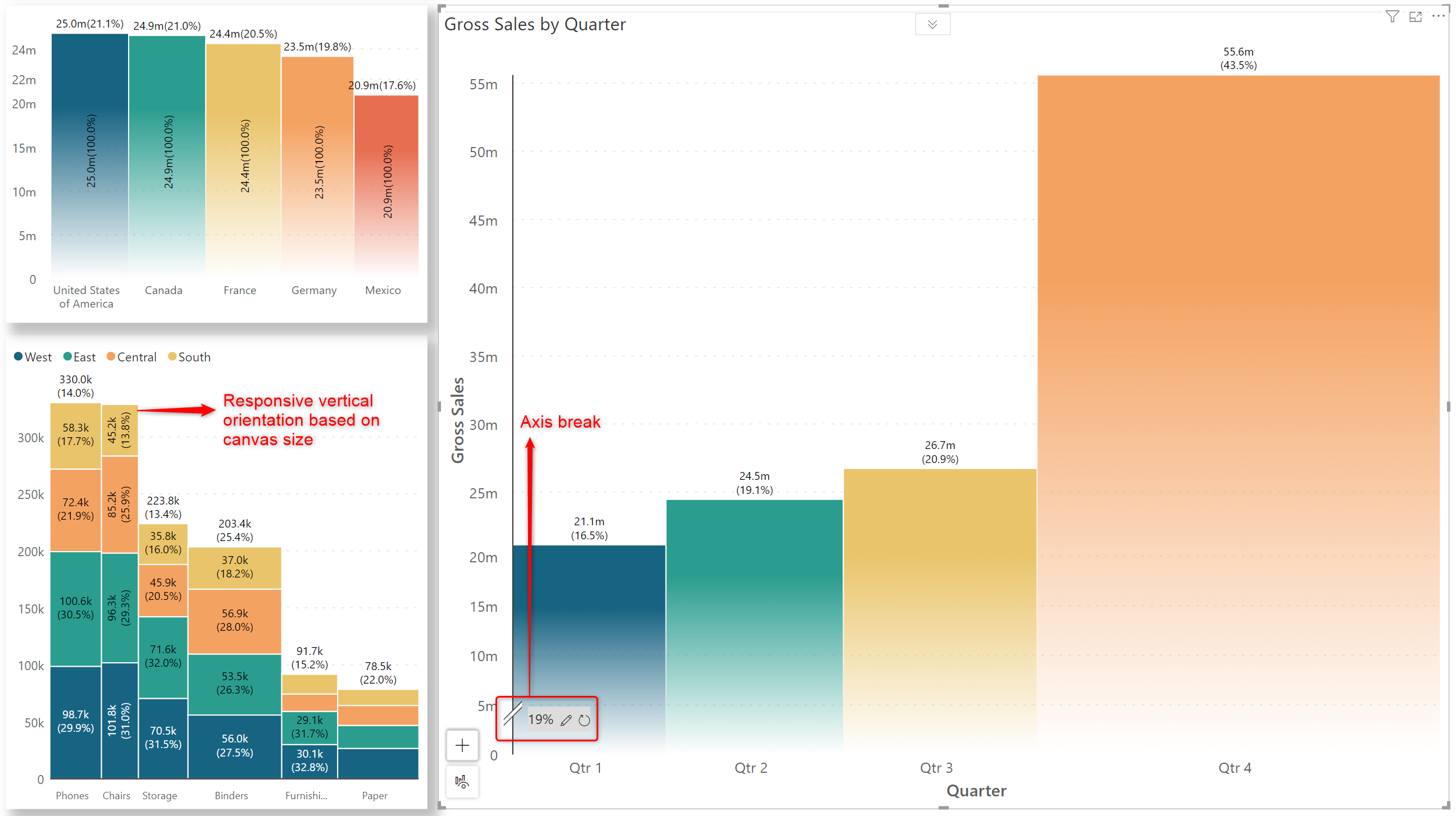
You can now add axis breaks for regular Marimekko charts. With this release, the orientation of the data labels will be changed automatically when the visual is resized, ensuring that the entire label is displayed. If you do not want the orientation to change, you can disable the Responsive orientation option in the Data Labels pane.
The manage measure window for pivot charts has been tailored for performance reports and reflects the Actuals, Target, and Additional target measures. End users can access and switch between actual and target measures during runtime or in the Power BI reading view. This is something that none of the other custom visuals offer.
We have launched a new, concise, single-column layout for cards. In this layout, the chart and metrics are displayed side-by-side. The wide spacing enhances readability and facilitates comparative analysis between metrics. You can position the KPI metrics to the left or right side of the chart.
In real-life business scenarios, not all hierarchies are balanced and symmetrical. Power BI has limited capabilities in handling unbalanced and asymmetric hierarchies. With Inforiver Analytics+, ragged hierarchy support is available out of the box and is enabled by default, so you never have to worry about the blank categories being displayed. You can suppress blank categories when you have unbalanced hierarchies, i.e., where the number of levels is uneven. Enable the ‘Ragged hierarchy’ toggle in Axis settings to hide blank rows. This option is available in all visual modes - chart, card, and table.
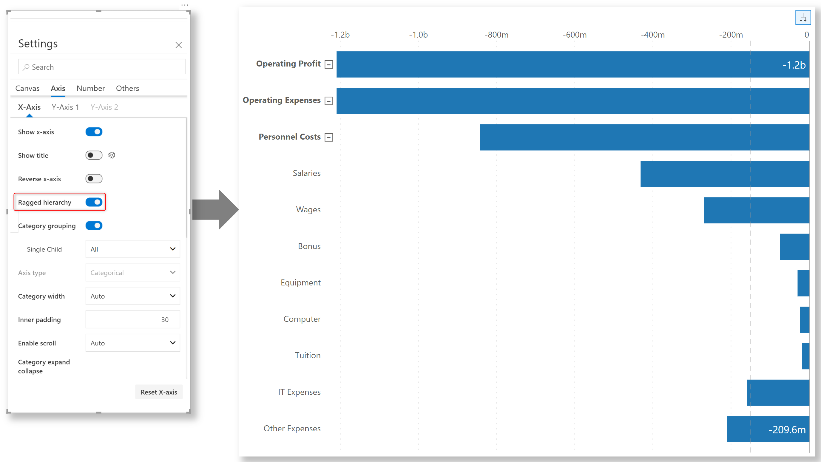
In some use cases, you might be asked to display Blank categories. Once the ragged hierarchy toggle is disabled, the blank categories come back on the visual.
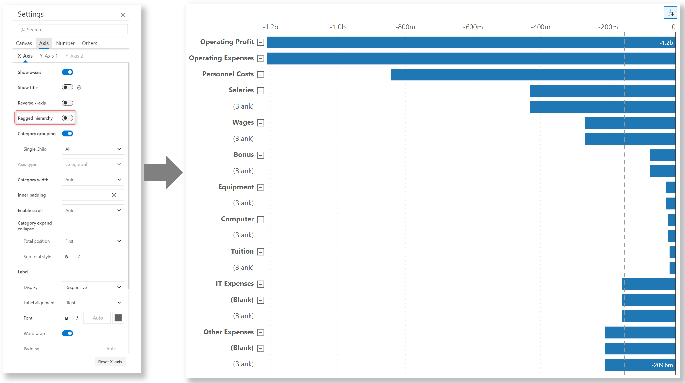
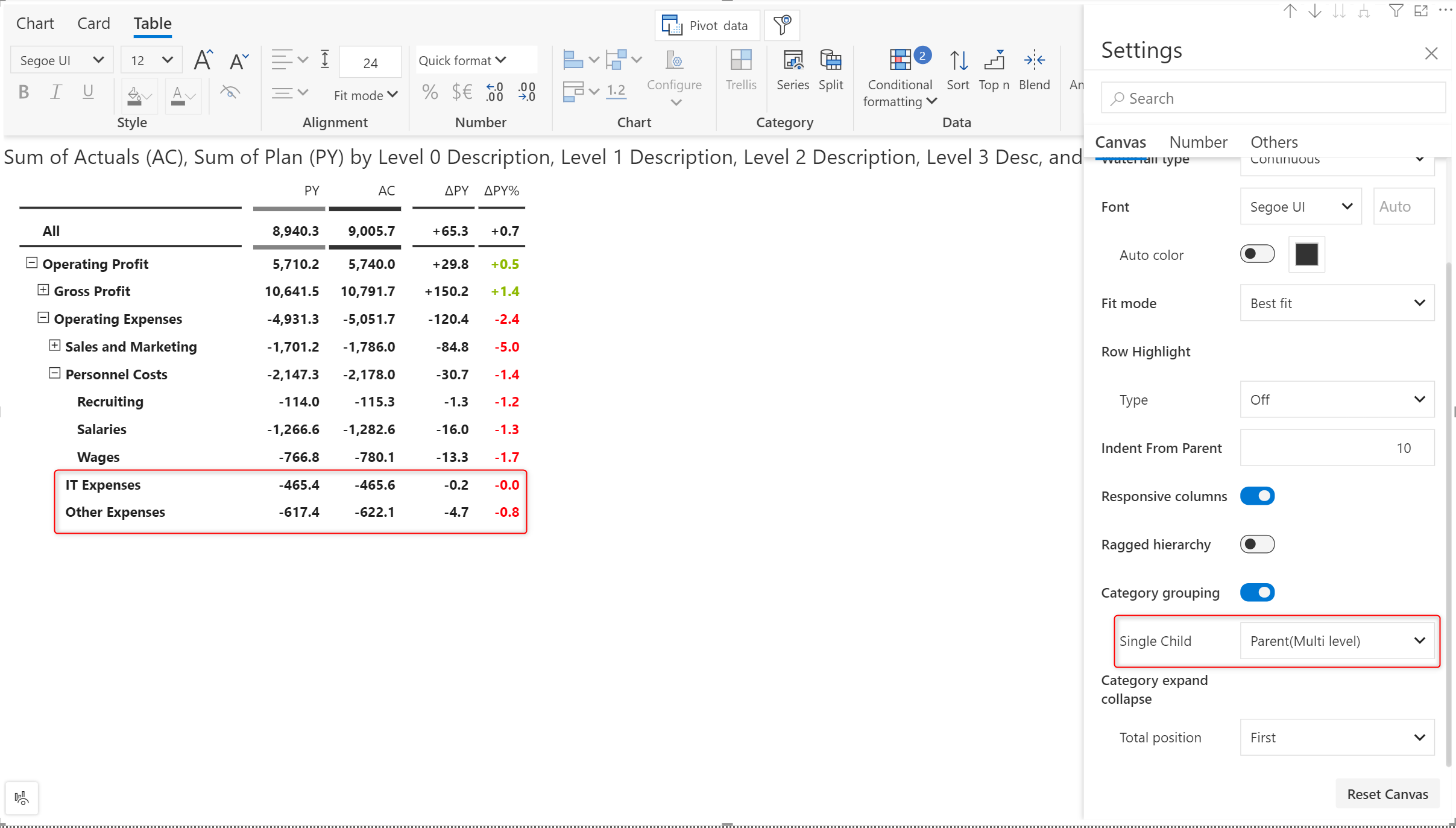
As an extension to the ragged hierarchy capabilities of Inforiver Analytics+, we have also introduced the Single child option to display single node hierarchies, i.e., when a parent hierarchy has only one child. For single-child hierarchies, you have options to hide leaf nodes, hide all nodes if they are single children, or hide the parent node and display the leaf node directly if it has just one child.
To demonstrate this, let’s look at an account hierarchy.
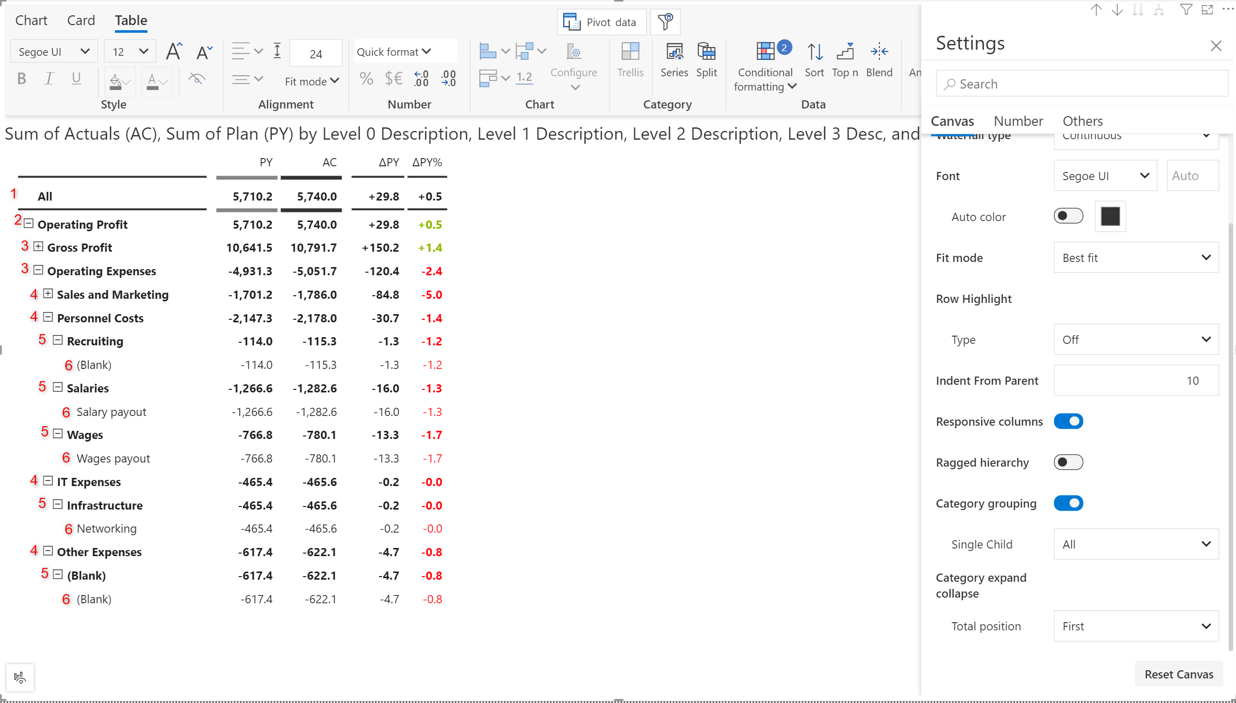
The single child nodes at level 5 and level 6 have been suppressed using the “Parent (Multi level)” option.
Single child options are available in charts that contain hierarchies as well.
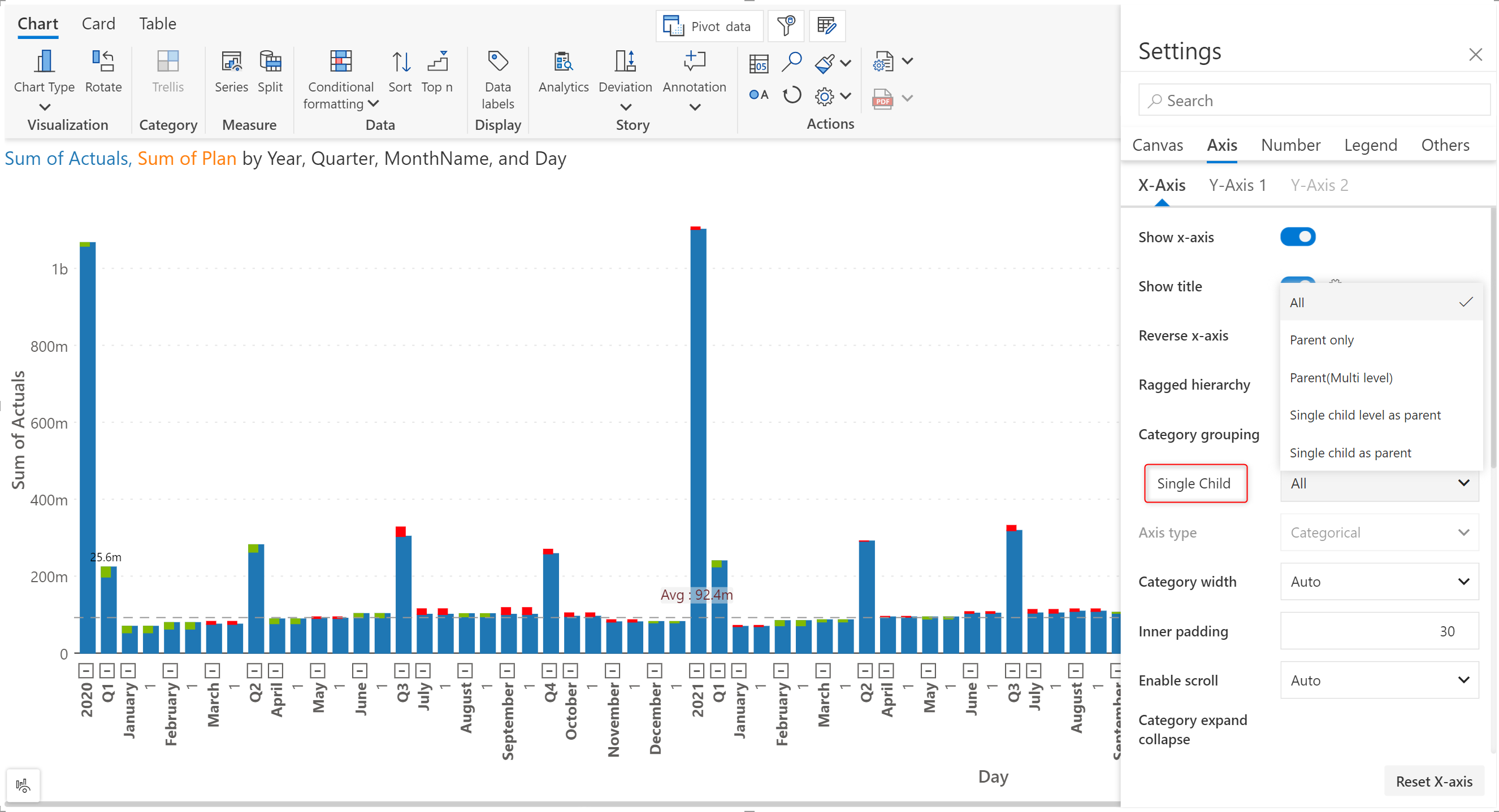
Notice how the day 1 leaf nodes are hidden when the 'Parent only' option is chosen.
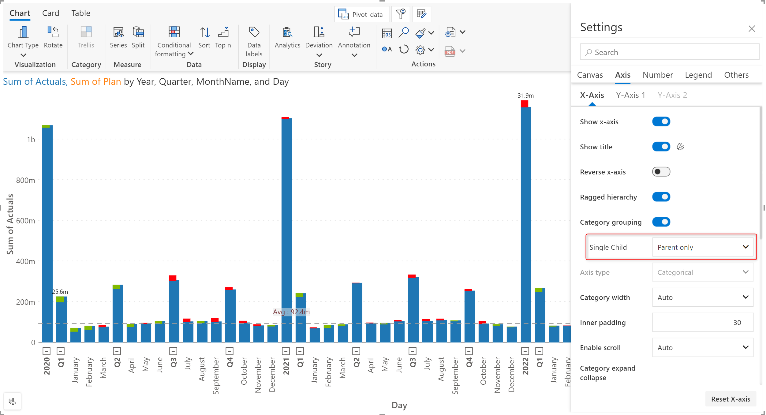
Please note that the single-child options are enabled only when the hierarchy is fully expanded.
The refinements that we continuously make to Analytics+ were made possible with your support and feedback. We look forward to receiving your suggestions and have many more exciting innovations lined up! Visit the Inforiver Community to share your ideas, vote on other submissions, and interact with other users.

Inforiver helps enterprises consolidate planning, reporting & analytics on a single platform (Power BI). The no-code, self-service award-winning platform has been recognized as the industry’s best and is adopted by many Fortune 100 firms.
Inforiver is a product of Lumel, the #1 Power BI AppSource Partner. The firm serves over 3,000 customers worldwide through its portfolio of products offered under the brands Inforiver, EDITable, ValQ, and xViz.