Upcoming webinar on 'Inforiver Charts : The fastest way to deliver stories in Power BI', Aug 29th , Monday, 10.30 AM CST. Register Now
Upcoming webinar on 'Inforiver Charts : The fastest way to deliver stories in Power BI', Aug 29th , Monday, 10.30 AM CST. Register Now
Histograms offer a powerful way to understand the distribution and frequency of your numerical data. While seemingly simple, they hold the key to uncovering patterns, identifying outliers, and gaining crucial insights that might be hidden in raw numbers. Before jumping to conclusions or applying complex statistical models, a histogram provides an essential first look into the nature of your data.
But what exactly is a histogram, why should you use one to explore your data, and how do you create a histogram in Power BI effectively, especially when you want to go beyond basic visualization within tools like Power BI? Let's delve deeper.
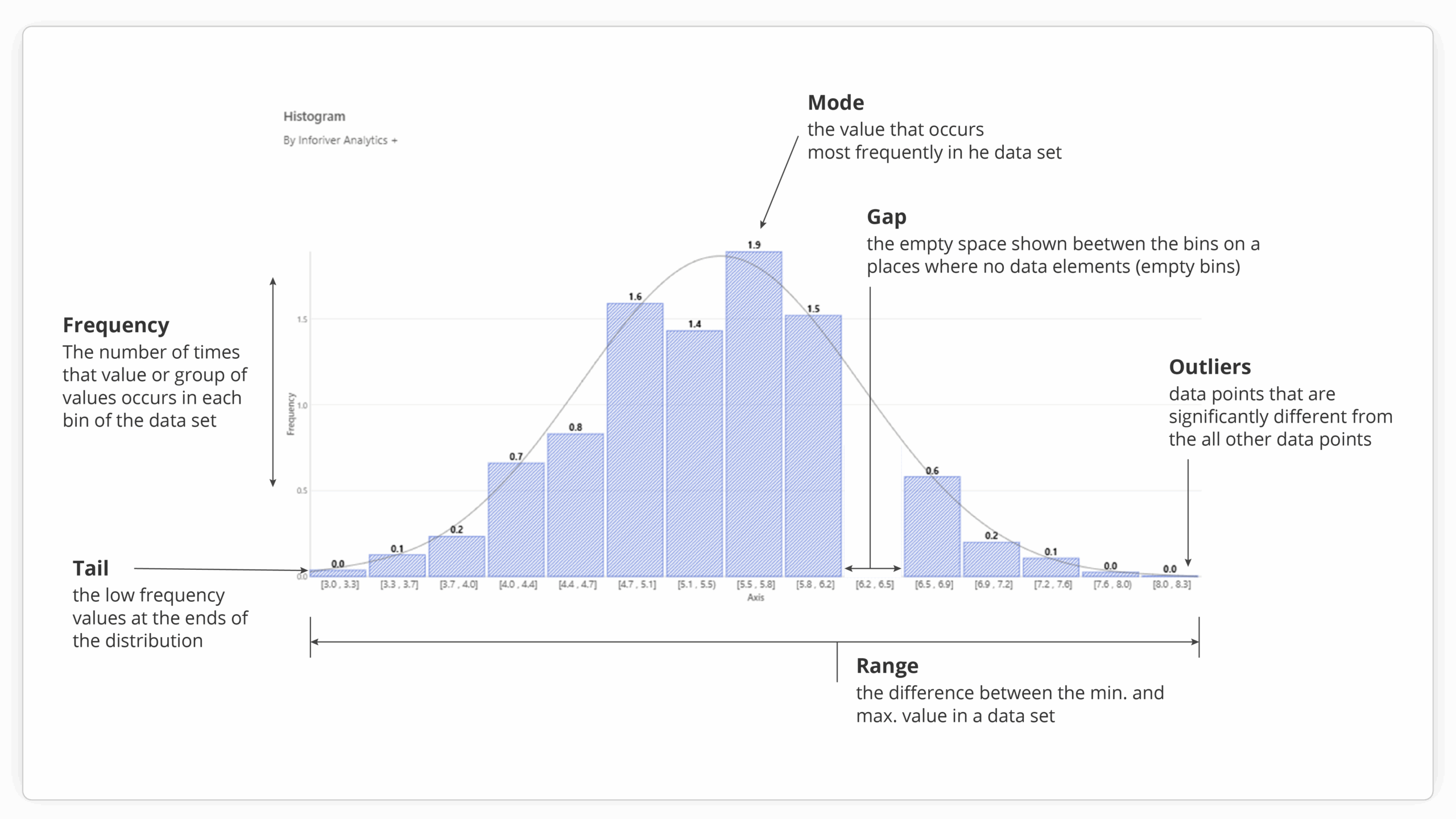
At its core, a histogram chart is a graphical representation of the distribution of a dataset's numerical values. It visually organizes a large number of data points into a more digestible format, showcasing where values are concentrated and how they spread across a range. While they might resemble bar charts, their purpose and construction are distinct. In a histogram, the horizontal axis represents continuous ranges of numerical data, known as "bins." The vertical axis, on the other hand, indicates the frequency – the count or proportion of data points that fall within each corresponding bin. The adjacent nature of the bars in a histogram emphasizes the continuous scale of the data, unlike the distinct, separated categories in a typical bar chart.
The fundamental process, whether done manually or with a computer tool, involves these steps:
While these steps outline the core concept, the ease, flexibility, and analytical depth of creating histograms are significantly influenced by the software you use to create them.
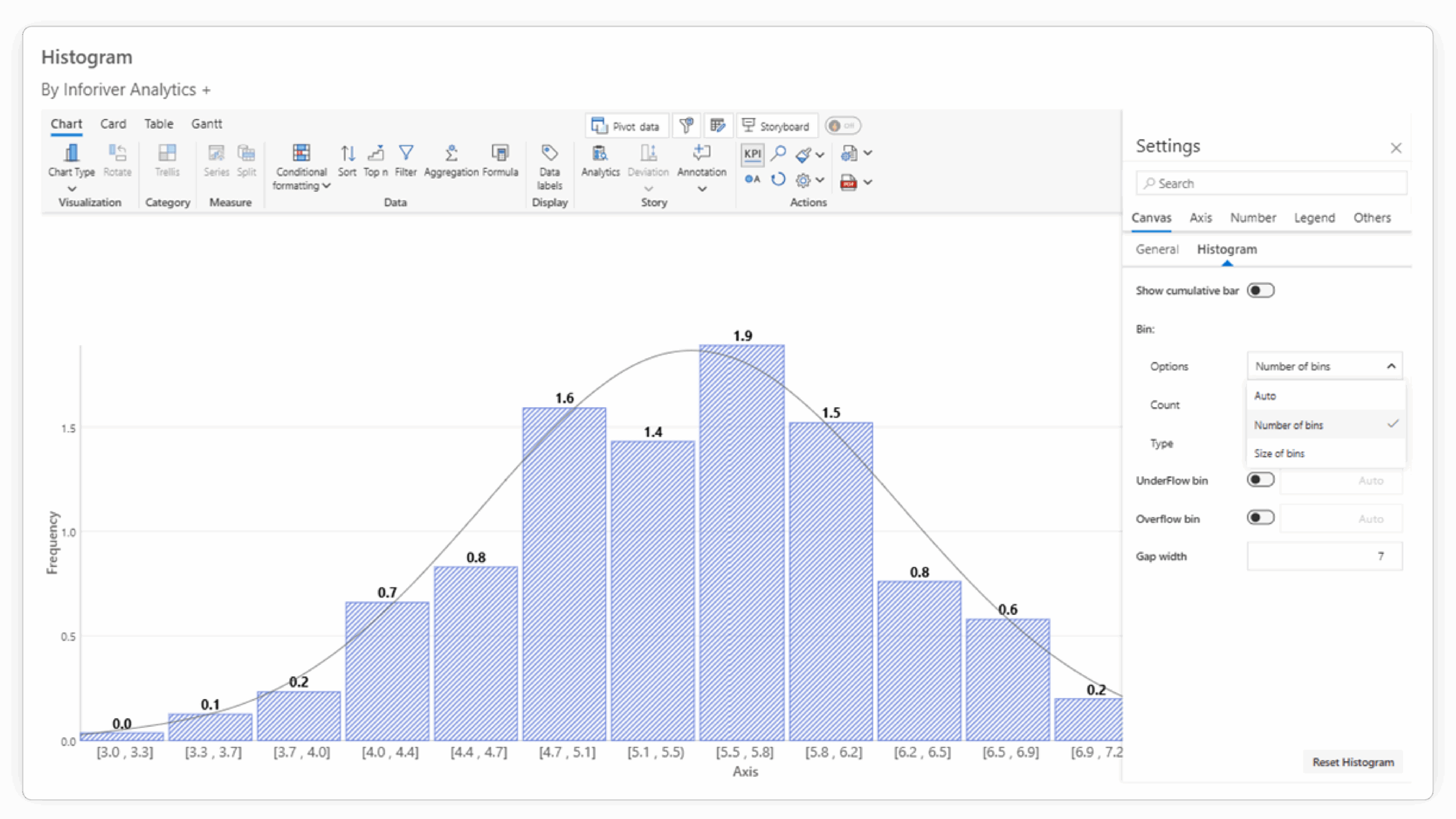
Power BI provides a built-in histogram chart, which serves as a basic tool for visualizing data distribution. However, for users who require more sophisticated analysis, greater customization, and enhanced storytelling capabilities directly within their Power BI reports, Inforiver Analytics+ offers a powerful and comprehensive alternative, essentially providing an advanced histogram for Power BI. As a certified Power BI visual, Inforiver Analytics+ extends the capabilities of Power BI significantly, and its histogram feature is a prime example of this enhanced functionality.
Inforiver Analytics+ transforms the standard histogram by offering a range of advanced features designed for deeper analytical exploration and more impactful data presentation:

(a)

(b)


While Power BI's default histogram provides a basic visualization of frequency distribution, Inforiver Analytics+ stands out with a suite of advanced features that cater to more complex analytical needs and enhance the clarity and impact of your reports. Here's a more detailed look at how they differ:
| Feature | Power BI Default Histogram | Inforiver Analytics+ Histogram | Why This Matters |
|---|---|---|---|
| Histogram Types | Primarily a simple frequency histogram. | Offers Simple, Cumulative, and Stacked histogram types. | Provides more analytical perspectives on your data's distribution and composition within the same visual. |
| Binning Control | Offers automatic binning and some basic manual control (e.g., number of bins). | Provides advanced and flexible options for axis binning and grouping, including custom ranges and specific intervals. | Allows precise control over how data is grouped, enabling more accurate representation and tailored analysis for different datasets and objectives. |
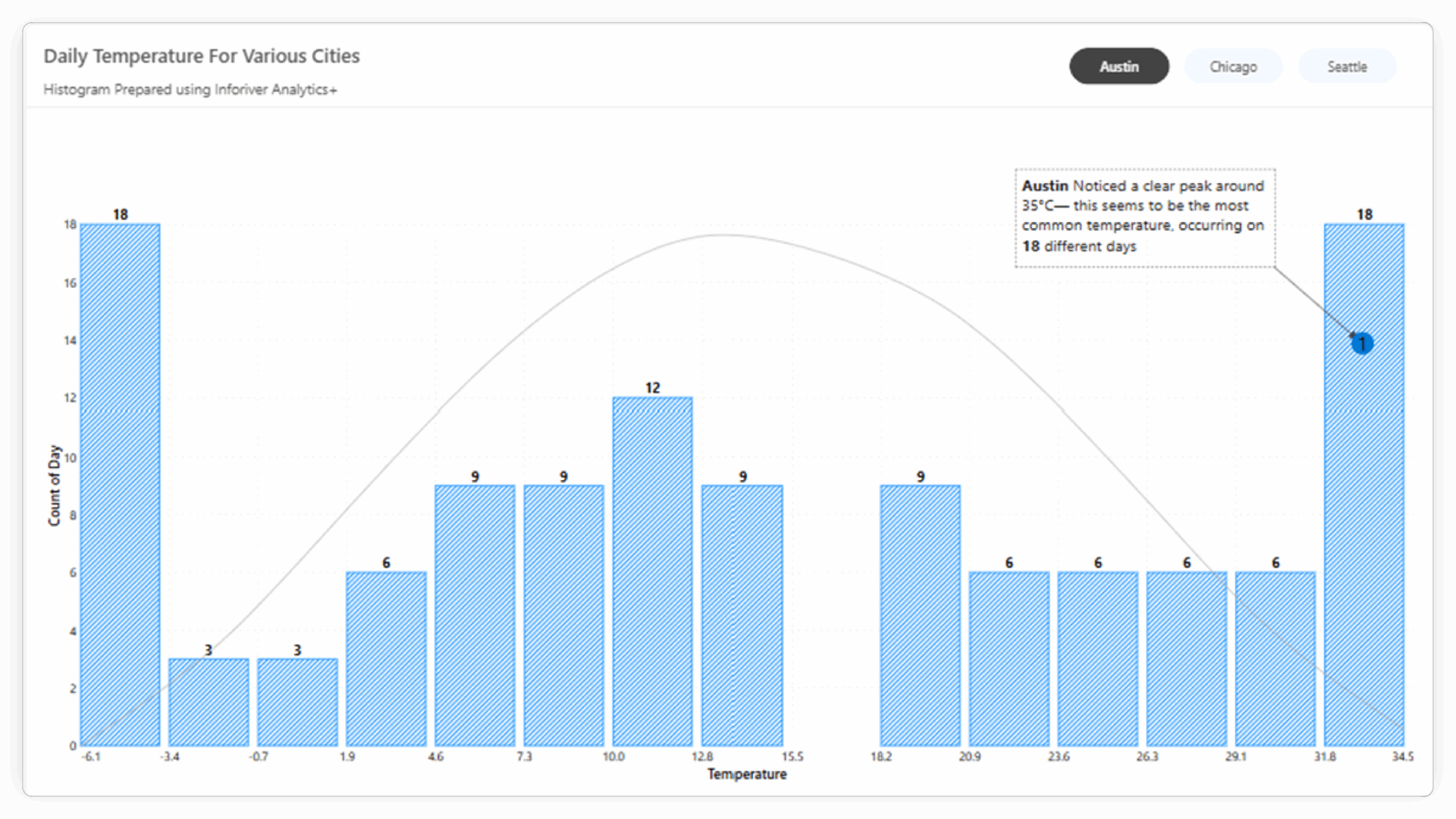
| Analytical Overlays | Limited or no built-in options for statistical overlays. | Allows direct overlay of Pareto lines and Normal Distribution Curves. | Facilitates immediate comparison with statistical benchmarks and quick identification of key segments or deviations from normality. |
| Small Multiples | Requires creating separate visual instances for comparisons across categories. | Built-in support for creating small multiples, enabling easy side-by-side comparison of distributions across different dimensions within a single visual. | Streamlines comparative analysis and makes it easy to spot differences in distribution across various segments of your data. |
| Annotations | Basic or limited native annotation capabilities. | Offers robust annotation features to add context, highlight key data points, and tell a clearer data story. | Improves the narrative of your data visualization, making it easier to communicate specific insights to your audience. |
| Performance with Data | Can experience performance limitations with larger datasets. | Engineered for better performance and can handle a significantly higher volume of data points. | Ensures a smoother, more responsive analytical experience, especially when working with extensive datasets. |
| Customization & Formatting | Offers standard Power BI formatting options. | Provides extensive formatting and customization options specifically designed for detailed chart control and IBCS standards compliance. | Allows for highly tailored visuals that meet specific reporting standards and enhance the aesthetic and readability of your histograms. |
The differences highlight that while the default Power BI histogram is suitable for basic visualization, Inforiver Analytics+ provides the depth and flexibility required for advanced data analysis and professional reporting directly within the Power BI environment. The ability to control binning precisely, overlay analytical curves, and utilize features like small multiples and annotations transforms the histogram from a simple frequency chart into a powerful analytical tool.
Histograms are a valuable tool for anyone working with numerical data. They provide crucial insights into the shape, spread, and frequency of your data, guiding your analytical journey. While Power BI offers a foundational histogram visual, Inforiver Analytics+ empowers you to go significantly further. By providing advanced histogram types, granular binning control, integrated analytical overlays, powerful storytelling features, and superior performance, Inforiver Analytics+ enables you to conduct more thorough analysis and communicate your findings with greater clarity and impact, all within the familiar Power BI environment.

Inforiver helps enterprises consolidate planning, reporting & analytics on a single platform (Power BI). The no-code, self-service award-winning platform has been recognized as the industry’s best and is adopted by many Fortune 100 firms.
Inforiver is a product of Lumel, the #1 Power BI AppSource Partner. The firm serves over 3,000 customers worldwide through its portfolio of products offered under the brands Inforiver, EDITable, ValQ, and xViz.