Inforiver

Upcoming webinar on 'Inforiver Charts : The fastest way to deliver stories in Power BI', Aug 29th , Monday, 10.30 AM CST.    Register Now

Table of content

Unlocking Advanced Insights with Stacked Clustered Charts in Inforiver Analytics+ 

by Amulya Aravind Kulkarni | Oct 28, 2025 |

Introduction 

In today’s data-centric world, visualization techniques that illuminate multi-dimensional relationships are essential for sound decision-making. The Stacked Clustered Chart stands out as an advanced solution that allows organizations to analyze complex datasets by combining comparison and composition in a single, streamlined view. This blog explores what makes stacked clustered charts exceptional and how leading industries leverage them in practice, and how Inforiver Analytics+ can help you create these visuals instantly with no coding required. 

What is a Stacked Clustered Chart? 

A Stacked clustered chart is a sophisticated data visualization that combines two powerful charting techniques, clustering and stacking to represent complex, multi-dimensional data in a clear, concise manner. This hybrid chart type enables analysts to compare groups of data side-by-side while also understanding the composition within each group. 

Breaking Down the Concept

  • Clustering: 
    Clustering organizes data into distinct groups or categories called clusters that are placed adjacent to each other along the primary axis (usually the horizontal axis). Each cluster represents a main category such as geographic region, business unit, or product category. By placing these clusters side-by-side, the chart allows direct visual comparison across different groups. For example, you could see sales performance in different regions (North, South, East, West) all at a glance, with each region being a cluster. 
  • Stacking: 
    Within each cluster, data is further divided into sub-categories or segments that are visually “stacked” one on top of another to form a single column or bar. Stacking reveals the contribution of each sub-category to the total value of the cluster. For instance, within the North region cluster, sales data could be broken down and stacked by quarters (Q1, Q2, Q3, Q4), showing how each quarter contributes to the yearly total for that region. 

How the Two Techniques Work Together? 

The magic of a stacked clustered chart lies in blending these two dimensions: clustering and stacking into one coherent visualization. This allows the chart to communicate multiple layers of information simultaneously: 

  • Multiple Groups Across the Primary Axis: You can compare several clusters (e.g., multiple regions, departments, or product categories) side-by-side. 
  • Component Breakdown Within Each Group: Each cluster contains stacked segments that break down the values into meaningful parts (e.g., time periods, product lines, customer segments). 

Why Is This Powerful? 

This dual-layered approach provides a comprehensive view that neither a simple clustered chart nor a stacked chart could achieve alone: 

  • Macro and Micro View at Once: You get to see broad differences among clusters (macro view) while also understanding detailed composition within each cluster (micro view). 
  • Rich Multi-Variate Analysis: This enables deeper insights when comparing multiple dimensions like categories, sub-categories, and values. 
  • Facilitates Comparisons Across and Within Groups: For example, it’s possible to compare the total sales across regions while simultaneously evaluating how individual product lines perform within those regions. 

By organizing complex data sets into clusters and stacks, a stacked clustered chart makes it easy for viewers to grasp intricate patterns, trends, and relationships that would otherwise require multiple separate charts or cumbersome tabular data. This makes it an indispensable tool for analysts aiming to communicate both comparisons between groups and breakdowns within those groups in a single, elegant visualization. 
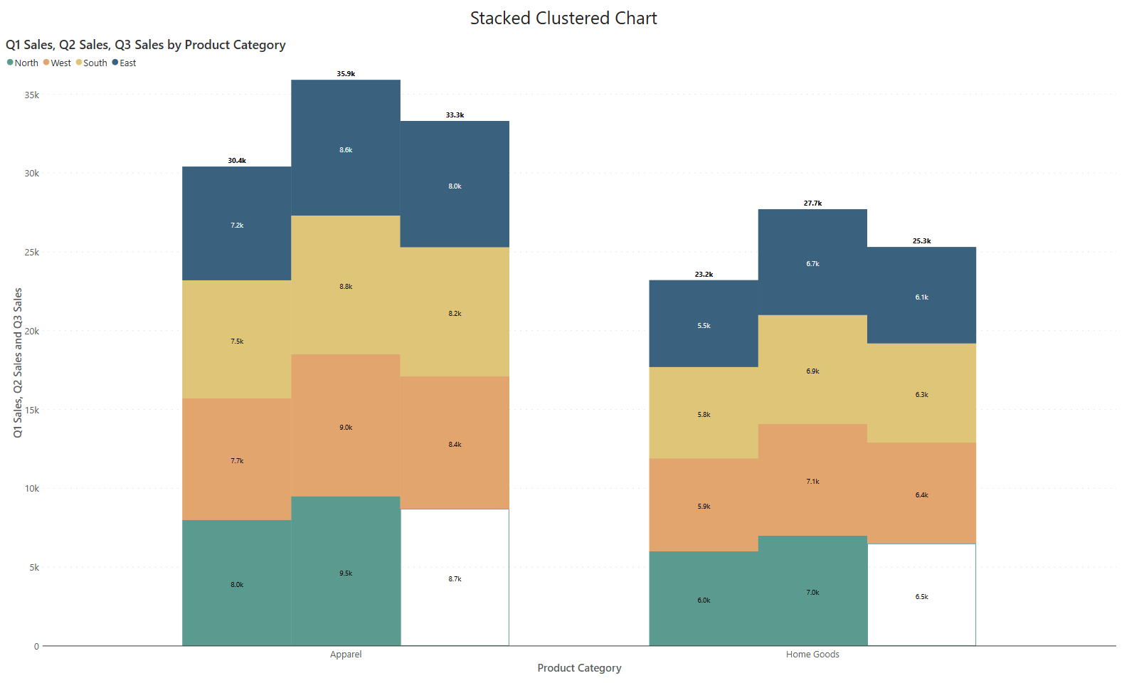
Stacked clustered chart in Power BI showing macro and micro comparisons across multiple categories and subcategories for detailed data analysis

Where Are Stacked Clustered Charts Used? 

Stacked clustered charts address real and complex business challenges. Here’s how various industries have adopted them: 

Key Use Cases 

  • Retail: Analyze sales of multiple categories across regions, tracking monthly contributions to annual totals. 
  • Manufacturing: Compare production volumes and categorize defects across several lines and time frames. 
  • Healthcare: Examine patient statistics segmented by hospital, department, and treatment period. 
  • Financial Services: Dissect portfolio performance by asset class, category, and reporting period. 
  • IT & Telecom: Monitor network activity, segmenting usage by device type and period within each customer cluster. 
  • Education: Track institutional performance across schools, class types, and academic terms. 

Why Choose Stacked Clustered Charts? 

Pros 

  • Simultaneous Comparison & Breakdown: Easily compare primary groupings while also assessing the composition within each. 
  • Space Efficiency: Consolidates extensive details in one chart, reducing dashboard complexity. 
  • Dynamic Insights: Uncover drivers behind aggregate trends and enable fast diagnostic analysis. 
  • Actionable Storytelling: Translates complex relationships into comprehensible visuals for stakeholders. 

Cons 

  • Overcrowding Risks: Too many clusters or stacks can diminish clarity; careful design and color selection are critical. 
  • Label Management: Densely packed data may require advanced label formatting for readability. 
  • Interpretive Complexity: Novice users may need orientation or guidance to fully unlock chart insights. 

Real-World Scenario 

Retail Growth Analysis 

A nationwide retailer wants a holistic yet granular view of performance. They cluster each product, show bars for product categories, and stack each bar by sales quarter. This reveals both which quarter and product categories are leading and when. 
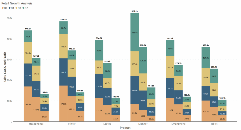
Stacked clustered chart in Power BI showing retail product category performance across sales quarters for regional growth analysis

Healthcare Resource Monitoring 

Hospital administrators need to uncover seasonal trends and highlights resource allocation gaps. A cluster stacked chart comes in handy in such scenarios. It visually compares medicine usage (antibiotics, painkillers, and vaccines) across hospital departments (Pediatrics, Surgery, Emergency) for each month. Each month displays clustered bars for departments, with stacked segments showing medicine usage, helping identify seasonal trends and resource allocation gaps. 
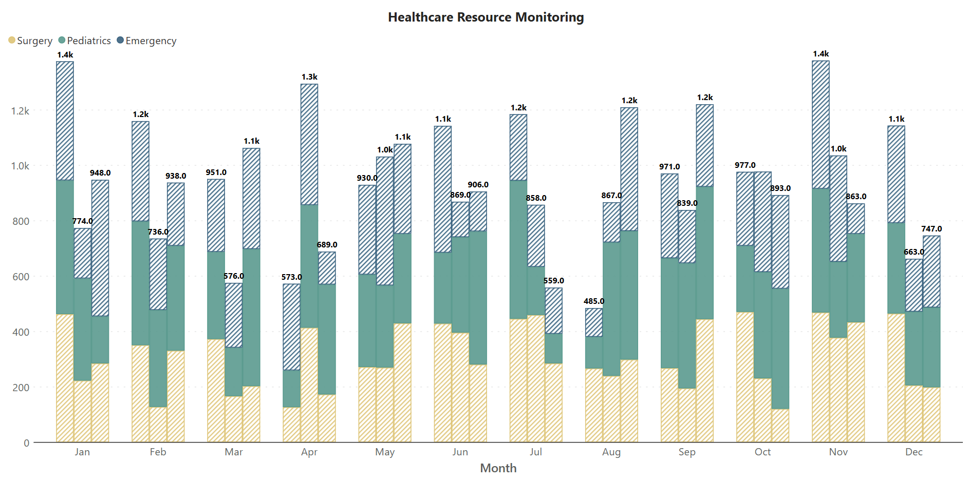
Stacked clustered chart in Power BI showing monthly medicine usage across hospital departments to identify seasonal trends and resource allocation gaps.

Manufacturing Defect Evaluation 

Factories cluster by line, columns represent defect types, stacked segments reveal frequency by root cause. This enables targeted interventions for quality improvement. 

Stacked clustered chart in Power BI showing defect frequency by root cause across different production lines for quality improvement analysis

Stacked Clustered vs. Clustered and Stacked Charts 

Chart TypeFeaturesBest For
ClusteredSide-by-side category comparisonComparing groups
StackedSub-category totals, breakdown viewShowing composition
Stacked ClusteredBoth comparison & breakdownMulti-dimensional analysis

Why Stacked Clustered Chart in Inforiver Analytics+ are Unique? 

  • Exclusive Chart Options: Stacked clustered charts available for rapid creation.
  • No-Code Experience: Everyone—from analysts to executives—can build sophisticated visuals. 
  • Flexible & Intuitive: Drag-and-drop mapping, rich customization, real interaction. 
  • Instant Results: Go from raw data to actionable insights in moments. 

Ready to transform how you visualize and interpret complex data? Try Inforiver Analytics+ today and experience seamless, no-code chart building with features you won’t find anywhere else—including the stacked clustered chart. Empower every stakeholder with clear, comprehensive, and actionable insights. 

“With Inforiver Analytics+, unlock layers of meaning in your data without ever writing a single line of code.” 

Start your journey to advanced, intuitive data storytelling. Inforiver Analytics+ makes it possible—for everyone. 


Share this on:

Other Blogs

Get Inforiver brochure

Maximize your business potential with Inforiver's paginated reporting, data entry, planning & budgeting capabilities
Download now
Inforiver

Inforiver helps enterprises consolidate planning, reporting & analytics on a single platform (Power BI). The no-code, self-service award-winning platform has been recognized as the industry’s best and is adopted by many Fortune 100 firms.

Inforiver is a product of Lumel, the #1 Power BI AppSource Partner. The firm serves over 3,000 customers worldwide through its portfolio of products offered under the brands Inforiver, EDITable, ValQ, and xViz.
linkedin facebook pinterest youtube rss twitter instagram facebook-blank rss-blank linkedin-blank pinterest youtube twitter instagram