Upcoming webinar on 'Inforiver Charts : The fastest way to deliver stories in Power BI', Aug 29th , Monday, 10.30 AM CST. Register Now
Upcoming webinar on 'Inforiver Charts : The fastest way to deliver stories in Power BI', Aug 29th , Monday, 10.30 AM CST. Register Now
Every Tableau-to-Power BI migration eventually comes across a Gantt chart. It looks simple on the surface, but not every Gantt chart is actually simple.
In practice, a Gantt is often a combination of requirements layered together over time. One report may focus heavily on milestones, another on task dependencies. Some rely on status indicators, baseline comparisons, progress tracking, or reference lines.
That's why Gantt migrations are not really about recreating the visual. They're about understanding the functionality behind it. So instead of asking "can I build a Gantt chart in Power BI?" (you can, natively), the better question is:
Can you recreate the same business experience in Power BI?
That was the focus of our recent webinar, Tableau to Power BI: Recreating Gantt Charts Without Compromise, led by Kavita Behera, Senior Product Manager at Lumel. This post walks through the same ground: what a Gantt chart needs to do, where Power BI's native visual falls short, and how Inforiver Analytics+ closes the gap, field by field.
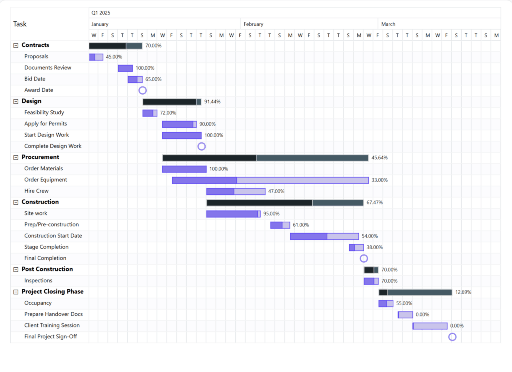
Start, end, duration, hierarchy, progress - all on one timeline
One fact from the session is worth repeating: the Gantt chart is named after the wrong person.
Henry Gantt published his version in 1910, in English, and the name stuck. But 14 years earlier, in 1896, Polish engineer Karol Adamiecki had already built the same bar-and-timeline concept, calling it a harmonogram. His work simply stayed in Polish and Russian, and by the time it reached a wider audience, "Gantt chart" had already won.
The chart itself is old and well understood. What's changed is the tooling, and that's where migrations get complicated.
Ask ten people what a "Gantt chart" needs and you'll get ten different answers, because a Gantt isn't one requirement. It's a family of related charts, each answering a different question:
| Type | Question it answers | Required fields |
| Standard Gantt | When is a task happening? | Task name, start date, duration or end date |
| Resource Gantt | Who or what resource is responsible? | Task name, grouped by, start date, duration or end date |
| Milestone Gantt | What important events happen during this project? | Milestone date, milestone label |
| Dependency Gantt | What depends on what? | Task name, start/end date, connect to, connector type |
| Baseline Gantt | Are we still tracking against the original plan? | Planned start/end date, actual start/end date |
| Sprint Gantt | How does work repeat across cycles? | Sprint ID, task name, start/end date |
| Critical Path Gantt | Where could delays hit hardest? | Task name, start/end date, is critical |
| Progress Gantt | Where are we today versus the plan? | Task name, progress, start/end date |
This is the part that trips up most migrations. When a stakeholder says "we need to move our Gantt to Power BI," they rarely mean the standard version alone. There's usually a milestone marker layered on top, or a status color tied to a dependency chain, or a baseline comparison nobody mentioned until the new report was already in review.
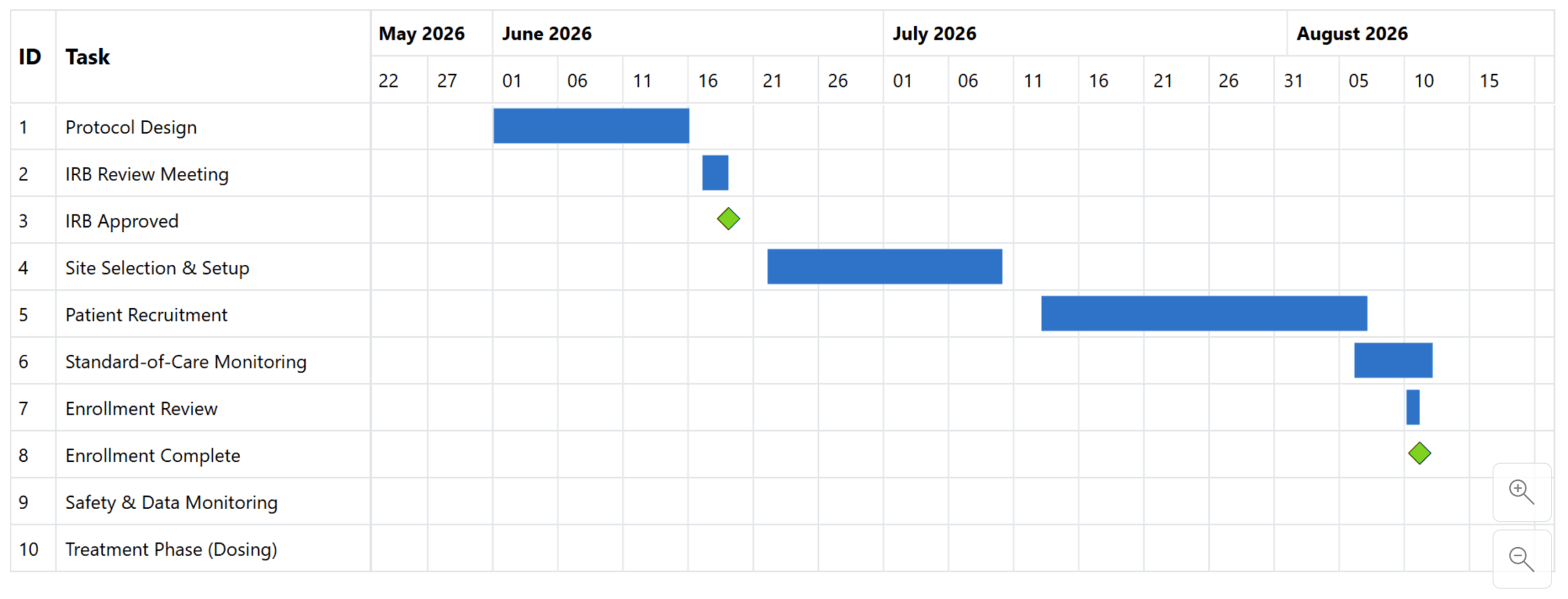
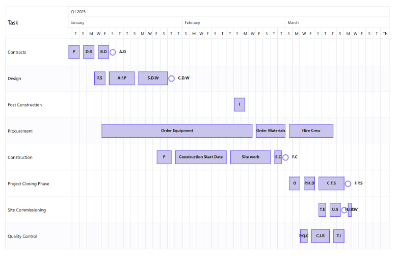
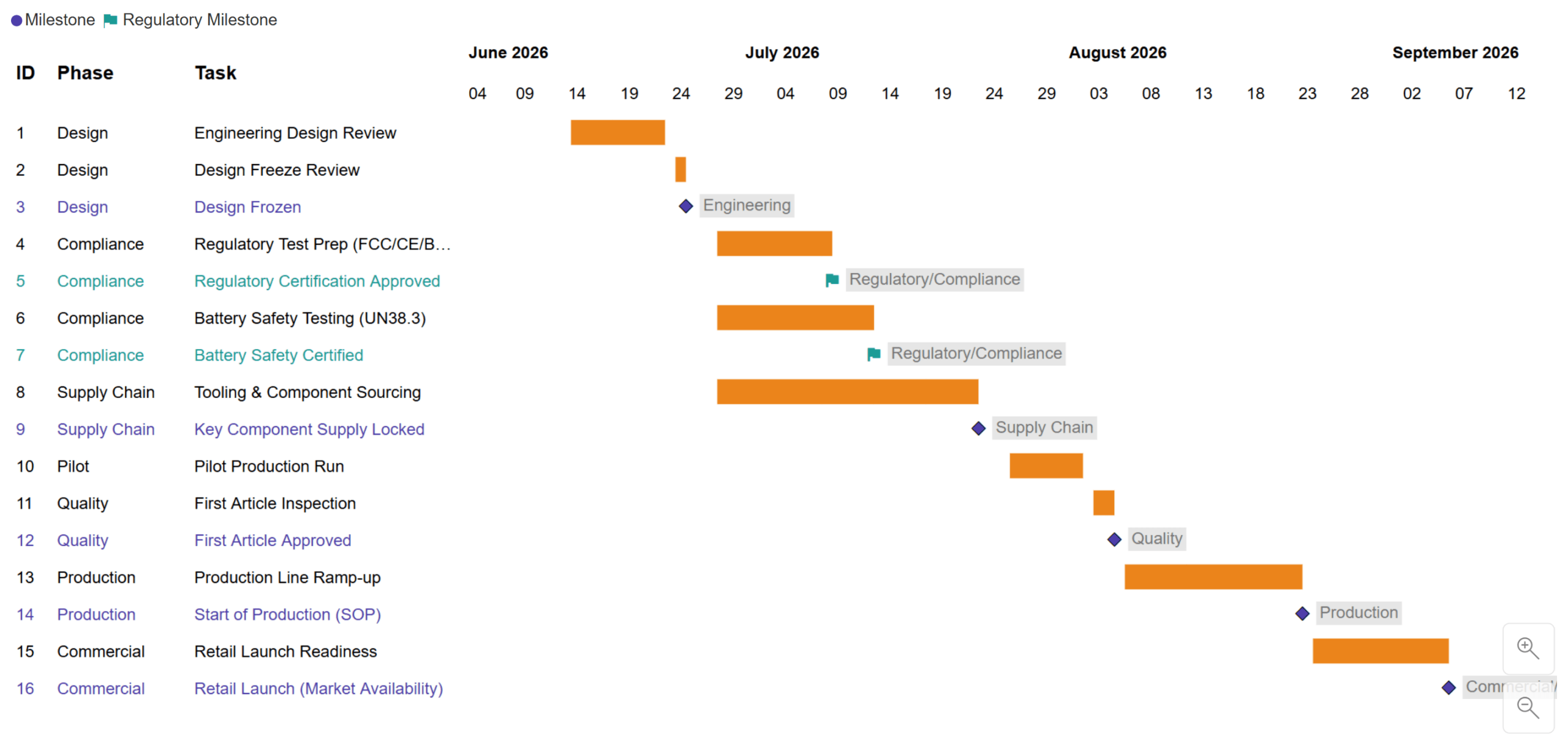
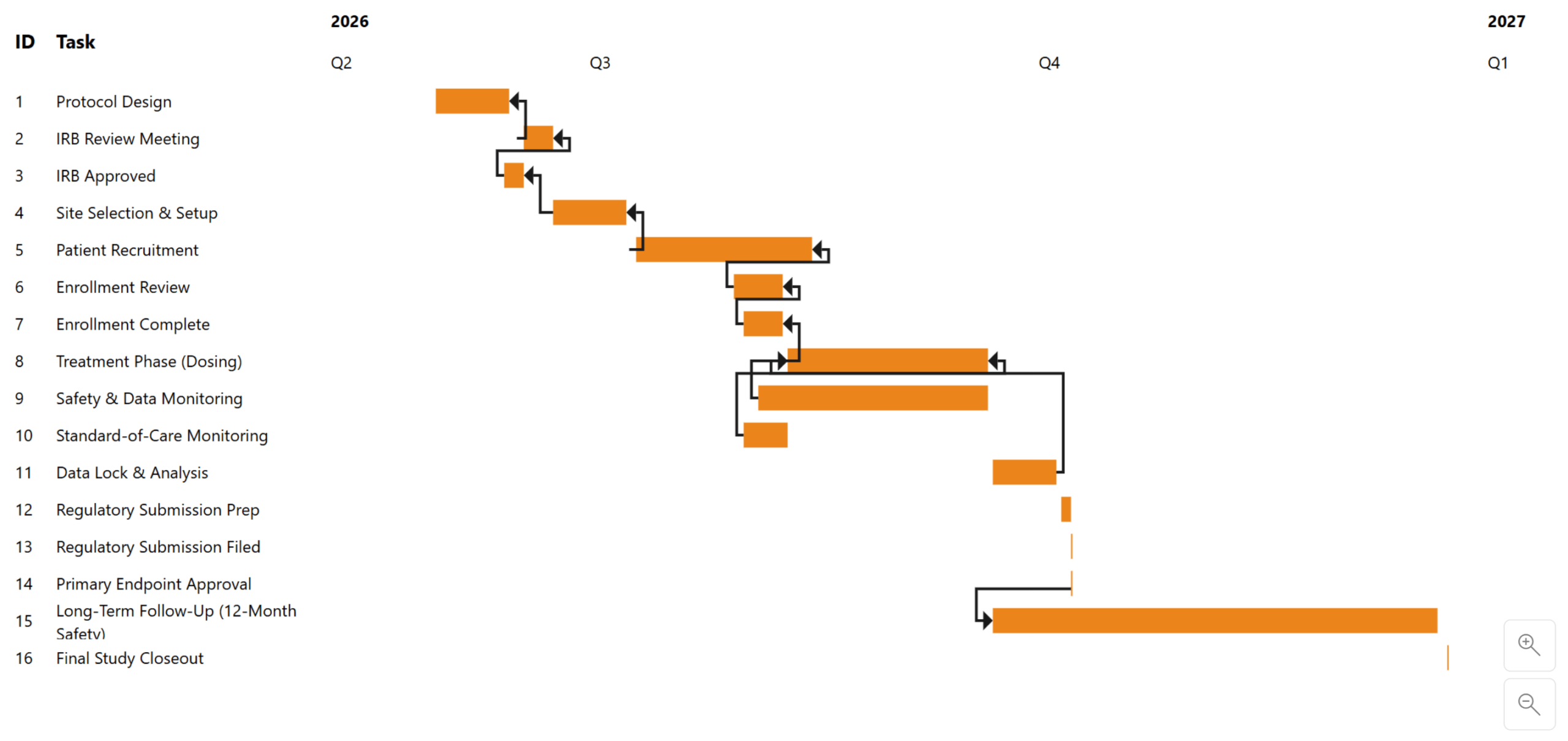
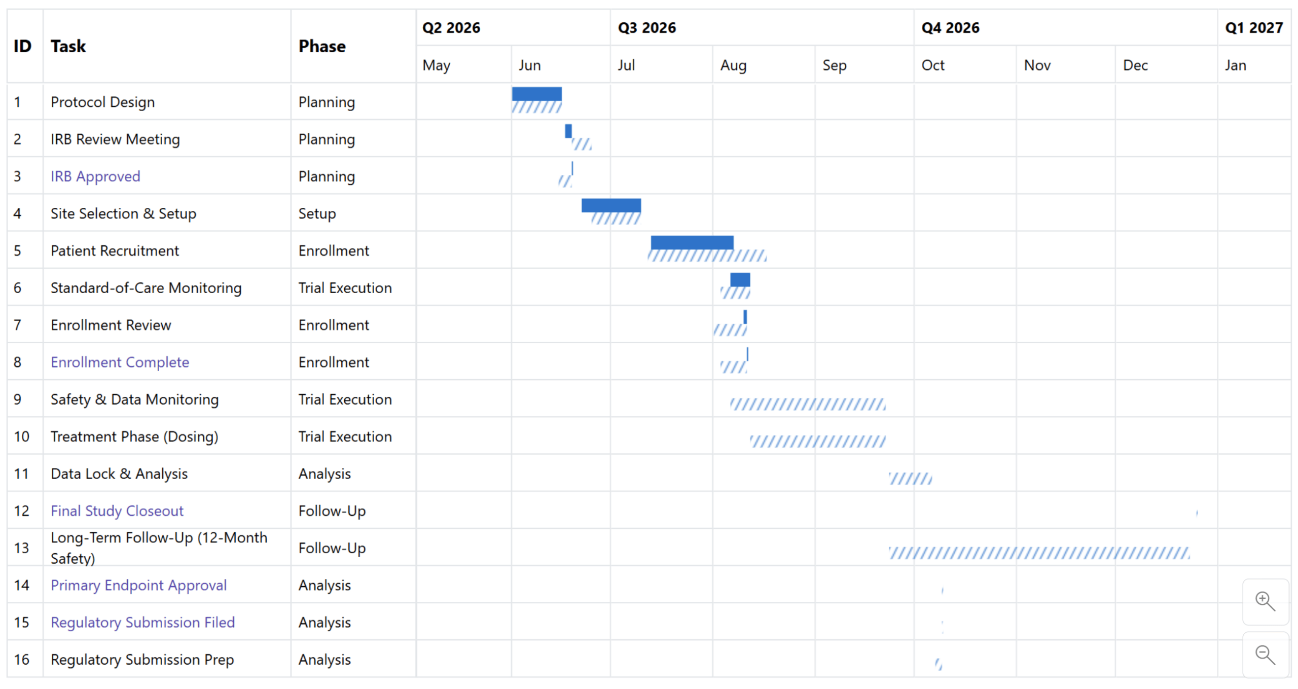
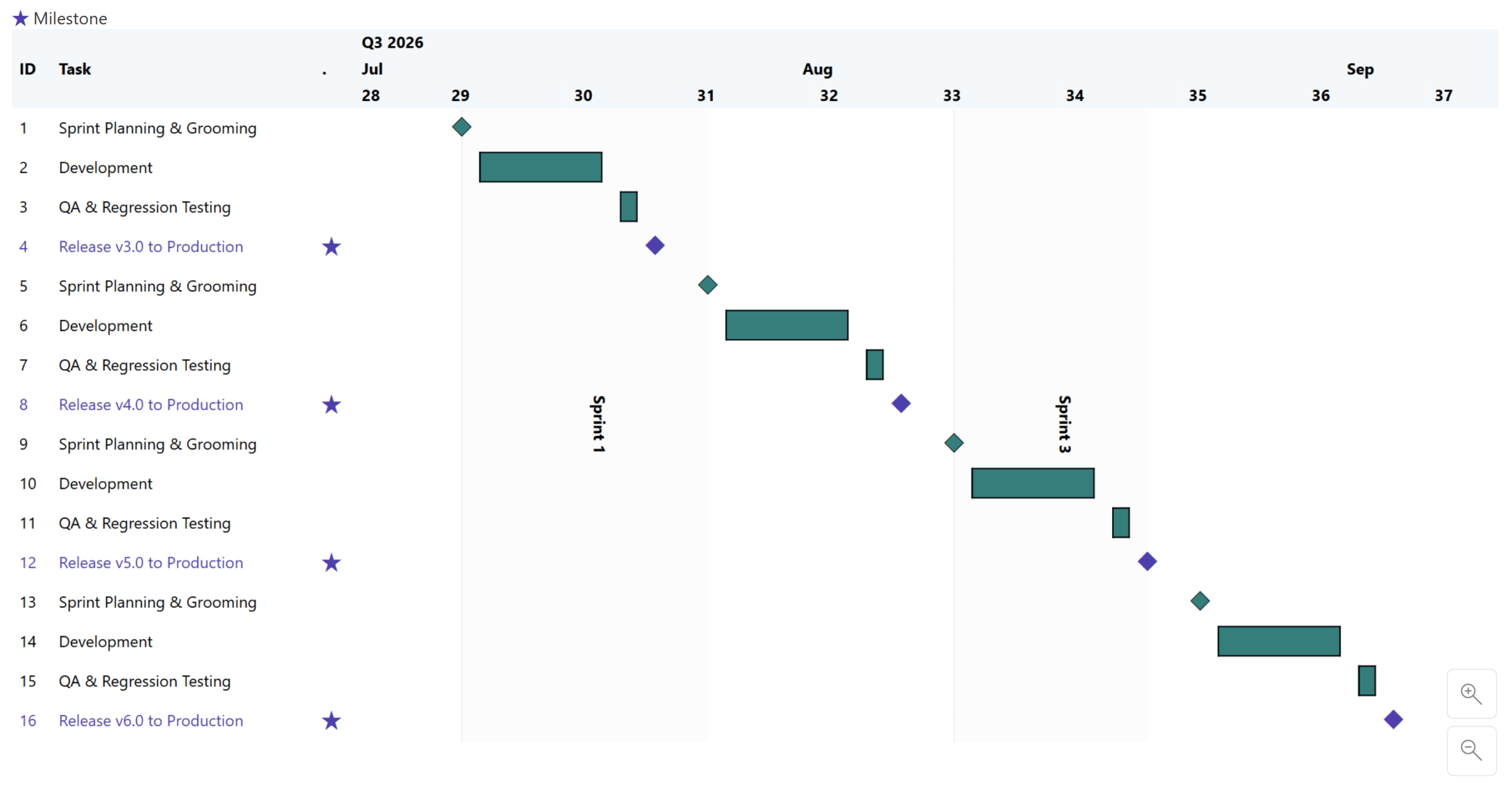
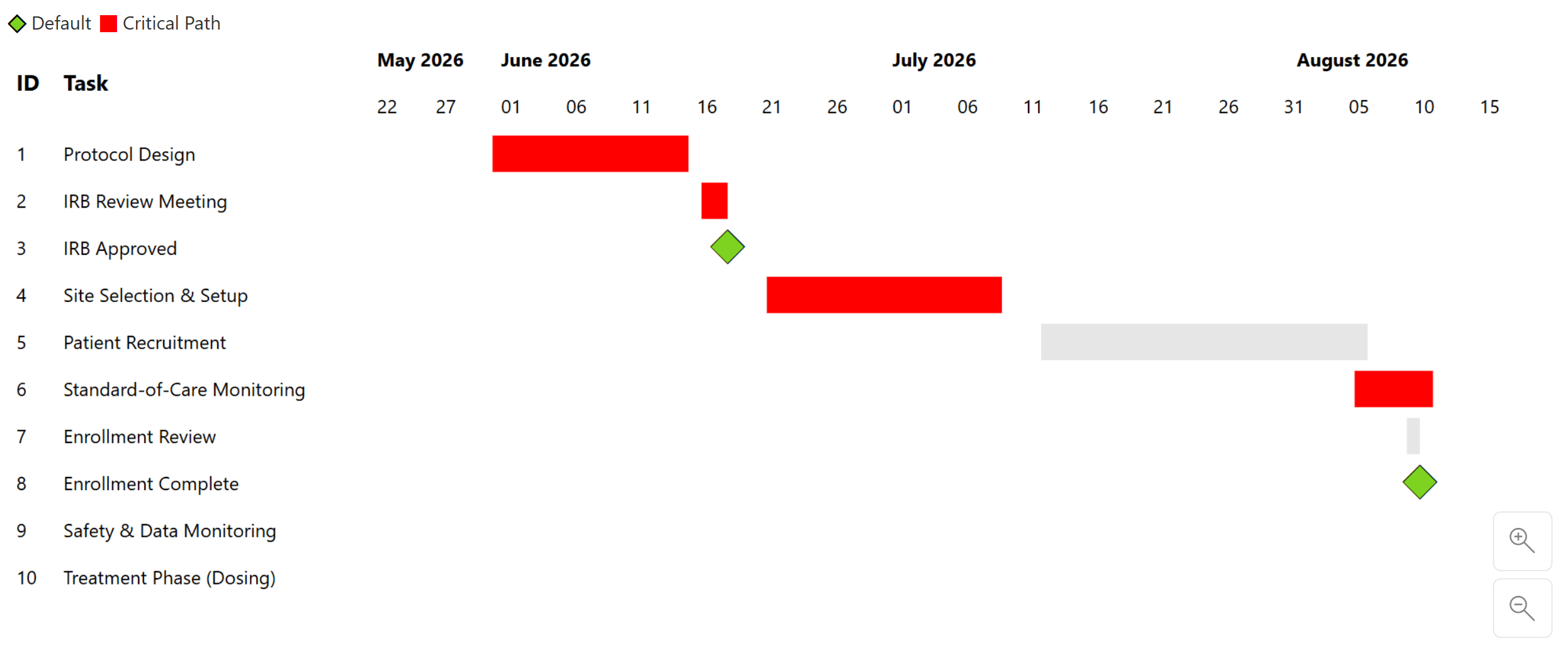
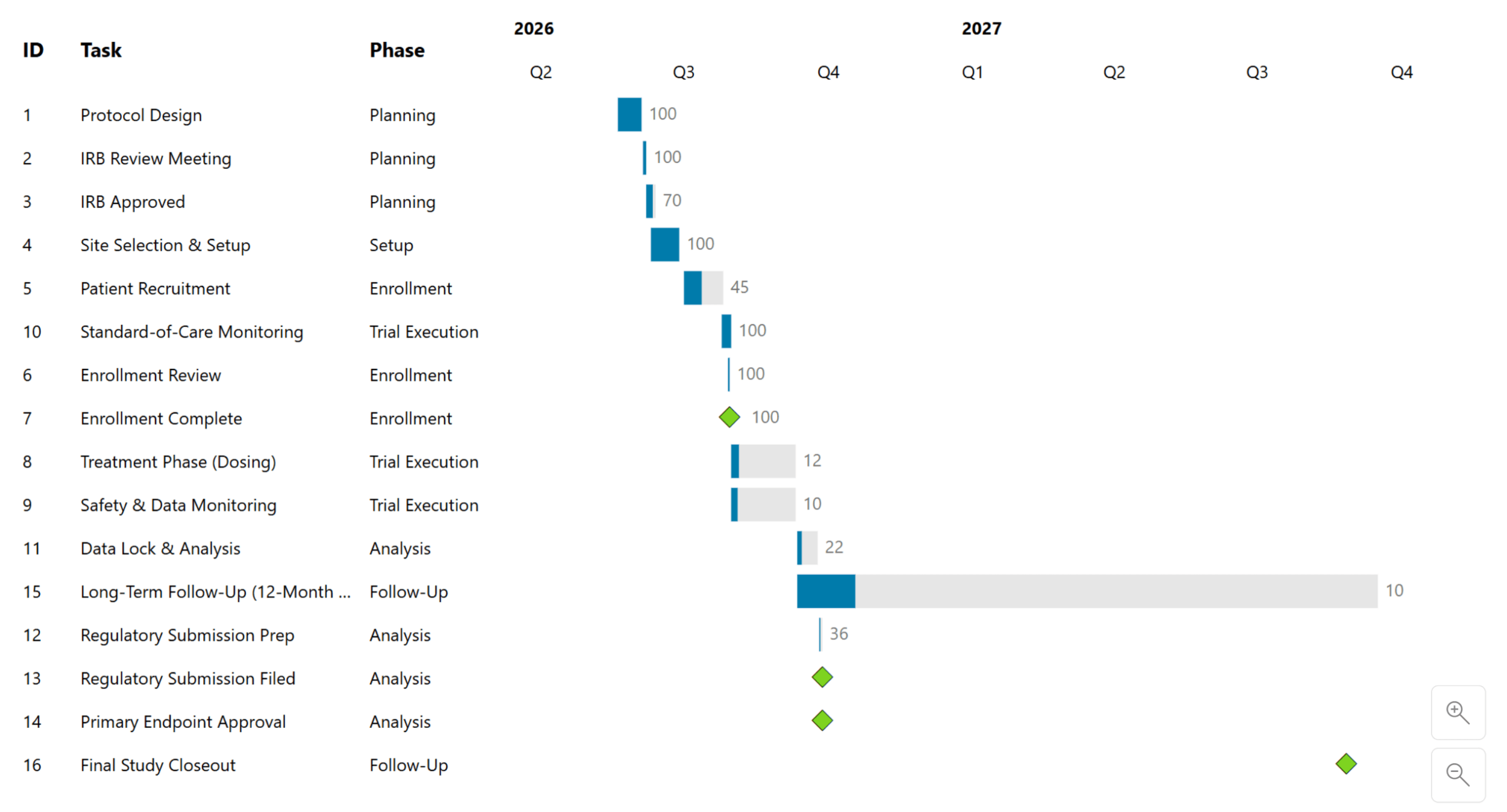
Picture the report your team is trying to move: a Tableau Gantt your users already rely on. Your company has decided to standardize on Power BI, whether for platform consolidation, cost, or governance. That decision is already made. What's left on the table is narrower than "can Power BI do Gantt charts":
Can you recreate the same business value, without compromise?
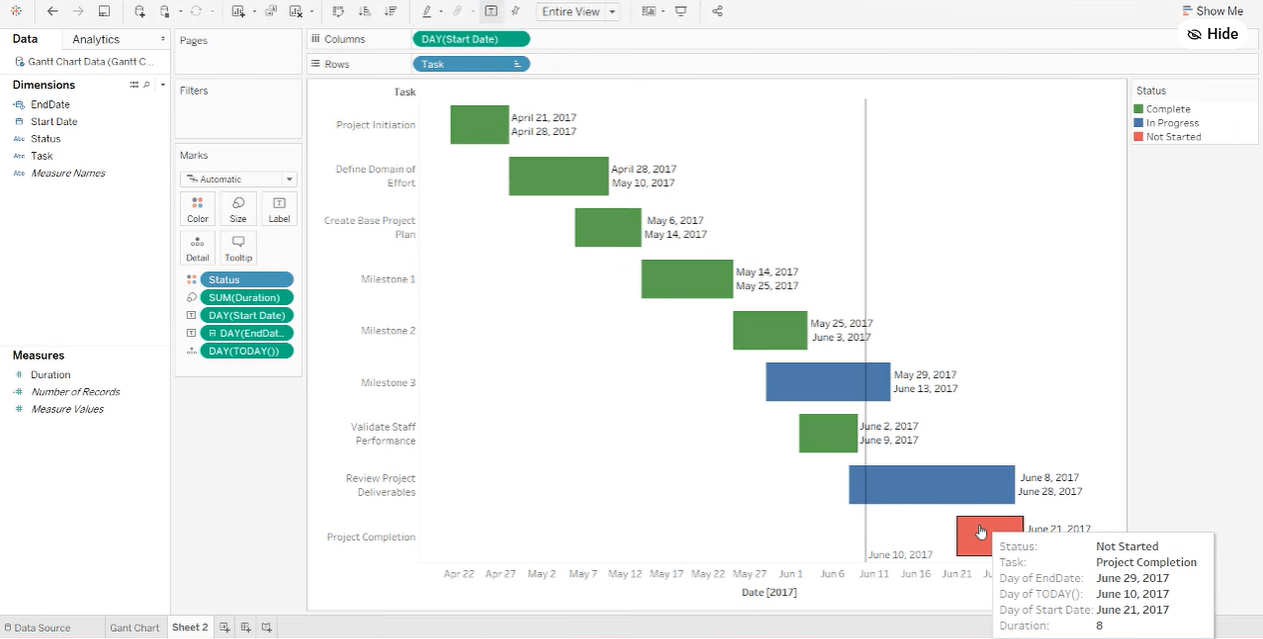
The report your users already trust - the one the migration has to answer for
Answering that starts with field mapping, not chart-building. Tableau, native Power BI, and Inforiver Analytics+ don't always use the same term for the same concept: what Tableau puts on Rows shelf, Power BI calls a category well, and so on. The goal isn't to find an exact one-to-one equivalent for every setting. It's to identify what purpose each field serves, then find the option that repurposes it correctly in the new tool.
From there, build a checklist against the actual report in front of you: start date, end date, duration, task hierarchy, milestone dates, a reference line, tooltips, color-coded status. Whatever the original does, write it down, then find its equivalent.
Mapping the fields is the easy part. Rebuilding them is where the native Microsoft Gantt visual starts to show its limits.
Start date, end date, duration, task labels, legend-based color by status: all straightforward. But two fairly ordinary asks stop the native visual cold. There's no way to put data labels on the bars - if your original report shows a start date or a percentage directly on each bar, there's no setting for that. And there's no reference line: a vertical "today" marker, one of the most common asks on any project timeline, isn't available as a built-in analytics feature.
Neither ask is exotic. They're the kind of detail that doesn't show up in a requirements doc but absolutely shows up in the first stakeholder review after go-live.
Rebuilding the same report in the Inforiver Analytics+ Gantt closes both gaps, plus a few more the native visual doesn't attempt at all. It adds reference lines, including a live "today" marker or a fixed custom date. Data labels can be placed per element: a start date on the bar, a label only on milestones, or none at all. Conditional formatting drives bar color, milestone icons, and row highlighting off the same underlying rule, so a "status" field can color bars, tag a compliance milestone, and stamp a row-level icon without three separate builds. Zoom-level settings control how the timeline header collapses from days to weeks to months. A single visual can carry multiple milestone types, each with its own formatting. And native dependency connectors mean you add a connect to and connector type field and the relationship lines draw themselves.
The result isn't a pixel-perfect clone of the Tableau original. Colors, spacing, and chrome will differ. What it does preserve is every capability the original report relied on: the reference line, the milestone flags, the status-driven color, the dependency logic.
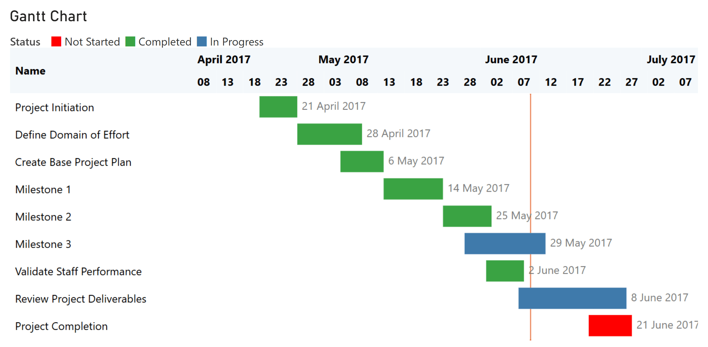
One detail from the live build is worth calling out. Once a status field is wired into conditional formatting for bar color, that same rule set can drive a row-level status icon or a legend entry too, without rebuilding the logic from scratch. That reuse is what turns a long formatting exercise into something that scales as requirements get more specific.
Whatever tool you land on, work through migrations in this order.
When you migrate a report, don't try to migrate the visual. Try to migrate what the visual was doing for the people who relied on it. If you can name the job (flagging a milestone, showing slippage against a baseline, surfacing the critical path), you can almost always find a way to do that job in Power BI. The chart type is just the container.
This post covers the framework. The webinar covers the live build: a Tableau Gantt rebuilt first in native Power BI, then in Inforiver Analytics+, field by field, with every gap and workaround shown in real time.
Watch: Tableau to Power BI - Recreating Gantt Charts Without Compromise →
Inforiver Analytics+
100+ chart types built for teams migrating off other BI tools, including every Gantt variation covered above. See the product →
Pricing
See what's included at each tier before you scope the migration. View pricing →
Talk to our team
Every migration has its own edge cases: a custom visual that won't render cleanly, a modeling decision that doesn't translate, a feature that seems to have no Power BI equivalent. If you're stuck on one, we can help you find the path through it.
Contact us →

Inforiver helps enterprises consolidate planning, reporting & analytics on a single platform (Power BI). The no-code, self-service award-winning platform has been recognized as the industry’s best and is adopted by many Fortune 100 firms.
Inforiver is a product of Lumel, the #1 Power BI AppSource Partner. The firm serves over 3,000 customers worldwide through its portfolio of products offered under the brands Inforiver, EDITable, ValQ, and xViz.