Upcoming webinar on 'Inforiver Charts : The fastest way to deliver stories in Power BI', Aug 29th , Monday, 10.30 AM CST. Register Now
Upcoming webinar on 'Inforiver Charts : The fastest way to deliver stories in Power BI', Aug 29th , Monday, 10.30 AM CST. Register Now
Inforiver Analytics+ for Power BI provides users with the capability to compare performance and benchmark with variance visualized in both absolute & % terms.
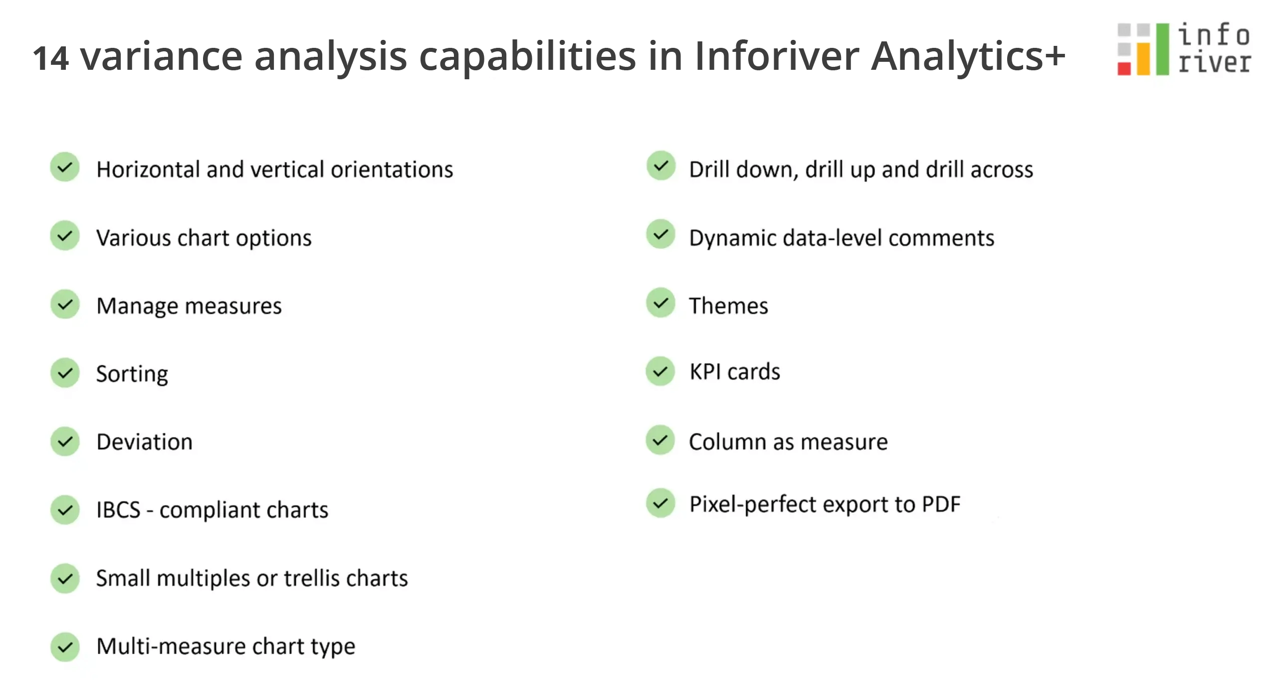
In this blog, let us look at some of the key capabilities delivered by Inforiver Analytics+ for performing variance analysis.
The variance chart is useful for visualizing both categorical and time series data. 2021 actuals vs plan for different subcategories using integrated variance columns is shown below.

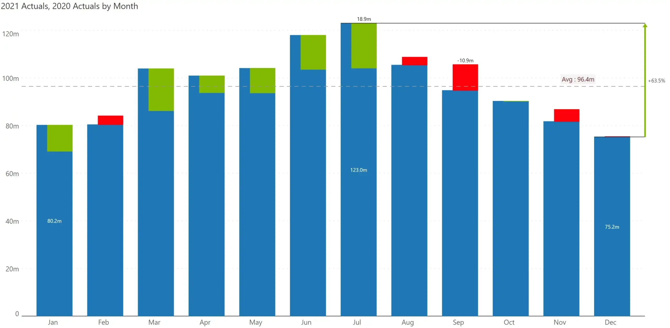
In the below image, 2021 actuals is compared against prior year actuals over the 12-month period using integrated variance bars.
Inforiver provides several chart types – bar, column, line, area, and waterfall for visualizing variances.
Examples:
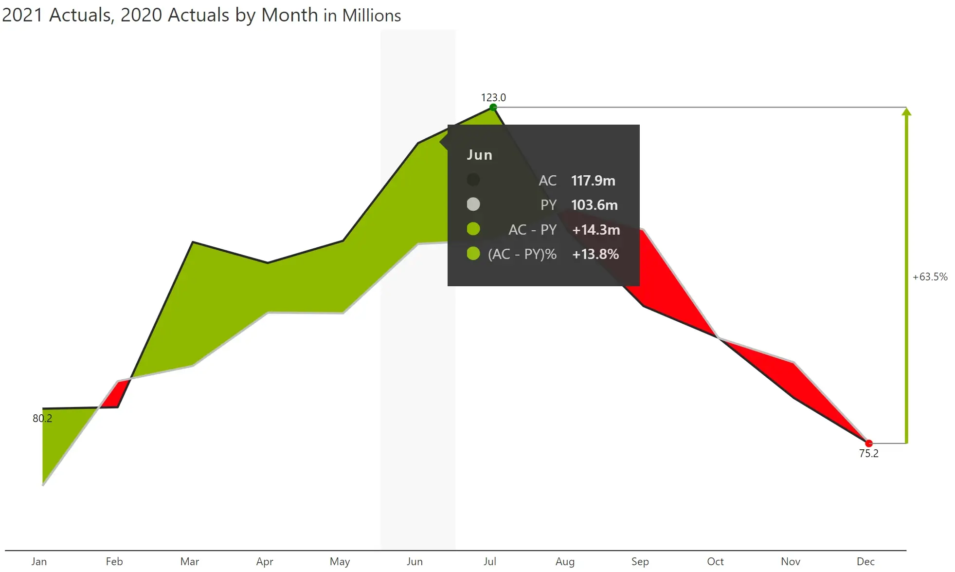
a) Variance line chart – Line/area charts do not have an option to display the absolute/relative variances as separate series, but they can be seen on the tooltip.
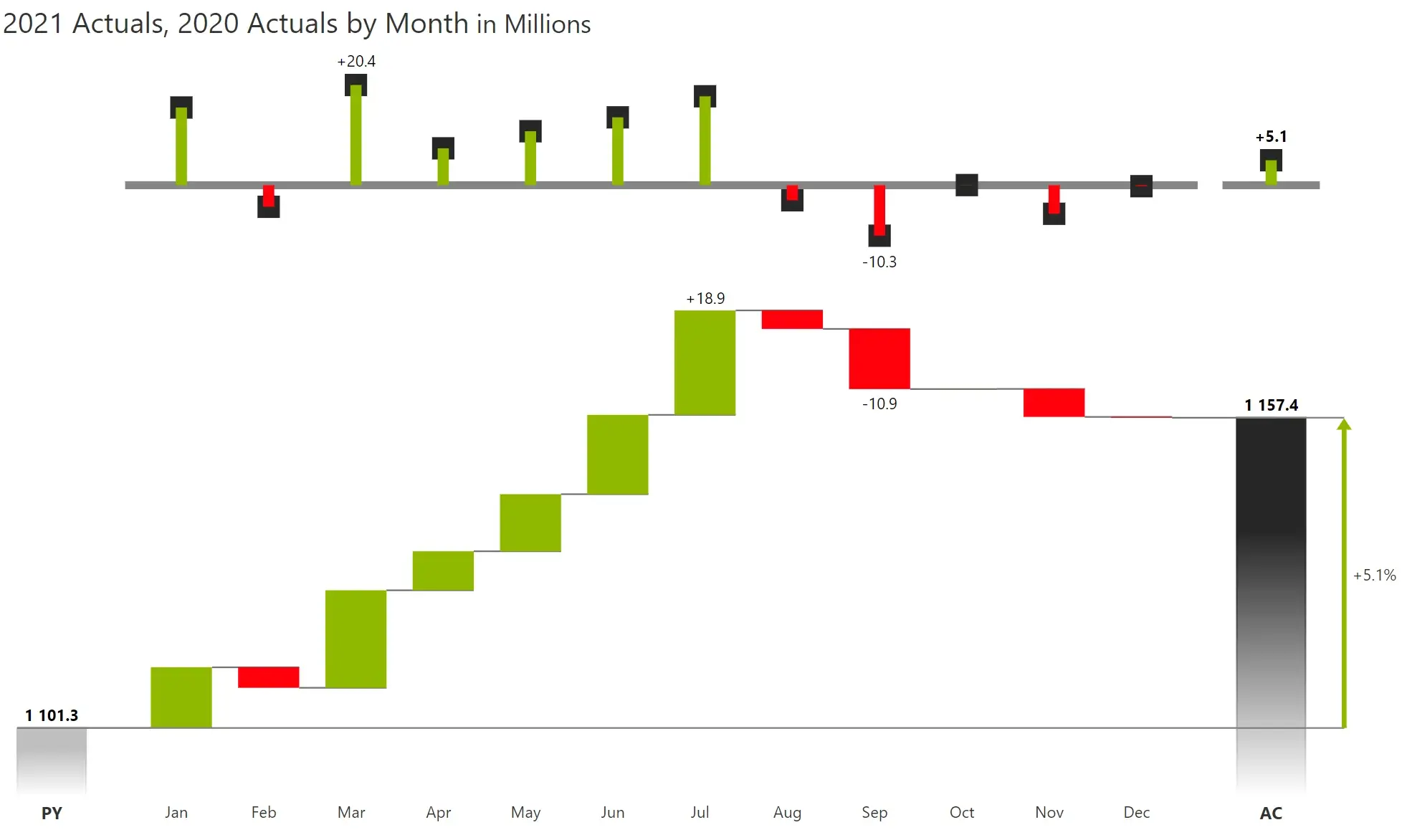
b) Variance waterfall chart – The variance between AC and PY is visualized as a waterfall across the categories/time periods.
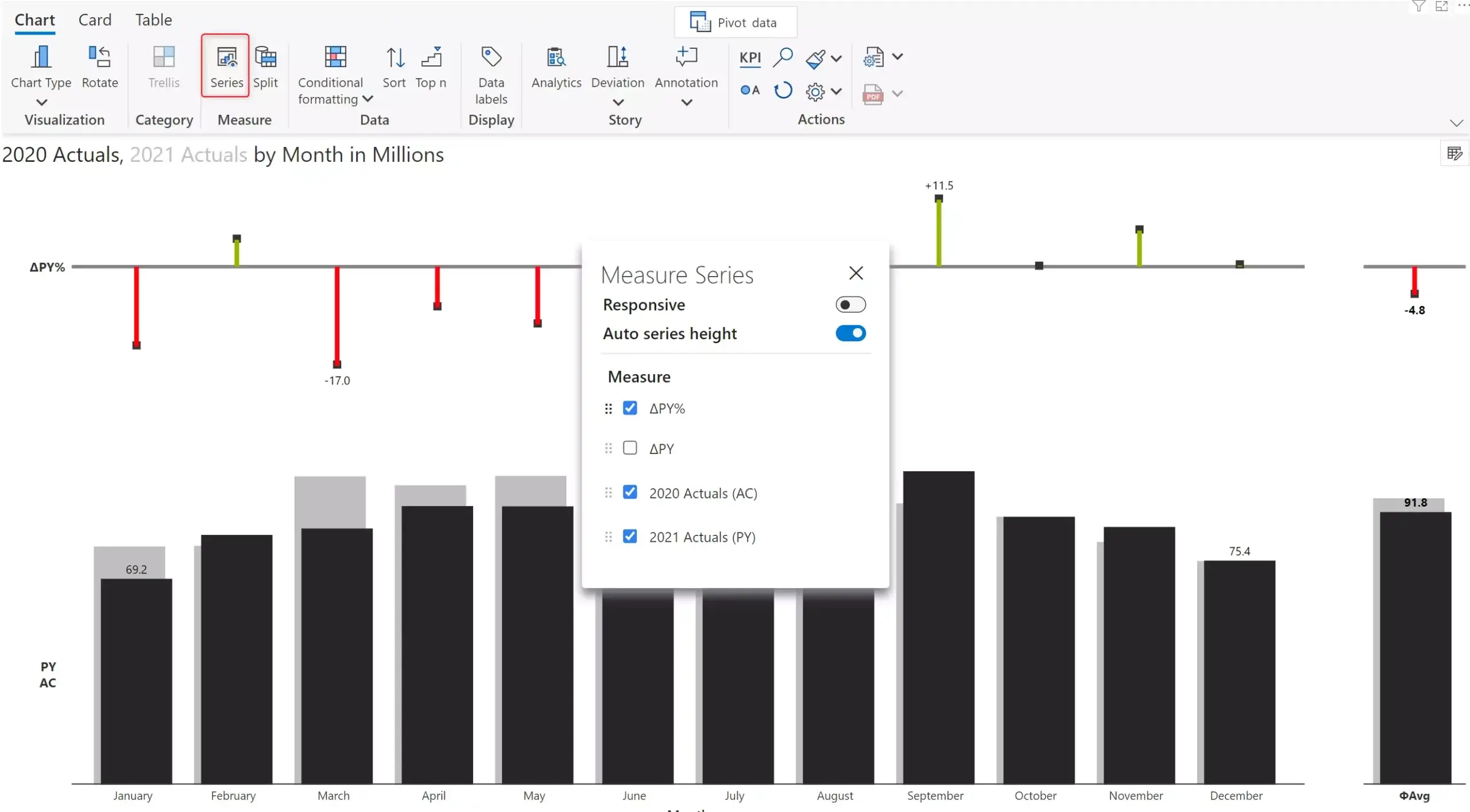
At times, visualizing absolute and relative variance in a chart might not be required. In such cases, you can disable either (or both) of these. You can choose which measures/variances to render from the ‘Series’ option.
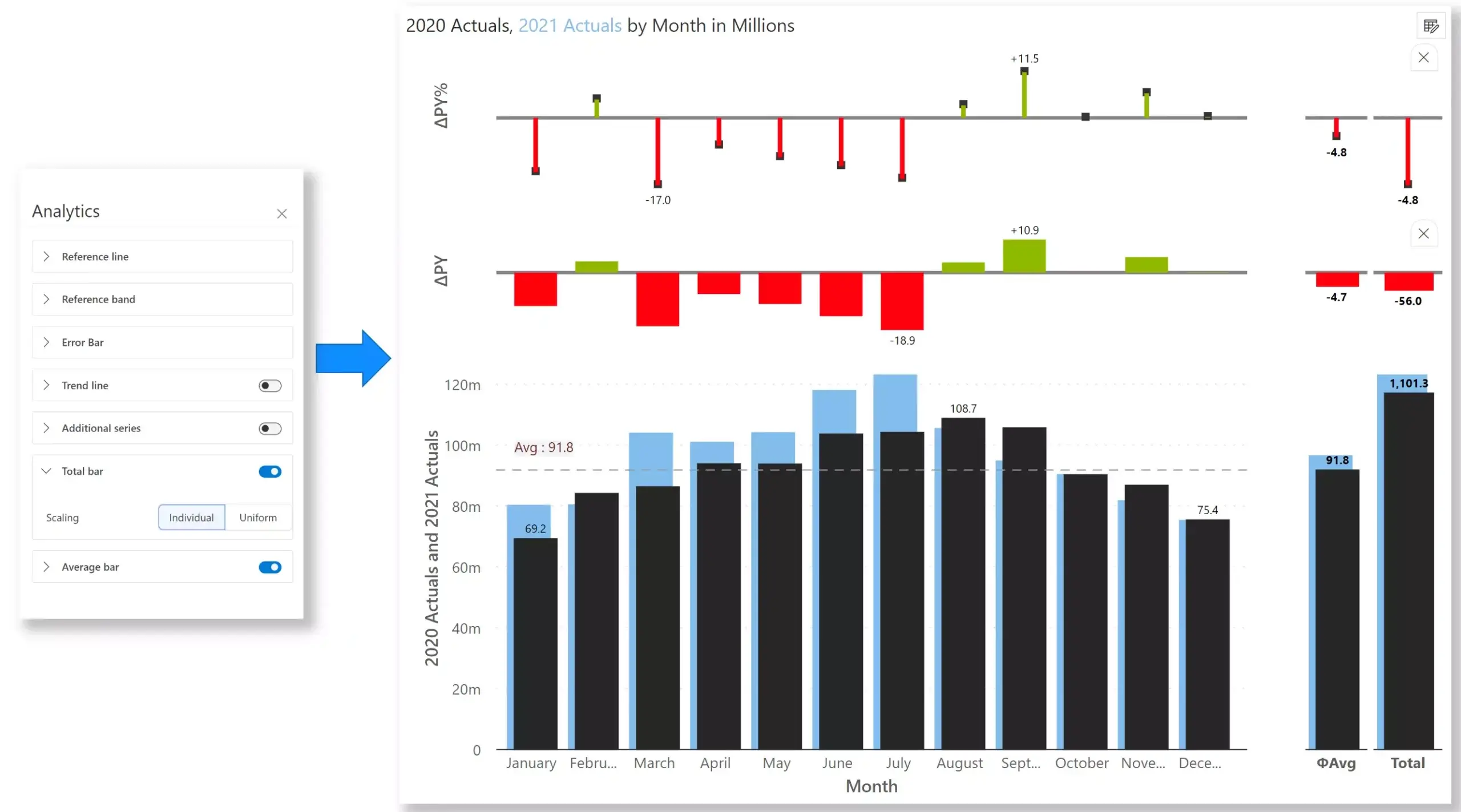
You can also enable/display averages or totals for all the measures – performance, benchmark, absolute variance, and % variance as shown below. Notice that scale bands get enabled for enhanced comprehension of variances.
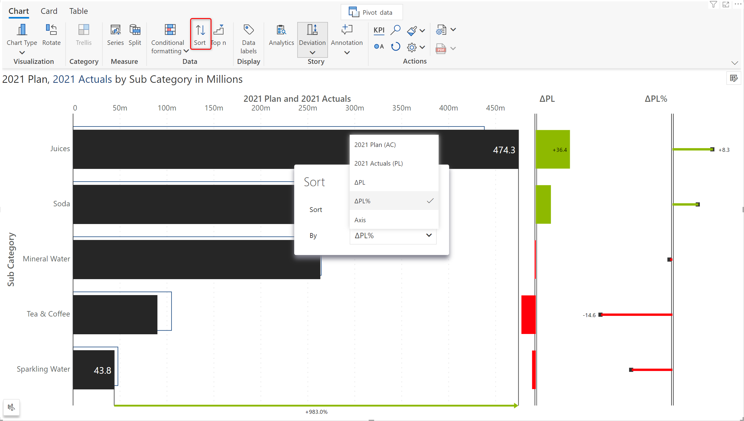
Sorting can be done by performance, comparison, absolute variance or % variance. In the image below, the values are sorted in ascending order of % variance.
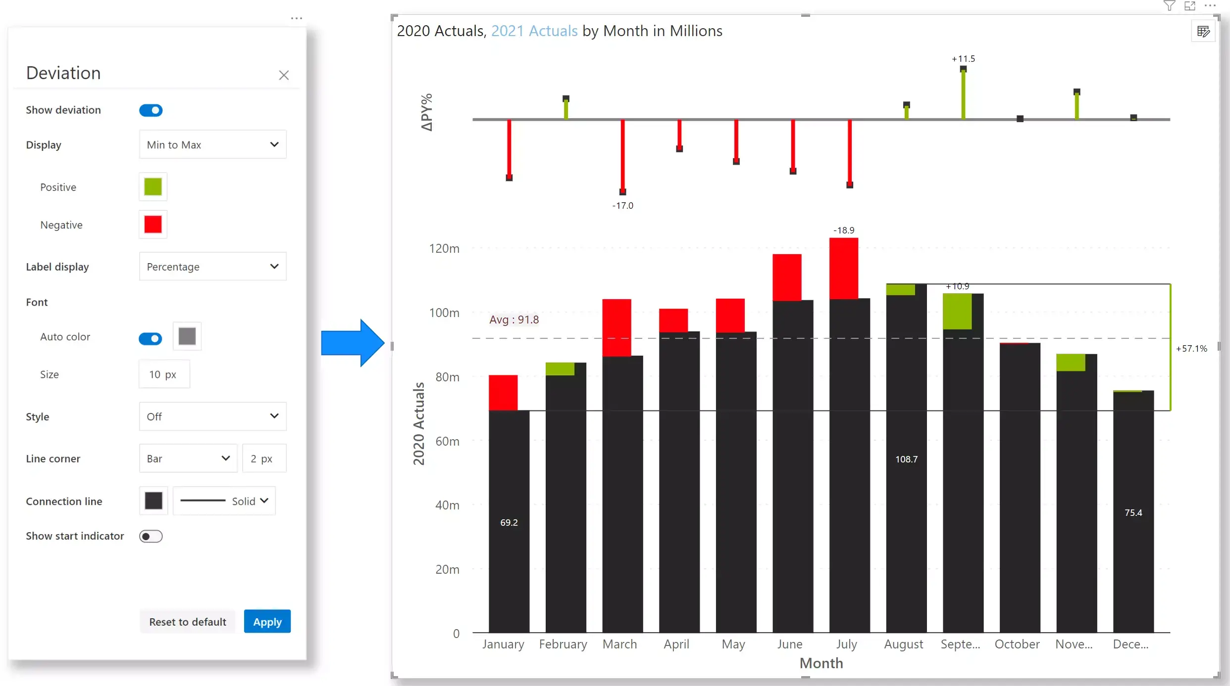
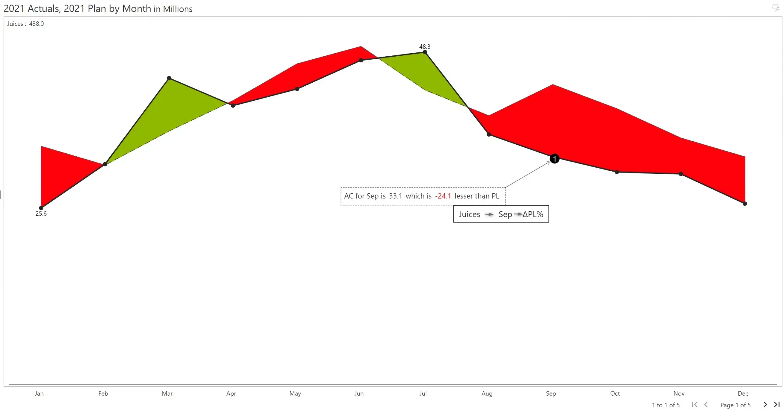
View deviation between two data points such as first to last, min to max, etc., including dynamic deviation during runtime.
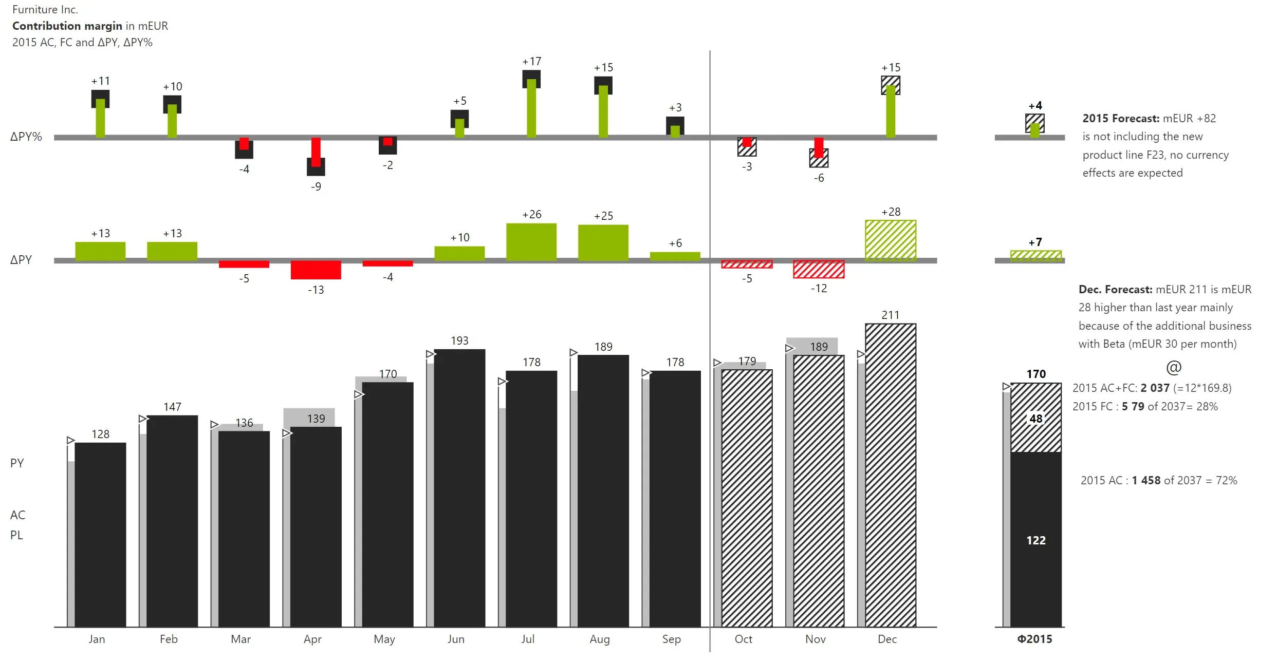
Inforiver Analytics+ can be used to create IBCS-compliant charts for variance analysis. The below image (IBCS C04 template) shows the temporal development of different scenarios (AC, FC and PY) as a grouped column chart and the absolute and relative variances as bar and pin charts.
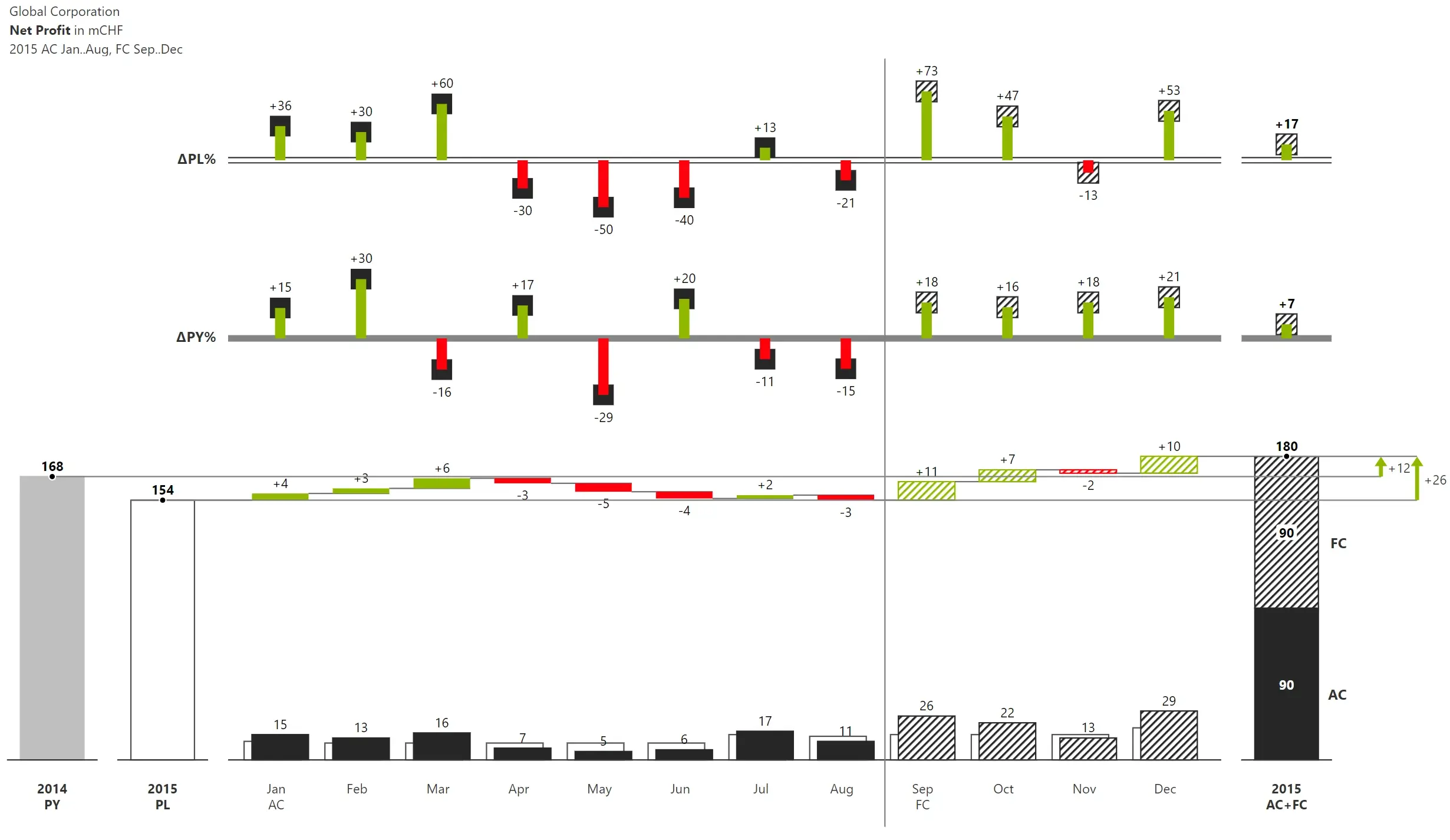
C05 and C12 chart templates replicated using Inforiver Analytics+ are shown below.
AC (resp. FC) and PL are shown as grouped columns and combined with a horizontal waterfall chart for showing the absolute variances. Relative variances of AC (FC) to PL and PY are shown as pins.
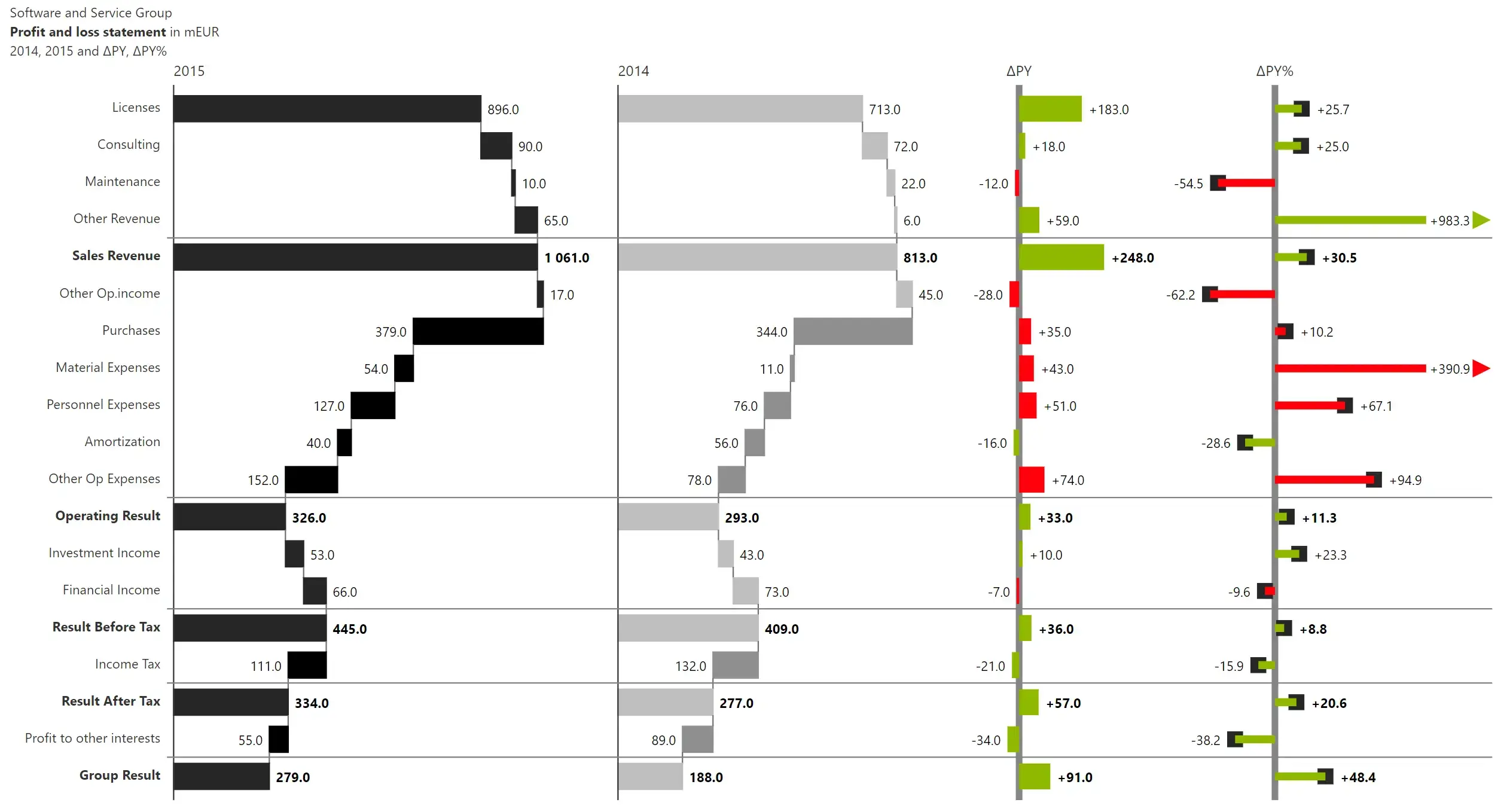
Calculation schemes are visualized as side-by-side waterfalls with absolute and relative variances in bars and pins.
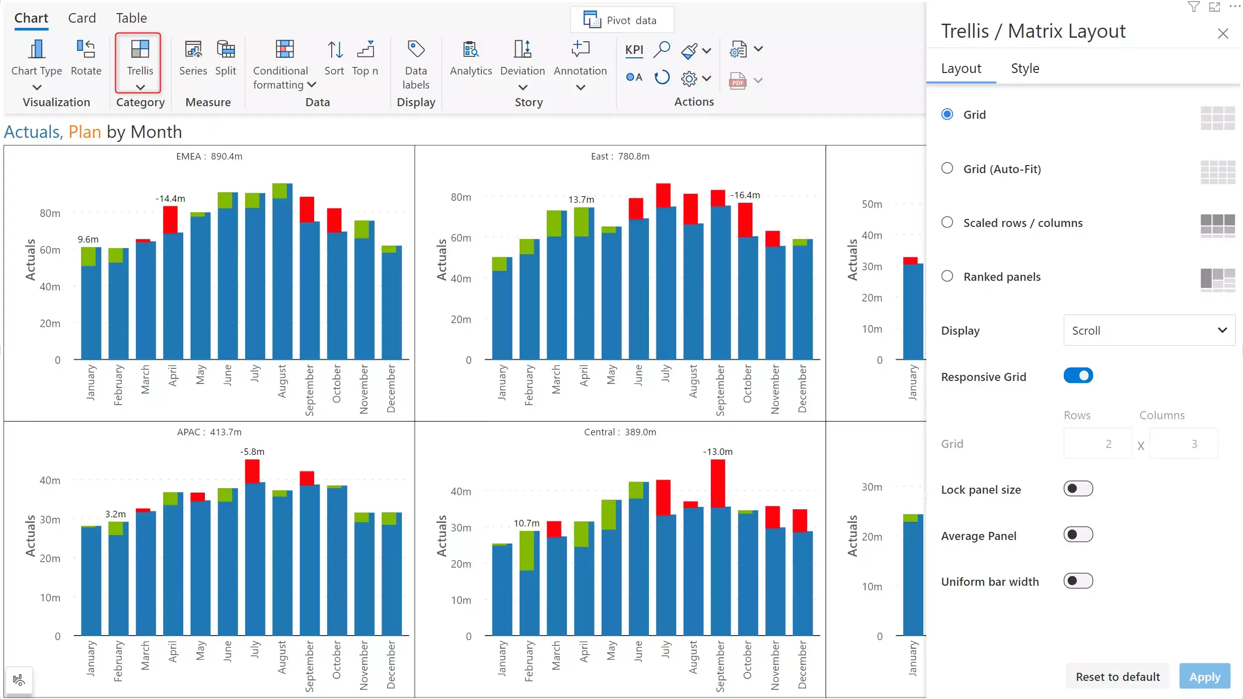
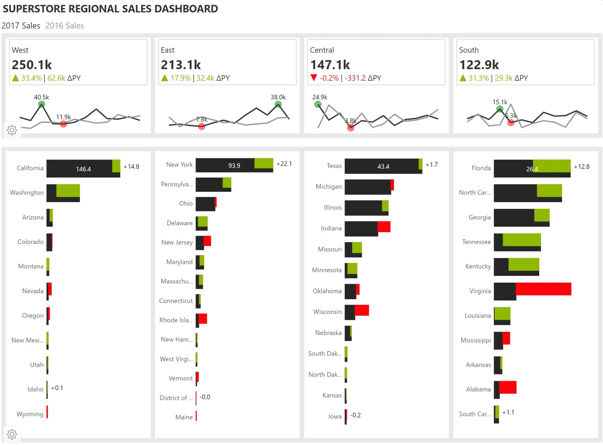
Using small multiples, you can visualize variances across multiple dimensions. In the below example of a sales vs forecast analysis, 3 dimensions are used – segment, region, and months.
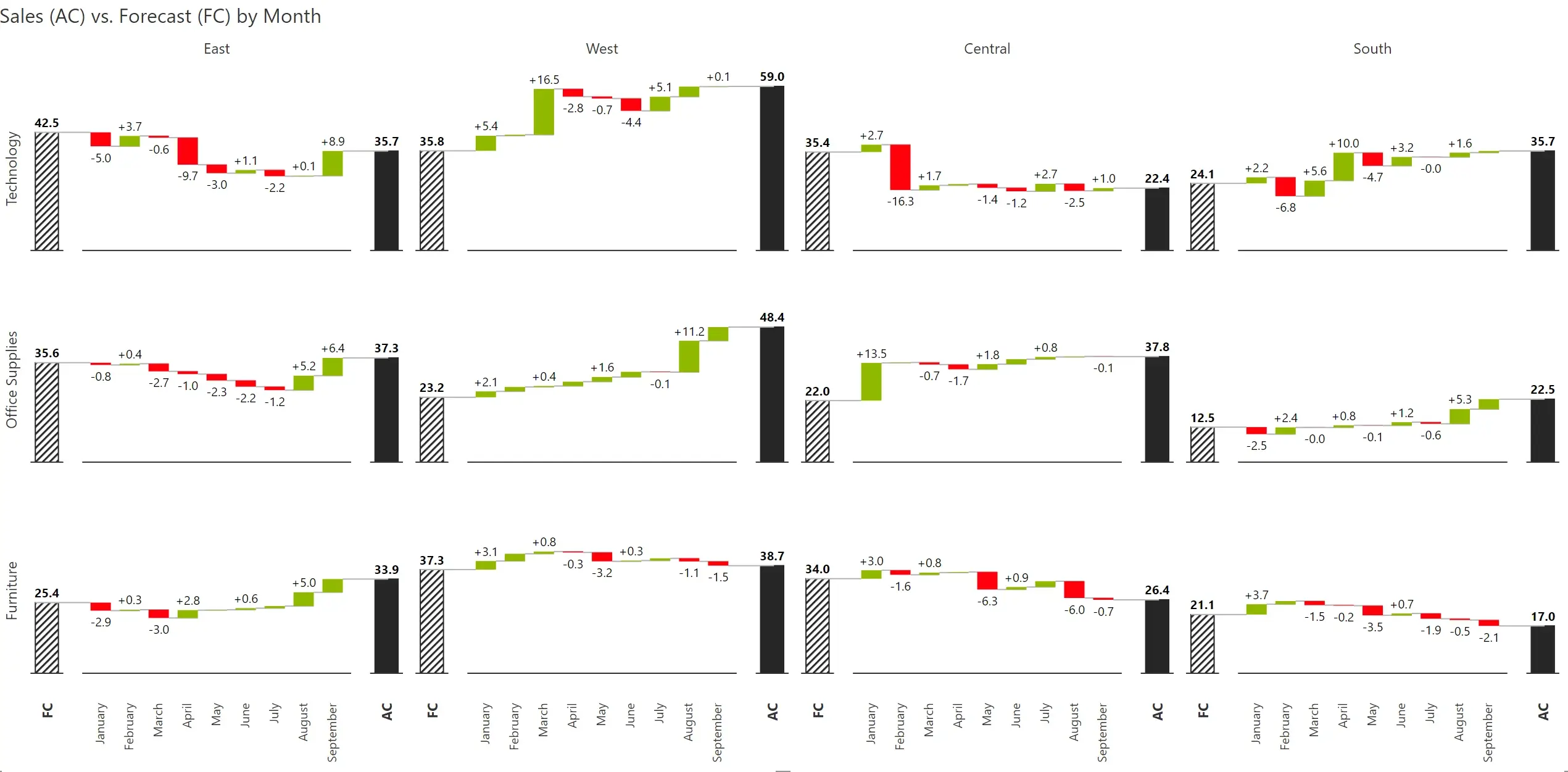
Inforiver supports dynamic individual panel height (ranked panels) and value based dynamic row height (scaled rows). There are several other customization options such as average panel, ability to lock the panel size and define the number of rows and columns in a grid.
For a detailed walkthrough of advanced small multiples using Inforiver Analytics+, read this blog.
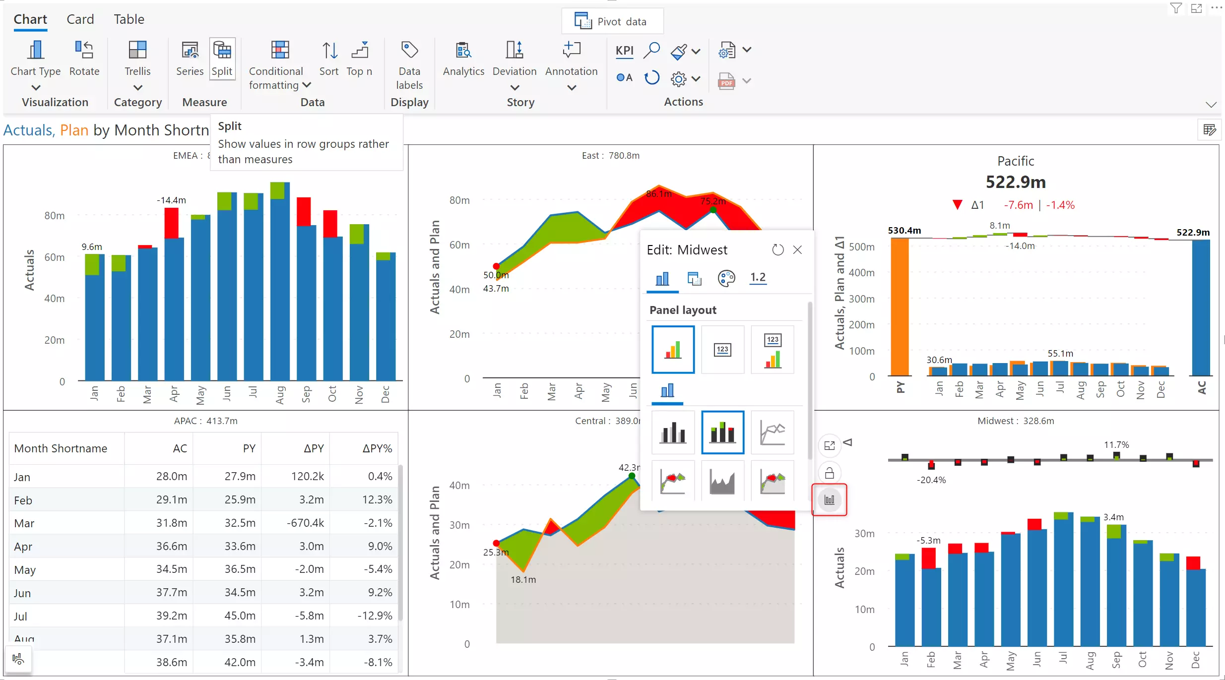
With Inforiver, each row or column or cell in a trellis chart can be customized to show a different chart type.
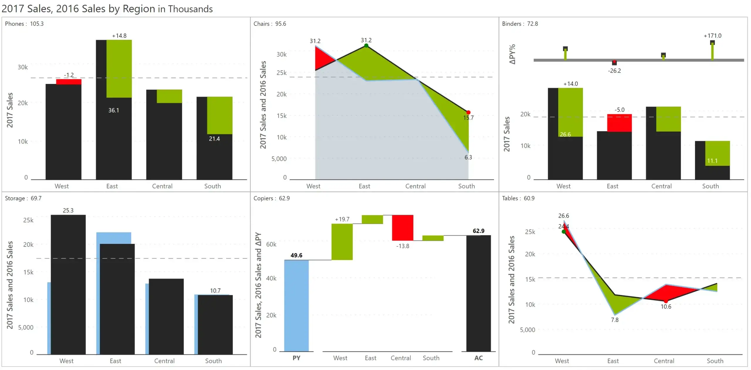
On hovering over a chart, you can find the customize chart option. The available chart types will be displayed, and you can select the one you desire. You can also enable/disable the absolute and relative variances, add a KPI header, set the scaling, colour etc .
Inforiver provides comprehensive drill down, drill up and drill across navigation for easy exploration of hierarchical data.
In the below example, data is assigned as below:
Axis – Sub Category, Quarter; Group – Region; Values (AC) – 2021 Actuals; Compare to Prior Period (PY) – 2020 Actuals and Compare to Plan (PL) – 2021 Plan
Variance bars are shown for the sub categories (axis) and grouped by region. Let’s see how you can drill down one field at a time or all fields at once.
a) Drill down one field at a time: On hovering over a bar as highlighted in the below image, you can drill down to view the quarterly variances for International – Soda. You can switch to other regions or sub categories from the highlighted dropdowns.

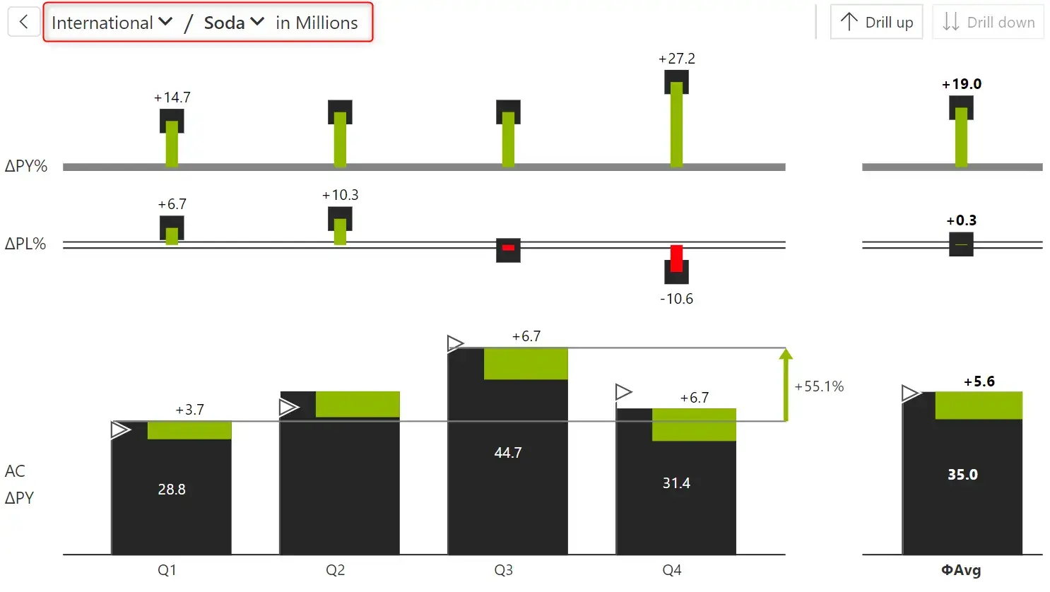
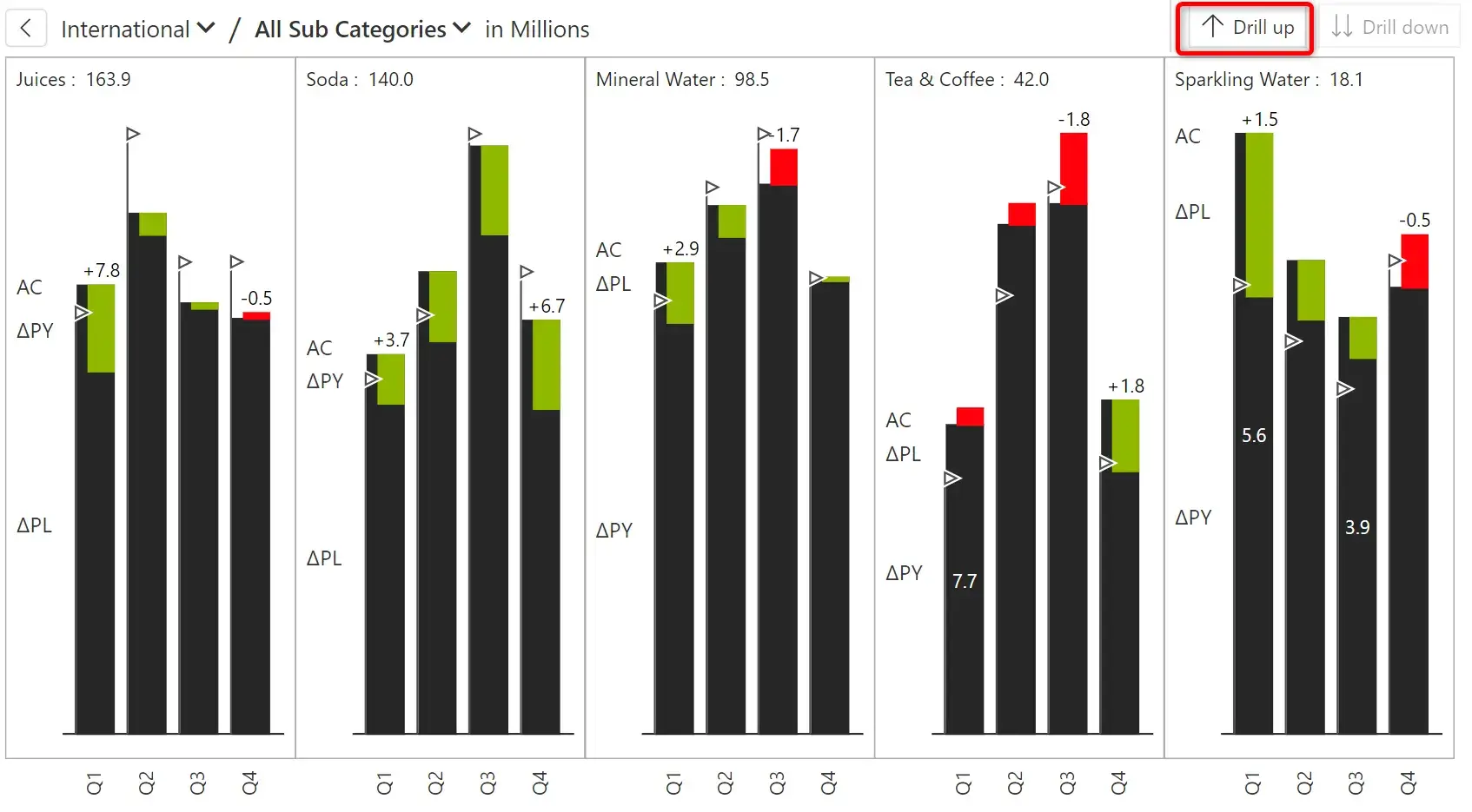
b) Drill down all fields at once: Instead, if you want to view the quarterly variance for all the sub categories, you can click the highlighted icon.
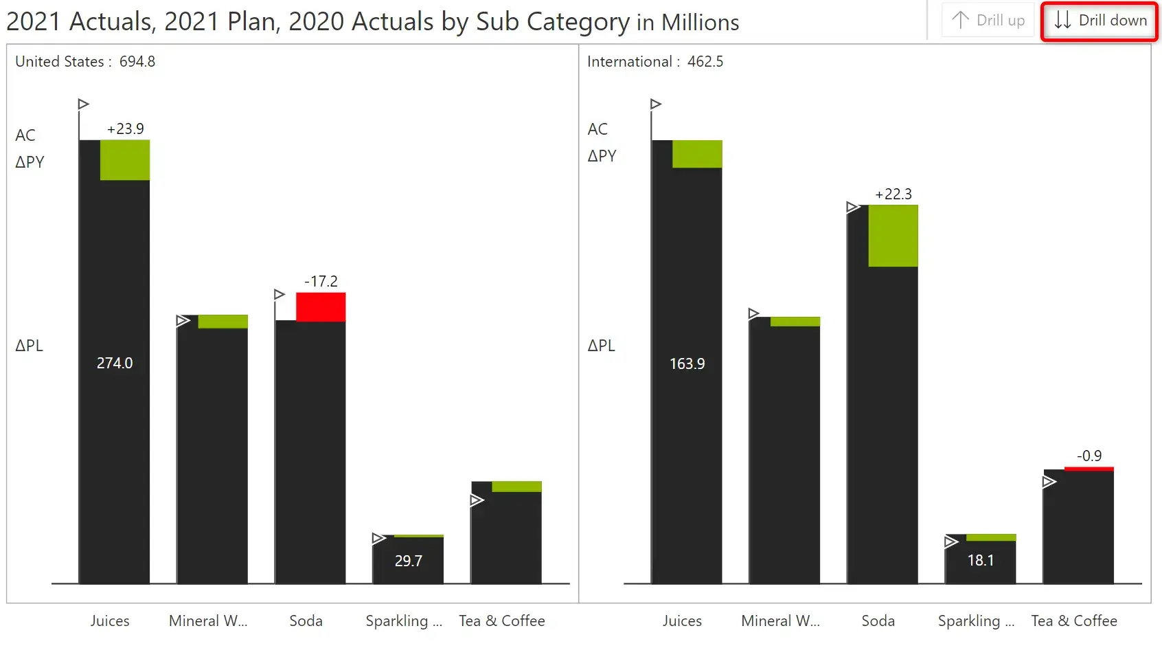
In both the cases, to drill up to the previous level in the hierarchy, you can use the drill up option highlighted below.
You can add data-level comments which supports dynamic data tags and custom calculations using an excel-like formula editor.
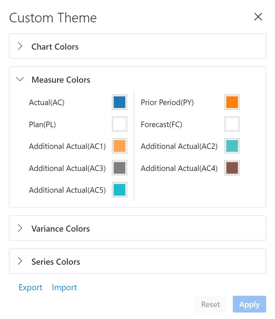
You can leverage themes such as Power BI, Inforiver, IBCS and xViz to apply one-click formatting.
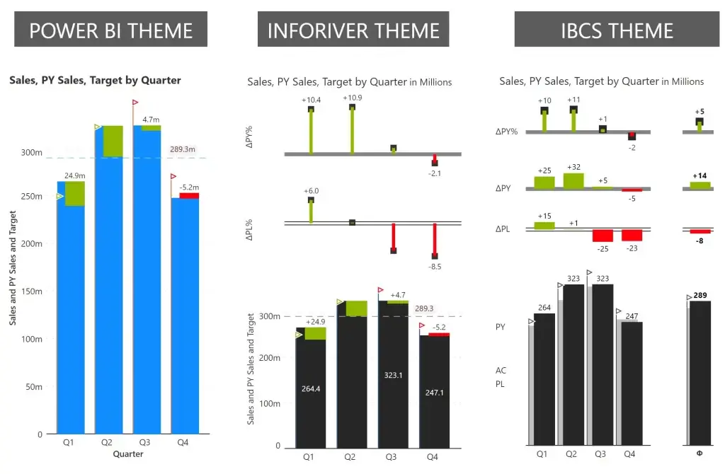
Themes can also be customized based on your needs. Support for export and import of themes is available and is shown below.
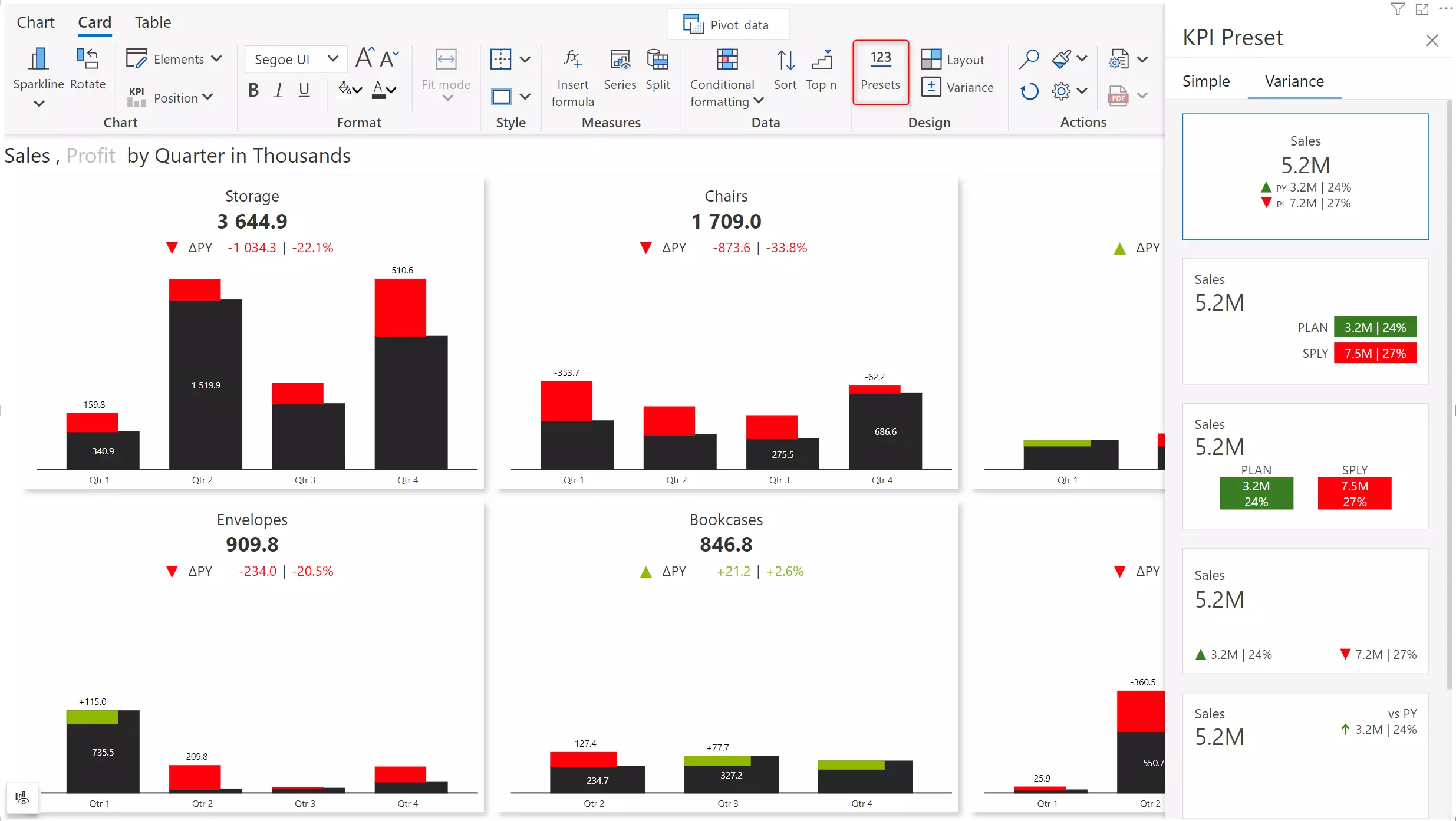
You can insert KPI cards featuring variance presets in a couple of clicks to create stunning reports.
The presets and customization options are shown below.
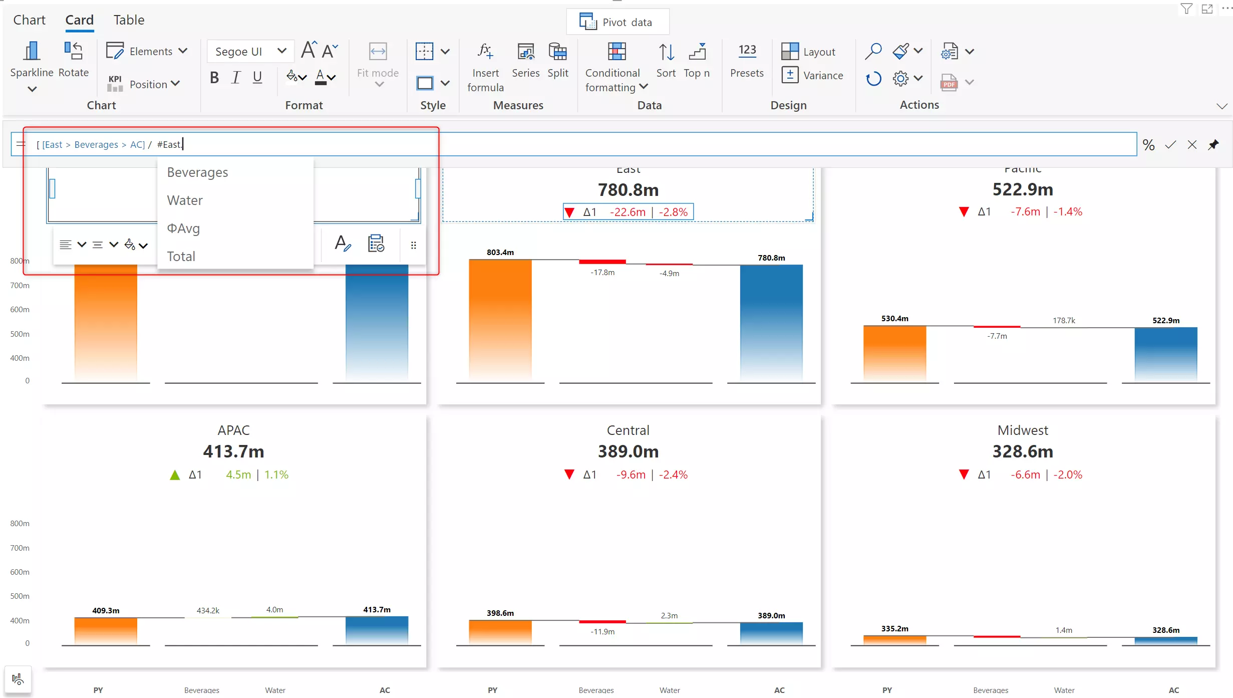
You can also create custom calculations in KPI cards and annotations using an excel-like formula editor.
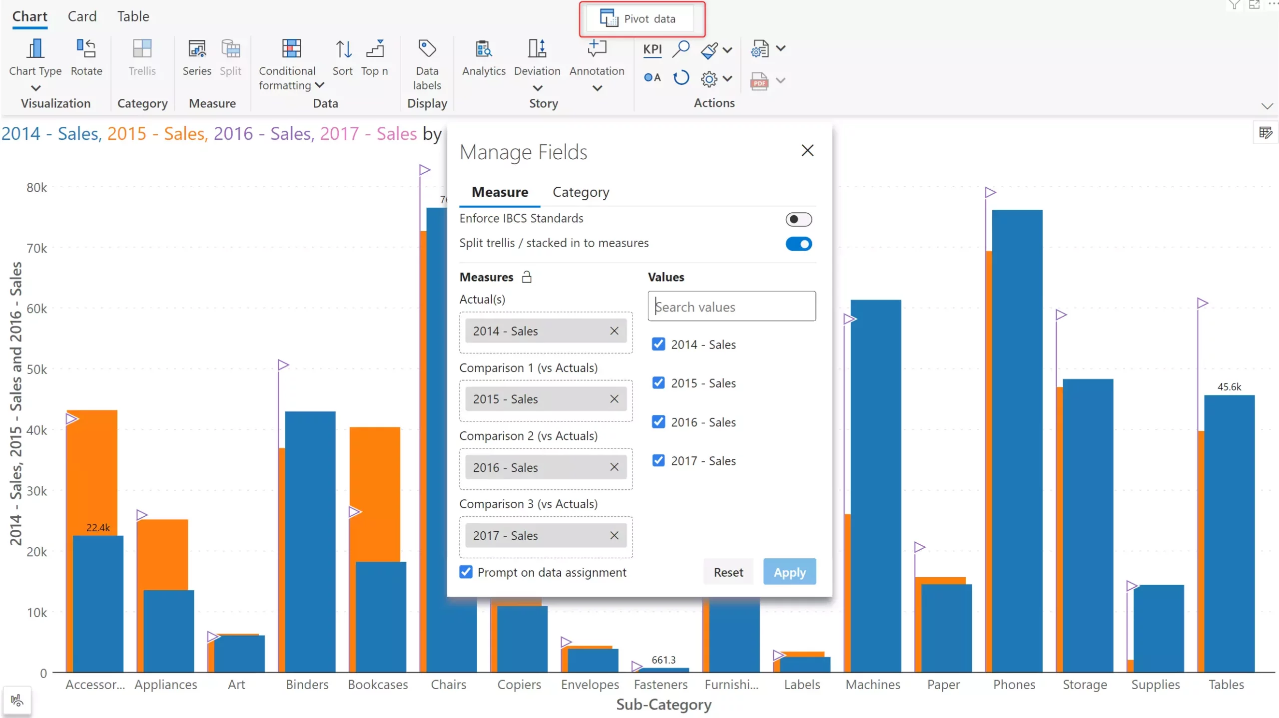
Often, year or month is a category in the models, and so DAX measures need to be created for each time-period (e.g., 2020 Sales, 2019 Sales) which can be further used to create variances. With Inforiver, you can bypass this step and create variances between member values (say, for Year) in a few clicks.
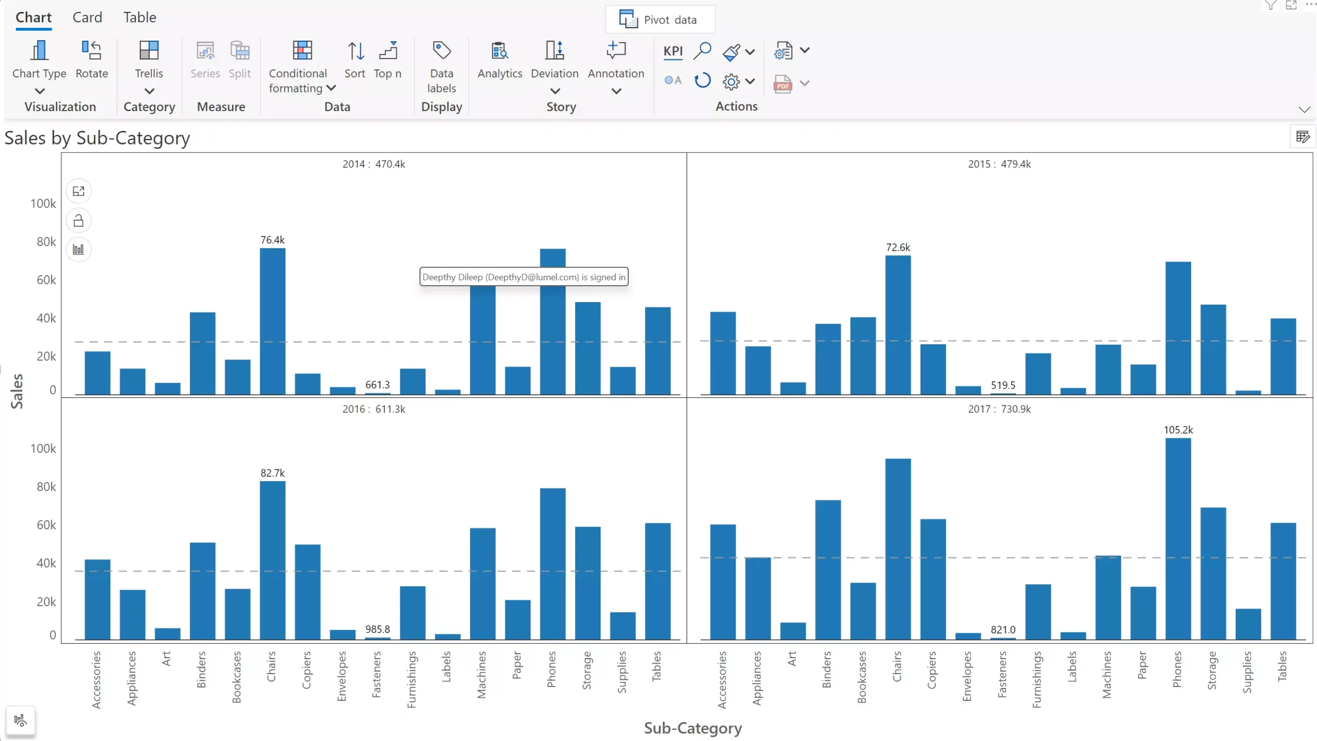
In the below image, we have sales by sub category for 4 years.
Enable the Split trellis / stacked in to measures option and assign the measures to the Actuals and Comparison buckets for variance analysis.
Inforiver Analytics+ supports exported to PDF with the exact formatting in your report. Note that export is possible only from Power BI service.
These are the 15 variance analysis capabilities that we reviewed so far.
Inforiver Charts has been renamed to Inforiver Analytics+, a 3-in-1 visual for dashboards and storyboards. It offers 50+ charts, cards, and tables. Learn more
Inforiver Analytics+ offers a lot more than what is listed above. You can try it for yourself by installing the free trial version of Inforiver Analytics+ from Appsource.
Check out our comprehensive demo "Variance Analysis using Microsoft Power BI" to perform variance analysis using Inforiver's bullet chart.
Explore our latest blog on calculating variances from a single measure in Power BI—no DAX required!
If you are interested in hierarchical variance analysis for table/matrix, read this blog.

Inforiver helps enterprises consolidate planning, reporting & analytics on a single platform (Power BI). The no-code, self-service award-winning platform has been recognized as the industry’s best and is adopted by many Fortune 100 firms.
Inforiver is a product of Lumel, the #1 Power BI AppSource Partner. The firm serves over 3,000 customers worldwide through its portfolio of products offered under the brands Inforiver, EDITable, ValQ, and xViz.