Upcoming webinar on 'Inforiver Charts : The fastest way to deliver stories in Power BI', Aug 29th , Monday, 10.30 AM CST. Register Now
Upcoming webinar on 'Inforiver Charts : The fastest way to deliver stories in Power BI', Aug 29th , Monday, 10.30 AM CST. Register Now
Advanced small multiples in Power BI are a game-changer for data analysis. Small multiples, also known as trellis charts in Power BI or faceted charts in Power BI, are popular for showing a collection of charts arranged in a two-dimensional matrix. They are essentially repeated visuals in Power BI, allowing for granular insights
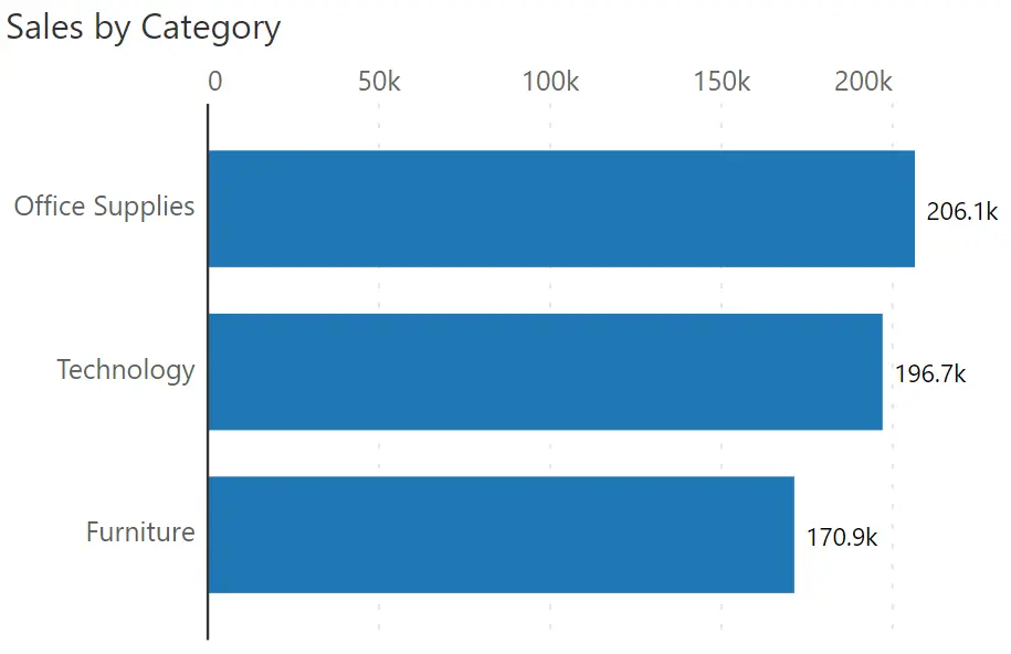
Take this bar chart for example. It uses one dimension (category) and one measure (sales).
A small multiple, by its nature, reveals a lot of data points. If not handled carefully, this Power BI mini chart approach can easily result in information clutter and sensory overload. To avoid this, and to deliver highly effective Power BI trellis charts, let’s look at the twelve (12) best practices as shown below.
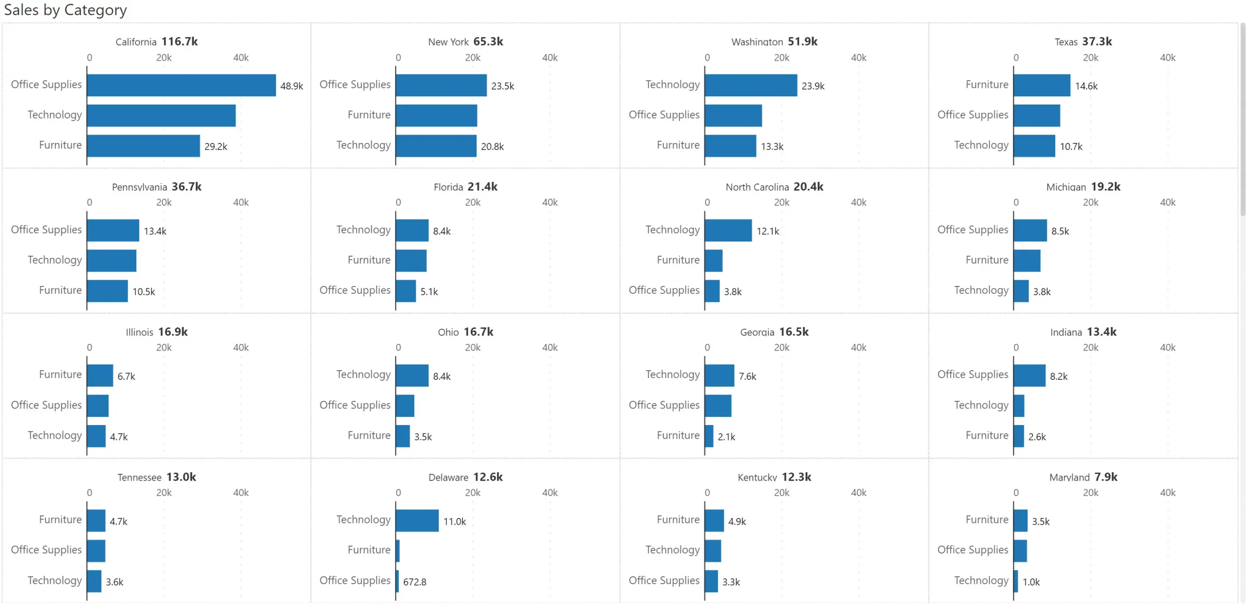
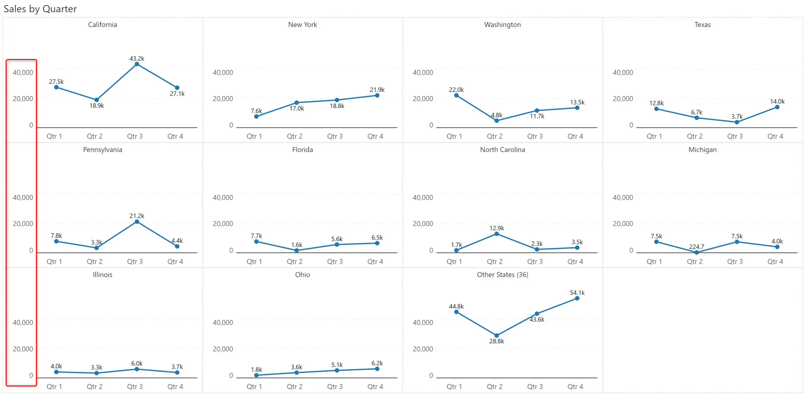
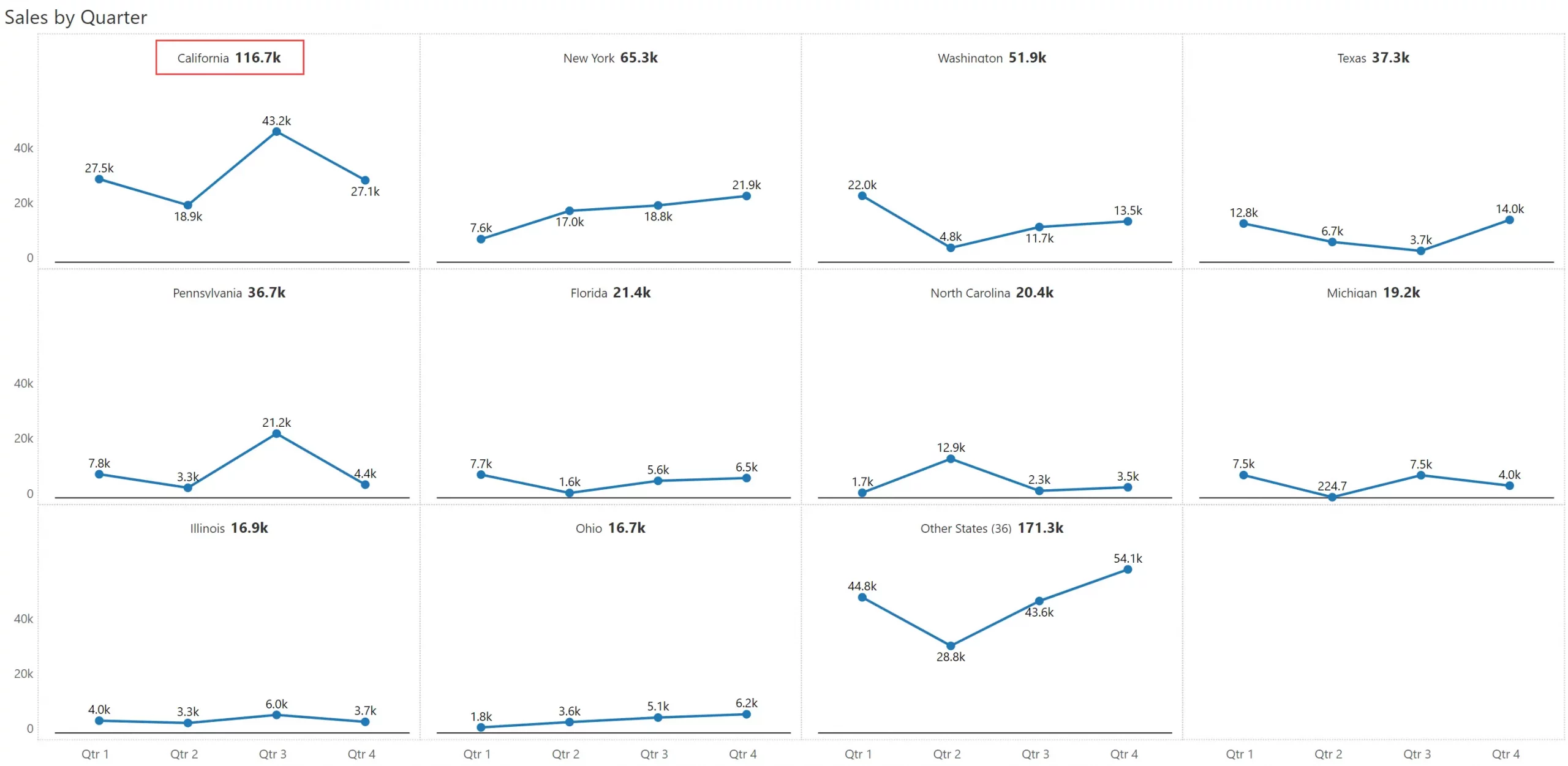
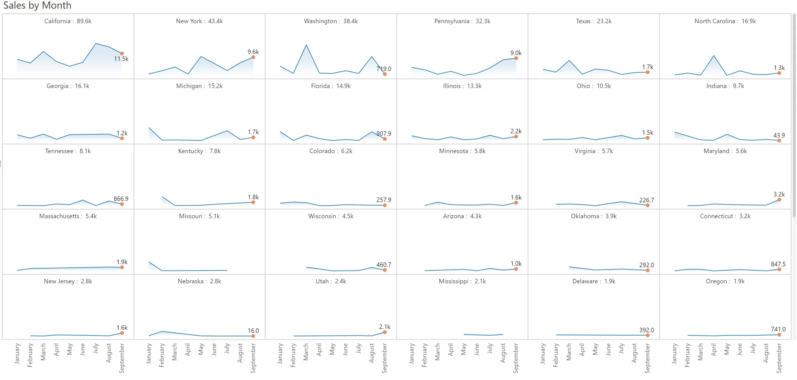
In the example shown above, you have a few dozen states which are manageable in a small multiple visual. However, companies can have hundreds of product categories sold in thousands of cities.
In such cases, it helps to restrict the focus to a few items, say the top 50.
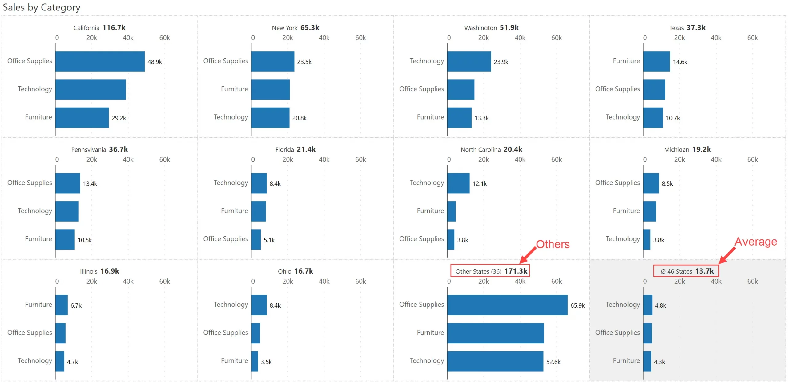
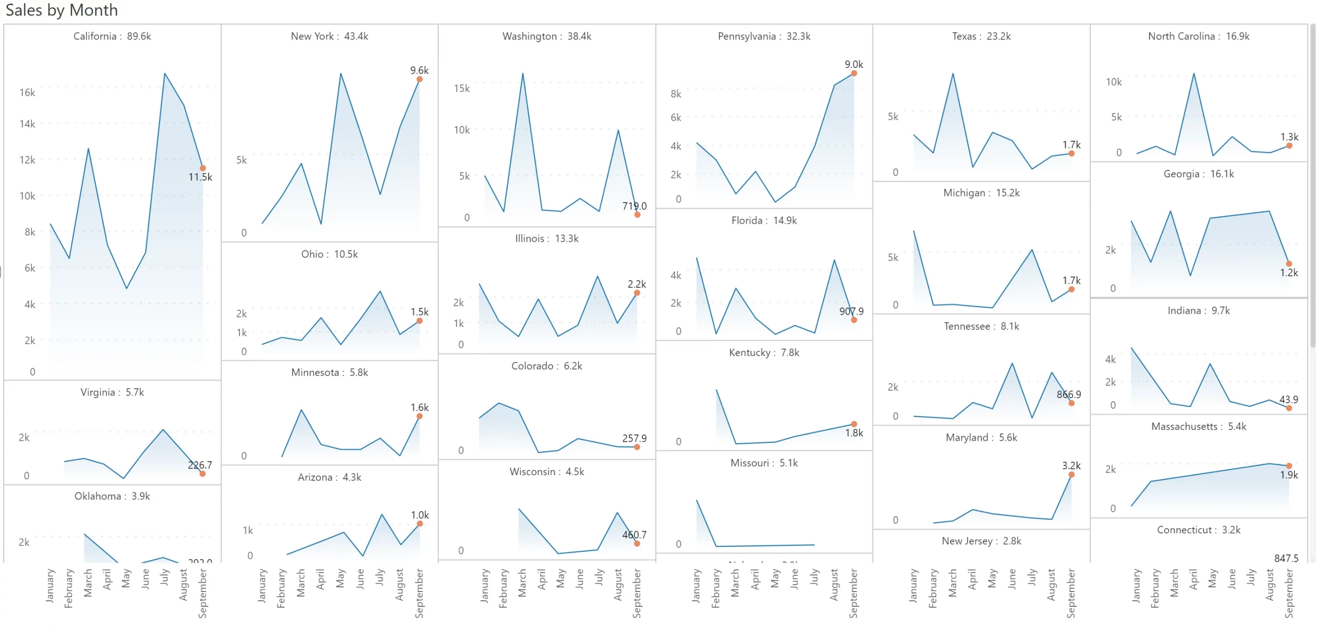
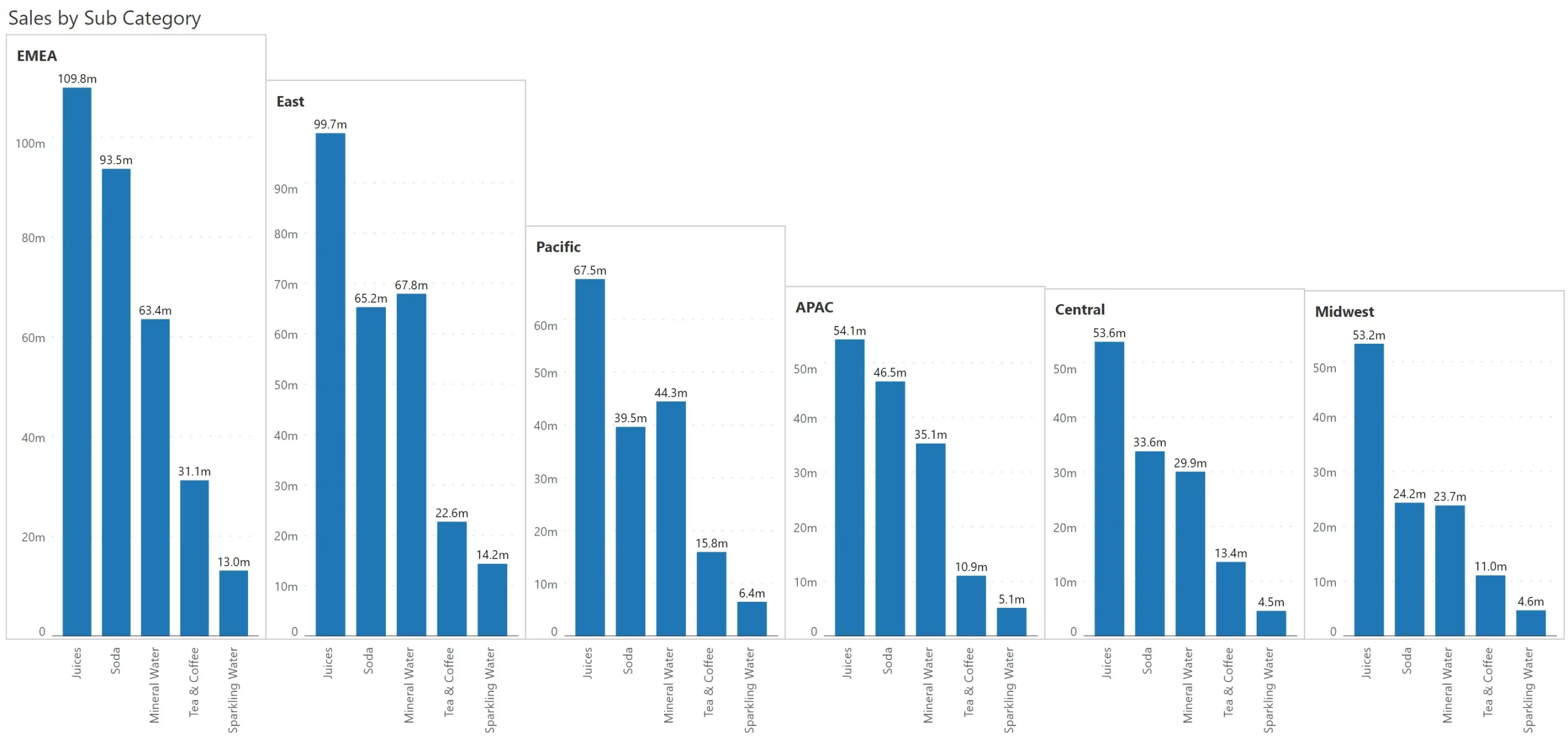
Here is an example where sales for the top 10 states are shown. This is followed by two additional panels: (a) one titled ‘Others’, which consolidates sales from all the remaining states, and (b) one with a grey background that shows the average of all the states.
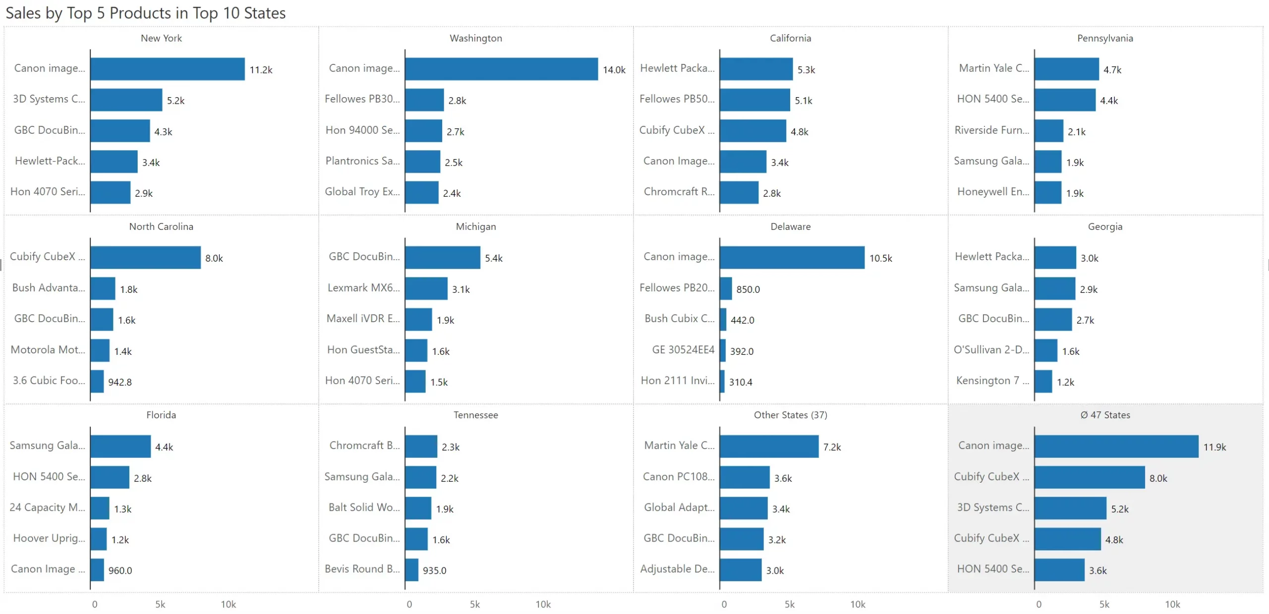
In the earlier example, we looked at a case where there was a restriction on the number of panels.
What if, in addition, you also have a lot of categories along the axis? This is where the Nested Top N Small Multiple comes in to help.
In the example below, the company has 1850 products. But we have chosen to show the top 5 products in the top 10 states. Interestingly, the Others and Average panels also show top 5 products.
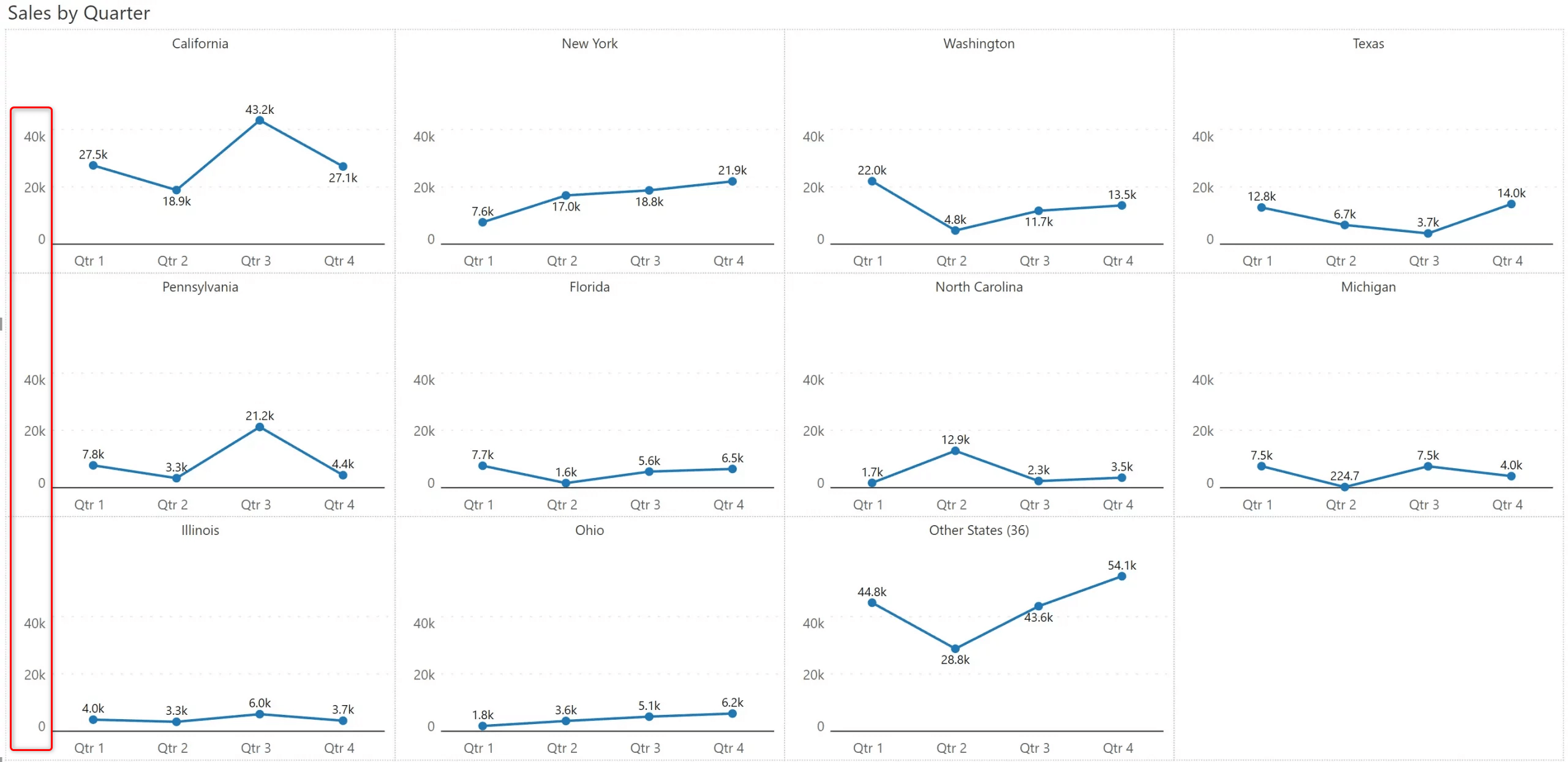
Real estate is highly precious while using small multiples. Look at the example below, where the Y axis labels are unscaled.
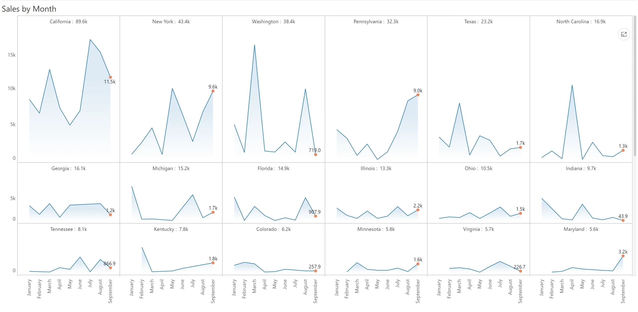
You get a lot more space to plot the chart when you use scaled Y axis labels. Scaling reduces clutter and increases the clarity of small multiples.
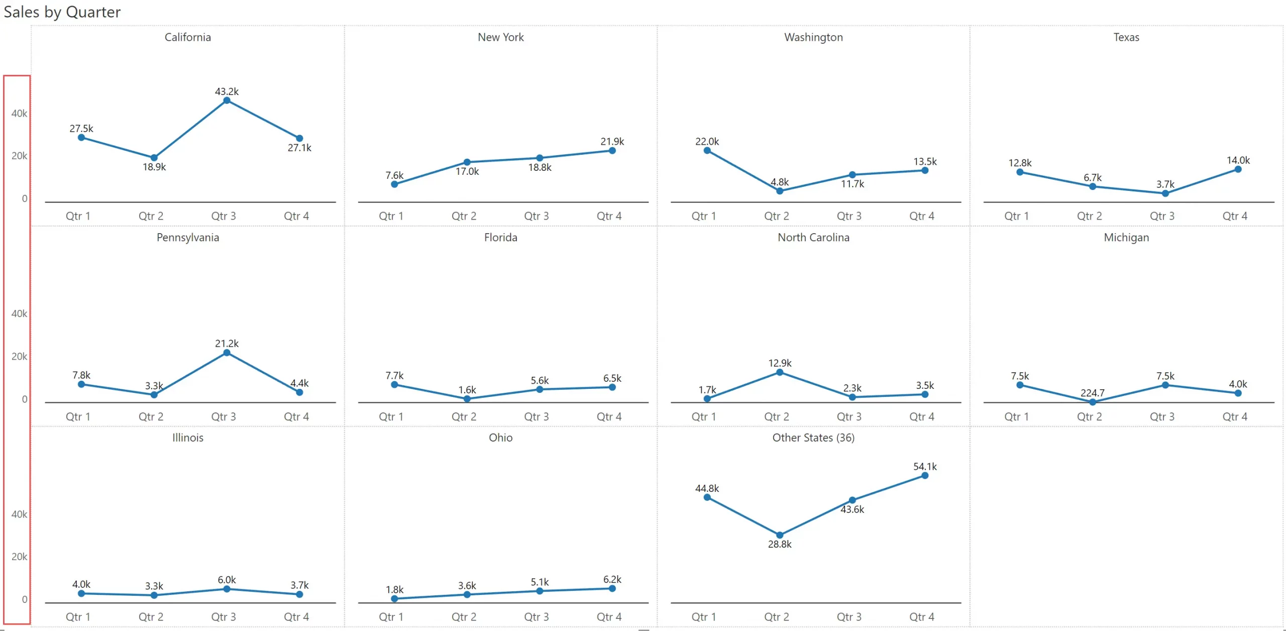
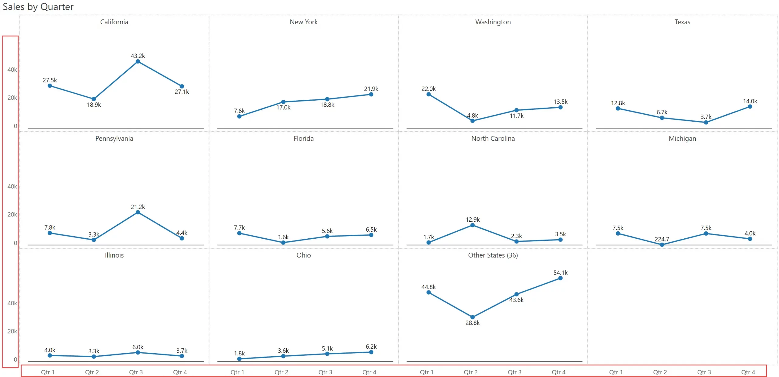
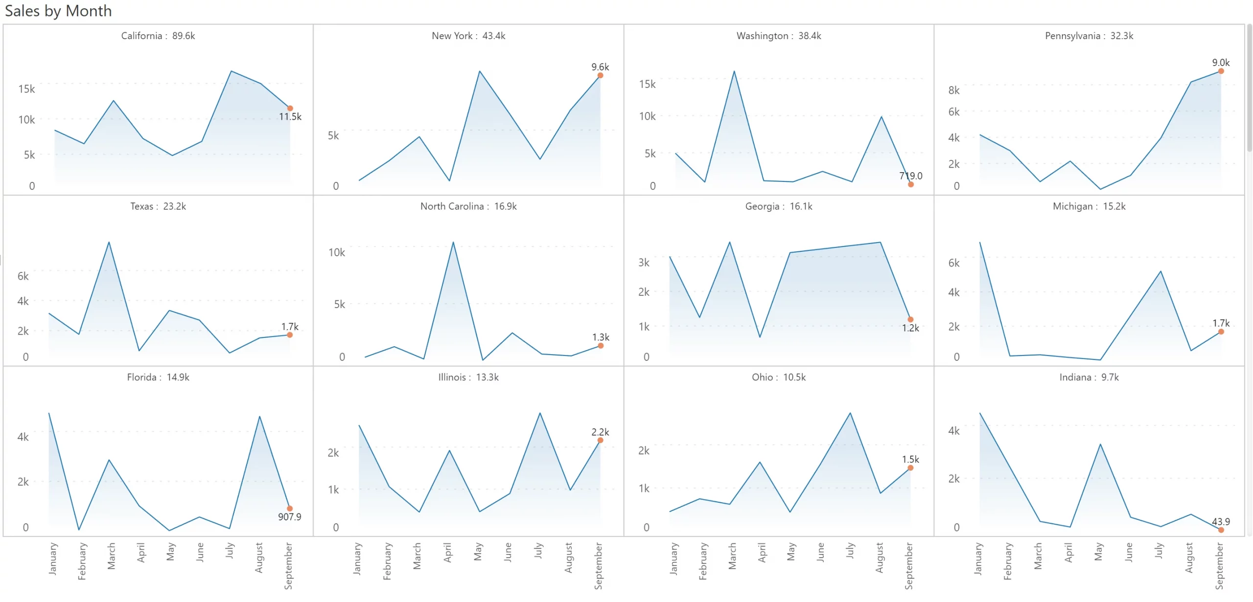
Here is another trick to make your small multiples less cluttered. When all the chart panels follow the same scale, freeze the Y axis on to the left as shown below. Isn’t the readability of this chart better than the one shown earlier?
Another way to enrich the small multiple is to showcase totals (or an appropriate aggregation for the measure, such as average) for each chart. In this case, it shows the total annual sales for each state in the chart header.
Take this example below, where you have 3 segments and 4 regions. You can plot these dimensions across the rows & columns respectively to deliver a 3x4 grid. Note that this is different from the previous example above, where we just showed 10 states.
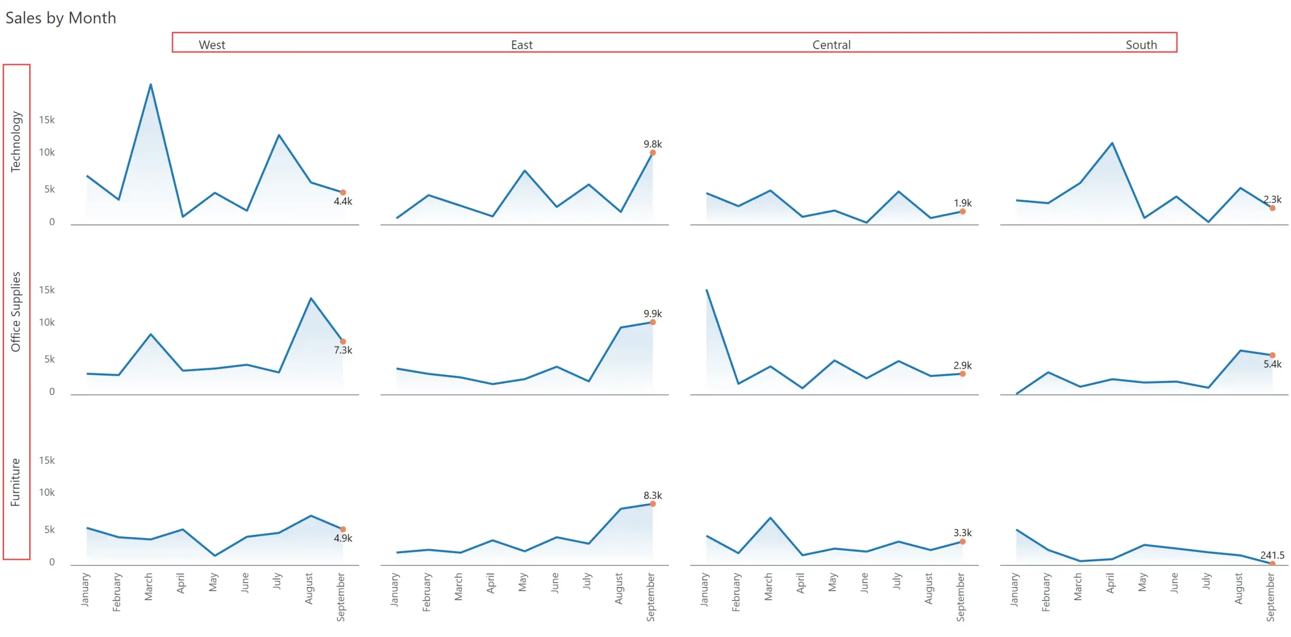
In effect, there are 3 dimensions used in this chart – Segment (rows), Region (columns), and Month (x-axis) – and hence the name multi-dimensional small multiple.
To make the line chart visually appealing, we have used an area shade with a gradient, and highlighted the value only for the most recent month.
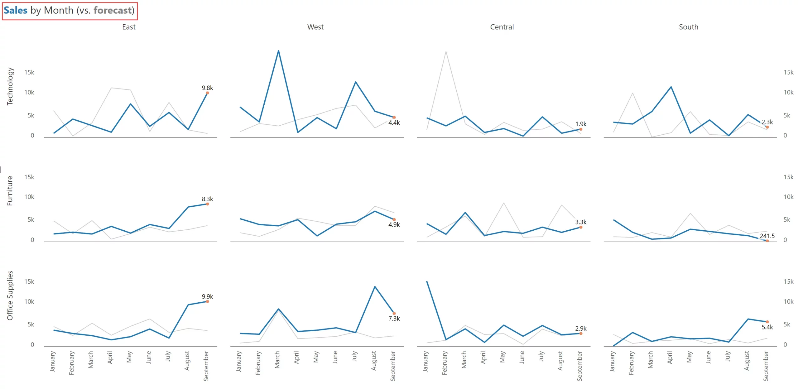
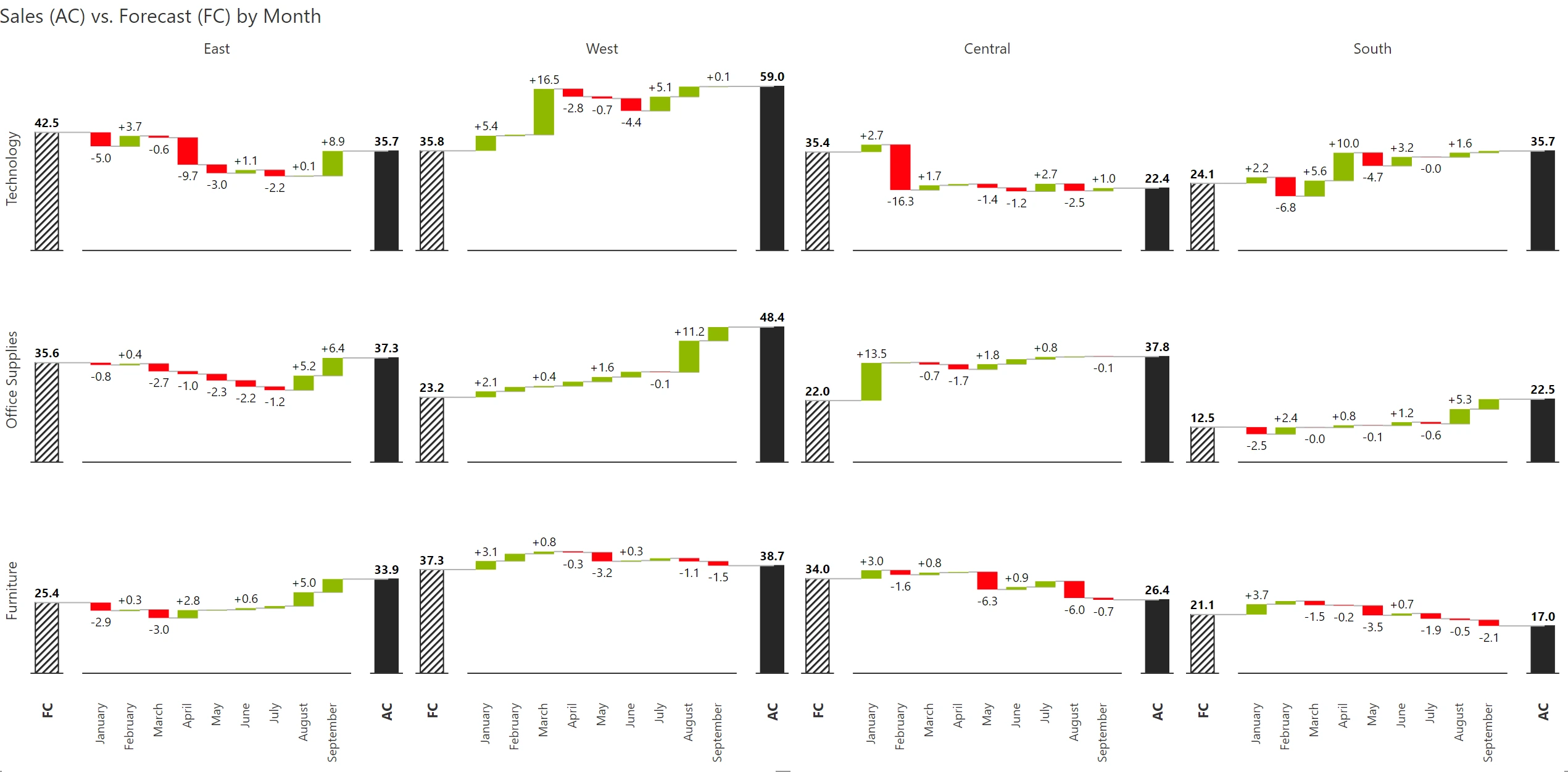
Comparative series are those that measure similar things in similar time periods and are of similar magnitude (e.g., Sales vs. Forecast). Simply put, comparative measures can be compared. Variances between these measures also make sense.
While using comparative series in a small multiple, try muting the secondary series as shown below. You can also color-code the title to make users understand what they are looking at – if you do this, you can avoid having to show the legend.
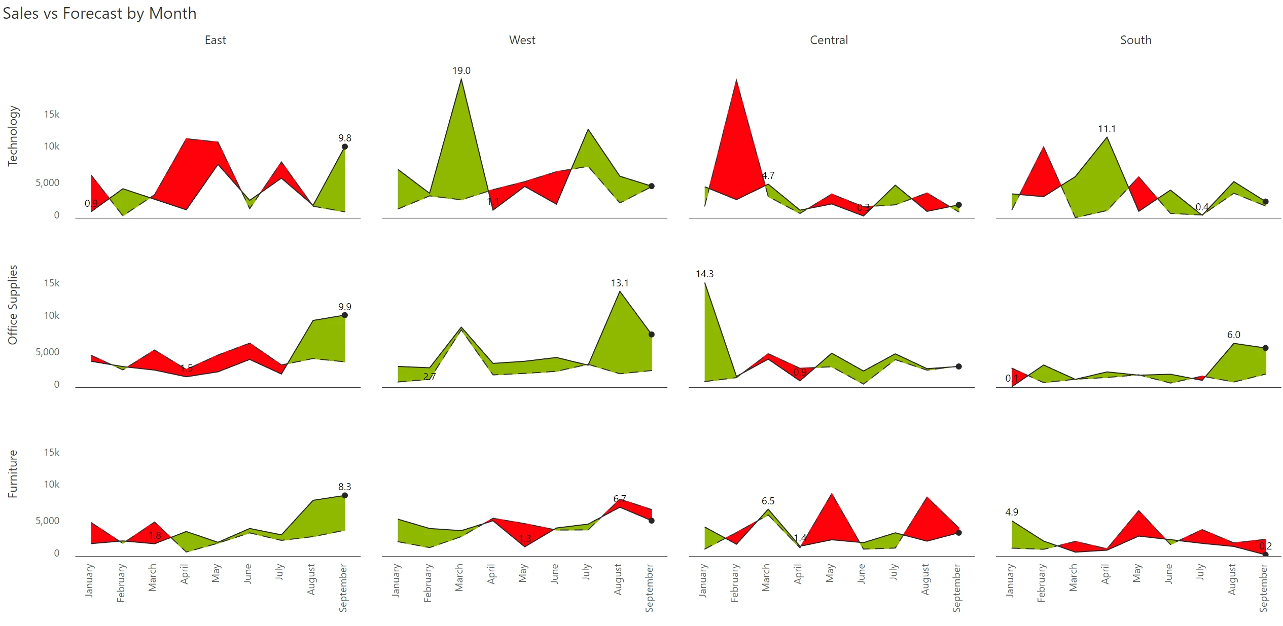
An alternative approach is to showcase variances by month.
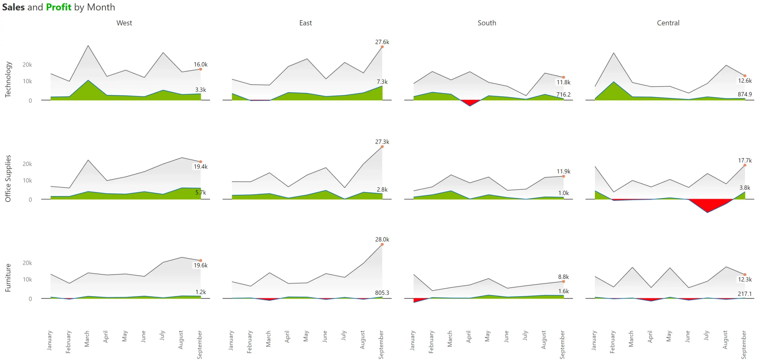
In the previous section (#7), we explored comparative measures. But how do we handle non-comparative measures (e.g., sales vs profit) in a small multiple?
Non-comparative measures are those whose magnitudes can be different (and one measure can even be negative, as in the case of profit). Other examples include sales vs. quantity, sales vs. net margin %, etc. A variance between such measure pairs does not make sense.
When you use non-comparative measures in trellis, you will encounter differences in scale due to which one of the measures is likely to be suppressed). Look at the example below.
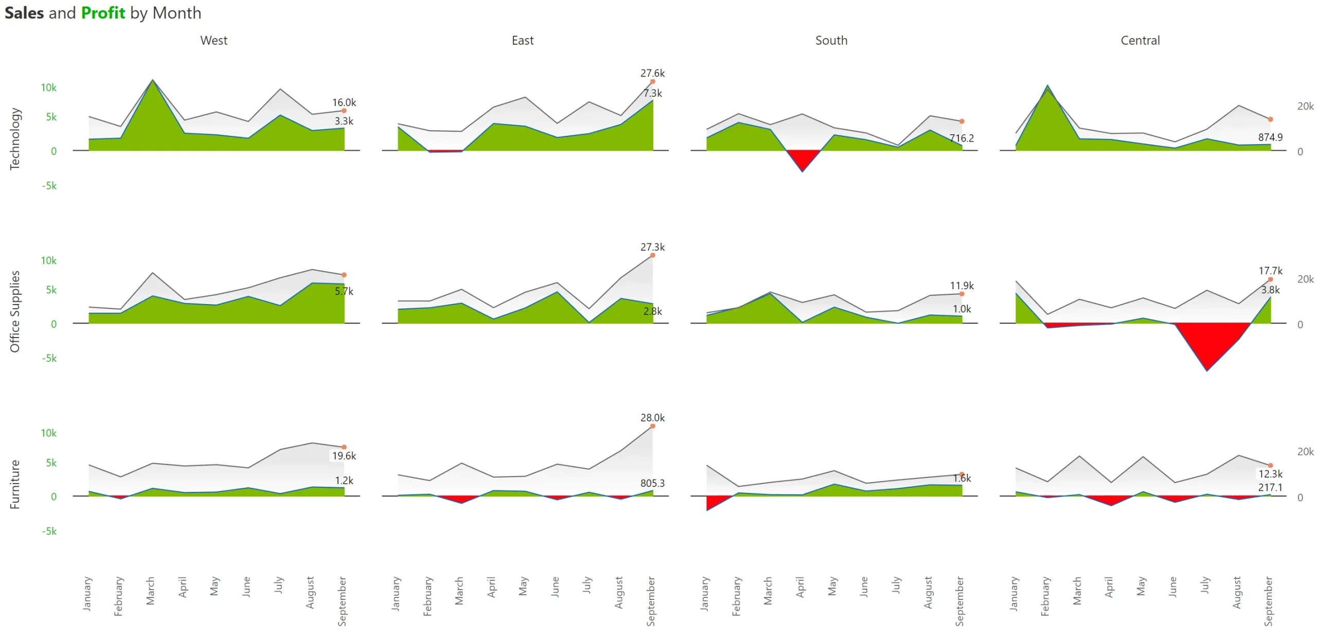
One approach that can deliver clarity is to plot them on two separate Y axes. However, this can complicate things further. In the example below, it is very easy to miss that both the series are plotted on two different axes, leading the viewer to the conclusion that the Top 7 regions consistently deliver extraordinary profit margins (~70-80%).
In any organization, 80% of outcomes are contributed by 20% of inputs or drivers. For example, approximately 80% of your sales can be driven by about 20% of your products, regions, or sales reps. This is better known as the Pareto principle.
When you use small multiples with uniform scaling (where the Y axis for every single panel is on the same scale), the bottom 80% of values (e.g., Delaware & Oregon in the last two panels) obstruct the ease of use in two ways: (a) they occupy the same amount of space as the states contributing the most, and (b) they make it difficult to discern trend variations in states that contribute a lot more but are not necessarily in the top (e.g., Georgia in the second row).
This is where scaled rows can help. In essence, we fix each row to a scale and vary its height for readability. You can immediately observe that the trend for Georgia (1st in the second row) is much clearer than in the small multiple provided above.
In the previous example, we recommended deviating away from uniform scale but still fixed each row to a scale. Sometimes, it may be better for you to discard uniformity at a row level too and go for individual scaling for each panel. (Of course, as mentioned earlier, such decisions must be determined based on the metrics, context, and intent of the communication)
If you decide to use individual scaling, you have two options.
One option is to use simple individual scaling for each cell as shown below. However, unlike the uniform scaling and scaled rows seen above, it is harder to gauge the relative contribution from each state. For example., California is the same size as Georgia.
This is where the second option of using ranked panels can help. The ranked panel is a compromise between scaled rows and individual scaling. This ranks each state (akin to a heat map) roughly based on its contribution. And each cell, in turn has its own scale. This allows you to gauge the relative contribution (or ranking) of the states, while also clearly discerning the trend within each state. Compared to all the other options, a ranked scaling uses real estate most effectively.
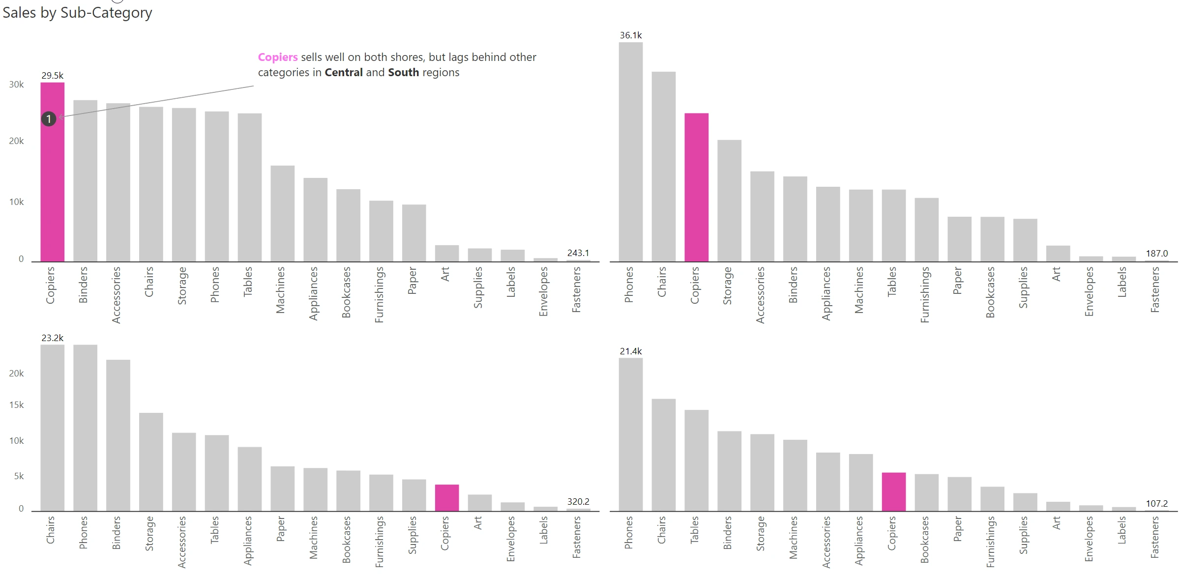
In this example, we highlight how Copiers, despite selling well in the coastal regions, lags behind in the heartland. While the unique formatting draws attention, the annotation helps communicate the analyst’s intent.
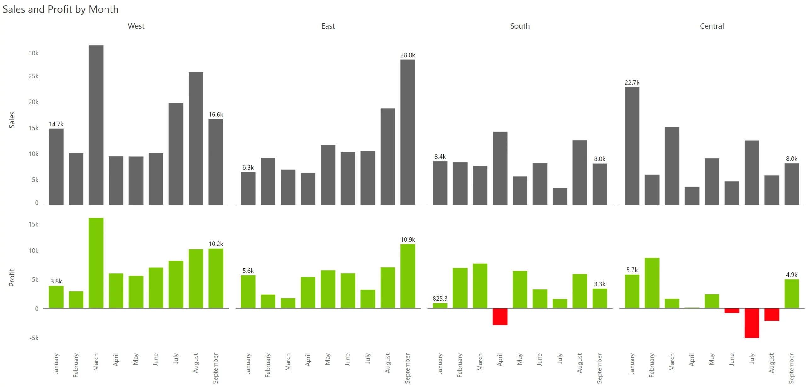
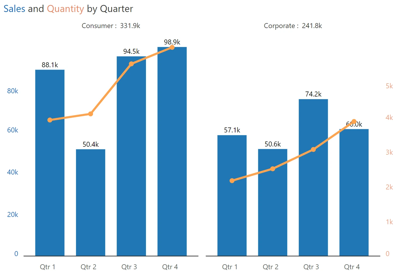
The small multiple need not be restricted to a large number of charts. One of the most under-used and yet a highly powerful variant is the dual panel small multiple. Check out the example below, where sales & quantity are plotted for two segments, consumer & corporate. Observe how both sales & quantity are plotted in two different Y axes, with the axis labels, data series, and chart title color-coded to differentiate Quantity from Sales.
Here is a summary of the twelve (12) recommendations and best practices for small multiples in Power BI, including how to leverage trellis charts in Power BI and other repeated visuals in Power BI for maximum impact.

Inforiver helps enterprises consolidate planning, reporting & analytics on a single platform (Power BI). The no-code, self-service award-winning platform has been recognized as the industry’s best and is adopted by many Fortune 100 firms.
Inforiver is a product of Lumel, the #1 Power BI AppSource Partner. The firm serves over 3,000 customers worldwide through its portfolio of products offered under the brands Inforiver, EDITable, ValQ, and xViz.