Upcoming webinar on 'Inforiver Charts : The fastest way to deliver stories in Power BI', Aug 29th , Monday, 10.30 AM CST. Register Now
Upcoming webinar on 'Inforiver Charts : The fastest way to deliver stories in Power BI', Aug 29th , Monday, 10.30 AM CST. Register Now
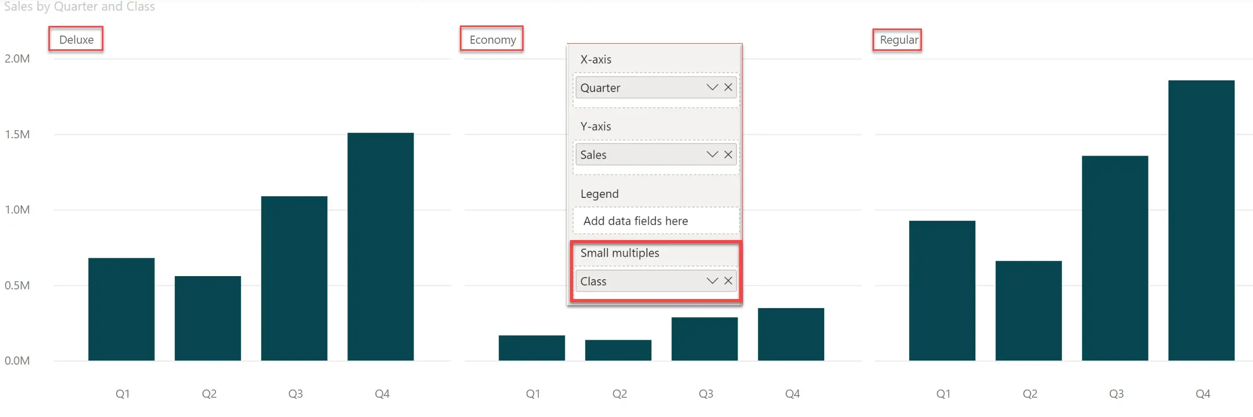
You have often seen category-based small multiple in Power BI. For example, here is a small multiple based on a category called Class, whose values are Deluxe, Economy and Regular. Note that all the three carts show the same measure Sales. This is essentially a category-based small multiple.
Similarly, is it possible to create a measure-based small multiple in Power BI, with each chart showing, say, a different measure? In other words, instead of showing Deluxe, Economy and Regular – can it show Sales, Margin, and YoY % Growth in each chart respectively?
In Power BI, you can achieve this only by arranging multiple charts side-by-side.
With Inforiver, you can create a measure-based small multiple from a single chart.
This is especially useful when the number of measures you need to display goes up (you don’t need 6 charts for 6 measures). In addition, you can toggle anytime between this measure-based small multiple and the normal clustered mode (where all measures are shown in a single chart).
***
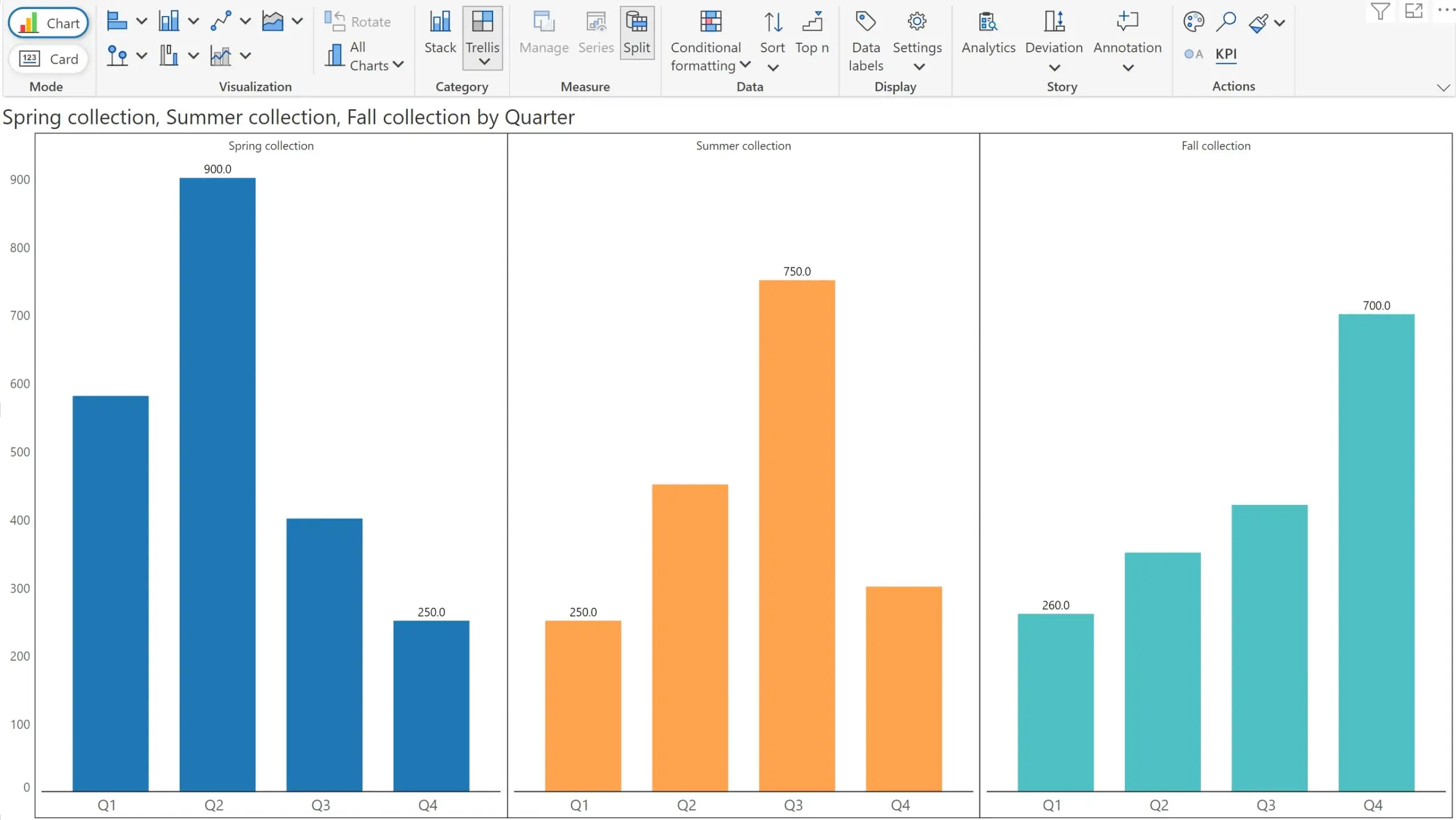
Take this chart as an example. We have three measures tracking sales for an apparel brand respectively for their spring collection, summer collection & fall collection lines.
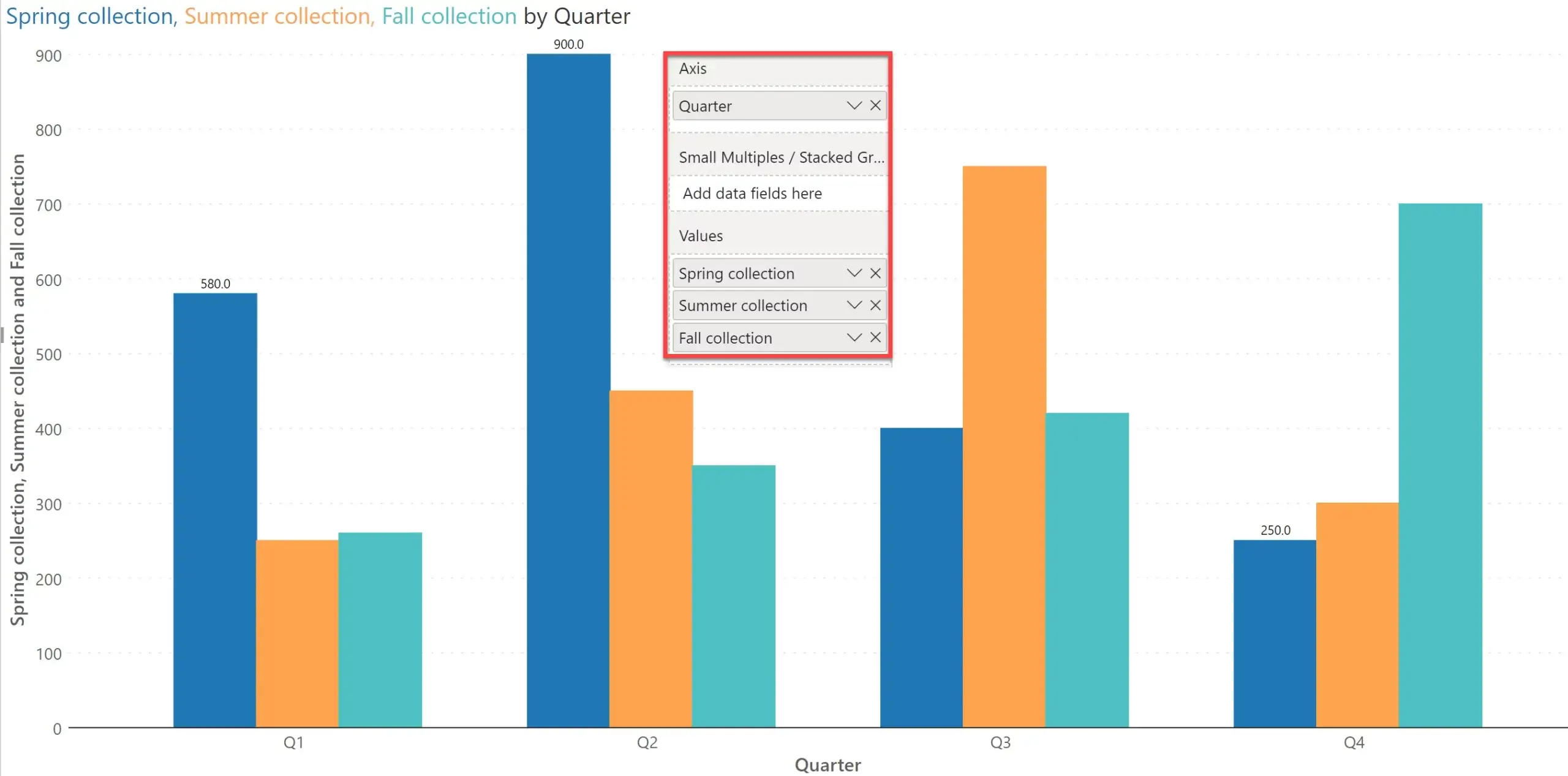
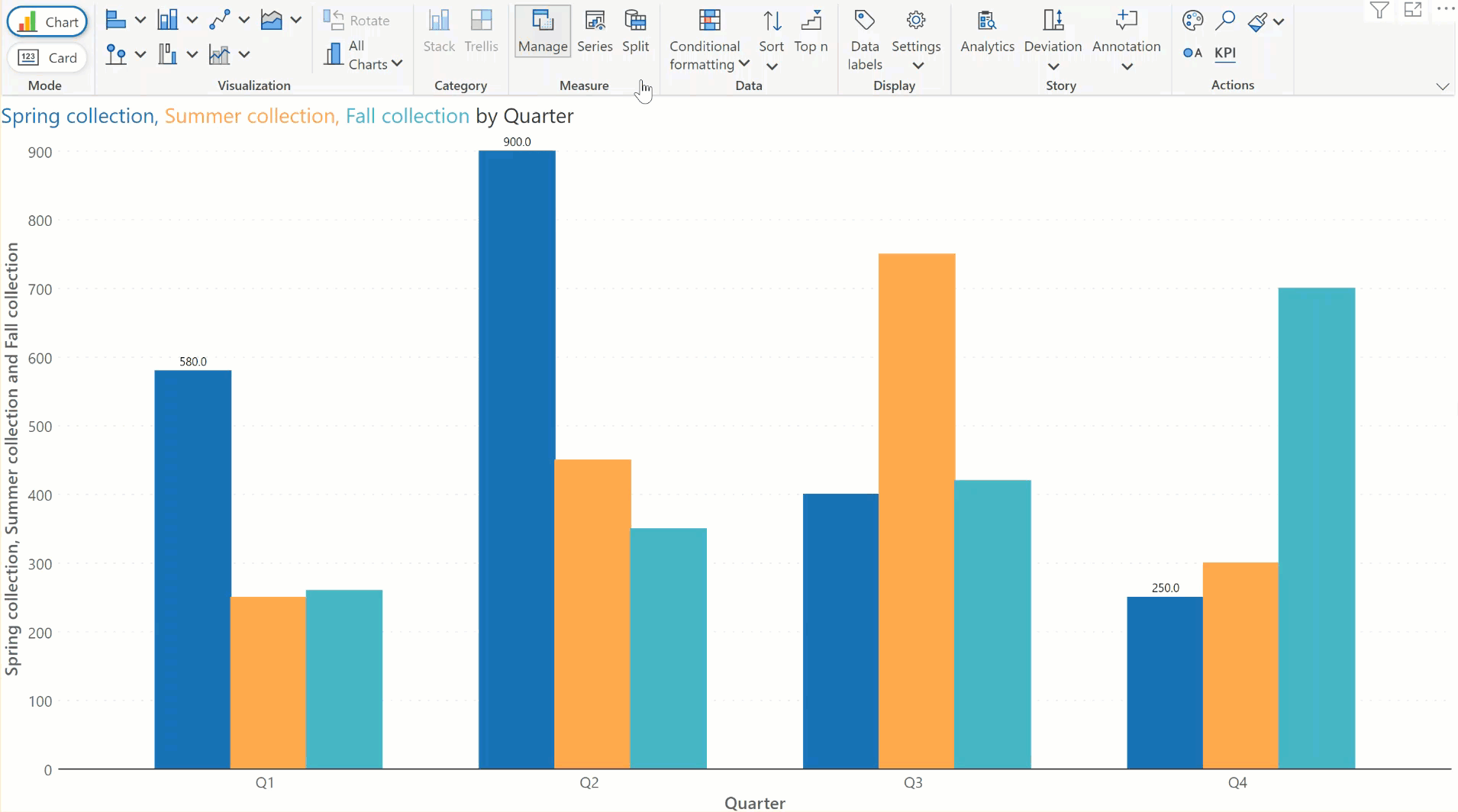
Instead of the standard chart above, I prefer a small multiple with 3 charts, one for each measure.
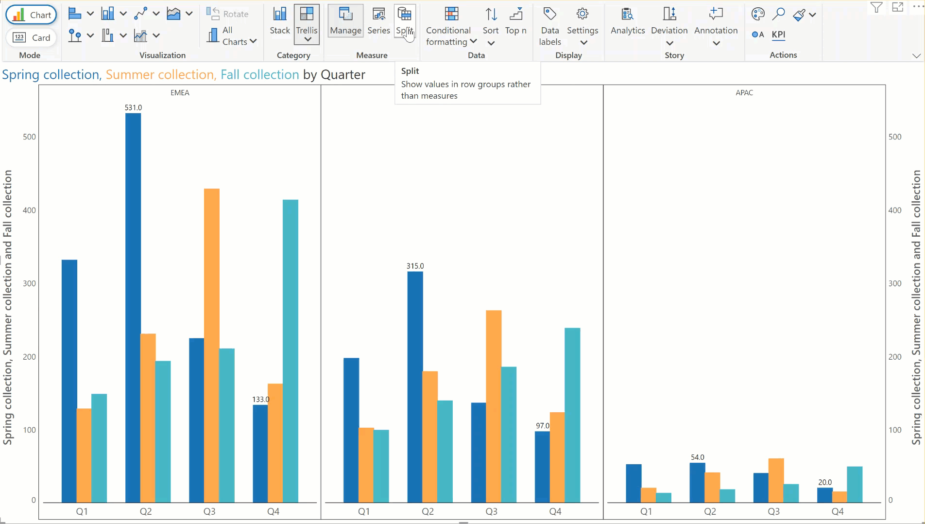
To accomplish this, go to the toolbar and select ‘Split’ in the Measure section.
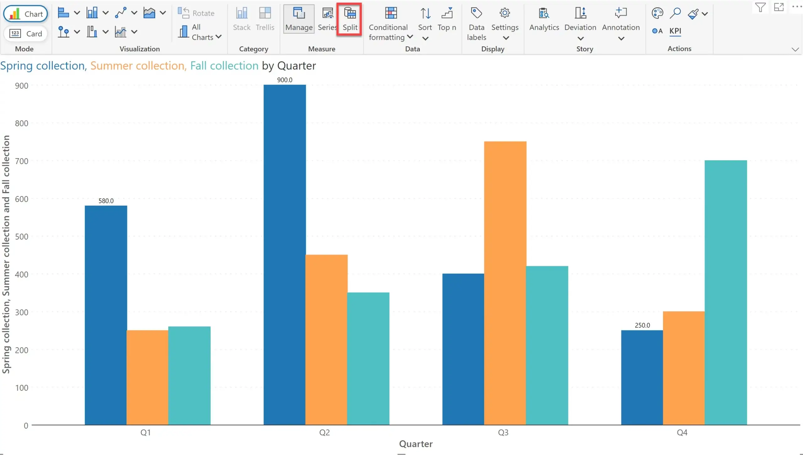
Inforiver will instantly deliver a small-multiple, each featuring one measure. The coolest thing is that each measure retains its own color to ensure consistency with visualization best practices. From the chart below, it is a lot clearer that the spring collection peaked in Q2, summer collection in Q3 and fall collection in Q4. The chart above shows the same data, but it is a bit harder to observe.
Here is the animated example:
Note that splitting of measures into different charts helps when you are working with non-comparative measures. In other words, measures that cannot be compared against each other such as Sales, Quantity and YoY Growth %. Instead of using a multiple axes chart, you may be better off to use measure-based small multiple to deliver insights without clutter.
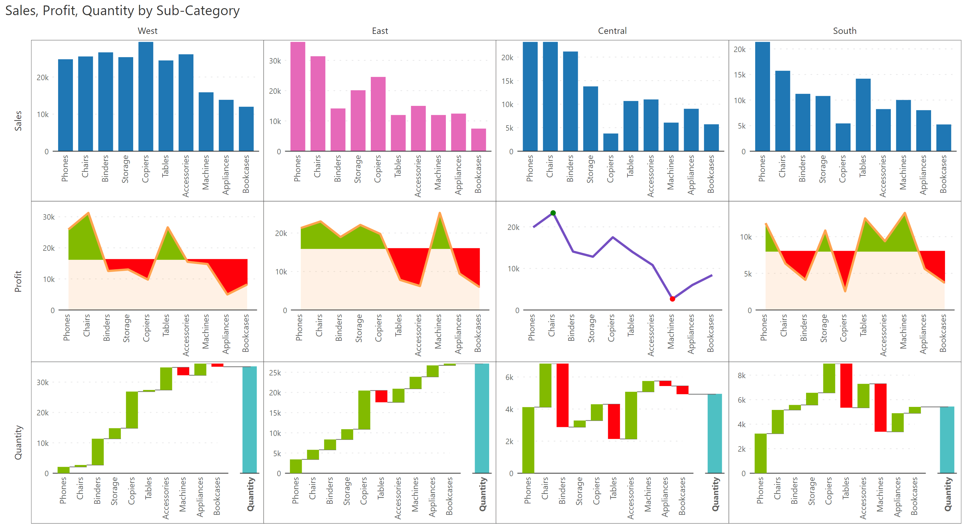
Inforiver can stretch this further to create an advanced small multiple with category across columns and measures in rows.
To demonstrate this, let us go ahead and add a new dimension ‘Region’ to the field Small Multiples/Stacked Group. The chart now shows the three regions – EMEA, NA and APAC in columns. The measures now appear in rows, one beneath the other.
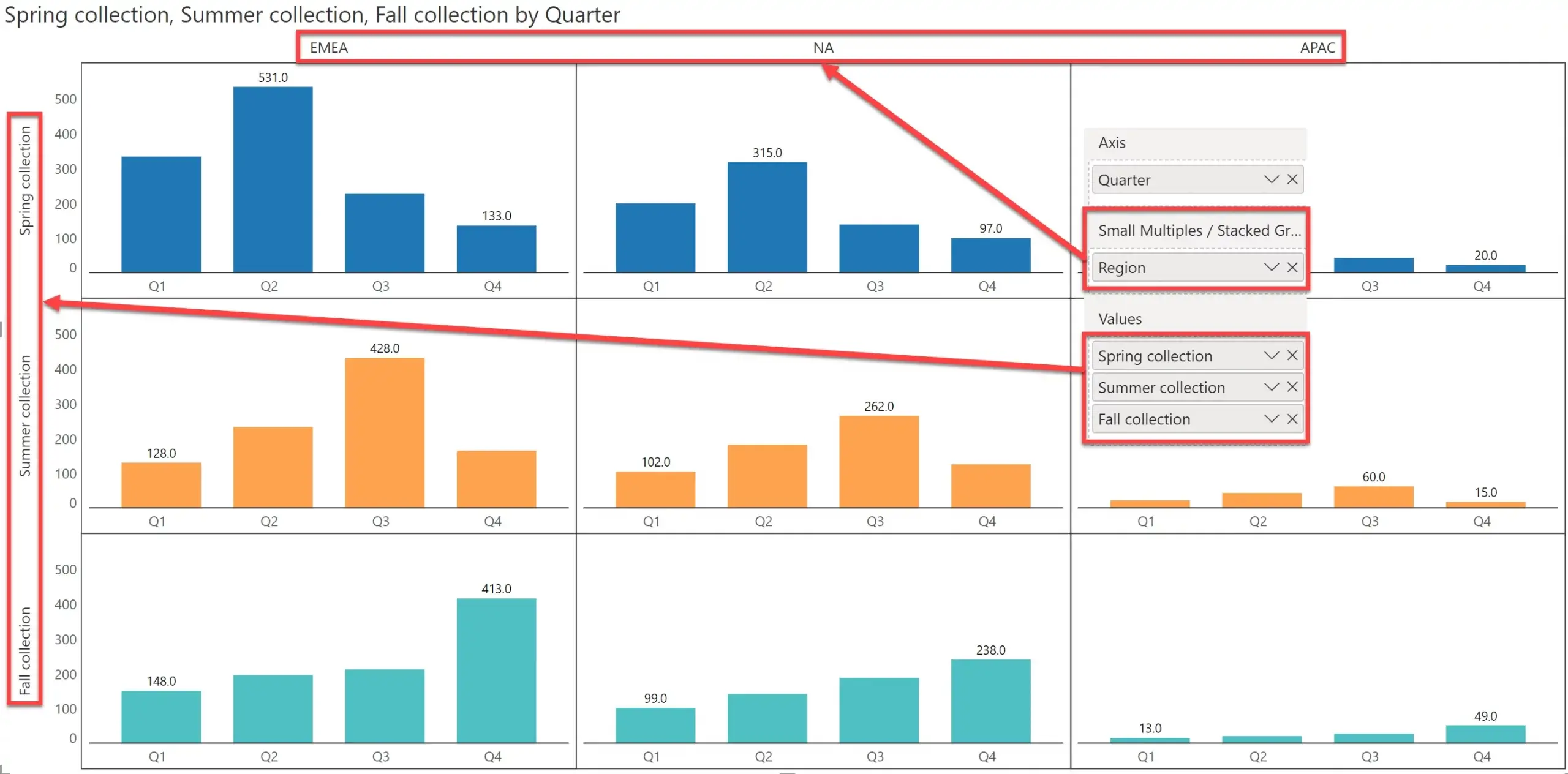
The unique color in each row indicates the presence of distinct measures in the small multiple. This ensures that users do not mistake the chart for showing a single measure across all the charts.
The animated split action for the two-dimensional small multiple is shown below.
Here is another example of a measure-based small multiple. Note that Inforiver allows you to customize each chart based on your needs.
***
Inforiver delivers several market-leading innovations such as the above to ensure cutting edge report design user experience.
Learn more about best practices for small multiples in Power BI.
Download your copy of Inforiver Analytics+ today and try out measure-based small multiple on your own.

Inforiver helps enterprises consolidate planning, reporting & analytics on a single platform (Power BI). The no-code, self-service award-winning platform has been recognized as the industry’s best and is adopted by many Fortune 100 firms.
Inforiver is a product of Lumel, the #1 Power BI AppSource Partner. The firm serves over 3,000 customers worldwide through its portfolio of products offered under the brands Inforiver, EDITable, ValQ, and xViz.