Upcoming webinar on 'Inforiver Charts : The fastest way to deliver stories in Power BI', Aug 29th , Monday, 10.30 AM CST. Register Now
Upcoming webinar on 'Inforiver Charts : The fastest way to deliver stories in Power BI', Aug 29th , Monday, 10.30 AM CST. Register Now
A visual, including a table or a matrix, can typically accommodate multiple measures with some exceptions. Most visuals in tools such as Power BI, Tableau, Qlik and Spotfire tend to treat all measures equally and are also based on a single measure. However, this leads to poorer user experience. Consider the following example.
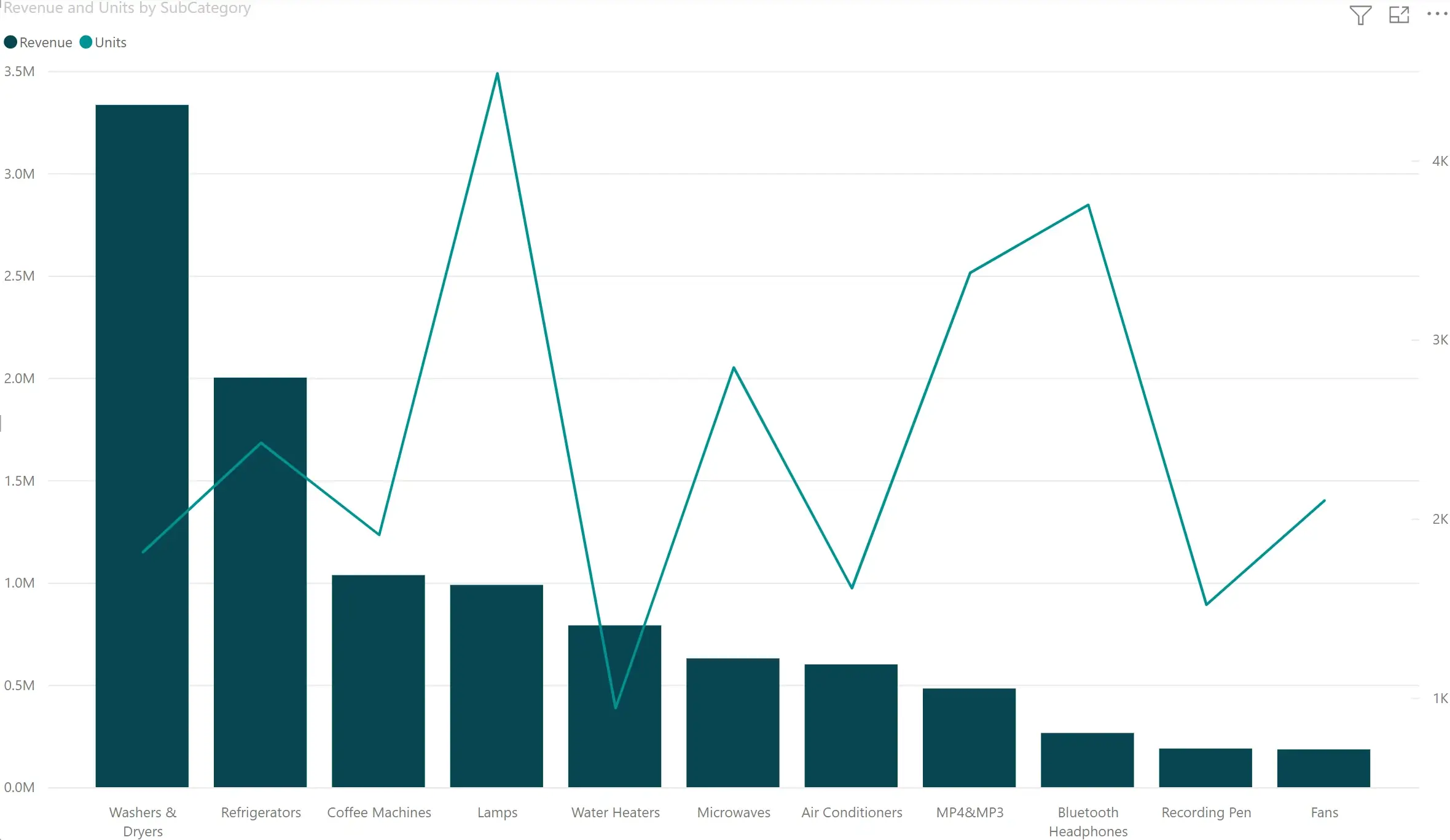
At ACME Corp, we need to track Revenue vs. Units sold by product category. When I plot both in a Line & Clustered Column visual in Power BI, I see both of them plotted on the same scale.

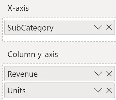
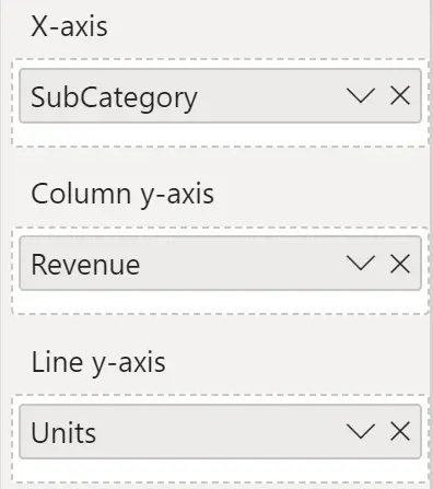
I can move the Units measure to another field called Line axis, but the results are very similar, except that the second measure is now a line instead of a column. But you can hardly observe the units sold.

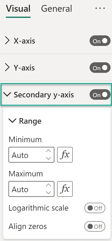
I then go to the property sheet and turn on the secondary Y-axis. Once this is done, the correct chart that I need is rendered.
This shortcoming is not restricted to Power BI alone. The setup is very similar in other visualization tools such as Tableau and Qlik.
The key question is: Why do visualization tools lack in-built intelligence to render charts intelligently based on data? Wouldn’t it provide a great boost to user experience (UX)?
Let us try the same thing with Inforiver Analytics+.
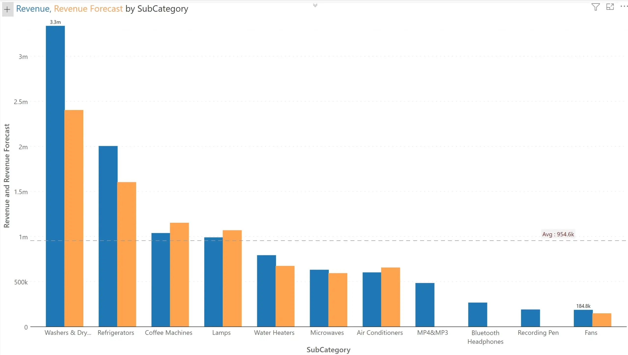
First, we try Revenue vs. Revenue forecast – both of which are on a similar scale. Inforiver plots the following. They are of similar scale, and they are on the same Y axis.
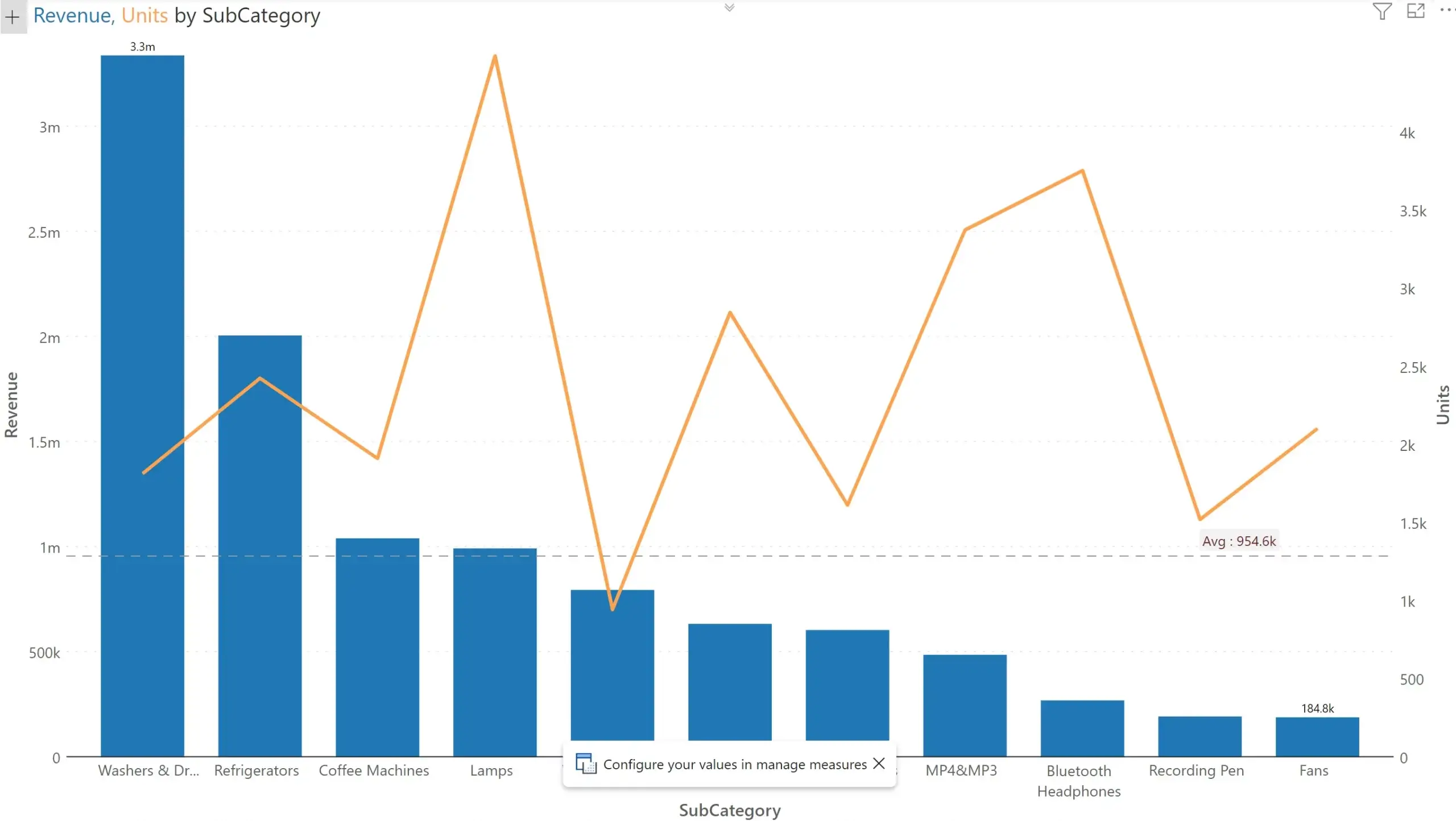
When we try Revenue vs. Units in a different Inforiver Chart, it automatically detects that the second measure is in an entirely different order of magnitude and plots it in a new Y axis. It also switches the secondary series type to a ‘line chart’ to avoid potential confusion.
This is just a simple example. Visualization tools can do a lot more for comparative measures. Before we understand advanced use cases, it helps to define what comparative and non-comparative measures are.
In simple terms, comparative measures are those that can be compared to each other, and potentially warrant a comparison.
Examples of comparative measures include the following:
Non-comparative measures are those that cannot simply be compared. Consider these measure pairs:
An alternate definition is as follows: Comparative measures are those for whom calculating variances are meaningful.
There is also a special case where a set of measures share the same Unit of Measure (UOM) – for example Revenue and Profit. Both are measured in currency. Despite a common UoM, they are typically treated as non-comparative measures, but there may be exceptions to this rule.
As seen in the earlier example, the first step for a visual is to understand whether measures are comparative. If done properly, we can do a lot more than automatically assigning measures to a new axis.
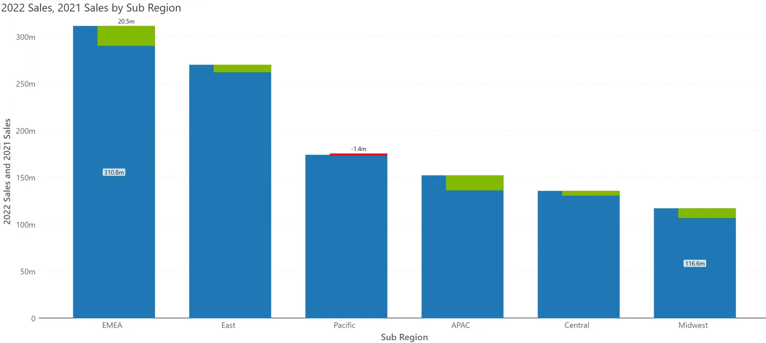
Consider another example where two measures, 2022 Sales and 2021 Sales need to be displayed by region. A typical chart is rendered as follows.
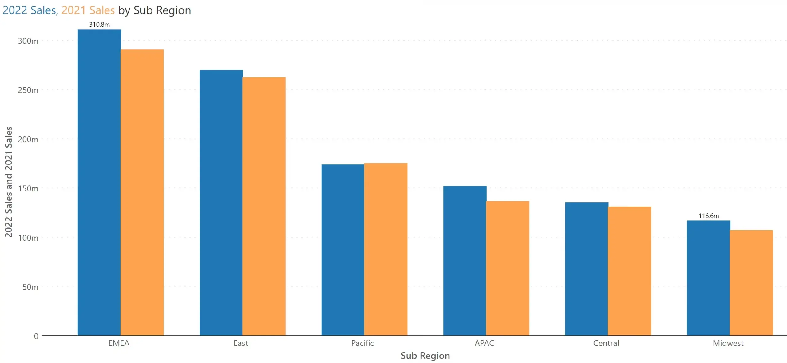
However, for this data set, it is highly valuable to quickly perceive whether the regions witnessed an increase in sales year-over-year, rather than the absolute sales revenue for each category in both the years.
Would it not be better to render something like this automatically to our users – without requiring you to manually go and change the chart type? You will instantly observe that Pacific region witnessed a decline in sales, whereas other regions experienced growth.
However, in our user research, we had a split verdict. Many preferred the integrated variance chart, while a considerable number of users wanted a normal column chart. As we did not want to throw a new chart type to casual users, we came with a new solution.
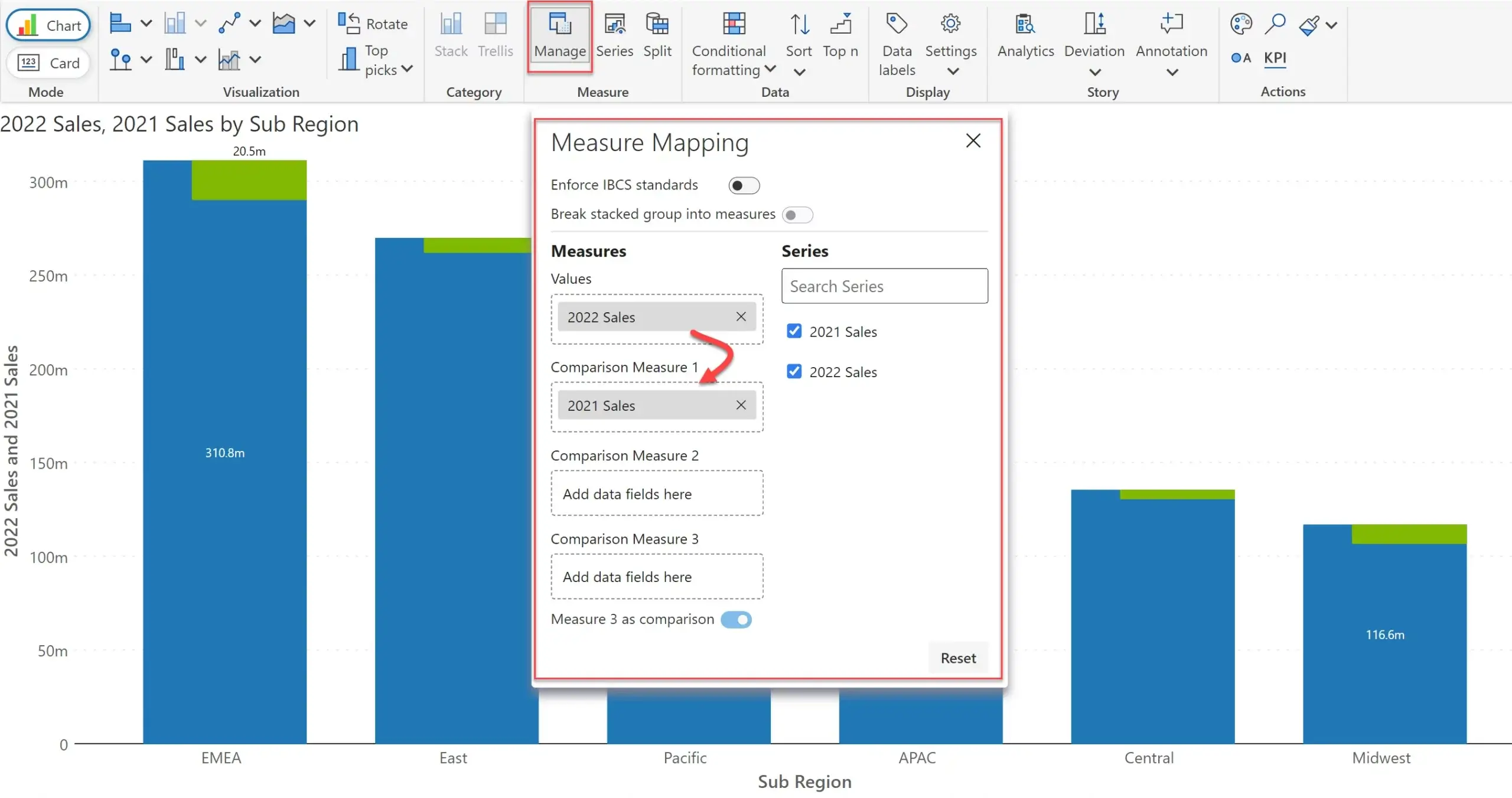
By default, Inforiver Analytics+* will deliver a normal column chart (but still assigning any measure in a radically different scale to a new axis and plotted in a line). However, the user can force the treatment of such measures as comparative measures which gives priority to variances.
You do this my opening ‘Measure Mapping’ and dragging 2021 Sales from the field Values to Comparison Measure 1. This instantly updates the chart from a simple column chart to an integrated variance chart.
But wait, there is more.
The typical data model has a single observation (e.g., Sales), with multiple contexts such as Year (2021, 2022, etc) or Version (Actual, Plan, Budget, Forecast v1, Forecast v2). The latter is a lot common in sales, and financial planning & forecasting.
In a dataset like this, how do we plot two different series for 2022 Sales and 2021 Sales, and calculate their variances? Today, this is not possible without creating explicit measures using DAX in the data model.
This is where advanced measure management comes to help. Let me illustrate with an example.
I map my data on to Inforiver Analytics+* as follows.
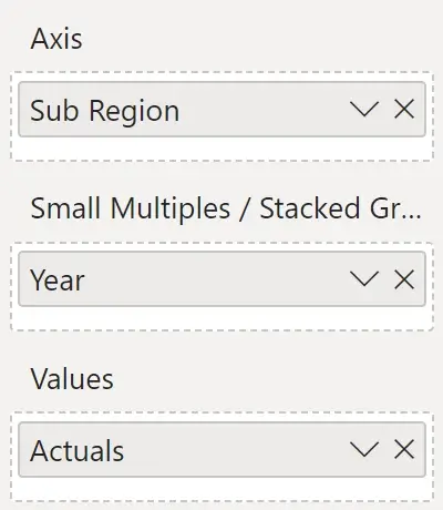
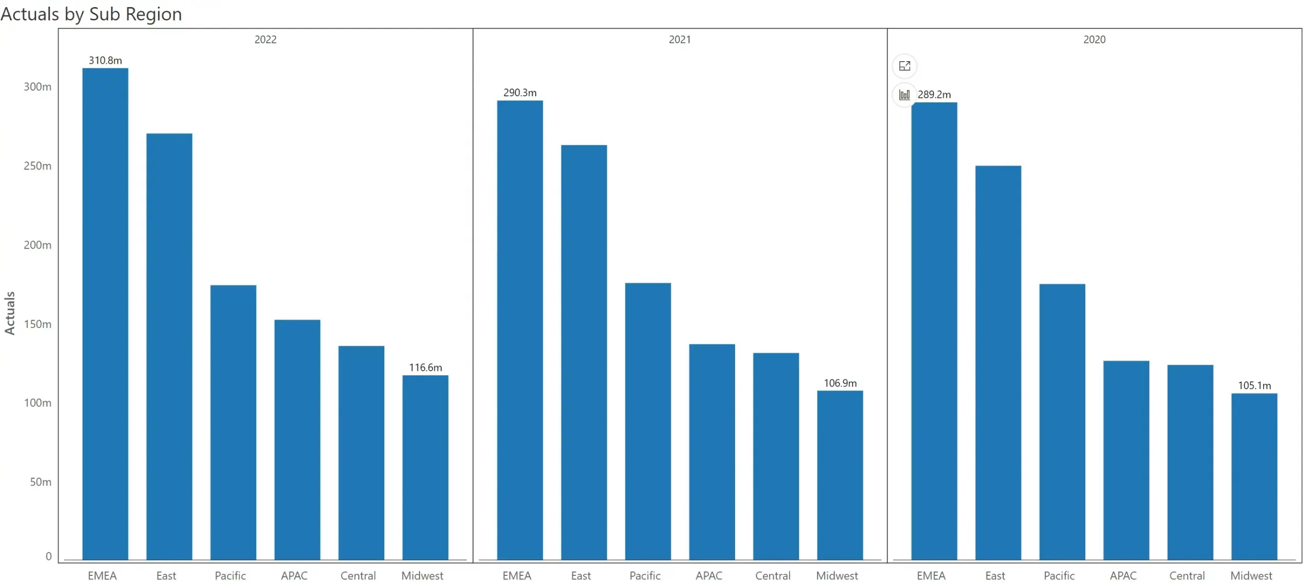
Since I have only 3 years’ worth of observations, I get displayed a small multiple with 3 charts. The sub region is plotted on the x-axis, and the actuals on Y axis.
But I would like to compare 2022 Actuals vs 2021 Actuals. How do I do it?
In the same Measure Mapping/Measure Management popup, I turn on ‘Break stacked group into measures’

Once I turn it on, the measure is broken down into three (by Year - which was assigned to the ‘Small Multiple/Stacked Group’ field) – corresponding to three years.
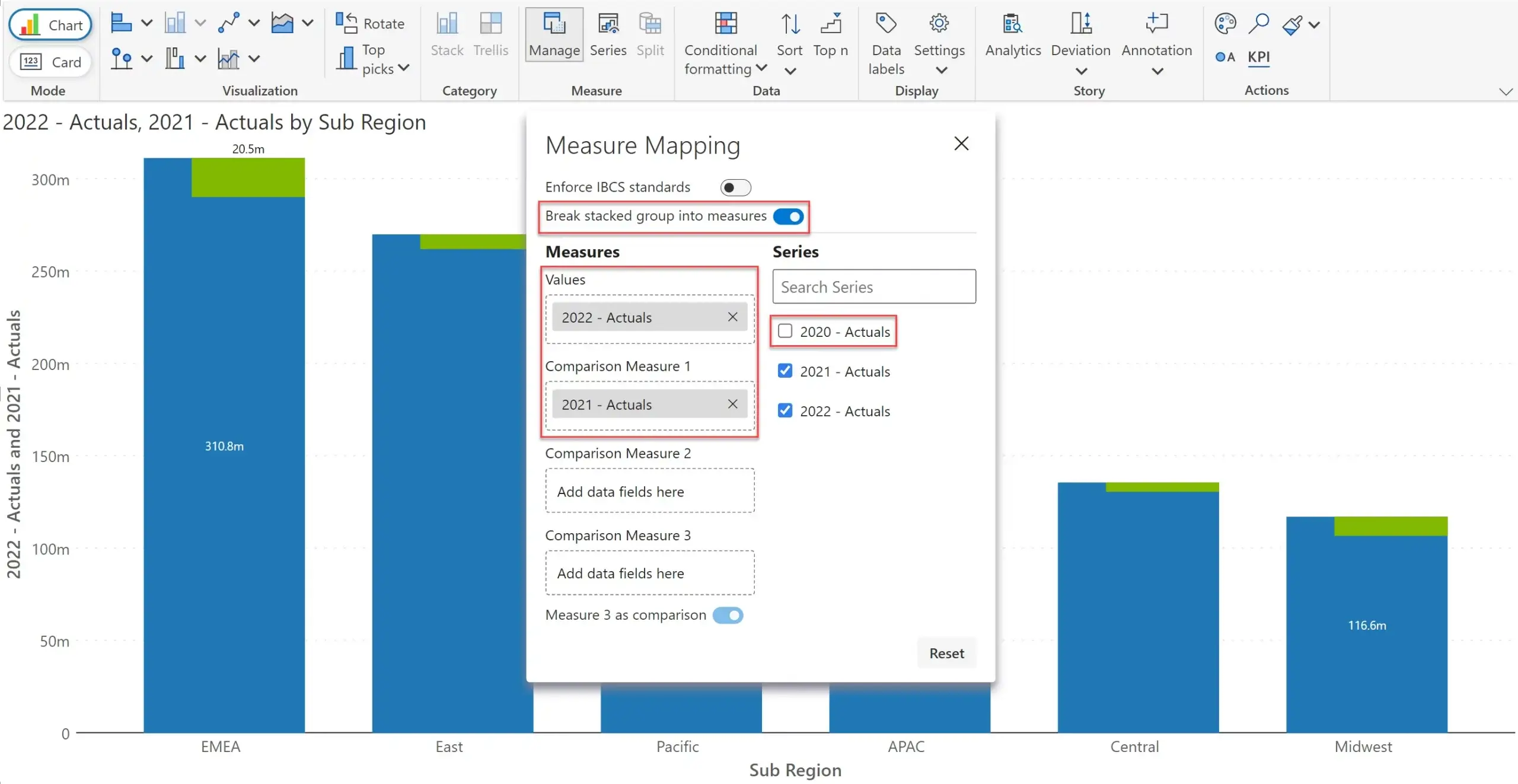
Once it is broken down into three, I can disable 2020 data by deselecting the checkbox. You can notice in the image above that the chart automatically updates itself to show variances for 2022 vs. 2021.
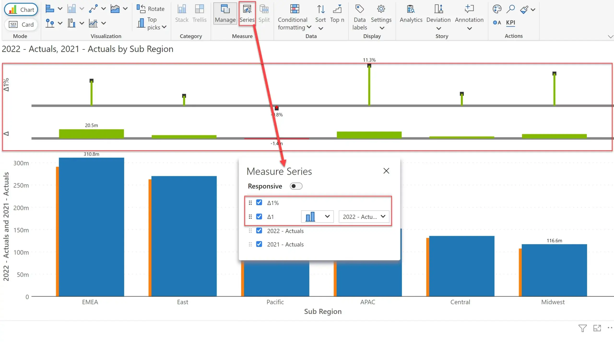
Whenever I breakdown a measure into its constituents using Measure Management, Inforiver also calculates variances. I can go to the ‘Series’ tab and enable the checkboxes against the absolute and % variances – and these get displayed on top of the chart.
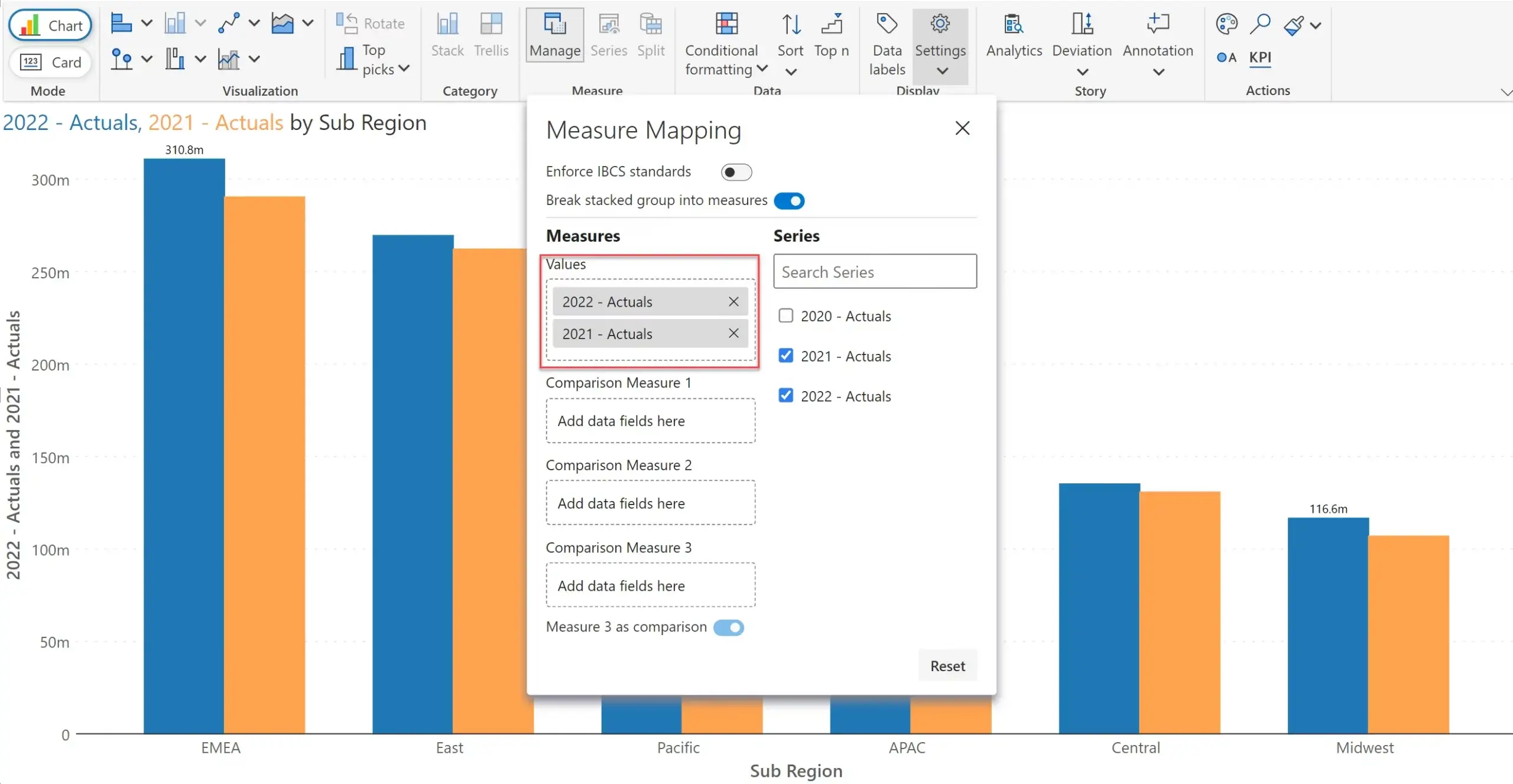
At any point in time, I can add 2021 Actuals to Values, and Inforiver starts treating them as a normal chart.
Note that in the last example above we have extracted two series from a single measure.
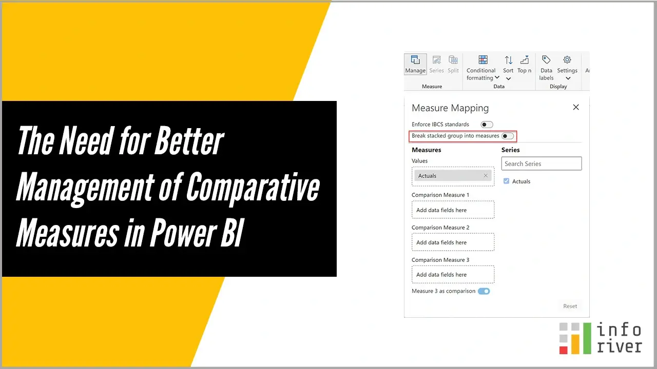
One final capability delivered as part of Measure Management is the option to enforce International Business Communication standards.
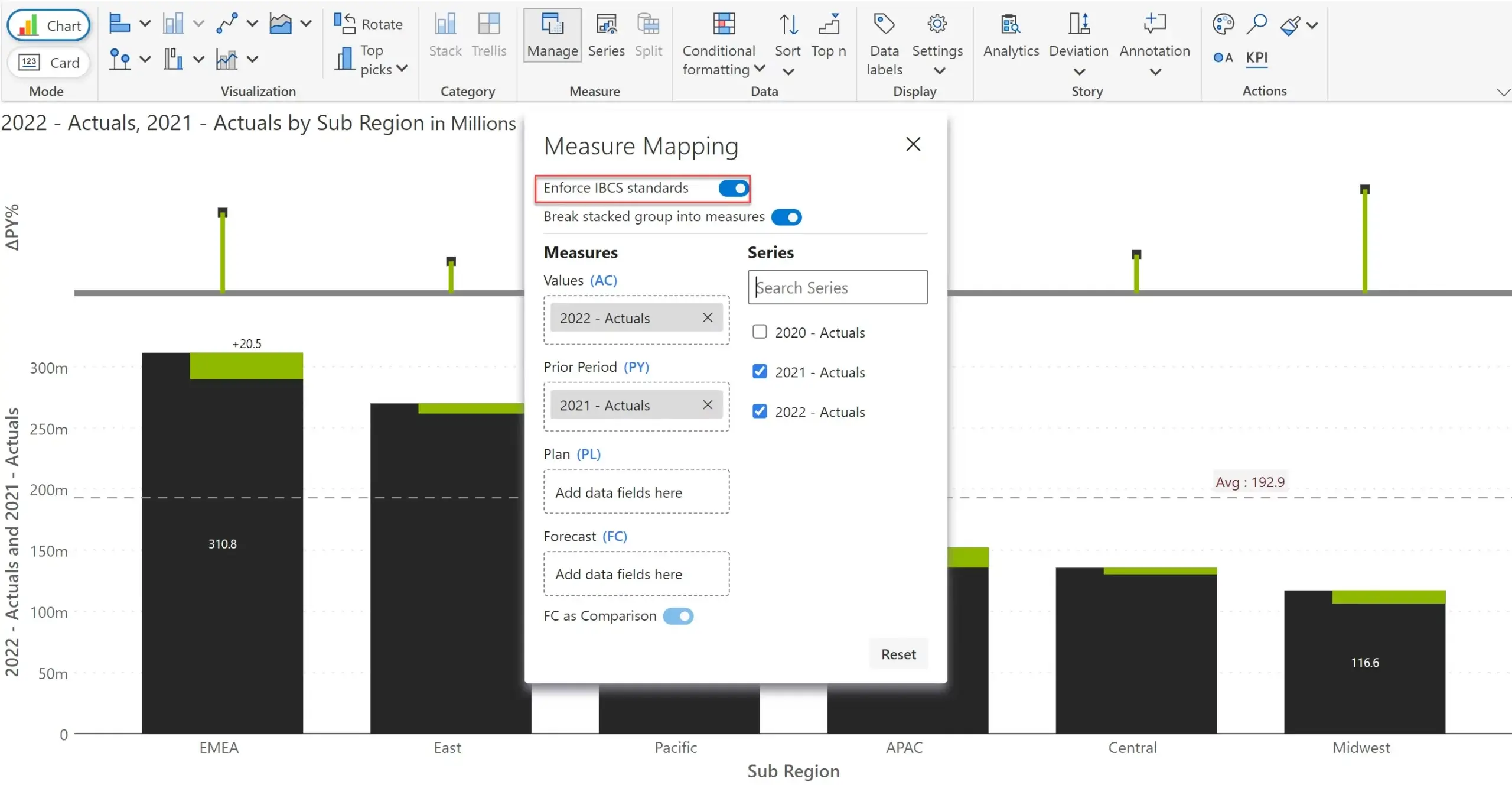
When this option is turned on, the original field names in the Measure Mapping window - Comparison Measures 1, 2, and 3 – acquire IBCS-specific names – Actual (AC), Prior Year/Period, Plan and Forecast. The chart in the underlying canvas gets rendered as per IBCS standards.
Measure management is a feature that is unique to Inforiver.
Up until the earlier version of Inforiver Analytics+* (Nov 2022), the product used 4 separate fields in the Power BI fields pane to capture data – AC, PY, PL and FC. Naturally, many users unfamiliar with IBCS standards had a confusing time assigning fields.
With the new release, the comparative measure assignment is abstracted into Measure Management that is accessible through the toolbar menu. This ensures that casual users (who constitute >90% of Power BI users) do not have to learn about measure assignment or deal with the complexity of managing four different fields.
In addition, Measure Management also allowed us to break down a measure into sub-components (e.g., by Year or Version field) – which bypasses the creation of DAX measures completely. This would not have been possible in our earlier approach of having four separate fields due to Power BI SDK limitations.
And above all, Measure assignment & management is also available for users in the reading view. This ensures that consumers of your reports can easily manage measures and swap multiple budget and forecast versions during runtime.
* * *
What do you think of Measure Assignment & Management? Does it elevate treatment of comparative measures to another level? Do let us know.
*Inforiver Charts has been renamed to Inforiver Analytics+, a 3-in-1 visual for dashboards and storyboards. It offers 50+ charts, cards, and tables.

Inforiver helps enterprises consolidate planning, reporting & analytics on a single platform (Power BI). The no-code, self-service award-winning platform has been recognized as the industry’s best and is adopted by many Fortune 100 firms.
Inforiver is a product of Lumel, the #1 Power BI AppSource Partner. The firm serves over 3,000 customers worldwide through its portfolio of products offered under the brands Inforiver, EDITable, ValQ, and xViz.