
Upcoming webinar on 'Inforiver Charts : The fastest way to deliver stories in Power BI', Aug 29th , Monday, 10.30 AM CST. Register Now
Upcoming webinar on 'Inforiver Charts : The fastest way to deliver stories in Power BI', Aug 29th , Monday, 10.30 AM CST. Register Now
This article explores the different types of variance charts and shows how Inforiver Analytics+ features enable you to create variance charts with a few simple steps.
A variance chart is a data visualization technique designed to show the difference (variance) between two key measures. Most commonly, it compares:
Instead of just showing two separate bars or lines, a variance chart often directly visualizes the gap, highlighting whether you are over, under, or on target, and by how much. This makes deviations immediately apparent.
Variances can be expressed in two primary ways:
Visualizing variance isn't just about making reports look good; it provides tangible business value:
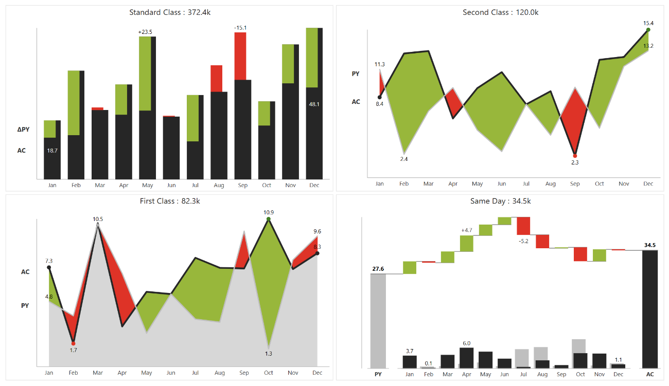
While the goal is always to show the difference, variance can be displayed using various chart types, each suited for different contexts and insights. Analytics+ supports a wide array of these, optimized for variance visualization:

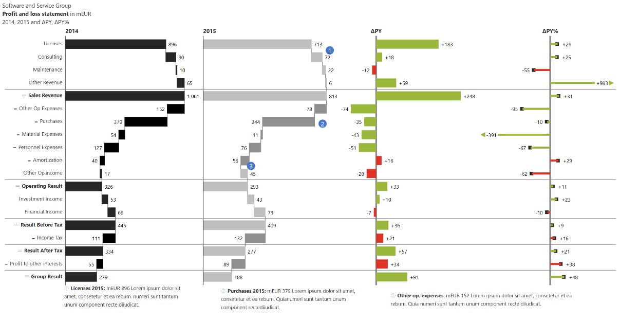
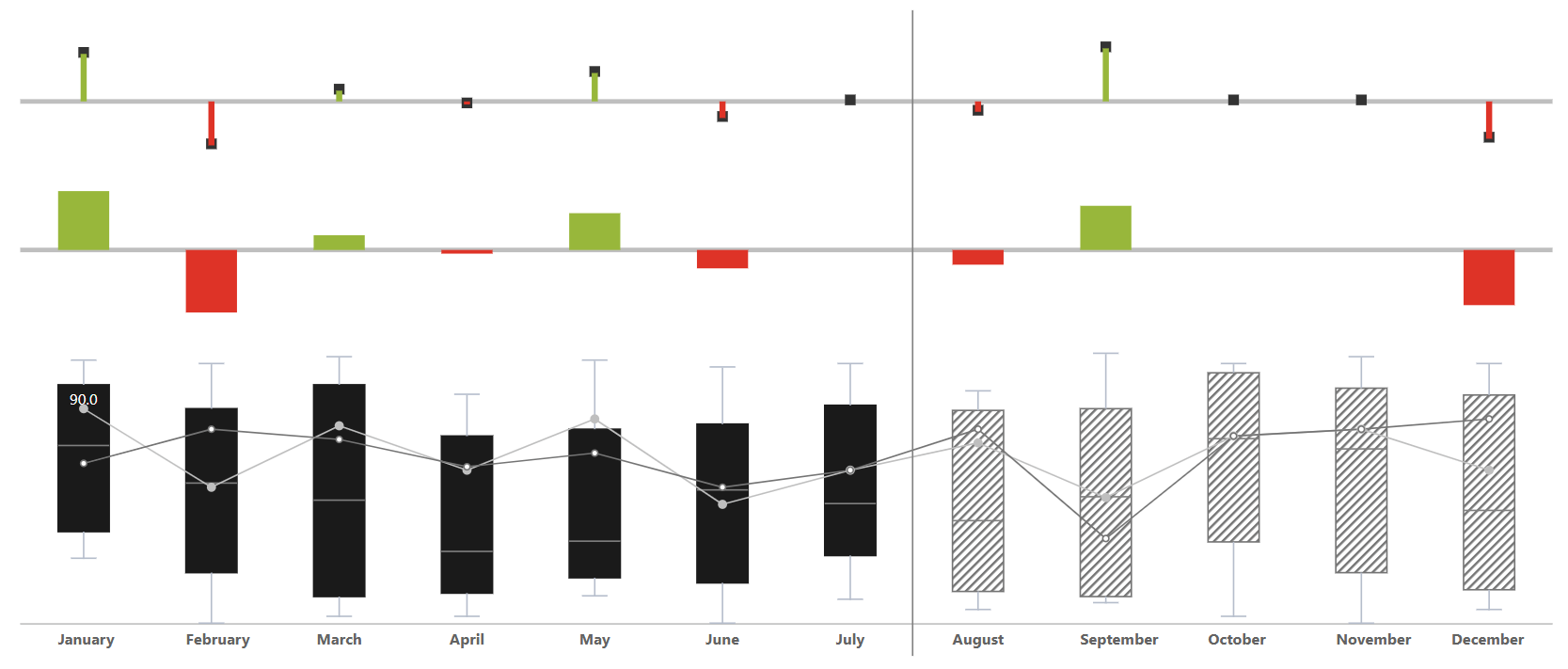
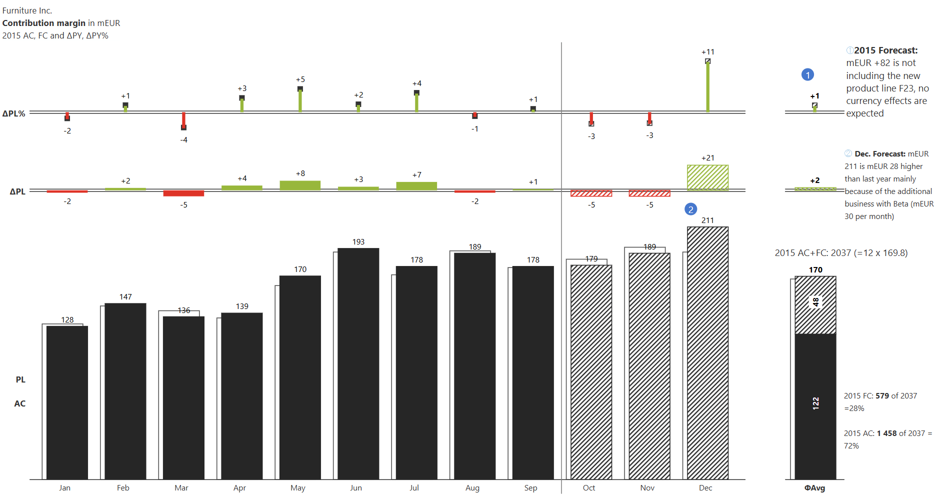
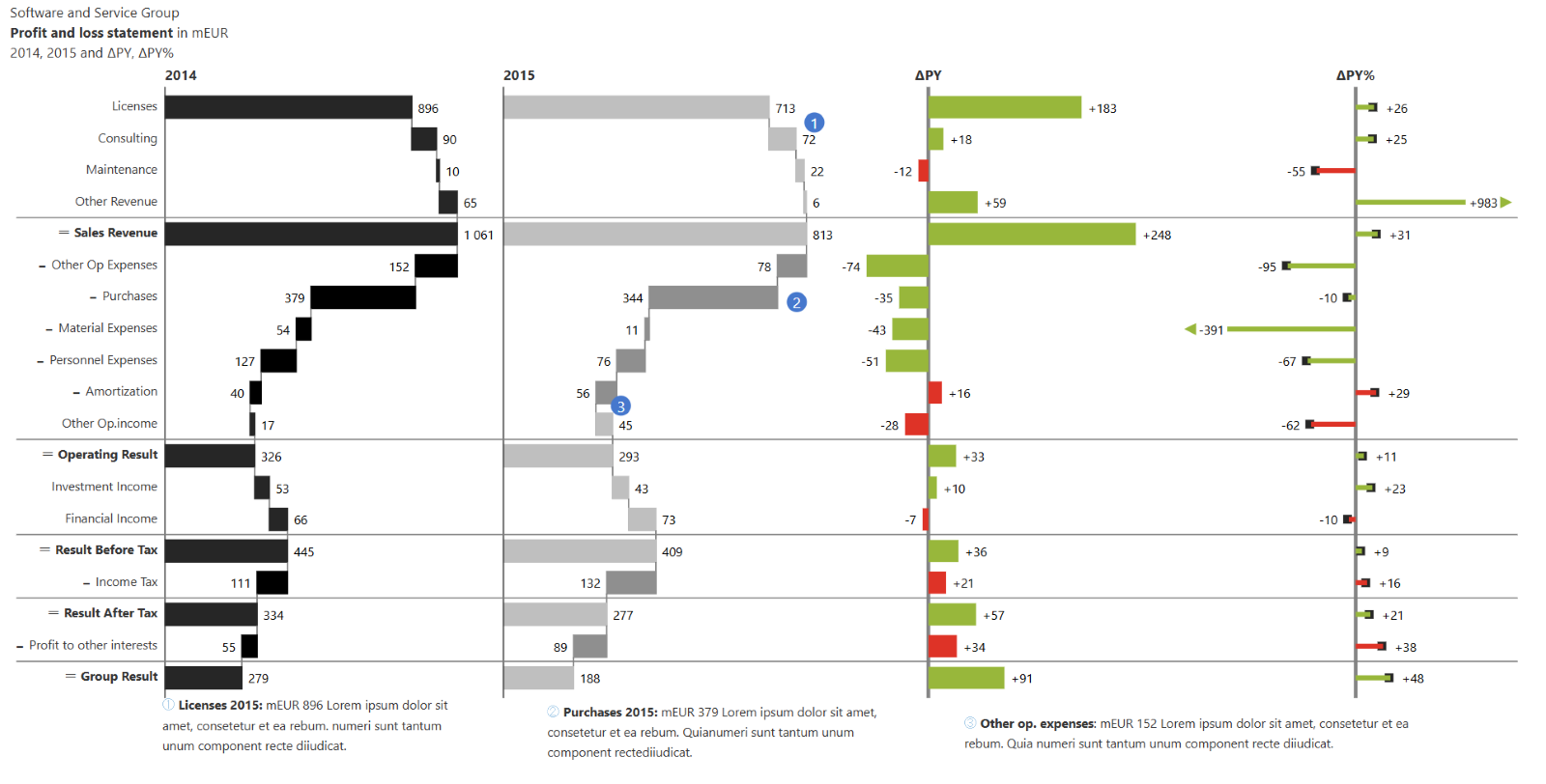
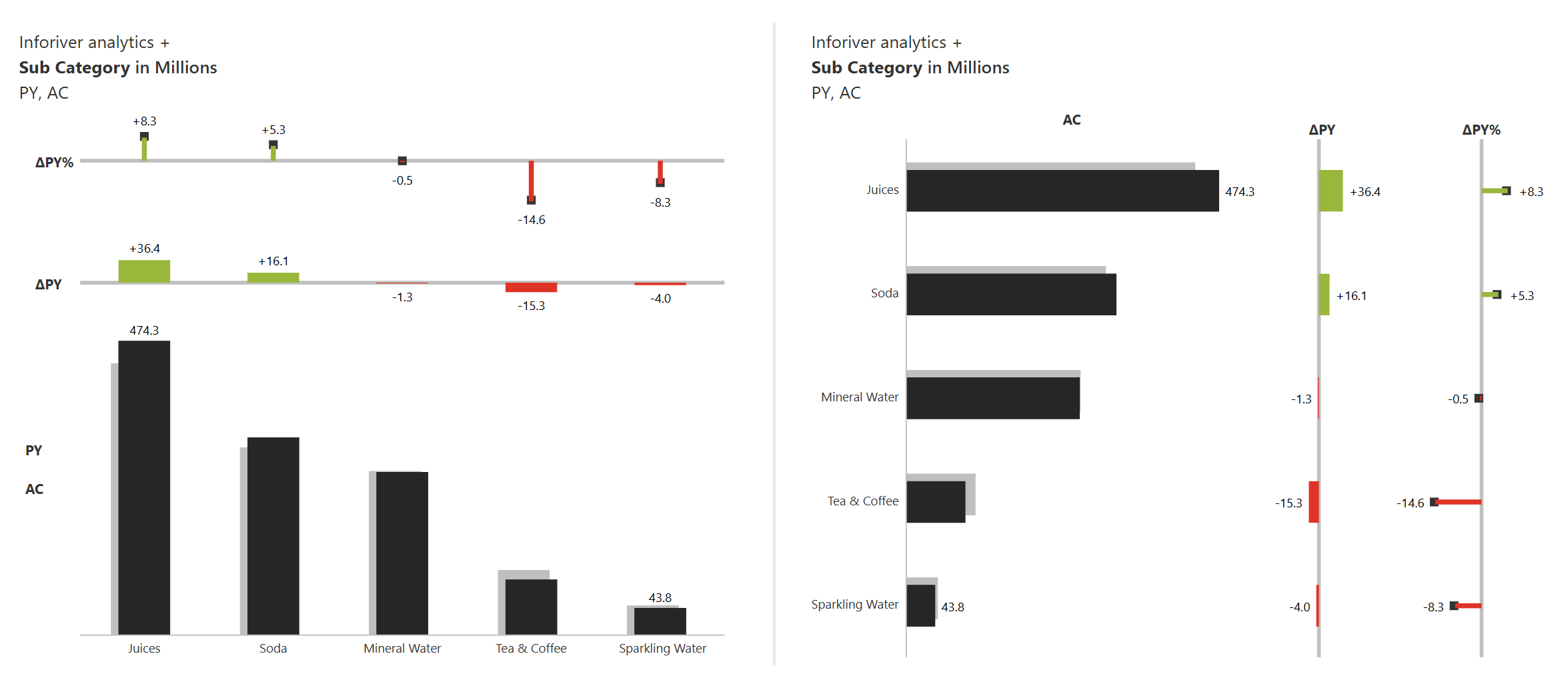
The International Business Communication Standards (IBCS®) provide practical guidelines for designing business reports, presentations, and dashboards that are clear, consistent, and easy to understand across organizations and cultures. A key principle of IBCS is the integration of actual values, comparison values (such as budget or prior year), and the resulting variance into a single, cohesive visual element.
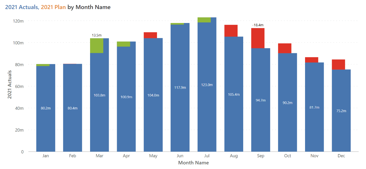
Rather than displaying these figures as separate bars or charts, IBCS recommends combining them in one visual—such as a single bar for the actual value with an overlay, added segment, or connected marker to show the variance. This integrated approach enhances readability and helps users quickly grasp key insights.
Adopting an integrated variance chart style, especially one aligned with IBCS principles, significantly enhances report comprehension, ensures consistency across different reports, and helps users quickly grasp performance deviations, leading to faster and more reliable decision-making.
You can easily build variance charts in Power BI using custom visuals. Inforiver Analytics+ empowers you with all the right features to build a display variance.
Inforiver Analytics+ supports both horizontal and vertical orientations, allowing you to easily plot visualizations based on screen size and label length to show details properly.
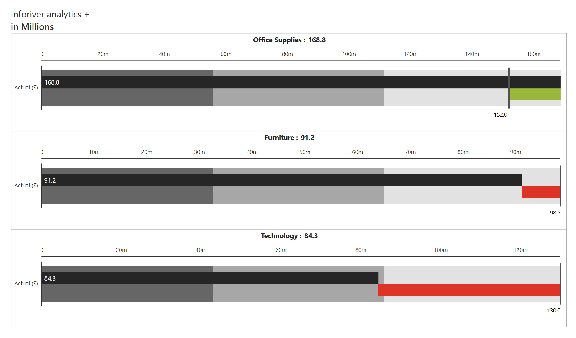
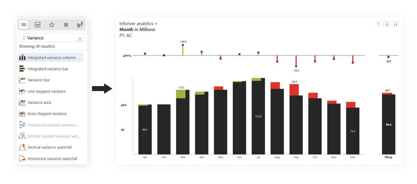
Inforiver Analytics+ supports multiple chart types including bar, column, line, area, waterfall, and bullet to visualize variance. To access these charts, go to the toolbar, select the chart type, and choose the desired chart from the respective family or search for variance.
All the charts mentioned in this section are available.
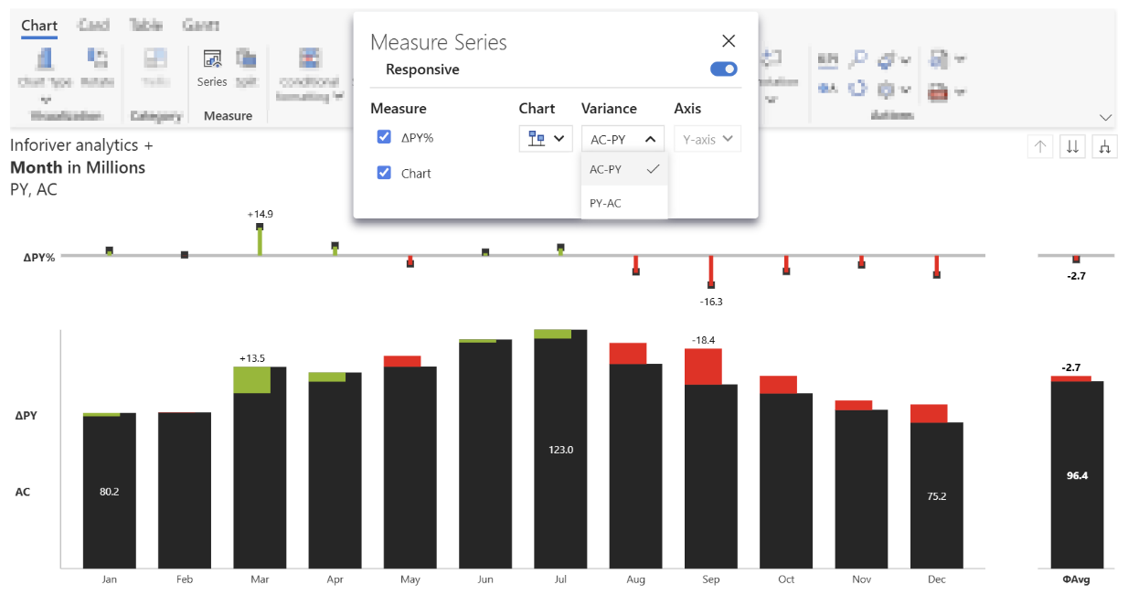
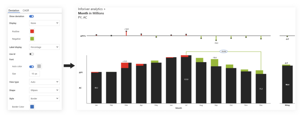
With Inforiver Analytics+, you don’t have to write any additional DAX or code to calculate variances. Simply select multiple measures. It supports up to 4 measures. Drag them into the respective fields in Pivot data. By default, you’ll see an integrated chart. Switch the chart type using the chart slider icon. To manage variances and series, go to the “Manage series” tab.

Integrated variance charts include absolute variance as part of the default design. In other charts control variance series using the Manage Series option available in the “Measure” tab.
This allows you to configure the variance type, formula, chart style (pins, column), and responsiveness of variance based on visual space.
In case of multiple measures, you can add or show more than 1 absolute and relative variances.
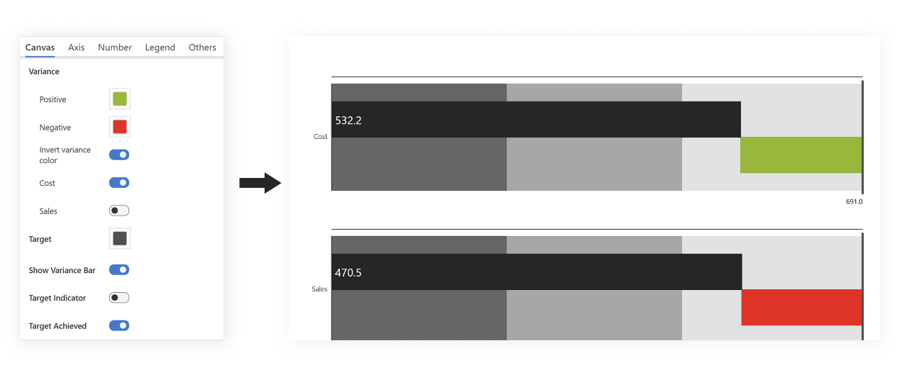
A variance chart includes two additional colors for positive and negative changes other than standard category colors. Inforiver Analytics+ allows you to control the color for variance and invert variance for specific cases.
To configure this property, go to Settings > Canvas > Variance Colors.
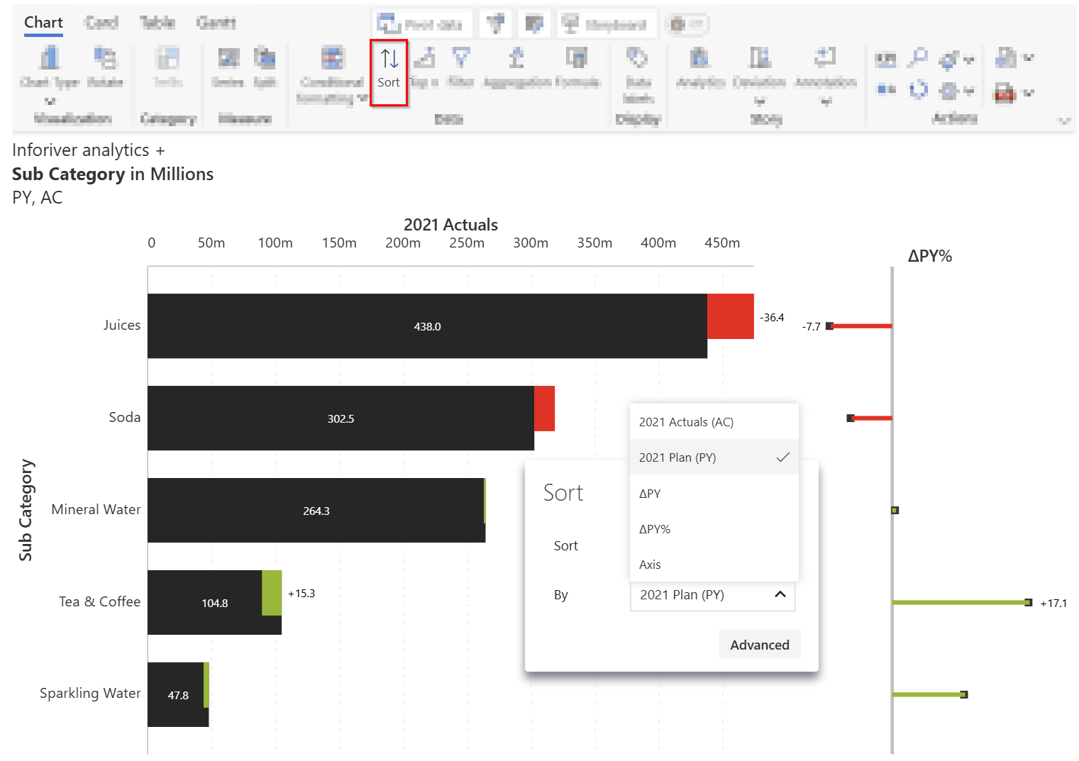
Sorting in variance charts can be done based on category, values, or variances.
To enable this option in Analytics+, go to the toolbar > select Data, > choose the Sorting option.
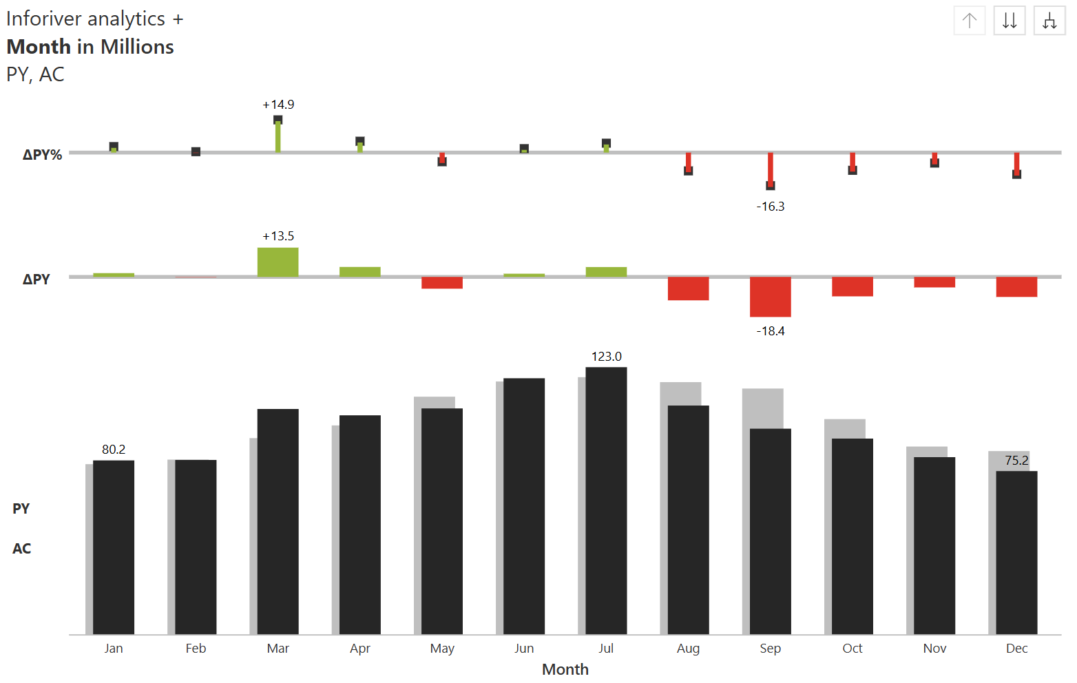
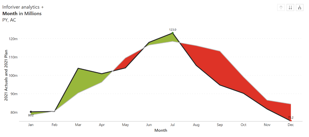
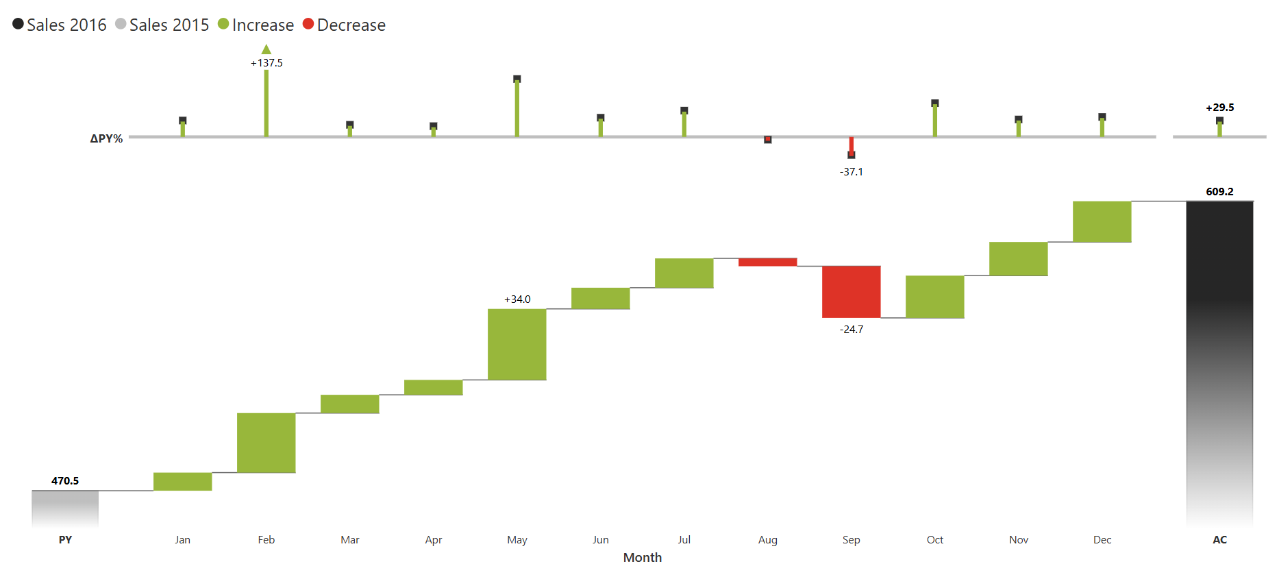
To highlight specific differences between two points in a variance chart, you can enable the deviation line. It also allows dynamic deviations such as min-max, first-last, and more.
In Analytics+, you can highlight different elements of charts based on a given rule. Absolute and relative variances can be used to create rules, and any rule can be applied to variance charts to change the formatting when it’s true.

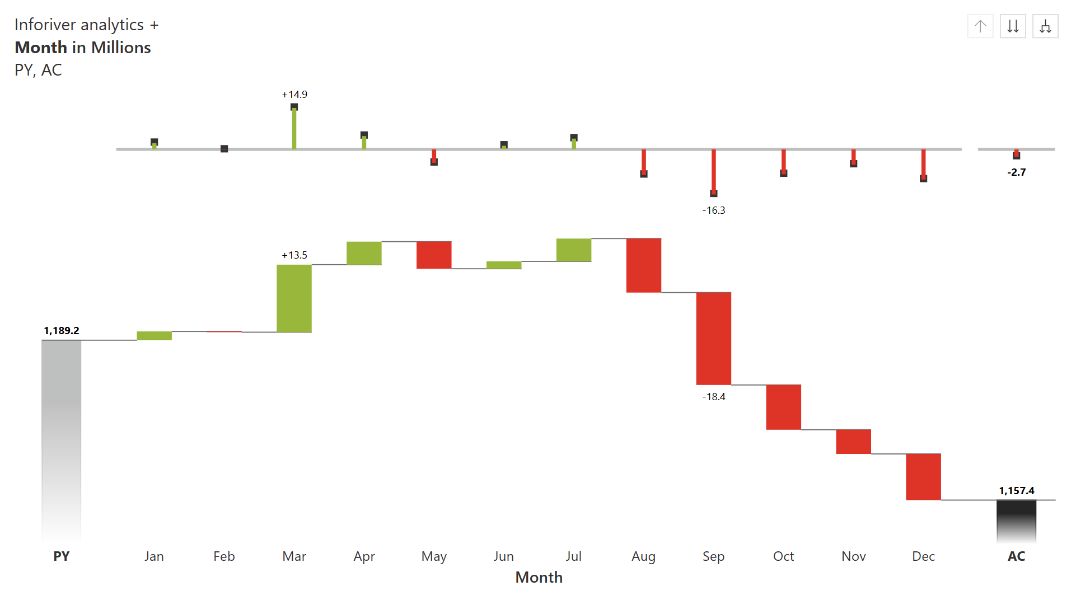
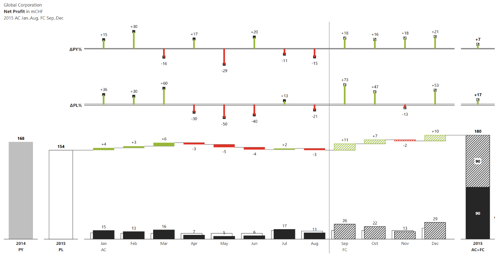
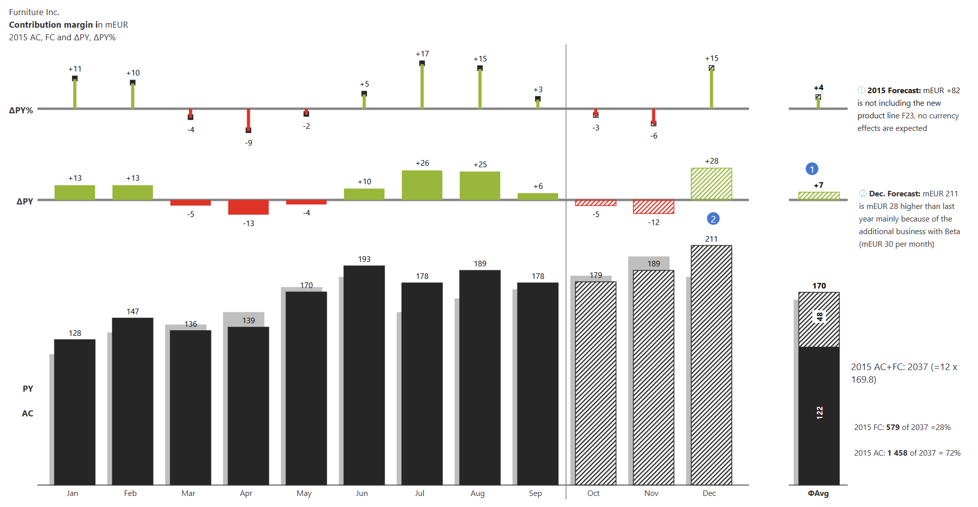
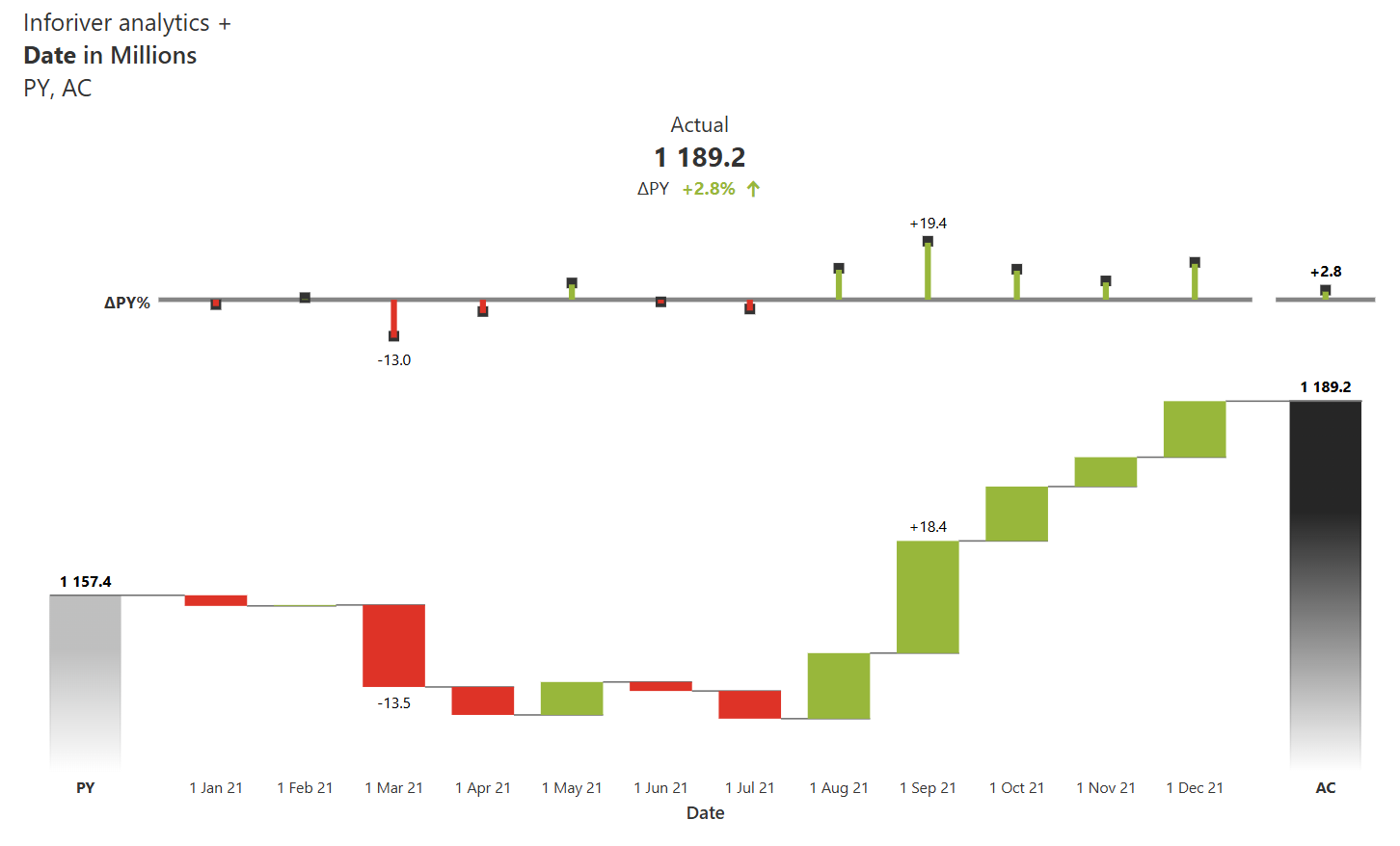
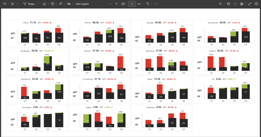
Inforiver Analytics+ supports all IBCS-compliant charts for variance analysis. It automatically calculates absolute and relative variances while following IBCS notations (AC, PL, PY & FC). Furthermore, IBCS guidelines suggest showing total or average bars at the end, which can be enabled from the Analytics tab.
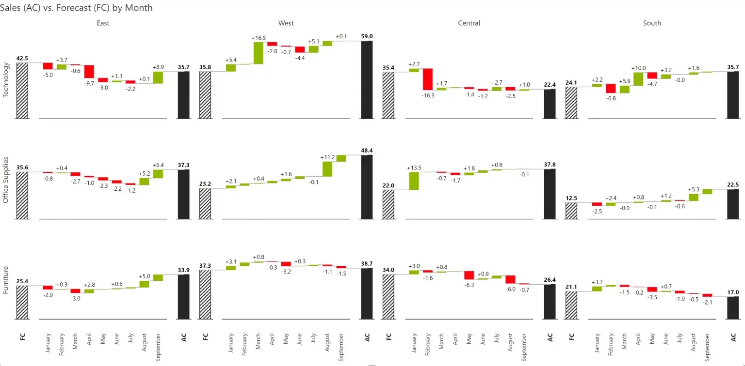
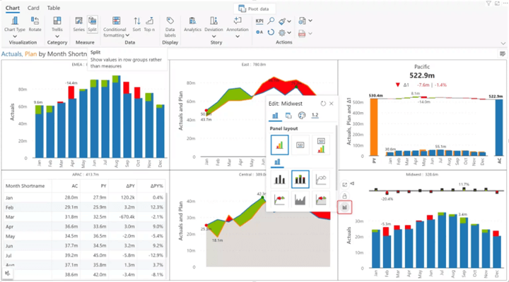
All Inforiver Analytics+ charts support trellis mode, allowing you to get a detailed overview of changes across multiple categories.
You can enable grid or ranked layouts with average panels and more customizations.
To display overall change or variance, you can enable KPI mode in the chart. This helps you showcase the total actual and budget values along with overall variances.
Inforiver Analytics+ supports the multi-measure chart feature. This allows you to choose different chart types for each trellis panel. This allows you to enhance the overall view and break the repetition on screen.
To enable this, hover on any panel, select the chart icon to choose a different variance-supported chart. This feature is smart enough to only suggest chart types which support similar data types, and it uses the formatting from the main chart as well.
Analytics+ supports increase/decrease legends to easily identify which color indicates positive and negative changes.
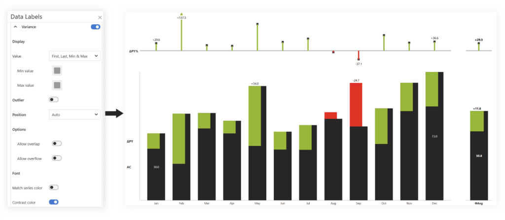
Absolute and relative variance series have data label properties. You can control the display types as min-max, first-last, or all, and manage the color and font properties for labels.
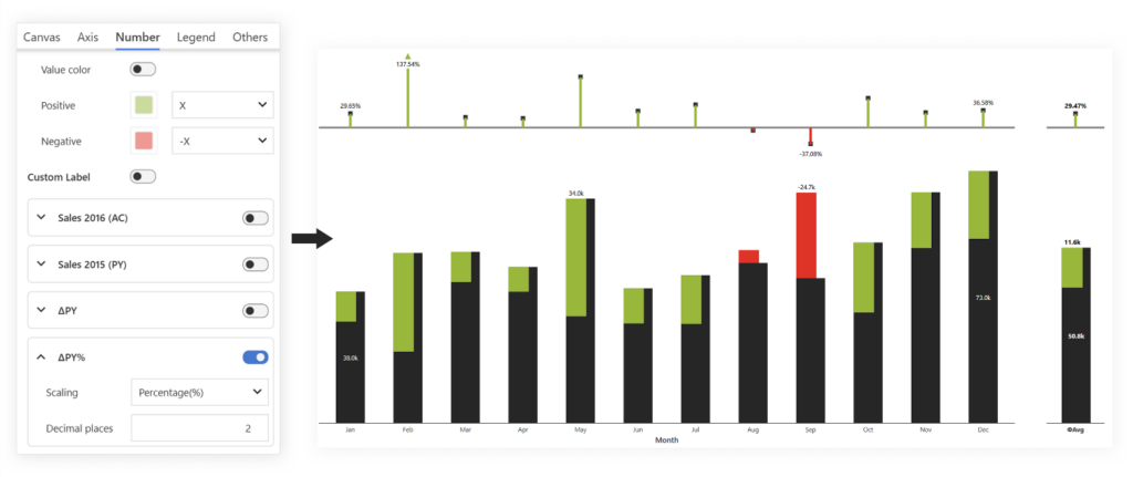
Inforiver Analytics+ allows you to manage individual measure formatting, including all variances. You can control the scaling type, decimal points, prefix, and suffix options for values.
It is helpful when dealing with different scaling data types or customizing different decimal points for actual or absolute variance.
Inforiver Analytics+ supports exporting to PDF with the exact formatting in your report.
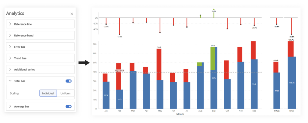
Inforiver Analytics+ supports more than 10 types of analytics features, including reference line, band, error bars, and more. One of the important analytics features for variance charts is the total and average bars are also included.
To compare the overall or average change, enable them from Analytics+. It allows individual or uniform scaling so both total and individual bars can be read without impacting height.
There are many additional features that are part of Inforiver Analytics+, including modern UI, dynamic annotations, theme support, import/export JSONs, and tooltip customization to deliver high-performance visualization.
Variance charts can be a useful visualization for comparative measures. It can clearly communicate the deviations to drive decisions. Inforiver Analytics+ focuses on simplifying the process of plotting a variance chart without any additional coding or DAX.
Inforiver Analytics+ is a 3-in-1 visual that consolidates all your reporting in one platform. It offers 100+ charts, Gantt, cards, and tables. Learn more
Explore our other post on calculating variances from a single measure in Power BI—no DAX required!
If you are interested in hierarchical variance analysis for tables/matrix, read this blog.

Inforiver helps enterprises consolidate planning, reporting & analytics on a single platform (Power BI). The no-code, self-service award-winning platform has been recognized as the industry’s best and is adopted by many Fortune 100 firms.
Inforiver is a product of Lumel, the #1 Power BI AppSource Partner. The firm serves over 3,000 customers worldwide through its portfolio of products offered under the brands Inforiver, EDITable, ValQ, and xViz.